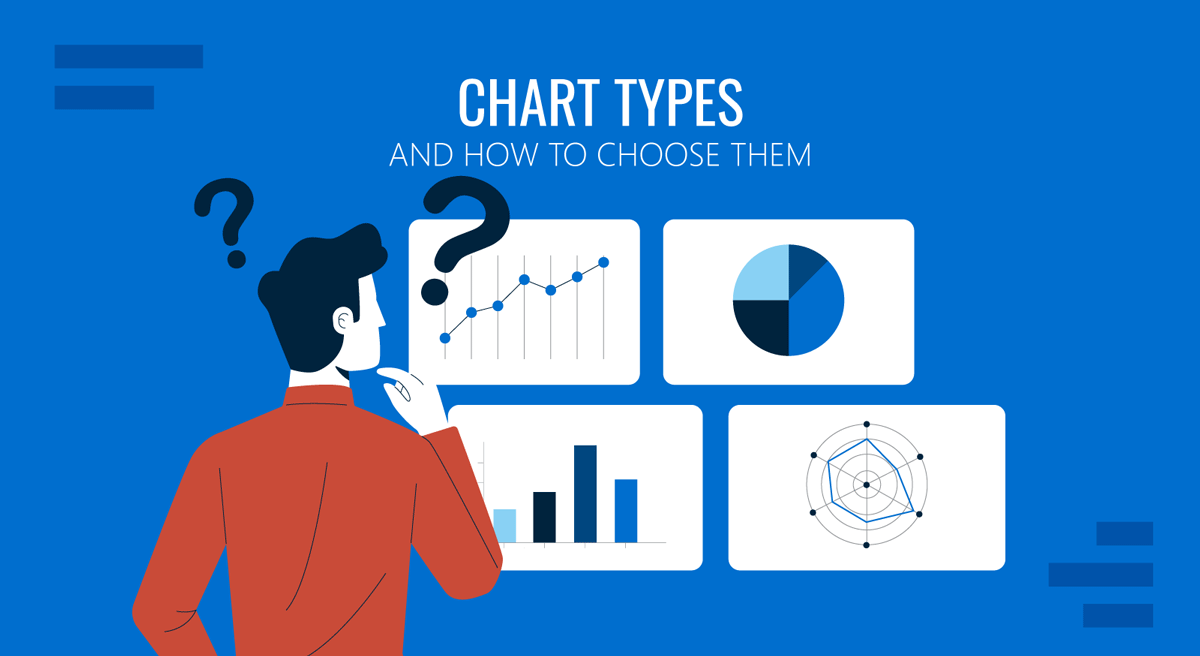
Most presenters treat chart selection as a formatting decision. They export the numbers, scroll through the gallery, and pick whichever shape looks least cluttered on the slide. The result is a deck full of technically correct visuals that fail to make a point. A pie chart with eleven segments, a line chart plotting categories with no sequence, a stacked bar chart asked to communicate precision it cannot deliver: these are not design errors. They are reasoning errors that happen to appear on a screen.
Chart selection is the moment where analysis becomes communication. The dataset has already been cleaned, and the conclusion has already been reached. What remains is deciding which visual form will move that conclusion into someone else’s head with the least friction. Every chart type encodes information differently, and each encoding favors certain comparisons while suppressing others.
This guide covers the different types of charts and graphs for presentations, grouped by the analytical job each one performs. It then explains a repeatable method for choosing among them, including how Abela’s Chart Chooser turns the decision into a short sequence of questions. Finally, it addresses how these choices play out inside PowerPoint, where slide constraints, projection conditions, and live audiences add requirements that a static report never faces.
Charts, Graphs, and Diagrams: What the Terms Actually Mean
The vocabulary around data visuals is loose enough to cause real confusion in professional settings. Analysts, designers, and executives often use chart names interchangeably, which makes briefs ambiguous and reviews slower than they need to be.
A chart is any graphical representation of data, covering everything from a two-bar comparison to a multi-series statistical plot. A graph, in strict usage, is a chart that plots values against a coordinate system, typically two axes. Every graph is a chart, but not every chart is a graph. A pie chart has no axes and is therefore not a graph, while a line chart is both. The distinction matters less in casual speech than in technical writing, though understanding the difference between charts and graphs helps when specifications need to be precise.
Diagrams occupy separate territory. Where charts display quantities, diagrams display structure, sequence, or relationships that are not primarily numeric. A flowchart shows how a process moves, an organizational chart shows reporting lines, a Venn diagram shows logical overlap. These are visual arguments about how things connect, not about how much of something exists. Confusing the two families leads to a common failure: forcing quantitative data into a structural layout, or decorating a process map with numbers that carry no analytical weight.
The practical takeaway is that the types of diagrams and charts available to you serve different questions. Before selecting a form, decide whether the slide answers “how much” or “how does this work.” That distinction immediately eliminates roughly half the options.
The Complete List of Data Chart Types
The sections below organize chart types by analytical function rather than by appearance. Grouping by function is more useful because it maps directly onto the question you are trying to answer. When someone asks what the different types of charts are, the honest answer is that there are perhaps forty in common use, but only six families of purpose. Learn the families and the individual chart names become easy to place.
Comparison Charts
Comparison charts answer questions about relative magnitude across categories. They are the most frequently used family in business presentations because most business questions reduce to “which is bigger” or “who performed better.”
The bar chart and the column chart use the same visual logic, rotated 90 degrees. Columns run vertically and work well for time-based categories or short labels. Bars run horizontally and handle long category names without forcing readers to tilt their heads. Both encode value as length, which the human eye judges more accurately than area or angle. This is why bar charts remain the safest default for a comparison chart on a slide.
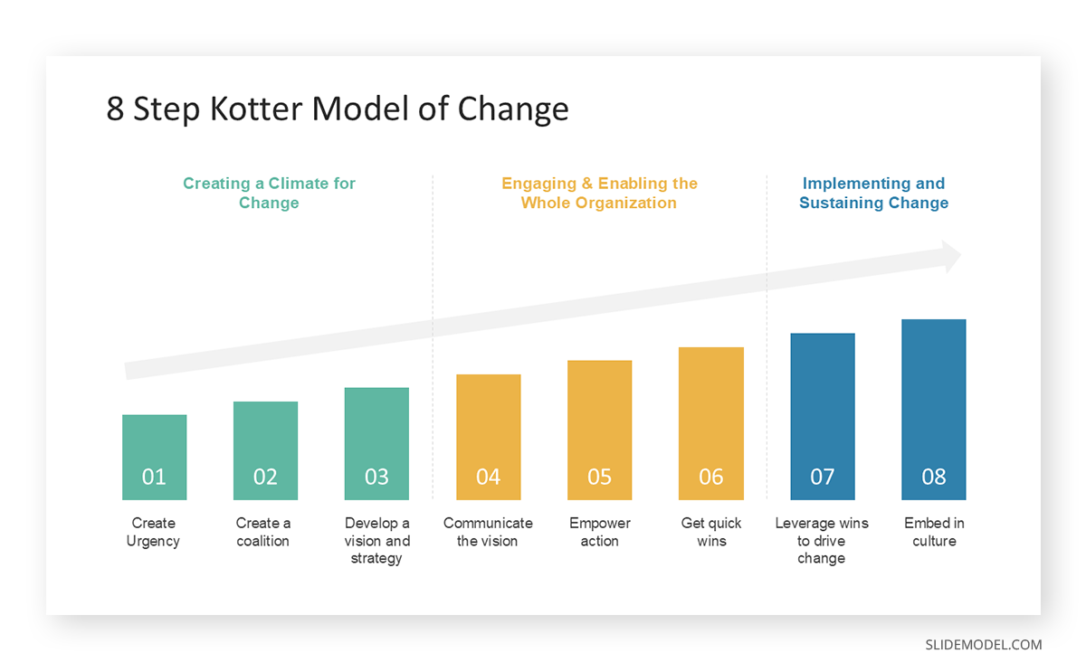
Grouped bar charts place multiple series side by side within each category, allowing comparison across two dimensions at once. They stay readable up to roughly three or four series before they collapse into stripes. Stacked bar charts place series on top of one another, showing both category totals and internal composition, though only the bottom segment sits on a common baseline and can be compared precisely.
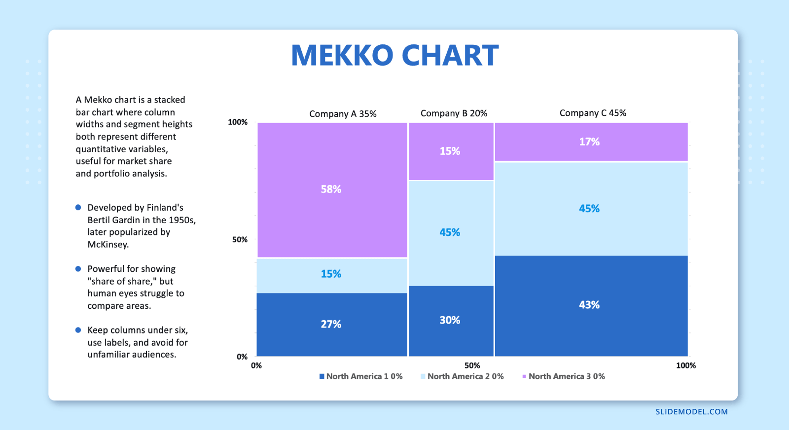
The Marimekko chart extends the stacked bar by varying column width according to a second variable, usually market size. A Mekko chart lets a strategy team show share and volume simultaneously, which is why consulting decks favor it for market landscapes.
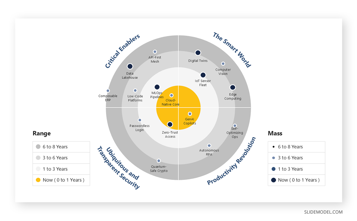
Radar charts, sometimes called spider or web charts, plot several variables on axes radiating from a center point. A radar chart suits capability assessments, competitor profiling, and skills evaluations where the shape of the polygon communicates a pattern faster than a table of scores. Its weakness is precision: the enclosed area exaggerates differences, so it works better for profile comparison than for exact measurement.
Bullet charts compress a measure, a target, and qualitative ranges into a single horizontal element. They were designed as a replacement for dashboard gauges and remain one of the most space-efficient ways to show performance against a benchmark.
Composition Charts
Composition charts answer questions about parts relative to a whole. They are heavily used and heavily misused, largely because the pie chart is the first option most software offers.
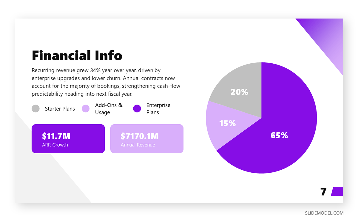
The pie chart divides a circle into wedges proportional to their share. It performs acceptably with two or three segments and one clearly dominant slice. Beyond that, the eye cannot reliably compare angles, and the chart becomes decoration. The donut chart applies the same logic, with a hollow center that some designers use to hold a total figure. Neither should carry more than five categories.
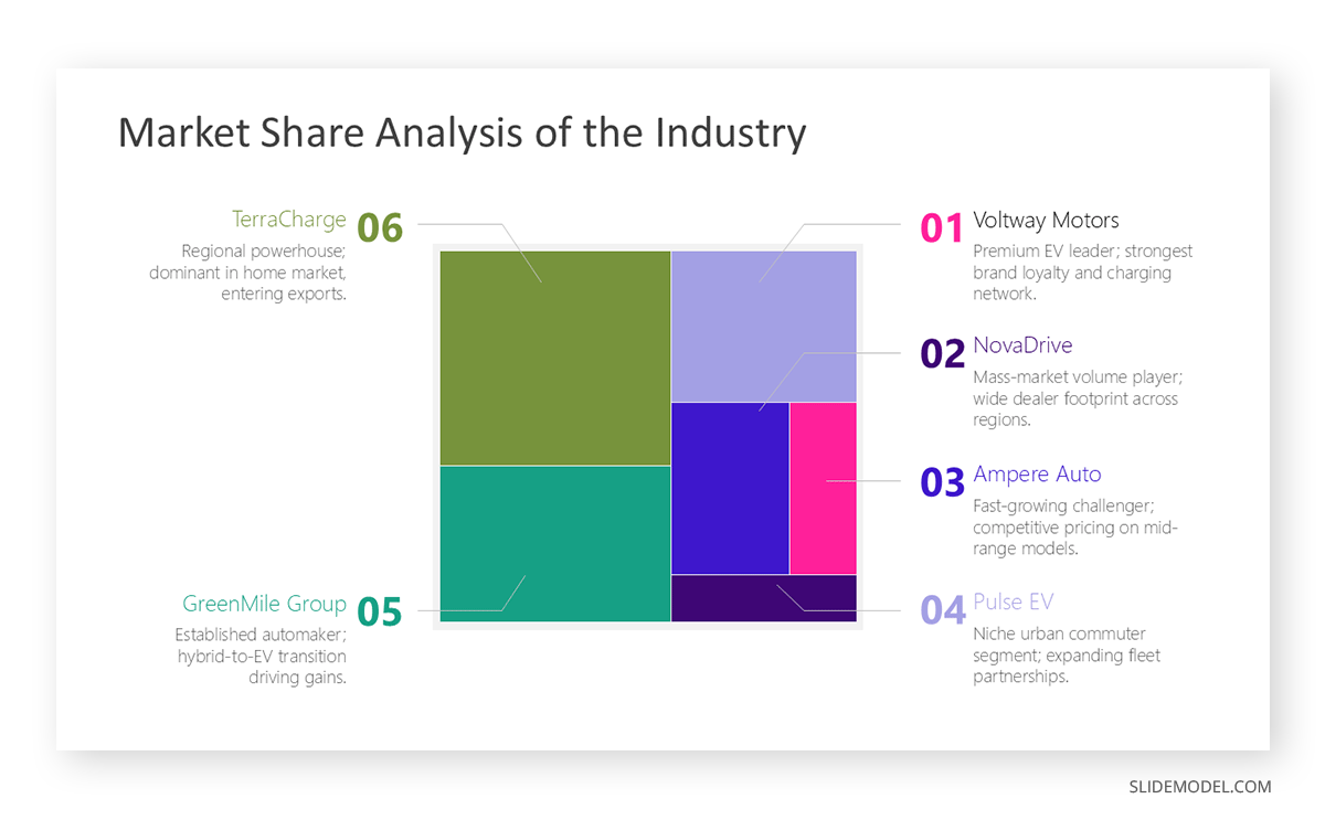
Treemaps solve the problem pies cannot. A treemap chart nests rectangles sized by value, handling dozens of categories and supporting hierarchy through nesting. Product portfolios, budget allocations, and content inventories display well in this form.
Stacked area charts show how composition shifts across time. They combine the trend logic of a line chart with the part-to-whole logic of a stack chart, making them useful for revenue mix or channel contribution over several periods. Readability degrades quickly past four or five bands.
Waterfall charts explain how a starting value becomes an ending value through a sequence of increases and decreases. Finance teams rely on them to bridge analyses: opening revenue plus new business, minus churn, equals closing revenue. Learning to build a waterfall chart is one of the higher-return skills for anyone presenting financial movement.
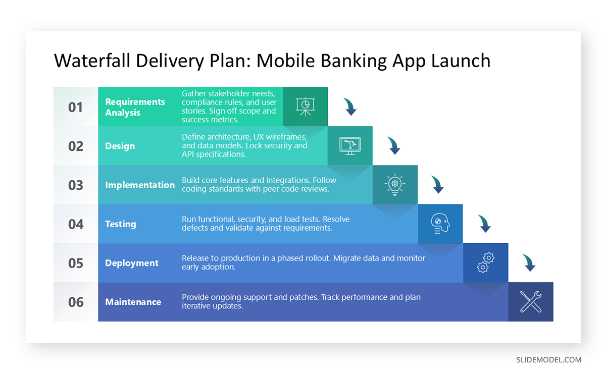
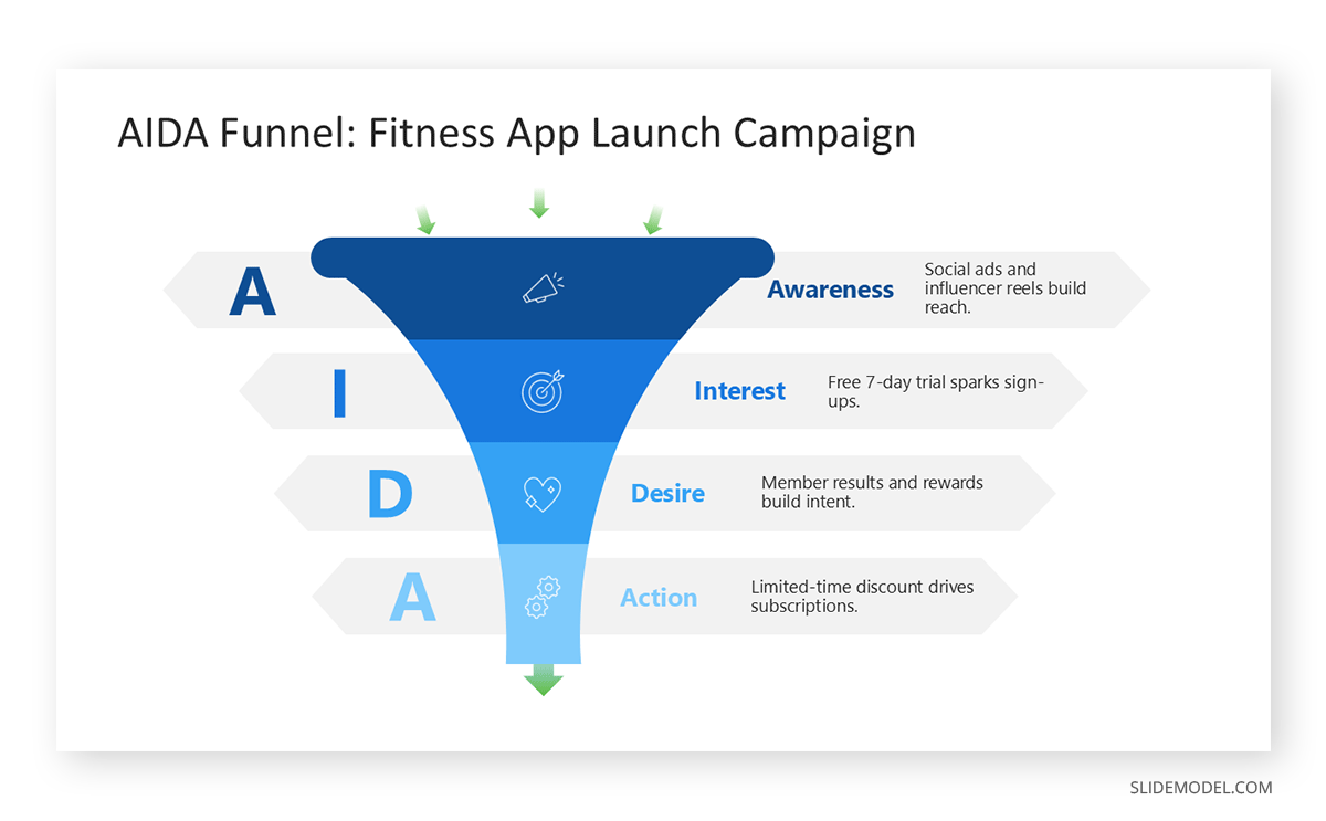
Funnel charts display sequential stage conversion, most commonly in sales and marketing pipelines. A funnel visualization makes drop-off between stages immediately visible, which is its entire value. Pyramid charts use similar geometry but typically represent hierarchy or layered concepts rather than conversion, and a pyramid chart works best when the layers have a genuine ordinal relationship.
Distribution Charts
Distribution charts answer questions about how values spread across a range. They appear less often in executive presentations than in research, quality, and operations contexts, though their absence from business decks is frequently a missed opportunity. Averages hide variance, and variance is often where the actionable finding lives.
The histogram groups continuous data into bins and plots frequency. It reveals whether a distribution is symmetric, skewed, or bimodal, which a mean alone will never tell you. Building a histogram is worth the effort whenever an audience needs to understand spread rather than central tendency, such as customer response times or delivery delays.
Box plots, also called box-and-whisker plots, summarize a distribution through median, quartiles, and outliers. They allow several distributions to be compared side by side in very little space, which makes them valuable for benchmarking across regions or teams. Their drawback in business settings is their unfamiliarity, so they require an explanatory sentence.
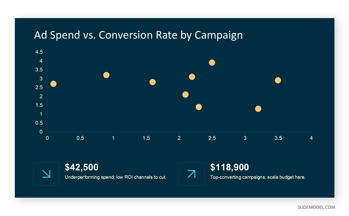
Scatter plots place individual observations on two axes, revealing clustering, correlation, and outliers. Bubble charts extend the scatter plot with a third variable encoded as marker size. A bubble chart carries three dimensions on one slide, which suits portfolio positioning, though bubble area is judged imprecisely and should never be the sole basis for a comparison.
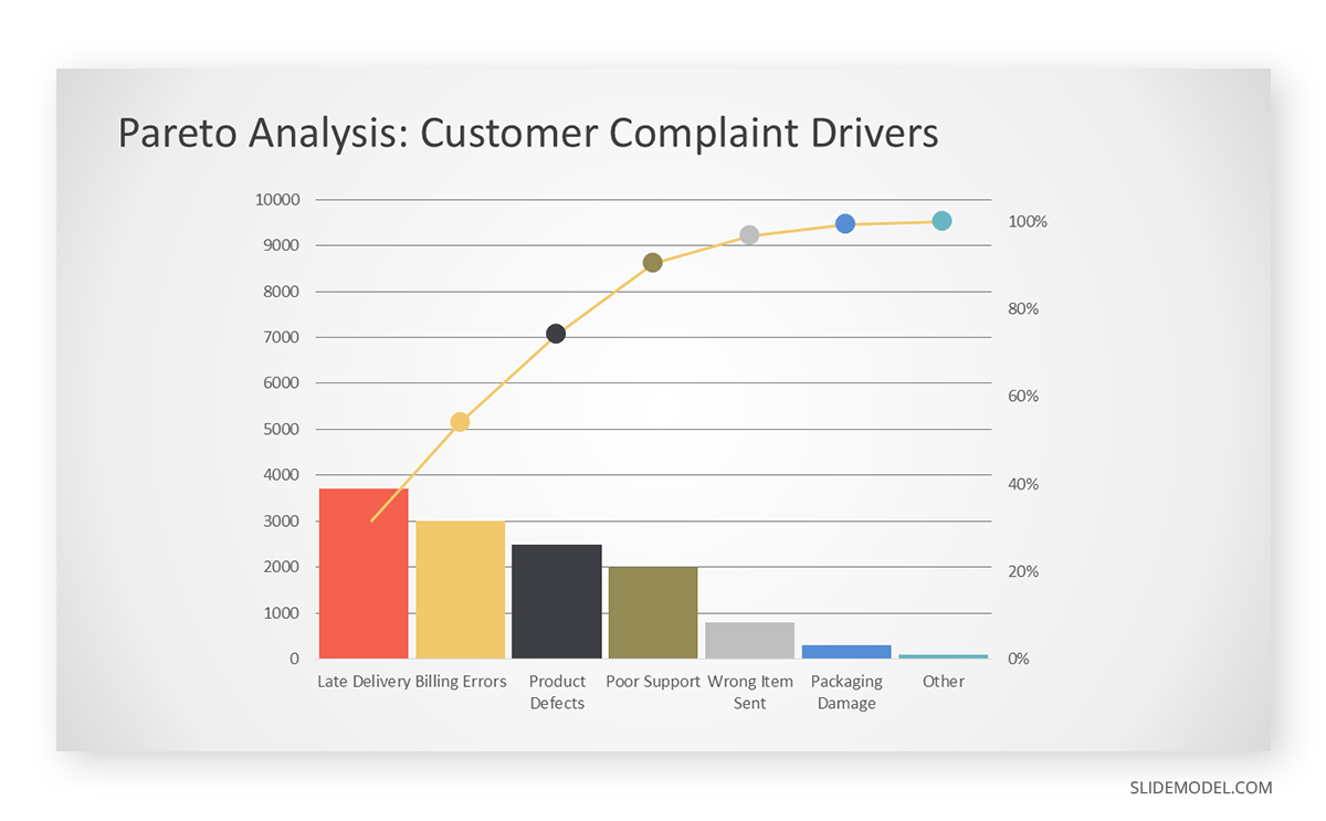
Pareto charts combine a descending column series with a cumulative line, operationalizing the principle that a small number of causes generate most of the effect. A Pareto chart is the standard visual for root cause prioritization in quality and process improvement work.
Trend and Time Series Charts
Trend charts answer questions about change over time. Time is a continuous, ordered variable, and that ordering is what justifies connecting points with a line.
The line chart is the default. It handles long time series gracefully, supports multiple series without visual collapse, and communicates direction, rate of change, and inflection points in a single form. A well-built line chart can carry four or five series where a bar chart of the same data would be unreadable. Reviewing line chart examples across different contexts clarifies how axis scaling and the number of series change the message.
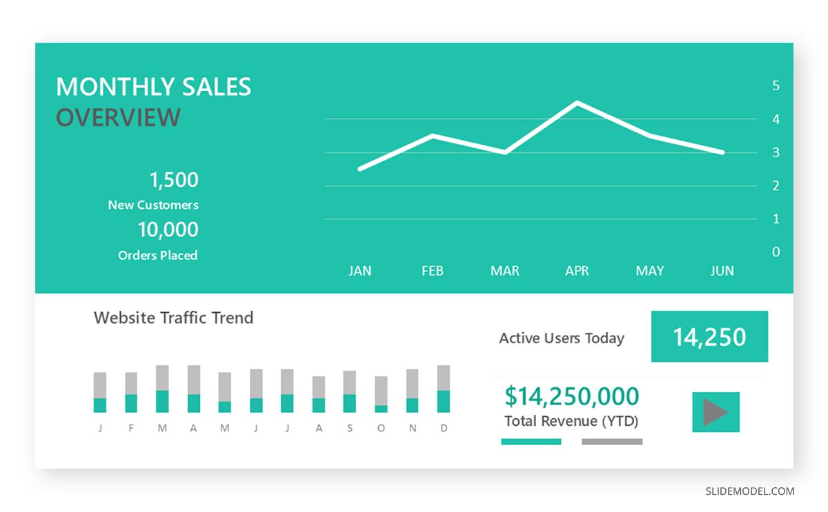
Area charts fill the space below a line, emphasizing accumulated volume rather than rate. Use them when magnitude matters as much as direction, and avoid them when multiple series would obscure one another.
Sparklines are word-sized line charts embedded in text or tables. They add trend context to a number without consuming slide space, which is particularly useful in metric summaries where a figure alone leaves the audience asking whether it is improving.
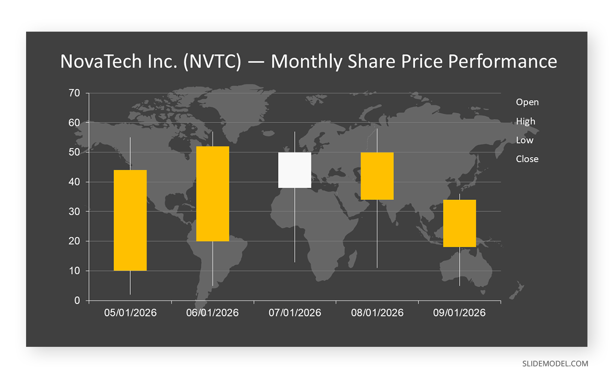
Candlestick charts encode open, high, low, and close values for a period in a single mark. A candlestick chart is standard in financial presentations covering price movement and communicates volatility that a simple line would flatten out.
Gantt charts map activities against a time axis, showing duration, sequence, and overlap. A Gantt chart is technically a specialized bar chart, and it remains the most recognized format for project scheduling in business environments. Related to it, timeline visuals handle milestone sequences where duration matters less than order and date.
Relationship Charts
Relationship charts answer questions about how variables or entities connect. This family carries the highest analytical density and the highest risk of losing an audience, so it demands the clearest narration.
Scatter plots appear here again because correlation is as much a relationship question as a distribution question. When a scatter plot is used to argue that two variables move together, the presenter bears the burden of showing whether the relationship is causal, and it usually is not.
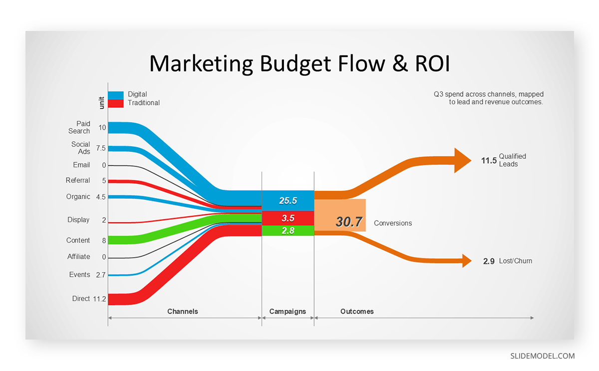
Sankey diagrams show flow between states, with bandwidth proportional to volume. Sankey diagrams suit energy flows, budget allocation, customer journey paths, and any situation where quantities split and merge across stages. They reward study but resist quick reading, which makes them better suited to documents and standing dashboards than to a slide shown for thirty seconds.
Heat maps encode value through color intensity across a grid, making patterns visible in datasets too large to read numerically. A heat map presentation works well for correlation matrices, activity by day and hour, or performance across regions and product lines. Color scale selection determines whether it informs or misleads: sequential scales belong with ordered data, diverging scales with data that has a meaningful midpoint.
Network charts plot nodes and edges to show connection structure, such as stakeholder influence or system dependencies. They communicate topology rather than magnitude and should be simplified aggressively before reaching a slide.
Geographic and Structural Charts
Geographic charts encode data onto spatial coordinates. Choropleth maps shade regions by value and suit territory performance, market penetration, and regional distribution. They carry a known distortion: large, sparsely populated areas visually dominate small, densely populated ones, which can misrepresent the underlying reality. Proportional symbol maps, which place sized markers at locations, avoid that problem.
Structural charts sit at the boundary between charts and diagrams. Organizational charts map reporting relationships and are among the most requested visuals in corporate decks. Working from established org chart layouts saves considerable time because the hierarchy logic is already solved. Flowcharts map decision paths and process steps, and building a flowchart correctly depends more on notation discipline than on visual styling.
Tables deserve mention alongside charts because they are often the right answer. When an audience needs exact values, when categories are few, or when the data will be referenced rather than interpreted, a well-designed table presentation outperforms any chart. The instinct to chart everything is one of the more expensive habits in business communication.
How to Choose a Chart for a Presentation
The selection process becomes reliable once you stop starting from the data and start from the question. Data does not suggest a chart type. A conclusion does.
Begin by writing the takeaway as a full sentence. Not “Q3 revenue by region,” but “the Northeast recovered while the West continued to decline.” That sentence contains the analytical relationship, and the relationship determines the form. In this example of chart reasoning, recovery and decline over time point to a line chart, while regional magnitude at a single moment points to a bar chart and regional share of a total points to a composition chart. The sentence does the selection work before the software is involved.
Second, identify how many variables are in play and what type each one is. A single categorical variable measured once needs a simple bar chart. Two continuous variables need a scatter plot. Two categorical dimensions and one measure require a grouped bar chart, a heat map, or a small multiples arrangement. Counting variables eliminates most candidates mechanically.
Third, consider the precision the audience requires. If someone will act on exact figures, use a table or label the chart directly. If the audience needs to perceive a pattern, a chart without value labels reads faster and cleaner. Mixing both intentions produces cluttered visuals that serve neither. This is where a strong data presentation approach separates itself from a data dump.
Fourth, respect perceptual accuracy. Human judgment is most reliable for position along a common scale, then length, then angle, then area, then color intensity. This ordering explains why bar charts outperform pie charts and why bubble size should never carry the critical comparison. When accuracy matters, choose an encoding higher on that list.
Abela’s Chart Chooser as a Decision Framework
Andrew Abela’s Chart Chooser formalizes the process into a branching diagram that has become a reference for analysts and consultants. It begins with a single question: what would you like to show? Four answers branch out: comparison, distribution, composition, and relationship, each of which subdivides based on the structure of the data.
During comparison, the framework asks whether the data is across categories or over time, then how many categories or periods there are, and arrives at a specific recommendation, such as a column chart for a few time periods or a line chart for many. Under composition, it distinguishes static composition from composition that changes over time, then asks whether only relative differences matter or whether absolute values do as well. Under distribution, it separates single-variable, two-variable, and three-variable cases, producing histograms, scatter plots, or bubble charts, respectively. Under relationship, it asks how many variables are being compared and points toward scatter or bubble forms.
The value of this framework is not that it produces perfect answers. It is that it forces the question to precede the visual. Presenters who internalize the four branches stop browsing the chart gallery and start reasoning about intent. The Abela’s Chart Chooser reference is worth keeping accessible during deck preparation, particularly for teams standardizing how they visualize recurring reports.
One caveat is worth stating. The framework was designed around common business data and does not cover every specialized form, including Sankey diagrams, treemaps, and geographic visuals. Treat it as a fast path to a reasonable choice rather than an exhaustive taxonomy.
Matching the Chart to the Setting
The same data justifies different chart choices depending on where it will be seen. A visual built for a printed report can carry detail that a projected slide cannot. A dashboard viewed on a laptop supports interaction that a conference room screen does not.
A slide graph needs to be legible from the back of a room, which sets a practical floor on font size and a ceiling on data density. As a working rule, charts for presentations should communicate their main point within five seconds of appearing, and anything requiring longer study belongs in an appendix or a leave-behind document. Applying visual hierarchy principles determines whether that five-second read succeeds: what the eye lands on first should be the conclusion, not the axis labels.
Audience expertise also shapes the decision. An operations team reads box plots comfortably. A board of directors generally does not, and forcing an unfamiliar form on them diverts attention from the substance of your argument. This is not about simplifying the analysis. It is about choosing an encoding your specific audience can decode without instruction. When you must use an unfamiliar chart type, spend one sentence explaining the form before interpreting the content.
Building and Formatting Charts in PowerPoint
PowerPoint includes a native charting engine that supports most of the forms described above, and understanding its behavior can save considerable rework. When you insert a chart in PowerPoint, the application creates an embedded worksheet holding the data. Editing that worksheet updates the visual, and the file travels with the presentation, which means the chart stays editable on any machine that opens the deck. Creating a presentation graph in PowerPoint from scratch follows the same process regardless of which format you select.
The types of charts in PowerPoint available from the gallery are grouped into column, line, pie, bar, area, scatter, map, stock, surface, radar, treemap, sunburst, histogram, box and whisker, waterfall, funnel, and combo categories. The combo option deserves attention because it allows two chart types on shared axes, which is how you build a Pareto chart or plot a volume series against a rate series. Secondary axes are available in the same dialog, though they should be used sparingly since two axes on one plot invite misreading.
For data that lives elsewhere, linking rather than embedding keeps the deck synchronized with the source. Knowing how to move Excel data into PowerPoint slides correctly determines whether your numbers stay current through the revision cycles that precede most presentations. Linked charts update when the source workbook changes, which is useful for recurring reports and risky for decks that travel without their source files.
Formatting decisions carry more weight than most presenters assume, and they are what separate default PPT charts and graphs from ones an audience can actually read. Remove gridlines unless the audience needs to read values off the axis. Delete the legend when a single series is plotted, and label series directly on the plot when there are two or three, since direct labeling eliminates the eye movement that legends require. Start value axes at zero for bar charts, where length encodes the comparison, and consider a truncated axis only for line charts where the variation would otherwise be invisible. Use color to mark the point you are making rather than to distinguish every category, which usually means one accent color and several muted ones.
Google Slides users face a different workflow, since charts there link to Google Sheets by default, and creating a graph in Google Slides follows similar logic with tighter spreadsheet integration. In either environment, starting from prepared PPT chart templates removes the formatting work and enforces visual consistency across a deck, which matters more in long presentations than any individual chart choice.
Creative Ways to Present Data in PowerPoint
Standard charts handle standard questions. When the objective is retention rather than reference, the presentation method matters as much as the chart type.
Progressive disclosure is the most reliable technique. Rather than revealing a complete chart, build it in stages: axes and context first, then the baseline series, then the comparison, then the annotation carrying the conclusion. Each stage gets a sentence, and the audience follows the reasoning instead of decoding a finished object. PowerPoint animation supports this through series-level entrance effects.
Annotation converts a chart into an argument. A callout reading “conversion dropped 40% after the pricing change” does more work than any amount of formatting refinement, because it states the finding rather than leaving the audience to find it. The chart becomes evidence supporting a stated claim, which is how data storytelling functions in practice.
Small multiples deserve wider use. Instead of stacking eight series on a single plot, repeat a small, identical chart across a grid, one per category. The eye effortlessly compares shapes across panels, and patterns buried in a tangle of overlapping lines become obvious.
Comparison framing gives numbers meaning. A figure like 2.3 million means little in isolation, but presented against last year or against target, it acquires significance. Techniques for presenting key metrics consistently emphasize this: never show a number without the reference point that makes it interpretable.
For summary views, a dashboard layout collects several charts into a single coherent slide. Dashboards work when the metrics genuinely belong together, and the layout guides reading order. They fail when they become a wall of visuals with no hierarchy.
Finally, consider whether an infographic treatment serves the moment better than a conventional chart presentation. For internal campaigns or summary material meant to be shared rather than presented, illustrated data can carry a message further than a precise plot. The tradeoff is analytical rigor.
Common Mistakes in Chart Selection
Certain errors recur across industries and seniority levels, and most trace back to selecting the visual before defining the message.
The most frequent is using pie charts for anything beyond three or four segments. Angular comparison is unreliable, and a pie with nine wedges communicates less than a sorted bar chart would. The second is plotting categorical data as a line chart. Lines imply continuity between points, so connecting unrelated categories asserts a relationship that does not exist.
Truncated axes on bar charts constitute a third error, and a consequential one. Because bar length carries the comparison, cutting the axis at an arbitrary value visually exaggerates differences. On line charts, where the reader tracks direction rather than length, a truncated axis is often defensible.
Overloading a single chart with too many series is a fourth pattern. Past four or five lines, individual series become untraceable, and the visual reads as texture. A related failure is using three-dimensional effects, which distort every encoding they touch and add no information.
Missing context is the most damaging error because it is the hardest to detect. A chart with an unlabeled axis, an undefined time period, or an unstated data source cannot be evaluated by the audience, and sophisticated audiences discount conclusions they cannot verify. Every chart should answer three questions without narration: what is measured, over what period, and from what source. Building this discipline into your process supports data-driven decision-making rather than merely decorating decisions that have already been made.
FAQs
What are the main types of charts used in presentations?
The most common charts for presentation work are bar and column charts for comparison, line charts for trends, pie and donut charts for simple composition, scatter and bubble charts for relationships, and tables for exact values. Beyond these, waterfall, funnel, treemap, radar, heat map, and Gantt charts each serve specific purposes the basic set handles poorly.
What is the difference between a chart and a graph?
A chart is any visual representation of data. A graph is a chart plotted on a coordinate system with axes. Line charts and scatter plots are graphs; pie charts and treemaps are charts but not graphs. In everyday business usage, the terms are treated as synonyms, and doing so rarely causes problems.
How many chart types does PowerPoint include?
PowerPoint offers 17 chart categories, including column, line, pie, bar, area, scatter, map, stock, surface, radar, treemap, sunburst, histogram, box-and-whisker, waterfall, funnel, and combo. Each contains several variants, bringing the number of selectable configurations to roughly sixty.
Which chart should I use to compare values across categories?
A bar or column chart. Use columns when category labels are short or represent time periods, and horizontal bars when labels are long. Sort the categories by value rather than alphabetically unless the natural order carries meaning, since sorting makes the ranking immediately visible.
When is a pie chart appropriate?
When you have three or fewer categories, the segments differ substantially in size, and one portion dominates. If segments are similar in size, if there are more than four, or if the audience needs to compare them precisely, a sorted bar chart communicates the same data more accurately.
What chart works best for showing change over time?
A line chart for most cases, particularly with many time points or multiple series. Column charts work well for a small number of discrete periods, where each value represents a distinct event. Area charts suit accumulated volume, and waterfall charts explain how a starting figure became an ending figure.
How do I choose between a table and a chart?
Use a table when the audience needs exact values, when there are few rows, or when the data will be referenced during discussion. Use a chart when the point is a pattern, trend, or comparison that the eye can perceive faster than it can read numbers. Some slides justify both, with the table in an appendix.
What is Abela’s Chart Chooser?
It is a decision diagram developed by Andrew Abela that routes users to an appropriate chart type through a sequence of questions. It starts by asking what you want to show, branches into comparison, distribution, composition, and relationship, and then narrows based on the number of variables and whether time is involved.
How many series can one chart hold?
For line charts, four to five before individual series become difficult to trace. For grouped bar charts, three to four. For pie charts, three to four segments. Beyond these thresholds, split the data across small multiples or highlight a single series while muting the rest.
Should chart axes always start at zero?
For bar and column charts, yes, because bar length encodes the comparison and truncating the axis distorts it. For line charts, no, since readers interpret direction and slope rather than absolute length. A truncated axis on a line chart is often necessary to make meaningful variation visible.
What is the best way to display parts of a whole?
For a handful of categories, a sorted bar chart or a simple pie chart. For many categories, a treemap. For composition changing over time, a stacked area chart or a stacked column chart. For a value that builds through additions and subtractions, a waterfall chart.
How can I make charts readable on a projected slide?
Increase font sizes well beyond the software default, remove gridlines and unnecessary axis labels, use a single accent color against muted tones, and label series directly rather than using a legend. Test the slide from the back of the room or at 50% zoom to confirm the main point still registers.
What chart type suits distribution data?
A histogram for a single variable, showing frequency across value ranges. A box plot for comparing distributions across several groups in limited space. A scatter plot for two variables, and a bubble chart when a third variable needs to be encoded as marker size.
Are 3D charts ever advisable?
No. Three-dimensional effects distort length, angle, and area, which are precisely the encodings the reader depends on. They also introduce occlusion, where forward elements hide those behind them. Every legitimate use case for a 3D chart is served better by a two-dimensional alternative.
How do I show relationships between two variables?
A scatter plot, with one variable on each axis. Add a trend line if the relationship is worth quantifying, and label notable outliers directly. If a third variable matters, encode it as bubble size or point color, though bubble area should not be used for the primary comparison.
Final Words
Chart selection rewards a small amount of upfront discipline. Writing the takeaway as a sentence, counting the variables, and asking what precision the audience needs will resolve most decisions before the software opens. The four branches of Abela’s framework handle the remainder for standard business data.
What separates a functional chart from an effective one is rarely the chart type. It is whether the visual was built to answer a specific question, whether the audience can decode it without effort, and whether the conclusion is stated rather than implied. A plain bar chart with clear annotation outperforms an elaborate visualization that leaves the audience guessing what to notice. Choose deliberately, and the charts in your decks stop illustrating your analysis and start carrying the argument.