Data, a term used to classify the facts and statistics collected together for reference or analysis. As short and crisp the word may sound, today it has a full-fledged study that revolves around it. Data science, as we know it, has been making ripples in every industry for almost a decade now. Whether you’re a project manager in an IT firm or are cradling a product-based startup, using the right data and bringing it out in the most efficient way is something you must master. This will help you beat all that competition and become a favorite amongst your clients.
Before you begin the data analysis and presentation journey, it is crucial to understand that data is no more just about facts and numbers. Today, it is transforming into building blocks that are being utilized by businesses to do everything from establishing a reputation to attracting new leads. What started as a collection of statistics, has morphed into a bundle of concepts that includes Machine Learning, Artificial Intelligence, and the Internet of Things.
Further, it would not be incorrect to say that data is multiplying like rabbits in all forms. Over the last few years, there has been an exponential growth in the data volumes available to enterprises, which is categorically known as Big Data. The use and presentation of Big Data in a seamless manner is being applied to almost every field these days. It is only getting more diverse, vast and complicated as you read this.
Overall, the need for utilizing data in the best interest and presenting it flawlessly has given rise to the need of data stories. Yes, that means storytelling with data. That’s what most brands and businesses are leveraging these days to scale new heights of success.
If you’re new to the concept of data stories, hang it tight.
Let’s begin the journey of whats, whys, hows and ifs of turning your data into eye-opening stories.
What is Data Storytelling?
This is the question that troubles whoever is working in data storytelling PPT; in layman’s terms, data storytelling is a method that allows sharing data through a story that provides for easier understanding.
When we go a bit in-depth into that, we need to understand that building any narrative is always complex. Even though there are proven methods that have historically worked for storytelling, when we need to add numbers and information, we need to work around the idea of how numbers can present this story on their own. To do this, data visualization becomes an ally, and a correct visual presentation will make the story come to life powerfully.
Data Storytelling connects 2 critical aspects that we humans live with daily: excessive information and the need to connect. When we can provide numbers and figures a meaning that makes sense in our context, we are truly doing storytelling with data.
- Why is Data Storytelling Important?
- Converting Data into Stories – Tips
- Three Golden Rules of Turning Data in Stories and Insights
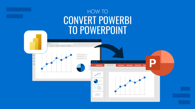
- Using PowerPoint Templates and Dashboard for your Data Presentations
Why is Data Storytelling Important?
As a brand or organization, most of the content and data that you generate is in the form of messaging. And, you may have noticed that most of this fails to create an impact. It just doesn’t deliver your message, right, does it? Data visualization comes out as the best solution to this. When used mindfully, this tool can transform the way your story is told and perceived.
Following are some reasons to pay attention to storytelling with data.
Data Fuels Up Your Stories
Adding data to your brand messages gives you the perfect success elixir. It is like the soul of the message, a unique ingredient that speaks for itself. So, basically, with data, you’re not just telling a story, but you’re showing it. Data can add credibility to your story and make it trustworthy. This would help in improving your reputation and accelerate content consumption.
Visuals + Data = More Engagement
If you use compelling and clean visuals with your data, it will act as a magnet to the audience, drawing them to explore and engage in your content even more. Irrespective of whether you choose to go for static or interactive data visualizations, you’ll be able to attract readers to examine the data with an improved perspective. Bottom line: combining the power of slick visuals (for example professional PowerPoint templates) with credible data is the mantra to boosting engagement.
Data Stories Can Help You Make an Impact
Using relevant data within your content can help you make an impact that you couldn’t have imagined otherwise. Here, it is imperative that statistics and data sets are interpreted in the right context so that nothing stands in your way of becoming the next big thing in your audience’s minds. Well designed and strategically planned data stories have an uplifting effect on the audience, and help in making a more lasting impression on them.
If these reasons do not convince you already, let’s a look at some eye-opening stats here:
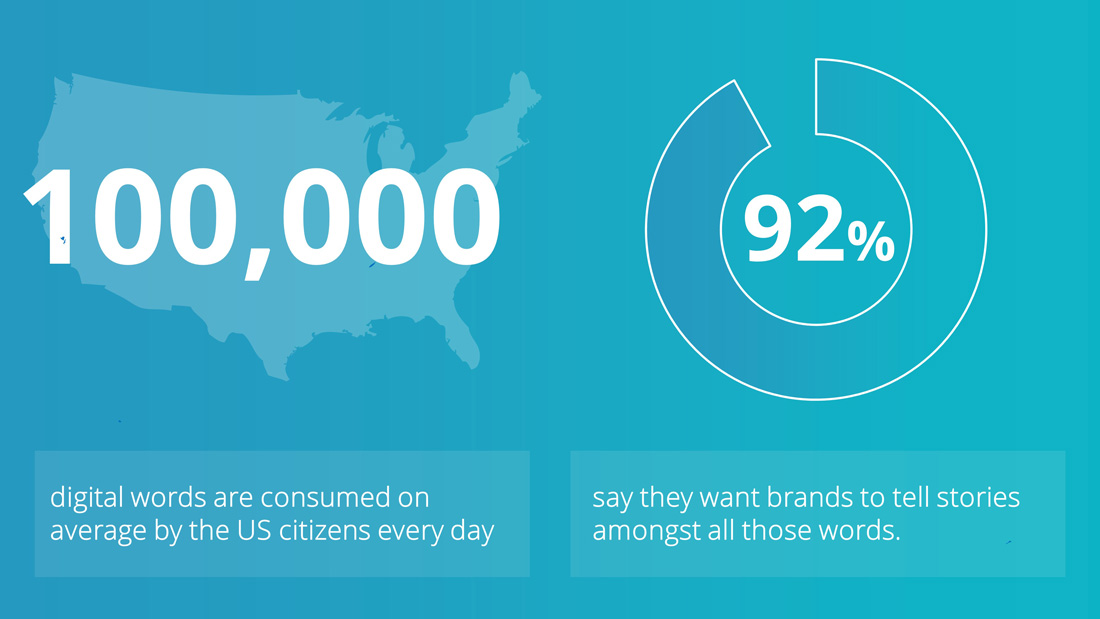
In a recent study conducted by Fast Company, it was revealed that about 92% of consumers want the brands to build ads that feel like a story. This is the cue! They don’t want stats to be thrown at them one after the other. Instead, they want data to be stringed together in an artful, tasteful, consumable manner.
Your goal here is to pick those statistics, which have the ability to hit the emotional node with your audience and convert it into a story that would stay with them after hearing your message.
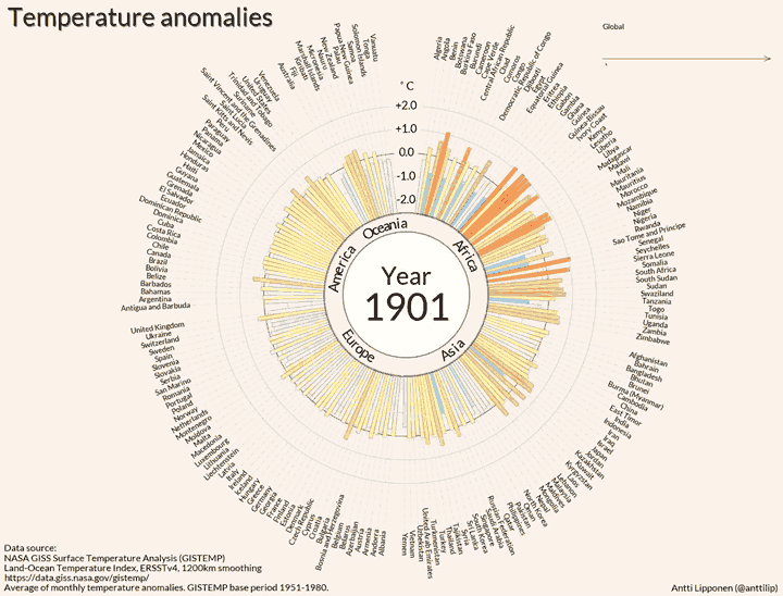
As an example, we could use the controversial topic of global warming. A great debate is growing around from governments and their interests, but if you want to convince your audience, nothing is more powerful than data. A scientist at Finnish Meteorological Institute , Antti Lipponen created an animated visualization showing the evolution over time of global ocean temperature (based on information published by NASA). The evidence is stunning and the visualizations speaks by itself.
Now that you know WHY you need to give data visualization a thought, let’s move on to how is should be done.
Converting Data into Stories – Tips
Following are some steps that must undertake while creating that eye-opening, impactful story that will help you answer the question: How can data be used to tell a story?
Have a Plan Ready Before Choosing a PowerPoint Template
Let’s take PowerPoint storytelling as an example. Before you choose a template to present your data story in front of an audience, make sure you have an execution plan ready. Resist any urges of choosing a format without doing your homework. If your goal is more than just presenting information, you’ll need to put in some hard work and thought to find the correct visualization for your data set. Look for a template themed for your niche; that will help on creating infographics and use charts that feature metaphor related shapes.
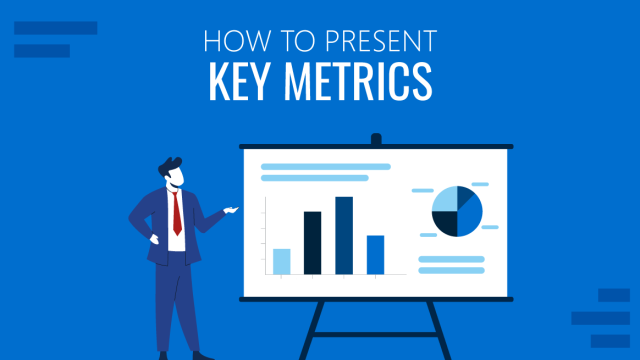
Measure All Relevant Metrics
Every business is different; so are the audiences and the success paths. This is why a one-size-fits-all approach does not work. When creating a data story, it is important that you measure and prepare a checklist of all relevant metrics. Some of these can be about which platforms you want to use, the devices your audience may be using, the message you want to put across are just a few to name.
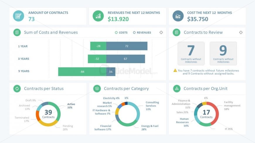
For example, if you need to tell the story of your sales organization performance, you can compile the main KPI’s in a PowerPoint Dashboard and move through each area referencing its representative measure.
Use Clean Visualizations

How you lay out your data will have a riveting difference in the impact that you make. These days, PowerPoint presentations are more about visuals and aesthetics than about words and numbers alone. With that being said, visualizations tend to promote cognition and eliminate any chances of confusion. The ultimate goal here is to use expressive elements that clearly convey the what, why and how behind your story.
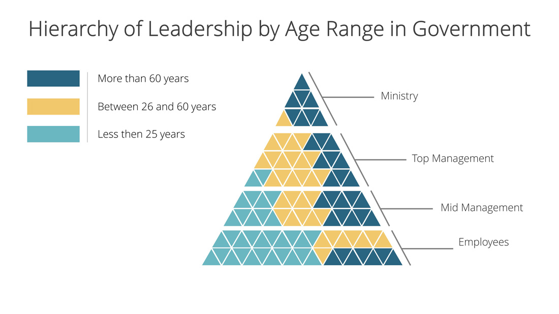
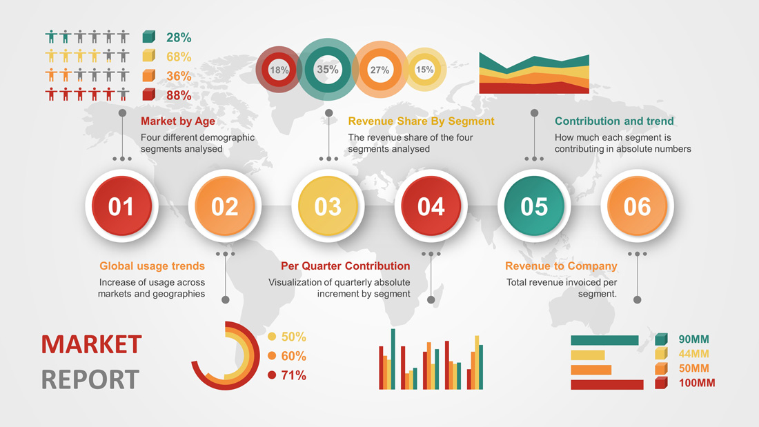
For example, in the following visualization describing the distribution of state employees within hierarchy tier and their age, it is clear to see how Ministry and Top management positions are not assigned to young people. The infographic representation is simple to understand and quickly grasp the story behind the data.
Fuse All Data Sources
Bring all the data sources together and integrate them to empower yourself in making better business decisions. By combining the virtues of traditional databases with the sophistication of big data solutions, you can tap into the potential growth column that will enhance your customer understanding.
Get Your Business Diagrams Right
While you’re creating that presentation, make sure you use all the right diagrams. There are different types of business diagrams that have the power to deliver your story in an impeccable and tasteful manner. Using diagrams like SWOT analysis, circular diagrams and funnels can really build the credibility of your story.
With these are some of the most crucial tips that can help you master the art of storytelling with data.
As important it is for you to be familiar with these tips, it is crucial that you become acquainted with the different rules that must be followed while trying to turn data into stories.
3 Golden Rules of Turning Data in Stories and Insights
Make it Real and Believable
By the end of it all, your goal is to give something practical, believable and real to your audience. Your story should be thought-provoking.
Worship the Context
Context is everything – that’s the bottom line. For example, Saying “We have 40 million users across the globe” is something but a stat. However, when you put it this way, “ We have 40 million users, that shot up from 30 million last giving us a 90% hike in the new users accessing our products”, it comes to a story. It is an insight, which audiences may value.
So, adding context to your data will give your audience a reason to care about the raw stats hidden in the story.
Make it Flow
Your story should be intertwined like perfect twigs of data. It should not sound abrupt and disconnected. Your audience will only be able to establish a connection if it flows well and appeals to them. Pay attention to the skeletal plan of the data flow and visualization.
Use these 3 rules and your data story will never go unnoticed.
Using PowerPoint Templates and Dashboard for your Data Presentations
Data presentations can be done seamlessly by using PowerPoint templates and dashboards. They were initially developed keeping business professionals in mind, who would use them for creating a project outline. Today, their use has extended into other fields and is being extensively used by brands to promote and grow their operations.
One such type of template that you can use to convert your data into an insightful story is the Timeline Template Material PowerPoint. What makes this a stellar choice is its visually-appealing design, which can used as a hook to impress the audience. It uses animation elements that make the presentation flow like a smooth video.
The design of this template is based on showing statistics of events along time. A great way to impress audience with an effective schedule planning presentation. The use of PowerPoint animation makes the template visually appealing and generates the sense of flow. Also, the customizable data chart features of this template will help you create a seamless story without put in a lot of sweat.
When it comes to visual content, we cannot ignore the fact how infographics have been selling like hot cakes. The Infographic Dashboard Elements PowerPoint Template is something that you must consider using if an intuitive story is what you want to deliver.
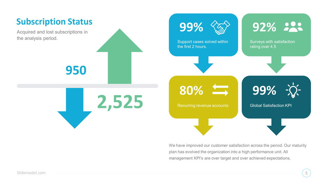
PowerPoint Dashboards are a slick tool that can help you deliver the required information in the form of attractive visuals.
Conclusively, it is important that whether you choose any element or path way to create your data story, you must pay attention to the basics. This way, you can convey complicated facts in a simple and clear way during your presentation. Choose the right narrative, give importance to the interests of your audience, and edit very carefully. That’s all the mantra that you need to get started!