What do all businesses have in common? They all create data. Nevertheless, they differ in how they use the data to make informed business decisions.
Are you ready to make better decisions for your business? Do you want to use the data your business piles up effectively? It’s time to start using dashboard presentations.
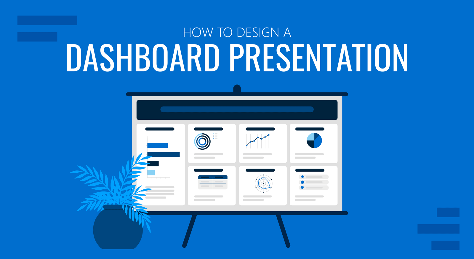
This quick guide will take you on a journey to create a data dashboard presentation highlighting metrics and KPIs needed to make essential decisions about any business scenario.
What is a Dashboard Presentation?
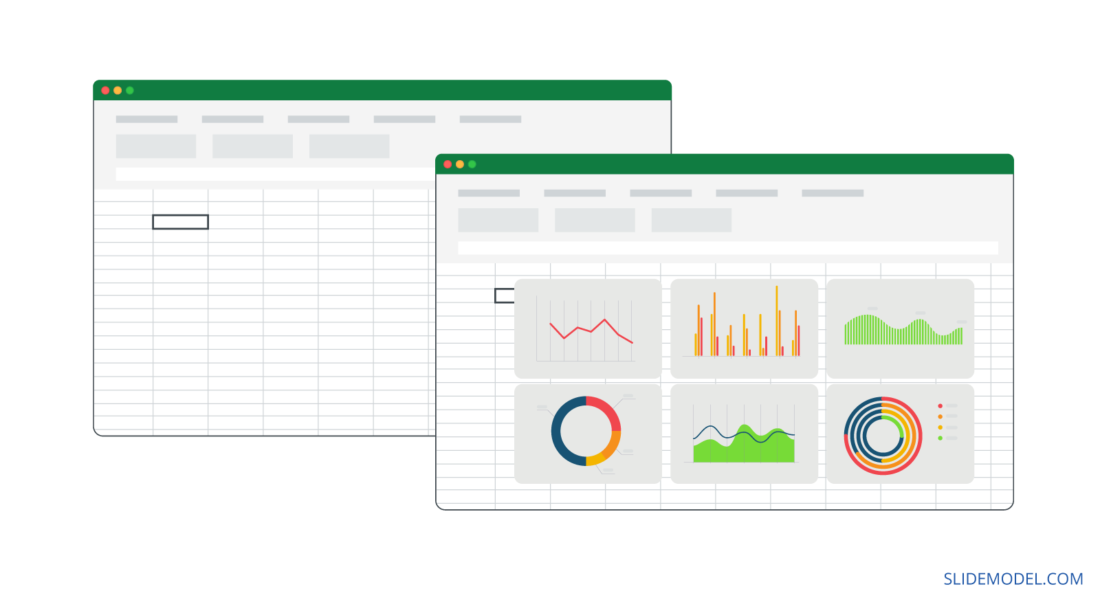
A data dashboard is a versatile and practical tool for making important decisions. It’s the solution to time-consuming data research that expands across multiple locations.
In business, you have various tools to keep you informed on performance and growth. Your sales platforms, marketing applications, and customer service software collect data. Looking through data on different locations takes up time, and that’s where custom dashboards come in.
Dashboards bring together data in one place to answer specific questions and tell stories about your business. Data dashboards can be created in several ways, depending on their level of interactivity and real-time data updates.
To be truly effective, a dashboard needs a hierarchical strategy. One or more main dashboards answer the big questions, while others answer specific questions per team, time frame, or campaign.
Live dashboards update at regular intervals, pulling data from many sources simultaneously, offering a real-time overview of the big picture.
Dashboard presentations display data for a specific point in time, a snapshot to share with stakeholders and managers. This is the type of presentation you can create today using PowerPoint and editable presentation templates by SlideModel.
Why do you need a Dashboard for your business?
Every business generates data about customers, employees, production lines, communication platforms, etc. All the collected data is valuable information for making informed business decisions. That said, only some in a company know how to manually dig into data spreadsheets to find trends, sudden changes, and other business metrics. A dashboard fixes that.
Not all business data lives in the same place, most of which isn’t visual. In a dashboard, you bring together data from different sources, choose the metrics you need for that dashboard and make it all look coherent and easy to understand.
There are more benefits than setbacks when using dashboards, especially when they’re created efficiently and follow a straightforward data story.
Here’s a list of the most significant benefits of using dashboard presentations in your meetings and strategy sessions:
- Data dashboard presentations help you and your team make better, more informed decisions.
- They provide a coherent and detailed overview of your business’ KPIs and metrics for a specific strategy, campaign, or hypothesis.
- Dashboard presentations facilitate analysis and understanding of how different metrics and dimensions have different outcomes.
- They improve accountability in a team as everyone can see what needs improvement and what is reaching set benchmarks.
- Using data dashboards as a team makes sense. To work together towards a common goal, everyone must know what’s at stake.
How to Design an Efficient Dashboard Presentation
Creating a dashboard presentation for the first time can feel a bit daunting. This guide takes you step-by-step through the process from strategy to completion.
Click on the sections below if you’d like to skip ahead.
- Anatomy of an Effective Dashboard Presentation
- Metrics and KPIs to include in your dashboard
- Step-by-Step Guide to creating a dashboard presentation
Anatomy of an Effective Dashboard Presentation
The layout for a dashboard presentation depends on the aspect ratio you need to work with. The aspect ratio will depend on how your audience views and uses the dashboard.
For a desktop or computer view, a horizontal 16:9 ratio is suitable. A scrolling dashboard is better on mobile devices—just remember to highlight the hierarchy in the data. The optimal dashboard presentation is responsive to different screen sizes.
Before we get into the KPIs and the step-by-step guide, let’s visualize the anatomy of a dashboard presentation. Here are some actionable guidelines to help you.
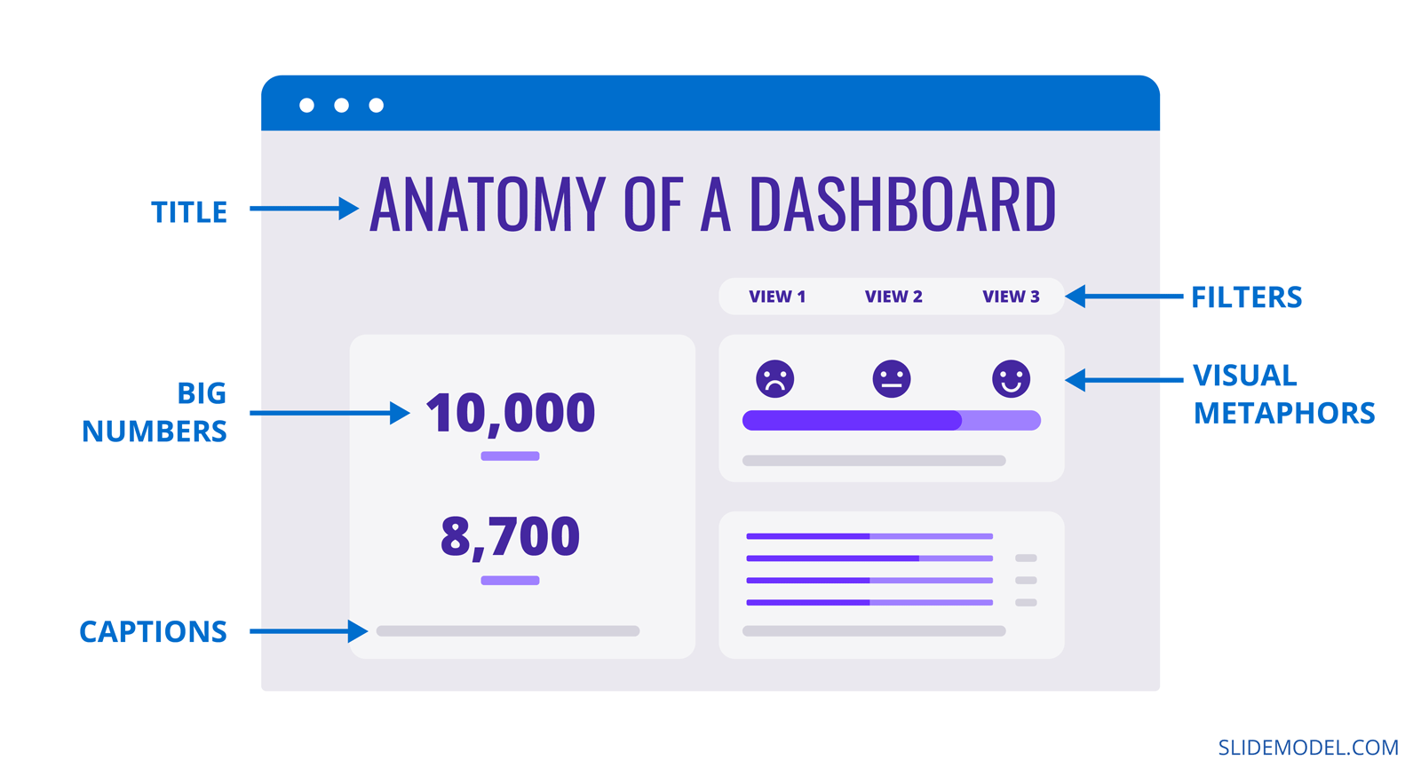
Giving the dashboard a title
The dashboard title doesn’t need to be too large; remember that you need space in the canvas to display the data. If necessary, include a subtitle with essential information. Don’t add it if it’s not needed to understand the dashboard.
The location of the title is preferably at the top left or top center. To the left, leaves space to the right for a couple of data points; the centered option will have white space on the sides.
Grouping Big numbers and data visualizations
The most efficient way to organize the information on your dashboard is to group the data points into relevant categories. Creating these groups has two purposes; it helps with the overall layout and hierarchy of the dashboard, and it supports the cognitive analysis done by the viewer.
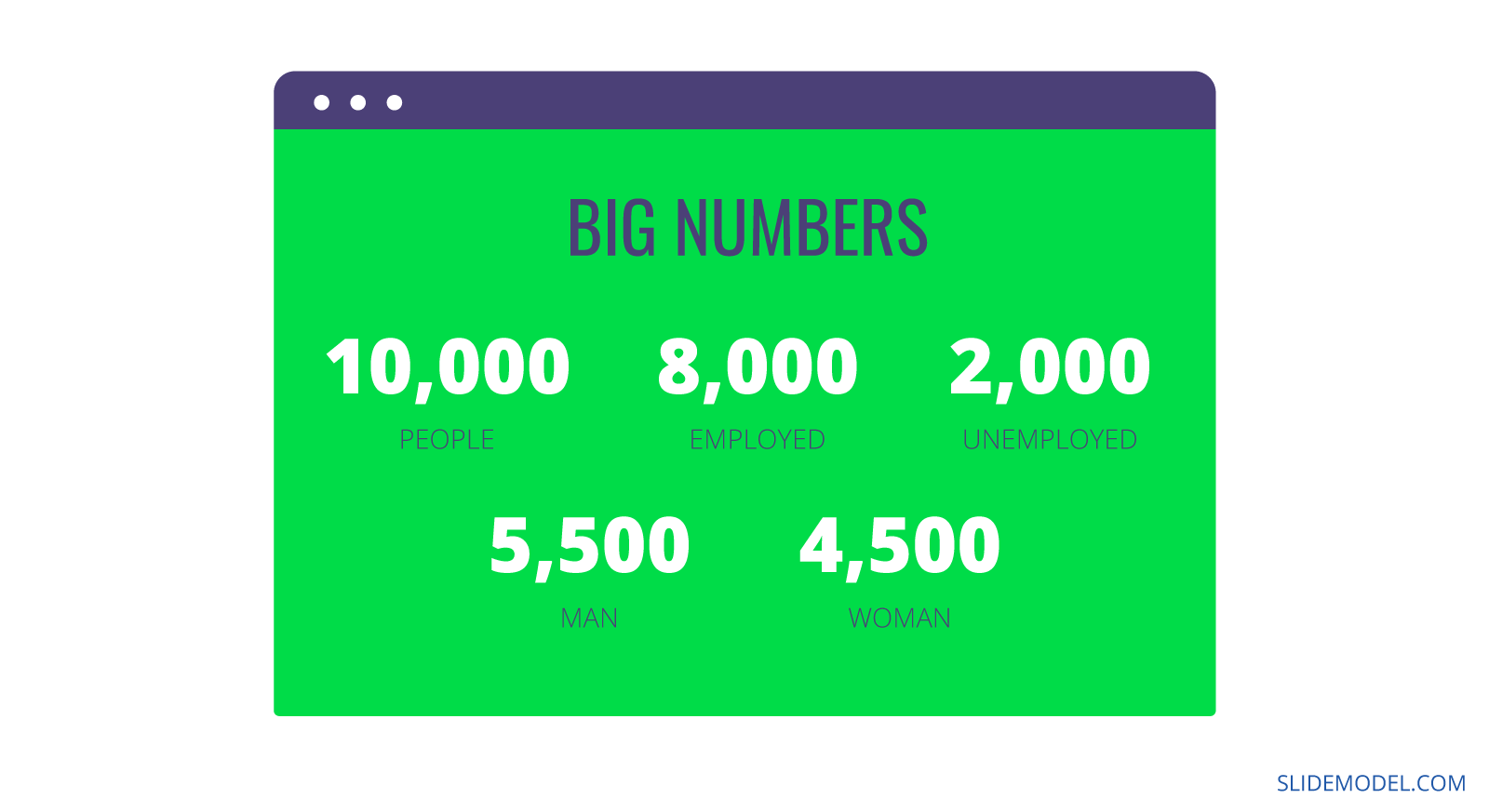
As you create groups of data points, place similar visualizations inside groups to maintain a visual balance. For example, at the very top, it’s common to have a horizontal section with a group of big numbers.
Big numbers are data points that highlight an exact number or value at a specific time. Some big numbers include; overall revenue, profit, number of followers, number of support calls completed, etc. Likewise, big numbers can be the percentage reached towards a goal or the progress of a specific action.
Group data visualizations or similar charts into more sections to place below the big numbers. This technique uses human reading patterns to create a visual hierarchy for the dashboard, making it easier to understand at a glance.
Adding visual metaphors
There’s no need to use just numbers and charts inside a dashboard. Take advantage of visual metaphors to help highlight the data in their sections. This is a common technique for creating infographics.
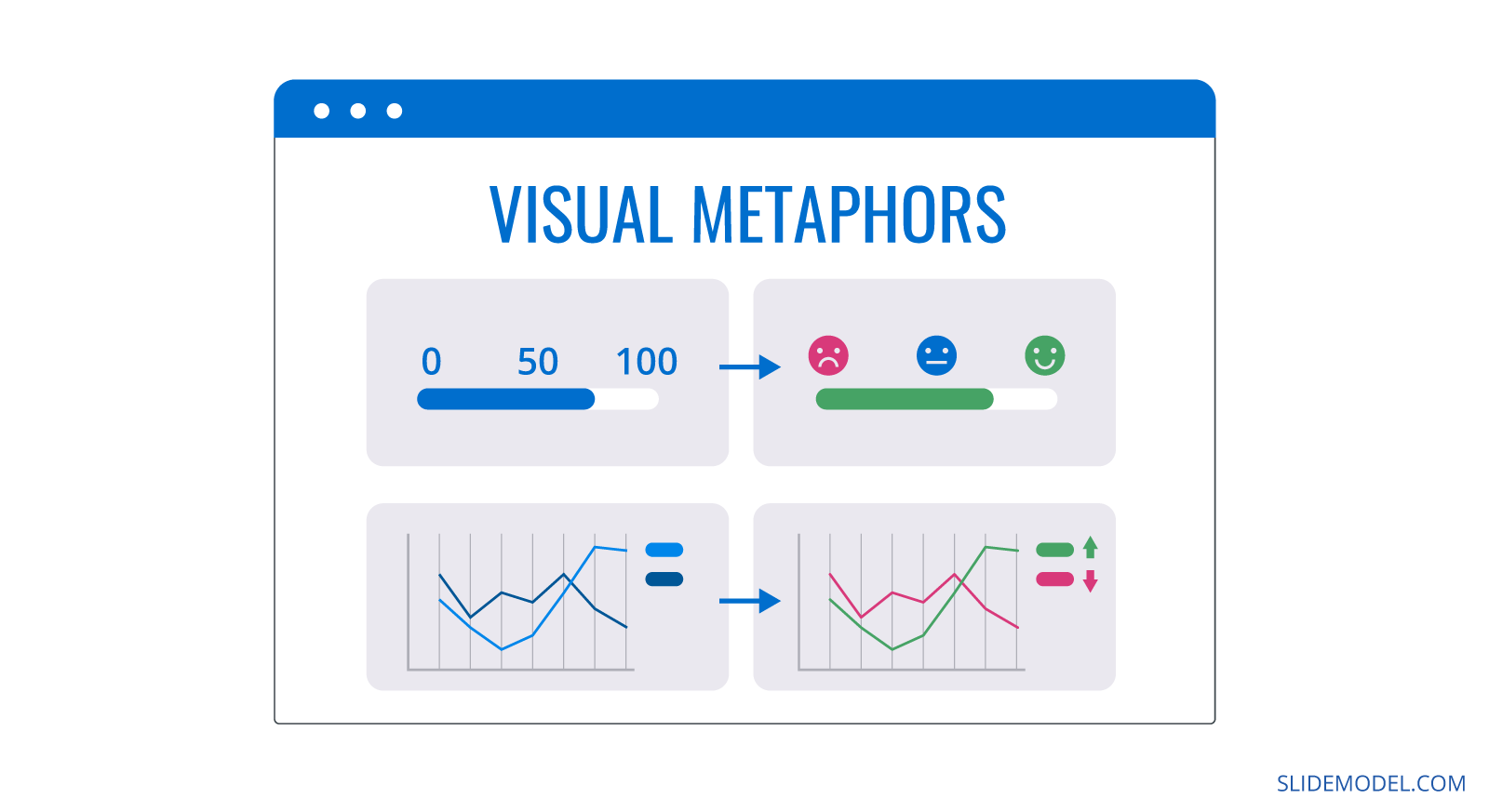
A dashboard’s most used visual metaphor is a data point’s negative or positive impact. For this purpose, you can add arrows, color labels, up and down thumbs, happy and sad faces, or a visual thermometer highlighting the current amount of money collected in a fundraising campaign. Which style, depends on the dashboard’s business tone. For a financial dashboard, color labels are enough, but emojis are just as adequate for a young startup’s sales rep dashboard.
Crafting legends and captions
Data points and data point groups will be more precise with a caption or label accompanying them. Place short labels in the exact location in each group, and place legends in similar areas to each data point. This visual consistency makes the data easier to review.
We can’t stress enough how important it is to choose the right font for your dashboard. It needs to be easy to read at small sizes and consistent throughout the layout. Forget about using two fonts or more. Use one and highlight selected text with bold or italic styling.
Supporting analysis with filters
Adding filters to a dashboard is a choice you’ll have to make with your team. First, why filters? A filter is a selection tool to choose between views in the dashboard. Standard filters include time frame, location, people, etc.
Regarding dashboard presentations, filters don’t work the same way as they do on Excel dashboards. In an Excel dashboard, filters are integrated into the data points. When used, the data in the dashboard changes dynamically. You’ll have to create separate views on different slides in a dashboard presentation.
Metrics and KPIs to include in your dashboard
The content in a dashboard is metrics, dimensions, and KPIs, but how do you know which ones to include? There’s no one answer to this question; every dashboard is different. But thankfully, there are some general foundations you can follow.
First, you need to know the strategy to determine what metrics and KPIs you’ll need. Think of this as a playbook for every dashboard you create.
- Have a clear grasp of the dashboard’s purpose and goal. Know the answers to the questions in Step 1 of the step-by-step guide.
- Formulate one or more hypotheses or questions as a base for the analysis.
- Study the data you have on hand and select the metrics and KPIs that highlight what you need to know about your hypothesis or question.
- Outline the data sets in a hierarchy of importance and relevance.
This playbook will guide your decision on what metrics and KPIs to use, regardless of your profession and industry. Here are some example KPIs and templates to help give you a better idea
Marketing
A social media dashboard that asks questions about engagement and brand awareness would use weekly KPIs like:
- Follower growth
- Engagement to follower count ratio
- Measurement of clicks on links
- Hashtag tracking
- Comment and DM tracking
- Best all-around post
The marketing dashboard template below highlights the following:
- Conversions
- Sessions
- Downloads
- Comments
- Traffic
- Browser preference
- Location
- Performance
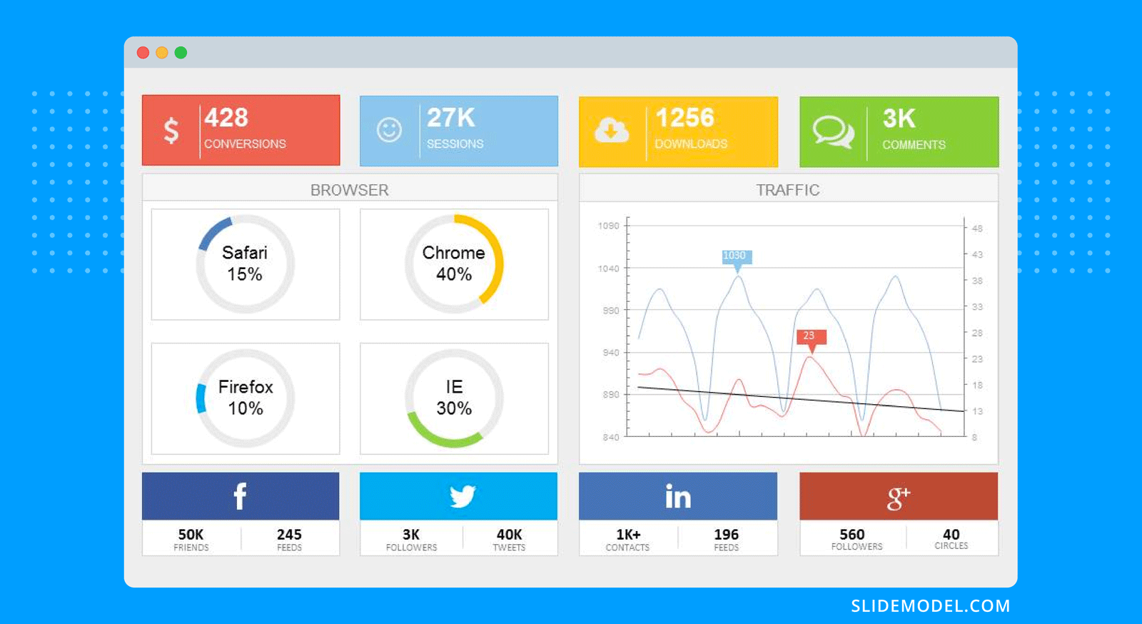
Download it to start using it with PowerPoint to create your following marketing dashboard. If you’re looking for marketing campaign dashboards, browse our template gallery.
Sales
A retail company asks for a dashboard highlighting how online and in-store sales are leveling up after the pandemic. These would be good KPIs to include:
- Overall sales in the stores and online
- Product category sales that differ in online and in-store purchases
- Trends over time
- Return rates for online and in-store sales
- Demographic data about the customer
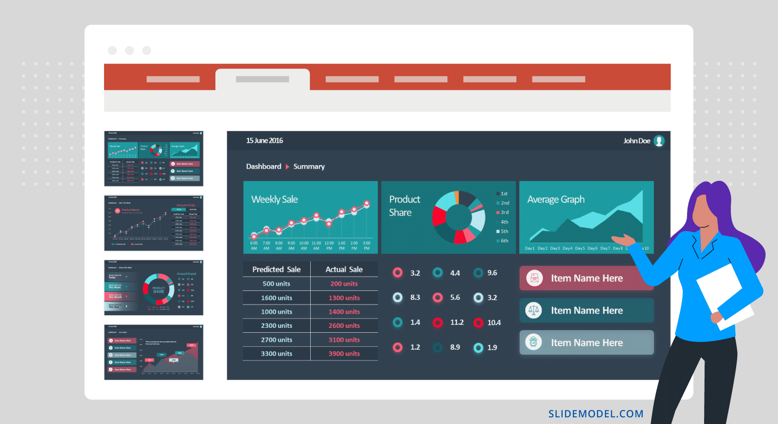
Below is one of our sales dashboard templates. There’s a summary dashboard on the first slide and consecutive slides with detailed data. These are some of the metrics it highlights:
- Weekly sales
- Product share
- Predicted vs. actual sales
- Sales over time
- Forecast
Customer Service/Support
A dashboard highlighting the successes and fails of the customer support team would use metrics like these:
- Customer satisfaction score
- Customer effort score
- Total tickets + tickets per customer
- Volume by channel (chat, phone, email, etc.)
- First response time
- Average handle time
- Cost per resolution
- Net promoter score
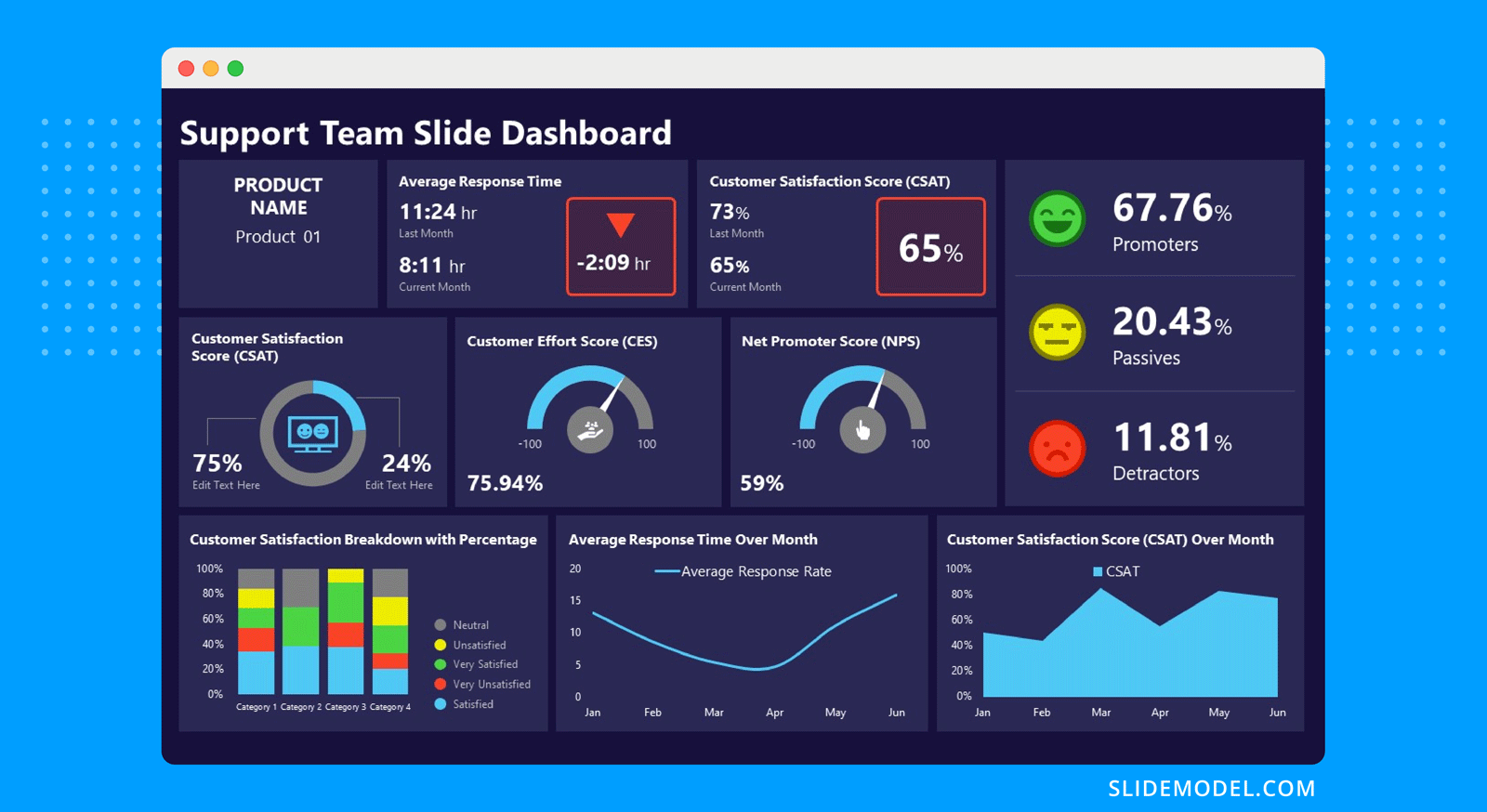
Look at this customer service KPI dashboard template that uses most KPIs mentioned above. Note that first response time and average handle time are all metrics you can get from your business phone system.
Project Management
These are the common metrics in a project dashboard, you can add or take away depending on your particular dashboard purpose:
- Planned Value
- Actual Cost
- Earned Value
- Cost Variance (Planned Budget vs. Actual Budget)
- Cost Performance Index
- Planned hours of work vs. actual situation
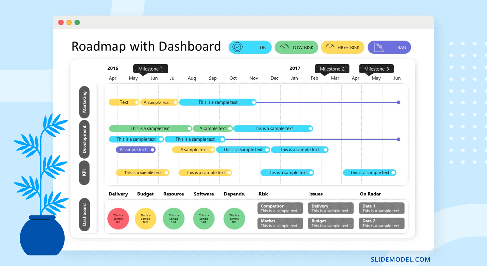
Alternatively, you can use a roadmap dashboard with a Gantt chart and other important KPIs highlighting progress.
Financial Operations
Financial dashboards tend to get very busy visually. They usually also have more line charts than others. Here are a few of the most common KPIs for a financial dashboard presentation.
- Operating Cash Flow (OCF)
- Current Ratio
- Burn Rate
- Net Profit Margin
- Sales Growth
- Vendor Expenses
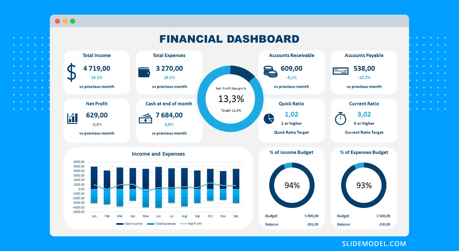
This financial dashboard template, for example, has 12 data points in one space. It’s a great example of how design and dashboard storytelling techniques help create a beautiful dashboard.
If you need a quick method to create a dashboard presentation, check out our AI presentation maker. A tool in which you add the topic, curate the outline, select a design, and let AI do the work for you.
Step-by-Step Guide to creating a dashboard presentation
Now it’s time to get into the nitty-gritty, the how-to for creating a dashboard presentation
These steps cover what you need to know to create an efficient dashboard presentation with PowerPoint and SlideModel.
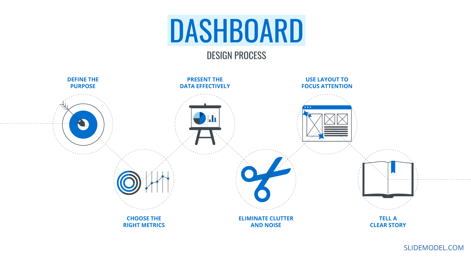
Step 1: Define the purpose of your dashboard presentation
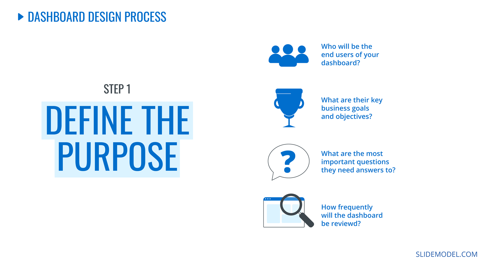
Dashboards are born from a business need, a way to quickly analyze data and make informed decisions. That’s why it’s essential to know your dashboard’s purpose before you do anything.
It could be as broad as a CEO saying they have 30 seconds to see a dashboard once a week. Or a high-level manager wants to see an overview of the activity in their department at the Monday morning meetings. And yet another could be the social media manager’s need to show progress over time regarding a specific campaign.
Here are the questions you need to answer before continuing:
- Who will be the end users?
- What are their key business goals and objectives?
- What are the most important questions they need answers to?
- How frequently will the dashboard be reviewed?
With the answers to this checklist, you’re ready to go on to the next step.
Step 2: Choose the right metrics for your purpose
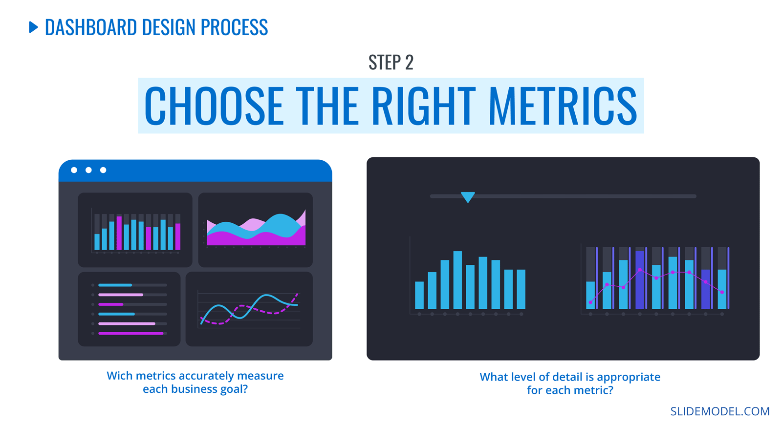
Above, we show you how to choose the KPIs for your dashboard. You might already have some data inside several business platforms’ analytics sections. Others you might have to source in other ways.
As you collect the data, analyze the level of detail you’ll need to visualize. It will help later when transforming the data from its original form to a data visualization on the dashboard.
For each data point, take note of what it’s highlighting. What exact question is it answering? These will turn into legends and captions when you put them all together.
Step 3: Present the data effectively
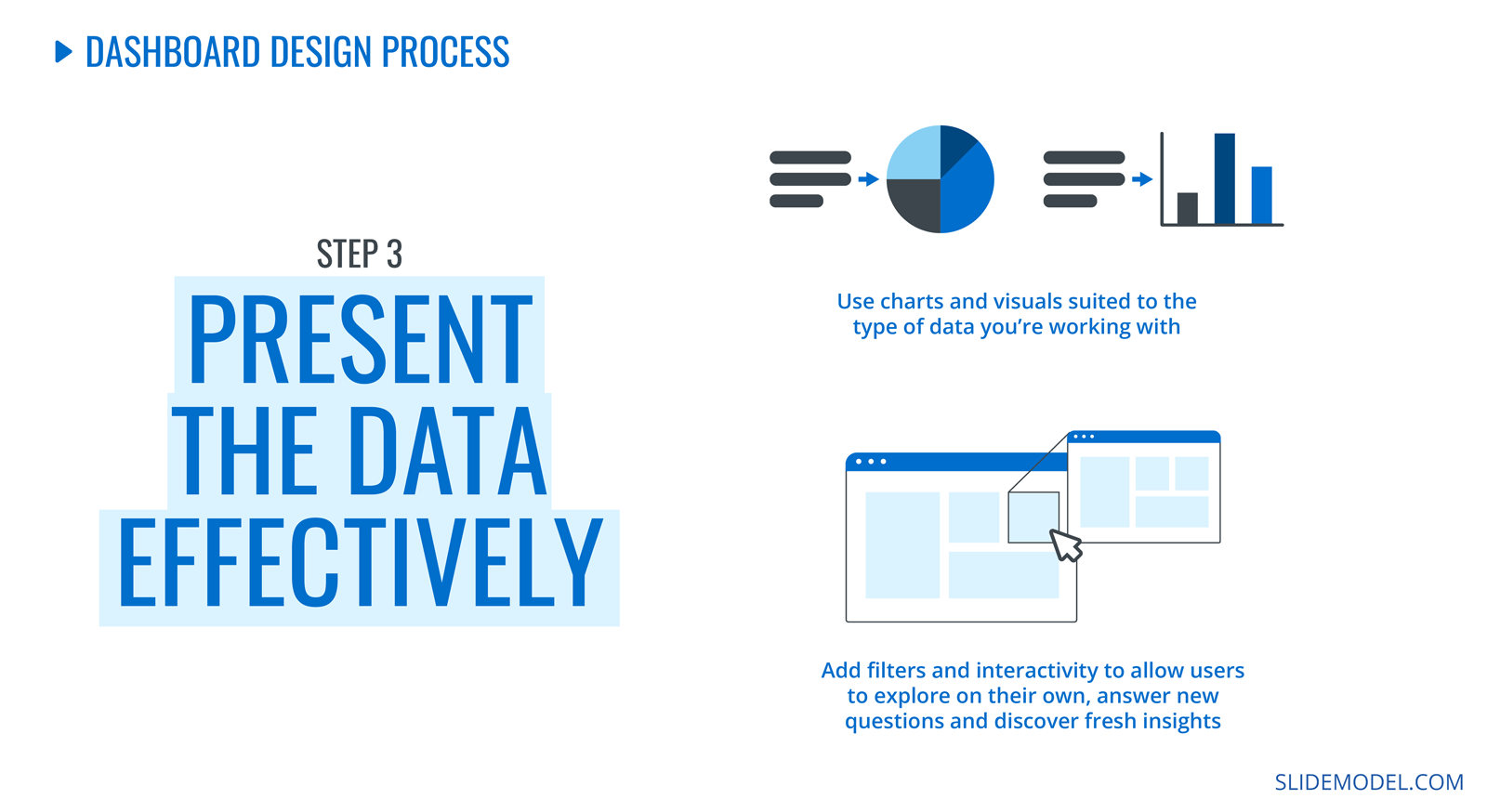
With the metrics and KPIs collected, it’s time to present them on the dashboard. It’s essential to write down a hierarchical outline of the data points. Start with the most critical data according to the question the dashboard aims to answer.
For each data point, select a style of visualization; big numbers, percentages, bar charts, simplified line graphs, and arrays. Write it all down on the outline. Use big numbers at the top of the dashboard to highlight the most influential data. Don’t use too many data visualization of the same style together; the repetition affects the viewer’s attention.
Before adding the data to PowerPoint, prepare your charts to export them easily. Ensure the data is cleaned and revised, and there’s no extra irrelevant information.
Step 4: Eliminate visual clutter and noise
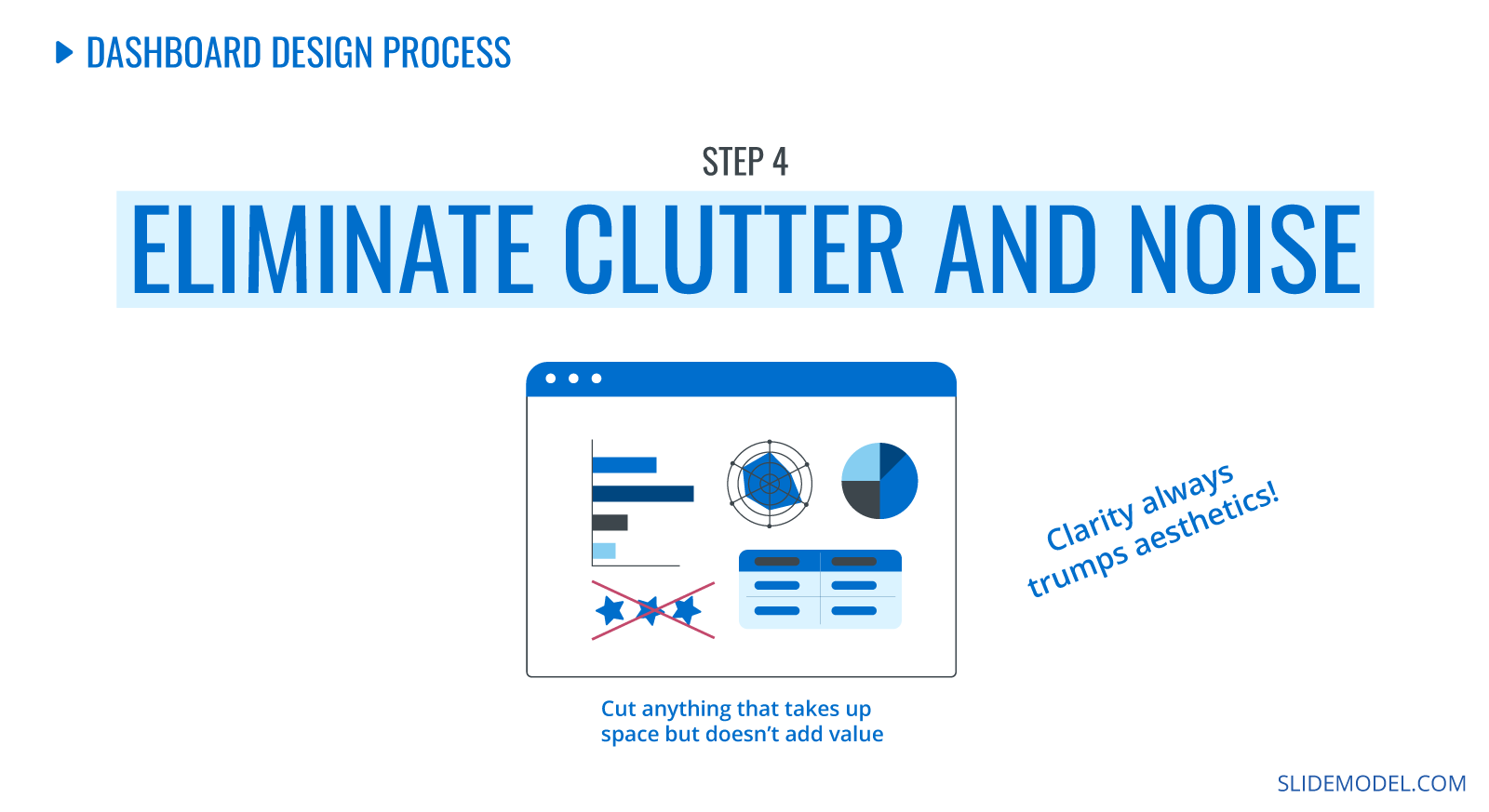
Once you have all the KPIs on the dashboard, check for unnecessary visual material. Are you using the same font for all data points? Is the color unified across the design? How about text size and alignment?
Give each data point a margin of space around it. Keep the distance between data points and groups similar in size. Keep lines as straight as possible without much overlap between data points. Resize and shape each data point so it aligns neatly on the dashboard.
Check the text in the chart and graph legends. Make sure to keep all legends and labels similar in size and easy to read. Don’t use colored text or styled text unless it serves a purpose.
Step 5: Use the layout to focus attention
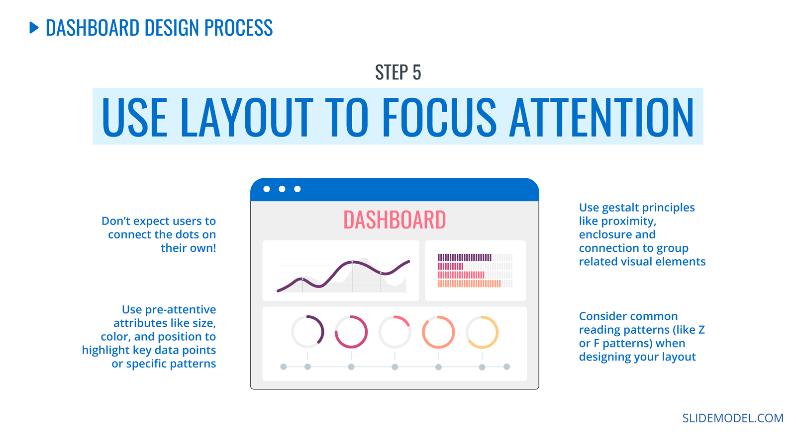
To structure the layout of your dashboard, take note of the human act of reading. People read from left to right, starting in the top left corner of the page or screen. Their gaze continues in a back-and-forth motion that resembles the letters Z and F. Knowing where your viewer will most likely look first, place your most important, high-level data in their line of sight.
Remember to combine similar data points to create visual separations in the layout. Help the viewer follow the flow of information with subtle design elements like color, size, and position. Apply Gestalt principles like proximity and similarity to group elements together.
Step 6: Tell a clear story
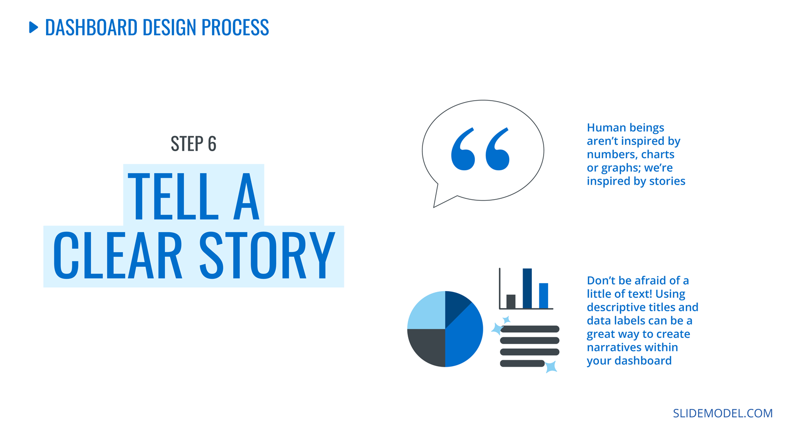
Why is it important to tell a story with data on your dashboard? If you were to phrase your dashboard’s purpose as a question or hypothesis, the data would be the answer. Use descriptive titles and labels to help the viewer understand the data in order of importance.
As the viewer scans the data on the dashboard, comprehension must start at the top with the top-level data points. These answer the most immediate question of the dashboard’s purpose, like the opener of a story or essay. The story continues with the rest of the data points, which will complete the analysis.
When you tell a clear story with the help of a hierarchic layout, descriptive titles, and labels, the data story flows naturally. To achieve a compelling data story for your dashboard, ask for feedback from your team and edit the layout until it makes sense.
How to present a dashboard in PowerPoint?
Presenting a dashboard on PowerPoint is simple. Depending on what type of dashboard you need, there’s a way to do it.
You only need the collected data and one of our dashboard templates to create and present a static dashboard presentation with PowerPoint. The step-by-step guide above will help.
For dynamic and interactive dashboards in PowerPoint, you’ll have to connect to your live data on Excel using a tool like Presentation Point. Alternatively, you can embed Power BI and Excel dashboards into your PowerPoint slides.
Recommended State-of-the-Art tools to create a dashboard
Let’s take a quick look at the recommended data dashboard tools. For a static dashboard presentation, our preferred tool is PowerPoint. But for highly interactive and dynamic dashboards with live data updates, you’ll need something else.
Looker Studio (previously Google Data Studio)
Looker Studio is the new name of Google Data Studio. With this tool, you can create dashboards and reports to showcase and highlight KPIs regardless of your business type. Adding a Looker Studio dashboard to a PowerPoint presentation isn’t ideal. There’s no intuitive process, and it isn’t recommended. Looker Studio is better suited for teams that work with the G-Suite.
Microsoft Excel
Excel dashboards are a classic reporting staple in the world of business. You can create elaborate dashboards with dynamic and interactive features using data sources, reference tables, and pivot tables. Stay tuned if you have ever wondered how to create an Excel dashboard that updates automatically.
Power BI
Power BI (Business Intelligence) is a Microsoft tool for visualizing data insights that help make better business decisions. It is the tool of choice for big companies with large amounts of data to be analyzed. Connecting and embedding Power BI dashboards to PowerPoint is simple since they’re both from Microsoft.
Tableau
Tableau is similar to Power BI in that they are both data visualization platforms that improve business intelligence. Tableau dashboards are a great alternative to Power BI and can also be embedded into a PowerPoint presentation.
SlideModel + PowerPoint
Finally, the combo between SlideModel and PowerPoint comes into the picture. This duo is your best friend when creating static dashboard presentations.
Use SlideModel dashboard presentation templates to create a static dashboard that gives an insightful overview of some aspects of your business. Share the dashboard with your team and make better decisions together.
All these tools combined with PowerPoint can help you to build presentations based on live metrics. To create a live data dashboard presentation with SlideModel and PowerPoint, try Presentation Point, a tool to help bring live data into your presentations. Alternatively, you can try our AI PowerPoint generator to create a custom companion slide deck for your presentation topic.
A Quick Look at Excel Dashboards
As we mentioned above, Excel is an epic tool for business dashboards. It’s more accessible than Power BI and easier to use than Tableau (especially if you’re already an Excel pro). To create an Excel dashboard, you need to set up at least four sheets that work together to highlight the KPIs. They are:
- Data source sheets
- Reference tables sheets
- Pivot Tables sheets
- The Dashboard sheet
The best part about creating Excel dashboards is the possibility of building dynamic dashboards with data that updates automatically. Our favorite part? You can then embed it in PowerPoint and use SlideModel templates to make it all visually cohesive.
Closing Thoughts
If you didn’t already know, dashboards are unique. They’ve been fantastic business tools for years. It’s no surprise they’ve jumped to other information design fields. For example, dashboard-style CVs!
Creating a static data dashboard presentation (as a CV or for your business) is much easier when you know your needed tools. Some are easier than others, while others are too much for your needs.
Since you’re creating a data dashboard presentation with static data, you only need a PowerPoint and SlideModel. Browse our library to find digital marketing dashboard templates, HR dashboard templates, and lots more.
Here’s to your next presentation dashboard. May it be the best you’ve ever made.