Visuals are a core element of effective communication, and regardless of the niche, graphs facilitate understanding data and trends. Data visualization techniques aim to make data engaging, easy to recall and contextualize while posing as a medium to simplify complex concepts.
In this article, we’ll guide you through the process of creating a presentation graph, briefly covering the types of graphs you can use in presentations, and how to customize them for maximum effectiveness. Additionally, you can find references on how to narrate your graphs while delivering a presentation.
Table of Contents
- What is a Presentation Graph?
- Types of Graphs Commonly Used in Presentations
- How to Select a Presentation Graph Type
- How to Make a Presentation Graph
- Design Principles for Effective Presentation Graphs
- Working with Presentation Graph Templates
- Integrating the Graph into Your Presentation
- Common Mistakes to Avoid when Making a Presentation Graph
- Final Words
- References
What is a Presentation Graph?
A presentation graph is a visual representation of data, crafted in either 2D or 3D format, designed to illustrate relationships among two or more variables. Its primary purpose is to facilitate understanding of complex information, trends, and patterns, making it easier for an audience to grasp insights during a presentation.
By visually encoding data, presentation graphs help highlight correlations, distributions, and anomalies within the dataset, thereby supporting more informed decision-making and discussion.
Types of Graphs Commonly Used in Presentations
Various types of graphs are commonly used in presentations. Each type serves specific purposes, allowing presenters to choose the most suitable format for conveying their data accurately. Here, we’ll discuss some common examples of presentation graphs.
Check our guide for more information about the differences between charts vs. graphs.
Bar Charts
A bar chart is a visual tool that represents data using horizontal bars, where the length of each bar correlates with the data value it represents. This type of chart is used to compare discrete categories or groups, highlighting differences in quantities or frequencies across these categories.
For more information check our collection of bar chart PowerPoint templates.
Column Graphs
Column graphs are a variation of bar charts. They display data through vertical columns, allowing for comparing values across different categories or over time. Each column’s height indicates the data value, making it straightforward to observe differences and trends.
Line Graphs
Line graphs depict information as a series of data points connected by straight lines. They are primarily used to show trends over time or continuous data, with the x-axis typically representing time intervals and the y-axis representing the measured values. Line graphs highlight the rate of change between the data points, indicating trends and fluctuations.
For more information check our collection of line chart PowerPoint templates.
Circle Graphs
Circle graphs, commonly known as pie charts or donut charts, present the data distribution as fractions of an entity. They provide a quick understanding of the relative sizes of each component within a dataset. Pie charts are particularly effective when the goal is to highlight the contribution of each part to the whole data.
For more information check our collection of circle diagram templates.
Area Graphs
Area graphs are similar to line graphs, but the space below the line is filled in, emphasizing the volume beneath the curve. They represent cumulative totals over time through the use of sequential data points, making it easier to see total values and the relative significance of different parts of the data.
For more information check our collection of area chart PowerPoint templates.
Cone, Cylinder, and Pyramid Graphs
Three-dimensional graphs, such as cones, cylinders, and pyramids, create a dynamic visual impact on presentations. While not as common as the other types, they are used for their ability to add depth and dimension to data representation. These graphs create a visually engaging experience for the audience, although sometimes they sacrifice accuracy for the sake of visuals.
For more information check our collection of pyramid diagram PowerPoint templates.
How to Select a Presentation Graph Type
As a presenter, you must be aware of both the topic’s requirements to discuss and your audience’s needs. Different graphs fulfill distinct purposes, and selecting the right one is critical for effective communication.
Line Graphs for Trends Over Time
A line graph is effective when you want to present trends or changes over a continuous period, like sales performance over months. Each point on the line represents a specific time, offering a clear visual representation of the data’s progression.
Bar Graphs for Comparing Quantities
If your goal is to compare quantities or values across different categories, such as sales figures for various products, a bar graph is suitable. The varying lengths of bars make it easy to compare the magnitudes of different categories.
Pie Charts for Showing Proportions
Use pie charts when you want to illustrate parts of a whole. For example, to represent the percentage distribution of expenses in a budget, a pie chart divides the total into segments, each corresponding to a category.
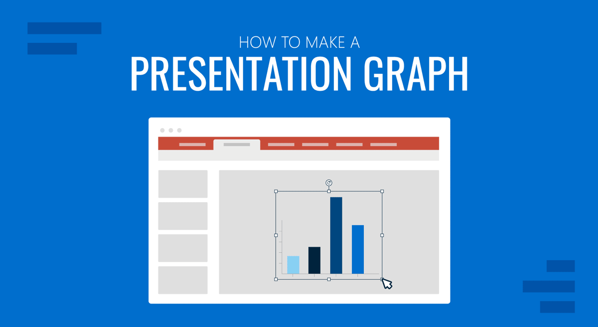
How to Make a Presentation Graph
Follow these guidelines to create your presentation graph for the data you intend to represent. In this section, let’s see how to create a graph in PowerPoint.
How to Make a Presentation Graph in PowerPoint
Start by opening your presentation slide deck. For this tutorial’s purpose, we’ll work with a blank slide.
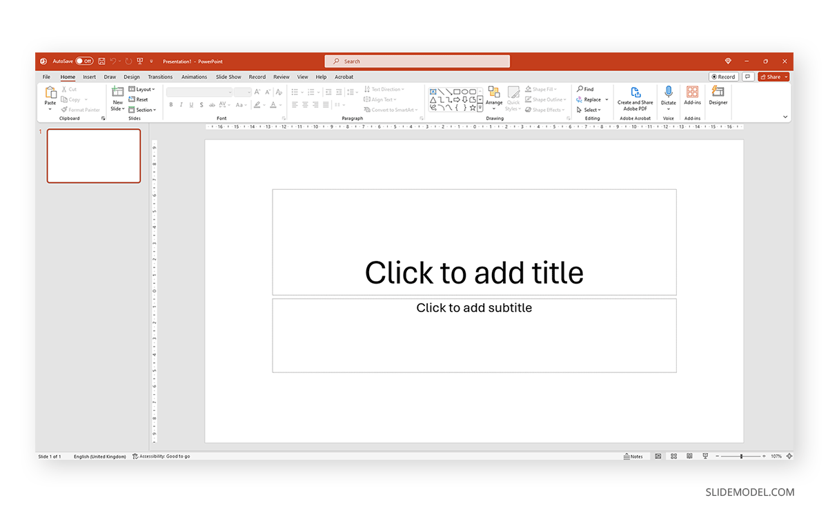
Switch to the Insert tab and click on Chart.
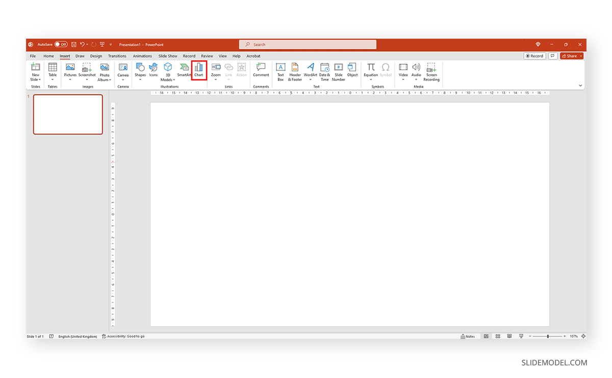
A new dialogue window will open, where you have to select the chart type and the specific representation type—i.e., for area charts, you can choose from 2D or 3D area charts and their distribution method.
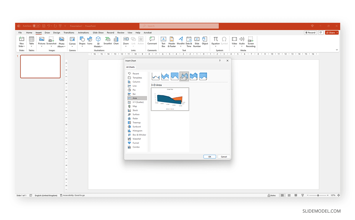
If you hover over the selected chart, it will zoom in to check the details. Double-click to insert the chosen graph into the slide.
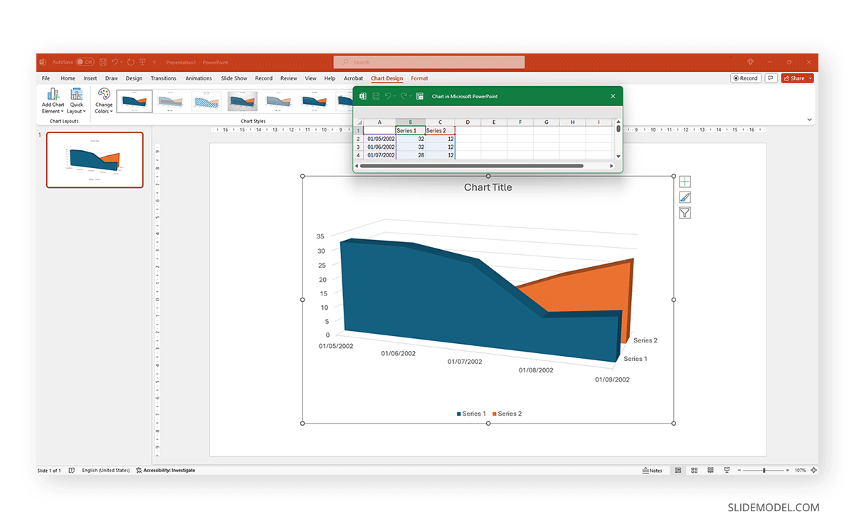
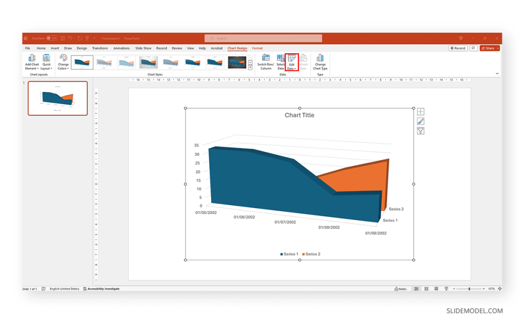
As we can see, a spreadsheet to edit the data is now available. If you accidentally close it, go to Chart Design > Edit Data.
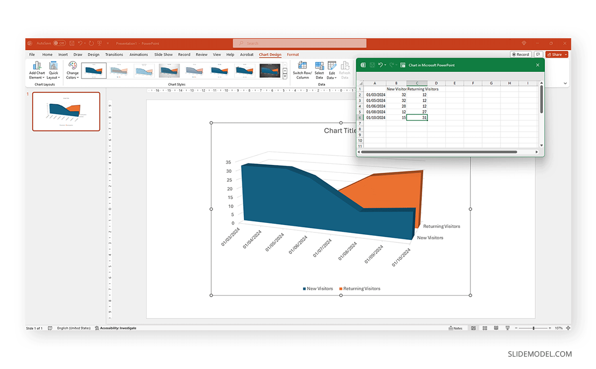
Replace the data in the numbers to reflect the data you need to showcase. The columns’ titles indicate the text the legend shows for each series. Then, we can close the spreadsheet and continue customizing it.
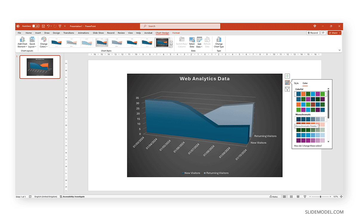
By clicking on the paintbrush, we access the Style options for the graph. We can change the background color, layout style, and more.
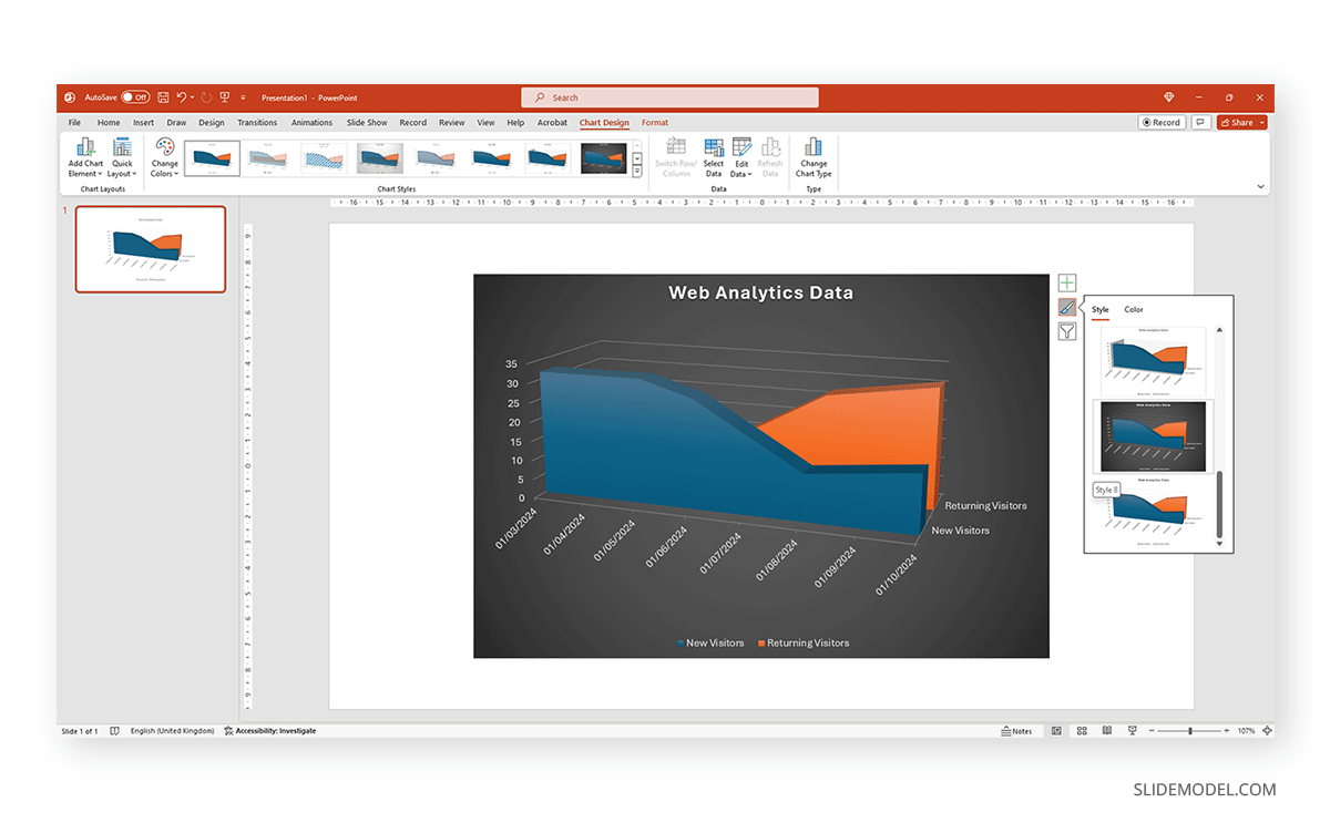
If we switch to the Color tab inside of Style, we can modify the color scheme for the presentation graph. And as simple as that is how to make a graph in PowerPoint.
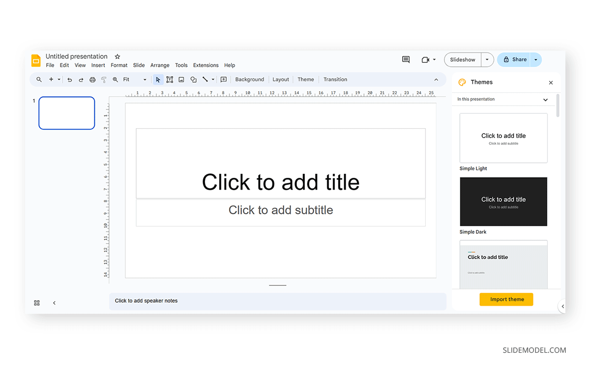
How to Make a Presentation Graph in Google Slides
Now, let’s see how to create a graph in Google Slides. To createa a graph in Google Slides, we start once again from a blank slide.
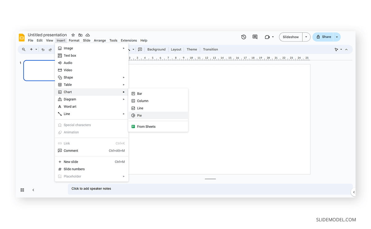
Go to Insert > Chart. Select your desired presentation graph option. In our case, we will work with a Pie Chart.
To change the placeholder data, click on Edit Data.
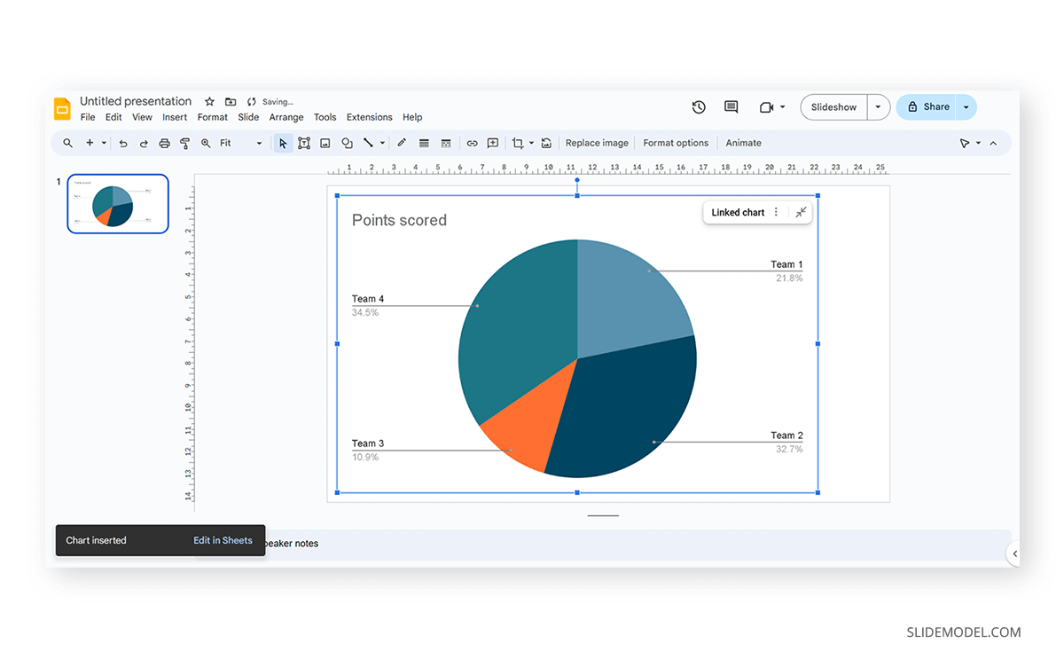
If you missed the emergent tab, you can go to the three points in the graph, click on them, and select Open Source.

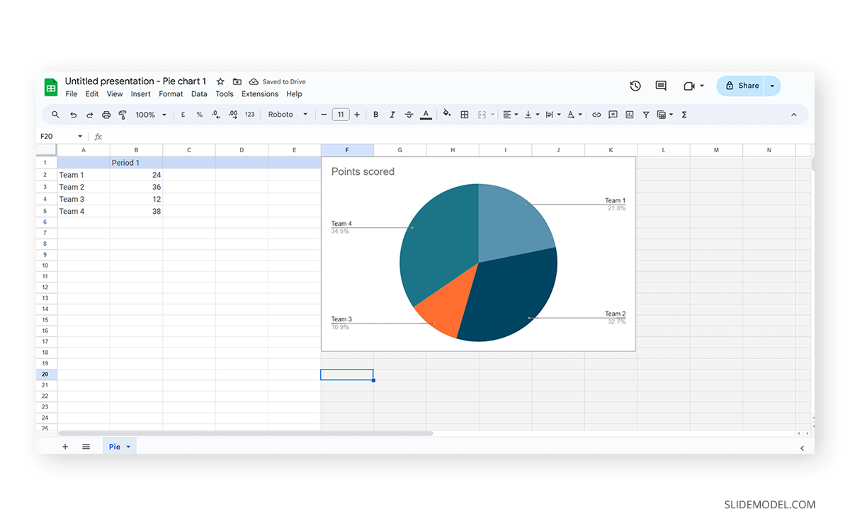
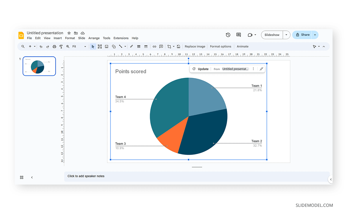
The graph will most likely cover the data spreadsheet, so move it to one side to see the entire data range. In this case, the auto-generated graph is wrong as the sum gives 110%. We’ll correct that now.
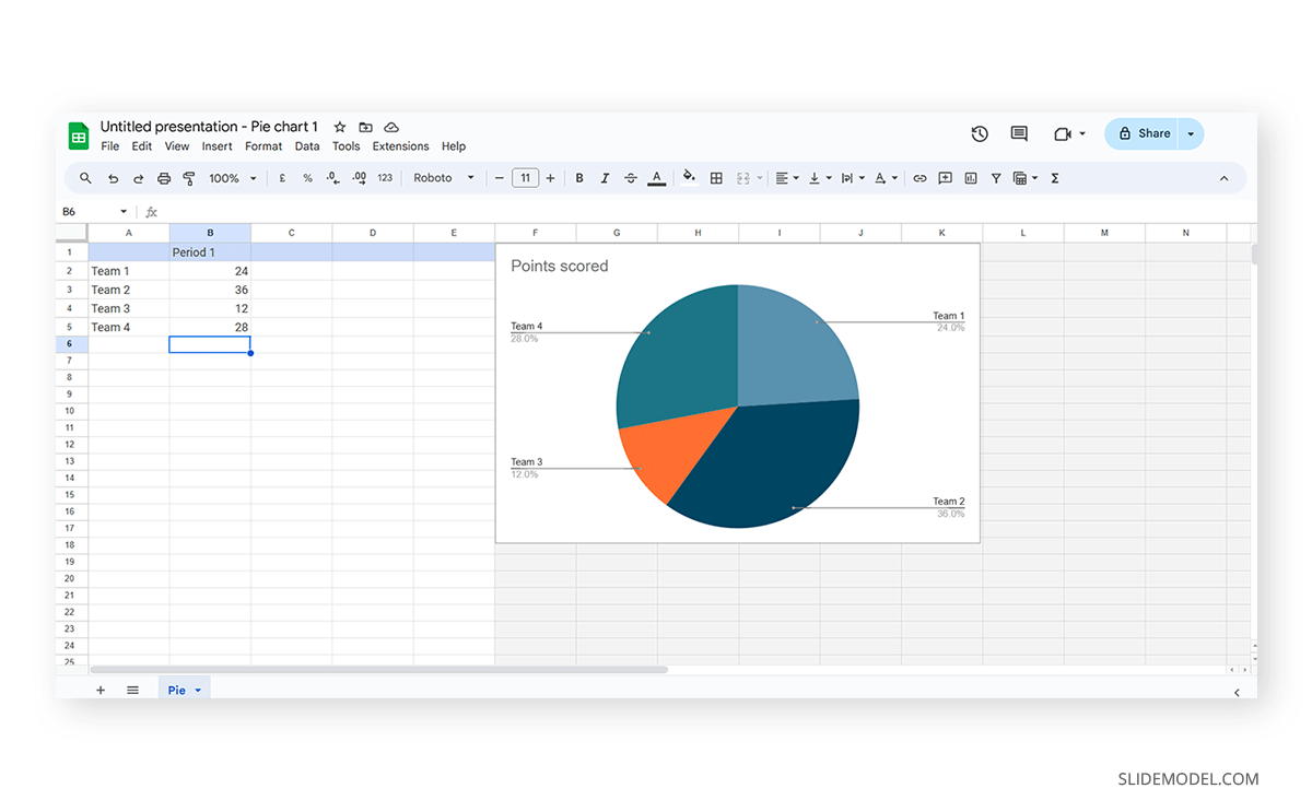
And this is how it looks with the corrected data.
Next, we click on the three dots on the chart and select Edit the Chart. This shall open all customization options.

At the Setup tab, we can change the chart style and select from various options.

The data will refresh in that case and adapt its representation to the new style.

If we switch to the Customize tab (it says Customise, as the selected language is UK English), we can fine-tune our presentation graph starting from the background color.
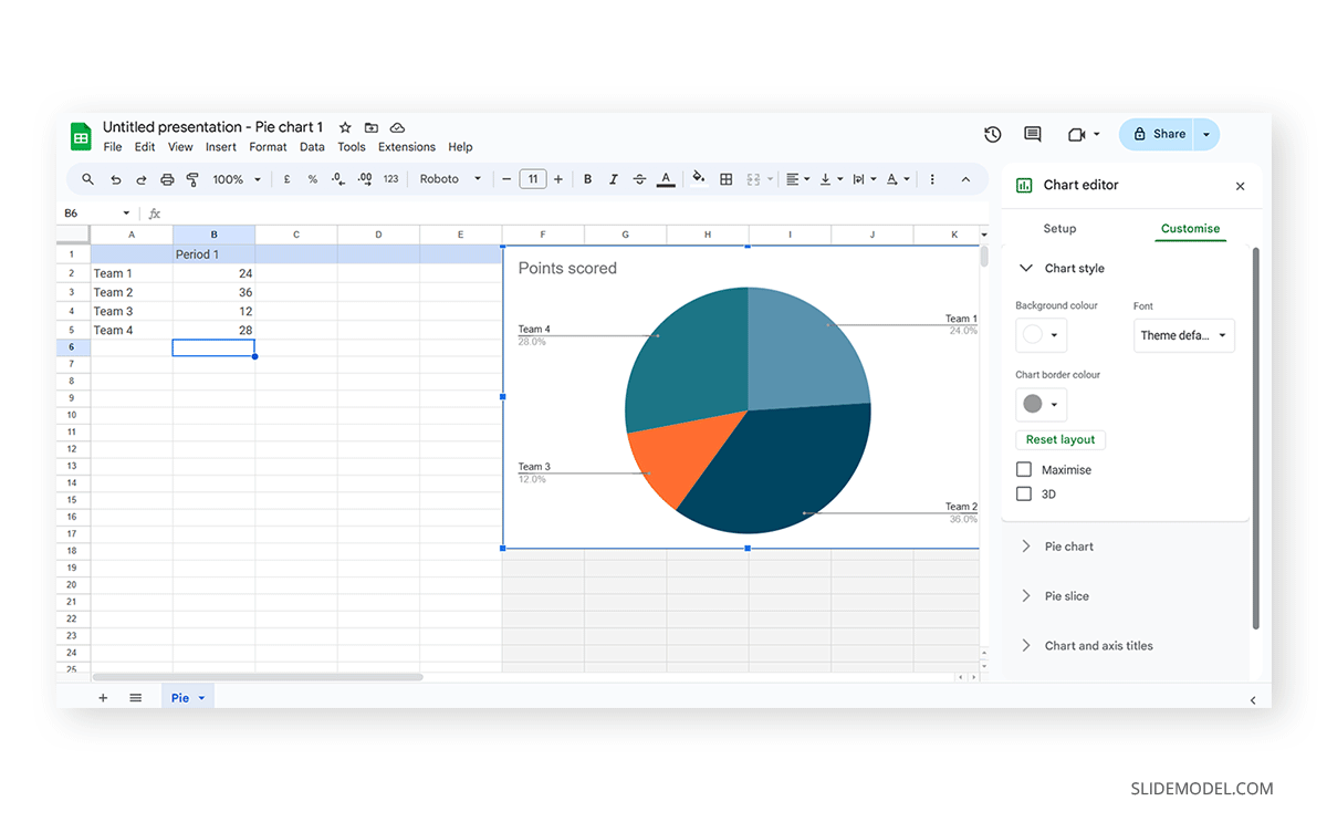
Activate the 3D checkbox to change to a 3D pie chart (applicable to any graph).

We can find tailored settings for the Pie Chart to convert it to a donut chart, with settings like the donut hole size.

The Pie Slice section helps us change the color scheme for each one of the slices.

We can change the title and axis titles in the Chart and axis titles section.
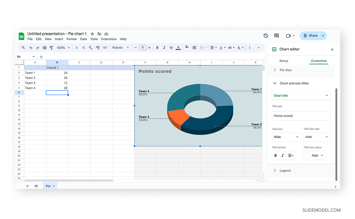
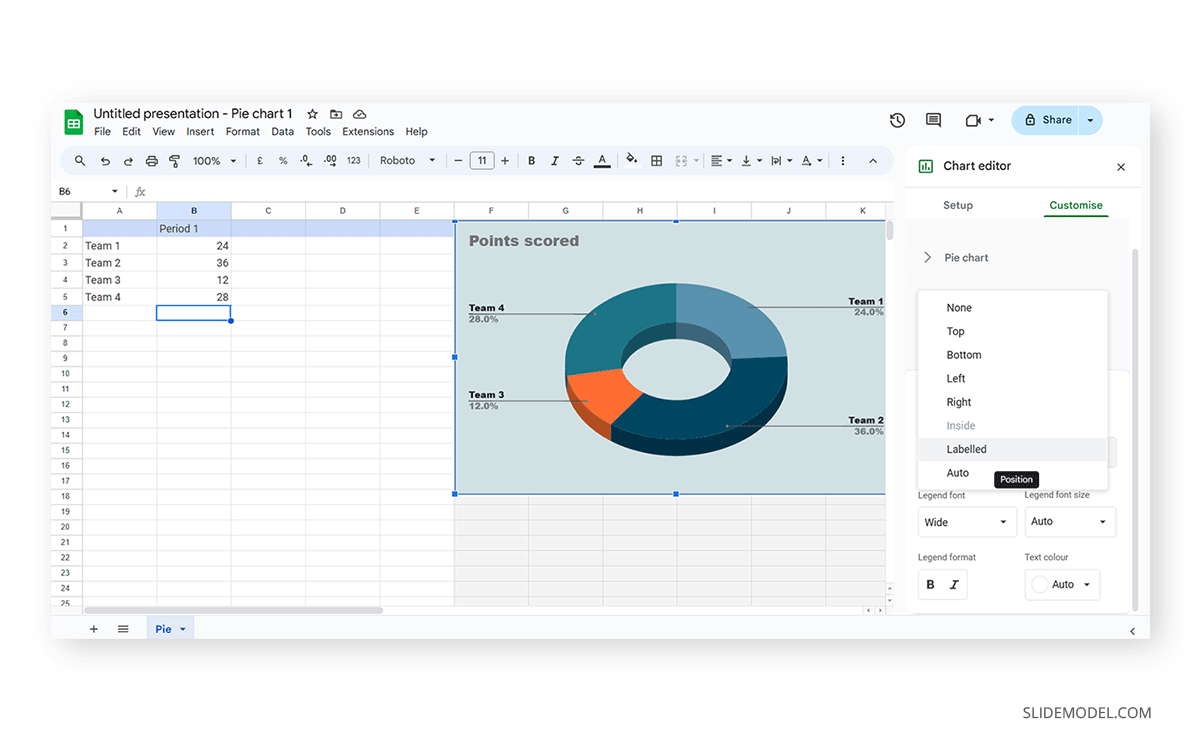
Finally, the Legend section offers many customization options to alter the legend’s format.
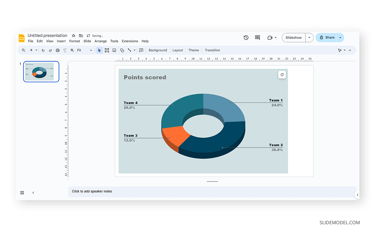
Once the customization process is completed, close the Google Spreadsheets tab, go to your presentation chart, and click Update.
Google Slides will refresh the data for your created presentation graph with the last synced data.
Design Principles for Effective Presentation Graphs
Adhering to certain design principles is imperative for creating graphs and communicating information effectively.
Simplicity and Clarity
A graph should be clean and free from unnecessary details. Clear graphs have visible data points and helpful short texts for better understanding. Even if it looks simple, it can still show important information. To make it easy to understand, avoid adding distortions, shading, weird perspectives, too many colors, unnecessary decorations, or 3D effects [2]. It is also essential to ensure the plotted data points are clear, not hidden or covered.
Use of Color and Contrast
Thoughtful use of color and contrast enhances visual appeal and distinguishes different elements within the graph. Colors can effectively improve the chart presentation in three ways: highlighting specific data, grouping items, and encoding quantitative values. However, do not use fancy or varying colors in the background. We suggest resisting decorating graphs excessively, as it can hinder clear data presentation [4]. Only use different colors when they highlight important differences in the data.
Labeling and Legends
Accurate labeling is crucial to provide context and understanding. While designing graphs, we don’t expect the viewer to guess. Instead, we clearly label titles and axes. Clear labeling means displaying both axes on your graph, including measurement units if needed. Identify symbols and patterns in a legend or caption [3]. Legends explain symbols and patterns in a graph.
Scale and Proportion
For more clarity, we keep the measurement scales consistent and avoid distortions for accuracy. This ensures the exact difference between all the values. It will present data relationships and prevent misinterpretation due to skewed visual perceptions.
Tips for Customizing Graphs
PowerPoint provides various customization options—Right-click on elements like axes, data points, or legends to format them. You can also change colors, fonts, and styles to match your presentation’s look.
Coloring Your Data
When you want to make different parts of your chart stand out, click on a bar or line. Then, right-click and choose “Format Data Series.” Here, you can pick a color that helps each set of data pop. Do this for each part of your chart to make it visually appealing.
Changing the Chart Background
If you want to change the background color around your chart, right-click on the white space. Choose “Format Chart Area” and change the background color to something that complements your data.
Customizing Line Styles
Change the appearance of your lines for a unique look. Click on a line in your chart, right-click, and select “Format Data Series.” Experiment with different line styles, such as solid, dashed, or dotted.
Fine-tuning Axis Appearance
To make your chart axes look polished, right-click on the X or Y axis and choose “Format Axis.” Adjust properties like line color, tick marks, and label font to suit your design.
Perfecting Legends
Legends can be tweaked for a more integrated look. Right-click on the legend, select “Format Legend,” and adjust options like placement, font size, and background color to enhance the overall appearance.
Working with Presentation Graph Templates
Creating graphs in PowerPoint or Google Slides from scratch can be time-consuming, and ultimately, it won’t yield the same results as professional-made designs. We invite you to discover some cool designs for presentation graphs PPT templates made by SlideModel.
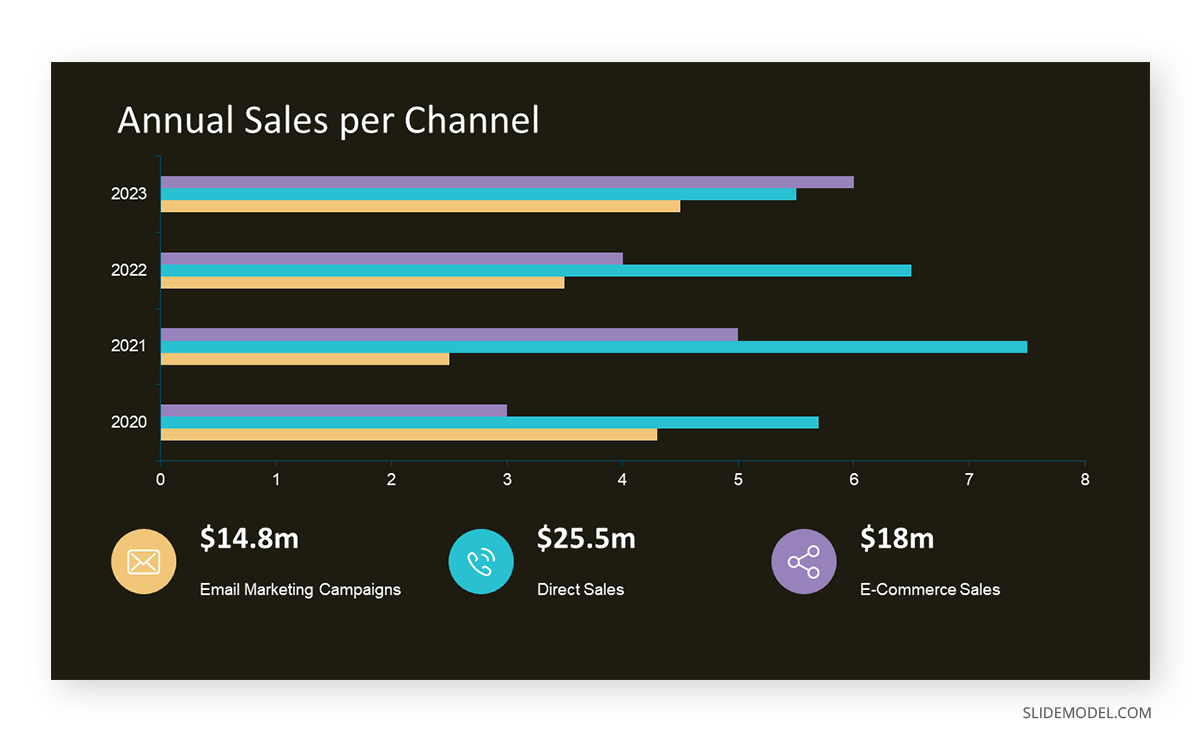
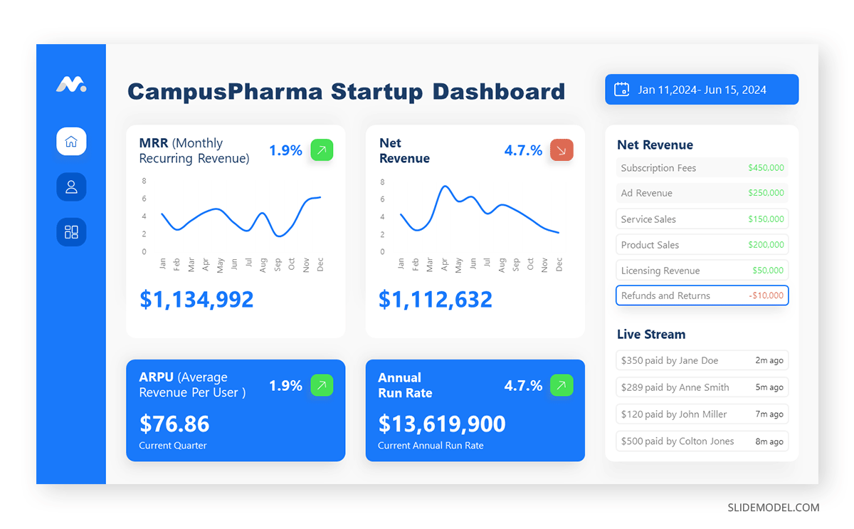
1. Dashboard Presentation Graph for PowerPoint & Google Slides
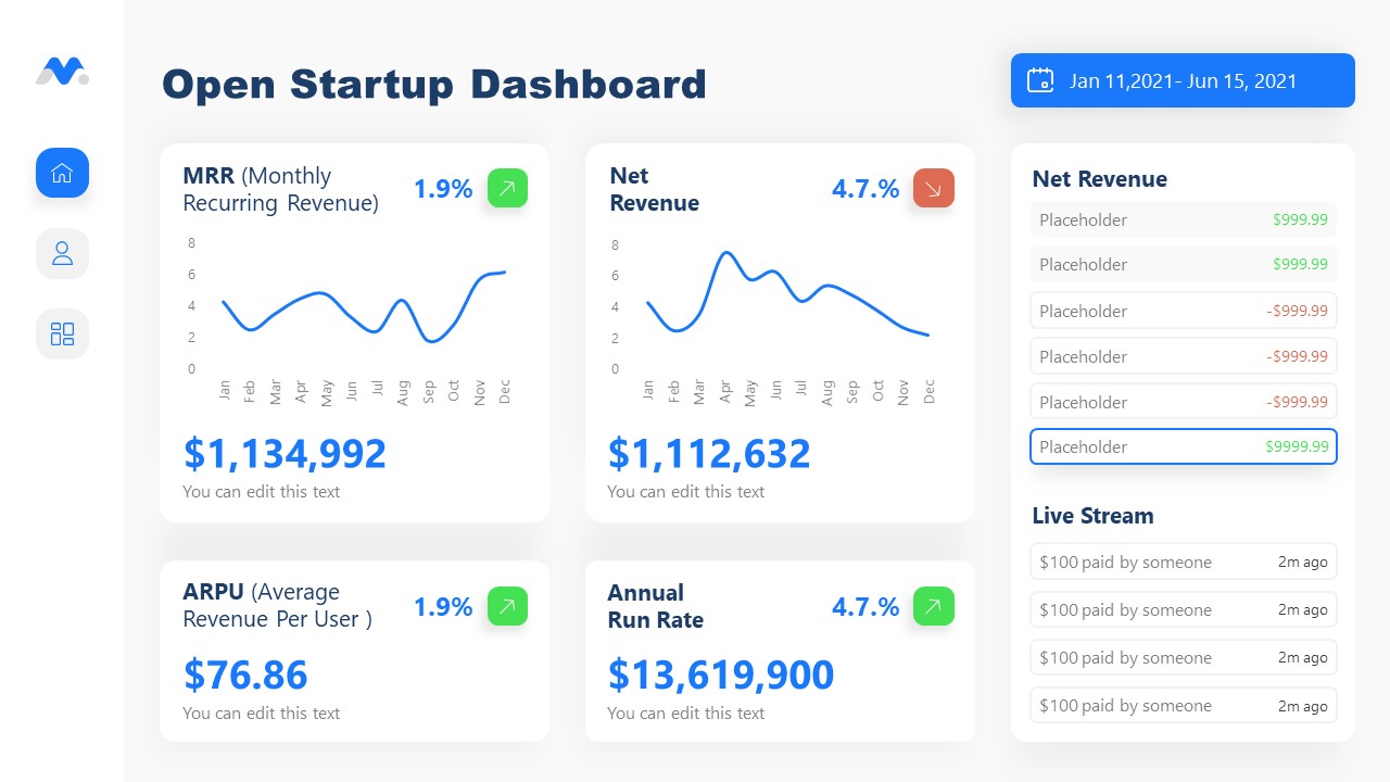
Don’t worry about how to make a graph in PowerPoint – let’s us bring the resources in the shape of a cool dashboard layout. Ideal for any kind of e-commerce business, you can track expenses or income, evaluate metrics, and much more.
2. Infographic Donut Chart Presentation Template
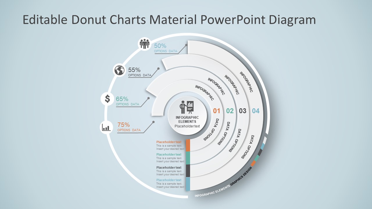
Explain concepts in different hierarchy levels, or processes that require a set of sequential steps by implementing this donut chart PPT template. Each segment has a bubble callout to expand further information for the areas required.
3. Presentation Graph Slide Deck PPT Template
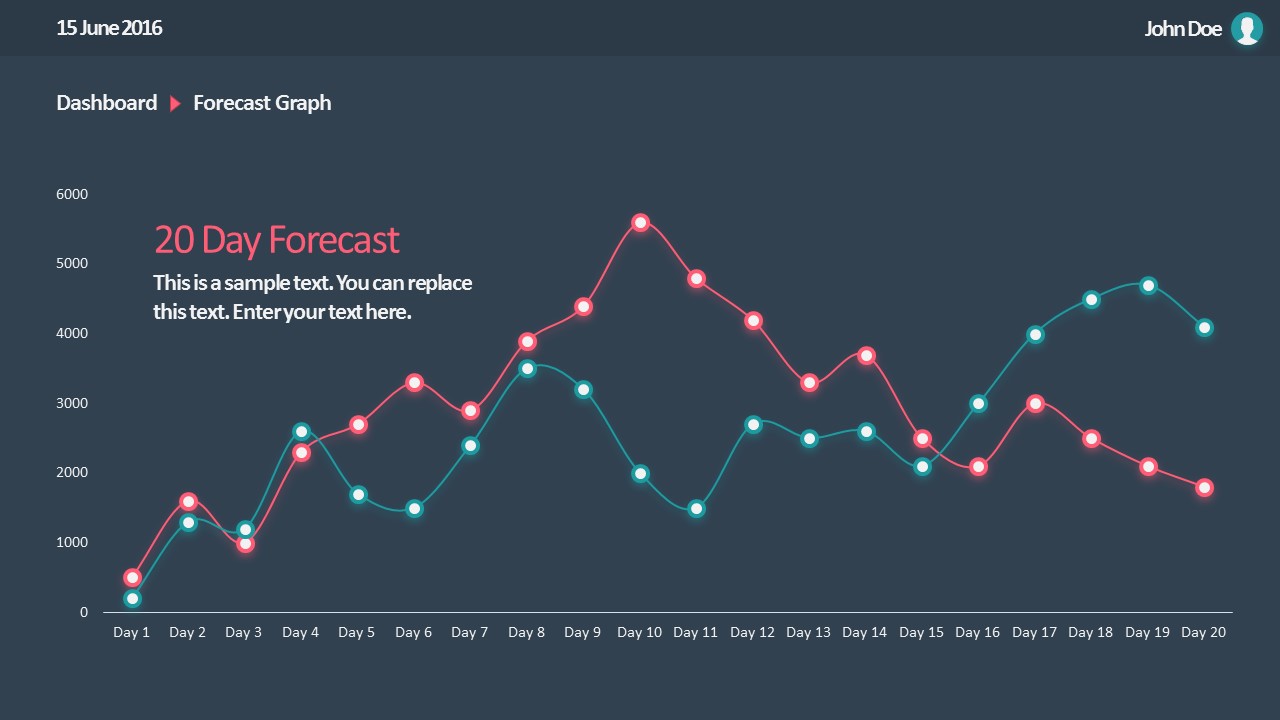
All that’s required to create a data-driven presentation is here. Customize donut charts, funnels, histograms, point & figure charts, and more to create professionally-designed presentation slides.
4. PowerPoint Charts Slide Deck
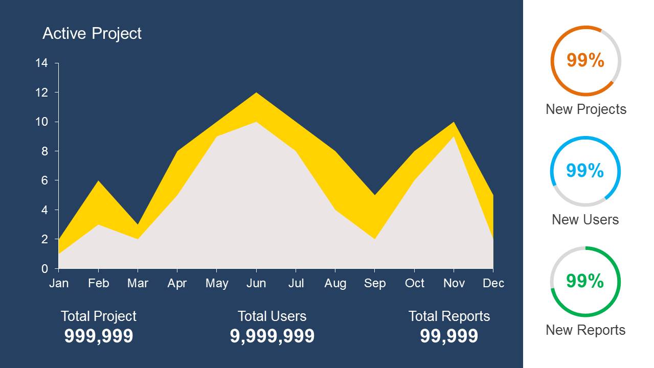
If you’re looking for clean layouts for column graphs, area charts, line graphs and donut charts, this is the template you need in your toolbox. Perfect for marketing, financial and academic reports.
Integrating the Graph into Your Presentation
Consider its relevance to the content when incorporating your graph into the presentation. Insert the graph in a slide where it logically fits within the flow of information.
Positioning the Graph Appropriately in the Presentation
Deciding where to put your graph in the presentation is essential. You want it to be where everyone can see it easily and where it makes sense. Usually, you place the graph on a slide that talks about the data or topic related to the graph. This way, people can look at the graph simultaneously when you talk about it. Make sure it is not too small. If needed, you can make it bigger or smaller to fit nicely on the slide. The goal is to position the graph so that it helps your audience understand your information better.
Ensuring Consistency with the Overall Design of the Presentation
Align the graph with the overall design of your presentation to maintain a cohesive visual appeal. You can use consistent colors, fonts, and styles to integrate the graph seamlessly. The graph must complement the theme and tone of your slides. Therefore, you should avoid flashy or distracting elements that may deviate from the established design. The goal is to create a harmonious and professional presentation where the graph blends naturally without causing visual disruptions. However, we recommend you use bar chart templates already available for presentation.
Narrating Your Graph
When explaining your graph during the presentation, start by providing context. Clearly state what the graph illustrates and its significance to the audience. Use simple and direct language, avoiding unnecessary jargon. It is important to walk through the axes, data points, and any trends you want to highlight. Speaking moderately allows the audience to absorb the information without feeling rushed. You can take pause when needed to emphasize crucial points or transitions.
You can learn more about creative techniques to narrate your graph in our data storytelling guide.
Common Mistakes to Avoid when Making a Presentation Graph
Overloading with Information
One common mistake is presenting too much information on a single graph. Avoid filling the graph with excessive data points or unnecessary details.
Misleading Scales or Axes
Scale mistakes, such as uneven intervals or a bar chart with zero baselines, are common graphical mistakes [5]. Misleading scales can distort the interpretation of the graph and lead to incorrect conclusions. Scales should accurately present the data without exaggerating certain aspects.
Inappropriate Graph Types for the Data
Selecting an inappropriate graph type for your data is a mistake to avoid. Choose a graph type that effectively communicates the nature of your data. For instance, a pie chart for time-based trends might not be the most suitable choice. Match the graph type to the data characteristics to convey information accurately.
If you need a quick method to create a presentation graph, check out our AI presentation maker. A tool in which you add the topic, curate the outline, select a design, and let AI do the work for you.
Final Words
Working with presentation graphs may feel challenging for a beginner in presentation design software. Still, practice makes the master. Start by clearly stating your objectives in terms of data representation—this will make the presentation graph-type selection process much easier. Customize the graph by working with appropriate color combinations (you can learn more about this in our color theory guide), as this can also help highlight relevant data sections that may influence an informed decision.
Everything depends on your creative skills and how you want to showcase information. As a final piece of advice, we highly recommend working with one graph per slide, unless you opted for a dashboard layout. Ideally, graphs should be seen from a distance, and working with reduced sizes may hinder accurate data representation.
References
[1] https://uogqueensmcf.com/wp-content/uploads/2020/BA Modules/Medical Laboratory/Medical Laboratory Courses PPT/Year III Sem II/Biostatistics/lecture 1.pdf (Accessed: 06 March 2024).
[2] Five Principles of Good Graphs. https://scc.ms.unimelb.edu.au/resources/data-visualisation-and-exploration/data-visualisation
[3} Guide to fairly good graphs. Statistics LibreTexts. https://stats.libretexts.org/Bookshelves/Applied_Statistics/Biological_Statistics_(McDonald)/07%3A_Miscellany/7.02%3A_Guide_to_Fairly_Good_Graphs
[4] Practical rules for using color in charts. https://nbisweden.github.io/Rcourse/files/rules_for_using_color.pdf
[5] https://iase-web.org/islp/documents/Media/How%20To%20Avoid.pdf[6] Duquia, R.P. et al. (2014) Presenting data in tables and charts, Anais brasileiros de dermatologia. 10.1590/abd1806-4841.20143388