127+ Data, Curve & Charts for PowerPoint Presentations
Our PowerPoint Chart Templates are pre-designed slides that help you represent your data accurately and create professional charts for your presentations. These PPT chart templates are fully editable in PowerPoint & Google Slides.
The chart templates for PowerPoint includes a range of chart types, including bar charts, line charts, and pie charts, with customizable color schemes and font options. You can easily present data clearly and concisely with the aid of visually enhancing design elements, making it easy for your audience to understand and interpret the information.
Use our PowerPoint Chart Templates to include facts and statistics in your next presentation. You can use any of the Data & Chart PowerPoint templates for your business modeling, website dashboards analysis, and PPT slides for Microsoft PowerPoint.
Featured Templates
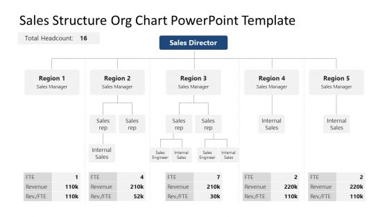
Sales Structure Org Chart PowerPoint Template
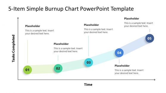
5-Item Burnup Chart PowerPoint Template
Financial Chart Slides PowerPoint Template
Animated PowerPoint Charts Collection Template
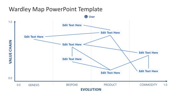
Wardley Map PowerPoint Template
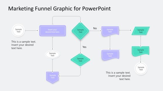
Thin Border Flow Chart Template PowerPoint
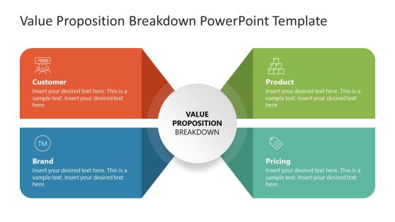
Value Proposition Breakdown PowerPoint Template
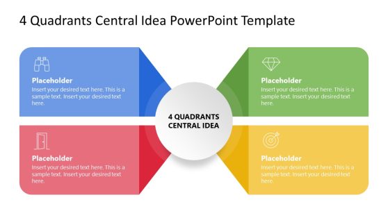
4-Quadrant Central Idea PowerPoint Template
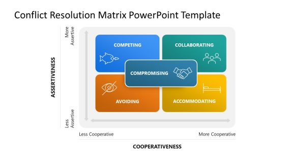
Conflict Resolution Matrix PowerPoint Template
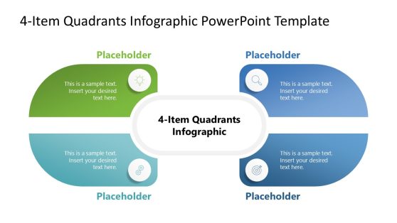
4-Item Quadrants Infographic PowerPoint Template
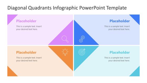
Diagonal Quadrants PowerPoint Template
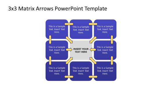
3×3 Matrix Arrows PowerPoint Template
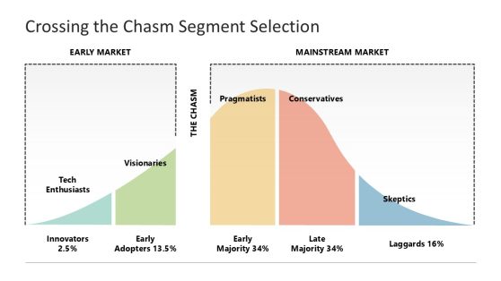
Crossing the Chasm Segment Selection
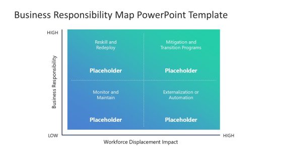
Business Responsibility Map PowerPoint Template
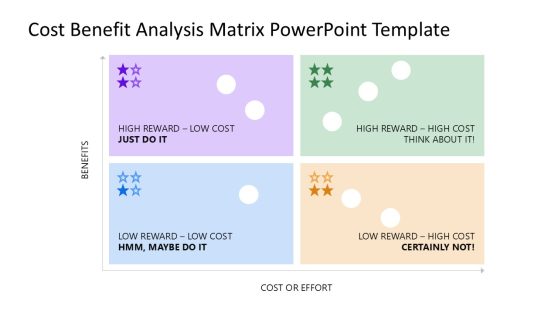
Cost Benefit Analysis Matrix PowerPoint Template
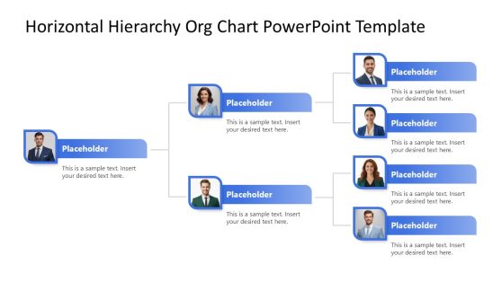
Horizontal Hierarchy PowerPoint Template
A data PowerPoint Template is a set of slides that you can use in your PowerPoint presentations to create charts and graphs that visualize data. They are pre-designed slide templates that will help you present data accurately to your audience, using a range of chart types such as bar charts, line charts, pie charts, slope charts, Sankey charts and scatter plots.
With a PowerPoint chart template, you can easily customize the chart to your specific needs by entering your data and choosing from various options, such as color schemes, layouts, and font styles. Using a chart PowerPoint template can help you effectively communicate data to your audience, through a data presentation, allowing the audience to understand and interpret the information you presented quickly. And it will also save you a lot of time and effort in creating charts and graphs from scratch. It provides a starting point that you can easily customize to suit your needs, allowing you to focus on the content of your presentation rather than the design of your charts.
Some Chart PowerPoint Templates also come with features such as pre-designed color schemes, layouts, and font styles, which can help you create a comprehensive presentation. Whether you are a student, a professional, or a business owner, a Chart PowerPoint Template can be a valuable asset in your presentation tools. You can learn more about the difference between graphs vs charts.
Without a doubt, charts and graphs are essential for visualizing and communicating data in presentations. They are well-designed to help reduce the stress of creating a chart presentation from scratch, and they can help you convey complex ideas and patterns clearly and concisely, making it easier for your audience to understand and remember the key points you are trying to convey.
How Do I Make A Chart In PowerPoint?
To create a chart in PowerPoint, follow these steps:
- Open the PowerPoint presentation and go to the slide where you want to add the chart.
- Select the “Insert” tab in the top menu.
- In the “Illustrations” group, click the “Chart” button.
- Select the type of chart you want to create from the drop-down menu.
- A new window will open with sample data. You can either keep this sample data or delete it and enter yours.
- Click “OK” to insert the chart onto the slide.
- You can then click on the chart to select it and use the “Chart Tools” tab in the top menu to customize the chart’s appearance and layout.
What Charts Are Available In PowerPoint?
PowerPoint is a popular presentation software that allows users to create professional-looking presentations with various charts and graphs.
Some of the charts available in PowerPoint include Line charts; Bar charts; Pie charts; Column charts; Scatter plots; Bubble charts; Area charts; Gantt charts; Waterfall charts; Radar charts; and Stock charts.
Also, PowerPoint provides a wide range of charts to help you quickly present data and information to your audience.
How Do I Make A Chart Look Professional In PowerPoint?
There are several ways you can make a chart in PowerPoint look professional:
- Choose the right chart type.
- Use a clear and readable font.
- Add a title to your chart and axis.
- Use gridlines.
- Use a consistent color scheme.
- Edit the chart layout and add chart borders.
- Use slide layout.
Following the listed tips, you will create professional-looking charts in PowerPoint that effectively communicate your data.
Can You Edit Graphs In PowerPoint?
Yes, you can edit graphs in PowerPoint. Follow the following do-it-yourself procedures:
- Open the PowerPoint presentation containing the graph you want to edit.
- Click on the graph to select it.
- Small squares called “handles” appear around the edges of the graph. These handles allow you to resize or move the graph.
- To edit the data displayed in the graph, right-click on the graph and select “Edit Data” from the context menu. It will open the “Edit Series” dialog box.
- Use this dialog box to modify the data and labels in the graph.
- To change the graph’s appearance, such as the colors or line styles, click on the graph to select it and then use the options in the “Chart Tools” ribbon at the top of the PowerPoint window.
How Do You Make A Graph Look Good In PowerPoint?
The following are some tips you should follow to make your graph look good in PowerPoint:
- Use appropriate formatting.
- Use cool colors and simple fonts that are easily read and look good together.
- Use a clear and concise title.
- Use appropriate scales, axes, and data labels.
- Use a simple layout.