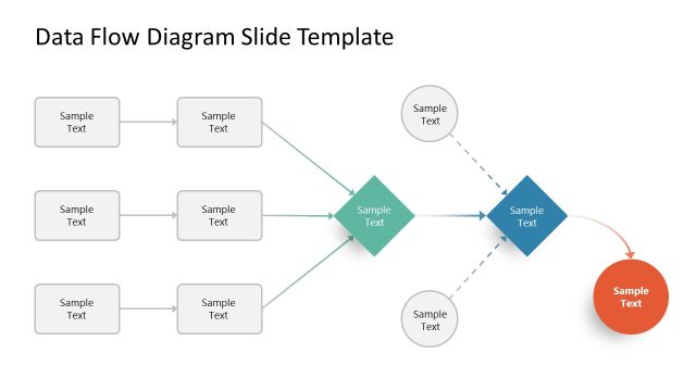
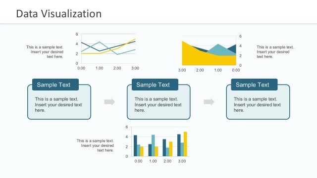
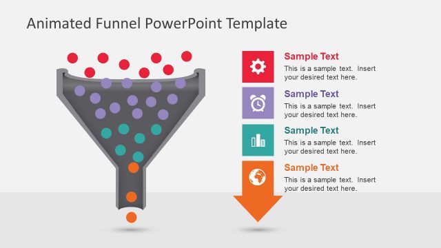
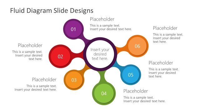
The Editable Sankey Diagram PowerPoint Template is a fully customizable slide designed to help professionals visually represent flows of data, resources, or processes in a clear and impactful way using the popular Sankey Diagram. This PPT template was created using PowerPoint shapes and vector objects, allowing users to easily edit colors, labels, flow thickness, and overall layout to fit their presentation needs.
Sankey Diagrams are widely used in engineering, energy distribution, financial analysis, supply chain management, and business reporting, offering an intuitive way to illustrate proportional relationships between different entities. Unlike standard flow diagrams, Sankey diagrams emphasize flow weight, making it easy to understand the relative volume of inputs, outputs, and transfers within a system.
With this editable PowerPoint template, users can adjust the width of the flow paths to accurately represent data proportions, customize colors and labels to align with branding or presentation themes.
Use the Sankey PPT template for energy flow, financial transactions, customer journeys, project management, and more. This Sankey Diagram PPT template is ideal for business analysts, engineers, consultants, educators, and professionals looking to enhance their data visualization and storytelling in presentations.
Whether you’re analyzing power flow, budget allocation, process efficiencies, or marketing funnels, this Sankey diagram slide template provides a flexible and professional solution to make complex data easier to understand for any audience.
What’s inside this template
Example presentation scenarios
- An energy analyst can use the Sankey flow diagram to show how multiple input sources combine and split into output streams with visible flow thickness.
- A finance presenter can replace the sample labels and central value blocks to explain budget allocation, transfers, or spend categories to executives.
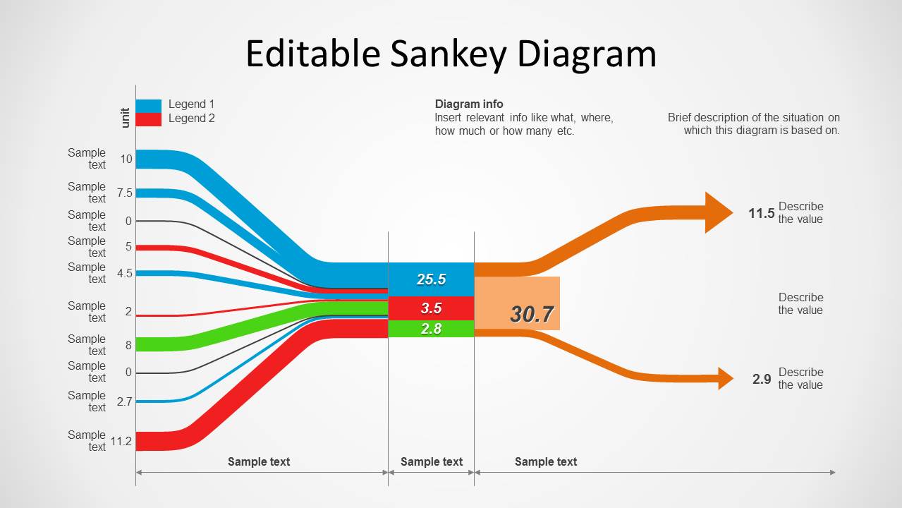
- A supply chain manager can use the left-side input labels, merged center section, and output arrows to show material movement across process stages.
- A consultant can use the legend and description text areas to frame a client process analysis before discussing where volume is gained, lost, or redirected.
Features
- 100% editable presentation template
- Compatible with Microsoft PowerPoint and Google Slides
- 16:9 aspect ratio slides
- Scalable vector shapes, icons and illustrations
- AI-Ready for Microsoft Copilot and Claude
- Instant access and download
Frequently asked questions
Q: How should I present the Sankey diagram so the audience reads it correctly?
A: Start by naming the unit and explaining what the line thickness represents. Then move left to right: input categories, merged center values, and downstream outputs. Keep labels short, call out only the most important values, and use the description area to state the business context before interpreting the flow.
Q: Who is this Sankey slide best suited for?
A: This slide is best for presenters who need to explain proportional movement across a system, such as energy distribution, financial transfers, process throughput, or supply chain flow. Analysts, engineers, consultants, and managers can use it when a simple flowchart would show direction but not relative volume.
Q: Why use a Sankey diagram instead of a regular process flow?
A: A Sankey diagram makes volume part of the visual message. Wider paths signal larger quantities, while thinner paths show smaller flows. The visible merge point, central value blocks, and output arrows help the audience understand not only where items move, but which streams matter most.
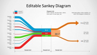
Sankey Diagram for PowerPoint
1-slide Sankey diagram presentation template for flow analysis, value callouts, and proportional paths.
Sankey Diagram for PowerPoint is a 1-slide diagram template for showing proportional flows through a system. The slide includes a Sankey flow diagram, left-side input labels, a small legend, central value blocks, and right-side output callouts. It is built for analysts, engineers, consultants, and business presenters in Microsoft PowerPoint and Google Slides.
- Category
- Diagrams
- Rating


 Loading...
- Aspect ratio
- 16:9, 4:3
- Item ID
- 1135
- Colors
 Microsoft PowerPoint
  Microsoft Copilot
  Claude for PowerPoint
 Other formats supported
Subscribe today and get immediate
access to download our PowerPoint templates.