A visual comparison between different topics, items, or events can be easier to follow for an audience than the information provided in plain text. Different types of comparison charts are often used for this purpose. These charts are used in publications, presentations, websites, advertisements, etc.
Table of Contents
- What is a Comparison Chart
- When is a Comparison Chart Used
- Advantages of Comparison Charts
- Different Types and Examples of Comparison Charts
- How to Create a Comparison Chart in PowerPoint
- How to Choose the Right Comparison Diagram
- FAQs
- Final Words
What is a Comparison Chart
A comparison chart is a graphical tool that shows the differences and/or similarities between two or more topics. This can be a comparison of features of two products, a price comparison, a comparison between trends tied to specific topics, and the like. Businesses often compare quarterly and annual trends using comparison charts. Similarly, comparison charts in advertisements commonly attract users toward a specific product or service by comparing features with competitors. Advertisements might also show the same product or service variants in a comparison chart to allow potential customers to make informed decisions according to their budget and needs.
When is a Comparison Chart Used
Comparison charts are used across academic industries and are widely applied in print and electronic media. Modern websites often make use of comparison charts to attract customers online. In contrast, newspapers, magazines, and brochures often use them to inform the target audience regarding the similarities or differences between different topics, products, or services. For example, a car manufacturer might provide a comparison chart showing the different features of each variant of a car model. The same car brand might come with a manual engine, CVT engine, and some extra features in a third variant. Another example of a comparison chart is the business-related trends used in PowerPoint presentations showing the growth or decline of a business by quarter to assess annual performance.
Advantages of Comparison Charts
Comparison charts are useful tools that can help individuals and organizations make informed decisions. Here are five advantages of working with comparison charts:
Clear Visualization of Options and Differences
Comparison charts provide a clear and concise visual representation of the similarities and differences between various options, making it easier to understand the unique features and benefits of each.
Facilitates Informed Decision-Making
By laying out all the relevant information side by side, comparison charts help individuals and organizations make informed decisions based on a comprehensive overview of the available options.
Saves Time
Comparison charts condense a lot of information into a single, easily digestible format, saving time that would otherwise be spent reading through lengthy descriptions or specifications.
Enhances Communication
Comparison charts are an effective communication tool that can be used to clearly convey information to others, whether it be in a presentation, report, or other format.
Aids in Identifying the Best Value
By comparing the cost and features of different options, comparison charts can help individuals and organizations identify the best value for their needs, ensuring that they get the most bang for their buck.
Different Types and Examples of Comparison Charts
Below is a list of different types, examples of comparison charts, and some suggested comparison template designs for PowerPoint.
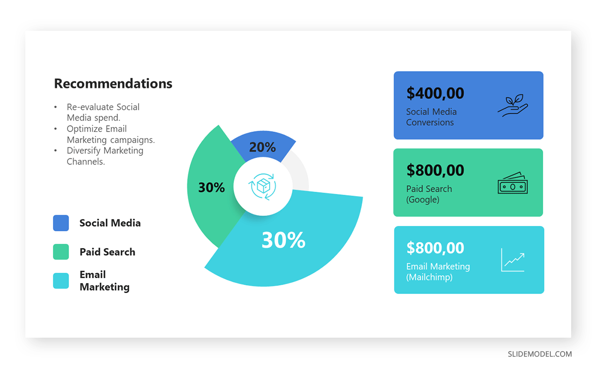
Pie Chart
A pie chart is a commonly used comparison chart type. This type of chart often shows a comparison using a pie shape, representing the share of each of the compared components.
Example: BlueLabel is an e-commerce platform in the sustainable fashion niche. Their current marketing strategy is seeing poor ROI results for the investments made, therefore, the board wants a detailed analysis of where the budget is going and which conversions are seen
Bar Chart
A bar chart is another very common comparison chart type. Bar charts represent information in the form of bars, where different colorful bars represent trends. Bar charts are commonly used for showing business trends, such as sales figures, quarterly performance, and annual performance reports, and to show projected trends. Like most common comparison charts, it represents percentages and integers.
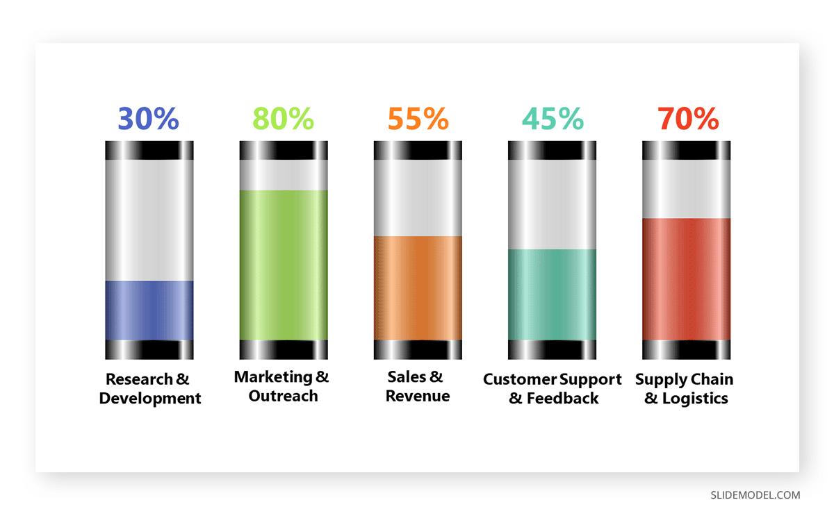
Example: The bar chart template below shows a company’s progress in key areas. Tube 1 stands for Research & Development, which saw 30% of the allocated resources to research and make iterative improvements, but is still far off of the expected benchmark. Tube 2 stands for Marketing & Outreach, which met 80% of the quarterly goals achieved, significantly improving brand partnerships. Tube 3 stands for Sales & Revenue, and the sales team met 55% of their target goals. Tube 4 stands for Customer Support & Feedback, which met 45% of their efficiency targets. Finally, Tube 5 stands for Supply Chain & Logistics, where the company’s Supply Chain Department ensured a 70% on-time delivery rate despite global disruptions.
Venn Diagram
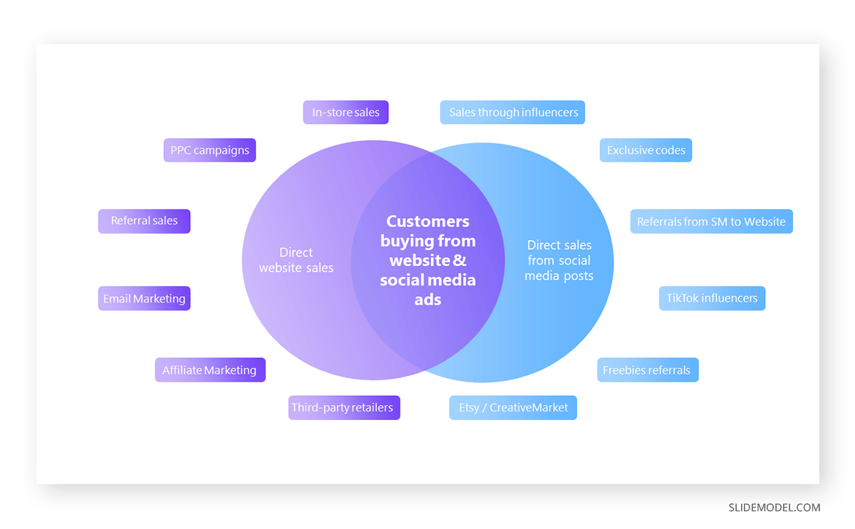
Venn diagrams show a logical comparison between sets. They are represented in overlapping circles to show connections and are often used for comparing data sets.
Example: The Venn diagram template below exemplifies how you can create overlapping comparisons to represent data sets. In this case, a company presents its sales channels to see where to segment customers that prefer one medium over another.
You can learn more about making such diagrams from our article about how to make a Venn diagram.
Comparison Matrix
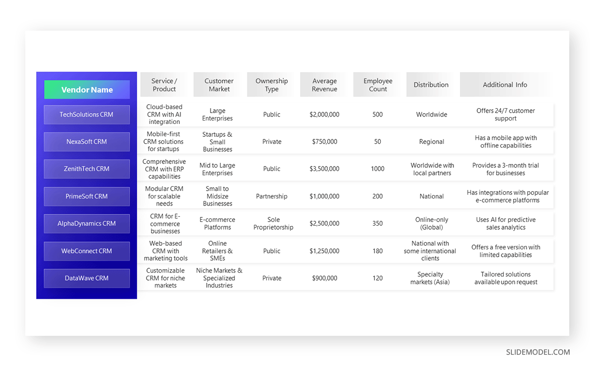
A tabular or matrix-like comparison is often a common depiction of two or more entities.
Example: An e-commerce site is looking to acquire the services of a CRM for their business. Therefore, they created this matrix chart design to compare data sets in an easy-to-read layout. A chart template can help make comparisons of different characteristics of topics, such as comparing different vendors when assessing quotations to find the best price and value for money based on bids received.
Histogram
Histograms are used for data sets to understand the distribution of values. Histograms can also be used for making comparisons.
Example: An example of using a histogram for comparison can be illustrated by studying the evolution of salaries within a company.

How to Create a Comparison Chart in PowerPoint
Follow these instructions to create your own comparison chart in PowerPoint.
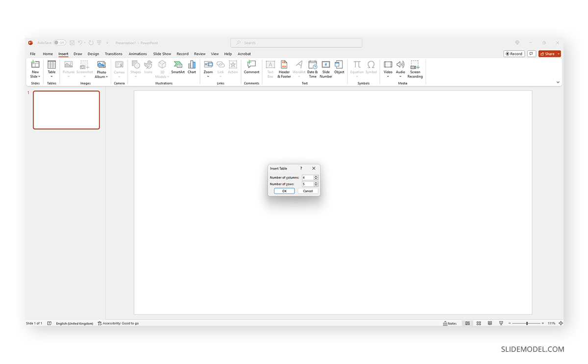
Open PowerPoint and create a blank presentation. Then go to Insert and click on Table.
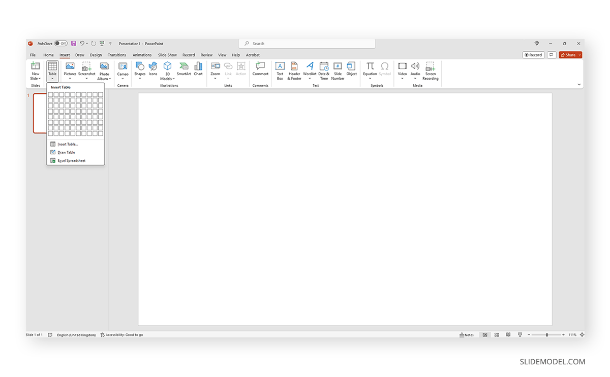
In the Insert Table dialogue box that will appear, select the number of rows and columns required for your comparison chart and hit OK.
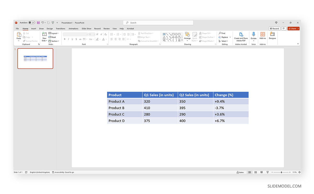
Now we need to enter the data for the comparison. Use the first row to list the criteria, and the first column to list the elements you’re comparing. Fill the rest of the cells with relevant information from that comparison.
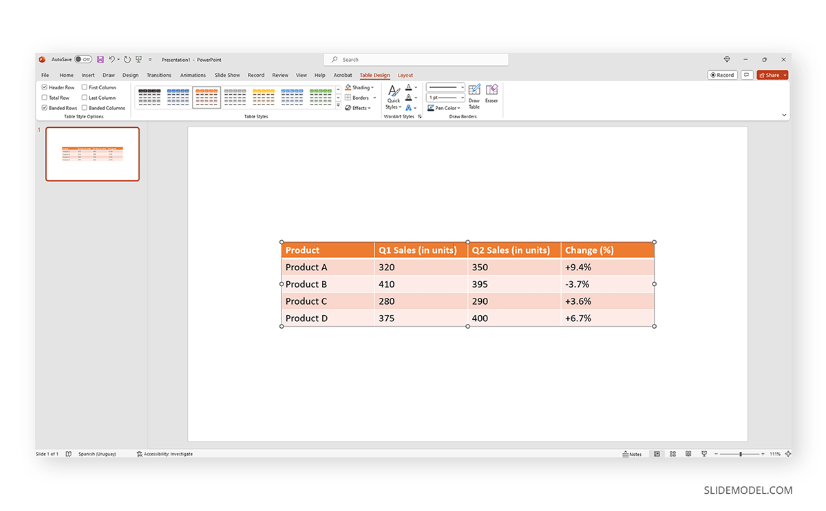
In order to format the table, click to select it. Go to the Ribbon and locate Table Tools Design to alter the style of your table. We can alter the cell size, add or remove rows, change color, and more.
Once you’re satisfied with the result, you can save that presentation or export it to a PDF format.
How to Choose the Right Comparison Diagram
Two elements define how you can choose the right comparison diagram: the type of data to be used and the message you want to convey. To simplify this process, let’s bring a basic approach for how to choose a comparison diagram:
- Understanding the data: Answer if the data you’re using to compare is right for a qualitative or quantitative study. How many items will you study? Is there a dependency relationship between the items? Which relationships are established between the items? That, and asking yourself if you have enough data to answer all categories (valid for a competitor’s analysis), should be the first thing to focus on.
- Defining the objective: Which approach will you use for your comparison? Highlight similarities or differences. Maybe both? Do you want to show a pattern or a trend in the market?
- Consider the audience: Don’t neglect the audience factor, as they will be familiar with the tool you opt to use. Choose a diagram format that’s easily understood by your audience.
- Picking the right diagram type: Based on your data, objective, and audience, select the most appropriate diagram type. Here are some common comparison diagram types:
- Bar Chart: Useful for comparing quantitative data across different categories.
- Line Chart: Useful for showing trends and patterns over time.
- Pie Chart: Useful for showing the proportion of each item in relation to the whole.
- Venn Diagram: Useful for showing the similarities and differences between two or more items.
- Table: Useful for comparing qualitative or quantitative data side by side.
FAQs
What types of data can be compared using a comparison chart?
Comparison charts can be used to compare both qualitative and quantitative data. This includes comparing products, services, prices, features, specifications, etc.
Can I customize a comparison chart to fit my needs?
Yes, most comparison charts can be customized to fit your specific needs. This includes changing the colors, fonts, and layout and adding labels, titles, and other annotations to make the chart more informative.
Can I use a comparison chart to compare more than two items or options?
Yes, you can use a comparison chart to compare multiple items or options. The number of items you can compare will depend on the type of chart you are using and the complexity of the data.
How do I ensure that my comparison chart is accurate?
To ensure accuracy, double-check all data entries and calculations. Also, make sure that the criteria you use for comparison are relevant and unbiased.
What are some common mistakes to avoid when creating a comparison chart?
Common mistakes include using the wrong chart type, including too much or too little information, and not clearly labeling the axes and data points. Also, avoid using confusing or misleading scales.
How do I handle missing data when creating a comparison chart?
If you have missing data, you can either exclude the item or option from the comparison or clearly indicate that the data is missing.
Final Words
The above list of comparison charts is not a definitive list that can be used for comparisons. The comparisons that can be made are difficult to list, and the chart types that can be used are also numerous. For example, a PEST analysis can be used to compare the political, economic, social, and technological factors, whereas a PESTEL analysis adds environmental and legal factors to the mix. Similarly, different comparisons and chart types can be used to discuss scientific topics, business trends, economic viability for investment, product or service comparison, etc.