
A waterfall chart shows how the starting value changes over time due to a series of positive and negative contributions. Commonly used in finance and business reporting, this chart type helps the audience clearly understand how different factors impact a final result. If you’re wondering how to create a waterfall chart in PowerPoint, the guide below provides a detailed walkthrough on how to make a PowerPoint waterfall chart.
What is a Waterfall Chart
A waterfall chart in PowerPoint is a type of data visualization that shows how an initial value increases or decreases through intermediate steps to reach a final value. It’s called a bridge diagram or bridge chart because it visually connects two values. A few examples include revenue and profit, opening and closing balance, and budget vs actual performance. Each column represents a change: positive values increase the total, negative values decrease it, and the total columns show cumulative results.
Waterfall charts are especially useful in corporate and financial presentations. Common uses include profit-and-loss analysis, budget-versus-actual comparisons, revenue breakdowns, cost analysis, and financial reporting. Because they show both increases and decreases, they are ideal for explaining performance changes.
Why is it Called a Bridge Chart
The term bridge chart comes from finance and consulting, where analysts use these charts to explain how one figure transitions into another. For example, Revenue -> Costs -> Expenses -> Profit. This is because each step builds a bridge, from the starting value to the final outcome. Making it easier for stakeholders to understand what’s driving the change. This makes it useful to create a bridge chart PowerPoint slide to explain such concepts conveniently.
How to Create a Waterfall Chart in PowerPoint
PowerPoint includes a built-in waterfall chart type. Using this chart type, you can build your own charts in just a few minutes to show custom values by editing the sample ones.
Step 1: Insert a Waterfall chart by going to Insert -> Chart -> Waterfall.
Step 2: Enter your data into the Excel sheet that opens when you select the chart. Enter your data in a structured format, including a starting value, intermediate gains or losses, and a final total.
Step 3: Select the first and last columns (e.g., Starting Value and Final Value) and select Set as Total. This ensures that those columns start from the baseline rather than floating.
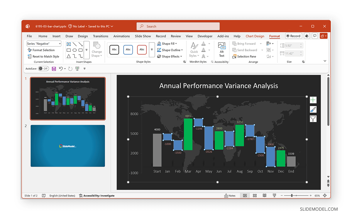
Step 4: Once the chart is inserted, you can format it using the Chart Design and Format tabs. The example below shows the Data Driven Waterfall Chart PowerPoint Template and illustrates how to create a Waterfall chart in PowerPoint. Using this template, you can easily edit the given sample layout to create a custom waterfall chart slide.
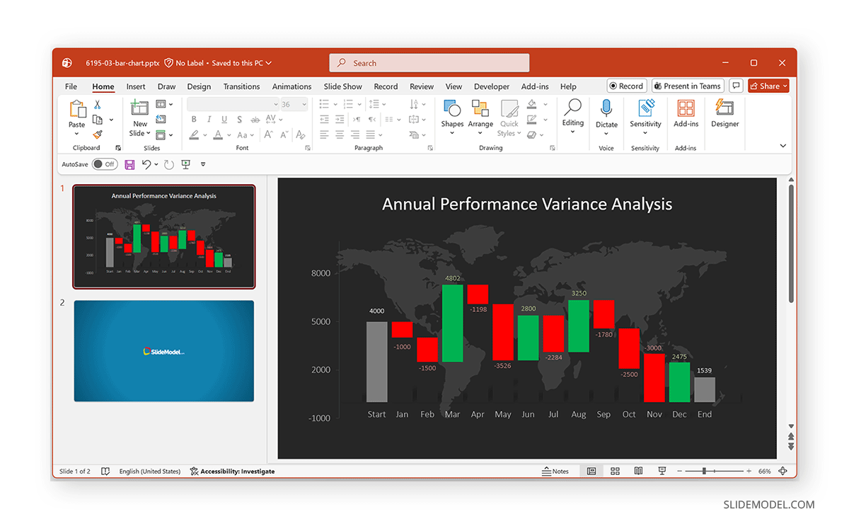
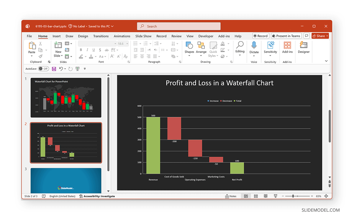
Example: Showing Profit and Loss in a Waterfall Chart
One of the most practical uses of a waterfall chart is to explain how a business moves from revenue to profit. Instead of presenting numbers in a table, a waterfall chart visually shows how each cost or gain contributes to the final result, making it easier for the audience to follow the financial story.
Understanding the Flow
In a typical profit and loss (P&L) waterfall chart, you begin with total revenue as the starting point. From there, each expense is subtracted sequentially until you arrive at the final profit. Each bar in the chart represents a change, either positive or negative, helping quickly identify which impacts the bottom line most.
Example
In the example below, we created a bridge diagram in PowerPoint that starts with Revenue as the baseline. Each expense (such as cost of goods, operations, and marketing) appears as a downward step, reducing the total. The final bar represents Net Profit, showing the remaining value after all deductions. This example illustrates how revenue is gradually reduced by cost components such as the cost of goods sold, operating expenses, and marketing costs, ultimately resulting in net profit.
Tips for Formatting a Waterfall Chart in PowerPoint
While most formatting options can be easily found via the PowerPoint Ribbon menu, below are a few tips to help you present a Waterfall graph PowerPoint slide.
Adding Data Labels: Click the chart, select Chart Elements (+ icon), and enable Data Labels. This helps your audience quickly understand the values.
Changing Colors for Clarity: By default, positive values are one color, negative values another, and totals a separate color. You can customize these by clicking a bar, then selecting Format Data Points from the right-click menu. From here, you can select a fill color to showcase the data according to specific requirements, such as green for gains, red for losses, blue for totals, or to align colors with your organization’s brand guidelines.
Adjusting Axis and Spacing: To improve the readability of your waterfall chart, you can fine-tune the spacing and axis settings. For example, reducing the gap width will make the columns thicker and easier to see, especially when presenting data on larger screens. You can also adjust the vertical (value) axis to better reflect your data range, which helps avoid excessive space or compressed values.
In addition, consider removing unnecessary gridlines or simplifying them so they don’t distract from the main data. Small adjustments like these can make your chart cleaner, more balanced, and easier for your audience to interpret at a glance.
Adding Titles and Labels: By adding the chart title (e.g., “Revenue to Profit Bridge”), Axis labels, and Category names, your chart will be easier to interpret.
Using PowerPoint Templates for Waterfall Charts
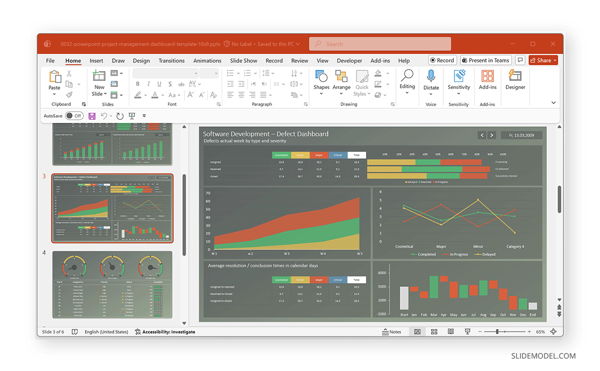
If you need a faster or more polished result, you can use templates to explain financial dashboards and business reports. These pre-formatted chart templates contain color-coded visuals and editable data placeholders. This saves time and ensures consistency in presentations. For this purpose, you can use Waterfall and data-themed slides using Data and Chart PowerPoint Templates, such as the RAG Project Status Dashboard Template for PowerPoint shown below.
Final Words
Learning how to create a waterfall chart in PowerPoint can be very useful for business professionals, analysts, consultants, and the like. Whether you’re presenting financial data, explaining performance changes, or building waterfall charts, you can use a structured slide to communicate insights.
One of the biggest advantages of using a waterfall chart is its ability to turn raw numbers into a narrative. Instead of overwhelming your audience with tables or spreadsheets, you can show how each component contributes to the final outcome. This makes it easier for stakeholders to identify key drivers, understand trends, and make informed decisions.
By using PowerPoint’s built-in chart tools, you can quickly create and customize waterfall charts without needing advanced technical skills. Additionally, pre-designed templates can help you save time while maintaining a consistent and professional look across your slides. With the right formatting, such as clear labels, logical sequencing, and effective color coding, you can further enhance readability and impact.