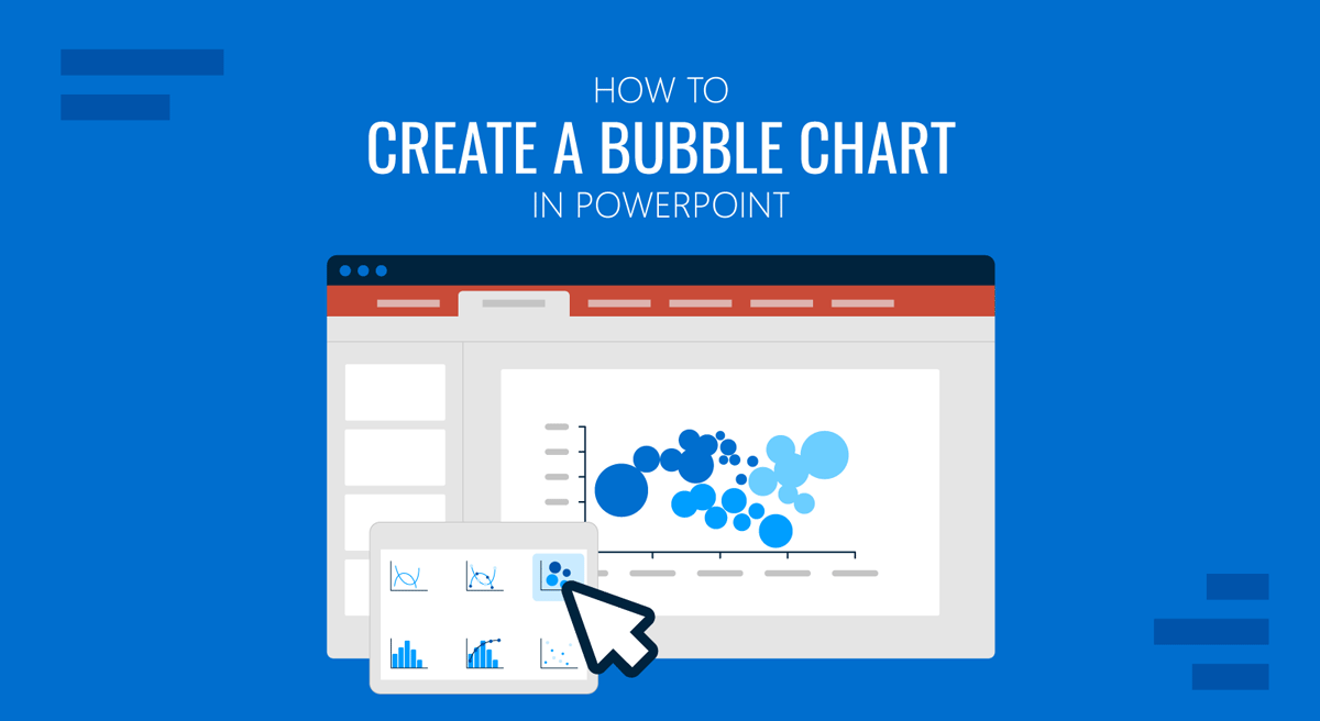
If you need a chart type for your presentation that shows relationships between variables, consider a bubble chart. By using a bubble chart in PowerPoint, you can create a single, easy-to-understand graphic to help the audience spot patterns, outliers, and insights more quickly.
In this guide, you’ll learn what a bubble chart is, why it’s useful, and how to create a PowerPoint bubble chart. We’ll also cover best practices to ensure your chart communicates insights clearly rather than overwhelming your audience.
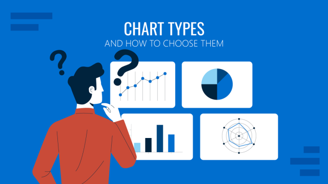
What is a Bubble Chart
A bubble chart is essentially an expanded version of a scatter chart. Instead of plotting data using just two values on the horizontal and vertical axes, it adds a third dimension by varying the size of each bubble. The position of a bubble along the X-axis represents one numeric variable, while its position on the Y-axis represents another.
The size of the bubble itself conveys a third value, allowing the presenter to compare scale or impact at a glance. Furthermore, color can serve as an additional layer of information. For example, the horizontal axis might show market growth, the vertical axis could represent profit margin, and bubble size might indicate revenue. Different colors can then be used to distinguish industry segments or product categories. By combining these dimensions in a single view, PowerPoint bubble charts help teams compare performance, spot opportunities, and understand trade-offs more quickly than with traditional charts.
Why Use Bubble Charts in PowerPoint
Bubble charts are effective because they condense complex datasets into a single visual. Instead of scanning tables or multiple charts, the audience can understand relationships at a glance.
Condense Complex Data into One Visual: Bubble charts combine multiple variables into a single graphic, making it easier to understand relationships without scanning tables or switching between charts.
Reveal Patterns and Correlations: By plotting two metrics on the axes and using bubble size to encode a third variable, bubble charts help audiences see how different variables interact.
Highlight Outliers Naturally: Large, small, or isolated bubbles stand out immediately, making it easy to draw attention to exceptional cases or unusual performance.
Support Strategic Decision Making: Bubble charts are commonly used in portfolio analysis, market positioning, and performance reviews where trade-offs and relative impact matter.
Tell a Story with Data: When paired with labels and annotations, bubble charts help explain why certain data points matter. A PowerPoint bubble chart can therefore be useful for instantly highlighting key information at a glance and creating a data story for the audience.
How to Make a Bubble Chart in PowerPoint
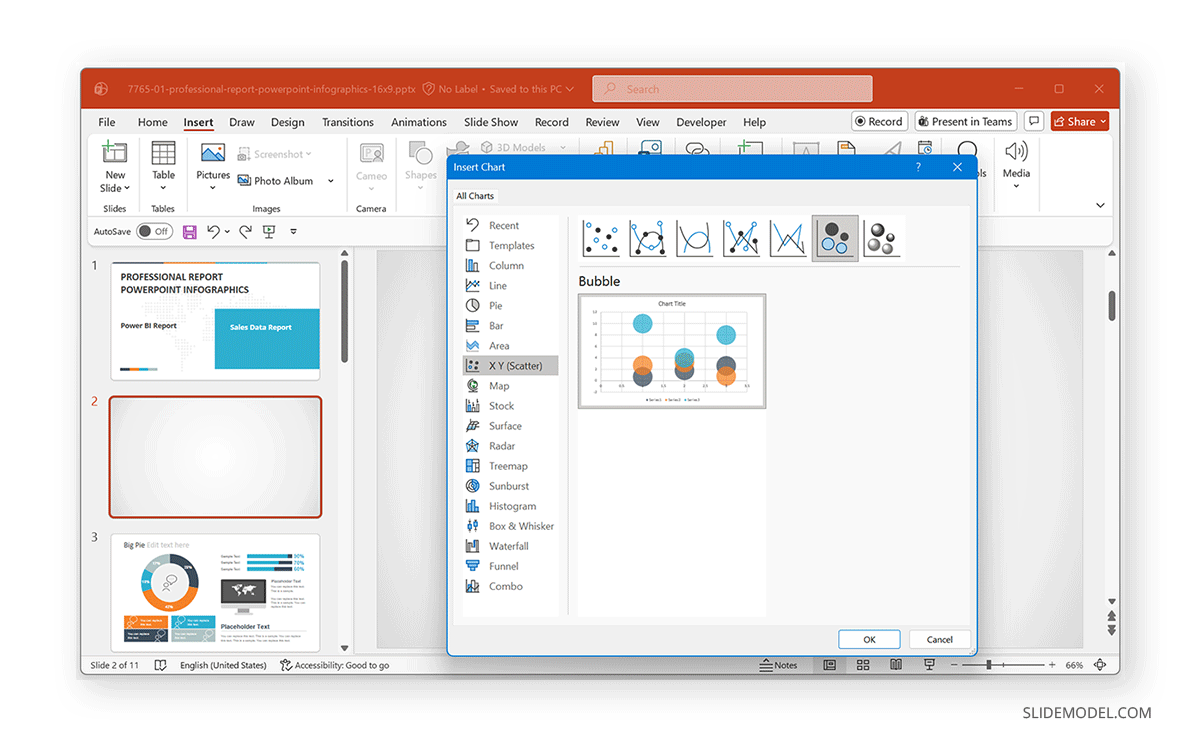
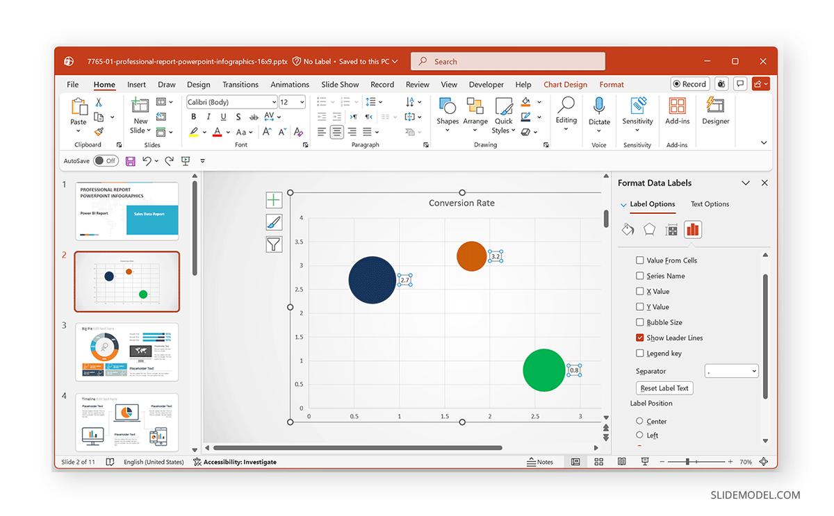
PowerPoint includes bubble charts as part of its built-in chart tools, and you can add them via the Insert menu. The section below demonstrates the process using the Professional Report Infographics PowerPoint Template.
Step 1: Go to Insert -> Chart -> XY (Scatter), and select Bubble from the chart categories. You can insert either a standard or a 3-D Bubble chart. Once selected, PowerPoint inserts a default bubble chart along with an Excel data sheet.
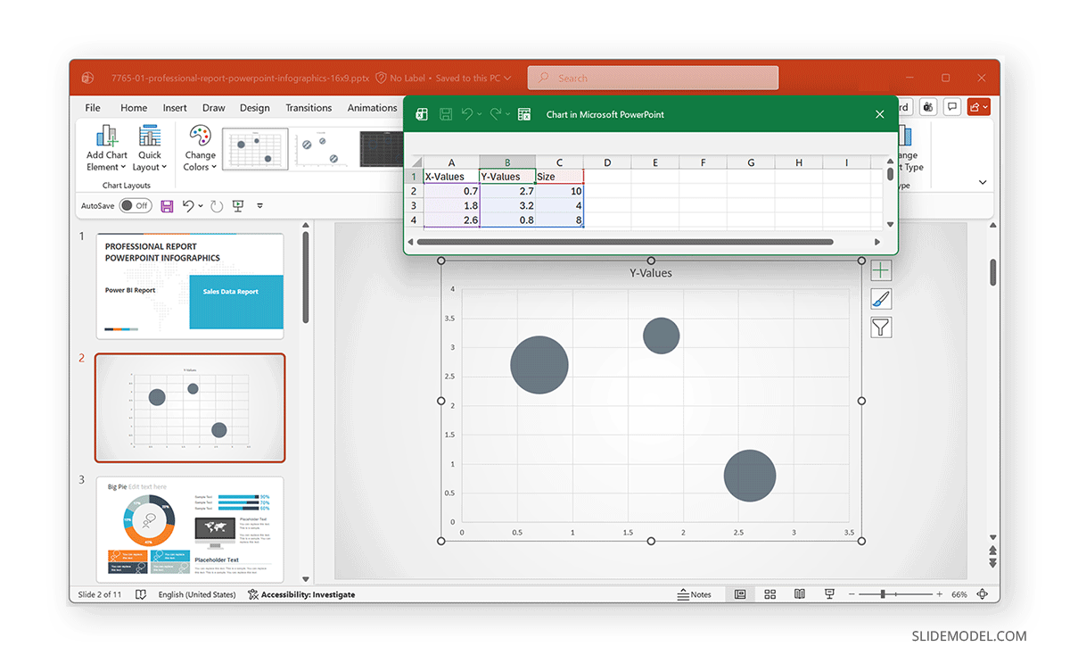
Step 2: In the Excel sheet, replace the placeholder values with your own data. As you update the spreadsheet, the bubble chart updates automatically. Each row represents a single bubble (data point).
Example:
- Column A = X-axis values
- Column B = Y-axis values
- Column C = Bubble size
Step 3: Add axis titles to explain what each axis represents. This is because clear axis labeling is essential for interpretation. Adjust minimum and maximum values to avoid overcrowding. Ensure both axes use comparable scales when possible and avoid wide ranges that make meaningful differences hard to see.
Step 4: PowerPoint allows you to fine-tune bubble scaling using the Format Data Series options in the right-click context menu. Use this option to adjust the bubble size.
Note: Avoid extreme size differences that dominate the chart, and test the chart on a projected screen to ensure bubbles remain distinguishable.
Step 5: Add a legend if the color represents categories. Color can add a valuable extra layer of meaning. You can use color to represent categories (e.g., regions or segments). Stick to a limited, consistent palette, and use each color to represent and distinguish data rather than adding color solely for visual appeal.
Designing and Presenting Bubble Charts Effectively
Small design choices can make a big difference in how easy a bubble chart is to read and understand. Therefore, you should consider designing bubble charts tailored to your audience to make data interpretation easier.
Add Data Labels Selectively: Label only the most important bubbles, such as top performers, outliers, or key focus areas, to avoid visual clutter.
Reduce Gridline Noise: Lighten, simplify, or remove gridlines so the bubbles remain the main focus of the chart.
Maintain Consistent Typography: Use readable fonts that match the rest of your presentation to keep the chart visually cohesive.
Add Context with Annotations: Short callouts or notes can explain why specific bubbles matter, helping turn raw data into a meaningful story.
Common Mistakes to Avoid
Be Mindful of Interpretation Pitfalls: The audience may misread bubble charts if it’s not clear what bubble size represents, if too many bubbles are shown, or if size differences are assumed to be perfectly linear. Always explain what each dimension represents, whether verbally or on the slide, and clarify the meaning of the X-axis, Y-axis, bubble size, and color to guide interpretation.
Choose the Right Chart Type: Use scatter charts when comparing only two variables, bar or column charts for precise comparisons, and bubble charts when scale or relative impact adds important context.
Avoid Bubble Charts when Simplicity is Better: Bubble charts are not ideal for very small datasets, precise numeric comparisons, or crowded charts that are hard to read.
Final Words
Creating a bubble chart in PowerPoint can help visualize complex relationships and present data-driven insights with significant clarity before an audience. By combining position, size, and color, bubble charts allow audiences to grasp multiple dimensions of information in a single view. This can enable easy, at-a-glance data interpretation.
With clear labels, sensible scaling, and focused messaging, PowerPoint bubble charts can help the audience see patterns, compare alternatives, and understand what truly matters in the data. However, overcrowding bubbles, inconsistent bubble sizes, and the use of bubble colors without context can make the chart unreadable or easy to misinterpret. If you are new to PowerPoint bubble charts, you might want to run your chart before colleagues or a controlled audience for feedback before using it for a critical presentation.