Making sense of geographical and categorical data to understand information of variable importance, requires a visualization type that can help identify the phenomenon by highlighting key bits of the data. Heat maps are used to identify and interpret such information. This article will introduce the concept of a heatmap, which are the popular variations, and how they are used in real-case scenarios.
Table of Contents
- What is a Heat Map?
- Benefits of Using Heat Maps
- Best Practices for Heat Map Design
- Heat map Visualizations and How To Present Them
- How to Present a Heatmap Analysis to an Audience
- Heatmap Tools
- How to insert a Heat Map from Excel to PowerPoint?
- Final Words
What is a Heat Map?
A heat map is the visualization of data that represents the magnitude of a value in a color code ranging from minor to major intensity. The name metaphor is born in the technique used to depict heat; blue means cool, red means hot, and intermediate temperatures are coded as the gradient between those two. The variation of color is often portrayed in intensity and hue, highlighting the extent of the phenomenon to make it easier to interpret.
There are two main types of heatmaps:
The Spatial Heat Map: Represented with a canvas that represents a two-dimensional space; it can be a geographical map, a web page, or another cartesian representation.
Grid Heatmap: This type of heat map displays the magnitude of a phenomenon using a two-dimensional matrix. Columns and Rows categorize a cell (the location) and the cell’s color code defines the phenomenon’s value intensity.
Benefits of Using Heat Maps
Heat maps offer a range of benefits regarding data visualization and analysis. Here are some key advantages:
- Pattern Recognition: Heat maps are excellent tools for identifying patterns and trends within complex datasets. They make it easy to spot high or low activity areas, which can be crucial for decision-making.
- Data Summarization: Heat maps condense large amounts of data into a visually digestible format. This simplifies the understanding of intricate details within the dataset.
- Immediate Insight: Users can quickly grasp insights without delving into extensive numerical data. This immediacy is particularly useful for non-technical stakeholders.
- User-Friendly: Heat maps are user-friendly and require minimal training to understand. They are intuitive, with color gradients conveying information effectively.
- Visual Appeal: Heat maps are visually appealing and engage the audience. They are a powerful tool for presentations and reports.
- Interaction and Exploration: Interactive heat maps allow users to explore data hands-on, making them a valuable tool for in-depth analysis.
- Multivariate Analysis: Heat maps can represent multiple variables simultaneously, making them versatile for various data types.
- Anomaly Detection: Heat maps can highlight anomalies and outliers in the data, drawing attention to areas requiring further investigation.
Best Practices for Heat Map Design
Designing effective heat maps requires careful consideration. Here are some best practices to remember:
Thoughtful Color Palette:
Choose a color palette that aligns with your data’s characteristics and the audience’s understanding. Consider using distinct colors for different data ranges, making it easy for viewers to interpret. For example, select a palette that transitions smoothly from cool to hot if your heat map represents temperature variations.
Clear Scale and Legend:
Incorporate a scale and legend to provide context and aid interpretation. The scale should define the range of values and how they correspond to colors. A well-constructed legend makes it clear what each color represents. Ensure that the legend is legible and not too cluttered.
Data Preprocessing for Clarity:
Before creating your heat map, clean and preprocess your data. Identify and handle outliers and missing values to prevent them from distorting the visualization. Proper data preparation is essential for accurate and meaningful heat maps.
Effective Labeling:
Labeling important data points or regions can enhance the audience’s understanding of the heat map. Labels provide context and facilitate comparisons. Ensure that labels are placed strategically and are easily readable. For instance, label the highest and lowest data points to highlight extremes.
Responsive Design for Different Devices:
Test the responsiveness of your heat map across various devices, including desktops, tablets, and smartphones. Ensure that the visualization remains legible and functional on different screen sizes. A responsive design guarantees that your heat map is accessible to a wider audience.
Heat map Visualizations and How To Present Them
While we can broadly categorize heatmaps as spatial and grid, there are different ways in which these map types can be instantiated, and used in visualizations and charts. Through the following heat map examples, we provide recommendations to present your heat map analysis.
1. Geographical Heatmap
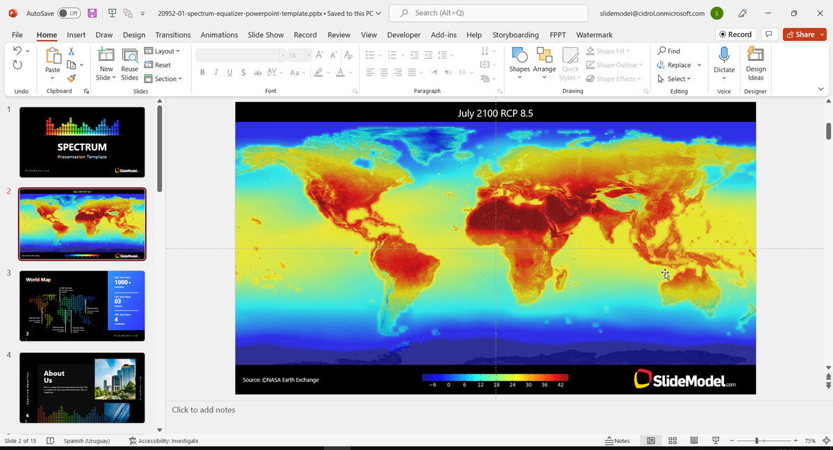
A geographical heatmap is a spatial map to visualize data according to geographical location. This can be done to show the phenomenon’s intensity, such as weather trends or demographic information. The heatmap quality will be determined by the density of the dots in the map and the color spread. This means that the more latitude-longitude dots you have on the map, the better the representation of reality. Precision geographical heat maps are created with mathematical-statistical tools, like R, Python, or more specialized tools, and require a lot of data.
For example, we can take the NASA projection of the world’s average temperature for 2100. If you need to present a heatmap of this level of detail, our recommendation is that you generate it in a statistical tool and include it in your presentation as an image. Source: NASA
When creating presentations that do not require “scientific” precision, you can create a geographical heat map using a low-resolution representation of the map. That will allow the presenter to instantiate the datasets with fewer data points.
For low-resolution maps, you can use pixelated maps or low poly maps.
A real-life example would be the global sales of a company, distributed around the world.
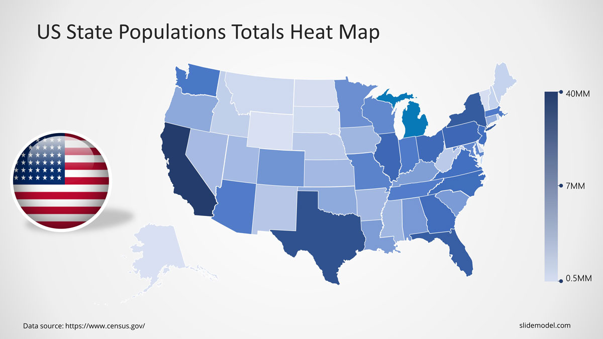
Choropleth Maps – An alternative to Geographical Heat Maps
By formal definition, the Choropleth Maps differ from the geographic spatial heat maps we described earlier. Mainly because it does not use pure spatial information. It uses predefined segments in the map (area/region) to aggregate the phenomenon variable. This aggregation makes it simpler to understand, and it has become an even more popular tool in business, politics, and social studies.
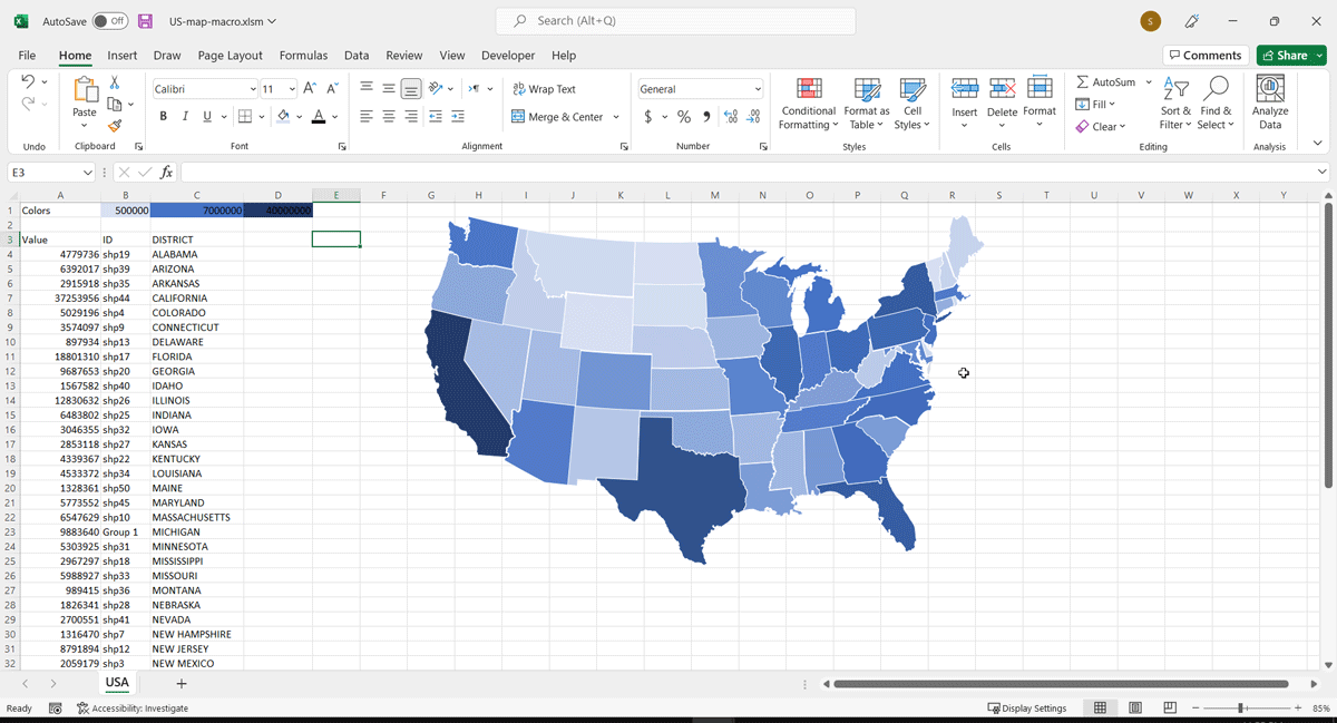
You can create Choropleth Maps using Excel (Office 365 version) or with SlideModel’s PowerPoint map templates, which provide data-driven Choropleth for all versions of Excel and PowerPoint.In the following example, we used our editable us map and applied the US Census data from 2010 to 2019.
The map uses a data-driven Excel provided by the presentation template. The Census data was loaded into the Excel sheet. Then we placed the map in the PowerPoint presentation, just dragging and dropping.
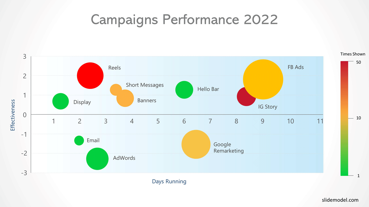
2. Bubble Chart Heatmap
Bubble charts generalize the scatter plot. Each point is located on a cartesian axis (X, Y), and a circle is created. The size of the circle is a third dimension in the visualization, used to represent a magnitude. A fourth dimension can be represented as a heat map when complemented with a color gradient.
Bubble charts can be used both spatially and in the form of a grid.
For example, let’s see an example of the analysis of marketing campaign results. The following heatmap has the following dimensions:
- a. on the X-axis the days the campaign was running
- b. on the Y-axis an effective KPI
- c. the size of the bubbles represents the monetary cost of the campaign
- d. the color of the bubble is a gradient that determines the times the campaign was displayed to the audience.
This visualization helps marketers spot the campaigns with the best monetary performance and without abusing display impressions.
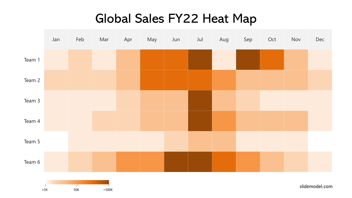
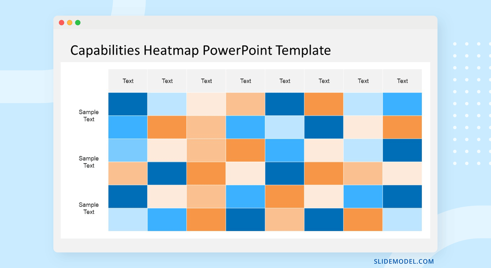
3. Matrix Heatmap
The Matrix heatmap uses a two-dimensional matrix to represent the phenomenon. This is a grid map with rows, columns, and cell colors representing data. The matrix heatmap depicts the magnitude of a phenomenon based on a 2D matrix, with each category or trait representing a dimension (e.g., year, month, and temperature).
An example of a matrix heat map is the following analysis of the sales team. Each row represents a sales team; each column represents a month of the year. Each cell represents the amount of sales completed, with a gradient coding.
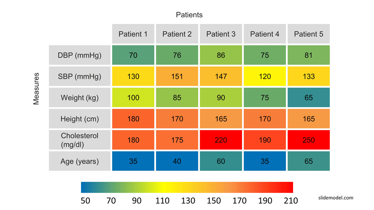
4. Clustered Heatmap
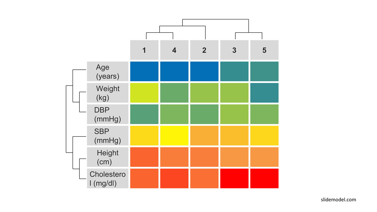
Clustered heat maps specialize in matrix heat maps. Generally used in medicine, biological studies, and mathematics, their purpose is to aid in the visual comparison of sample sets. To help users understand the structure, everything starts with a matrix heat map, where columns are “measuring sets”, and rows are the measured variable. Each cell contains the magnitude measured for the pair set value. Then a clustering algorithm is applied to create Dendrograms, first for the variables (rows), later for the sets (columns). The clustering algorithm is out of the scope of this article, but we will use an example to understand the process of creation assuming the dendrograms are created by a black box.
A common use case we can describe is the comparison of laboratory tests of patients. Each column of the matrix will represent a patient. Each row will represent a variable measured. Each cell will be the magnitude of the variable for the patient.
The first image shows the matrix heatmap, without the clustering:
The second image represents the clustered heatmap once the dendrograms have been applied and the rearrangement of the matrix has been applied, according to the clusters.
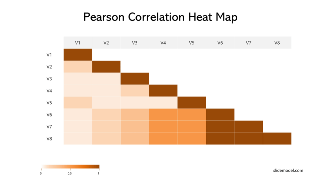
5. Correlation Heatmap
Another form of the grid heatmap is the correlation heatmap. This visualization is used to interpret the correlation phenomena of a set of measured variables.
In the columns and the rows, the variables are displayed. Each cell represents the combination of the row variable with the column variable. This matrix is the cartesian product of the variables set. Each cell contains the calculated correlation between the variables. Correlation algorithms differ, but the correlation heatmap stays the same for all of them. As a particular structural behavior, the diagonal of the matrix has the correlation of one variable with its own, which is always 1, and the number of columns is the same as the rows, so it is a square matrix. A correlation is the same below the diagonal, or above, a triangle is used.
You can easily present a correlation matrix using a PowerPoint table as shown above and add the colors based on your coding.
When dealing with a large number of variables, the suggestion is to use excel, as you will be able to embed the result in your presentation and control several aspects of the table such as colors, layout, and display.
6. Abstract Positioning Heat Map
Abstract positioning heatmaps are those where the spatial canvas is not a geographical map, but another kind of plane that wants to be analyzed by a ranging phenomenon. The positions in the plane are determined by a cartesian X, Y-axis; the plane is set as a background, and the phenomena are placed with the intensity defined by the color code selected. To better understand these heat maps, we will drill down into two popular examples.
a. Web Heatmaps
Web heatmaps have become very popular to understand user behavior on web pages. With the modern javascript libraries that allow tracking users’ clicks and navigation in the browser, webmasters are able to record this information and summarize it over a static canvas of the web page. The heatmap consists of using the web page or application as the canvas and placing in a new layer, the clicks and movements of the users using simple X, and Y positioning. To picture an example, you can see how users interact in the SlideModel Homepage in the following web heatmap:
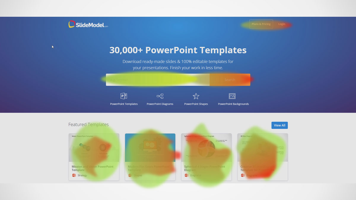
The color code is intuitive. The nearer to reading, the more concentration of click. Nearer to green less concentration.
Web heatmaps need to be created with special tools. In order to present results, we suggest generating a high-fidelity heatmap and placing it as an image in the PowerPoint Presentation as an example.
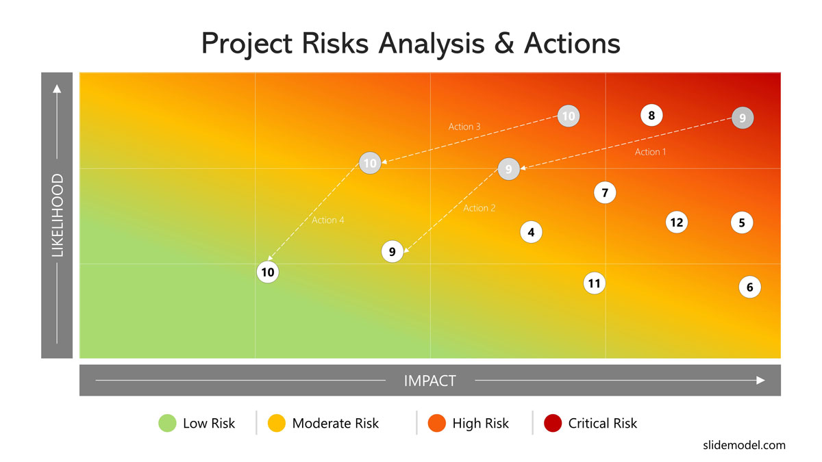
b. Risk Heatmaps
Risk heat maps are very popular in the project management space. Conceptually is a simple chart, with X-axis denoting the impact of the phenomenon and the Y-axis representing the likelihood of occurrence. A simple color code is defined for the range where 0 is green, the midpoint is yellow and higher points of impact occurrence are red. With this gradient definition, a colored heatmap is created as the canvas background. Over the canvas, the different risks analyzed are categorized, and then action and plans are defined to take them from the start point in the heat map to the desired location of lower impact occurrence.
Using SlideModel’s Gradient Risk Matrix, you can create your own Risk Heat Map in PowerPoint.
How to Present a Heatmap Analysis to an Audience
The following sequence of suggestions will help you structure your heatmap presentation. It covers the pillars your message will need to address for everyone to understand your heatmap visualization and how they were interpreted to draw conclusions.
Step 1 – Introduce the data (observations and variables)
Before you show your heatmap to the audience, it might be necessary to explain the data, how observations are recorded, over which spatial space will be placed and which are the magnitudes of measurement. Instead of displaying the actual map, you can perhaps use a snapshot in your introductory or title slide to give a taste of what’s coming.
Step 2 – Start with a Complete View of the Space
To explain your heatmap, you can begin by showing a complete overview of the map. A bird’s eye view will help you place the spatial axis over it, and if needed, is the memento to address any caveats about precision and assumptions over the map.
For example, if you decide to go with a pixelated world map, instead of a geographic map, you can explain how many points will represent the volume of the area, or if the location of the measured value is approximated.
Step 3 – Highlight the Phenomenon
Once you have explained the different dimensions in the heatmap you need to explain the phenomenon being colored. Explain the color code and the gradient selected. Make sure the range is clear, and what you plan to state in your thesis. If you are trying to find similarities in the data (when you use correlation heatmaps or clustered heatmaps) explain the grouping criteria of colors. If you are trying to explain intensity or lack of it, explain the criteria of high and low. Even though colors are generally related to the same metaphors (red = hot, blue = cool) explaining the metaphor applied is always recommended.
Step 4 – Explain the Map for Comparison and drill up/down
If the map shows a small area or you need to present a small set of data, even a single slide might suffice; however, for more complex maps, you can break down the phenomenon by focusing on part of the map as you present your slide.
For example, suppose you represent a geographic spatial map showing a weather phenomenon. In that case, you can show the areas most affected by the phenomenon, followed by those least affected, to create a comparison. For this purpose, you can divide the map into multiple slides or use Slide Zoom in PowerPoint.
When using Choropleth Maps, it is common to drill down from Regions, into sub-regions. As explained earlier this visualization is biased by the fact that a complete region is the aggregation of values of sub-regions. So it is wise to include in the analysis some kind of drill down that might spot certain behavior along the borders of regions.
Step 5 – List the insights that the heat map provides
After navigating the heatmap, focus on presenting the identified insights. For example, in the scenario of a web heatmap presentation, identified insight might be how many times users press a button, or how they ignore certain call-to-actions on a web page. In a correlation heatmap, some variables might show a high correlation through a big colored space, showing this associative force. Another example of insight could be comparing heatmap snapshots, for example, global temperatures in 2000 vs global temperatures in 2020, and how the heatmap shows the change over time.
Step 6 – Concluding Your Heatmap Presentation
You need to conclude your presentation with the formulated hypothesis, how the heatmap provides insights, and how they can be interpreted to draw conclusions or new hypotheses.
Heatmap Tools
Different tools can be used for creating and presenting heatmaps. We have listed a few tools that you might find helpful in creating a heatmap.
Construct a Matrix Heatmap in PowerPoint
You can create a grid heatmap in PowerPoint by either constructing rows and columns to form a plain PowerPoint Table or using third-party PowerPoint templates as the ones provided by SlideModel. Starting from a heat map template will help you save time, applying a professional layout without the hassle of structuring the whole slide’s visual look and feel. Just download the grid matrix you liked and fill it with your values and grid colors.
Charticulator by Microsoft
Charticulator is a free tool by Microsoft for creating different types of dynamic visualization. Heatmap is one of the types of visualization that you can create in very simple steps. The most important value about this tool is that the visualizations you create are data driven, so if you change the dataset, the visualization will adapt accordingly. You can use your data to create charts and export them as an image, HTML, Power BI custom visual, and a Charticulator template. We recommend generating image charts and importing them into PowerPoint.
For example, we decided to create a very simple matrix heatmap. For this we used the Latin America demographics dataset of the World Population Prospects. United Nations. 2019.
Step 1
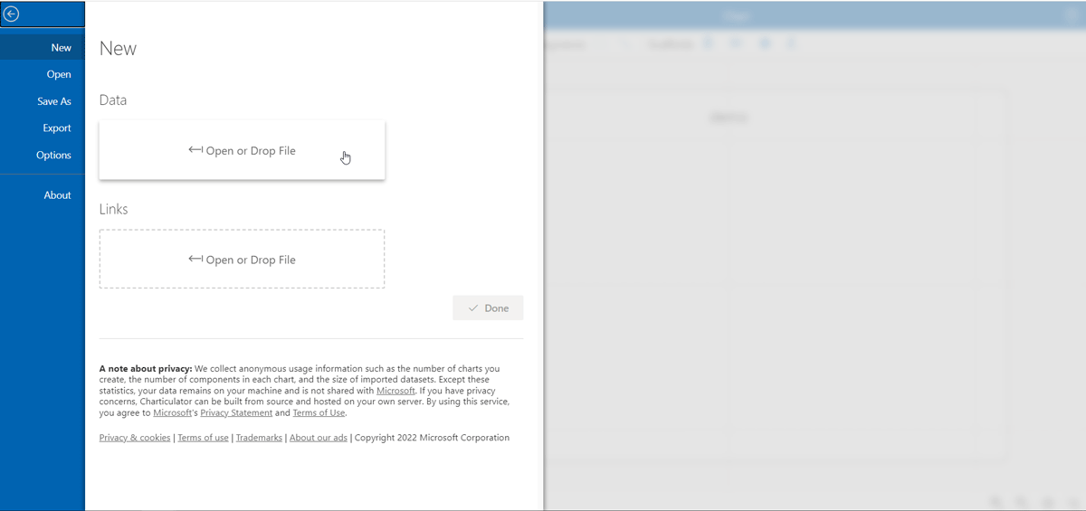
We start Charticulator with a new chart:
Step 2
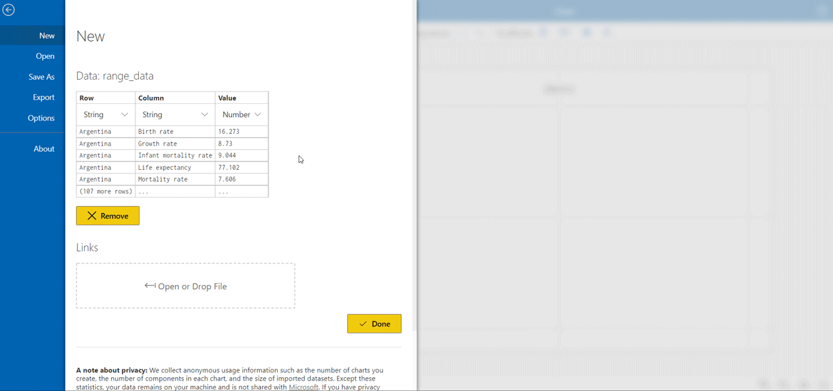
We import the CSV dataset. You will see a preview. Using a CSV importer can streamline this process, especially when dealing with extensive datasets.
Step 3
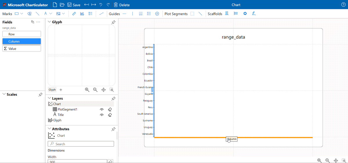
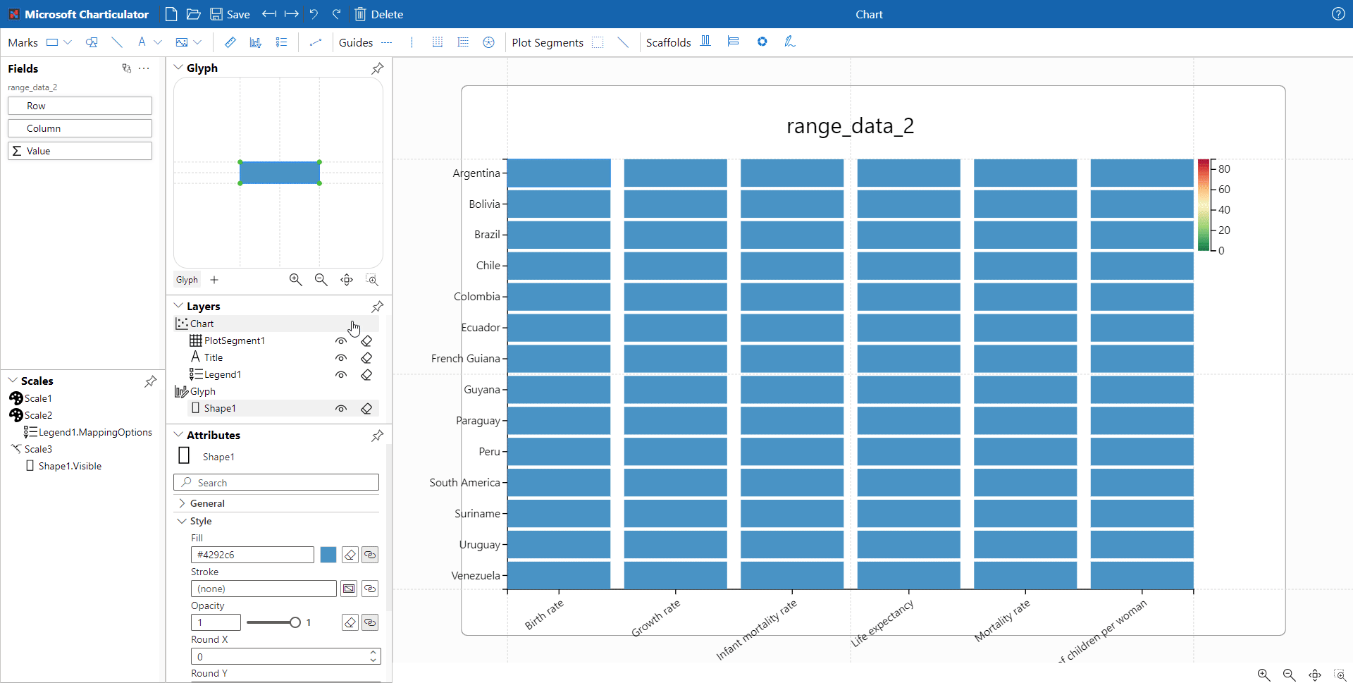
Once you imported the dataset, you will see in the left pane, the dimensions (named Rows and Columns). Drag the Row dimension to the Y axis of the editor, and drag the Columns dimension to the X axis:
Step 4
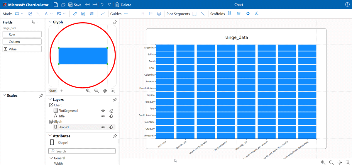
Once you have the dimensions, you need to build the shapes to represent the values. Charticulator calls the elements “Glyphs”. Go to the glyph editor and create a rectangle. This shape will hold the value of the X,Y position.
Step 5
Select the shape in the glyph editor (a menu with the layers section will appear). To configure the heatmap coding just drag the “Values” metric in the left pane, into the Shape Style Fill.
Step 6
Select the “SUM” metric function, then select the gradient coding of your choice.
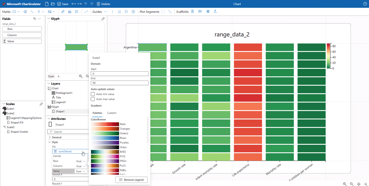
Step 7
Customize the final details, and finally export to SVG
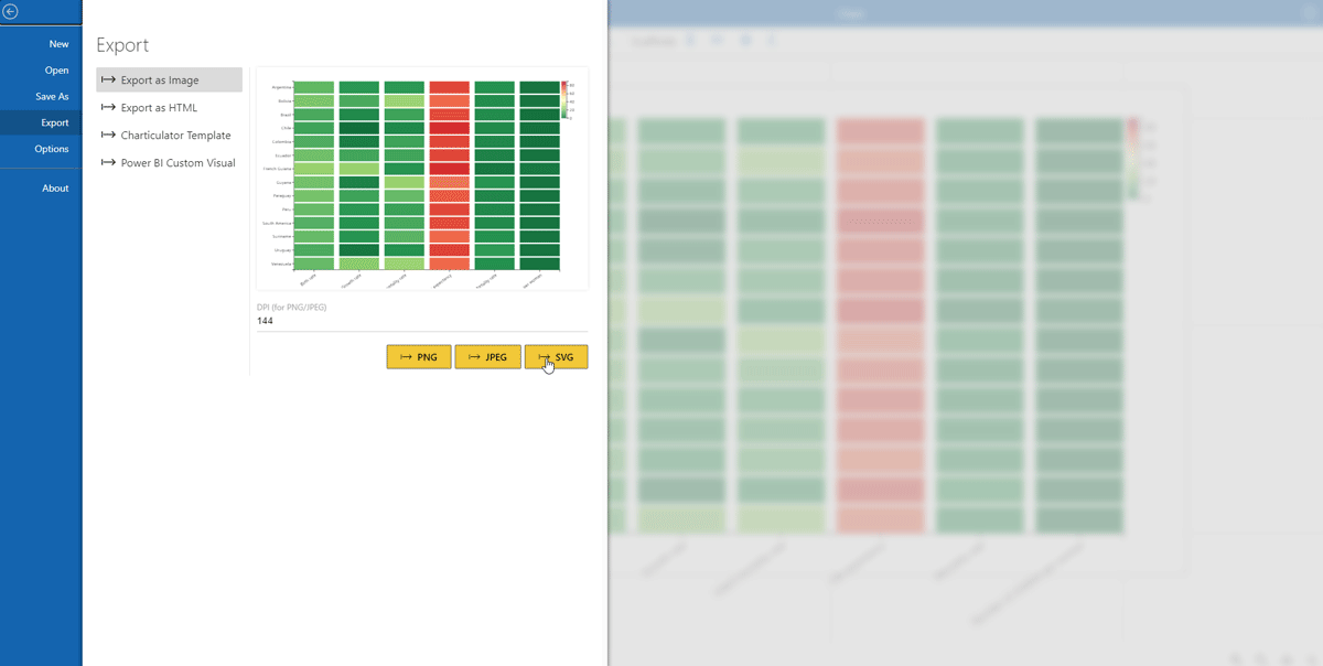
Step 8
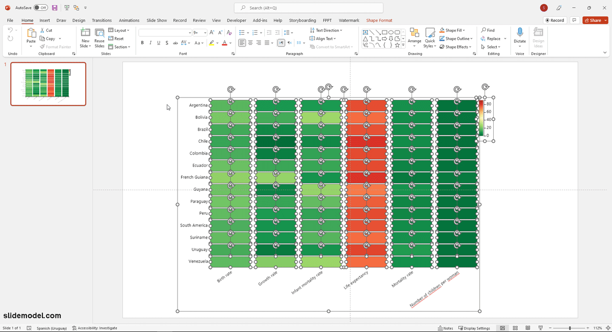
Import the heatmap in PowerPoint as an SVG object.
Tableau
Tableau is a business intelligence and data analysis platform. You can visually represent different data types and present them using different display possibilities. Tableau enables end-users to create and present heatmaps.
Users can create heat maps in Tableau using highlight tables that are used for categorical data comparison using colors. You can import your data in tableau and use drag and drop to create highlight tables as heatmaps. Once you create your heat map (spatial or grid) you can include it in your presentation through an embed.
Learn how to embed tableau in PowerPoint with our tutorial.
Power BI
Power BI is a powerful tool from Microsoft that allows creating visualizations with a variety of data sources. Among their core library of visualizations, it provides geographical heat maps, choropleth maps, Bubble heatmaps, and Grid heatmaps.
If you use PowerBI desktop you can export the visualizations as Images or Vectors, the latter being extremely customizable with your Presentation theme. If you use the PowerBI service, and you publish your visualization in your account, you will be able to embed it in PowerPoint using the PowerBI Add-in, which now is part of Office 365.
Spatial Heat Maps for Excel
Geographic Heat Maps and Choropleth maps are part of Excel charts. You can create the heat maps in excel and embed them in your presentation as any other kind of chart.
How to insert a Heat Map from Excel to PowerPoint?
PowerPoint allows you to embed your Heat Maps made in an Excel spreadsheet. Thanks to this functionality, you will be able to present your heat maps in a professional way and with accurate data.
Final Words
Heatmaps, be they spatial or grid heatmaps, can be extremely powerful visualizations to represent the intensity of a phenomenon.
How a heatmap chart is used depends on the type of data used and the kind of heatmap constructed for its representation. Heatmaps can be easier to interpret than many people might think. However, accurately plotting your heatmap requires careful consideration. Tools like Power BI, Tableau, and Charticulator can help you construct heatmaps from existing data.