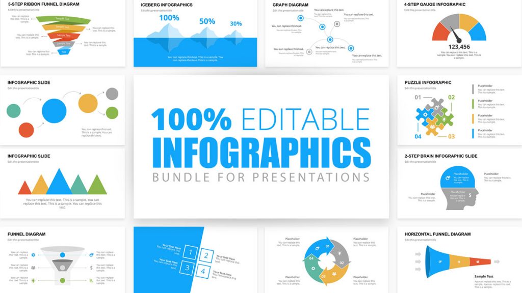
If your infographic presentations aren’t getting noticed as you’d like them to, they’re likely missing something. It’s time to add some visual metaphors and other design techniques to your slides to make your information more visual and engaging.
In this guide, you’ll learn how to make an infographic in PowerPoint and use SlideModel templates to create attractive Infographic slides. With the help of visual metaphors, infographic illustrations and more graphic design elements, you’ll be able to put together infographic presentations like never before.
Table of Contents
- What is an Infographic?
- Which type of infographic should you use?
- What is the purpose of using an infographic slide in a presentation?
- How To Make An Infographic In PowerPoint
- Tips for preparing data for effective infographics
- How to use SlideModel’s ready-made infographic templates to make your infographic in PowerPoint
- Create Engaging Infographic Presentations with SlideModel Templates
What is an Infographic?
An infographic is a visual that tells a story with data and information. Once upon a time, infographics were a design and marketing trend doing the rounds on blogs and social media. They were a welcome and fun take on the boring data we were all bored with. Nowadays, infographics have evolved into being relevant in any type of documentation that tells a data or information story. They’ve stopped being a trend and have justifiably taken a spot in the quintessential content stack for all businesses.
An infographic is a visual that tells a story with data and information.
Frequently, the terms ‘data visualization’ and ‘infographic’ are used interchangeably to describe graphics that visualize information. But there are some differences to take into consideration.
A data visualization is generally a chart or graph that must be read to understand. What differentiates it from an infographic is the way it’s put together. An infographic contextualizes data instead of just visualizing it, it’s a more creative approach that democratizes the way data is understood.
Infographics are sometimes made up of a collection of data visualizations, optimized to be more easily understood and more engaging than just a regular chart.
You can create an infographic however you like, as long as you’re using data visualization techniques and visual metaphors visually tell an informative story. You can even make an infographic with PowerPoint. Even better, use SlideModel templates to help you set it up.
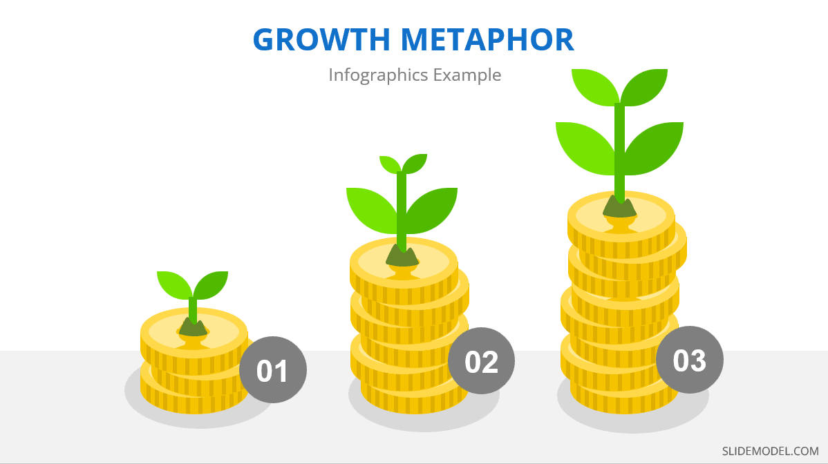
Every infographic tells a story, and stories use visual metaphors to help readers relate to the content. These details convert regular charts into infographics, making them more memorable and engaging.
Visual metaphors are graphic elements that help tell a story in an infographic. For example, imagine a data visualization comparing water usage in cities and villages. In a simple chart without visual metaphors, you must dig deeper into the information to understand what is being analyzed. This only makes sense if the chart is included within a text that gives background and context.
Now, imagine this chart information with visual metaphors like icons of cities and villages and visualizations of drought. When visual metaphors are done well, the viewer can deduce what the infographic is about much faster through an ‘Aha Moment’ of understanding. This leads to the shareability of the infographic and easier communication between the presenter and the audience.
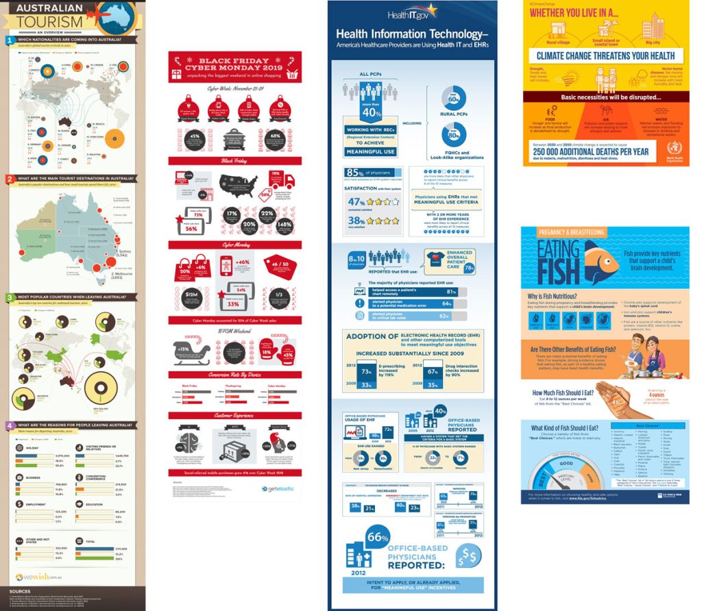
One of the greatest visual metaphors in infographic design is The Iceberg Model. This visual metaphor is of an iceberg sitting part underwater and a small section peeking over the water. The idea is that we see only what’s above water level, while everything else is hidden under the surface.
Which type of infographic should you use?
The type of infographic your team needs depends on if you will share contextual information, numerical data, or a progressive flow. Infographics are grouped into three main content categories; Information, data, and process. Let’s dig deeper.
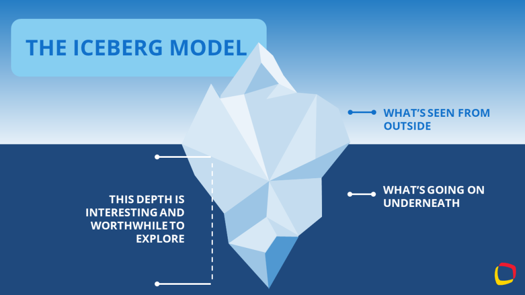
Informational Infographic
The purpose of an informational infographic is to share contextual information with the help of visual storytelling.
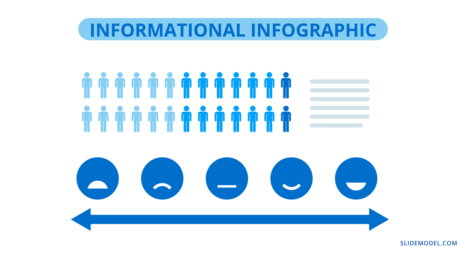
This type of infographic doesn’t usually include charts or graphs, it uses elements like icons, illustrations, numbers and shapes alongside short text. Information design projects like editorial and journalistic graphics, wayfaring and museum displays also fit into this category.
List Infographic
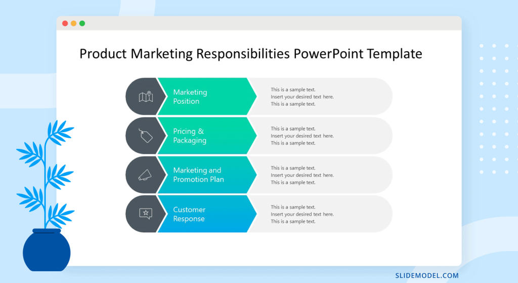
Creating an eye-catching list infographic is easy. Use icons and shapes to create visual sections for each list item. On each slide, include 3 or 4 list items and create a visual continuity between all slides that visualize the list. Alternatively, use a custom size slide in PowerPoint to create a vertical list infographic with a portrait layout. That said, you can use SlideModel templates quite easily on a custom-sized PowerPoint slide or learn how to change the slide size in PowerPoint here.
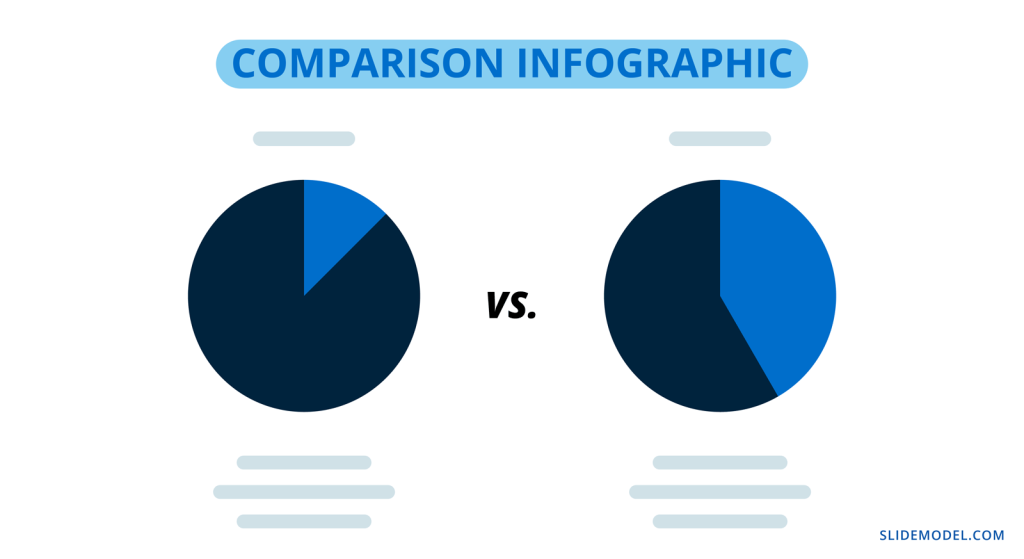
Comparison Infographic
A comparison infographic does what its name states. It compares two or more topics as visually as possible. There are several ways to visualize comparisons from simple to complex; in tables, bubble maps, and side-by-side widgets. Comparison infographic slides are great inside proposals and pitches.
Anatomical Infographic
An anatomical infographic visualizes all the parts and characteristics of a single topic, object, or person. Generally, the central visual topic is a physical object, not a concept. Parts of the main topic are then explained with text and graphics connected with lines. The most common use for anatomical infographics is in education and training.

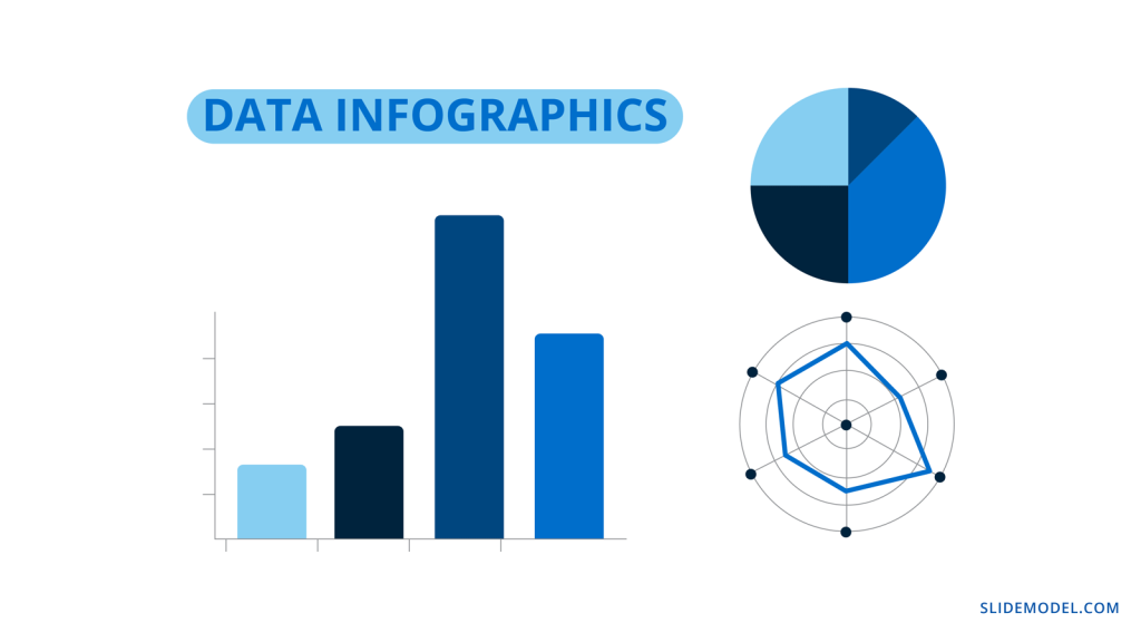
Data Infographics
Eye-catching Data infographics are made up of data visualizations, anywhere from one to multiple visualizations. Often, the question arises if a single chart is also considered an infographic. Technically, yes, but it will depend on its visual quality and the viewer to decide for themselves.
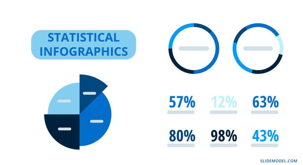
Statistical Infographics
Statistical infographics are the most data-centric of all the examples in this guide. These are the ones full of numbers and charts of all types to visualize information like survey results, research studies, sales and market analyses.
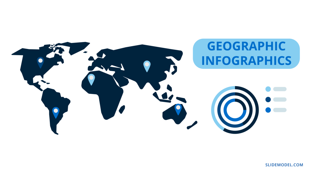
Geographic Infographics
Geographic infographics are made up of location data with maps and legends. They are used to present regional data. Maps can be color-coded to show geographic data from research studies, polls, and census records. Infographic map elements can also be added with location pins.
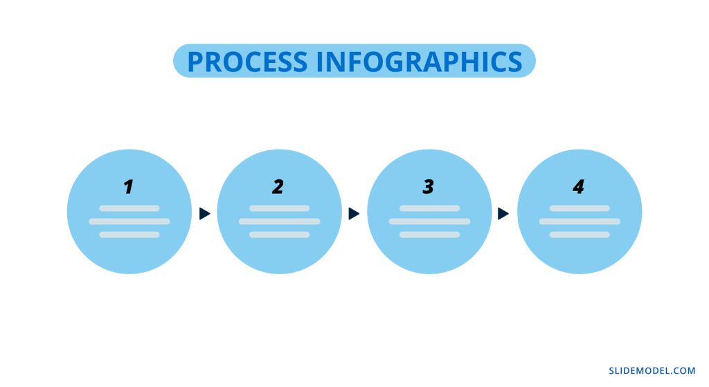
Process Infographics
Finally, the third type of infographic your business needs to know about is the process infographic. In this case, the idea is to visualize any type of information that follows a process or timeline.
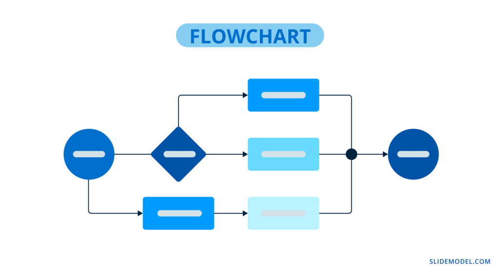
Flowchart Infographic
A flowchart infographic is very versatile in what it does. It allows you to put together a process visually in many different ways. Create decision trees, dichotomous charts, and flowcharts of any type.
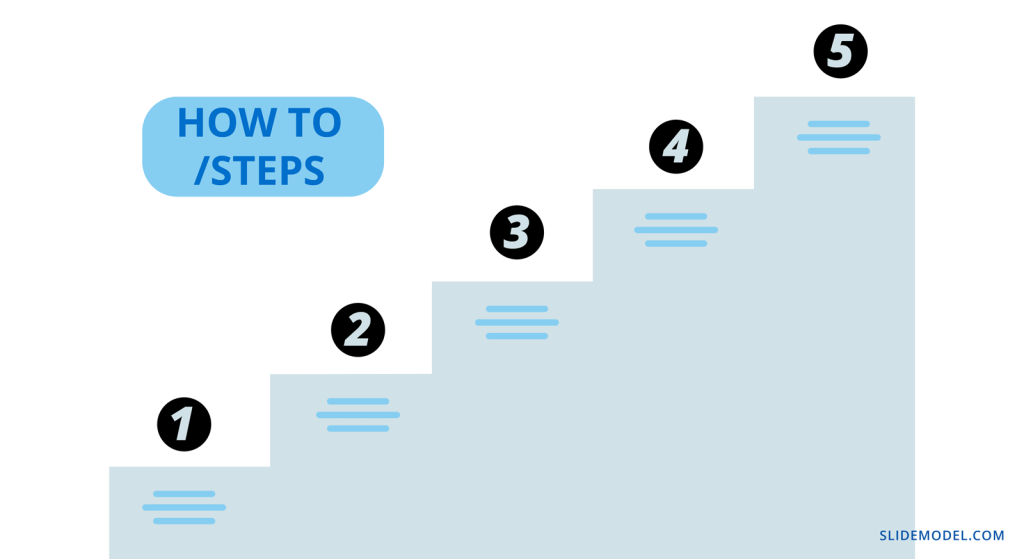
How to / Steps Infographic
One of the most common process infographics is the How-To or Step by Step visualization. There is no limit to how you can create a process infographic like this one. It can be long and vertical or a series of continual slides. These are ideal for training manuals and orientation packets.
Timeline Infographic
A timeline infographic can visualize a series of past events or an expected flow of future events. For example, an About Us slide in a pitch presentation can include a growth timeline.
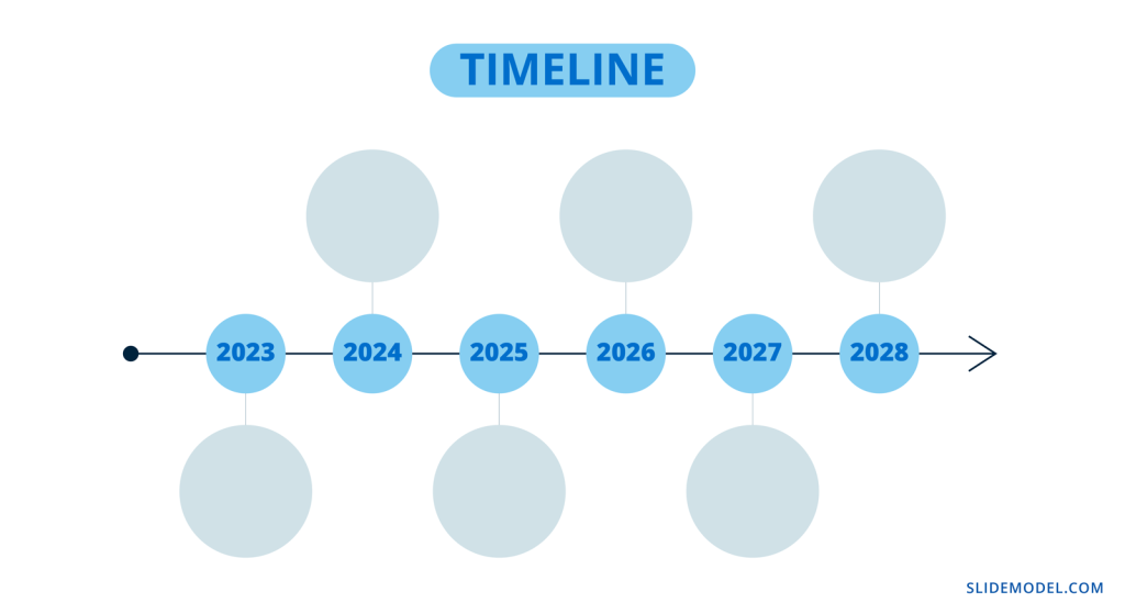
Likewise, in a proposal, you can add a roadmap of goals for the future. Check out our Roadmap templates and Timeline templates for more timeline infographic designs.
What is the purpose of using an infographic slide in a presentation?
Many presentations benefit from one or more infographic slides in the deck. Every business topic has some data or informative aspect that needs analyzing, visualizing, and explaining.
Infographic elements are ideal pieces of the puzzle to tell a story with a presentation. They support the information you’re sharing by making it easier to understand and attractive to look at.
Gone are the days of bullet points and a mishmash of stock photos. Infographic slides are essential when building business decks, they visualize the most important information for your audience.
Visual representation of data engages the viewer’s curiosity and helps with memory and retention.
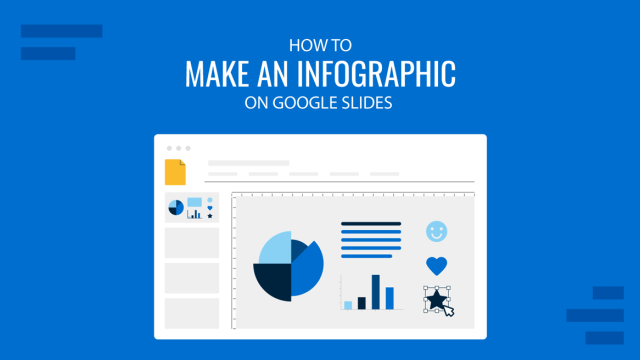
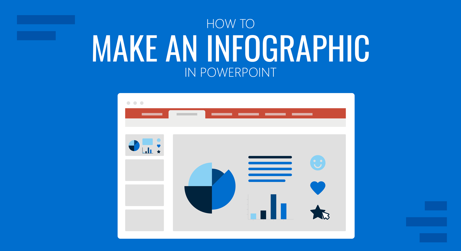
How To Make An Infographic In PowerPoint
Making an infographic in PowerPoint is easy, especially with SlideModel infographic and diagram templates to help. We’ve put together an actionable step-by-step tutorial for your next infographic.
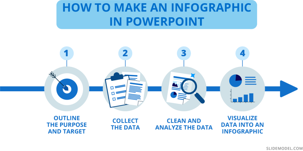
1. Outline the Purpose and Target
Before doing anything, you need to strategize your infographic. What is the purpose behind it? What story do you wish to tell? Are you visualizing survey results, research data, marketing analytics, or something else?
Who is the target? Is it clients, readers, team members, or your teachers? Who are you creating this infographic for? Be sure to know how your target consumes infographics and takes that route; people relate to what they know.
Will you be making a presentation with slides in a portrait format or a vertical infographic? Do you have a lot of numerical data, or is it more informational? Here is a list of infographic options that you can make with PowerPoint and SlideModel:
- One or multiple infographic slides in a complex presentation
- Full Infographic presentation
- Long and vertical infographic
- Square; single or carousel.
Outline these things on a document and have them on hand as you go through the next steps. Take notes as things progress and change. Everything is flexible until you feel that the data story is being told as you envisioned it.
2. Collect the Data
Decide how you will collect the data. Will you conduct research, survey, and round up analytics from data monitoring tools? Will you use existing data from databases like Our World in Data (Population), CDC WONDER database (Health), or other reliable sources?
If you’ll be collecting data via research and surveys, your questions must reflect your purpose and make it relatable to the audience. The wording of the questions needs to be equitable and objective. If sourcing existing data, you’ll need to filter the exact data sets you need and ignore the rest.
Do not manipulate the questions or answer choices to tell the visual story subjectively. Always be objective. If the data reflects something different than you expected, don’t change it to suit your theory.
2. Clean and Analyze the Data
Considering your purpose and target, analyze the data and clean it to fit in your infographic. When choosing what data sets to visualize, manipulate the data objectively so that it’s clear and there are no redundancies. Only use the essential data you need to tell your story.
Separate quantitative and qualitative data into separate sections, as they need to be visualized differently. Quantitative data, i.e., numerical data, can be visualized in charts and graphs, while qualitative data will need percentage gauges and informational visualizations.
Scrape the final data into dimensions like geographic, demographic, cultural, political, and behavioral. This will help you figure out the best way to lay out the data visualizations to tell your story visually and share your findings.
4. Visualize Data Into an Infographic
Now it’s time to visualize the data and turn it into an infographic. When creating an informational infographic, it’s time to write or edit the content to be succinct and short. Do a quick draft of how the information should be laid out. If it’s a step by step or process, it should progress from the top down or from the left to right. Don’t go against natural reading patterns.
Select and take note of the infographic styles you’ll need for your slides or presentation. You’ll likely have to combine different ones to tell your data story completely. For example, a combination of statistical, list, and geography infographic slides is perfect for a visualization of a specific location, and its characteristics.
At this time, you have to consider the visual metaphors that’ll be part of your infographic presentation. How do you come up with the elements for visual metaphors? You can mindmap or brainstorm using keywords and concepts from your data set. For example, imagine your infographic slides about big cities’ wealth gap. You can use visuals or icons representing money, housing styles, and employee satisfaction and mix them up with percentage gauges, large numbers, and subtext. The point is that the visual metaphor creates instant acknowledgment from the viewer.
You’ll need to choose a color palette and font pairing that suits your infographic’s purpose and format. If you already have a branding kit, by all means, use that, otherwise, you can choose your own color palette. Select a font that is easy to read and doesn’t get in the way of the data.
One infographic template slide (it can be any) in different color palettes and font pairings. Four max, in a collage
Start visualizing data sets and place them in order on your canvas or presentation. On a vertical infographic, you’ll need to separate the area into sections that can be followed. Use bits and pieces from several SlideModel templates to create your ideal data composition. Add two or three data sets per slide in a presentation or carousel. Avoid using a single chart per slide; it loses infographic quality and ends up as just a chart.
PRO Tip: Using PowerPoint, you can first create a presentation using 16:9 slides where each slide represents a specific section, and then join all of them together to produce a vertical infographic layout.
Take a look at this infographic dashboard template and get inspired to create compositions like these, where the data sets are grouped per slide. Better yet, if each data group has a specific dimension or category. These can be separated and used as you wish in a vertical infographic.
Tips for preparing data for effective infographics
Here are some essential tips to help you prepare the data for your eye-catching infographics.
Know your data types
You’ll need to know what type of data you’re analyzing before you start visualizing it. All data is categorized into two main types; quantitative and qualitative. In turn, quantitative data can be discreet or continuous, while qualitative data can be nominal or ordinal.
Let’s take a look at what all that means.
- Quantitative data can be measured in numerical values. It answers questions like “how much” and “how many.”
- Discreet: Numerical data in complete integers, no decimals or fractions.
- Continuous: Precise numerical data that can be measured into decimals.
- Qualitative data is called categorical data and isn’t made up of numbers but words, symbols, or pictures.
- Nominal: Variables of data without an intrinsic order.
- Ordinal: Values that can be in order or hierarchical.
Use the data type to inspire the visual metaphors you include in the infographics. These are what help the viewer understand your data story faster.
Use clear data sets or data dimensions
Data dimensions, or data categorization, are essential to data storytelling. If these aren’t clear in the visualization, there’s no backstory or foundation to what is being explained. These are the most common data dimensions you’ll be working with:
- Demographic
- Geographic
- Political
- Behavioral
- Cultural
Many other data dimensions apply to specific topics or industries. For example, in social media marketing, you’ll use metrics such as reach, engagement, views, and followers. But each of these can be subdivided into the basic data dimensions above.
How deep and detailed your data dimensions are, depends on what you want to analyze and share with stakeholders, clients, or team members. The more you understand the dimensions of your topic, the better your infographic will be.
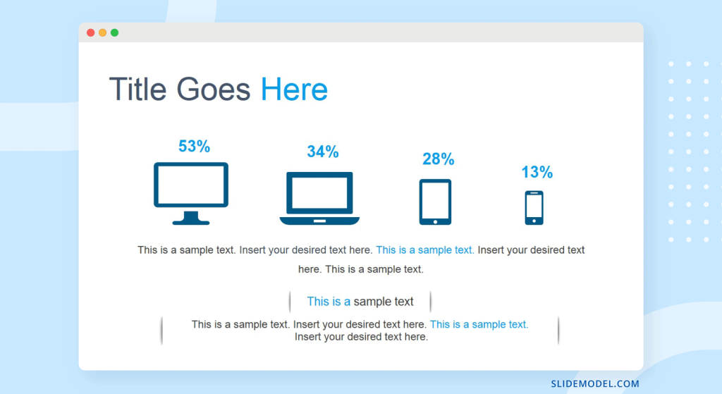
The slide below, for example, shows data dimensions for the different screen types on which people view a digital application.
Choose the right visualization for your data
Finally, knowing what data visualization to pick for your data is essential for a clear flow of information in your infographic. Infographics have a mix of visualizations that work together to tell a story.
Here’s an overview of what visualizations are best for what type of data.
- Quantitative percentages of a whole:
- Pie charts
- Donut charts
- Percentage gauges
- Quantitative Data that spans over time:
- Line graphs
- Bar graphs
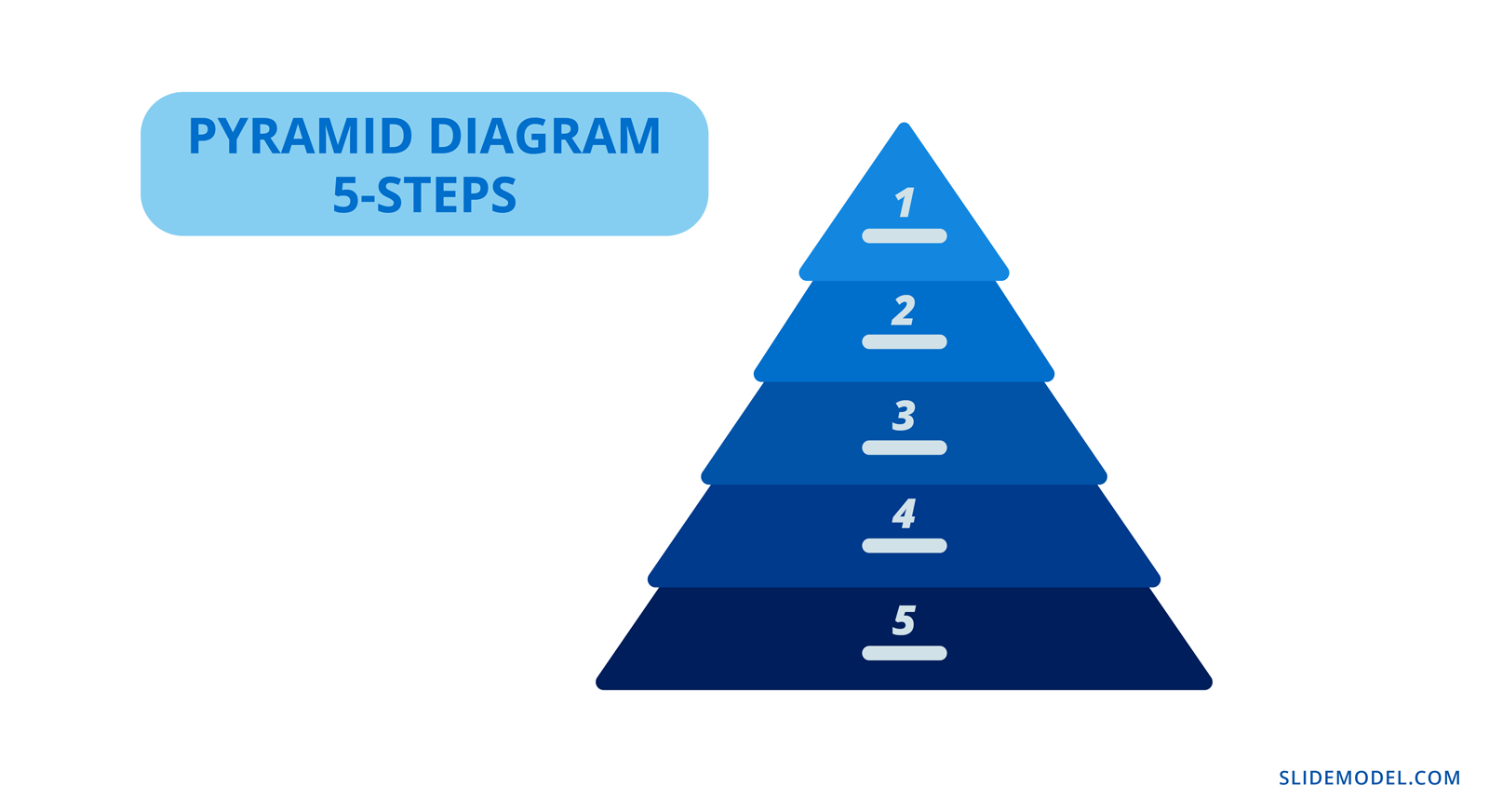
- Quantitative and Qualitative Hierarchical data:
- Pyramid charts
- Funnel charts
- Tree charts
- Quantitative and Qualitative Geographic data:
- Maps
- Color-coded
- Pinned
- Maps
- Quantitative and Qualitative Comparative data
- Tables
- Bubble charts
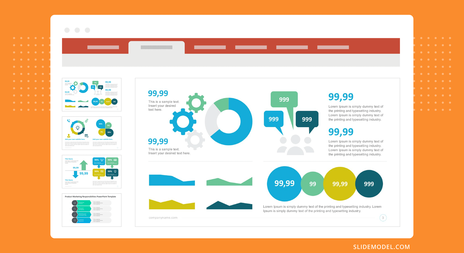
How to use SlideModel’s ready-made infographic templates to make an eye-catching infographic in PowerPoint
Creating an infographic with PowerPoint is much easier when you take advantage of SlideModel templates. We’ve created four infographic case studies to show you the possibilities. Let’s dive in.
Case Study Example 1: Political Analysis Infographic Presentation
A political analyst in Hawaii wants to create an infographic using the results of a recent poll. For this example, we sourced the data from the civilbeat.org website on a poll they conducted about constructing the Thirty Meter Telescope on Mauna Kea.
Let’s look at how this survey can be turned into an infographic presentation. Since there’s a set number of participants and the questions are multiple-choice, the data is numerical (quantitative) and best visualized in percentages. Percentages can be visualized in many ways. Pie charts and donut charts have long been the favorites, but you can try other styles for infographics.
“In the end, when it comes to displaying data — you need to do your best to design a simple story while being accurate.” – Kristi Pelzel,
Slide 1/Slide 2: Title: Will the Thirty Meter Telescope ever be built? Native Hawaiians hope it doesn’t.
Slide 3: 64% support of all voters polled the construction of the Thirty Meter Telescope.
Slide 5: 48% of Native Hawaiians and 53% under 50 don’t support it. (Icons of native Hawaiian and people under 50 and the percentages)
Slide 4: 50% oppose the protests about the TMT while 43% support them (thumbs up and thumbs down visual metaphor)
Slide 5: Mauna Kea already has 13 telescopes. (an outline of Manua Kea and 13 dots along it)
Slide 6: the Hawaii Night Sky Protection Act was initiated on July 1, 2013. (calendar and document visuals)
Slide 7: Mauna Kea is the highest of all the mountain islands and considered sacred by the native Hawaiians.
Slide 8: Construction of the TMT will cost at least, 2400 million USD. (Big number and money icon with the explanation)
Slide 9: Construction of the TMT on Mauna Kea is paused and might be constructed in La Palma, Tenerife. (The two islands and a line to connect them)
Take a look below at the complete infographic presentation for this case study.
Case Study Example 2: Admission Test Data Results Infographic Presentation
A university in Texas analyzes and visualizes admission test results for SATs taken on students’ graduation year. The purpose is to share the findings with high schools and other universities to help their students perform better on tests.
Each presentation slide is a section of the infographic. Repurpose it to create a 16:9 infographic presentation and a vertical visual infographic to use for other purposes.
We’ve outlined the visualization into sections. Each section is one slide.
Section 1: Texas High School students who SAT tests, perform differently according to ethnicity and economical advantage.
Section 2: The tested topics (Visualization of the topics tested. 1. Math, 2. Critical Reading 3. Writing.)
Section 3: Highest scores: Asians – 1110. Lower scores: Black or African American – 858
A big data set to set the scene, what ethnicity had the highest combined scores. Asian in both years.
Section 4: Economically disadvantaged test takers perform 20% worse than economically advantaged.
Section 5: Between 2007 and 2010 all combined test score results lowered year over year
Case Study Example 3: Marketing and Sales Infographic Presentation
A home security systems company wishes to share its marketing and sales performance in an infographic presentation.
The data is a collection of analytics results from the company’s CRM, customer segmentation and a popup poll on the website sent to repeat customers.
Slide 1: The power of marketing and sales in home security. More people wanted to feel safe at home in 2021
Slide 2: Sales totals per Q1, Q2, Q3, Q4 in dollar amounts. Q1: 780K USD Q2: 910K USD
Q3: 1.2M Q4: 2M
Slide 3: 25% percent of customers were new in 2021, 75% were repeat customers.
Slide 4: 68% of customers live in the east coast of the US. 80% live in cities, 75% in a house
Slide 5: 95% of customers say they’d recommend the product to friends
Case Study Example 4: Social Media Marketing Campaign Performance Infographic Presentation.
A marketing agency has created a social media campaign for a client and wishes to share the results in an infographic.
During and after the campaign, the marketing manager collected all UTM data leading to a dedicates landing page, plus all social media analytics for the posts about the campaign using a special hashtag. Using all this data, they created an infographic presentation to show the client.
Slide 1: Marketing with dedicated hashtags and landing pages have better results for market positioning.
Slide 2: Total followers per Social Channel before and after (social channel icon and arrows going up)
- Instagram – 15K – 17K
- TikTok – 3.5K – 5.2K
- Facebook – 12K – 14K
Slide 3: Churn percentages before and after the campaign
Before: 31% After:25% (exit sign and entry sign)
Slide 4: Percentages of hashtag use. Instagram: 56%, TikTok: 37%, Facebook: 7%
Slide 5: UTM links navigation to landing page, 156K in one month.
FAQs
What are visual metaphors in infographics?
Visual metaphors are graphic elements that help tell a story visually in an infographic, allowing the audience to relate to the content more quickly. For example, using an iceberg to illustrate what is seen versus hidden aspects of data.
How can I use SlideModel templates to create an infographic in PowerPoint?
SlideModel provides ready-made infographic templates you can use to quickly create visually appealing infographics. Simply download the templates, customize them with your data, and adjust the visuals as needed.
What are the benefits of using infographics in presentations?
Infographics make presentations more engaging by visualizing important information. They help the audience quickly understand complex data, improve retention, and make the content more memorable.
How do I decide which type of infographic to use?
The type of infographic depends on the kind of data or information you want to present. For instance, if you’re sharing statistics, use a statistical infographic; if you’re comparing two options, use a comparison infographic.
What is the difference between an infographic and data visualization?
Data visualization typically refers to charts or graphs that present data. Infographics take it a step further by contextualizing the data with visual metaphors and storytelling elements, making it easier to understand and more engaging.
How do I choose the right visualizations for my data?
Choose visualizations based on the type of data. For example, use pie charts or percentage gauges for showing parts of a whole, line graphs for data over time, and maps for geographic data.
Can I use PowerPoint to create a full infographic presentation?
Yes, PowerPoint is a great tool to create infographic presentations. You can use it to make individual infographic slides, a full infographic presentation, or even a long vertical infographic.
Create Engaging Infographic Presentations with SlideModel Templates
The SlideModel PowerPoint template library is a vast resource for your infographic creation needs. With an unlimited plan, you have access to all presentation templates, with which you‘ll be able to create not just one infographic presentation but as many as you want.
Do you want to create vertical or square infographics on PowerPoint? Download the SlideModel templates you might need and mix and match the elements in your PowerPoint canvas. Your infographic presentations will never be boring again.