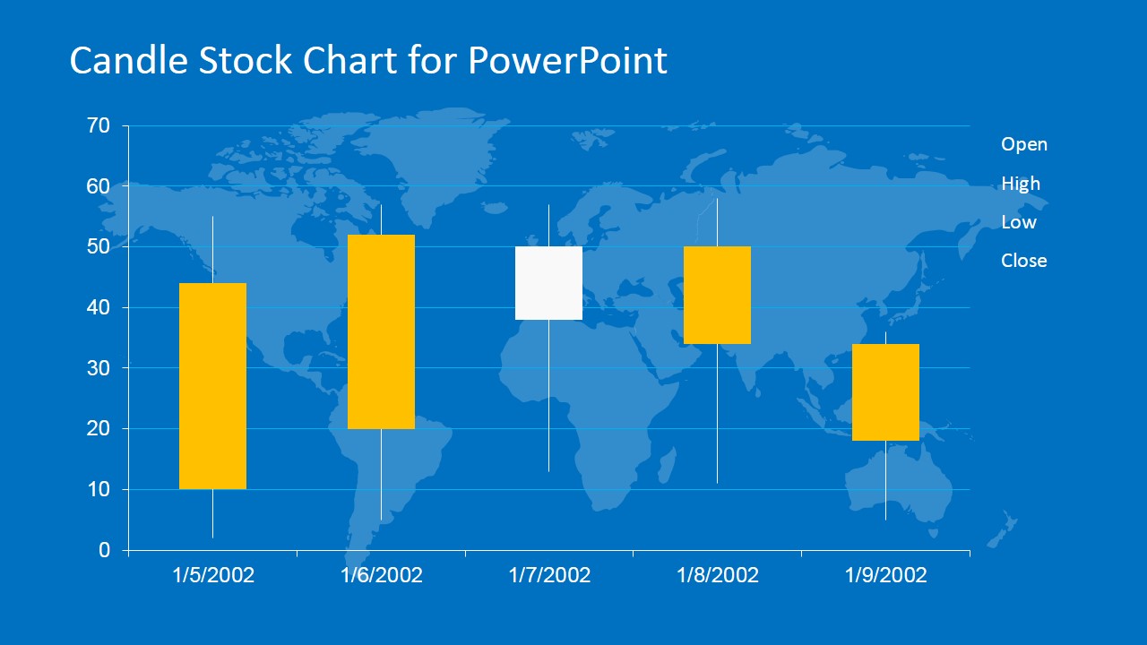
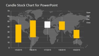
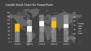
Candle Stock Chart for PowerPoint is a data-driven chart template that you can use to prepare stock market & financial PowerPoint presentations with a candlestick chart.
The candlestick chart was introduced in Japan during 17th. century and it was widely used for technical analysis to trade rice. The US version was initiated by Charles Dow around 1900, although many of the guiding principles were very similar.
What’s inside this template
Example presentation scenarios
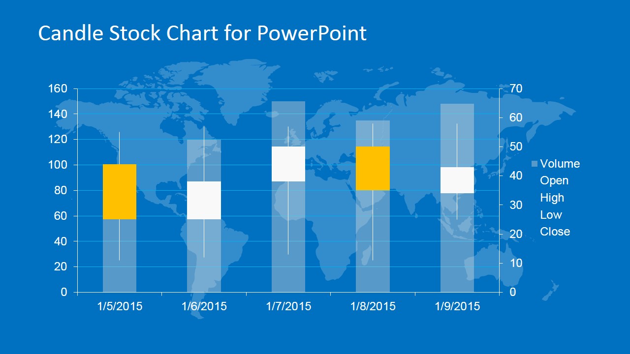
- A financial analyst can use the candlestick plus volume chart to report short-term price action and trading activity during a market update.
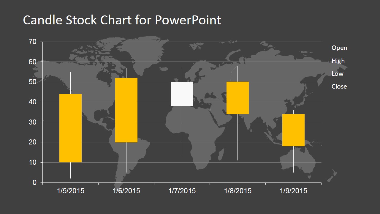
- An investment advisor can use the dark candlestick chart to explain open, high, low, and close movement to clients in a portfolio review.
- A trading educator can use the blue OHLC chart to teach how candlestick bodies and wicks communicate daily market behavior.
- A portfolio manager can use the volume columns and price candles together to discuss whether a price move is supported by trading volume.
Features
- 100% editable presentation template
- Compatible with Microsoft PowerPoint and Google Slides
- 16:9 aspect ratio slides
- Scalable vector shapes, icons and illustrations
- AI-Ready for Microsoft Copilot and Claude
- Instant access and download
Frequently asked questions
Q: How should a presenter explain a candlestick chart clearly with this template?
A: Start by defining the candle body and wick before interpreting the pattern. Use the legend on the right to point to open, high, low, and close, then walk left to right across the date axis. On the volume slides, connect the price move to the bar height so the audience sees both direction and trading activity.
Q: Who is this template best suited for in a business presentation?
A: This template fits presenters who need to discuss price behavior rather than broad company performance. Financial analysts, portfolio managers, investment advisors, and trading instructors can use it for market updates, stock reviews, or technical analysis training. The layouts are strongest when the audience already expects chart-based evidence.
Q: Why do the map background and dark or blue themes work for stock market analysis?
A: The world map background frames the topic as global finance without replacing the chart as the main evidence. The blue version feels like a dashboard or market terminal, while the dark gray version places stronger contrast on the yellow and white candles. This visual hierarchy helps viewers focus on price movement first.
You may also like:

Candle Stock Chart for PowerPoint
4-slide presentation template for candlestick stock charts, volume bars, and technical analysis reports
Candle Stock Chart for PowerPoint is a 4-slide data chart template for finance and investment presentations. It contains candlestick price charts, candlestick plus volume views, date axes, legends, and world map backgrounds. Analysts, traders, and finance teams can present open, high, low, close, and volume data in Microsoft PowerPoint or Google Slides.
- Category
- Data & Charts
- Rating


 Loading...
- Aspect ratio
- 16:9
- Item ID
- 6691-01
- Colors
 Microsoft PowerPoint
  Microsoft Copilot
  Claude for PowerPoint
 Other formats supported
Subscribe today and get immediate
access to download our PowerPoint templates.