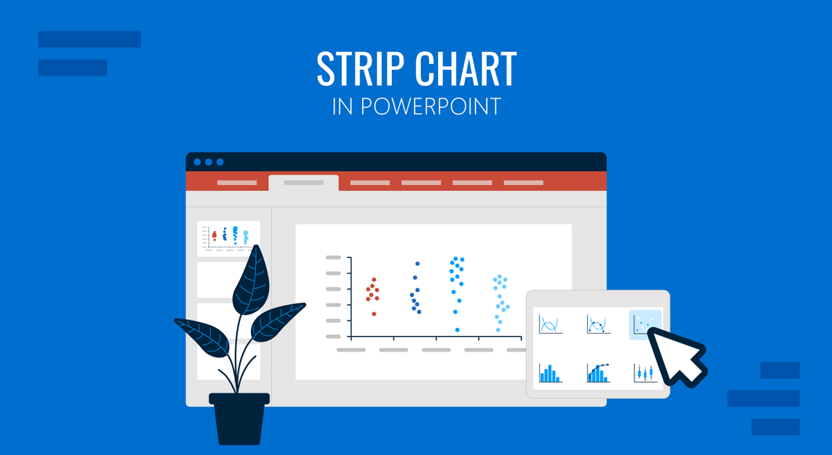
Common types of PowerPoint charts used for presentations often include bar charts, pie charts, and line graphs, but sometimes a simpler chart can provide a clearer view of how data is distributed, such as a strip chart. If you are new to such charts, a strip chart in PowerPoint can display individual observations along a single axis, helping reveal patterns that might be hidden in aggregated charts.
When you need to compare survey responses, visualize quality control measurements, or present performance data, strip charts can offer a straightforward way to communicate variation and distribution. In this guide, we will explain what a strip chart is, when to use it, and how to create one in PowerPoint using built-in chart tools.
What is a Strip Chart and When to Use One
A strip chart is a graphical representation that plots individual data points along a single numerical axis. Unlike bar charts, which summarize values, strip charts show every observation separately, making it easier to identify clusters, gaps, trends, and outliers. Since the chart displays data along one dimension, it is sometimes referred to as a one-dimensional scatter plot. In many contexts, it is also called a dot plot when individual values are represented as dots. For example, if a company records customer satisfaction scores from 1 to 10, a strip chart can display every response individually rather than showing only averages.
Strip charts are useful when you want to show the spread of data rather than just summary statistics. Common applications include survey results, quality-control measurements, employee performance scores, product-testing results, educational assessments, and research presentations. They are particularly effective when working with relatively small datasets where every observation matters.
Strip Chart vs Dot Plot vs Scatter Plot
As strip charts, dot plots, and scatter plots all use points to represent data, they are often confused with one another. While they share some visual similarities, each chart type serves a different purpose and is designed to answer different analytical questions. Understanding these distinctions can help you choose the most appropriate visualization for your PowerPoint presentation.
Strip Chart
A strip chart displays individual observations along a single numerical axis, making it useful for visualizing data distributions. Every value is shown as a separate point, allowing viewers to quickly identify clusters, gaps, concentration of values, and potential outliers. Strip charts are commonly used for quality control measurements, survey results, test scores, and other datasets where seeing each observation is important. Unlike many summary charts, a strip chart does not aggregate data into averages or totals. Instead, it reveals the spread of individual values within a dataset. Although these chart types share a similar visual style, their purpose differs significantly. Strip charts emphasize distribution, dot plots emphasize frequency, and scatter plots emphasize relationships between variables.
Dot Plot
A dot plot also uses dots to represent data values, but repeated observations are often stacked vertically above the same value on the axis. This makes dot plots particularly useful for showing frequency distributions and identifying how often certain values occur. For example, if ten respondents selected the same survey score, a dot plot PowerPoint would display ten stacked dots above that value, making frequency patterns easier to recognize at a glance. In some fields, strip charts and dot plots may appear very similar, especially when there are few repeated values.
Scatter Plot
A scatter plot is designed to explore the relationship between two numerical variables. Each point is plotted using both an X-axis value and a Y-axis value, allowing analysts to identify trends, correlations, and patterns between variables. For example, a scatter plot might compare advertising spend vs. sales revenue, study hours vs. exam scores, or product price vs. customer demand. By contrast, a one-dimensional scatter plot PowerPoint chart displays the distribution of observations along a single axis and is commonly adapted into a strip chart. Unlike strip charts and dot plots, traditional scatter plots focus on relationships between variables rather than the distribution of a single dataset.
How to Create a Strip Chart in PowerPoint
PowerPoint does not include a dedicated strip chart option, but you can easily create one using a scatter chart. As a result, many users create a one-dimensional scatter plot PowerPoint chart and then modify it into a strip chart by assigning the same Y-value to all data points. This approach produces the appearance of a strip chart while using PowerPoint’s built-in scatter chart functionality. The steps below show you how to create a strip chart using a scatter chart.
Step 1: Go to Insert -> Chart -> X Y (Scatter), choose the basic scatter chart.
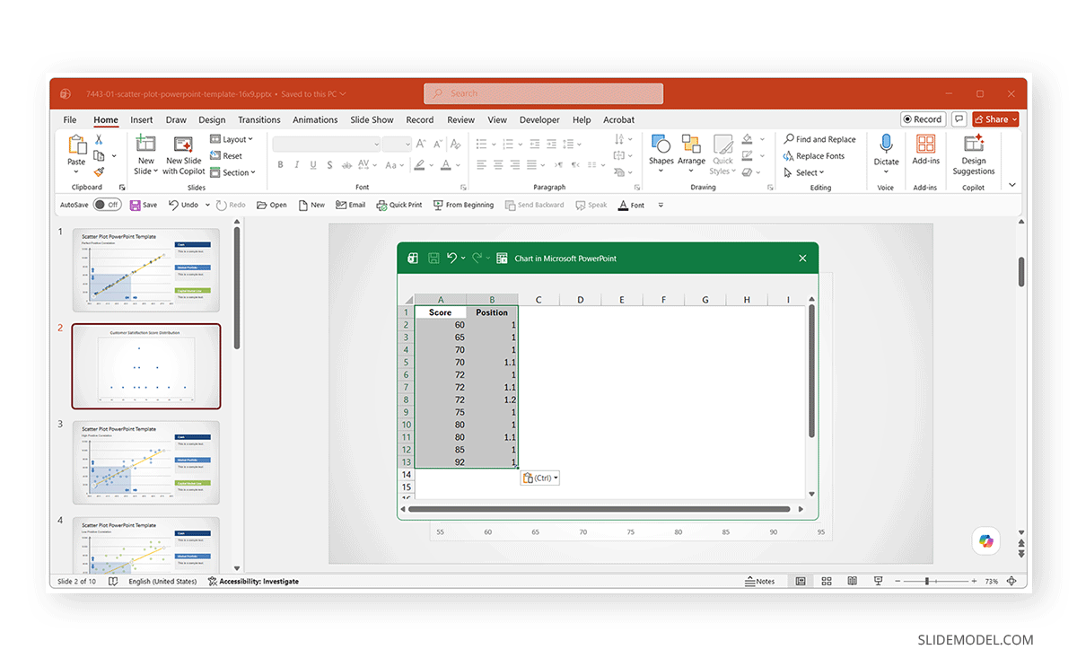
Step 2: PowerPoint will open an Excel worksheet for entering data. For a strip chart, the X-axis contains the actual values, while the Y-axis remains constant. Since all points share the same Y-value, they appear along a single horizontal line. PowerPoint automatically updates the chart based on the data entered in the sheet.
Note: When creating a strip chart in PowerPoint, duplicate values can overlap if they are plotted at the same coordinates. To make repeated observations visible, slight variations are often added to the Y-values so that identical scores appear stacked vertically. This does not represent a second variable; it simply prevents overlapping markers and makes the distribution easier to interpret. For example, if three respondents give a satisfaction score of 72, the dots can be placed at slightly different Y-positions so viewers can immediately see that the value occurred multiple times.
Step 3: To create a cleaner strip chart, remove the legend, gridlines, and the vertical axis (if not needed), and simplify the chart borders.
Step 4: Select the data series, choose Format Data Series, and adjust the marker size, shape, and color. Larger markers often improve visibility during presentations.
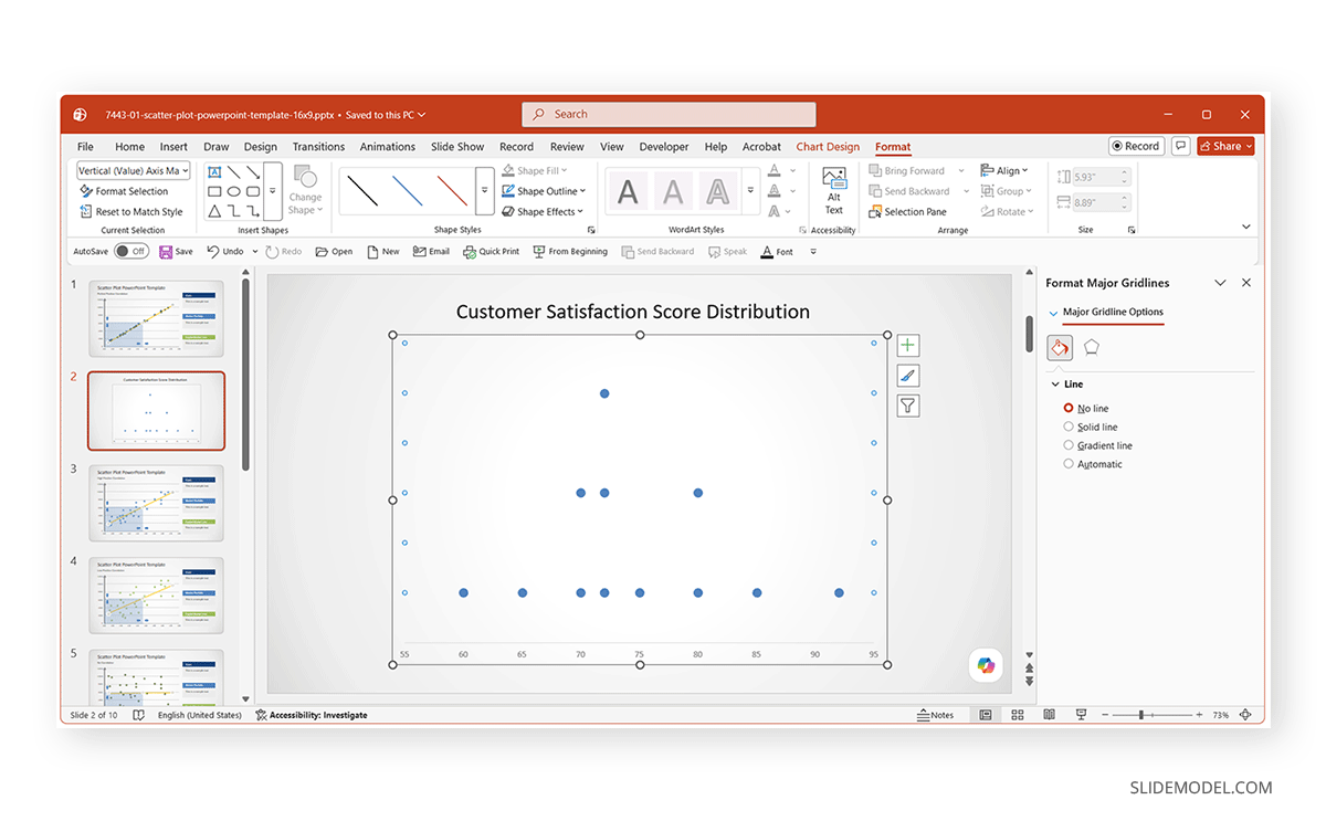
Step 5: Format the X-axis to reflect the range of your data. You can set minimum and maximum values, adjust interval spacing, and add axis labels. A properly scaled axis improves readability and interpretation.
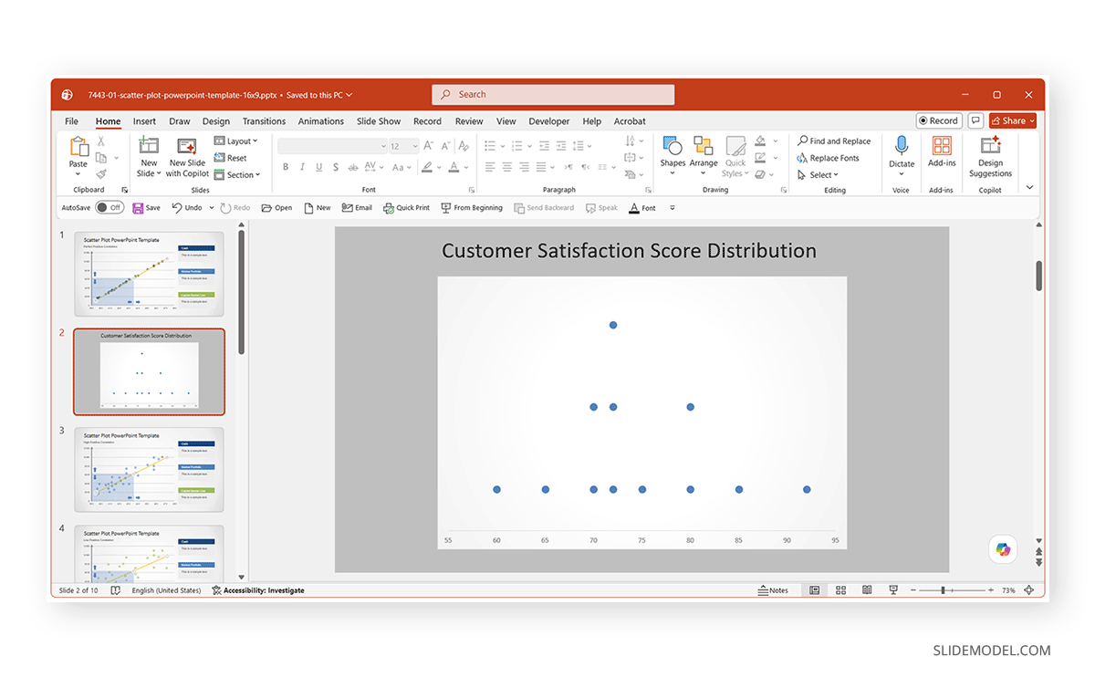
The strip chart below displays individual customer satisfaction scores. Each dot represents one survey response, while vertically stacked dots indicate repeated scores. The clustering of observations between 70 and 80 suggests generally positive customer feedback, with relatively few responses at the extreme ends of the scale.
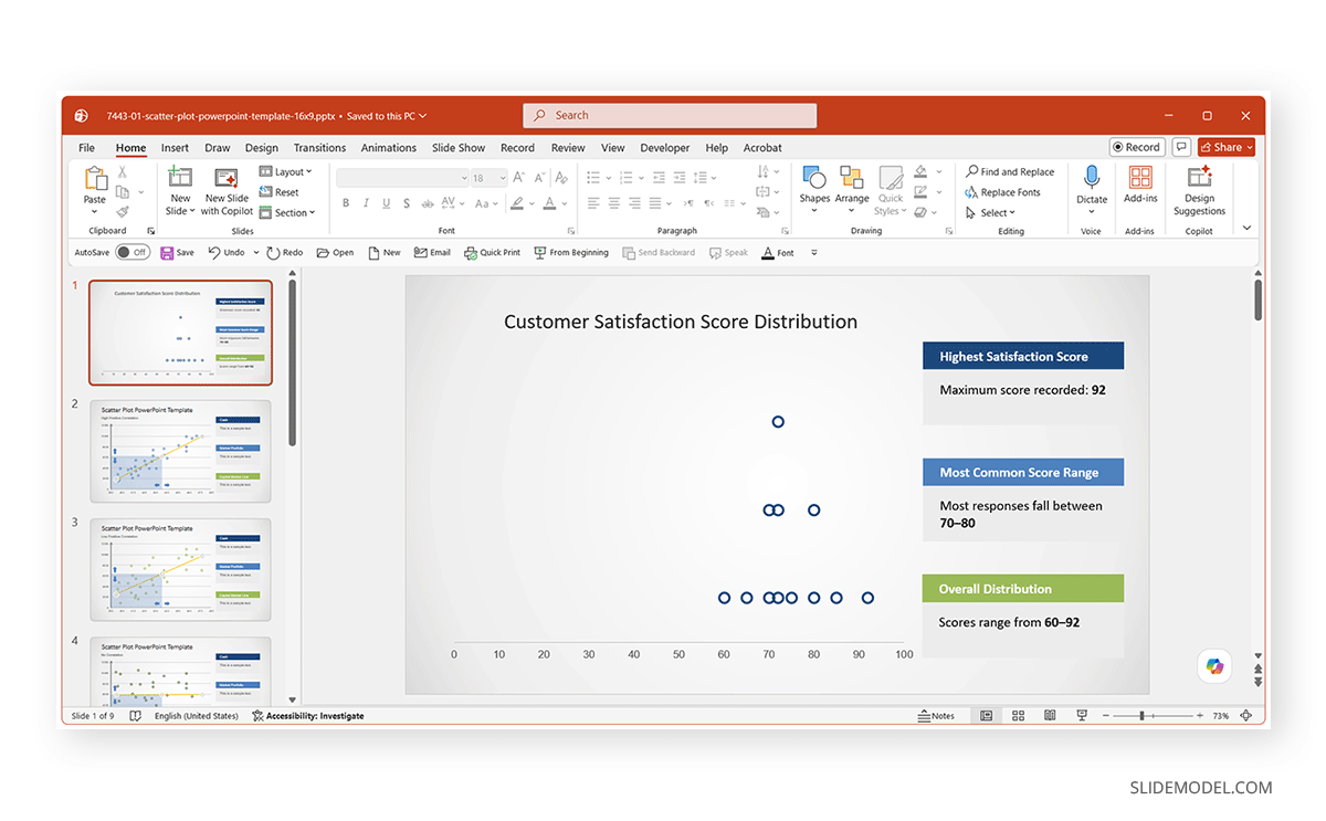
Other than making a chart from scratch, you can also create a strip chart either from scratch or by using a template such as the Scatter Plots Correlations PowerPoint Template. We created the same strip chart as above using this template to make it easier to read and to better explain the key points by filling in the text placeholders.
Final Words
A strip chart in PowerPoint offers a simple yet effective way to visualize the distribution of individual observations. Unlike charts that summarize data into averages or totals, strip charts allow audiences to see every data point, making patterns, clusters, and outliers easier to identify.
Although PowerPoint does not include a dedicated strip chart option, creating one with a scatter chart requires only a few formatting adjustments. A strip plot PowerPoint can be a valuable addition to presentations that need to communicate detailed data clearly and accurately.