Data-driven presentations require creating slides with graphs that can reflect information in an easy-to-grasp format. Google Slides, like other presentation apps, provides the utility to insert graphs, with all necessary formatting options to help present important information visually.
How to Make a Chart in Google Slides
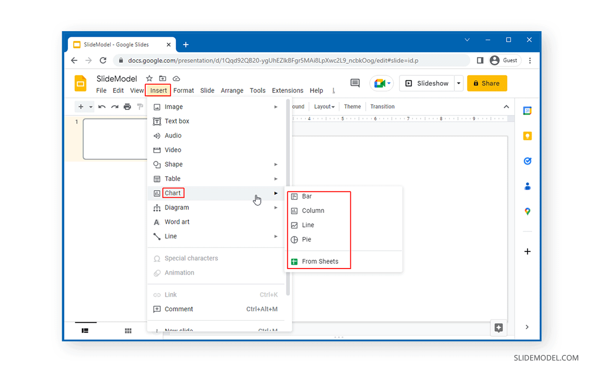
To create Google Slides charts, go to Insert > Charts. From here, you can choose to insert a bar, column, line, or pie chart in Google Slides. Furthermore, you can also pick a Google Sheet to create your chart.
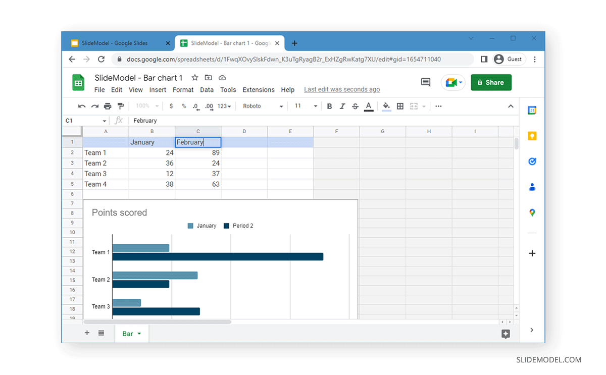
Your selected chart will be populated on the slide. To edit the existing chart, click the menu from the top right corner and click Open Source to see the data source.
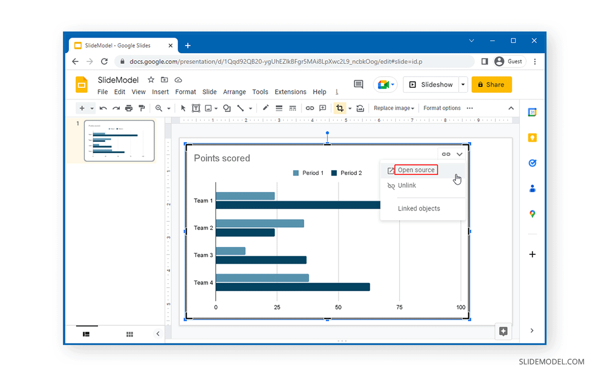
This will open the Google Sheet containing your chart data. You can edit the data and labels from this sheet. The changes you make will be immediately reflected on the chart in the Google Sheet.
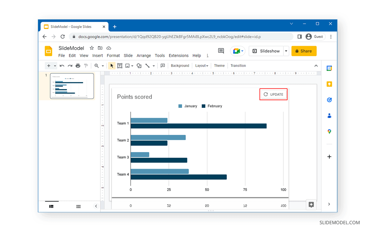
To make changes to the chart on your slide, click Update on the chart to refresh the data trends.
How to Format a Chart in Google Slides
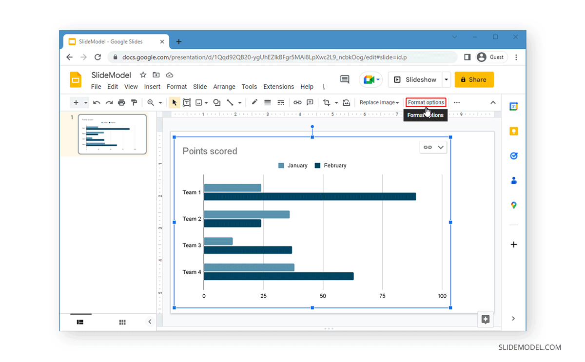
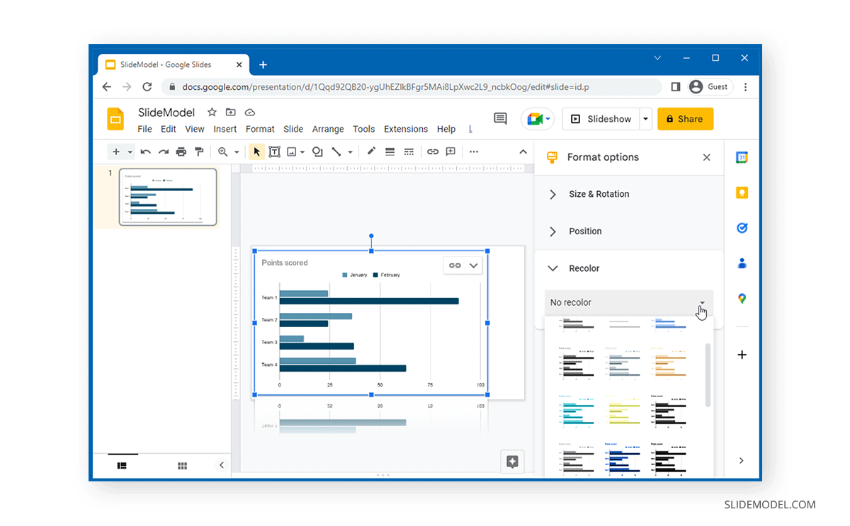
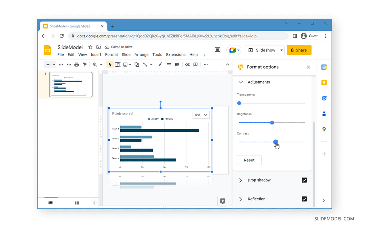
It is quite likely that you would want to further edit your chart by adjusting its colors or overall format in Google Slides. To do this, select the chart and click Format Options from the top toolbar.
From the right pane, you will be able to make changes to the chart. Click on any of the menus to expand it, and select the required formatting options to edit your chart in Google Slides.
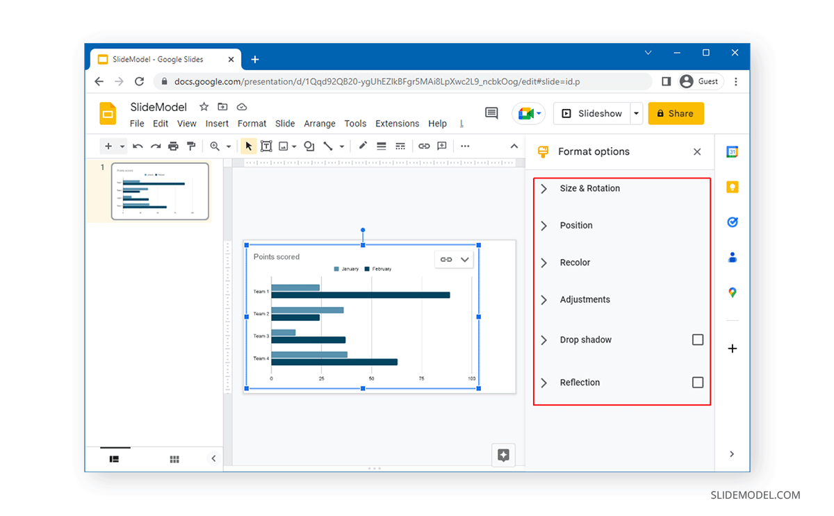
Size and Rotation: This menu enables editing the size and rotating the chart by selecting the width, height, width scale, and height scale. You can also adjust the chart size and rotate the chart via drag and drop.
Position: You can position your chart to the top left or center by selecting the position from the given drop-down menu.
Recolor: As the name suggests, this menu enables recoloring the chart by selecting a color scheme from the given menu.
Adjustments: You can adjust the transparency, contrast, and brightness of the chart from this menu.
Drop Shadow: This menu can be used to add a drop shadow to the chart. You can also adjust the transparency, angle, blur radius, and distance of the shadow.
Reflection: this menu can be checked to give a reflection to the chart to stylize it. The adjustment options for this menu include transparency, distance, and size.
Charts in Google Slides come with all basic formatting and editing options that can easily help you design basic charts. However, the charts aren’t as comprehensive as PowerPoint, which means you might need to opt for third-party Google Slides Templates to find chart slides that are professionally designed.
FAQ’s
How do I insert a chart in Google Slides?
To insert a chart:
– Go to Insert > Charts.
– Choose the type of chart you want (bar, column, line, or pie chart).
– The selected chart will be added to your slide.
How do I edit the data in a chart on Google Slides?
To edit chart data:
– Click on the chart.
– Select the menu icon in the top right corner of the chart.
– Click Open Source.
– Edit the data in the Google Sheet that opens.
– Return to your Google Slides and click Update on the chart to refresh the data.
Can I link a chart to a Google Sheet in Google Slides?
Yes, creating a chart in Google Slides automatically links to a Google Sheet where you can edit the data. Any changes made in the Google Sheet will be reflected in the chart after you click Update in Google Slides.
How do I format a chart in Google Slides?
To format a chart:
– Select the chart.
– Click Format Options from the top toolbar.
– Use the options in the right pane to adjust the size, position, recolor, and other formatting settings.
What formatting options are available for charts in Google Slides?
Available formatting options include:
– Size and Rotation: Adjust the width, height, and rotation of the chart.
– Position: Set the chart’s position on the slide.
– Recolor: Change the color scheme of the chart.
– Adjustments: Modify transparency, contrast, and brightness.
– Drop Shadow: Add and customize a shadow effect.
– Reflection: Add and adjust reflection settings.
How do I resize a chart in Google Slides?
To resize a chart:
– Select the chart.
– Drag the handles around the chart to adjust its size.
– Alternatively, enter the desired dimensions to Format Options > Size and Rotation.
Can I rotate a chart in Google Slides?
Yes, to rotate a chart:
– Select the chart.
– Go to Format Options > Size and Rotation.
– Enter the desired rotation angle.
How do I recolor a chart in Google Slides?
To recolor a chart:
– Select the chart.
– Go to Format Options > Recolor.
– Choose a color scheme from the given options.
How do I add a drop shadow to a chart in Google Slides?
To add a drop shadow:
– Select the chart.
– Go to Format Options > Drop Shadow.
– Check the Drop Shadow option and adjust the transparency, angle, blur radius, and distance.
Why should I use charts in Google Slides presentations?
Charts help present data visually, making it easier for your audience to understand and interpret information. They can highlight trends, comparisons, and relationships within the data.