A Mekko chart is one of the few visual tools that can show market size and composition simultaneously, which is precisely what makes it powerful and easy to misuse. Unlike conventional charts, it requires the audience to interpret area, not just height or length, turning design and structure into analytical decisions rather than cosmetic ones.
In presentation settings, this means the chart must be built with intention, clarity, and narrative awareness. This article explains how to create a Mekko chart presentation that supports reasoning, guides interpretation, and helps complex distributions translate into insights that are understandable and discussable with confidence.
What Is a Mekko Chart and What Does It Communicate?
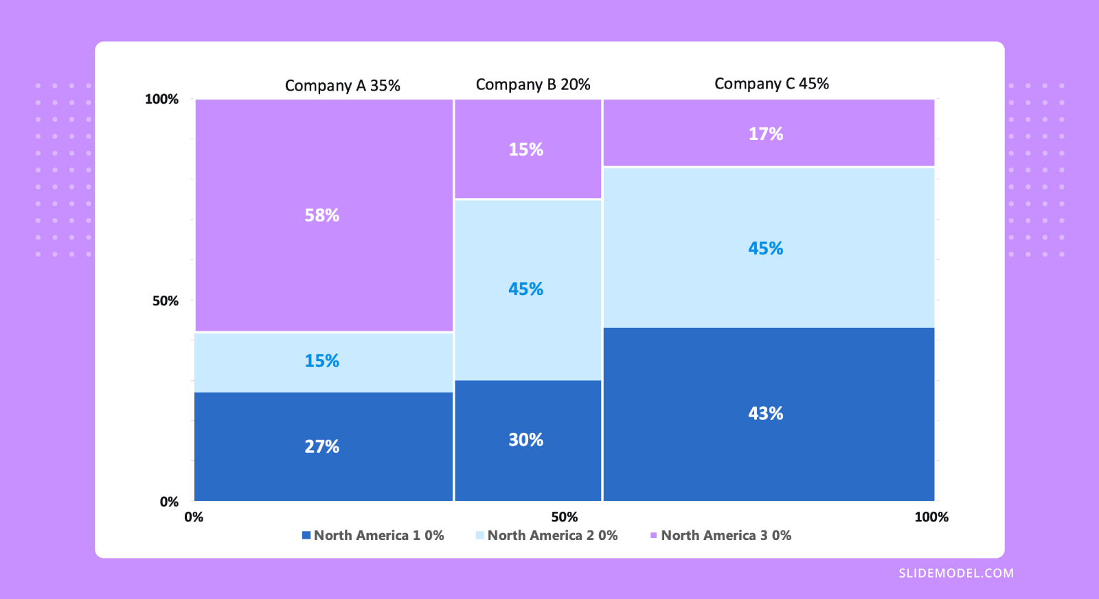
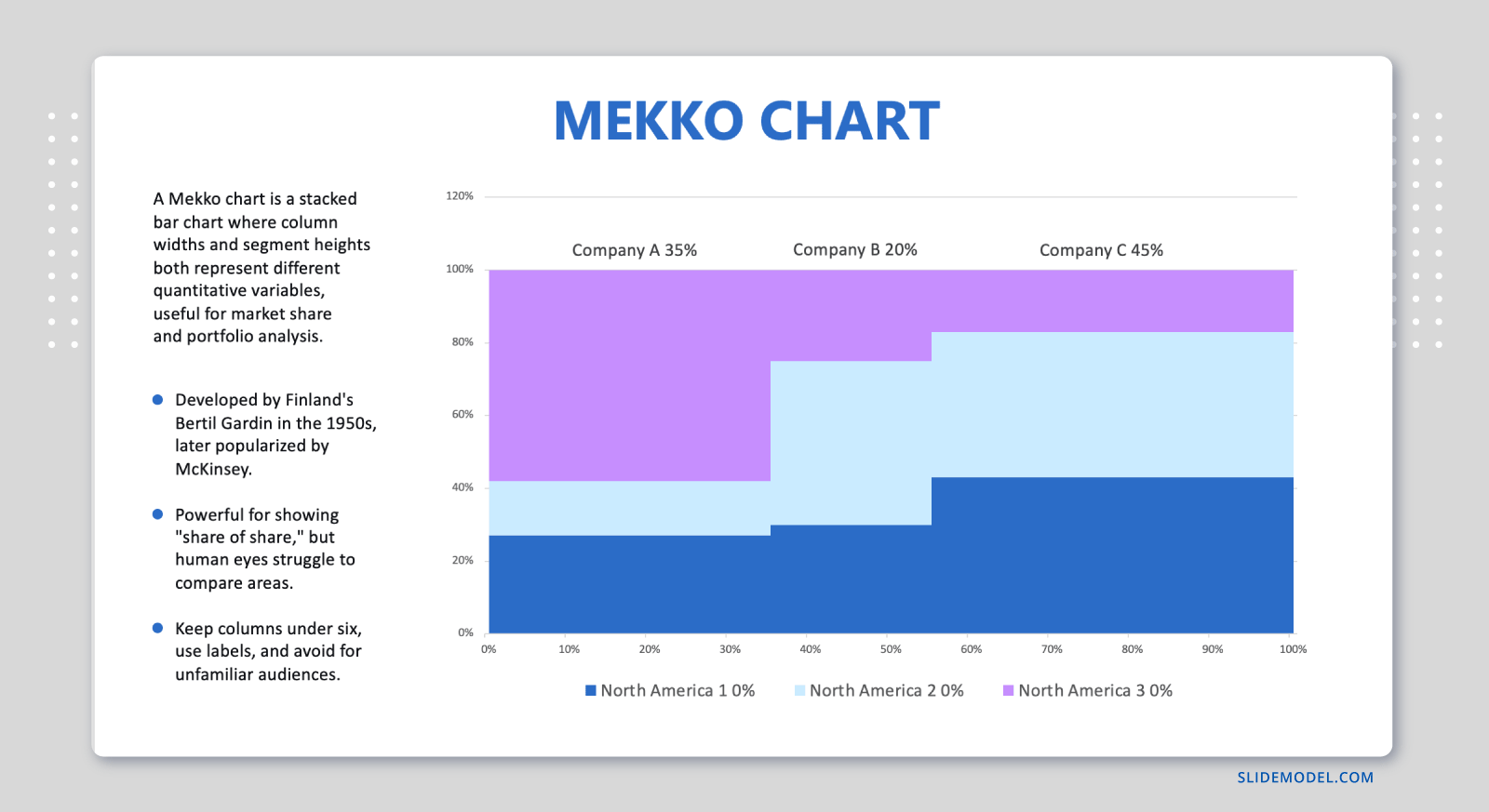
A Mekko chart, also known as a Marimekko chart, mosaic plot, or market map, is not just a variation of a stacked bar chart. Its defining feature is that it encodes two magnitude dimensions simultaneously: width and height. Width represents the size of a category (often market size, volume, or total value), while height represents composition or share within that category. The area of each block, therefore, becomes the true unit of meaning. This is where most Mekko presentations succeed or fail.

From a communication standpoint, a Mekko chart is undeniably analytical. It does not answer a single question but a compound one: how big is each category, and how is that category internally distributed? This makes it effective for strategic discussions on market structure, portfolio balance, revenue mix, and competitive positioning. A competitive landscape slide built around a Mekko chart can communicate both the size of each market segment and how the internal composition of that segment differs across competitors, all within a single view. At the same time, it is cognitively demanding. An audience cannot decode a Mekko chart instantly unless it is designed and framed with care.
Compared to other analytical chart types, the Mekko occupies a specific niche. A treemap chart shows hierarchical distributions using nested rectangles, but it does not preserve a consistent height axis, making proportional comparisons across categories harder. A standard stacked bar chart normalizes categories to equal widths, hiding differences in their sizes. The Mekko solves both limitations at once, which is why it appears frequently in strategy consulting, investment analysis, and executive reporting. Understanding precisely what the Mekko can and cannot communicate is the first step toward deciding whether it belongs in your presentation at all.
Choosing the Right Data Structure Before You Touch a Slide
Most Mekko charts fail long before they reach a presentation slide. The problem usually lies in the underlying data structure. Unlike simpler charts, a Mekko chart is intolerant of messy or loosely defined datasets. Every category must have a clearly defined total, and every subcategory must sum cleanly to that total. Any ambiguity in definitions will surface visually as confusion. A solid understanding of data presentation principles helps you anticipate these structural issues before they become visual problems.
The first structural decision concerns the factor that determines width. In business contexts, width often represents total revenue, total market size, total users, or total volume. Whatever variable is chosen must be meaningful at the category level and comparable across categories. Mixing fundamentally different units or aggregation logics undermines the chart. Combining regions measured by revenue with regions measured by units sold may be numerically convenient but analytically incoherent.
The second decision concerns internal segmentation. These segments should represent a single, consistent dimension across all categories: product lines, competitors, customer types, cost components, or similar. Avoid the temptation to customize segments per category. A Mekko chart depends on comparability. If one category shows four segments and another shows six unrelated ones, the audience cannot form stable mental references. The MECE principle is a useful test here: each segment should cover a distinct, non-overlapping portion of the whole, and together they should account for the whole.
Normalization is another critical step. Heights are typically normalized to 100% within each category so that the composition can be interpreted as a proportion. If raw values are used instead, the visual logic becomes much harder to follow, because both width and height now represent absolute magnitude. That approach is rarely effective in presentation settings and should only be used when the audience is explicitly prepared for it.
Ordering also matters. Categories should be arranged intentionally, usually from largest to smallest by width. This creates a left-to-right hierarchy that the eye can follow naturally. Random or alphabetical ordering wastes the chart’s explanatory potential. Similarly, internal segments should be ordered consistently, ideally from largest to smallest or according to strategic importance. When preparing a financial presentation, ordering revenue segments by contribution margin rather than by name gives the chart analytical weight that a random arrangement cannot provide.
How to Build a Mekko Chart in Excel and Transfer It to PowerPoint
Excel does not include a native Mekko chart type, so creating one requires a structured workaround. The method below is the most reliable approach for business professionals working without specialized charting add-ins. The process has two parts: building the chart in Excel, then moving it into PowerPoint cleanly.
Setting Up Your Data in Excel
Before creating any chart, the data needs to be formatted to simulate variable-width bars. The key concept is that each category’s column width is determined by the number of sub-columns you assign to it. If Category A holds 40% of the total market and Category B holds 20%, Category A should occupy roughly twice as many columns in your data table.
Start with a planning row. List each category and its total value, which will determine the relative width. Decide on a total number of units for the full chart width; 10 or 20 works well for most cases. Distribute those units proportionally across categories. A category representing 40% of the total market size gets 4 units if you are using 10 total; one representing 25% gets 2.5, which you can round to either 2 or 3, depending on the precision you need.
Next, build the data table. Create columns equal to the number of units assigned to each category, and repeat the segment percentages across each of those columns. For a category with 3 units, that means three identical columns with the same percentage breakdown. Label each column with the category name and a sequential number, such as North America 1, North America 2, North America 3. Then enter the segment percentages summing to 100% in each column.
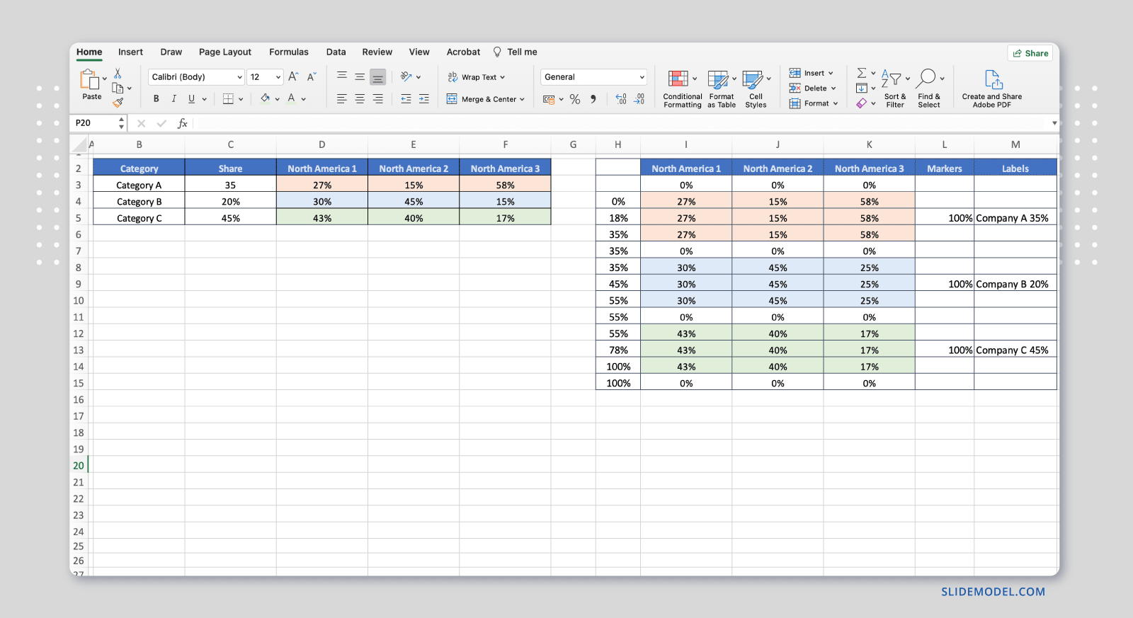
Your final table will have one row per segment and as many columns as your total number of units. This structure allows you to create a stacked bar chart that visually approximates variable column widths, which is the foundation of the Mekko format in Excel.
Creating the Chart Step by Step
With the data table ready, follow these steps to build the Mekko chart in Excel:
- Select the entire data table, including all segment rows and all category columns.
- Go to Insert > Chart and choose Stacked Bar Chart, specifically the 100% stacked bar variant.
- Once the chart appears, right-click any bar and select Format Data Series. Set the Gap Width to 0%. This removes spacing between bars, causing adjacent columns to merge visually into wider blocks.
- Right-click the horizontal axis and choose Format Axis. Under Axis Options, set the axis label interval to match the number of units per category, so only one label appears per category group. Alternatively, delete the axis entirely and add text boxes directly below each category group for cleaner positioning.
- Apply consistent fill colors to each segment across all columns. Since segments of the same type appear in multiple columns, format each series color individually or use the Format Painter to maintain consistency across the chart.
- Remove gridlines, lighten the axis lines, and add a chart title and legend. Keep the legend minimal: one entry per segment type, regardless of how many columns a category has.
- Review the chart carefully. The visual output should show wide and narrow column groups depending on category size, with consistent segment colors across each group. Verify the proportions against your original planning row before proceeding.
Once the chart looks correct, a quick visual check against the planning row is usually sufficient to confirm accuracy. If any column group appears disproportionately wide or narrow, revisit the unit distribution in your data table.
Transferring the Chart to PowerPoint
To move the chart, select it in Excel and copy it using Ctrl+C on Windows or Command+C on Mac. Open your PowerPoint file and navigate to the slide where the chart belongs. Use Paste Special (found under the Home tab or by right-clicking the slide) and choose the option that best fits your workflow.
Pasting as a Microsoft Excel Chart Object keeps the chart editable and linked to the source data. Double-clicking it in PowerPoint opens the Excel environment directly within the presentation. This is the best choice for presentations that may require data updates before delivery, or for charts that will be reviewed by colleagues who need to verify the underlying figures.
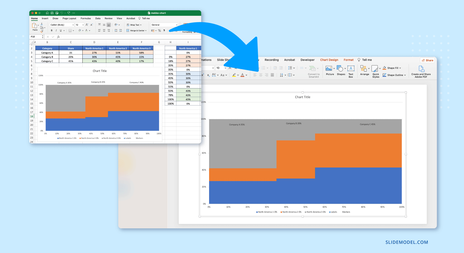
Pasting as an Enhanced Metafile or PNG produces a static image that cannot be edited during the presentation, reduces file size, and eliminates the risk of broken Excel links. For a more detailed walkthrough of embedding options, our guide on how to insert an Excel sheet into PowerPoint covers each approach in depth.
After pasting, resize the chart to fit the slide layout while maintaining its proportions. If the chart appears blurry at presentation size, use the EMF or chart object format rather than a standard image copy, as these scale without quality loss. Add a headline above the chart that states the key insight directly. A heading such as “North America Dominates Revenue but Lags in Premium Segment Share” communicates more to the audience before they read the chart than a generic title like “Revenue by Region and Segment” ever could.
Designing the Mekko Chart for Readability at Presentation Scale
Because the chart already has high information density, every additional visual element must justify its inclusion. The most common mistake is attempting to label everything directly. This results in overlapping text, cramped blocks, and an audience that stops reading. Thoughtful decisions about scale, color, axes, and labels are what separate a readable Mekko from an unreadable one.
Scale and Spacing
Start with scale and spacing. Blocks must be large enough to be distinguishable from a distance. If a segment is too small to label legibly, that is a signal to either group it into an “Other” category or move its explanation off the chart entirely. A Mekko chart is not a data table. Precision can be supported elsewhere through supporting slides or appendices; the chart itself must prioritize pattern recognition over exhaustive labeling.
Slide layout also affects readability significantly. The chart should occupy the majority of the slide canvas, with minimal title text and no competing visual elements beside it. White space around the edges helps the audience focus on the structure rather than scanning a busy slide for meaning. When working with a widescreen format, the extra horizontal space actually benefits the Mekko more than most other chart types, because wider columns give each segment more room to be labeled and distinguished.
A common layout mistake is placing the chart beside a large text block or a second chart. When that happens, the Mekko gets compressed to a size where its column widths become too narrow to read reliably. If additional context is needed on the same slide, consider a short headline annotation or a single callout box rather than a full text column. This preserves the chart’s visual real estate while still giving the audience a narrative anchor.
Color
Color should encode meaning, not decoration. Each segment type should have a consistent color across all categories. Avoid gradients and unnecessary shading, as they distort the perception of area. High contrast between segments is helpful, but extreme saturation is not. Muted, professional palettes reduce visual fatigue and keep attention on structure rather than style. Our guide to color theory for presentations offers a practical framework for building a palette that works at presentation scale without overwhelming the visual.
One useful technique is to reserve a single high-contrast accent color for the segment you want the audience to focus on. When one block stands out from the rest, the presenter can use it as an anchor point during verbal explanation, directing attention without requiring the audience to scan the entire chart. This is particularly effective when the key insight involves a specific segment that either outperforms or underperforms across categories.
Avoid using more than five or six distinct colors in a single Mekko chart. When the segment count is higher, the palette becomes too complex to track, and the audience must constantly refer to the legend rather than reading the chart directly. If your data requires more than six segments, that is usually a signal to consolidate rather than expand the color range.
Axes
Axes and gridlines should be minimal. The vertical axis often represents a percentage, but heavy gridlines are rarely needed. Subtle reference lines at key thresholds, such as 25%, 50%, and 75%, can help orientation without adding clutter. The horizontal axis usually does not need numeric labels if widths are proportional and categories are clearly named.
One area where axis treatment becomes important is when the chart is transferred from Excel to PowerPoint. Excel’s default axis styling is rarely appropriate for a presentation environment. Font sizes that appear readable in a spreadsheet often become too small on a projected slide. After embedding the chart, review all axis labels, tick marks, and reference lines at the actual display size before finalizing. Adjust font sizes upward if needed, and remove any automatic axis titles that duplicate information already present in the slide headline.
The decision to include or exclude the vertical percentage axis also depends on the audience. For technical audiences familiar with proportional charts, the axis provides useful reference points. For non-technical audiences, it can be distracting if viewers try to read precise percentages rather than understand the overall pattern. In mixed-audience presentations, removing the axis entirely and annotating only the most important percentage values directly on the chart is often the clearest solution.
Labels
Labels require strategic placement. Category names are best placed below the chart, aligned with their respective widths. Segment labels can be handled with a legend, direct labeling for the largest segments only, or progressive callouts. What matters is consistency. If one segment is labeled directly, similar segments should be treated the same way. Inconsistent labeling implies that labeled segments are more important than unlabeled ones, even when that was not the presenter’s intent.
For presentations where the chart will be printed or shared as a document, the labeling strategy may differ from that used in a live presentation context. In a projected setting, a side legend is easy to reference. In a printed handout, the eye travels a longer distance between the chart and the legend. Direct labeling on the largest blocks works better for print, while a clean legend works better for projection. If the chart will appear in both contexts, consider creating two versions with slightly different label strategies rather than one compromise that serves neither purpose well.
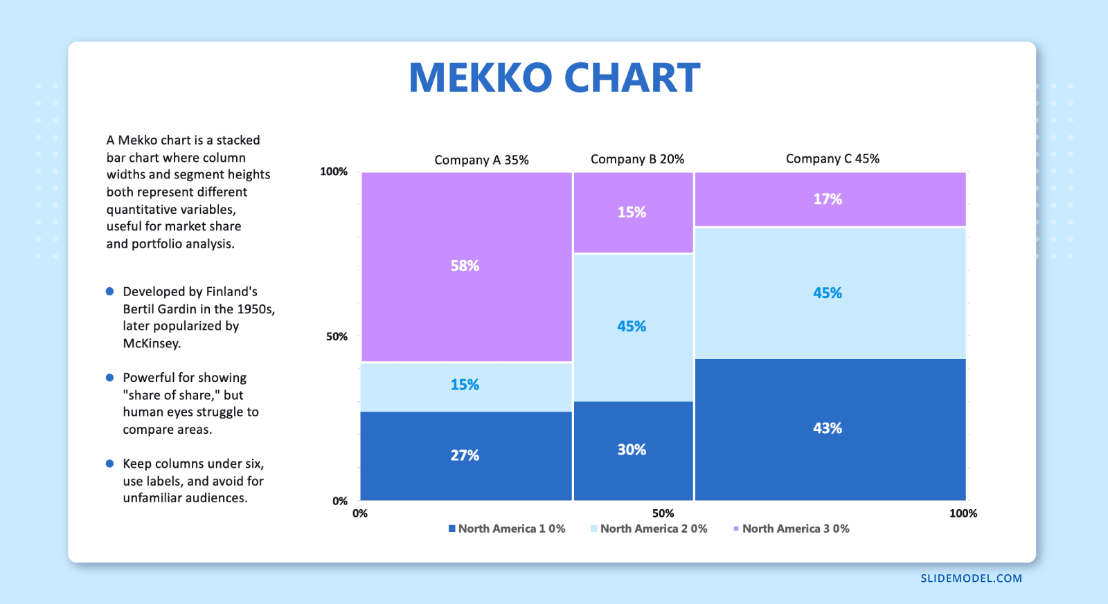
Percentage labels inside the blocks are optional. When included, they should appear only in segments large enough to fit the text legibly. Forcing a percentage label into a thin segment creates clutter, drawing attention to the label rather than the segment itself. A reasonable threshold is to label only segments that occupy at least 10% of their category’s height, leaving smaller segments explained in the legend or through presenter narration.
Framing the Mekko Chart for Your Audience
A Mekko chart does not speak for itself. Even a well-designed one requires framing. The role of the presenter is to deliberately direct attention, so the audience does not attempt to decode everything at once. Without guidance, viewers often fixate on the wrong dimension or misinterpret area as height or width alone. This is particularly relevant when presenting to mixed audiences, where some participants may be familiar with Mekko charts and others are encountering them for the first time.
The framing should begin before the chart appears. Introduce the variables in words first. State clearly what width represents and what height represents. This primes the audience’s perception and reduces initial confusion. A simple sentence such as “Each column’s width reflects total market size, while the colors show how that market is divided” can substantially improve comprehension. For executive presentations, where time is limited and attention is divided, this verbal orientation becomes especially important. Senior stakeholders often form quick impressions of a visual and move on; if the first impression is confusion, the chart’s analytical value is lost before the presenter has a chance to recover it.
Once the chart is visible, resist the urge to explain every element. Instead, establish a reading order. Start with the overall structure: which categories dominate in size? Then move to internal composition: how do those categories differ in mix? Finally, highlight contrasts or anomalies that matter to the narrative. This mirrors how analytical reasoning unfolds and keeps the audience aligned with the logic. The approach resembles what we cover in the guide on how to present complex concepts: start with the frame, then the detail, then the implication.
Comparisons should be explicit. If two categories are being contrasted, name them and explain why. Do not assume the audience will notice subtle differences on their own. Area-based charts are particularly vulnerable to misestimation, so verbal reinforcement is essential. Reference benchmarks, previous periods, or strategic targets to give the chart meaning beyond its immediate geometry. A Mekko chart is most persuasive when it connects structure to implication, rather than merely displaying distribution.
Integrating the Mekko Chart Into a Larger Presentation Narrative
A Mekko chart is rarely the opening slide of a presentation, and it should not be treated as an isolated exhibit. Its value increases when it is positioned within a broader narrative arc. Typically, it works best after the problem or question has been established and before conclusions or decisions are discussed.
One effective pattern is to use simpler charts first. A bar chart may establish total sizes, followed by a stacked bar to show composition, and then the Mekko chart to unify both views. This progressive disclosure builds understanding step by step and reduces the cognitive jump when the Mekko appears. The approach mirrors the logic of storytelling in presentations: build context before complexity, and let each chart earn its place in the narrative rather than appear out of place.
Transitions matter. The slide before the Mekko should explain why it exists. The slide after should extract implications from it. Avoid leaving the chart as an interpretive dead end. Explicitly state what the audience should take away and how it informs the next part of the discussion. Without a clear downstream implication, even a well-built Mekko chart can feel like an analytic detour rather than a moment of clarity.
It is also worth limiting the number of Mekko charts in a single presentation. Because they demand effort to read, one or two well-chosen Mekkos are usually sufficient. Overuse leads to fatigue and diminishing returns. The chart’s complexity is precisely what makes it memorable when used selectively; it loses that quality when it appears on every third slide.
Supporting slides can handle detail. If the audience needs precise figures or alternative breakdowns, those can appear in backup slides or appendices. This allows the main presentation to stay focused on structure and insight rather than exhaustive reporting. This principle applies equally in market analysis presentations, where the Mekko chart often serves as the centerpiece visual for a longer analytical narrative.
Recommended PPT Templates to Pair with the Mekko Chart for Marketing/Financial Presentations
1. Market Analysis PowerPoint Template

A 16-slide comprehensive deck covering market overview, competitor analysis, sales forecasting, marketing mix, and strategic recommendations. This PPT template is one of the strongest pairings for a Mekko Chart: the deck provides the research scaffolding, while the Mekko delivers the visual centerpiece, showing market size and segment share in a single chart that the surrounding analysis slides can then unpack in detail for stakeholders.
2. Market Positioning PowerPoint Template

With 14 slides covering TAM/SAM/SOM analysis, competitive positioning maps, unique value propositions, and go-to-market overviews, this PowerPoint template builds the strategic narrative a Mekko chart needs. Place the Mekko early to show market size and segment composition, then use this template’s positioning map and competitor analysis slides to interpret what those distributions mean for your company’s competitive stance.
3. Go To Market Strategy PowerPoint Template

This 18-slide professional deck spans target audience analysis, value proposition, competitive landscape, marketing timelines, financial projections, and KPIs. When a Mekko Chart is embedded in the competitive analysis section, it quickly communicates how the market is sized and distributed among players, making your positioning more visually persuasive before the template’s financial projections and risk slides bring the argument home.
4. Financial Report PowerPoint Template

This 10-slide deck is built for financial experts presenting revenue breakdowns, P&L statements, cash flow overviews, and year-over-year comparisons. Its structured layout makes it a natural companion to a Mekko Chart: use the Mekko to show how revenue is distributed across business units or product lines, then let this financial PPT template carry the supporting financial detail — balance sheets, KPIs, and trend charts — that give those distributions context and credibility.
Common Mistakes When Designing a Mekko Chart Presentation
Overdoing Segments
One of the most frequent mistakes in Mekko chart presentations is using too many segments. When each category is divided into numerous thin slices, the chart becomes unreadable. The solution is prioritization. Identify which segments truly matter to the message and aggregate the rest into a single “Other” category. A chart with five well-defined segments communicates far more than one with twelve indistinguishable slivers.
This is also a data governance question. If the underlying dataset has many fine-grained subcategories, the presenter needs to make a deliberate choice about the level of aggregation that serves the audience. The Mekko chart is not a display for raw data; it is a communication tool. Every segment shown is an argument for why that distinction matters. If you cannot articulate why a segment deserves its own color, it probably does not belong on the chart. Working through this question before building the chart in Excel saves significant rework later.
Inconsistent Segmentation
Another pitfall is inconsistent segmentation. Changing segment definitions between categories may seem analytically valid, but it destroys visual comparability. If exceptions are unavoidable, they should be clearly explained or visualized separately. For a structured approach to segmentation logic, our article on market segmentation provides helpful guidance. Proper data-level segmentation is what separates a chart that generates insight from one that raises questions about its own construction.
The issue often arises when data is pulled from multiple sources with different classification systems. One region may break down revenue by product category; another may break it down by customer industry. These are not equivalent dimensions and cannot be stacked against each other in a Mekko without first harmonizing the definitions. Harmonization takes time, but skipping it produces a chart that looks authoritative while actually comparing different things.
Not Giving Enough Explanation
Presenters often underestimate the need for explanation. Assuming familiarity with Mekko charts leads to silence where guidance is needed most. Taking thirty seconds to orient the audience pays off in better understanding and more productive discussion. A brief verbal orientation is not a sign that the chart is poorly designed; it is a sign that the presenter understands their audience.
This is especially relevant when presenting to stakeholders who work primarily with simpler charts in their day-to-day work. Finance teams comfortable with bar and line charts will still need a moment to calibrate when they first see a Mekko. Skipping that calibration moment forces them to do it on their own mid-presentation, which is precisely when you want their attention on your analysis rather than the mechanics of the visual.
The solution is to build the explanation into the presentation structure. A brief spoken introduction before the chart appears, a one-sentence label in the slide title, or an annotated callout pointing to what width means are all low-effort ways to close the interpretation gap before it opens.
FAQs
What is the difference between a Mekko chart and a stacked bar chart?
A stacked bar chart varies only by height, while a Mekko chart varies by both width and height, allowing it to show size and composition simultaneously.
When should a Mekko chart be used in a presentation?
It should be used when both the total category size and internal distribution are critical to the message and must be understood together.
When should a Mekko chart be avoided?
It should be avoided when only one dimension matters or when the audience needs quick, precise comparisons rather than structural insight.
What does the width represent in a Mekko chart?
Width typically represents a total value such as market size, revenue, volume, or user base for each category.
What does the height represent in a Mekko chart?
Height usually represents the percentage composition within each category, often normalized to 100%.
What does the area of a Mekko chart segment mean?
The area represents the combined magnitude of the category size and the segment’s share within that category
Is a Mekko chart easy to interpret for all audiences?
No. It requires more explanation than standard charts and should be introduced carefully in presentation settings.
How many segments should a Mekko chart include per category?
Ideally, no more than four to six segments, as too many reduce readability and visual clarity.
How should colors be used in a Mekko chart?
Colors should be consistent across categories, with each segment type assigned one stable color throughout the chart.
How should categories be ordered in a Mekko chart?
Categories are usually ordered from largest to smallest by width to create a clear visual hierarchy.
Are Mekko charts suitable for precise numerical analysis?
They are better suited to structural understanding and comparison than to reading exact values.
How should a Mekko chart be introduced during a presentation?
The presenter should first explain what width and height represent before asking the audience to interpret the chart.
What types of topics work best with Mekko charts?
Market share analysis, portfolio composition, revenue mix, competitive landscapes, and cost structure analysis.
Can you build a Mekko chart in Excel?
Yes, although Excel does not have a native Mekko chart type. The standard method involves structuring data across multiple proportional columns and using a 100% stacked bar chart with zero gap width to simulate variable-width bars.
How do you transfer a Mekko chart from Excel to PowerPoint?
Copy the chart in Excel, then use Paste Special in PowerPoint to embed it either as a linked Excel chart object for data editing, or as a static image for a final, uneditable version.
Final Words
A Mekko chart is one of the most demanding visual tools in a presenter’s toolkit. When used casually, it confuses. When used deliberately, it clarifies complex structures that would otherwise remain abstract. The difference lies not in the chart itself, but in how thoughtfully it is constructed, designed, and framed. As a presentation asset, it rewards careful preparation and disciplined storytelling. When those elements align, it becomes a powerful way to support data-driven decision-making rather than just another slide full of shapes.