Nobody said it’s easy to make a PowerPoint presentation. There are multiple design decisions to consider, like which layout is appropriate for the content you have to present, font pairing, color schemes, and whether to use animated elements or not.
Making these choices when working under the clock is overwhelming for most people, especially if you only intend to make a report more visually appealing. For this very reason, we curated a selection of 11 good PowerPoint presentation examples categories in different niches to give you insights into what’s valued and how to take your presentations to a professional quality. All the templates used on each case will be linked for easy access.
Table of Contents
- General Guidelines for Professional-Quality PowerPoint Presentations
- Business Pitch PowerPoint Presentation Examples
- Marketing Plan PowerPoint Presentation Examples
- Company Profile PowerPoint Presentation Examples
- Quarterly/Annual Results Presentation Examples
- Project Proposal Presentation Examples
- Training Presentation Examples
- Change Management Presentation Examples
- Industry Analysis Presentation Examples
- Financial Planning Examples
- Inspirational Presentation Examples
- Academic Presentation Examples
- Final Words
General Guidelines for Professional-Quality PowerPoint Presentations
Before introducing our presentation slide examples, we need to discuss a list of factors that transform an average slide into a professional-quality one.
Design Principles
For any professional-level slide deck, a consistent layout, color scheme, and font pairing are required throughout the presentation. The slides should remain uncluttered, with proper care of white balance across their composition, and stick to the 10-20-30 rule of presentations’s concept of one concept per slide.
Contrast between text and background color must comply with web design accessibility standards, meaning to work with a 4.5:1 contrast ratio for normal text, with exceptions for larger text. You can find more information in our article on accessibility for presentations.
Typography
A general rule in any graphic design project is to stick with fonts with ample legibility, like Arial, Helvetica, or Calibri. These are known as sans-serif fonts, and they work better than serif ones (i.e., Times New Roman) for larger text blocks.
Avoid using more than two different font families in your presentation; otherwise, the overall design will lose cohesion. Since you ought to ensure readability, the minimum size for body text should be 18pt, opting for larger variations and/or bold text for titles.
Using a combination of font pairing and font sizing helps create a hierarchy in your slides’ written content. For more insights on this topic, browse our article on fonts for presentations.
Color Scheme
Sticking to a color palette selection is one of the first design decisions to make when creating a custom slide deck. Colors have their own psychological impact on presentations, as explained in our article on color theory, so presenters must stick to 3-4 colors to avoid mixing up content in the slides. That being said, the colors have to be carefully selected according to the typical color scheme configurations, and using contrast to highlight key points on presentation slides.
Slide Layout
We can apply multiple graphic design guidelines to create professional-quality presentation slides, but in order to simplify the process, here are the key points to take into account:
- Grids and Guides: Divide your slide into sections using guides in PowerPoint or Google Slides. Then, you can build a grid that helps place elements and catch the viewer’s interest as they follow a logical flow while looking at the slide.
- Whitespace: Empty space is not your enemy. Slides shouldn’t be dense or feel hard on the eyes to read; therefore, work with a minimum of 30% whitespace.
Multimedia Elements
According to our expertise, video presentations and animation effects certainly increase the retention rate of the content you present. This is because they reduce the tiresome 2D presentation layout and add dynamism to the slides. Testing their functionality across different devices is a must to incorporate these elements into your presentation, especially if we consider that not all PowerPoint animation effects are compatible with Google Slides animations.
Sound can be distracting in many scenarios unless you opt for an interactive presentation and require an audio track for an exercise. Action buttons in the form of quizzes or multiple-choice questions are fine examples of how we can integrate hyperlinks in interactive presentations.
Business Pitch PowerPoint Presentation Examples
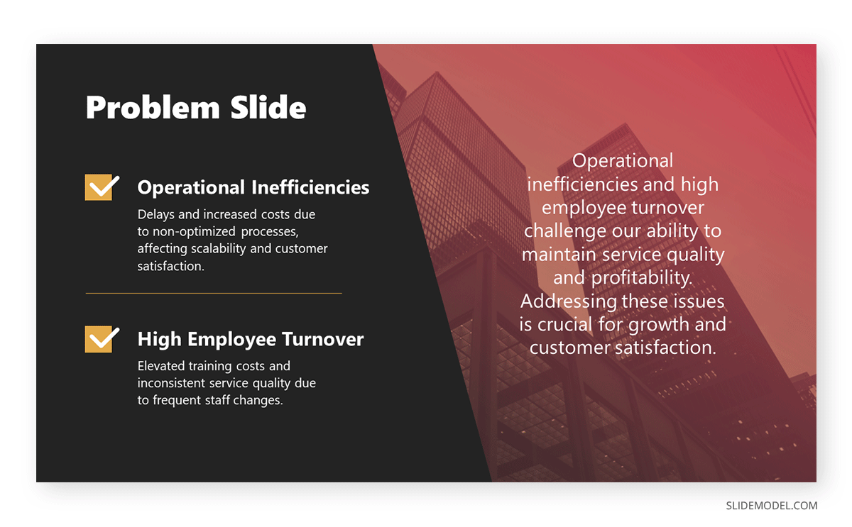
The first professional PowerPoint example we will cover is when creating a problem slide business pitch. This selected business pitch PPT template has a 50/50 image-to-content balance that allows us to add images from our organization (or stick to the corporate placeholder image design) and quickly summarize the issue or need that our business aims to solve.
Remember that the selected colors for the text background area and text color are not 100% pure values—they are slight variations to reduce eye strain, making this slide a perfect choice for any kind of meeting room. Ideally, you can present up to three different problems to solve; otherwise, the text will look too small.
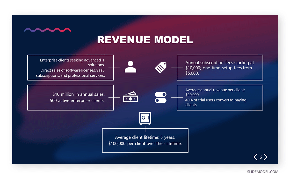
Another fine example of a PowerPoint presentation comes at the time of delivering an elevator pitch. As we all know, this concise presentation format requires a considerable amount of presentation aids to briefly expose each point in the speech under the allotted time frame. In this Revenue Model slide, we can find the answers to typical questions that help us shape the speech, all of them with icons and cues to remember from which areas the information comes.
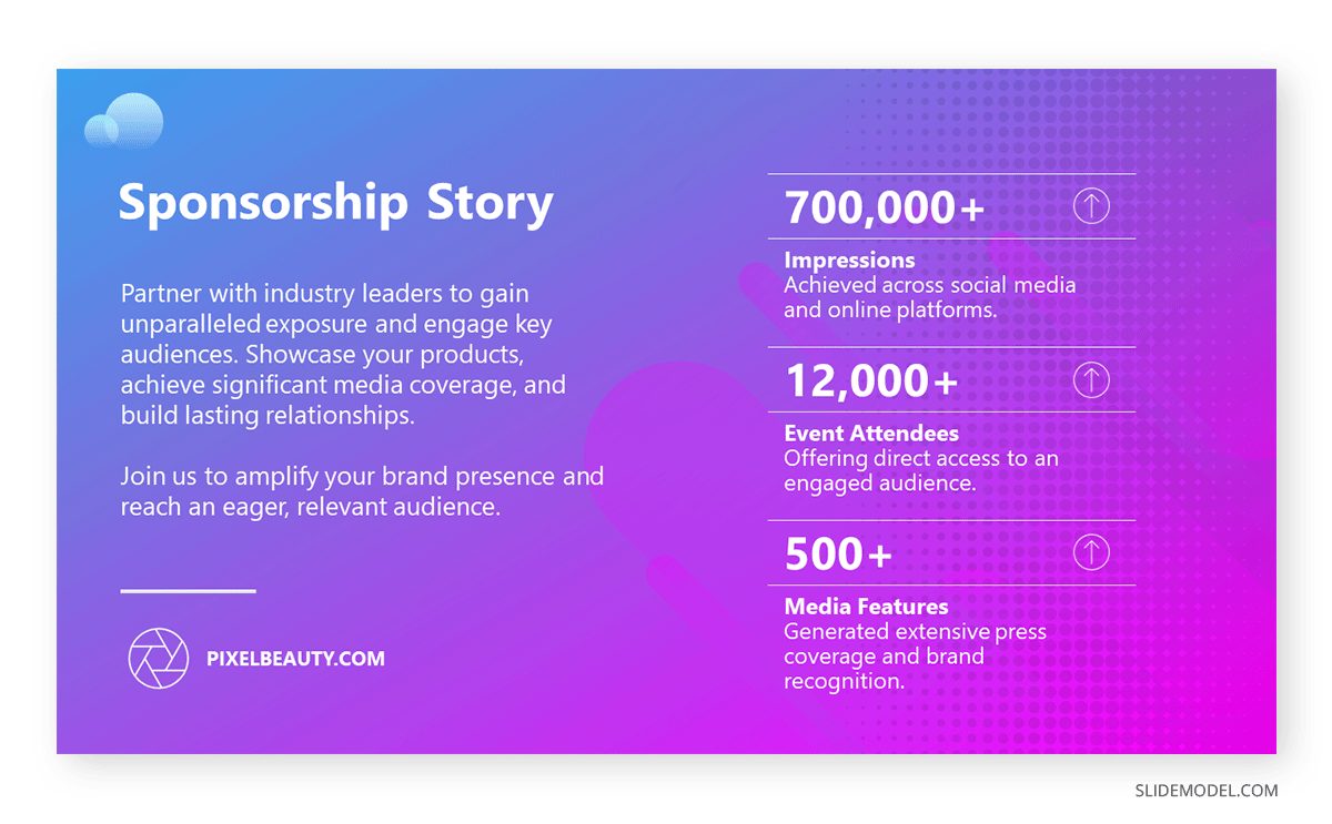
If we aim to create a sponsorship pitch deck, it is important to bring proof of past sponsorship experiences to build our credibility in front of prospective sponsors. With this best PPT template tailored for sponsorship pitch presentations, we can display such data in an attractive visual format. The neat layout balances whitespace with content, with three distinctive KPI areas to talk about your history in sponsorship experiences.
Marketing Plan PowerPoint Presentation Examples
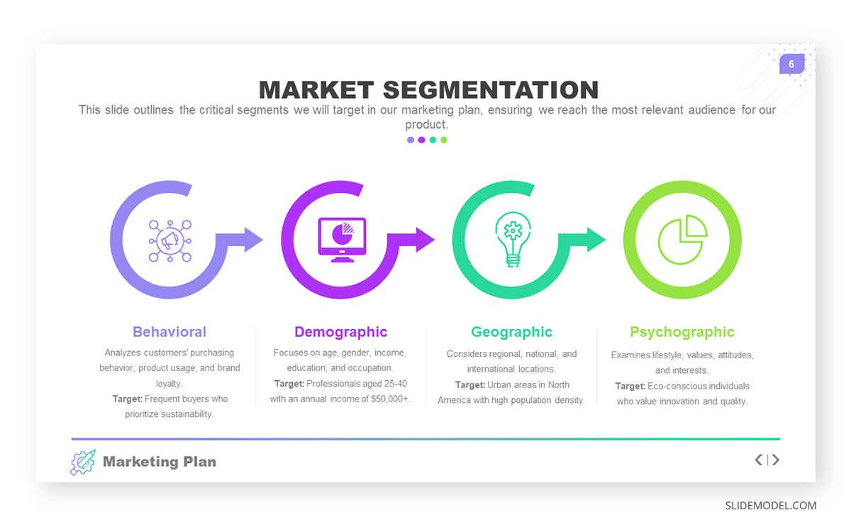
Talk about the market segmentation strategies of your marketing plan with this creative infographic template. This slide clearly illustrates that not all examples of PowerPoint presentations follow the same structure in terms of graphics-to-text balance. You can introduce data on how purchasing habits, user status, and brand loyalty influence buying decisions. Present key information about demographic & geographic segmentation and how psychographic information can provide deeper insights into consumer motivations to purchase.
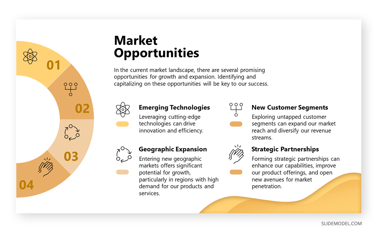
Another PowerPoint example comes in the format of presenting market opportunities in marketing plans. You can list up to four points, which can be extracted from the outcomes of a SWOT analysis or from retrieved data from polls or stakeholders’ insights. The icons are entirely editable, and the crisp layout makes readability much easier.
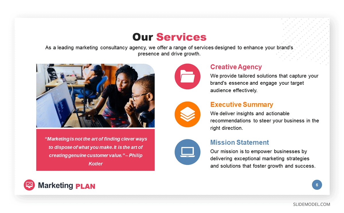
Marketing agencies can benefit from this presentation PowerPoint example, which illustrates how easy it is to customize the content and repurpose slides for different client meetings. This and the other slides of this marketing plan slide deck allow professionals to discuss their expertise, past projects, and proposals for their target clients. In this case, the agency in question is offering insights on their work ethics through a clean slide layout with icons to flag key areas.
Company Profile PowerPoint Presentation Examples
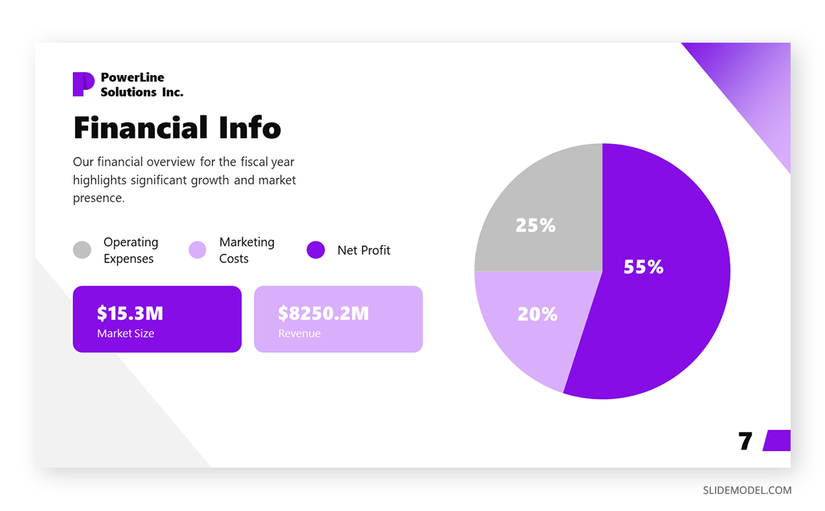
Our next PPT presentation example is suited for a Company Profile presentation in which we have to disclose key financial data. Thanks to the pie chart, presenters can segment revenue streams or do a balance between investments and profit. Additionally, the box placeholders allow us to deepen our knowledge of precise areas of interest.
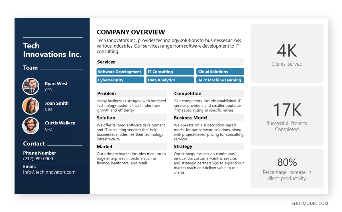
Organizations who are looking to create a company profile can opt for a one-page arrangement to introduce the team members in charge, the overall services or products, the business model, the market, competitors, and relevant strategy information. The text boxes placed in the right area are a perfect opportunity to highlight KPIs.
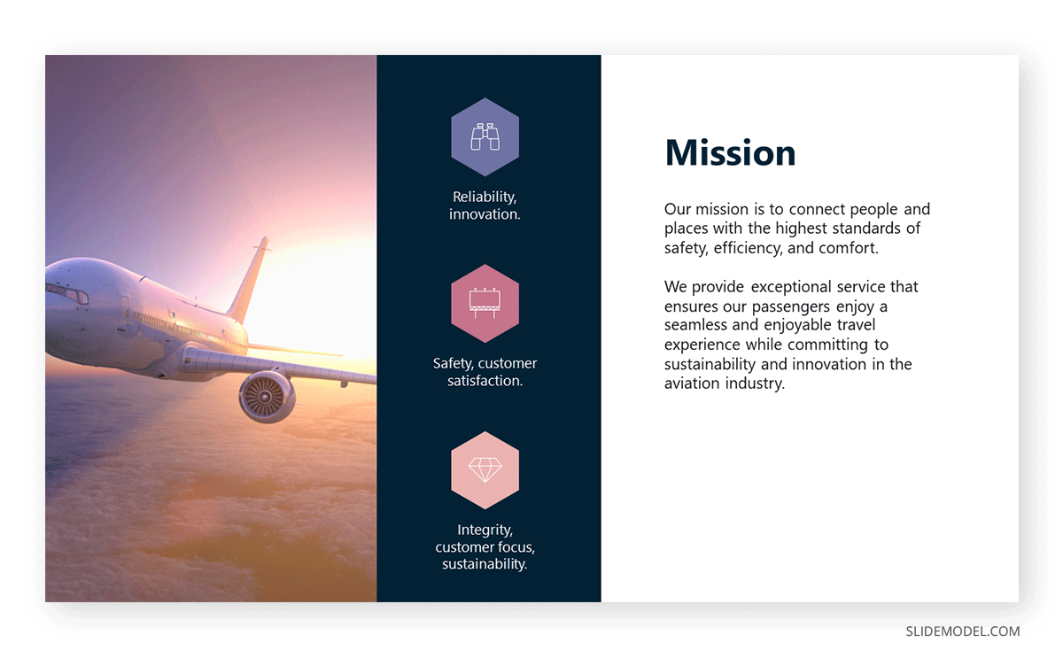
In any company profile presentation, we have to introduce the organization’s Mission and Vision Statements. This presentation sample slide allows us to creatively discuss those topics. Including icons, users can summarize the primary aspects of their mission statement in one single, professionally styled slide.
Quarterly & Annual Results Presentation Examples
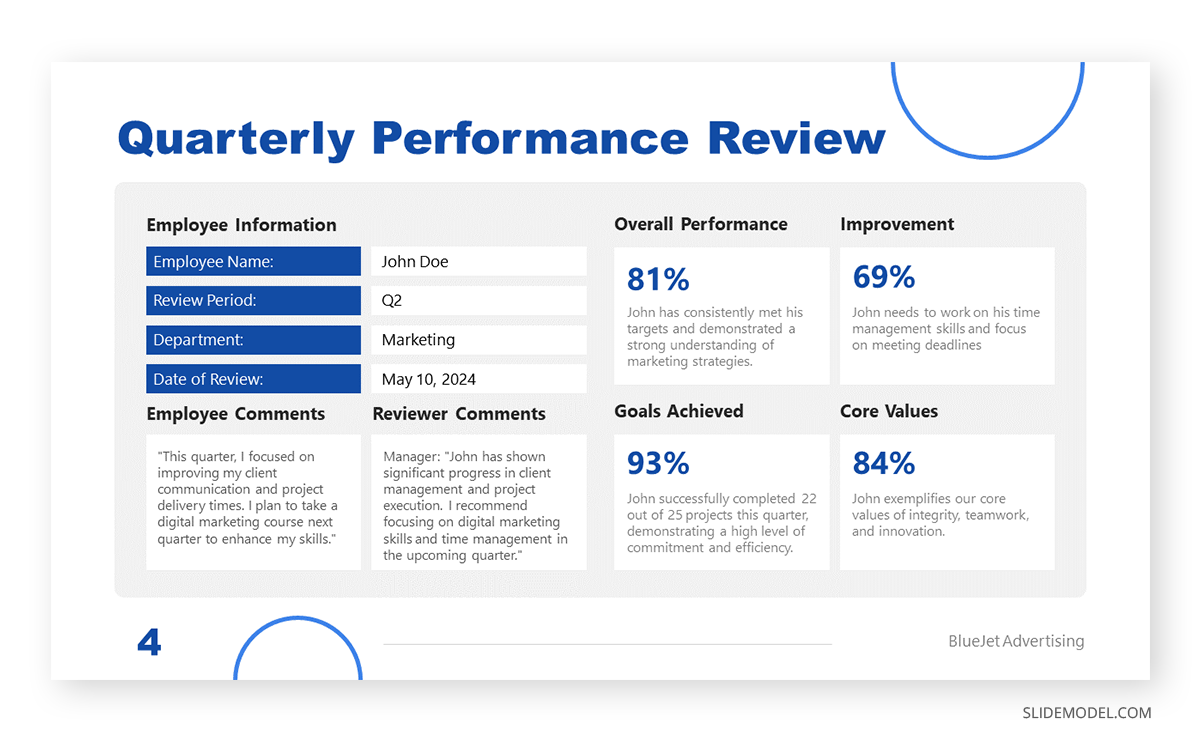
Quarterly reports don’t need to be depicted as boring PDF files. We can work with clean layouts that provide information in an easy-to-follow format that focuses on the core elements of the report. This quarterly report presentation example is perfect for detailed reports as we cover all essentials in a one-page format for an employee’s performance review.
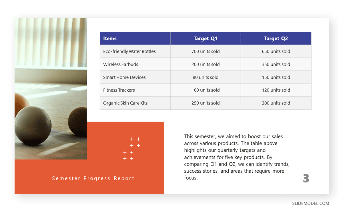
If, instead, you opt for a department-by-department approach, this slide presentation example illustrates two out of four quarters in the annual report. You can compare the product’s performance by production, allowing room to perform further optimizations based on sales behavior.
Project Proposal Presentation Examples
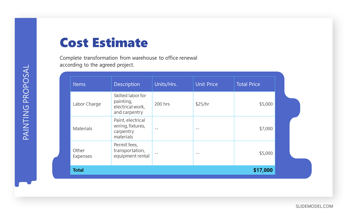
The construction industry requires a detailed presentation that covers all planned and contingency strategies for a project. Such an approach builds trust in the client, and that’s why we believe this PPT template for contractors with creative PowerPoint visuals is an essential tool for securing business deals. This presentation example template shows how to deliver a project proposal in style with accurate cost estimates.
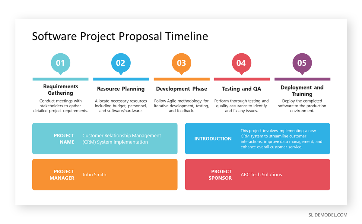
A generic PPT project proposal template allows us to repurpose the slide for many projects—ideal for agencies, consultants, and academics. With this visual project proposal timeline, you can discuss the different stages of a project, plan for resources (both material and workforce), seek funding, or prepare for contingencies.
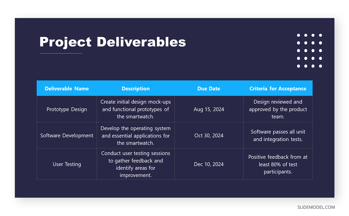
Once the project proposal’s core aspects are approved, teams must align efforts for project deliverables, acceptance criteria, and delivery format. This PPT presentation example illustrates a slide in a multi-team meeting to fine-tune aspects of the project deliverables, with an accurate representation of the due date and expected products.
Training Presentation Examples
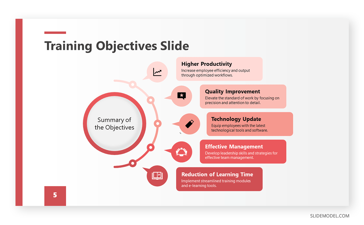
Team training requires a framework in which the objectives of the workshop, coaching, or mentoring programs are laid out for management. HR teams can benefit from this presentation example by summarizing the objectives about missed business opportunities or expansion plans for the organization.

Before even delivering a training program, HR teams discuss the content to cover with the head of each department, mainly to spot any missing area of knowledge required for optimal operations. Presenters can repurpose this slide for that kind of training proposal presentation or the training presentation itself.
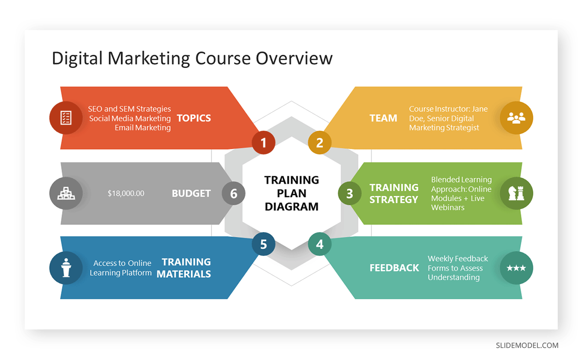
Intended for the early planning stages of a training program, this diagram is a well-rounded presentation example of how to discuss all points in one single slide, from the training budget to how to process employee feedback. We can expand each of these six topics in companionship slides.
Change Management Presentation Examples
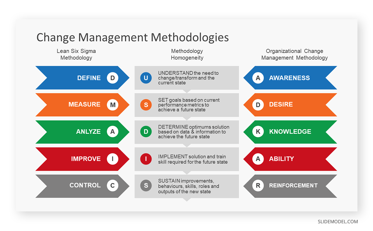
Companies undergoing change management processes can opt to apply the DMAIC or the ADKAR frameworks to orient the workforce. This presentation slide allows management to compare both methodologies and pick the one best suited for their organization.
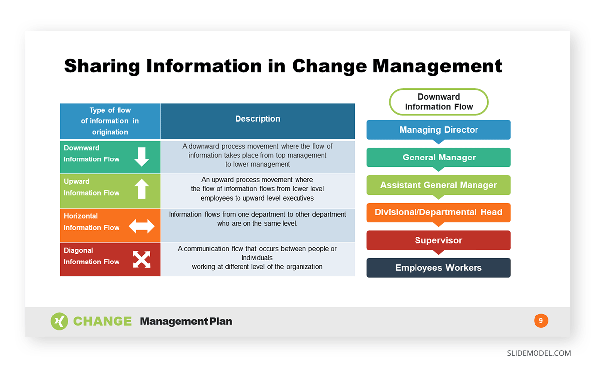
Since data sharing is delicate in charge management situations, implementing an information flow diagram is a good practice to orient your team, get the new owners or management the required information, and exchange information between departments.
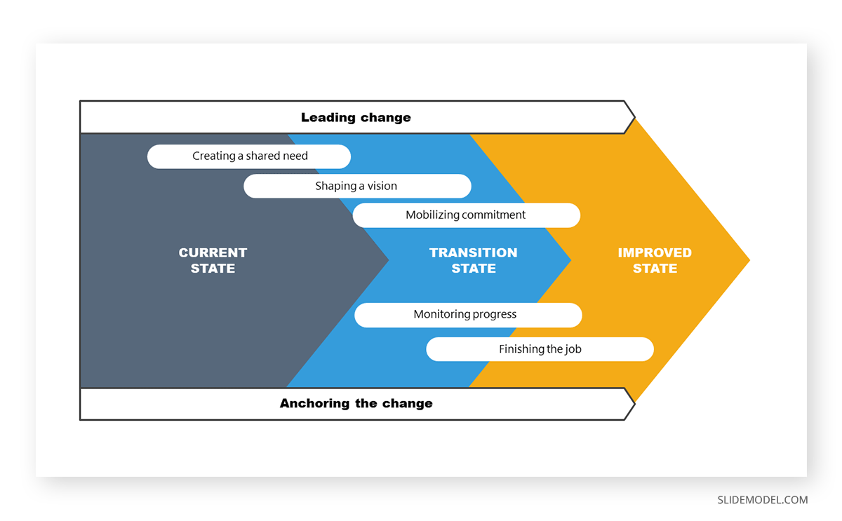
For change management directed at process optimization, this example slide allows management to stress the importance between the current situation and the expected improved state. This PPT template can also introduce the different milestones per stage and involve the management parties per area.
Industry Analysis Presentation Examples
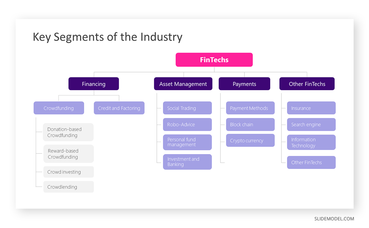
Startups often present their industry analysis to procure investment from venture capitalists. This industry analysis presentation example showcases a typical FinTech segmentation. Presenters can describe the different types of crowdfunding, credit, and factoring services and provide examples of companies or platforms in each subcategory. They can discuss areas like asset management, payments, and other relevant aspects in detail, with successful stories from referents that helped shape their business model.
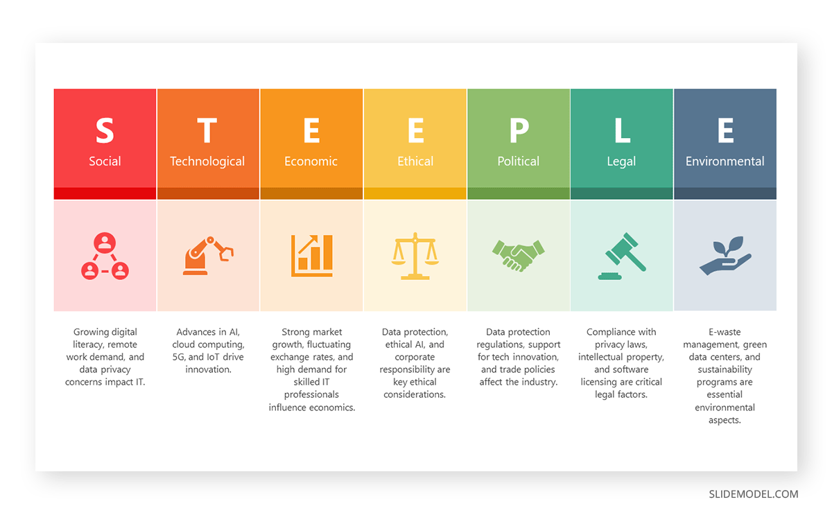
STEEPLE stands for Social, Technological, Economic, Ethical, Political, Legal, and Environmental factors. This framework allows us to perform a multidimensional industry analysis in which stakeholders can evaluate the appropriate approaches for venturing into a new business niche, renewing their overall strategy, or pursuing new goals based on recent industry changes, even those we don’t initially acknowledge.
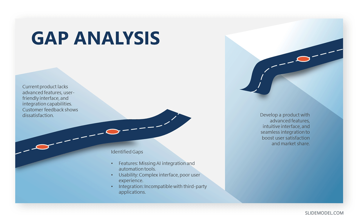
The Gap Analysis concept compares a company’s current status to a desired future state. By doing so, organizations can identify deficits or areas that require improvement in alignment with the future state. Presenters can work with this metaphorical gap analysis template and express the need for a plan that bridges such a gap.
Financial Planning Examples
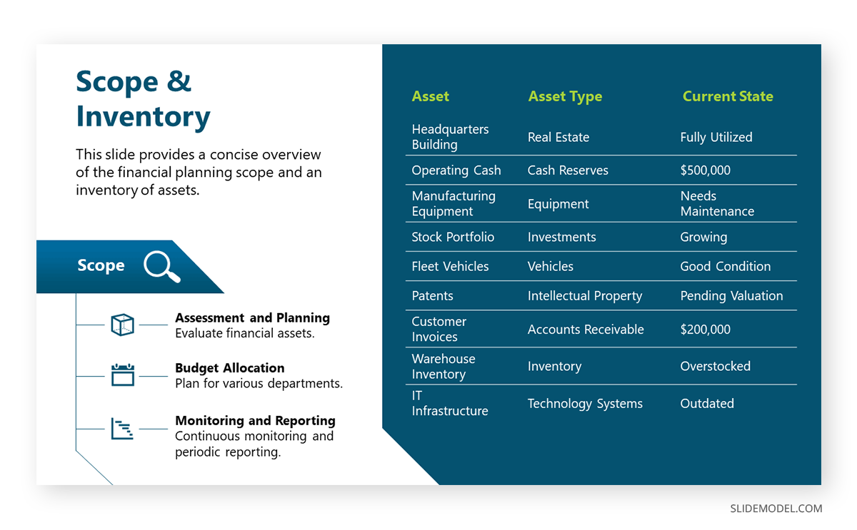
The next example of a PowerPoint presentation is oriented to the financial area, in which a consultant can refer to an organization’s asset management. By Scope, we imply the extent and boundaries of the asset management activities within an organization. It outlines what will be included in the asset management plan and what will not. On the other hand, Inventory points to a comprehensive and detailed list of all the assets owned by an organization. It includes essential information about each asset to facilitate effective management.
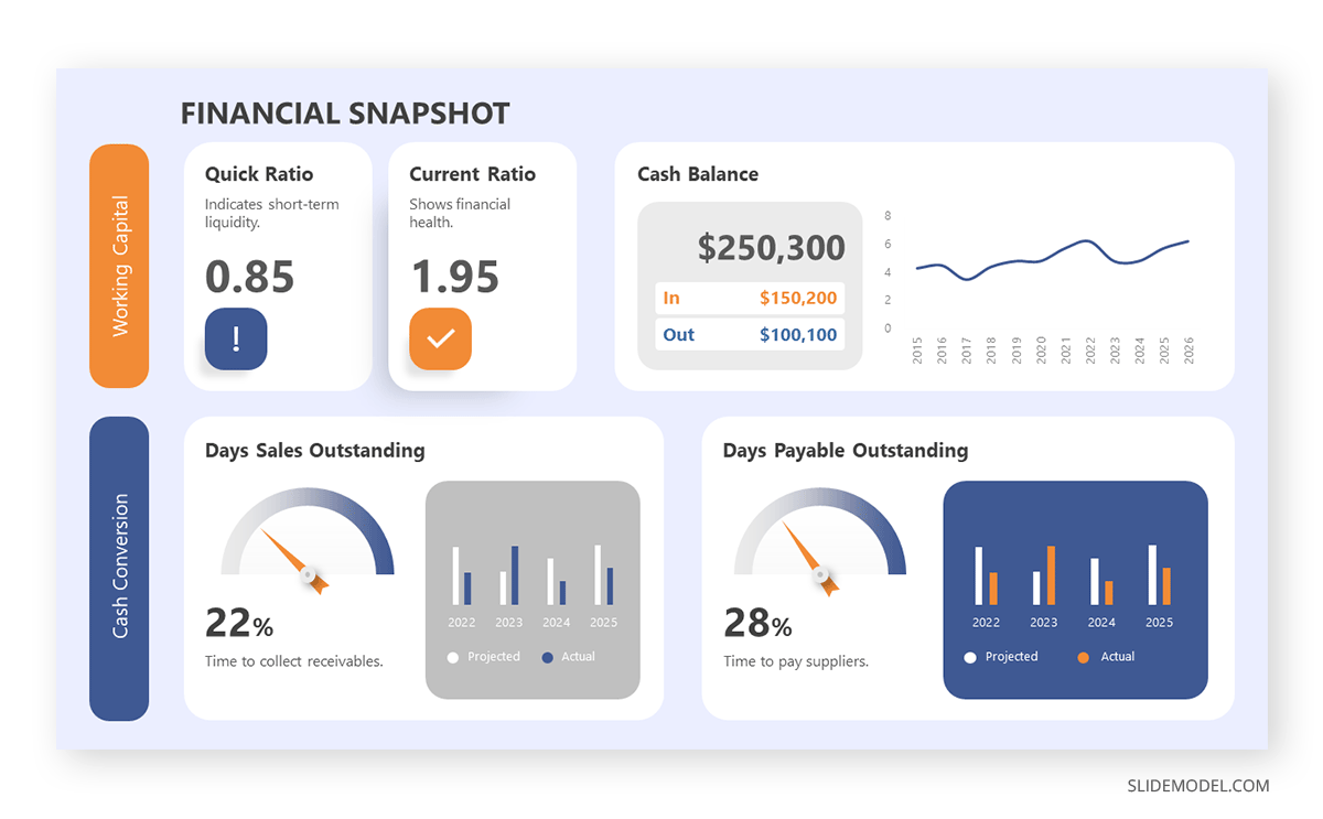
In financial presentations, the information must be clearly arranged so decisions can be made easily. In this case, we observe how a financial dashboard template can represent an organization’s relevant KPIs.
Inspirational Presentation Examples

Think about TEDx presentations or Pecha-Kucha. They all have one factor in common: quality graphics to talk about inspirational stories. Graphics can feel overwhelming for some presenters, which ends in picking low-quality pictures or stock images unsuitable for the context of your slide deck. For this reason, we highly recommend you implement vector illustrations into your motivational presentation slides. Easy to customize, they are a valuable asset to mix & match PPT templates and create your custom deck.
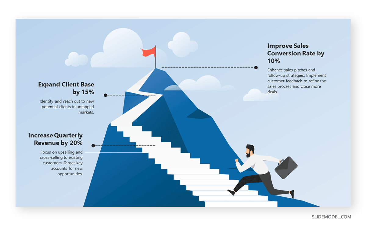
Aligning efforts toward a common goal requires a powerful visual communication language. Images are easier to retain than words, so imagine adding a storytelling factor and turning a goal into a mountain to conquer. Presenters can work with this mountain PPT template and signal the different milestones to reach prior to fulfilling a significant goal for the company/organization.
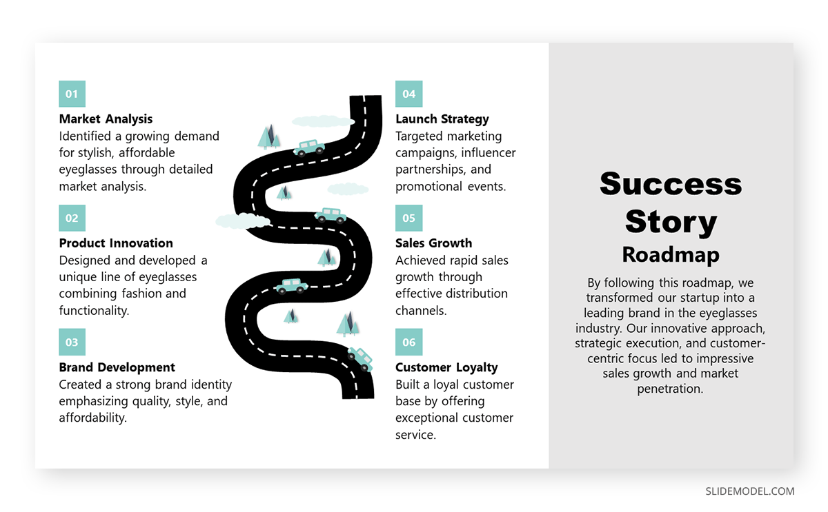
Another take in inspirational presentations is when we need to share our success stories with investors or in networking environments to inspire others. With this roadmap PPT template, presenters can go stage by stage and present the key stages that made them reach their success, or even project for expected goals to achieve.
Academic Presentation Examples
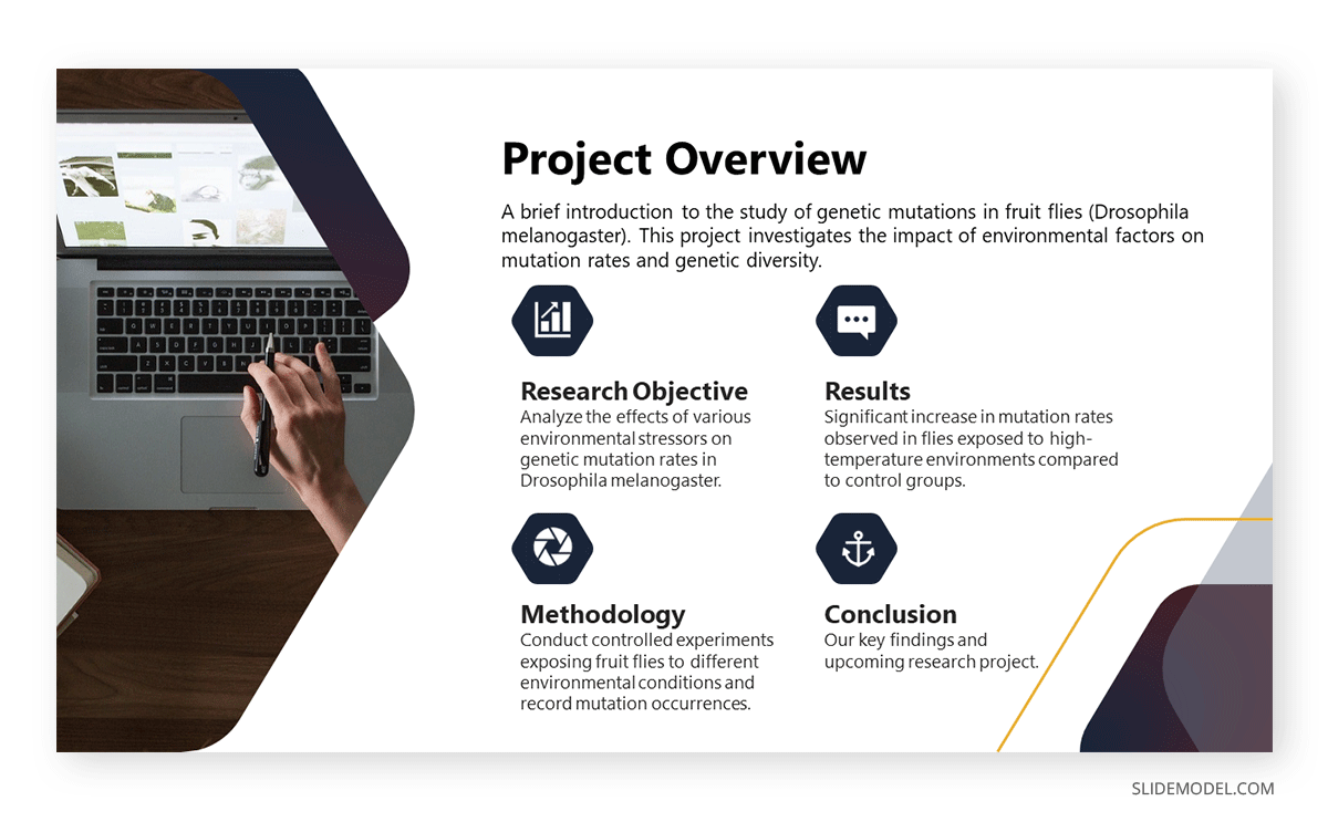
Academic presentations don’t have to look dull or excessively formal. We can incorporate a sleek layout into our slides and use icons to highlight key points. In this case, we observe a project overview for a research project, and the icons represent the main aspects to cover in this research.
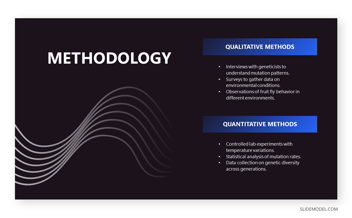
A thesis presentation requires properly introducing the methodology to demonstrate the hypothesis. Rather than adding complex figures, we can work with a minimalistic slide design and briefly describe the research methods. This slide deck is suitable for thesis presentations as well as academic projects, research papers, and more.
Final Words
As we can see, counting with a professionally designed slide deck makes a difference in how your presentation is perceived by the audience. By working with SlideModel PowerPoint templates, we can reuse and repurpose our slide templates as often as required or mix elements from different slides seen in these PowerPoint presentation examples to create uniquely styled slide decks.
