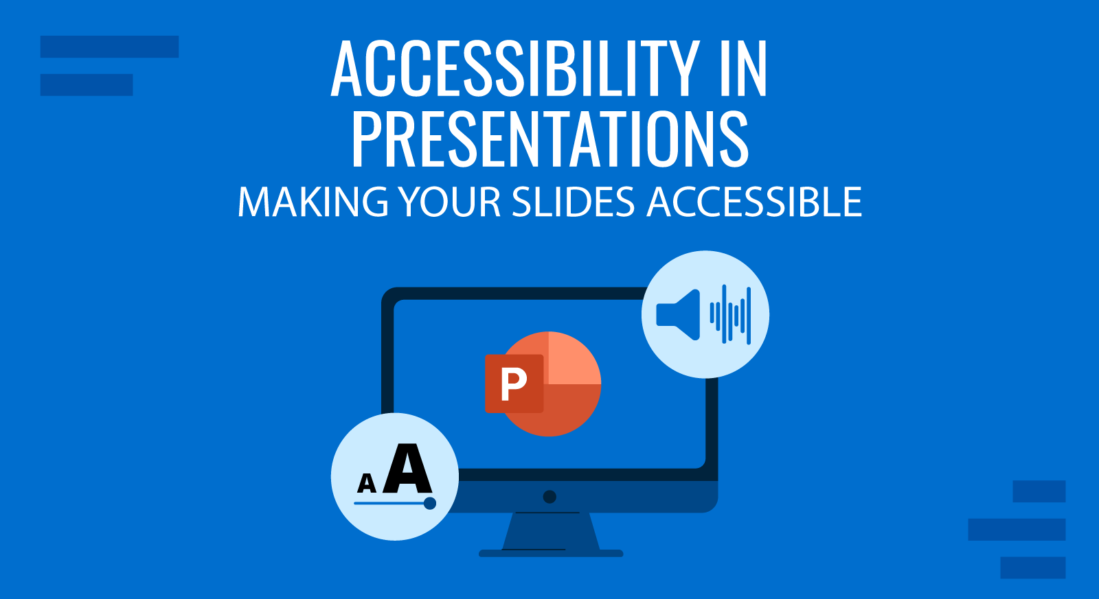
Accessibility in web, print, and presentation design is of paramount importance. Approximately 2.2 billion people in the world have a near or distance vision impairment. An even larger number lives with other types of visual or cognitive dysfunctions. When delivering a presentation to an audience, you never know what type of people will attend. Some audience members may have dyslexia, color blindness, moderate or severe forms of vision impairments which can affect their ability to enjoy your presentation as much as others do. This post offers a walkthrough of web content accessibility guidelines and PowerPoint accessibility features that will help you design and deliver more inclusive presentations.
Accessibility Definition
Accessibility focuses on how a disabled person can access or benefit from a physical or digital object they interact with.
Web accessibility, in particular, pertains to how people can interact with online materials, apps, and digital systems effectively. A huge body of website accessibility research is specifically dedicated to removing software usage barriers for people with different types of disabilities.
What’s more, improving web accessibility is a global regulatory agenda. The US adopted the Americans with Disabilities Act (ADA) back in 1990. Three decades later, it remains an important regulatory mechanism for imposing compliance on digital service providers. Last year, over 2,285 ADA class-action suits were filed against businesses, who failed to create an inclusive environment.

Globally, Web Content Accessibility Guidelines (WCAG), introduced by World Wide Web Consortium, are used to ensure a greater degree of accessibility for web content and web experience. Specifically, these include guidelines for:
- Adding support for voice-control systems
- Using transcripts and subtitles for content
- Prioritizing convenient navigation that does not use color
- Incorporating descriptive captions for images (alt texts)
To ensure compliance with the above, a lot of free web accessibility tools were created such as Section508 test, AChecker accessibility checker, and MAGENTA among others.
ADA accessibility guidelines also extend to presentation design. Since presentations are primarily digital mediums nowadays, making them easily accessible for different user groups is highly important. With the accessible presentations, we provide ways to make these documents and their content easier to navigate, read, and transform.
Benefits of Making Your Presentations Accessible
Some of the benefits of making your slides accessible are:
- Inclusion of audience members with special needs
- Ability to engage people who lack language fluency
- Improved perception of you as a speaker (and as company representative)
- Supplementary materials such as transcripts or audio can be re-distributed through other channels
- Presentation transcripts also help improve the SEO of the website where they are published
Let’s see how to create accessible PowerPoint & Google Slides presentations.
How to Make Your Presentations More Accessible: Best Practices
Accessibility is all about making your content more inclusive to diverse people, despite their physical or mental abilities. It doesn’t take long since PowerPoint includes a number of accessibility features. You just need to be a bit more mindful about your design choices to create accessible designs. When making presentations in PowerPoint, there are a few basic steps to follow in order to ensure your content is accessible by an audience.
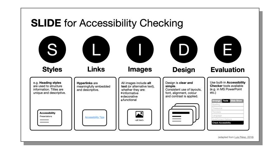
The following infographic represents five areas that you can consider to make your presentation content and slides accessible. As you can see, it covers Styles, Links, Images, Design, plus another dimension named Evaluation which involves the use of built-in accessibility checker tools like the available in Microsoft 365 and PowerPoint.
Fonts
Fonts can easily make or break the aesthetic appeal of the presentation. But far more importantly, a non-suitable font can prevent some audience members from benefiting from your slides.
Here are some best practices for accessible PowerPoint fonts:
- The best font size for a PowerPoint presentation is a minimum of 24 points. It’s okay to use a bigger typeface for headings and subheads to accentuate the important information. Likewise, go for a bigger size if you anticipate presenting in a big conference room.
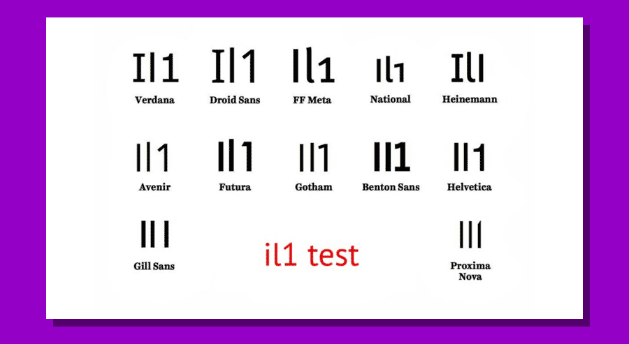
- Prioritize sans serif fonts. Sans serif fonts are those without small lines (serifs) at the ends of characters. Popular examples of sans serif fonts are Palatino, Georgia, Verdana, Tahoma, Arial, and Helvetica. Also, avoid handwritten and calligraphy-style fonts as these are the hardest to read for most people.
- Do not use flickering, flashing, and animated text. Such animations may not land well with visually impaired people or those suffering from epilepsy. In most cases, flashing fonts also make your presentation look cluttered and amateurish.
- Use bold for emphasis. When you want to highlight an important idea, use bold styling over underline and/or italics. The latter change the letter shapes, making them less identifiable, and thus less readable.
- Mark the hyperlinks. A good accessibility practice is to mark all hyperlinks are marked properly with both color and underlying for color-blind people. Also, use descriptive hyperlink texts. Otherwise, people who use screen readers will struggle to understand where the link leads.
Slide Texts
Once you’ve settled on the PowerPoint fonts, you’d be itching to type some presentation text. But before (and after) you do the writing, make sure that your accessible PPT template has the following characteristics:
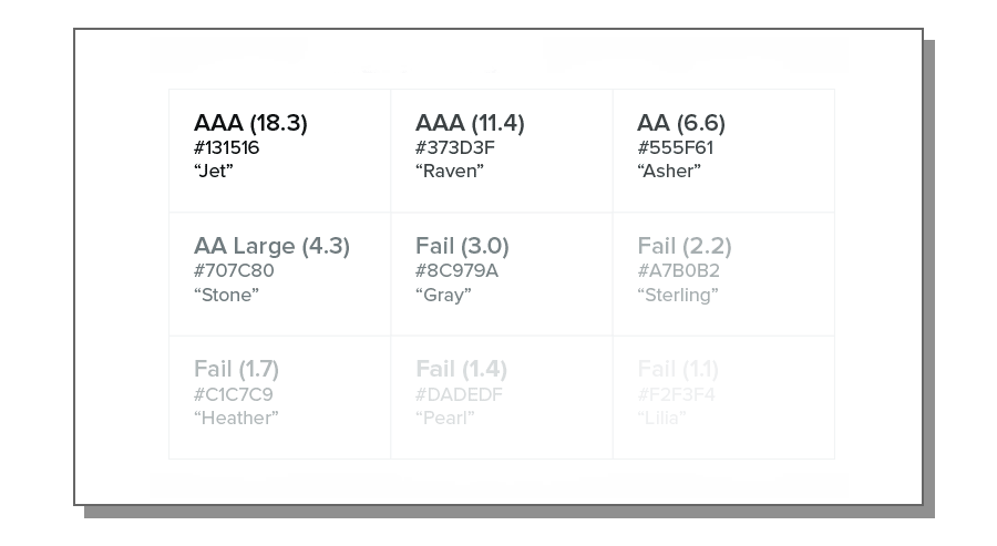
- Use strong contrast between text and background. Contrast helps visually impaired people better distinguish the characters. Use PowerPoint accessibility checker to locate insufficient color contrasts on slides. Also, check recommended color contrast values for text by WCGA.
- Go for simpler language. Don’t use jargon, industry-specific terms, acronyms, or catch-phrases. Most are not universally understood and some audience members may struggle to comprehend them. By using simpler language you are not “dumbing down” your copy — you make it more clear and concise. Add some more powerful words to make your texts more compelling.
- Check your texts for logic flow. Screen readers typically stand the text elements of the slide in the order they were added to the slide. It may be different from the order in which they actually appear. So double-check that your text flow is correct. Also, try adding ScreenTips if you are using PowerPoint.
- Don’t bottom-align slide text. Why? Because that may hide some of the bottom texts from people sitting in the last rows if the seating is tiered.
- Use captions and subtitles. Both can help audience members to better follow your delivery. Also, it’s easy to do since PowerPoint allows to automatically create real-time automatic captions for slides.
Presentation Visuals
Finally, an accessible PowerPoint template also features images everyone can understand, interpret, relate to, and process. Remember: some of the people may not see your slides well. Hence, you may need to add some extra cues for them.
Here are the essential accessibility practices for improving presentation visuals:
- Limit the use of GIFs, flashy videos or, animated transitions. Likewise, avoid shifting colors, rotating icons, and moving borders. Abusing of animations, or using too many effects and flashes in your slides can create unnecessary clutter and worsen the reading experience.
- Opt for texts over videos, when possible. If you absolutely must add a short video, ensure that the clip has good audio context for the listener to understand its content. As an alternative, add a slide note with a summary of the video clip.
- Include Alternative Texts (Alt Texts) for visuals. An ADA compliant PowerPoint presentation has to include alt texts for all images and other visual content. Alt texts can be processed by a screen reader, meaning people with visual impairments can better understand the featured information. Adding an alt text is easy.
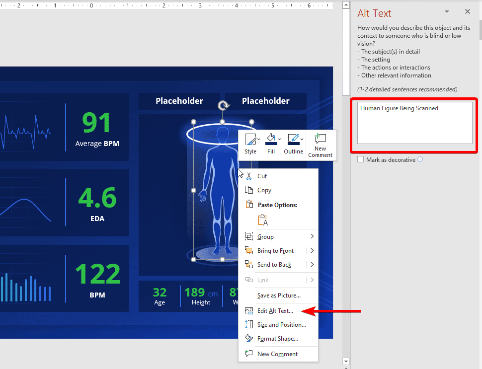
Right-click the graphic, select Format object, then click Alt Text pane, and provide a brief text description. The same approach works for Shapes. In the example below we can see how we configured the Alt Text for a human figure in the Health Check Dashboard template.
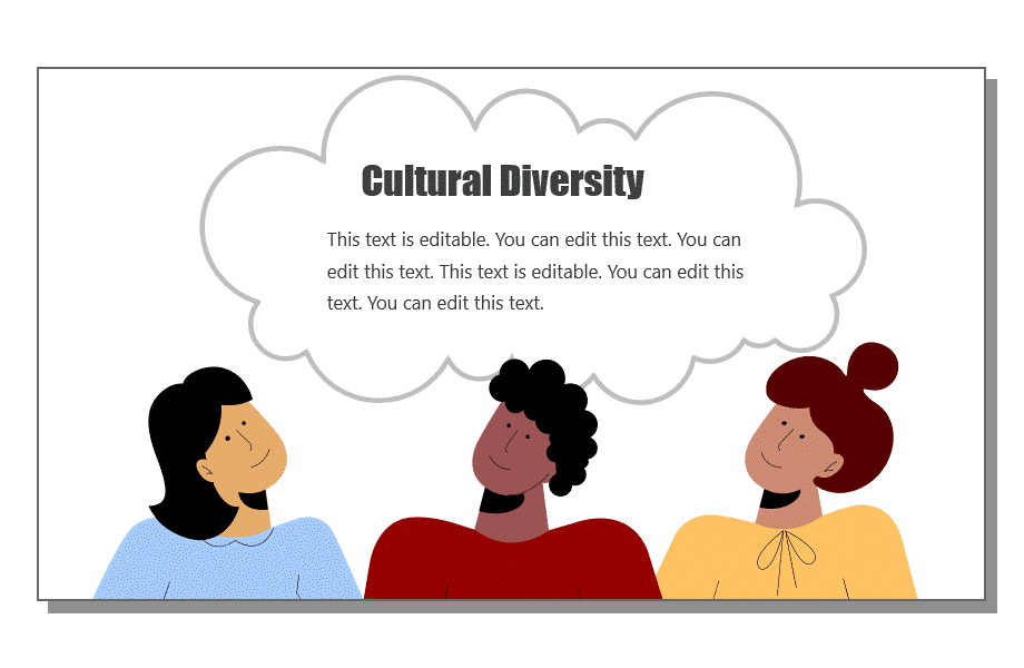
- Highlight diverse people on your slides. Our world is wonderfully diverse. So add use inclusive visuals featuring folks of different backgrounds, ethnicities, body shapes, and abilities. In fact, that’s what most people expect from you. According to a recent Getty poll, 80% of consumers believe that businesses should show more ethnic diversity in their advertising.
- Avoid complex charts or tables. These are often hard to process for screen reading software and audience members with cognitive issues. Thus, make your graphics as simple as possible. Be careful while using SVG format. SVGs are great as they give a lot of flexibility for designing the slides and including graphics in your presentations at a minimum file size, but the format lacks semantics for expressing structures like bar charts, tables, scattered plots, etc. The above makes the content difficult to parse by a screen reader.
Presentation Delivery
When the big day of the public speech comes, don’t let your accessibility design efforts go to waste by sabotaging the delivery. Remember: accessibility is about creating an inclusive experience, not just objects. Respectively, you’ll need to adjust your delivery too. Here’s how:
Before starting the presentation, ask if there are any people with special needs in the audience. That’s a simple gesture of courtesy that goes a long way. If you see some raised hands, ask how you could adjust your speech for the person’s comfort.
Overall, speak slowly and distinctively. Use simpler language when you can, mimicking the terms you are using in the presentation copy. Don’t overload your slides with text and instead use voice to communicate and explain extra concepts. Give enough time for the audience to read the slides. Make timely pauses, allowing people to catch up with reading and processing your main points.
Keep your language more inclusive overall. Use “they” as your main pronoun when making a generalization, instead of masculine pronoun (e.g., he), or the awkward “she/he” combo. Likewise, use plural noun forms (e.g. people, workers, employees) over terms marked for masculine (e.g. foreman, fireman, etc).
When you want to introduce a hero to your story, for example, as part of a case study, go for a “gender-neutral” name such as Alex, Dana, Kim to avoid stereotyping either males or females. By all means, avoid blanket, generalistic statements in your presentation such as “Women are better cooks” or “Asians are good in STEM”. This may alienate some audience members. The Linguistic Society has a great set of guidelines for inclusive language.
Finally, consider making your slides available in other formats. While accessibility in PowerPoint is rather great, converting your slides to another format such as PDF, HTML, mp3 audio, or another type of word processing document is another great step for ensuring that more people can access your content after a live delivery.
To Conclude: Go for an ADA Compliant PowerPoint Template
Designing accessible presentations requires some effort. Making your presentations accessible means you’re considering all disabilities. If you are not sure that you’ve got all the aspects of PowerPoint ADA compliance right, consider using a premade accessible template. Accessible PowerPoint templates are fully optimized for use by people with visual impairments and other types of special needs. By opting for such a solution, you won’t have to worry about the design intricacies and have more time to hone your delivery!