What makes or kills a first impression during any presentation is your usage of typefaces in the slide design. There are common sins that we should avoid at all costs, but mostly, there are tactics we can learn to feel confident about designing presentation slides for success.
In this article, we shall discuss what makes a quality typeface to use in presentation slides, the difference between fonts and typefaces (two terms mistakenly used interchangeably), and several other notions pertinent to graphic design in an easy-to-approach format for non-designers. At the end, you will have a better idea of which are the best fonts to use for presentations. Let’s get started.
Table of Contents
- Font vs. Typeface: What’s the difference?
- Serif vs. Sans Serif
- 6 Elements you should consider when picking a typeface for presentation design
- How to install a font in PowerPoint
- 20 Best PowerPoint Fonts
- 10 Best PowerPoint Fonts combinations for presentations
- Considerations before presenting or printing a slide regarding typefaces
- Recommended Font Pairing tools & other resources
- Closing thoughts
Font vs. Typeface: What’s the difference?
Most people are familiar with the term font, but what if we tell you it is wrongly used and you intend to say another word? Let’s start by defining each term.
A typeface is a compendium of design elements that set the style of any lettering medium. The misconception comes as the typeface is the set of rules that form a family in style, and the font is the implementation of those rules in practical elements. How so? Well, a font is part of a typeface family and can list variations, i.e., light, regular, bold, heavy, etc.
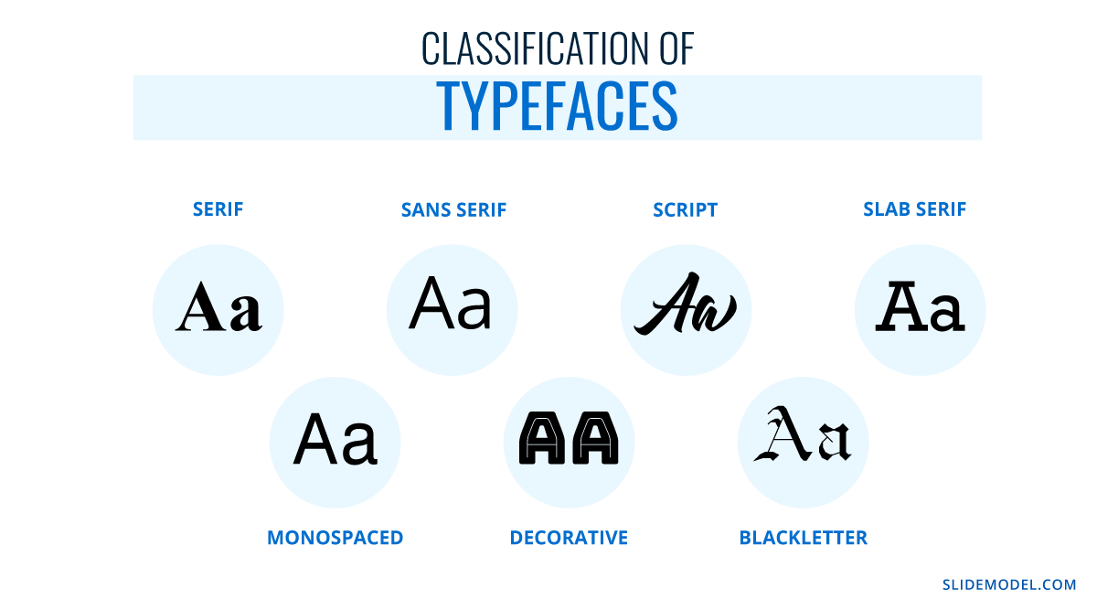
Putting it into simpler terms, a font is part of a typeface, and typefaces are set to classes depending on their graphical elements. That categorization stands as:
- Serif
- Sans Serif
- Script
- Slab Serif
- Monospace
- Decorative
- Blackletter
Serif vs. Sans Serif
Up to this point, you may ask yourself: what is the whole point of the serif? Well, there’s a little bit of story behind it. Back in the old days, when writings were made in stone, engravers added extra glyphs at the end of each letter, as a consequence of the chisel mark. In 1465, with the development of the type printing press by Johannes Gutenberg, the Gothic’s overly-ornamented Blackletter style – used mostly for ecclesiastical purposes – was the go-to typeface to use as it mimicked the formal handwriting style. There was a problem, though, and it arose as such typefaces required lengthy space to produce a book, increasing printing costs. This is where the first pure serif types started to emerge, but readability remained a problem; especially when Renaissance’s calligraphy style didn’t offer an alternative.
These concepts were revised by the 18th century when a pursuit for aesthetics gave birth to newer, slim versions of the serif script. By 1757, John Baskerville introduced what we now know as Transitional typefaces, intended as a refinement to increase legibility. The end of the 18th century saw the inception of modern serif typefaces, which came from the hand of designers Firmin Didot and Giambattista Bodoni. Their work altered the appearance of standard serif typefaces to make the metal engraving process a high-quality process. This is what we now know as the Didone typeface family.
19th century introduced the slab serifs, also known as Egyptian, which changed communication media as large-scale advertisement quickly adopted this style. In case you wonder if you ever saw this style, remember the large bold letters that newspapers used for headings. The evolution of this typeface style came in 1816, with William Caslon’s “Caslon Egyptian” style, or the two-lines style. This is the very first sans serif typeface ever recorded, and its continuity in style or alterations saw a massive process during the 20th century.
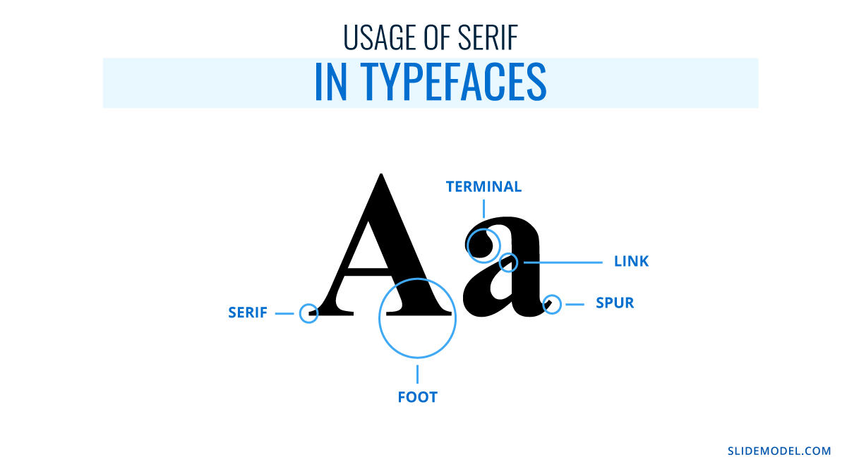
It is quite the process that led to what we now know as sans serif typefaces, and such a road was paved for the sake of legibility and style. Nowadays, there’s little doubt about these two typeface families as you can easily identify iconic styles such as “Times New Roman” and clearly differentiate them from sans serif families like “Arial.” In the graphic below, you can appreciate the glyphs that distinctively give the serif typefaces their style.
6 Elements you should consider when picking a typeface for presentation design
Moving on to the parts that pique our interest as presenters, you should consider some implicit rules before starting a PowerPoint design.
Functionality
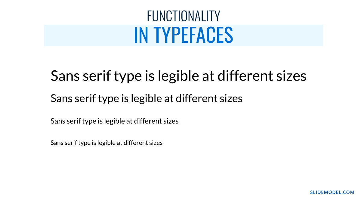
Let’s be hyper-clear on this point: not every typeface works for your intended purpose. Legibility should be your primal focus, way more than design, as what’s the point of using a cool-looking typeface if no one can get a clue of what’s written?
Functionality refers to the usage of a typeface at different sizes across a document. Do you ever wonder why you see the same typeface on eye testing boards? Usually is a slab serif, with its sans serif alternative, and the same font is repeated, downscaling its size to test your visual acuity. If, said typeface, had “catchy” glyphs, you would require twice as much time actually to read the type below the average 24pt in a board.
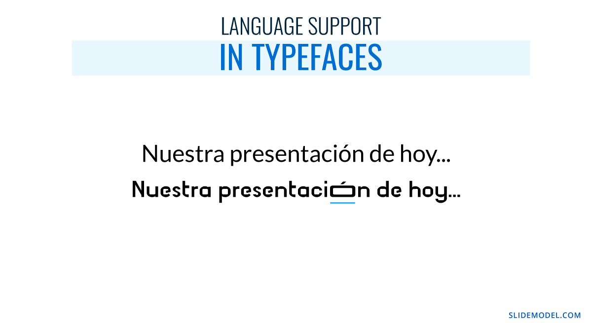
Language support
This is a common, and painful, pitfall many non-English speakers do. They fall in love with a typeface after browsing an English-based website, but whenever they apply it to a personal project, they find they cannot use their average characters. Which characters are those?
- Ø – in Nordic languages.
- Ö – also known as umlaut in German, is commonly used in Turkish, Nordic, and Baltic languages.
- Á – the acute accent used in most Latin-based languages such as Spanish, Italian, Portuguese, and French.
- Ô – the circumflex, mostly used by Portuguese-speaking users but also French.
- Ç – the cedilla, used in Portuguese, French, Catalán, and Turkish (the ? character, for example).
- Ã – the tilde, common in Portuguese.
And those are just some examples extracted from the Latin alphabet. The problem even worsens if we intend to use Cyrillic, Greek, Hindi, or other Asiatic alphabets (which don’t fall into Chinese, Japanese, or Korean typical logographic style). For this reason, we emphasize testing the characters you will mostly use throughout a standard written text, just not to come across nasty surprises.
Some font families offer support for multi-language applications across the same alphabet. Others, restrict their compatibility in terms of certain characters (i.e., the acute accent in Spanish), but sometimes, that renders as a distorted character that looks awful at any written copy.
Multiple weights
We want to expose this point by first explaining what weight means for a font family. As previously mentioned, fonts are part of a typeface; they are their implementation in terms of style. Well, fonts include variations within the same specific family style that makes the text look thinner or bolder. That’s known as font weight and can be classified in two ways.
Name classification:
- Thin
- Thin Italic
- Regular
- Italic
- Medium
- Medium Italic
- Semibold (also known as Demi Bold)
- Semibold Italic
- Bold
- Bold Italic
- Heavy (also known as Black)
- Heavy Italic
Web designers and graphic designers often use a number-based scale, which is inherited from CSS.
- 100 – Thin
- 200 – Extra Light
- 300 – Light
- 400 – Normal or Regular
- 500 – Medium
- 600 – Semibold
- 700 – Bold
- 800 – Extra Bold
- 900 – Black
Now you know the reason why some places like Google Fonts often show numbers next to the name definition of it.
Trademark
Not every typeface can be used for any project. Some typefaces can be acquired for a fee through sites like MyFonts.com, but their usage does not allow commercial use. What exactly does this mean?
Let’s say you created a product, and you love the Coca-Cola lettering style. Well, you want to use the Coca-Cola typeface, which is trademarked, as the typeface for your logo. Everything sounds fantastic until your designer warns you that it’s impossible.
Brands that create typefaces for their logos, which is a common practice to deliver the originality factor into the brand, restrict the usage of their intellectual property for commercial use as they don’t want to be associated with the wrong kind of message. Okay then, what happens when a kid uses those typefaces on a school project? This writer sincerely doubts a company shall put their legal team to prosecute a student; most likely, they feel it is part of their brand awareness and cultural influence. That same argument won’t be used if a particular is intending to use the typeface to make a profit with a non-branded product, and you will be legally requested to ditch the design altogether.
Therefore, before opting for a typeface, don’t fall prey to using a fancy, trademarked, typeface.
The unknown-typeface strikes again
This is another common pitfall if you attend multiple presentations or if you work in the printing business. How often does a user feel annoyed that the presentation “looked different” at home? Fonts are the culprit for this.
Whenever you work on a presentation using local-based software, like PowerPoint, the typefaces you pick are the ones installed on your computer. Therefore, if you change devices, the typefaces won’t be available. We will retake this topic later, but consider always working with well-known typefaces available on any computer rather than innovation.
Sins of type
Finally, we want to conclude this section with the vices you should avoid at all costs whenever working with type in presentations.
- Using multiple typefaces on the same document: As a rule, don’t use more than 3 typefaces across your presentation slides design. Increasing the number of typefaces won’t make it more appealing; quite the opposite, and you should be mindful that if your images contain text, they have to match the existing typefaces in the presentation.
- DO NOT use Comic Sans: By all means, do yourself a favor. There are multiple reasons why designers feel like having a stroke whenever Comic Sans enters the scene, but if you want a straightforward reason why, it makes your work look childish, unprofessional, and unfit for its purpose.
- Script fonts for the body of text: Legible typefaces are required in long text areas to make the reader feel comfortable. Script fonts are not intended for readability but for design purposes. If your text is long, work with serif or sans serif typefaces (slab serif won’t do good as well).
- Excess tracking: Tracking refers in typography to the space between words, and the perfect way to point this out is by referring to the Justify paragraph alienation, which often leaves heavy white areas between words. Excess tracking makes the text look boring and hard to read.
How to install a font in PowerPoint
Installing a font in PowerPoint doesn’t mean installing it as a third-party plugin; you must install the font family into the operating system (OS).
Installing a font in Windows
Method 1 – Via Contextual Menu
- Download your desired font family. Extract the zip file you obtain.
- Right-click the font files you obtain from the zip (they can be in OpenType or TrueType format). Click on Install on the contextual menu.
- You will be prompted to give admin rights to make changes to your computer. If you trust the source, then click yes.
Method 2 – Via C: Drive
- Open a new File Explorer window. Search this path: C:\Windows\Fonts. That’s where fonts are stored in any Windows OS.
- Copy the files from your extracted zip file or folder containing fonts.
- Paste the fonts by right-clicking inside the Fonts folder, then click Paste.
Relaunch the opened applications to see the effects of installing a font.
Installing a font on Mac
Mac OS requires a different procedure for installing fonts. First, access the Font Book app.
After launching Font Book, go to File > Add Fonts to Current User. Double-click the font file.
The Font Book app validates the integrity of the font file and if there are duplicate fonts. For more detailed instructions and troubleshooting on Mac font install procedures, check this guide by Apple.
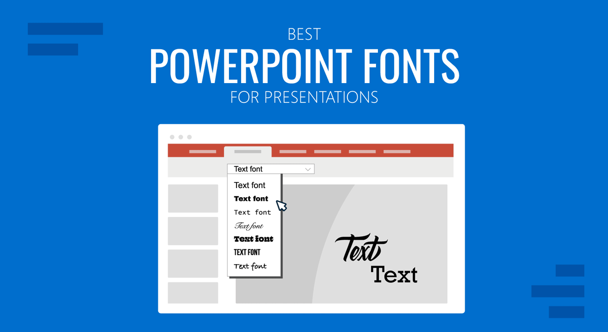
20 Best Fonts for PowerPoint
Now it’s time to explore what you’ve been looking for: the best fonts for PowerPoint presentations! This is a list of typefaces intended for multiple uses in slides, and it will certainly boost your PowerPoint design ideas for the greater. Let’s take a look at some of the best fonts for PowerPoint.
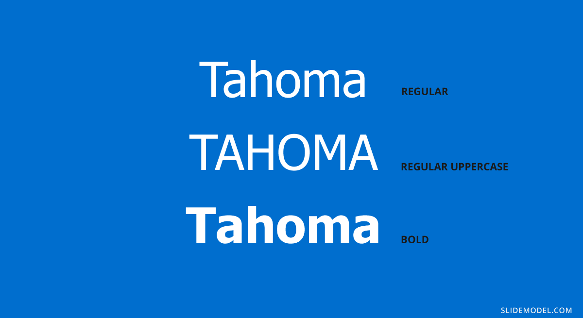
#1 – Tahoma Font
This typeface is typically used in PowerPoint slides, emails, Word documents, and more. It resembles Verdana but with a smaller kerning (distance between characters). Due to that, it feels slimmer, professional and works perfectly on multiple devices. This is one of the best fonts for presentation that you can consider to use.
Recommended font pairing: Georgia, Brandon Grotesque, Helvetica Neue, Palatino, Arial.
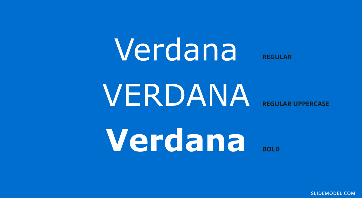
#2 – Verdana Font
Verdana is a sans serif classic commonly used for citations, disclaimers, and academic documents. It is available on both Windows and Mac as a pre-installed font, which would solve your problems if you have to deliver presentations on multiple devices (which may not be yours).
Recommended font pairing: Arial, Lucida Grande, Futura, Georgia.
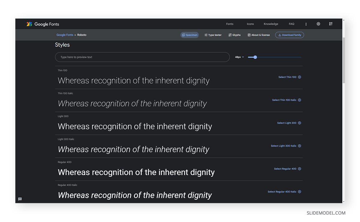
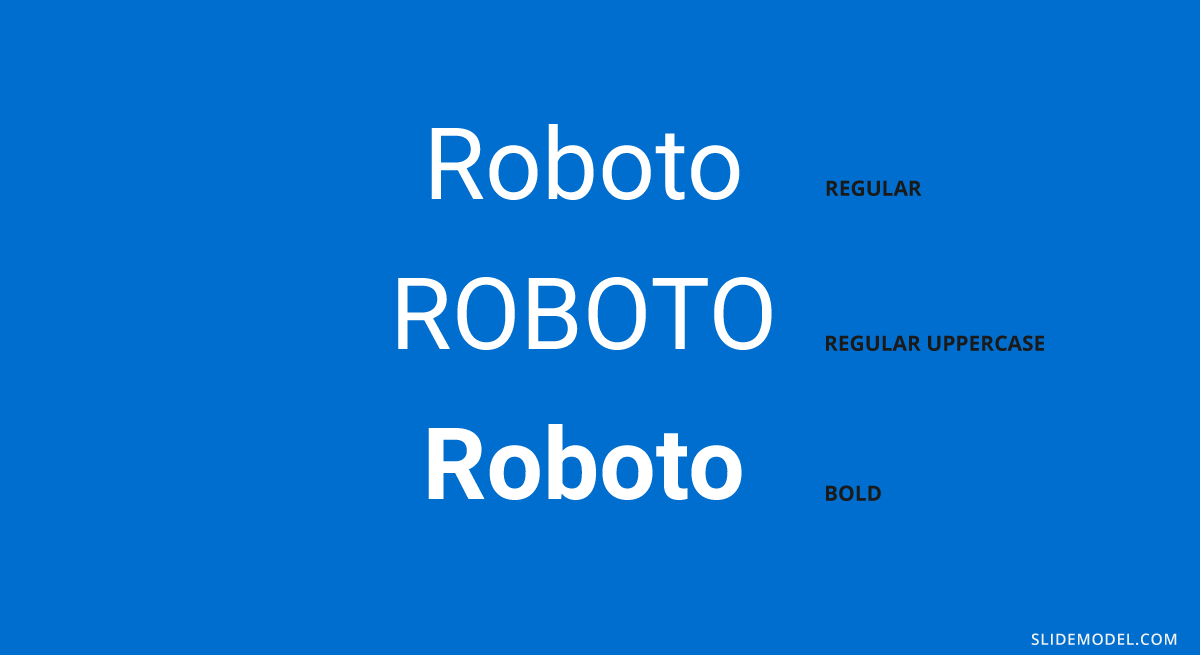
#3 – Roboto
Another delicate sans serif font that is ideal for text bodies. It is rated among the best fonts for PowerPoint readability and presentations, so you can easily pair it with more prominent font families. Roboto is one of the good fonts for presentations. You may recognize this typeface as it is the default Google Maps uses.
Recommended font pairing: Oswald, Gill Sans, Garamond, Open Sans, Teko, Crimson Text.
#4 – Rockwell
Including visually attractive elements is crucial when looking for the best fonts for presentations in PowerPoint, so why not combine a professional style with a slab serif typeface like Rockwell?
It is ideal for headings, especially if used in its bold font weight and paired with a sans serif for the body.
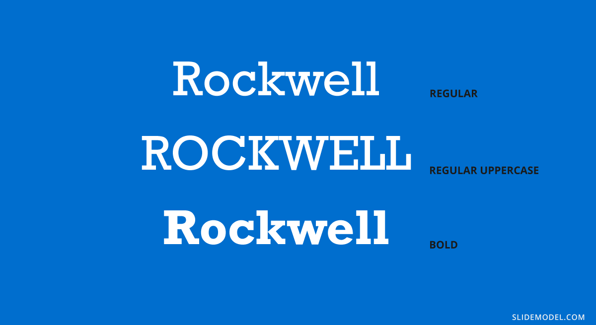
Recommended font pairing: Helvetica Neue, Gill Sans, Futura, DIN Mittelschrift.
#5 – Open Sans
This is easily one of the most versatile sans-serif fonts you can find! It is commonly used in presentation slides as both heading and body, varying font-weight, but you can also create powerful combinations with different typefaces. Let’s see an example of this good font for presentations.
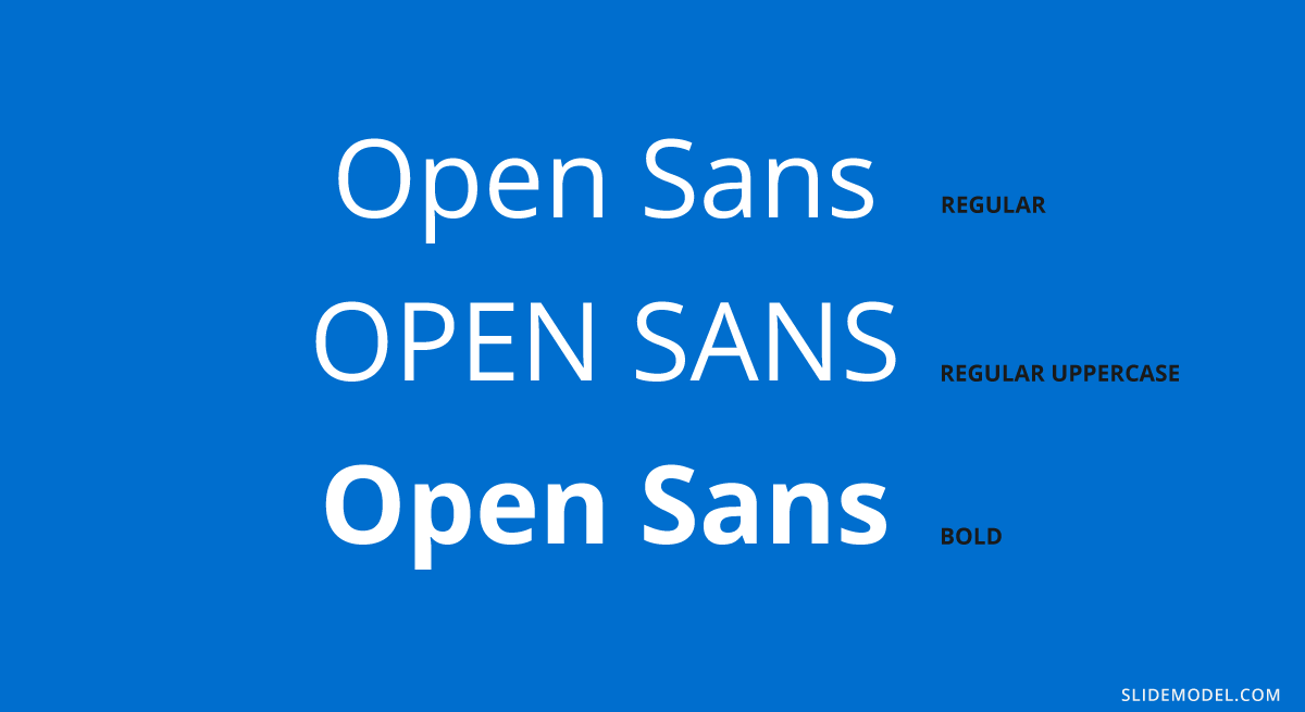
Recommended font pairing: Roboto, Brandon Grotesque, Montserrat, Oswald, Lora, Raleway.
#6 – Lato
A typeface intended for digital mediums, one of its biggest advantages is its wide range of font weights – much like Open Sans. It is ideal for headings in minimalistic-themed presentations, but it can work perfectly as body text if paired with a serif font or a script one. That’s why we choose it as one of the best fonts for PowerPoint presentations.
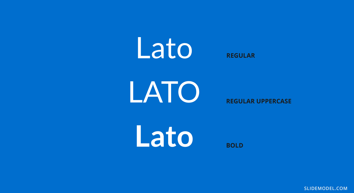
Recommended font pairing: Montserrat, Oswald, Roboto, Merriweather.
#7 – Futura
This sans serif typeface was designed by Paul Renner in 1927 and remains a preferred choice of designers thanks to its clean aspect with pure geometric shapes. It has inspiration from the Bauhaus in terms of styling, so any presenter that loves modern style will find in this typeface a loyal companion.
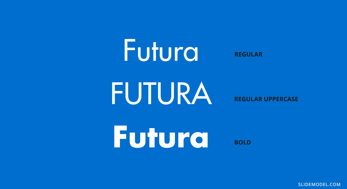
Recommended font pairing: Playfair Display, Lato, Book Antiqua, Helvetica, Open Sans.
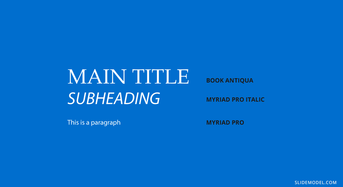
#8 – Book Antiqua
A typeface widely used in the first years of the 2000s, its graphical elements are inspired by Renaissance’s handwritten style. Created in 1991 by The Monotype Corporation, it is known as a classic in design projects and won’t run out of fashion any time soon. Its italic variation is considered one of the most beautiful italic serif fonts.
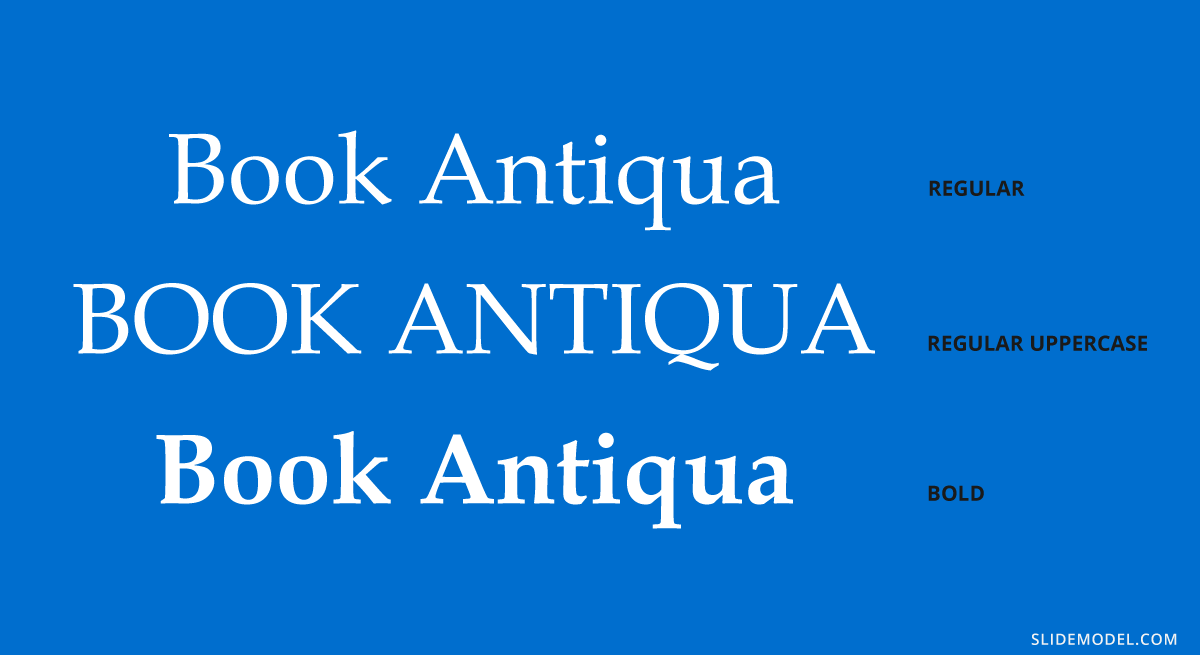
Recommended font pairing: Myriad Pro, Baskerville, Georgia, Futura, Vladimir Script.
#9 – Bebas Neue
This typeface is strictly intended for headings or for body copy that doesn’t mind the usage of caps. The reason is that this typeface is entirely made of caps. It has no lowercase characters, but its slender shape and tight kerning have made it a popular choice among well-known designers like Chris Do. One creative usage of this typeface is to use it in outline format.
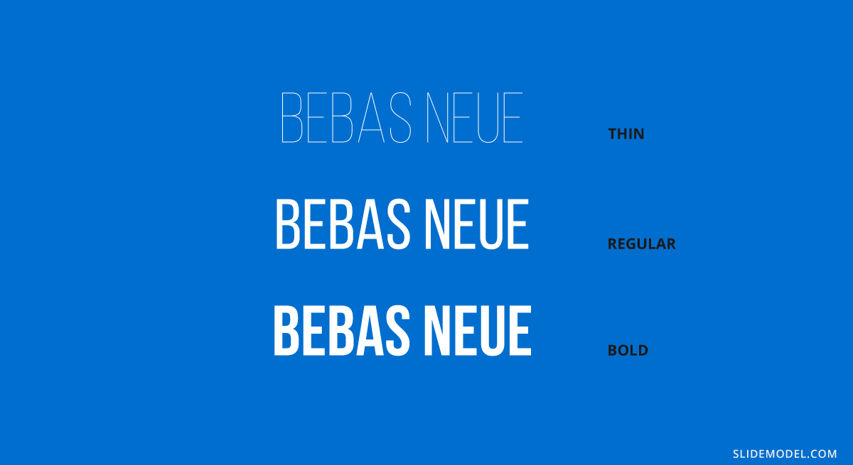
Recommended font pairing: Avenir, Montserrat, DIN Mittelschrift, Roboto.
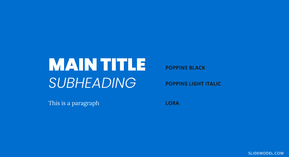
#10 – Lora
This serif typeface can be used both in PowerPoint and Google Slides, as it is a free typeface offered by Google. Works perfectly for formal-styled headings, but it can adapt for text body as long as it remains a minimum of 15pt in size. It is an ideal option to pair with free PowerPoint presentation templates.
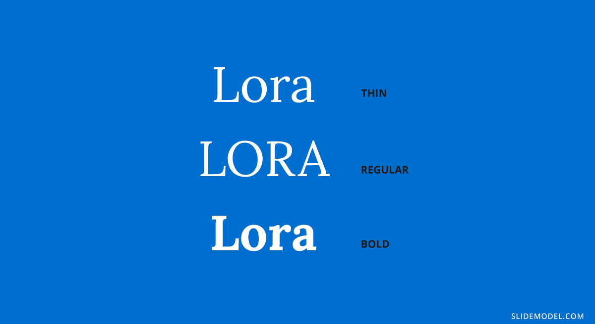
Recommended font pairing: Montserrat, Open Sans, Poppins, Avenir.
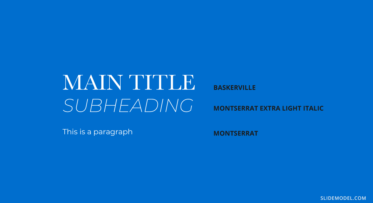
#11 – Montserrat
You most likely came across Montserrat at some point in your life, since it is an extremely popular choice among designers for presentations and packaging. Due to this, you won’t spark innovation but rather remain on the safe side for font pairings – which is ideal for corporate styling.
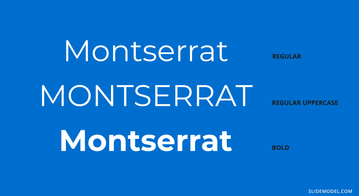
Recommended font pairing: Lora, Open Sans, Merriweather, Oswald, Georgia, Roboto.
#12 – Bentham
Another elegant serif font used for formal occasions, like wedding invitations, headings, or product descriptions. Its kerning makes it readable, unlike many other serif fonts, which is one of the reasons why you can work with this font for the body if you opt for a sans serif in the headings.
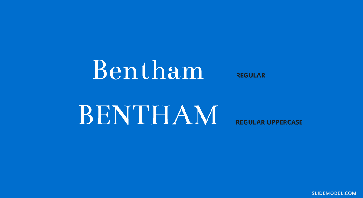
Recommended font pairing: Futura, Open Sans, Lato, Raleway.
#13 – Dosis
It is a simple, monoline sans serif typeface, which works perfectly in its extra light and light font weights to make a drastic contrast with a bold sans serif typeface. Ideally, work with this typeface for subheadings.
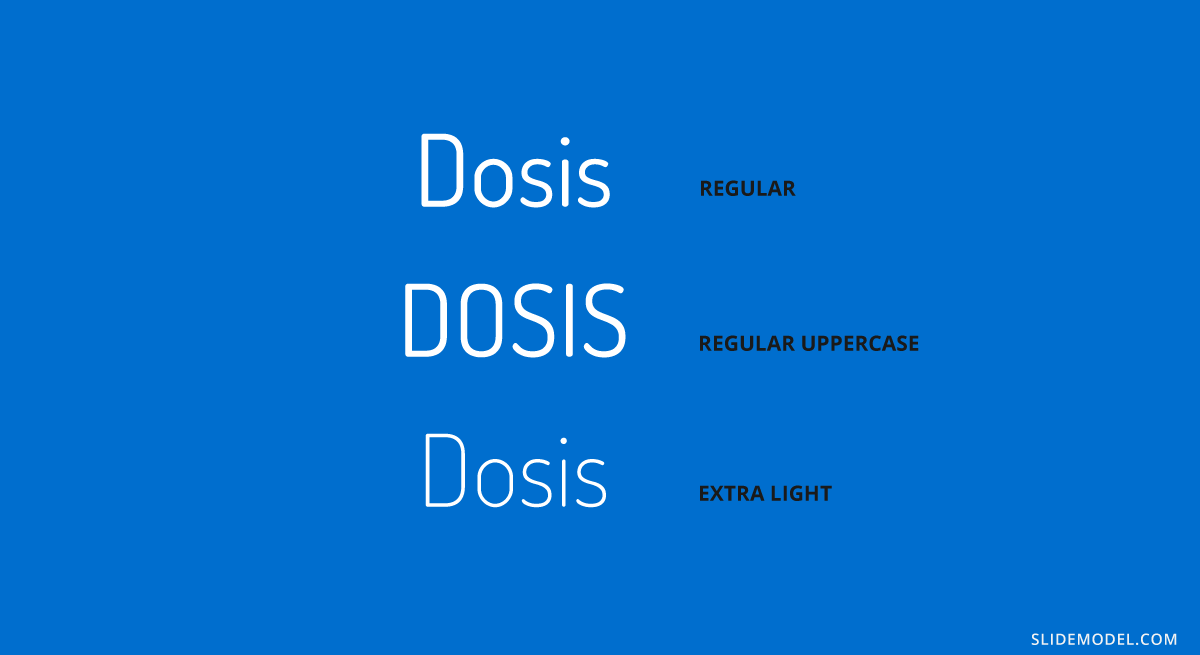
Recommended font pairing: Lato, Montserrat, Roboto, Oswald, Raleway.
#14 – Baskerville
You can come across this serif typeface in the form of Libre-Baskerville, a free serif typeface offered by Google. It is ideal for headings, thanks to its traditional style closely resembling the original Baskerville typeface, so it is ideal to stick to it in uppercase mode.
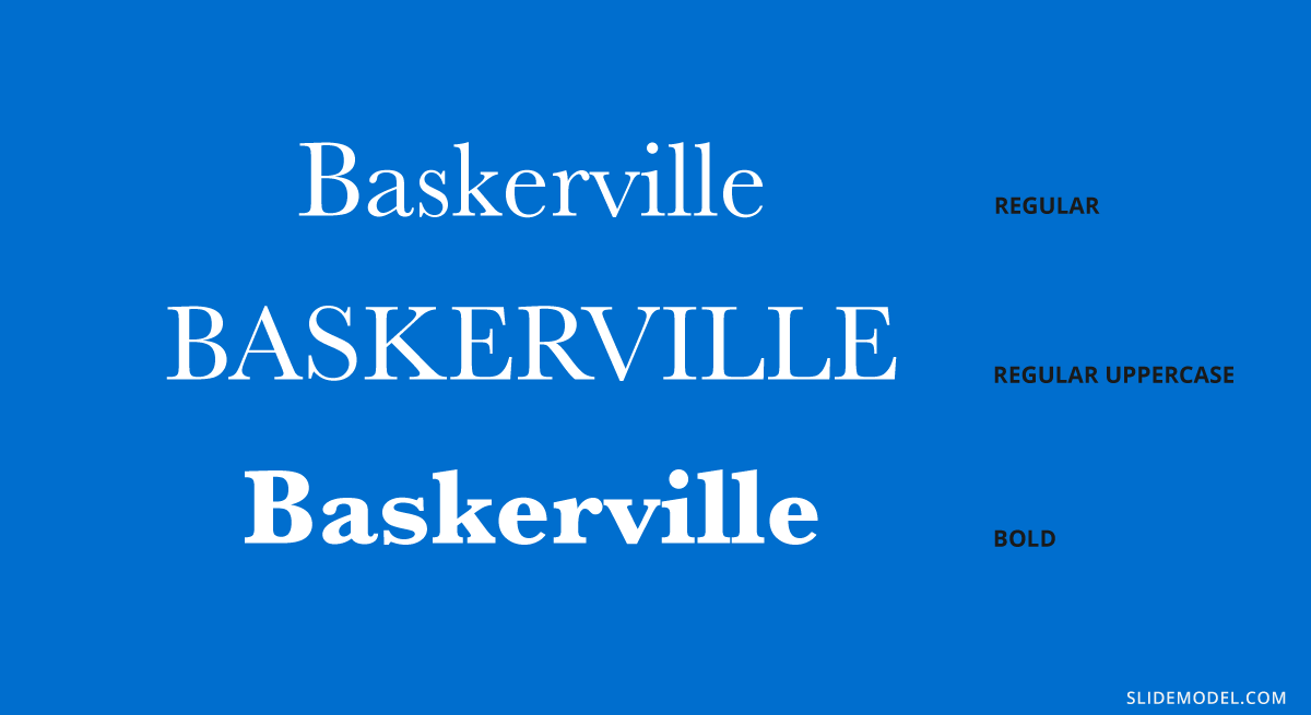
Recommended font pairing: Montserrat, Poppins, Lucida Grande, Helvetica Neue, Open Sans.
#15 – Poppins
This sans serif typeface breaks with the formal style of families like Verdana and Open Sans, introducing some graphical cues that make it adept for more relaxed situations. Therefore, it is ideal to use in team meetings, product presentations, or non-business presentations as long as it remains for title headers.
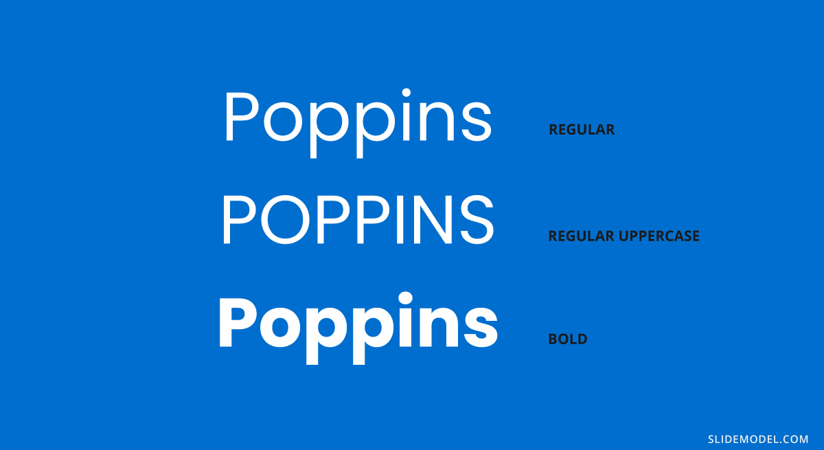
Recommended font pairing: Raleway, Garamond, Merriweather, Droid Serif.
#16 – Zenith Script
EnvatoElements is a great marketplace for typefaces; among the options, we can find this brush-style script typeface. Zenith Script is a powerful option to come up with creative title designs for non-corporate meetings, as long as the title remains short. It can also work for branding purposes, and certainly, you can use it as an asset if you are looking for how to start a presentation.
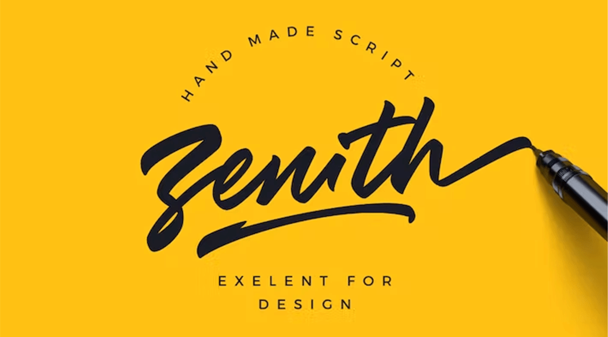
Recommended font pairing: Any sans serif font in uppercase format, with increased kerning. Options can be Open Sans, Bebas Neue (modified), Roboto, and Futura.
#17 – Amnesty
The second option we consider among script typefaces. Amnesty has that dramatic effect that resembles rusting handwriting from the old days. It is ideal for presentations that have to convey a strong emotional factor, like product releases for fashion brands, and we recommend limiting its usage to short titles, always paired with sans serif typefaces.
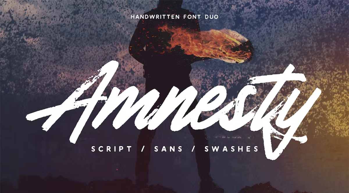
Recommended font pairing: As it is a custom-made font, we recommend pairing it with its Amnesty Sans listed in the product file.
#18 – Bodoni
This typeface dates all the way back to 1798 and is considered a transitional font type. Its name comes from Giambattista Bodoni, designer, and author of this typeface, whose work was heavily influenced by John Baskerville. As a didone typeface, you find elegant traces that instantly give the feel of a fashion magazine heading, and it is no coincidence that this was the selected typeface for the title of Dante Alighieri’s La Vita Nuova re-print in 1925.
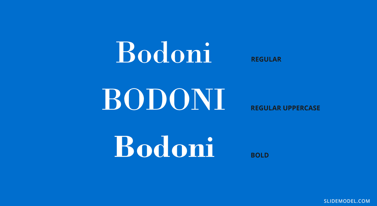
Recommended font pairing: Brandon Grotesque, Gill Sans, Playfair Display, Raleway, Courier.
#19 – Avant Garde
If you are looking for good presentation fonts, this geometric sans serif is the answer to your question. This typeface is based on the Avant Garde magazine logo and remains one of the most popular condensed sans serif options. Many brands use Avant Gard these days as part of their branding identity, such as Macy’s (lowercase usage), the Scottish rock band Travis, RE/MAX, among others.
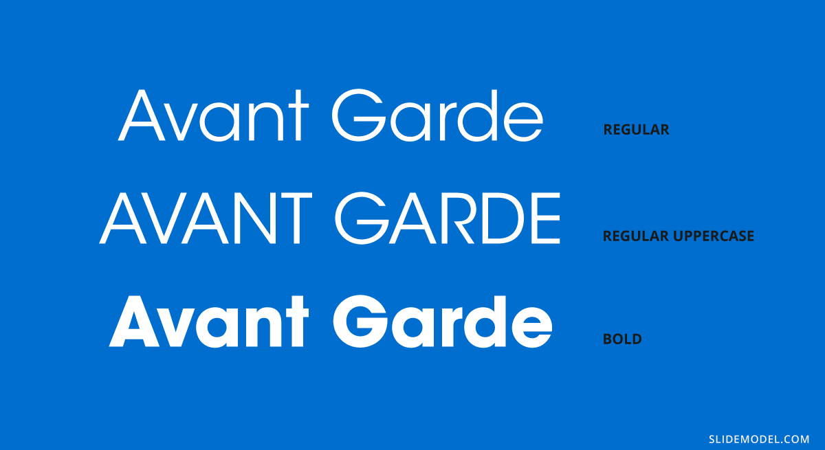
Recommended font pairing: Helvetica Neue, Sentinel, Garamond, Neuzeit Grotesk.
#20 – DIN Mittelschrift
Our final typeface in this list is the DIN 1451 sans serif typeface, widely used in traffic signage and administrative/technical applications. Its denomination, Mittelschrift, comes from the German word for medium, which refers to the font weight. You can find it in Engschrift, which stands for condensed.
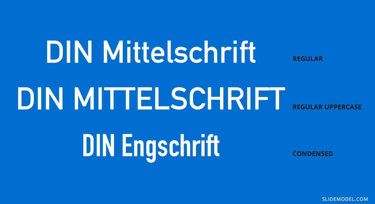
Recommended font pairing: Open Sans, Didot, Helvetica Neue, Lucida Grande.
Keep in mind that if you are looking for a proper way how to end a presentation, working with graphics is much better than sticking with type, as you show extra care for the final element in your slide deck.
10 Best PowerPoint Fonts combinations for presentations
Now that we have seen some of the best fonts for PowerPoint, let’s see some effective PowerPoint font combinations that you can use in your presentations, titles and slide body. You can consider the following font pairings as good fonts for presentations.
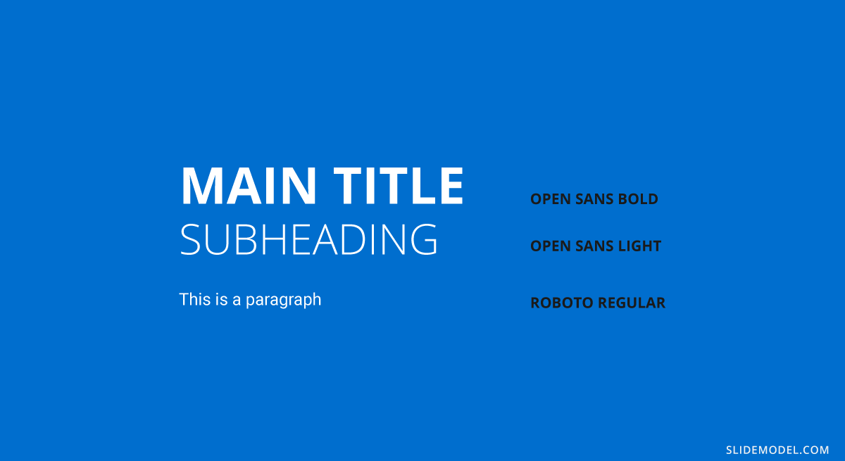
Open Sans + Roboto
Here is an example of a font combination including the popular Open Sans font plus Roboto. This pairing is ideal for corporate or educational presentations that require clarity and readability. Use Roboto Bold or Medium for slide titles to create a modern, professional appearance. Use Open Sans Regular for body content to ensure long paragraphs or data-driven explanations are easy to read.
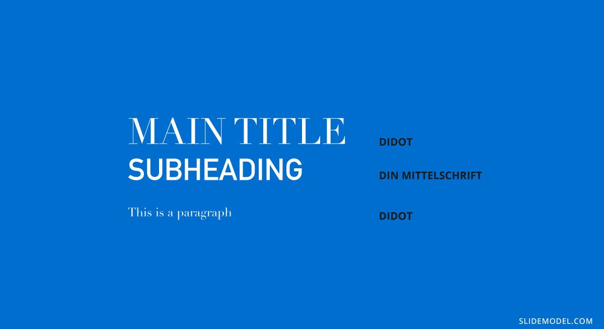
Didot + DIN Mittelschrift
This serif-sans serif duo offers elegance and technical precision. Didot, with its high contrast strokes, adds a refined and sophisticated tone to headers. DIN Mittelschrift, originally designed for signage, brings clarity and order to slide content.
This is best for Luxury brand pitches, fashion presentations, portfolios.
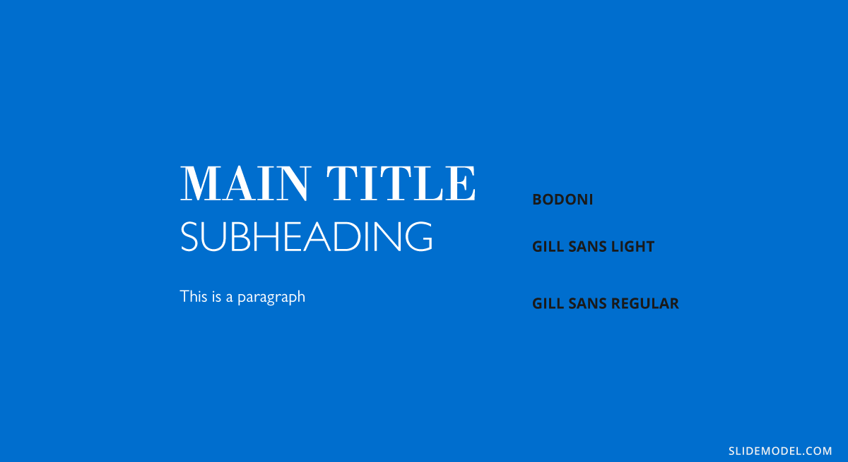
Bodoni + Gill Sans
A classic-meets-contemporary pairing that balances style and readability. This combination of Bodoni plus Gill Sans can be used in creative proposals, event presentations or marketing overviews. Bodoni stands out as a stylish headline font with a dramatic look, while Gill Sans keeps body text grounded and accessible.
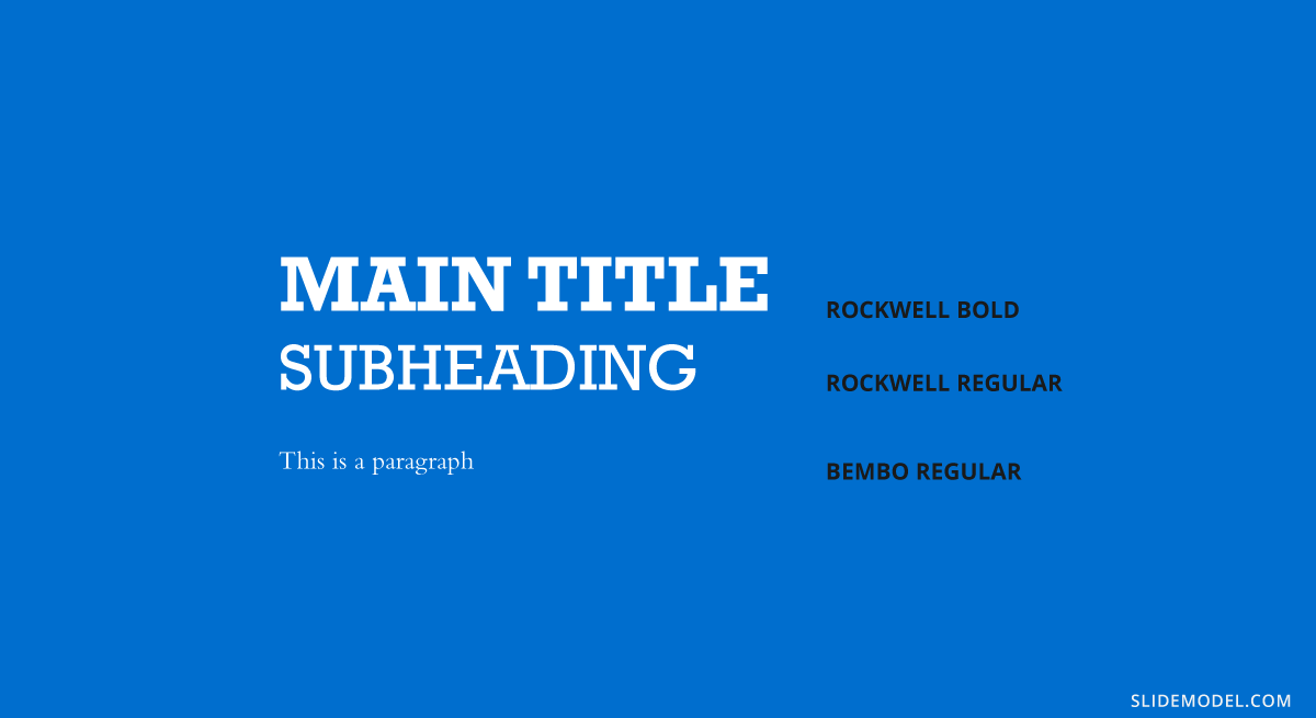
Rockwell + Bembo
If you want to grab attention with boldness while maintaining a traditional tone, Rockwell plus Bembo forms a good combination of fonts in PowerPoint. Rockwell Bold draws the viewer in with strong, geometric slabs, while Bembo font provides a humanist, bookish feel to descriptions and narratives. This PowerPoint font combination is better for educational content, thought leadership presentations and product pitches.
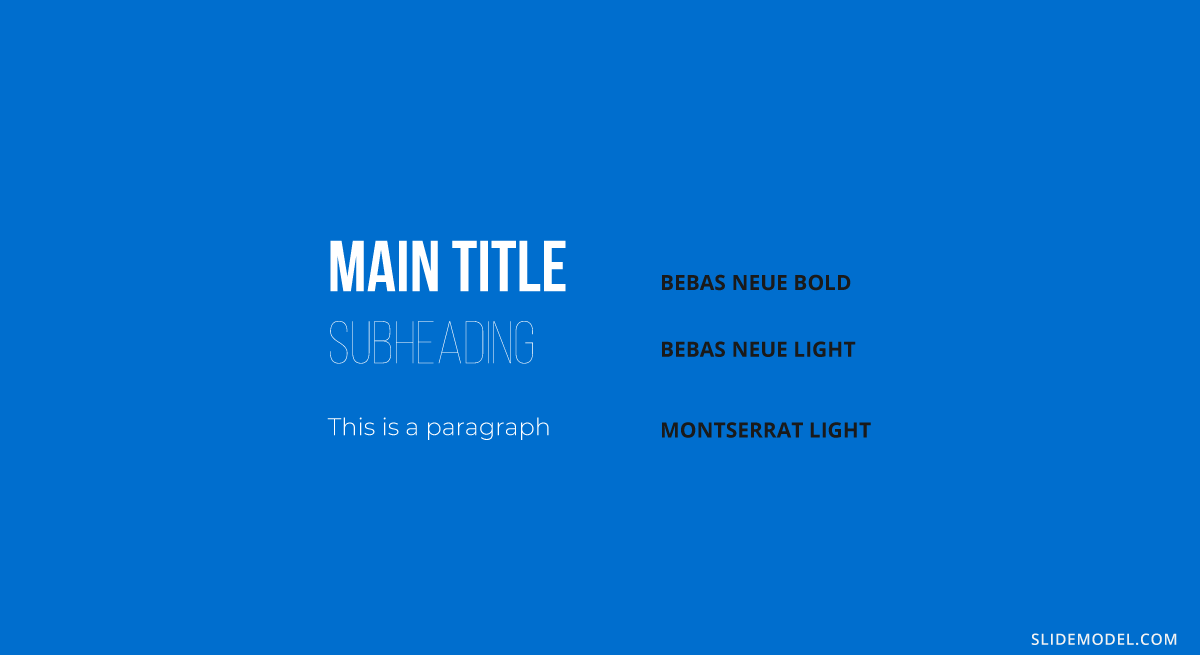
Bebas Neue + Montserrat Light
This modern and minimal combination is perfect for visual-centric presentations. This pairing combines Bebas Neue (all caps) with Montserrat Light. This combination of fonts in PowerPoint works best for impactful titles or section headers. Montserrat Light complements with clean, elegant lines in the body text. This pairing is ideal for Tech startups, portfolio & demo presentations or even startup pitch decks.
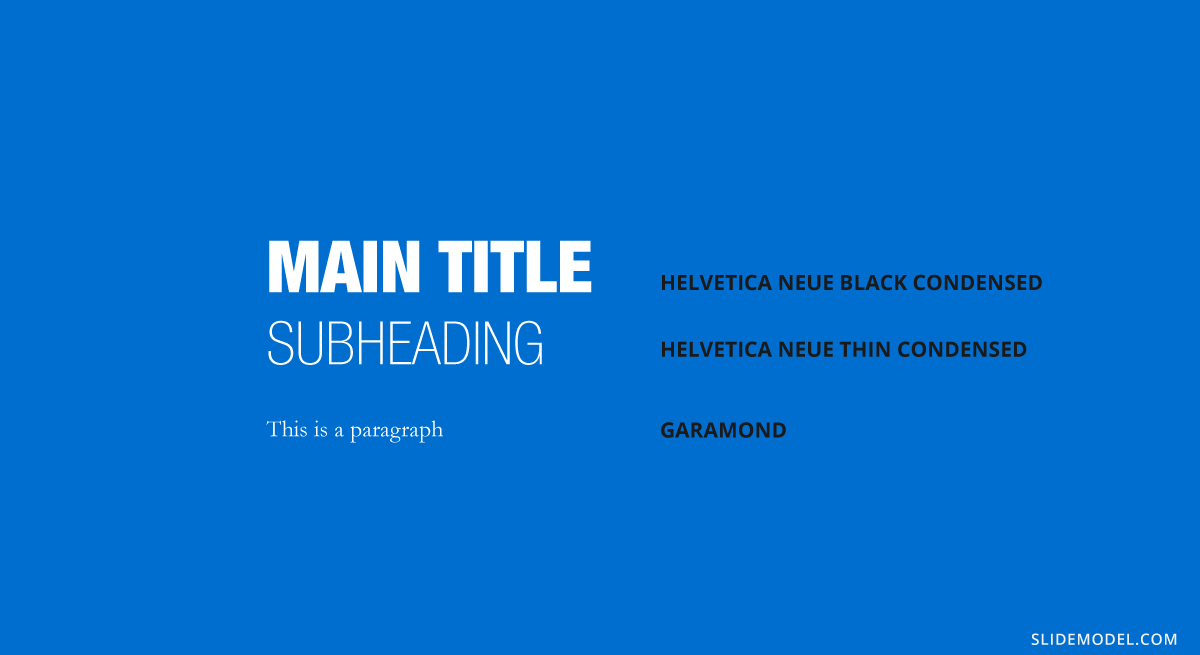
Helvetica Neue + Garamond
This inversion of the typical serif-sans pair adds timeless elegance to slides. While Garamond is great for stylized section headings or quotes, Helvetica Neue ensures the main text remains simple and legible.
You can use this PowerPoint font combination in formal reports, investor updates and nonprofit presentations.
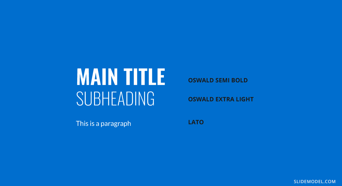
Oswald + Lato
By combining Oswald with Lato fonts, you achieve a highly versatile and readable pairing that adds energy to your slides. Oswald, being condensed, makes room for long headings, while Lato provides warmth and friendliness to your content without sacrificing clarity. This works best for sales decks, community presentations or product demos.
Baskerville + Montserrat
You can use Baskerville for the slide title and Montserrat for the body of your presentation. This combination of fonts in presentations produces a modern twist. Baskerville lends credibility and history to your headers, and Montserrat (which is a geometric sans serif variant) keeps things current in your content. You can use this font pairing for presentations on historical overviews, academic lectures, executive summaries.
Lora + Poppins
This font pairing balances personality and readability. Poppins has a round, approachable look for titles. On the other side, Lora, a serif font, supports longer content with literary grace. This font combination is best for team introduction presentations, internal training slides, education slides.
Book Antiqua + Myriad Pro
This is a classic font combination that works well for formal or narrative content. Myriad Pro keeps headers clean and open while Book Antiqua, with its old-style serif characteristics, improves storytelling in your slide text. This combination works best for Biographical presentations, case studies, storytelling decks.
Considerations before presenting or printing a slide regarding typefaces
Before concluding the technical aspects of this article on best presentation fonts, we want to mention some key elements that you should consider before delivering a presentation or printing it for physical format.
Sizing
Working with accurate text sizing in presentations can make a difference in how the slides are perceived by the audience. First, let’s make one very valid clarification: a Point (pt, unit used in PowerPoint and other word processing software) equals 1.333 pixels, or we can say a pixel is 0.75 pt.
You can find multiple resources and rules on font sizing intended for web designers, so let’s resume the primary points here:
- Body text should remain 12 to 14pt for legibility. If the presentation is shown from afar, increase body size to 16pt.
- The ratio for headings and titles is twice as big as the body text.
- Subheadings should be between 3-4 pt smaller than headings to make a valid contrast but not compete with the body text.
- Keep an eye on leading, the space between lines of text. Double spacing makes it hard to read in most situations, so avoid it for the text body.
Getting slides ready for print format
Remember what we mentioned above about not having your fonts installed on the computer? Well, this inconvenience can be easily solved by rastering type before leaving your home or exporting your presentation file. PowerPoint doesn’t offer a native option to do this, so if your presentation has sections that are bound to suffer from font issues, work with them as images, which can be exported from Adobe Acrobat or Adobe Photoshop/Illustrator. It is just like working with PowerPoint shapes, but you remain on the safe side of font compatibility issues.
Word of advice: keep an editable copy instead of just the rastered version.
Color contrast and color testing
Accessibility is the number #1 rule to remember when working with text, as it enhances the performance of your visual communication tactics. In general, don’t work with pure white or pure black colors, since it induces eye strain whenever a spectator has to read your slides for a long while. You can work with color contrast resources such as WebAIM’s Contrast Checker.
If your presentation slides are going to be handed out in deliverable format, be sure to perform a color test before you bulk print the slides. Some colors can be misleading, especially in the conversion from RGB to CMYK color spaces. Also, some light grays may not be accurately printed if done with an inkjet printer. Take some extra time to ensure this process is done right, and avoid last-minute costly frustrations.
Recommended Font Pairing tools & other resources
MyFont.com
If you need to purchase typefaces, opt for trustworthy marketplaces. Sites like MyFont.com offer an immense collection of font families available for you, plus extra services like WhatTheFont, their AI-based typeface recognition software, which allows you to scan and detect typefaces from documents, images, and more. It is extremely useful if you are looking for a typeface but cannot remember its name.
Alternatives: Fonts.com | Adobe Fonts | Google Fonts
Fontjoy.com
For those who seek to explore creative font pairing schemes, Fontjoy is the site to visit. It is a simple layout, in which you select the font for the Title, Subheading, and Body. You can randomly generate combinations based on the contrast between typeface styles, or start with a typeface you had in mind for one section – lock it – and click on the generate button.
Keep in mind it has a limited number of typefaces, some of which we mentioned here may not be available.
Alternatives: fontpairings.com
Typ.io
When looking for inspiration to create visually attractive font pairings, Typ.io is a website intended for web font inspiration, meaning to guide designers with different font schemes by looking at the font’s name.
You can look at some projects in detail, with their CSS code written for you, so you can analyze the font weight used or particular style details.
Typewar.com
Want to have fun while learning about font pairing? Well, an important part of that process is to learn by heart the most used typefaces. Typewar is a website that offers a quiz showing different characters in multiple typefaces, with the input to choose between two font families. It is ideal to practice classic typefaces, and you will increase your knowledge in design by a great deal if you practice 10 minutes a day.
Typescale.com
One crucial aspect of working with text is knowing how to scale it properly. Since readability is critical, you should know when and where to use each font size. Typescale is a website that is intended for web designers and can help convert typefaces from pixels to rem. How is this useful for presenters? Well, since we won’t dwell in pixels and other units besides points (pt), this tool is ideal to tell if a text is legible from distance at the current size you assigned, or whether you should upscale or downscale the body text to make a better contrast with the headings.
Coolors.co
Finally, we conclude this section by introducing Coolors, a palette generator tool that helps designers come up with beautiful color schemes for their work. As we discussed in our color theory for presentations article, it is important to keep an eye on the colors we manage as they contribute to the psychological impact the presentation has on the audience.
Get used to generating creative PowerPoint color palettes for each presentation to make them unique, or help your brand to tailor cooperative slides to the appropriate PowerPoint theme that matches the company’s logo.
Closing thoughts
As you can see, getting ready to make a presentation isn’t just an easy feat that can be accomplished in minutes if you aim for custom-made solutions rather than sticking to PowerPoint templates. Increasing your knowledge of font pairing and its proper usage will certainly boost your performance as a presenter, making you less prone to a design faux-pas that diverts the attention from your content.
We recommend you to visit our tutorials on how to add fonts to PowerPoint and how to add fonts to Google Slides. We hope this guide brings light to a complex topic like working with design decisions in presentations and see you next time.