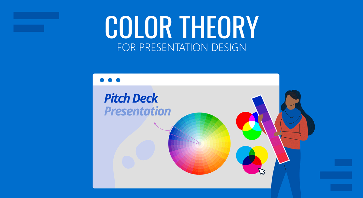
Color theory is a common conversation topic for graphic designers as its rules guide every aspect of a quality-crafted project. We can ask ourselves then: does color theory apply to presentation design? The short answer is: definitely yes.
To elevate the impact that your presentations can have, we designed this guide, intended to help people who are not necessarily knowledgeable in graphic design. We will cover in detail what color theory is, how different color schemes make a psychological effect on your target audience, recommended color schemes and pairings, and accessibility rules. Also, you can find two step-by-step examples in the final section on how to craft high-quality presentations by following these rules.
Table of Contents
- What is color theory?
- Why do we use color theory?
- Types of color schemes
- Accessibility rules for color theory
- Psychological effects associated with effective color theory application
- Black: Luxurious, sexy & powerful
- White: Fresh and clean
- Silver: Innovation and modernity
- Red: Power, action & confidence
- Blue: Trustworthiness, stability & safety
- Yellow: Happiness, energy & attention
- Green: Money, health, nature & luck
- Purple: Wisdom, creativity & ambition
- Brown: Strength, security & isolation
- Orange: Uplifting, attention & energy
- Pink: Girly and romance
- Case studies for color theory
- Final tips for proper usage of color theory in presentation design
What is color theory?
We can resume color theory as guidance on color mixing and combinations for achieving harmonious results, but to truly understand color theory, we must understand the concept of color itself.
The initial findings and research on color date back to ancient Greece, where Aristotle understood colors as “a mixture of light and darkness,” but discordances were seen in the way the human eye was able to perceive the phenomenon of color. Demokritos understood colors as the energy emitted from self-radiating objects but could not be extracted for artistic purposes. For philosophers like Plato, color was perceived after the rays emitted by the self-radiating objects collided with “pure rays” placed in the human eyes by the gods. Therefore the perception of “color” mainly depended on the properties of those rays (size, strength, and speed).
Even if we can criticize such simplistic approaches to color perception these days, the truth is those definitions aren’t that far from contemporary concepts. The color theory formalization process started with the findings of Leone Battista Alberti, referring to the mixture of colors as an infinite process in which other hues are created, but recognized only four true colors: red, blue, green, and grey. For Alberti, white and black were alterations in different colors.
The works of Leonardo da Vinci were geared toward the interaction of light and shade, where white represented the light and black the absence of color. This formulation was adequately analyzed by Sir Isaac Newton in 1666 when he observed that white light was composed of the entire spectrum of colors present in the rainbow. His experiment, made using two prisms, proved that light lacked any proper color on its own, but “color” was a human perception of the range of energies emitted when light fulfilled these three premises:
- It had a medium for propagation: air, water, etc.
- It involved interacting with at least two elements: an object and light.
- It had a spectator whose rational interpretation was able to “decode” the energy into a “color.”
Color properties and models
The direct consequence of Newton’s findings is the method by which we can analyze a color’s properties.
- Hue: How is the color perceived (if it is blue, red, yellow, etc.).
- Saturation: Also known as Intensity, it refers to how vivid color is. The more saturation it has, the stronger the color it will be. The lower the saturation value is, the more grayish the color would look.
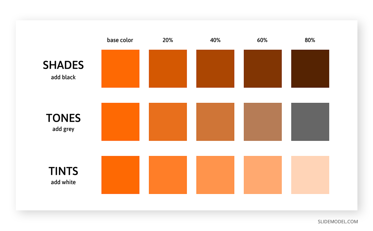
- Value: Speaks of the amount of light present in color. Colors with considerable amounts of light are referred to as Tints, whereas colors lacking light are known as Shades.
Thanks to these properties, colors can be classified according to their interaction with each other in two big models:
- Additive color model: This is where RGB comes from. Red, Green, and Blue make the primary colors as they are the colors available in the photoreceptors of the human eyes. Since white is conceived as the combination of red, green, and blue in equal parts, any ratio alteration creates the different colors we can perceive. Hence, black is defined as the removal of the three primary colors. This theory was conceived by James Clerk Maxwell and is fundamental for any kind of visual media.
- Subtractive color model: This model refers to CYMK, the acronym being Cyan, Yellow, Magenta, and Black. It is called subtractive as the concept behind it is purely physics-based. If we take the light spectrum and mix it with pigments, certain pigments absorb part of the light spectrum before letting the light bounce. Therefore, light waves are “subtracted” from the original light source when the color reaches the viewer’s eye. For instance, white objects lack pigments; that’s why the full spectrum reaches the object and can be perceived as white. As you add more pigments, you subtract more light waves from the light source, getting to the point where an object is perceived as black (hence why the letter K is in the acronym).
Now, these two different color perception models are applied in various mediums. As mentioned above, the RGB color range from the additive color model is used in visual media, such as computers and television. Up to 16.7 million colors can be created from this model, and the methodology for this is by mixing each channel (red, green, and blue) in a range from 0 (least saturated) to 255 (most saturated).
The CYMK color range from the subtractive color model is used for print media in a broad range of options: paper, textile, dyes, ink, etc. Unlike the RGB mode, CMYK is heavily restricted to an estimated 16k possible colors. Since CMYK is based on pigments, the conformation of each color is expressed in percentages for each tint.
On Primary, Secondary, and Tertiary Colors
We have approached a great deal of information, but what about what the teacher told us about “primary” and “secondary” colors in school? Well, let’s blame artists for this.
During the 18th century, discussions about color vision came to the convention that all elements were made out of three primary colors: red, yellow, and blue. This was due to the belief that these three tints could mix all the other colors perceived by the human eye. The RYB model distinct red, yellow and blue as the primary colors, where the mixture of these hues produces the secondary colors: orange, green, and violet.
Tertiary colors result from mixing a primary and a secondary color but include a higher ratio of the primary color. By doing that, you end up with these colors:
- Blue-green (Teal) = Blue + Green
- Yellow-green (Chartreuse) = Yellow + Green
- Red-orange (Vermilion) = Red + Orange
- Red-purple (Magenta) = Red + Purple
- Blue-purple (Violet) = Blue + Purple
- Yellow-orange (Amber) = Yellow + Orange
Color temperature
Although lighting professionals typically coin this concept, the truth is we can classify colors by their “temperature.” For artists and any kind of visual/printed medium, color temperature is a relative concept that relates to how cold or warm a color is perceived and the psychological effects linked to it.
Why is the color temperature a relative concept? Simple, it’s strictly related to the color in proximity to it. For example, if we take a wine color sample (red-violet) and put it close to a blue-colored object, the wine color will be perceived as warmer. On the other hand, if we take that same sample and place it next to a red thing, the wine color is observed as cooler due to the presence of blue pigment.
As a convention, colors can be classified according to their temperature as:
- Warm colors: Red, yellow, and orange hues
- Cool colors: Blue, blue-green, and violet hues
Some colors are “in-between” as they can both be warm or cold. Examples of these are pink, green, and gray.
In a later section, we will analyze the impact color temperature has on psychology and its usage for transmitting emotions in a message.
Why do we use color theory?
As in any discipline, we need a framework to provide quality results. Color theory is the consequence of centuries of research made by thinkers, scientists, and artists about the behavior of color and the human psyche.
This framework ensures we work under visually harmonic results for the desired outcome. Correct usage of color theory can elevate a design to its maximum potential. Although, we should consider that design is not the ultimate reason why the research on color and its theorization happened in the first place. In 1879 Odgen Rod published Modern Chromatics, the first scientifical publication made by a physicist about color theory taking notions from Jack Clerk Maxwell’s postulates. His work inspired the creation of a color standardization system, resumed in the 1912 book Color Standards and Color Nomenclature by Robert Ridgway.
In a different line of research, color representation was an idea often revisited during the 18th and 19th centuries. 3D shapes displayed the different hues, shades, and tints: spheres, pyramids, and cones. Eventually, the method was inefficient for any respectable academic or professional work. It was by the hand of professor Albert Munsell (creator of the Munsell Color System, still used to date) that a proper relationship between hue, saturation, and value was established. His discoveries involved a rigorous methodology in which the three color properties were expressed in percentages as a “rational way to describe color” – contrasting with the traditional (and misleading) color naming system.
Munsell’s first findings were published in his 1905 Color Atlas, improved later in the 1929 Munsell Book of Color. The impact of Munsell’s research was that his system was almost instantly adopted by the United States Department of Agriculture (USDA) for soil research and later on by the American National Standards Institute (ANSI) for the standardization of skin and hair colors in forensic pathology. Other known usages of Munsell’s system include dental restoration practices (for defining dental pieces’ tint) or comparing digital media to human color vision.
A final application of color theory and the one that mainly involves us in crafting presentations came from the findings of art theorist and artist Wassily Kandinsky. He established the nexus between colors and the effect on human behavior – a study that later evolved into the discipline of Color Psychology. His perception of the spirituality found in art is heavily used to date in marketing as specific colors were able to alter the mood of the audience. We will elaborate on this topic in a later section of this guide.
Types of Color Schemes
In this section, we will explain in detail each of the color schemes. Consider this article on color mixing for presentations as complementary information about tips for how to balance the color ratio and how to select a scheme.
Monochromatic
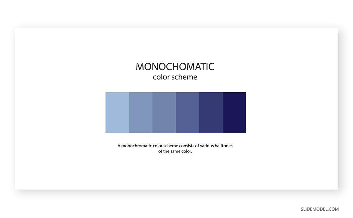
A monochromatic color scheme applies a single color with variations in shades and tints. This kind of scheme is often found in house paint palettes, and the overall effect is consistency.
Whereas it lacks contrast to make it look “vibrant,” the monochromatic scheme is one of the preferred choices of many designers as simply you cannot go wrong with it. It takes the decision of color matching out of the scene, and you can play with different shades and tints of the same hue to make transitions, highlight an element, etc.
Analogous
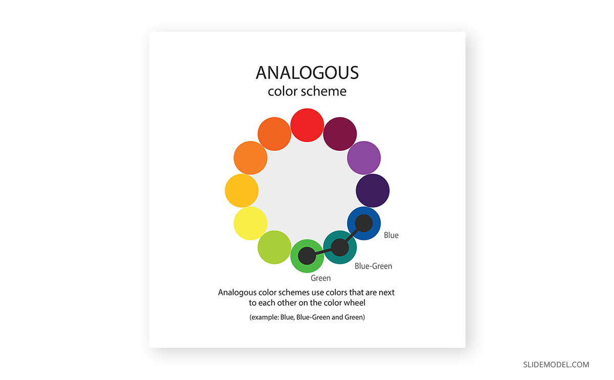
The analogous color scheme works with a pairing of the main color and the two directly next to it in the color wheel. One example we can take is an analogous scheme of blue with blue-green and green.
Overall, it is a color scheme that can be applied in most scenarios without harsh dynamic range impact. Its expected usage is for logos or branding, looking for a harmonic result in which the different colors blend together to convey a message.
Complementary

If you want to create an impactful contrast, this is your color scheme. The complementary color scheme uses two colors directly across the color wheel. Any other tints or shades relevant to those two colors can also be used.
And here’s why color theory is critical when approaching a presentation design. How would you actually use the colors in this complementary color scheme? 50/50? If that’s your initial guess, you are awfully wrong.
To preserve harmony in the composition, the advisable route is to consider one color as the predominant and the second contrasting color as the accent. The different tints and shades can be used in similar proportions, always as subordinates of those two.
The complementary color scheme is ideal for graphs, charts, and infographics. Its striking contrast makes elements outstand; thus, it’s advisable not to overload the balance between predominant and accent. One part can be colored in the accent color, then tints and shades of that color make the different points of the graph. The predominant color becomes the background for that presentation.
Rectangle or Tetradic
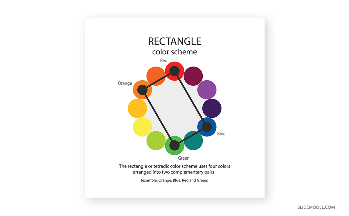
The tetradic color scheme defines a rectangle area where the four corners are the selected colors for the palette. It is one of the schemes that oughts to be used with extreme caution.
As a result of this selection process, we end up with two bold tones, and two muted ones, which are secondary colors related to the first ones. To apply the rectangle color scheme, start by making one color dominant. Balance the rest of the colors as subtle accents for different sections. To avoid its overwhelming effect, you can use either black or white (depending on your selection of colors) to tone down the color explosion.
Mobile development is a fine example of applying a tetradic color scheme, where we can see menus with cards in different colors. Keep a close eye on it; you will subtly find the other three tones in each card. Companies like Google or Microsoft use tetradic schemes for their logos, as it boosts the idea of diversity and openness.
Triadic
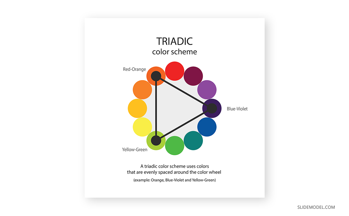
The triadic color scheme is trendy in flyers design and is also known to produce the best colors for presentations. Since all colors are equally distant in the color wheel, you get a high contrast composition; however, the best part of this color scheme is to play with the softer tints each color has as it gets closer to white.
Say you pick blue-violet as the dominant color. Yellow-green will be the color to contrast that blue-violet for a balanced look (red-orange if your take was to make it highly vibrant), so you can use either 100% yellow-green or a softer tint of it for different parts of your design. Then, the red-orange becomes a hue to add dynamism to the composition in attention-grabbing details.
Square
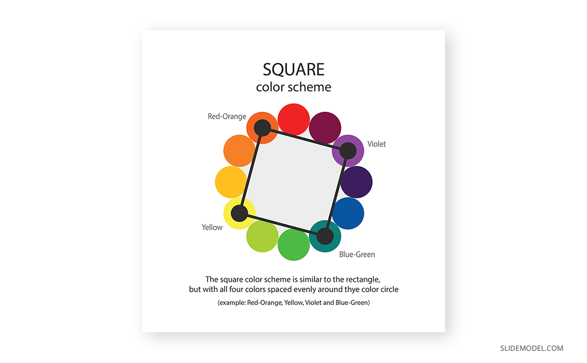
The square color scheme is a bolder version of the rectangle color scheme. Coining the idea of even spaces between colors, you end up with dramatic changes in hues while preserving one primary color, which is one of the reasons why web designers often pick this color scheme.
For correctly applying this scheme, we suggest you pick the darkest hue as the dominant color, then gradually introduce the others using the 60-30-10 rule for a balanced composition. Using white or black as the predominant color is an alternative, whereas the others picked by the square color scheme make the composition pop.
Split Complement
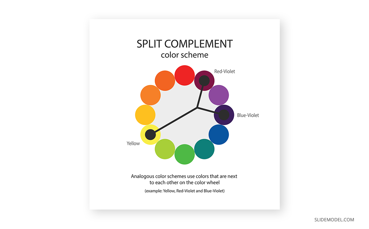
Finally, we have the Split Complement or Split Complementary color scheme, which resembles a tree structure. This scheme picks a primary color. Instead of selecting its direct complementary, it opts for a split in which the two colors are chosen on each side of the complementary color.
This kind of scheme is ideal for infographics and presentations since you balance the high contrast of the Complementary scheme with two subtler but intense colors. The second reason why so many users are fans of this scheme is that it keeps a proper balance between warm and cool colors.
Let’s assume red-violet is going to act as the base color. Then blue-violet can be used to enforce some shadow areas and yellow to bring life to the composition in a striking way. Since the contrast can be overwhelming, be mindful about the dosage of color you apply, and mostly: choose the base color with care. As an extra note, you can use a tint of the selected base color if you consider the chosen one is far too bold (e.g., if you picked yellow as the base color).
Accessibility rules for color theory
Color isn’t the answer to every project. Even if you consider the first step of picking the proper color scheme for your design is done, there are some extra rules you ought to check to ensure design accessibility. We cannot be more clear about this topic: if your design doesn’t follow the basic accessibility rules, all that hard work was done for nothing. Why? Let’s consider the following scenario.
You designed a presentation. The slides are done and ready to be projected for your audience. After the conference started, people in the back rows complained they could not understand what was written in your slides. Or worse: they get confused when trying to visualize graphs. And this doesn’t just affect people with visual impairments (which you should always consider when designing your slides) – different lighting conditions can hinder your own presentation performance from your workspace if the color contrast isn’t appropriate.
Therefore, we will resume the principal guidelines for accessibility that concern color theory:
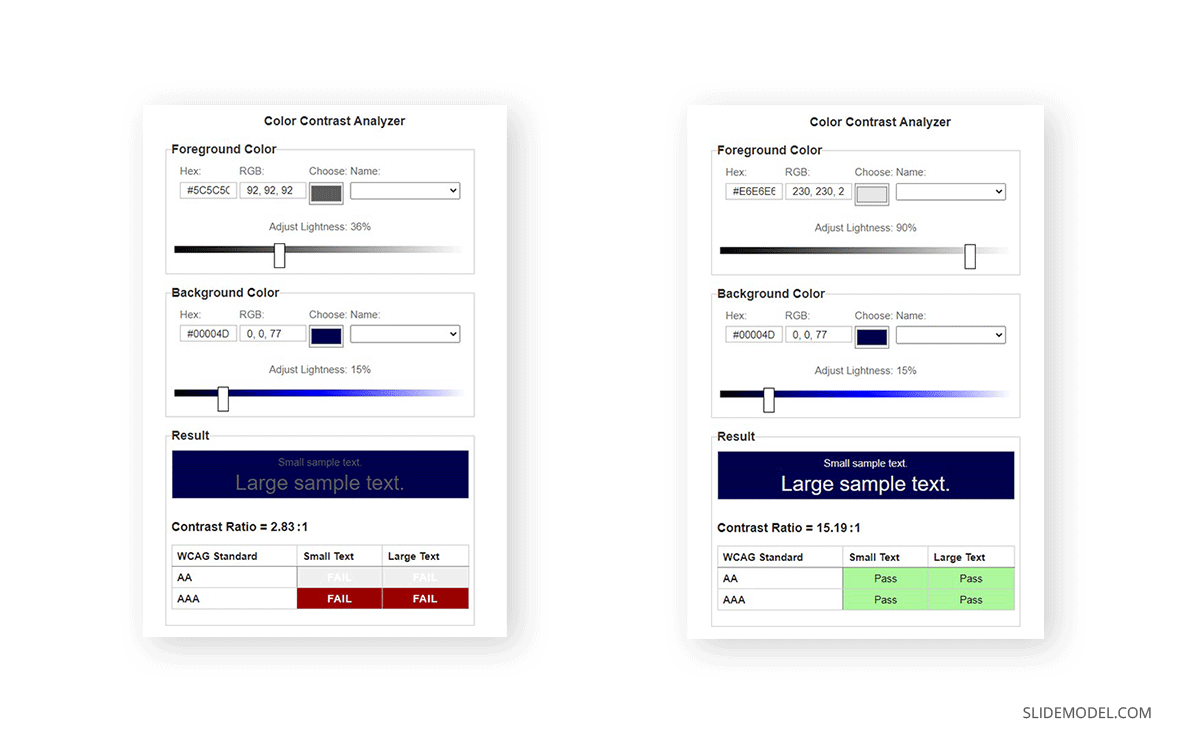
- Contrast foreground and background: To ensure your presentation is readable, apply a color contrast of 4.5:1 for placeholder text and 3:1 for titles. This also applies if the text was rasterized as part of an image. You can see the difference below between what’s considered a faulty contrast and a well-made pairing.
- A word of caution: Please look at the font color’s overall lightness. There’s a specific reason for not using 100% lightness because it causes visual discomfort to the user.
- Don’t assume people understand color the same way: As we’ve seen above, the perception of color is subjective and can be influenced by factors that can be both psychological, physiological, or even educational. Let’s take a classic as an example. A form section that says, “Required fields are in red.” Whereas this can be simple to understand, a person with daltonism or achromatopsia (total color blindness) won’t even know where to look. Instead, use a visual cue to help the user understand where to look, such as “Required fields are marked with an *.”
- Test designs in different sizes: Something that can be seen as balanced on a printed paper or computer screen may be overwhelming when reduced to mobile format. It’s a good practice to test the color schemes in different screen sizes to be confident users can read and understand our content, regardless of the medium they use.
Psychological effects associated with effective color theory application
Even though the naming is relatively recent, color psychology is the discipline that understands the relationship between color and human interaction. So significant is the importance for this study area that food packaging doesn’t happen accidentally, as improper color usage can alter how you perceive that food. Marketing, interior design, gaming industry, graphic designers, and so many other industries apply the guidelines of color psychology in their daily production to grant consumer satisfaction.
This section will explore the intrinsic messages that color can transmit and how our presentations can benefit from that.
Black: Luxurious, sexy & powerful
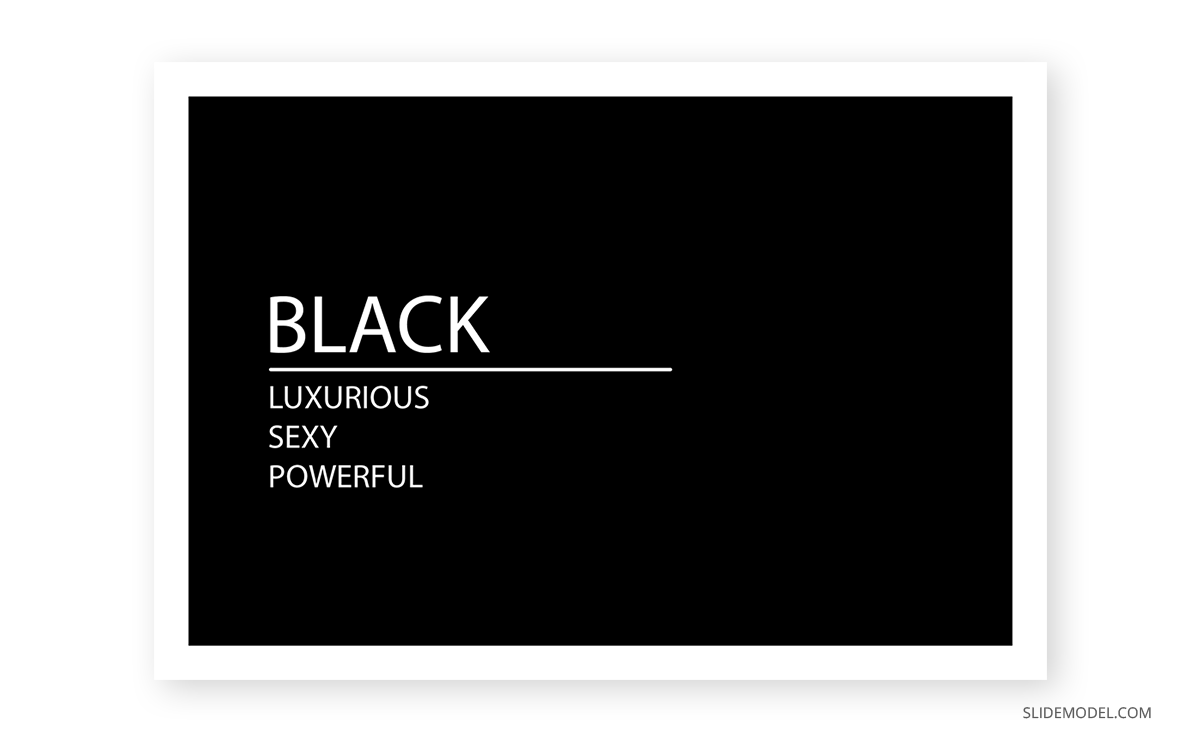
As an easy term, black can be understood as the absence of color. People can also interpret black as the lack of light or the technical fact that black can absorb the entire light spectrum.
Since we can analyze the color meanings by its positive and negative associations, we start with the positive feelings oozed by the color black. It is a direct message of sophistication and luxury. People instantly associate black with the color of tuxedos, black limos, and many spy-themed movies.
The black color also speaks of power, and it’s not without a cause, as court dresses historically have been black. Banking institutions reserve the black color for their premium members’ cards.
Negative connotations of the color black are feelings that evoke depression. This can be easily fixed by a sound, contrasting presentation color palette.
Opt for a black-themed presentation if you wish to transmit exclusivity, a VIP product or service for your audience. Gold accents work perfectly for this kind of topic, although somewhat cliché. Instead, you can work with ochre and coffee tones with subtle white accents to make the design tridimensional. Use texture images, such as carbon fiber, to reinforce the message of something luxurious that can elevate the customer’s standards.
Word of advice: not all black colors are precisely “black” – You can find warmer blacks, which work best with ochre tones, and cooler blacks that get along best with silver/gray hues.
White: Fresh and clean
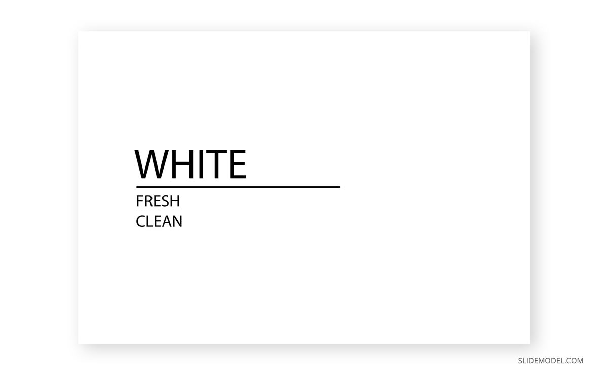
White speaks of purity, of something clean and innocent, hence why it is the main color picked for wedding dresses, baptisms, or hotel bedding. White also transmits minimalism, which is why nordic styling often pairs warm wood with matte white finishes for table lamps or furniture. It has a conveyed message of austerity.
As a color, technically speaking, is the full spectrum of light without being bounced. Therefore, white can be understood as a blank state, a new beginning of sorts. Its simplicity makes easier the effort to craft a presentation, so that’s the reason behind many users opting for classical white-predominant themes.
Negatively speaking, white can evoke bad feelings for those who have photophobia (intolerance to harsh lights) due to its striking contrast. Remember the recommendation above for not using pure 100% lightness in the white text? The same applies here for backgrounds unless you have a keen desire to hurt the spectators’ eyesight. Lower the value of white to 80-90% if your presentation is going to be purely white-based, and use 100% lightness for accent details if you prefer.
Pure white can also be perceived as dull, so pairing it with another hue is necessary for specific industries for quality presentation design.
Silver: Innovation and modernity
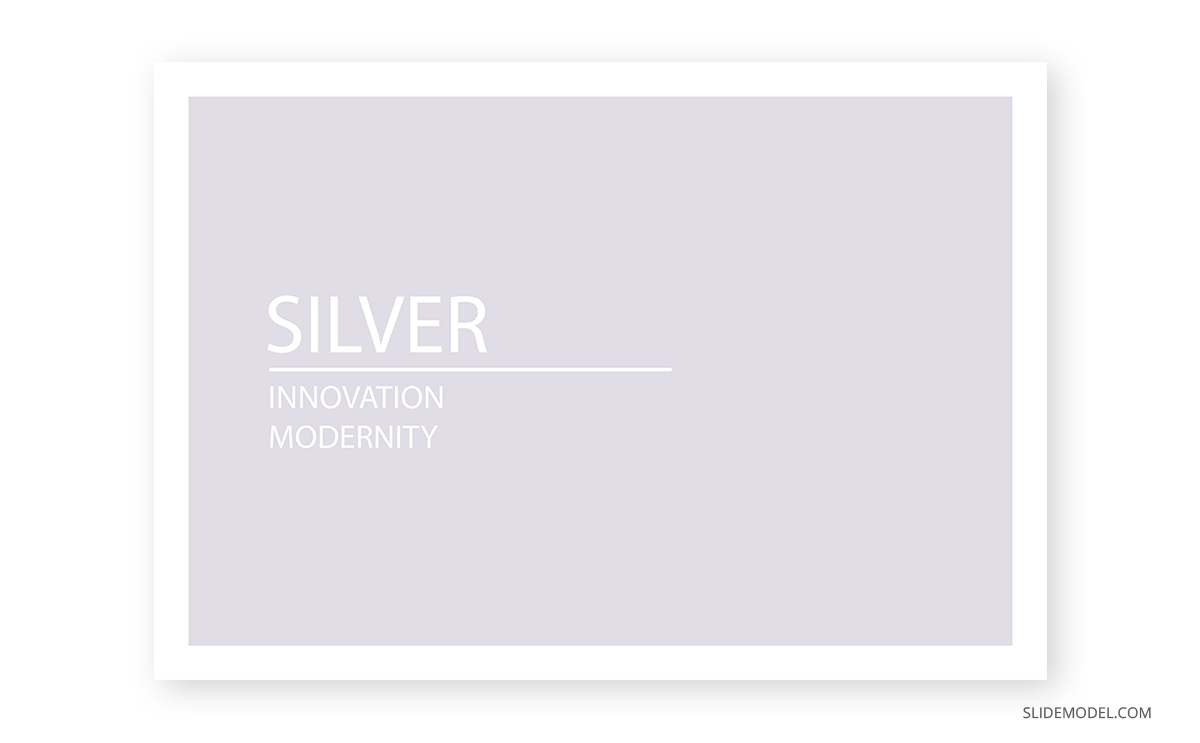
Silver or gray (depending on whether it resembles a metallic look) is a color of grace and modernity. It transmits a message of a change of direction, as light can bounce off it. Hence, professionals use it not just for technological aspects but also mental health as you feel all mental blocks are getting lifted.
It is a color often associated with wealth – its direct relationship with the silver metal – and thanks to being shiny, clean, and alluring, it is associated with everything modern and hi-tech.
Whereas it can be seen as a perfectly balanced color, it can easily be misused and fall under the bland side of the color spectrum. Melancholy and loneliness are negative feelings sometimes associated due to the lack of a prominent hue on them. Don’t be fooled by such a statement as there aren’t two equal grays in the world: put two gray color samples side by side, and you’ll notice the subtle differences in hue.
It is a color that dignifies, speaks of maturity, and a well-organized scenario. The corporate world uses this color in almost every scenario without even relating that embedded message, and at the same time, it reinforces the meaning.
Red: Power, action & confidence
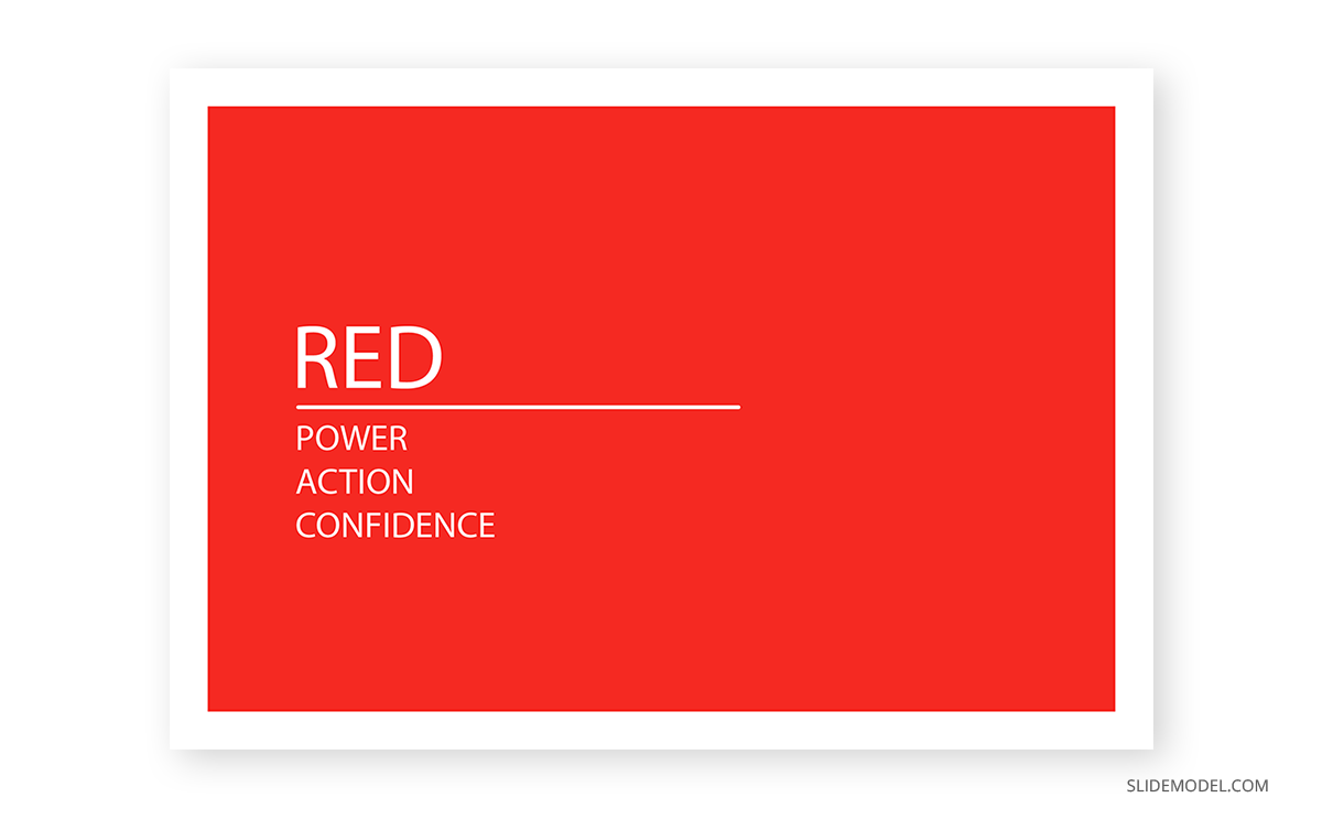
In color psychology, the primary colors are the ones that transmit the most powerful messages. Red conveys the fiery energy that fuels power and confidence. It is a color with a duality no other hue can express, and we will analyze why.
On a positive note, red is associated with love and passion. The image of a woman wearing a red dress or holding a red bottle of perfume not just seeks to evoke passion but to present the woman as a confident person, capable of making her own choices to shape her future. She is the coveted element of desire, not by her sex but by the ideal of power she can transmit.
Traditionally, red is the color of power in cultural scenarios. The Academy Awards attendants and nominees walk over the “red carpet.” Political parties use the color red for their logos. Anyone who sees the color red can instantly associate with the brand Ferrari and their Cavallino Rampante logo.
Physiologically, red is powerful enough to produce these physical effects:
- Elevate blood pressure
- Enhance metabolic rate
- Increase heart rate
- Induce hyperventilation
- Increase appetite
That’s why using red is not something to take for granted. Abusing the usage of red in a presentation can cause discomfort, whereas proper usage of red makes it engaging and dynamic. Remember that red is also the color used for signage in the case of “danger,” “stop,” “fire,” and several other negative connotations.
Be cautious when using pure red as your dominant color. Sometimes it’s best to play it safer and opt for a shade or a tint not so predominant in the message.
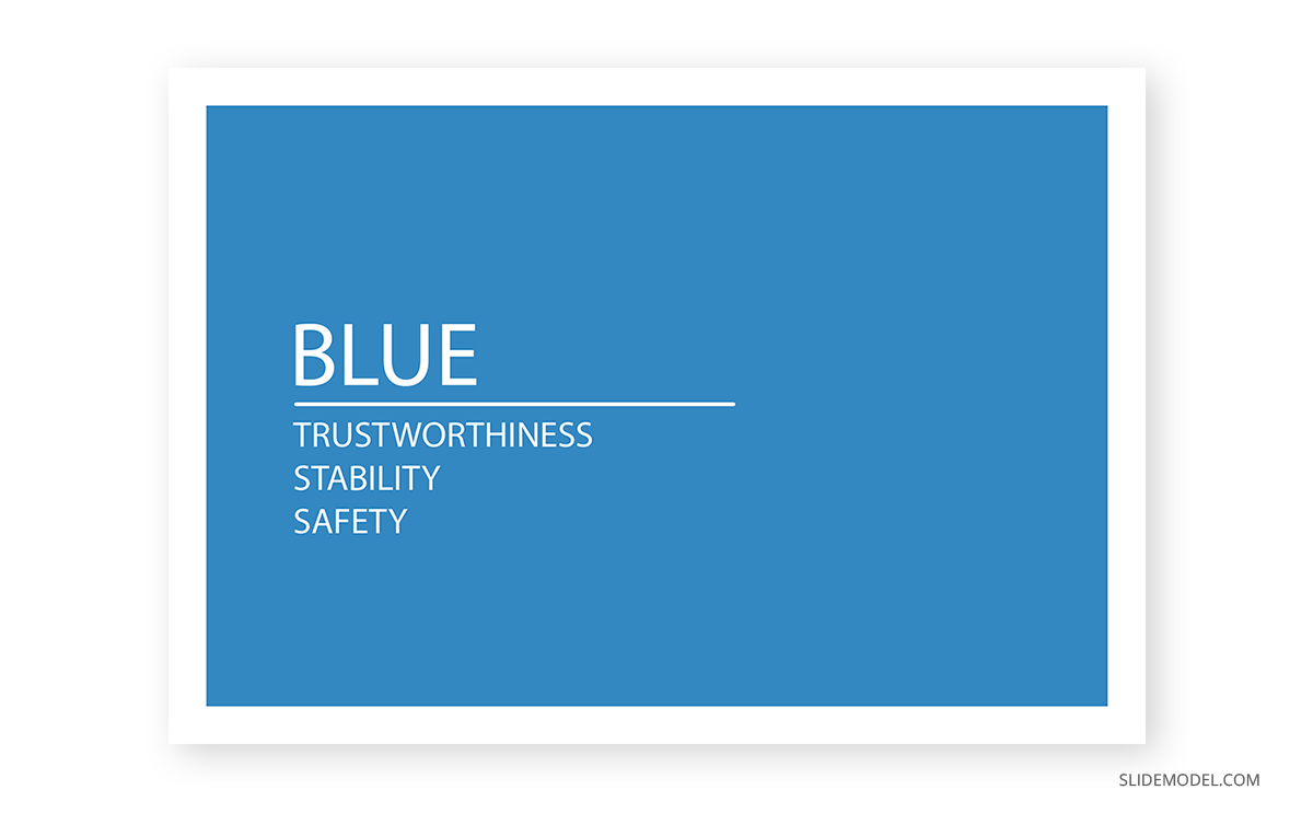
Blue: Trustworthiness, stability & safety
Blue is a color that instantly uplifts productivity. Commonly found in nature as in the daytime sky or water, it inspires serenity in the spectator, building confidence to become more productive.
One of the reasons blue is so commonly used in designs is because it’s felt as something conservative. Like you cannot go wrong when using blue or pairing blue with another color. That’s another sign of how much of an intense presence blue has in our daily life that we feel natural to pair blue with another hue.
As one of the primary colors, blue creates a strong feeling of stability and safety. Businesses, banking institutions, and health centers use blue to transmit their values of professionalism and trustworthiness. Psychologically, blue has the opposite effect to red regarding pulse rate, so it’s not unusual to find blue hues in offices requiring much concentration time.
Negatively, blue is associated with sadness, as in the common saying “feeling blue.” Pure blue schemes can seem detached to some audiences; therefore, opt for a Split Complement, Analogous, or Rectangle color scheme to make it look attention-grabbing. Some schemes pairing blue shades with ochre, brown, or orange can transmit the message of luxury when done with subtlety.
Yellow: Happiness, energy & attention
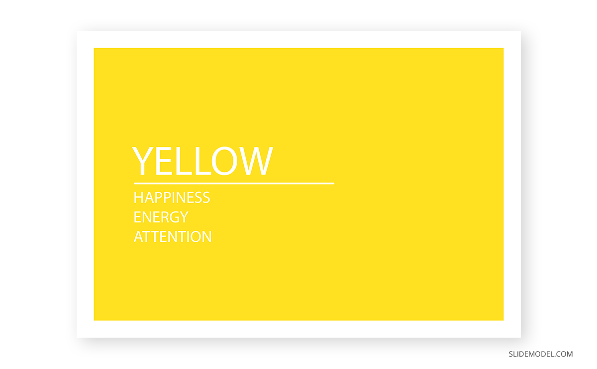
As the final primary color, it’s bright and intense, becoming one of its main usages as an attention-grabber. In general guidelines, we must not overuse yellow as a color in designs since it quickly builds visual fatigue. Physiologically, that has been related to the amount of lighting it emits in comparison with other colors (hence, its similar performance to white in cases of photophobia). However, we must not forget yellow can also increase the metabolic rate.
Yellow can get perception dualities as we’ve seen with red: some people find it cheerful, inspiring happiness and energy (e.g., SpongeBob SquarePants character), and others perceive it as absolutely annoying. That’s due to the attention-grabbing factor, so we must apply it carefully in presentation design.
Due to it being a stimulating color, we would recommend using tints of yellow as background color if yellow is a must. Avoid pure yellow at all costs. Some people interpret the yellow color as aggressive, and your presentation conveys the wrong message. Psychologically, it has been studied that conceited people prefer yellow color, whereas introverts react negatively to it. Instead, use a color scheme that pairs yellow with a less dramatic color, and apply yellow as the accent color of your scheme.
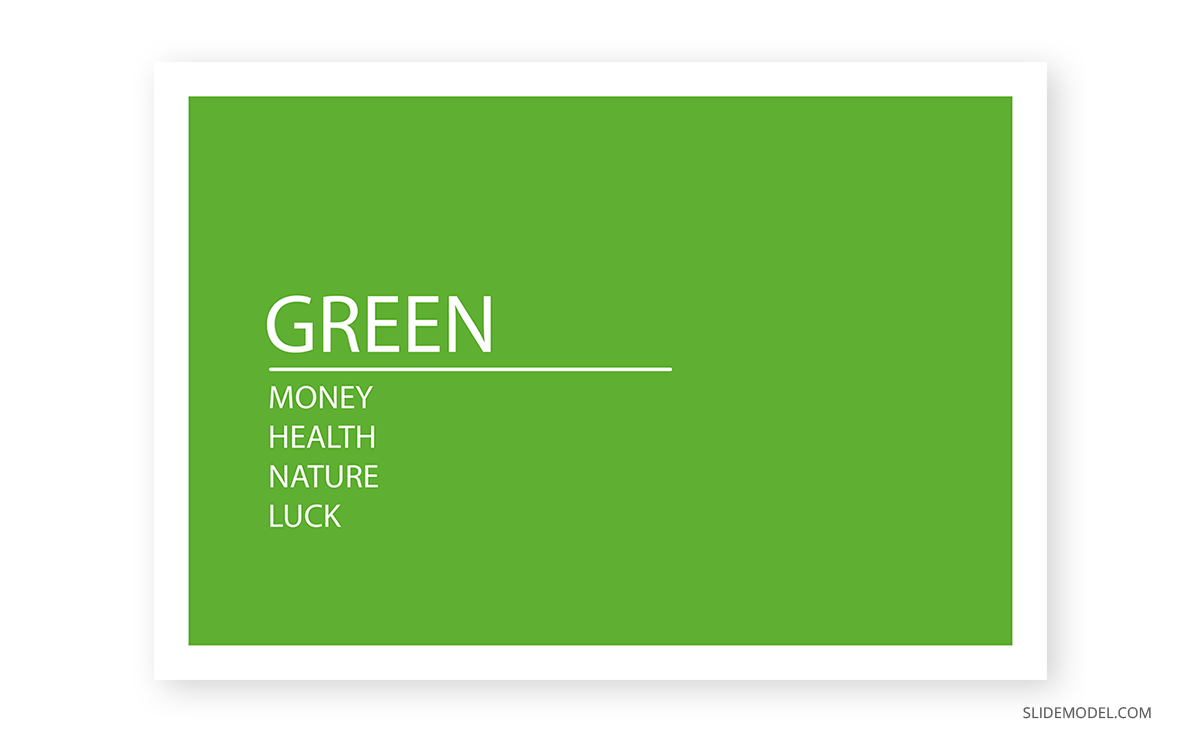
Green: Money, health, nature & luck
Is there any other instant connotation for green besides nature, outdoors, and ecology? Green is distinguished as a refreshing color and associated with health and eco-friendly practices.
As a combination of the steady blue and the happiness-booster yellow, green mellows the soul, taking us to a relaxing atmosphere. This is why designers create “green spaces” inside office buildings – becoming critical in dense capital cities with limited outdoor places to unplug from work.
Historically, humanity has associated green with different values:
- Money: Currency bills, such as the US dollar.
- Health: There are cultural associations of the color green with fertility, eating healthy, the agricultural industry, and living stress-free.
- Nature: The outdoors, green energy, eco-friendly organizations.
- Luck: A four-leaf clover, casinos, winning.
On the other hand, there’s the common saying that one can be “green with envy”, or relate to motion-sickness. Thankfully, that’s not the message green transmits when used in the design.
Before applying green to your slides, remember it’s not the same message you send when using an olive green (that speaks of elegance and earthiness) as when using an aqua green (freshness, sports). Be mindful when picking the green hue and research its own meaning before using the color because you just like it.
Purple: Wisdom, creativity & ambition
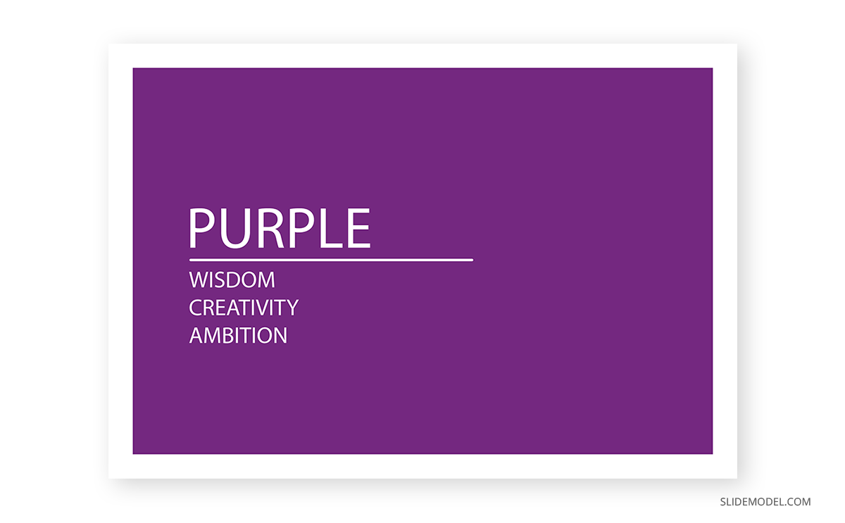
Although this color is associated with feminist movements these days, purple historically speaks of wisdom and creativity. It has an embedded message of ambition due to its cultural references to royalty and the clergy. You may ask yourself why if black is associated with the luxurious, we say that purple is the color of royalty. Well, the answer to that question we have to speak about a dye named Tyrian purple, with an insanely costly procedure that only allowed the extremely wealthy population to wear clothes in that color.
Changing perspectives, we can speak of the purple color from a creative aspect as a color that boosts inspiration. Its link to spirituality is well-documented, and one of its most controversial usages is the work of artist Francis Bacon in Study after Velázquez’s Portrait of Pope Innocent X. Also, purple is a color associated with courage. The Purple Heart medal is a military decoration of the United States awarded in the name of the US President to those wounded or killed during service.
The shades of purple can evoke exotic perceptions, from wine to delicate flowers such as orchids to precious gemstones such as Amethyst.
Since it’s not a color felt as natural by humans, we can create vibrant presentations on different topics that take the user away from conventionalism.
Brown: Strength, security & isolation
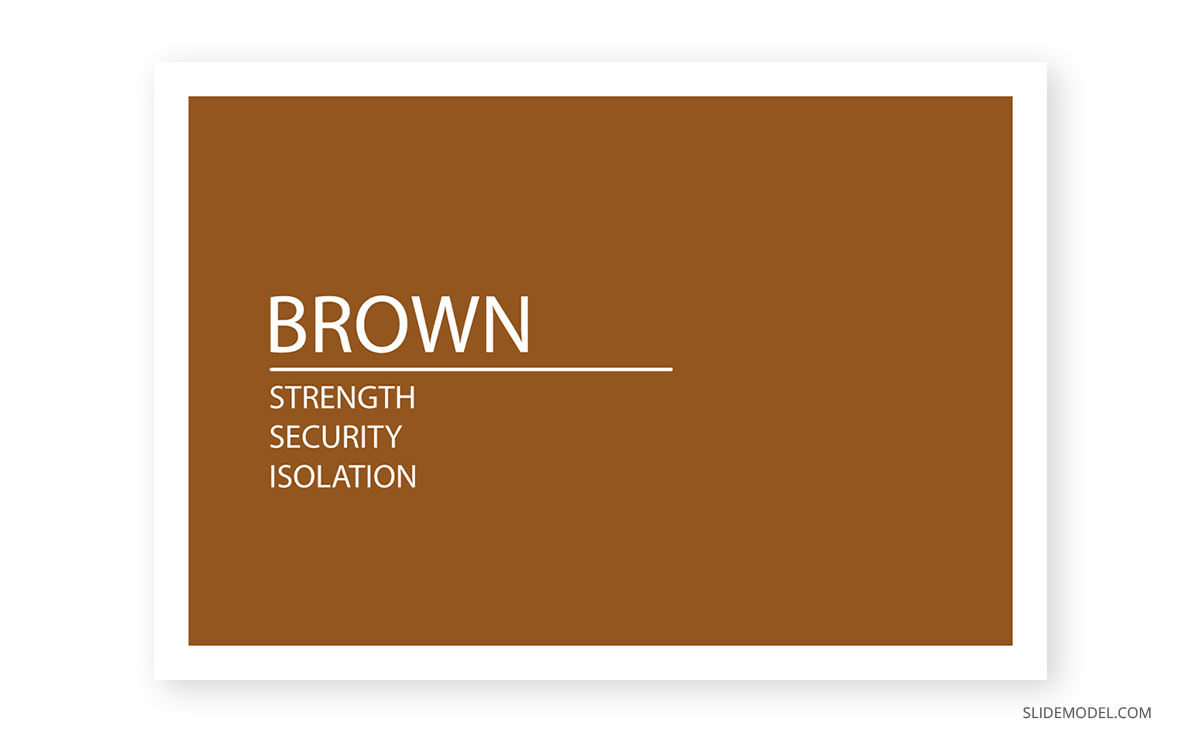
Brown is a color commonly used for outdoor adventures or to introduce all-terrain experiences in isolated places. Being the color usually associated with earth, it’s not a surprise to find the values of strength and reliability linked to the color brown, even if it’s not a color easy to manage as it leans towards both orange and yellow.
Warmth, comfort, and security are feelings transmitted by the color brown for its close relationship with nature. That could explain why security firms opt to include brown in their branding strategies and pair it with black to enforce the importance of “securing the valuables.”
To apply it in presentation design, it is a color that must be balanced in a complementary or split complementary scheme, preferably with a blue tint. Orange can bring far too much energy to the scene, so use the combination of brown + orange with caution (the same rules apply with brown + yellow).
Orange: Uplifting, attention & energy
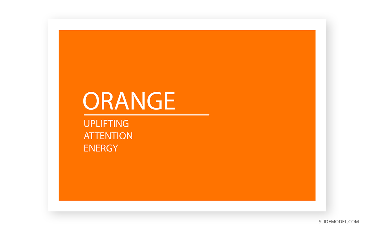
Depending on where its hue leans, we can say orange can be an uplifting color on an extremely attention-seeking one. The strong-red oranges are used for attention, such as in signage, whereas yellow-orange speaks of happiness, of being carefree. The “ideal” orange – such as the one in the photo above – is a color that transmits the feeling of energy, leading parcel delivery companies to use it for their marketing strategies.
As a highly energetic color, it’s often found in uniforms for sports, mascots, energy drinks, etc. People associate orange with summer and autumn: spectacular sunsets, orange juice, flowers, and so on. For the Asiatic culture, orange is a spiritual color that speaks of meditation, leaving materialism behind and Buddha. For Americans, orange is linked to Thanksgiving and Halloween.
Thankfully, orange is a color easy to pair in most scenarios as it blends with a multitude of colors. Still, we recommend it to mute the pure orange, opting for a sophisticated shade of it and leaving the intense orange hues as accent colors.
Pink: Girly and romance
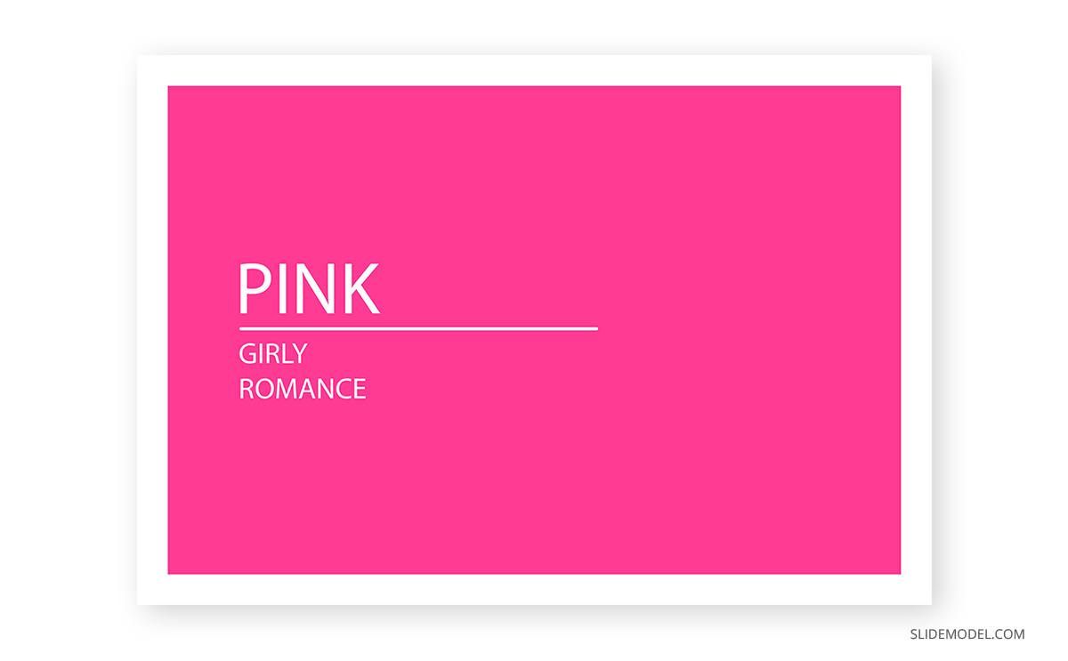
Last but not least, we will speak about the pink color. It is a color associated with the feeling of kindness, love, and femininity. A broad range of shades transmits different messages: whereas pastel pinks can evoke tenderness, a vibrant shade of pink such as magenta can be observed as aggressive by some audiences.
Joyful, pink is a girly tone that makes you feel integrated. As if you achieved your most desired dreams and you celebrate the outcome surrounded by your loved ones. For artists, it is a vibrant color that contrasts with often “dull” colors such as gray and black for interesting composition values.
If you can look aside the simplistic “girl” color concept, it’s a refreshing color that instantly takes people to a feeling of inspiration and renewal.
Case studies for color theory
In this final section of the article, we will use four different case studies to explain why some color selections are made in regard to sending the viewer a message with the presentation. Please keep in mind that most presentation templates are fully editable; therefore, if you love a design, but you don’t feel comfortable with its color range, you can change the color palette for ppt presentation by making a custom theme in PowerPoint.
Case study 1: Creating a Presentation with contrasting values
This first case study involves a medium-sized company that seeks to automatize its candidate selection process for the HR department through AI technology. As not every single member in the managerial area is convinced about this idea, the HR department prepared what’s known as a force field analysis presentation.
Thanks to the force field analysis model, the HR department presents the initiative, its driving forces (being the Pros of the initiative), and the restraining forces (the cons of this initiative) are easy to identify and represent with the help of a force field analysis slide template.
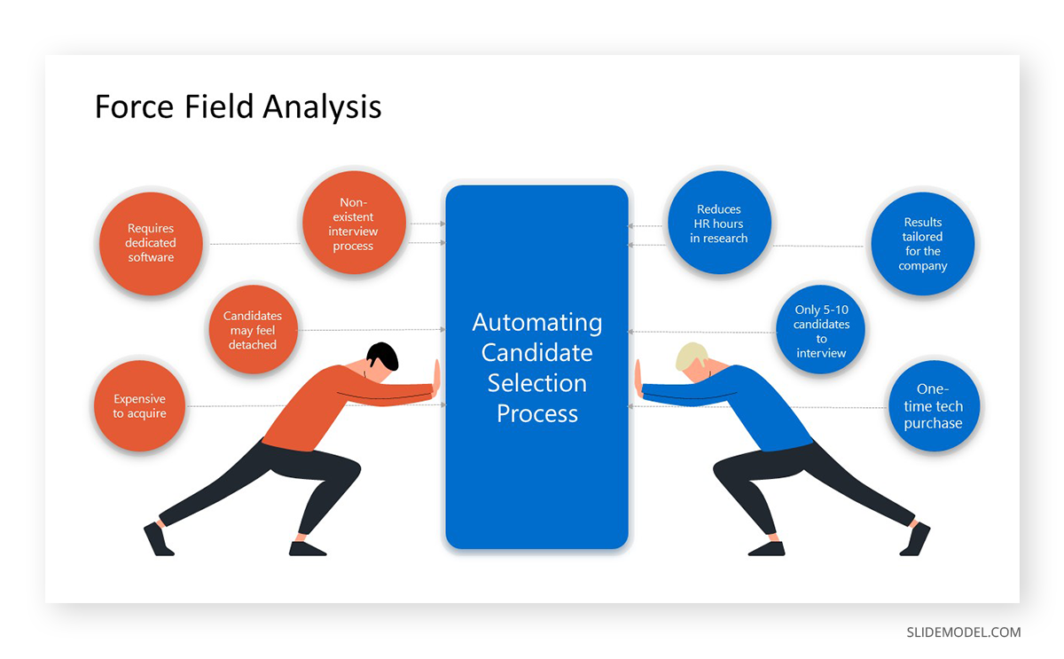
In a Complementary color scheme, the elements that weigh on the decision are represented in two colors: sapphire blue for the driving forces and orange-red to expose the restraining forces. Since we talk about something corporative, the same sapphire blue was used for the initiative area, not influencing the palette with another color.
Conducting the analysis from a color psychology perspective, the orange-red is attention-grabbing enough for people not to ignore the cons that this project can experience over time, whilst also reflecting an energetic resistance to change. Sapphire blue, on the other hand, speaks of professionalism. Of trusting the process in the decision to make since it’s time to move on and pursue bigger horizons – and the current selection process for new personnel is both time-demanding and often not tailored for certain departments.
Case study 2: Create a presentation for eco-friendly purposes
In our second case study, a waste management company is visiting potential customers to offer their services whilst also educating company owners on the importance of treating production waste with the care it requires.
This next slide introduces the ecology of waste management, in which, depending on the original materials, there are multiple methods to repurpose waste rather than piling it up in open outdoor spaces.
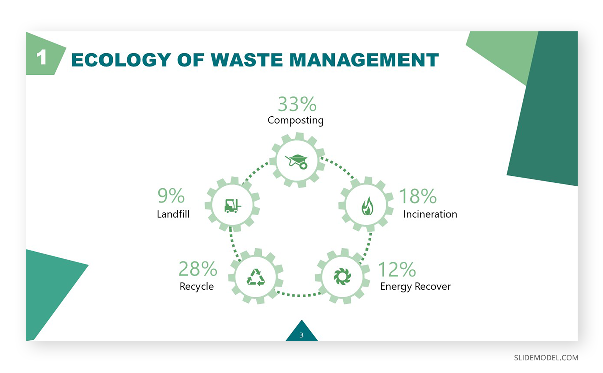
The waste management presentation template used features a Monochrome color scheme in shades and tones of green. The greens used are not also randomly selected:
- Dark green used in the title and accent effects speaks of the fact that waste can be repurposed into money, and that fact can easily become a driving force for customers to change their waste management policies.
- Bright green in the accent sections and number of slides refers to rebirth. Of giving new life to what’s considered decay.
- Pale green in the cogwheels and placeholder text percentages is a symbol of peace. Remembers the audience that being mindful about the final destination of our production processes is part of having a corporate social responsibility.
- Mint green is a signal for refreshment. Of lifting taxing decisions and outsourcing from people knowledgeable in the subject.
With this case study, you can appreciate how slide color schemes can reinforce the message to transmit without filler words.
Case study 3: Create a vibrant presentation to engage your audience
The next case study to analyze comes from a group of young software developers presenting their skills to a customer for a web design project. Despite not having a large trajectory in the industry, their team is well-balanced between experienced developers and creative designers to meet the demands of their clients.
This programming presentation template is the chosen asset to introduce their services visually compellingly while also listing their project portfolio.

A fine example of a Split Complementary color scheme, no doubt. The color selected was yellow-red, using blue and violet as the other two colors that made up this scheme. Since yellow is far too intense, it’s left as the accent color for some sections, and the background is a darker blue leaning towards blue-violet. The vector images follow suit by combining the colors selected in the palette, using gradients and lighter tints.
The question becomes now: what about the aqua tone? Sometimes, designers can combine color schemes inside a design to balance the overall composition. Since yellow would be too much attention-grabbing, and the presence of blues and violets is covered, there is a secondary usage of the Analogous color scheme, opting for a tint of the blue-green next to the blue color. The discrete way in which it was used brings life to the image and centers the vision in the placeholder text area.
Final tips for proper usage of color theory in presentation design
To conclude this guide, it is essential to answer a common question: how do I pick the colors for my slide design project?
For some people, inspiration about a word, a concept, or a product to present directly leads to the color selection of the main color – or at least an indicator of which hue would work best. Then, the selected color scheme helps to build up the entire color palette for the presentation. In some other cases, an image can become the leading source of inspiration. That’s the reason why you should check tools such as Design Seeds’ Instagram Profile or even Pinterest.
Online tools can help us easily come up with good colors for presentations. Some recommendations for this are Coolors or COLOURlovers. Although… what if you already got inspiration from a presentation you attended but don’t know which colors were used? This incredible tool may cheer you up: Site Palette, a Google Chrome extension that gives you the entire list of colors used, with their HEX values to reproduce them in your designs.
Check out our complete tutorial on how to make a PowerPoint Presentation.