Look around; how is the world communicating with you? Is there music? Are your shoes pinching your heel? Are there a million visual triggers trying to get your attention? We don’t have a crystal ball to answer the first two questions, but the third is a definite YES. What’s behind it? It’s visual communication.
Visual communication is the magic behind all the visible things in the world that tell stories, share information, and attract interest. As a person who makes presentations, you own the power of visual communication to impact, inform and attract your audience with visuals. All you need is the knowledge and the tools to make it work.
In this guide, we’ll share essential facts you need to know about visual communication and how they can help improve your presentations.
Table of Contents
- What is Visual Communication?
- What is Visual Presentation?
- Visual Presentation vs Visual Communication
- Why is Visual Communication Important for Presentations?
- 7 Types of Visual Communication Techniques in Presentation Design
- How to Use Visual Communication at Work Beyond Presentations
- Common Mistakes in Visual Presentations
- Final Words
What is Visual Communication?
Simply put, visual communication is the practice of communicating through the sense of sight. In a more profound sense, It democratizes communication in general because with visuals, there’s less need for language or translation.
But what does visual communication do? It tells stories through images, video, illustrations, and anything the audience can see.

Visual communication sits at the top of the list of effective communication strategies and designs for all industries and fields. It’s in all the conversations about marketing, community building, and the future of work. If your presentation design still hasn’t embraced the need to thrive on visual communication, it’s time to fix that.
Visual Communication Strategy
A visual communication strategy is key to a presentation’s overall mood and message. To create a visual communication strategy, follow the same steps as any communication strategy, and develop them simultaneously.
To give you an idea of the scope of influence of a visual communication strategy, consider all the advertisements you see regularly. Regarding the most successful ones, their visual qualities have been minutely strategized to inspire emotional reactions from you.
Do you want to get reactions when making your presentations? Use a visual communication strategy to create an overarching visual quality for your presentations’ slides.
FYI: Professionals building visual communication strategies include; brand specialists, marketing strategists, content designers, UX/UI designers, publicists, art curators, and anyone that understands how important planning and strategy are for every project.
Visual Communication Design
Once a visual communication strategy is in place, it’s time to take care of the visual communication design. This is the actionable part of the process; the strategy is the plan, and the design is the creation.
Visual communication design is essential for your presentations. You’re telling a story with your information, and visual techniques will help you add interest. Even a text section can have visual communication techniques applied. For example, the font, spacing, and layout.
Your visual communication strategy will help you choose the proper visual layout, data visualizations, and graphics for the presentation slides.
What is Visual Presentation?
Visual presentation is the strategic arrangement of visual elements—such as images, charts, typography, and color—to convey information, persuade audiences, or simplify complex ideas. Unlike traditional presentations that rely heavily on verbal or textual explanations, visual presentations prioritize design principles to create an intuitive and engaging experience. In business contexts, these presentations often take the form of slideshows, infographics, or interactive dashboards, serving as tools for decision-making, pitching ideas, or reporting data. The goal is not merely to display information but to structure it to align with human cognitive patterns, enabling viewers to process content quickly and retain it longer.
The effectiveness of a visual presentation hinges on its ability to balance aesthetics with functionality, transforming raw data or abstract concepts into coherent, memorable narratives.
Visual Presentation vs Visual Communication?
While visual presentation and visual communication are often used interchangeably, they occupy distinct roles in design. Visual communication is a broader discipline encompassing all forms of conveying messages through visuals, including logo presentations, advertisements, signage, and even emojis. It focuses on universal design principles to evoke emotions, build brand identity, or transmit ideas across diverse audiences.
For instance, a company’s logo uses color psychology and symbolism to communicate its values without words. In contrast, visual presentation is a subset of visual communication tailored to structured, context-specific scenarios. It involves curating visuals for a targeted audience with a clear objective, such as a quarterly executive review or a client product demo. While a social media post (visual communication) aims for broad engagement, a boardroom slideshow (visual presentation) prioritizes precision and actionable insights.
Another distinction lies in temporality: Visual presentations are often transient, tied to a specific event or meeting, whereas visual communication assets like branding materials endure over time. Additionally, presentations frequently integrate multimodal elements—combining slides with spoken narration—to reinforce key points, while visual communication may stand alone. Understanding this distinction helps professionals allocate resources effectively; a marketer might invest in timeless brand assets (visual communication) while designing modular slide templates (visual presentations) for recurring meetings.
Why Is Visual Communication Important for Presentations?
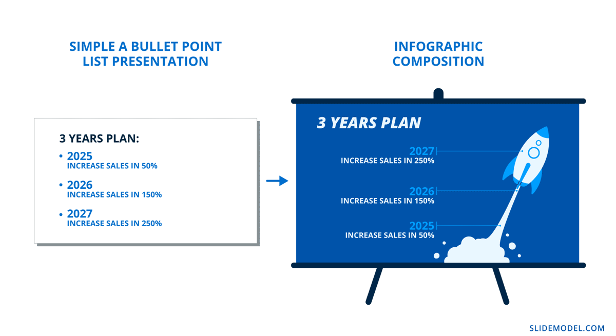
If you aren’t aware, storytelling is a massive factor in effective presentation design. To achieve it, you can’t depend on text content; you need visuals to support the information and create connections with the viewer. On a presentation slide, what’s better? A bullet point list or an infographic widget composition? The answer to this question would be the most visual option, in this case, the infographics.
Surely, you’ve heard of “Death by PowerPoint.” It’s the perfect example of how visual communication influences the audience. In this case, how can it go wrong and get undesired effects? Humans create emotional and memorable connections with everything they see. As soon as a presentation proves to be a drab PowerPoint, your audience clocks out and checks their phone.
Thankfully, visual communication harnesses many benefits for your presentation designs:
- Ideas and concepts are easier to understand and transmit in visual form.
- Visuals deliver information faster and more directly.
- A good visual communication strategy is attention-grabbing and engaging.
- Visual elements and characteristics make an impact on the viewer.
- A strong visual component improves the credibility of the message.
Visual communication is vital in presenting a slide deck to an audience. Your outfit, body language, and poise all matter. The audience isn’t just looking at your presentation; they’re looking at you. Take the time to expand your presenting skills by practicing, trying new things, and improving your confidence.
7 Types of Visual Communication Techniques in Presentation Design
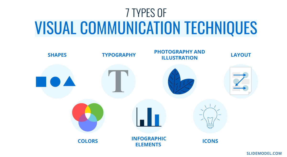
Visual communication techniques are the puzzle pieces of successful content. They are so important that there are psychological applications for all of them.
Here’s a quick list to give you an idea of their importance.
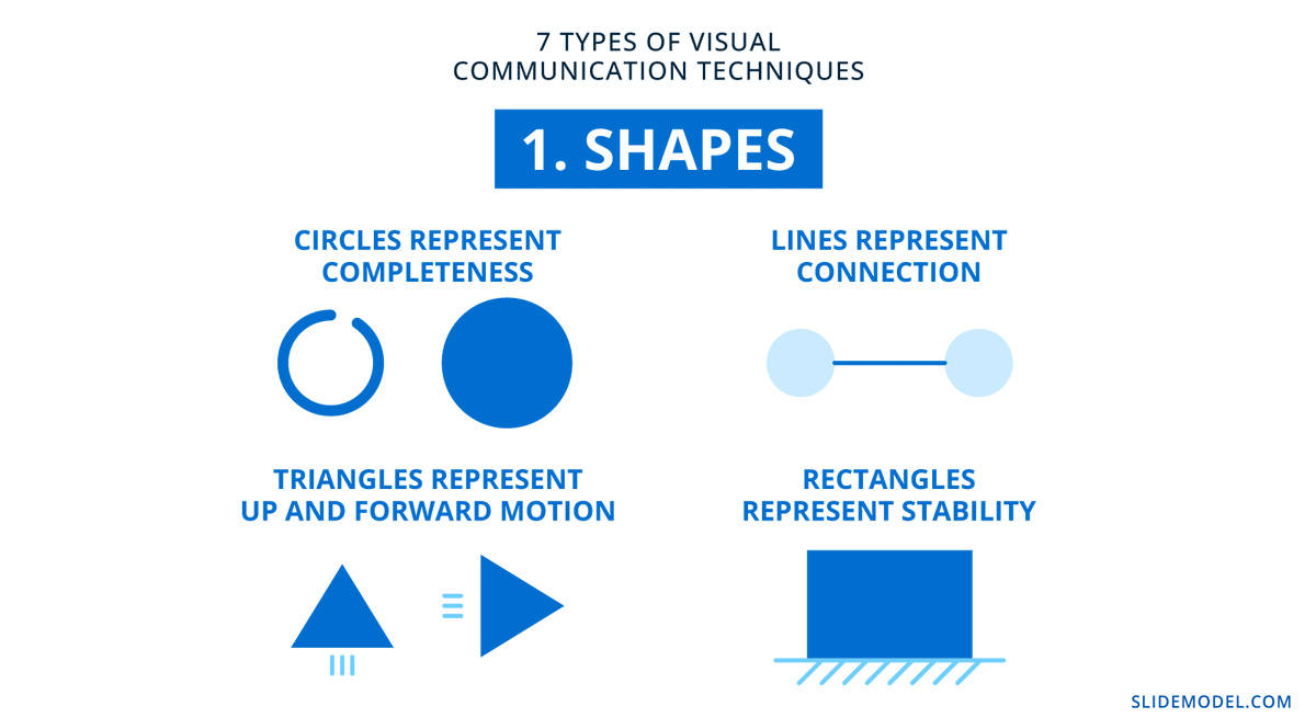
1. Shapes
Shapes have subliminal, subconscious, and even cultural perceptions. The shapes you choose to include across the slides will set the tone for the entire presentation. For example, circles represent completeness, triangles represent up and forward motion, lines represent connection, and rectangles represent stability.
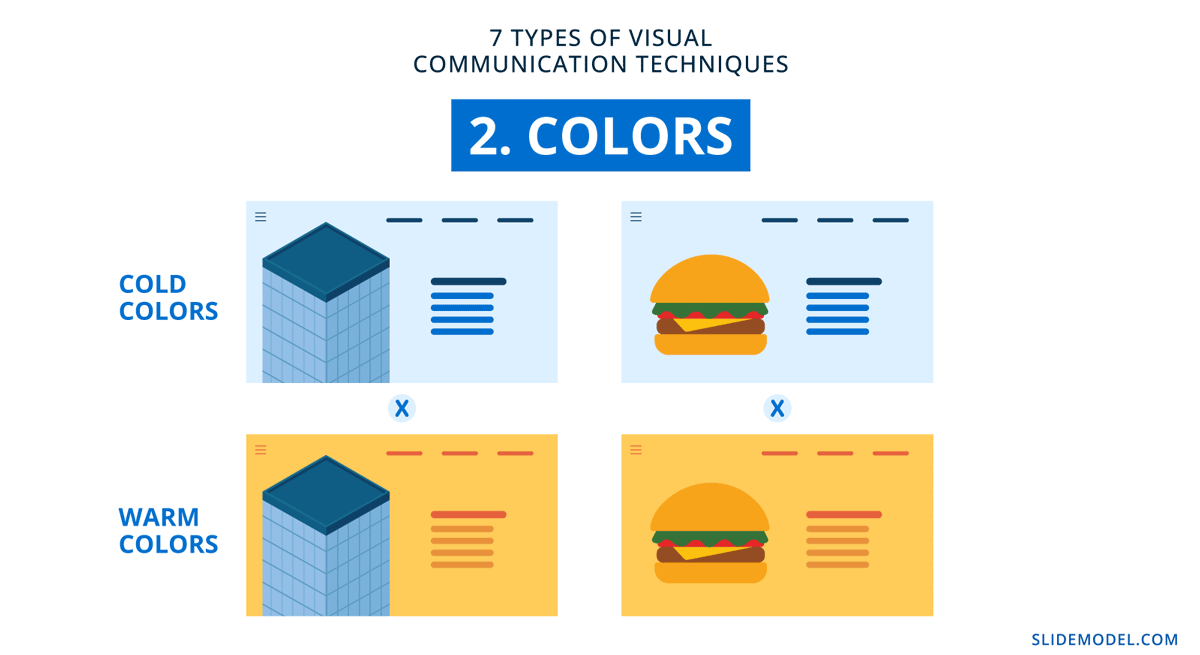
2. Colors
In design, colors are the trigger for emotion in content and visualization. Each color has a meaning and an association. Combining colors to create palettes is a practice in mood and emotional communication through vision. If a presentation is all blue and gray, it feels corporate, a vibrant color combination feels happy and inspiring. Muted and desaturated colors feel calm and inviting.
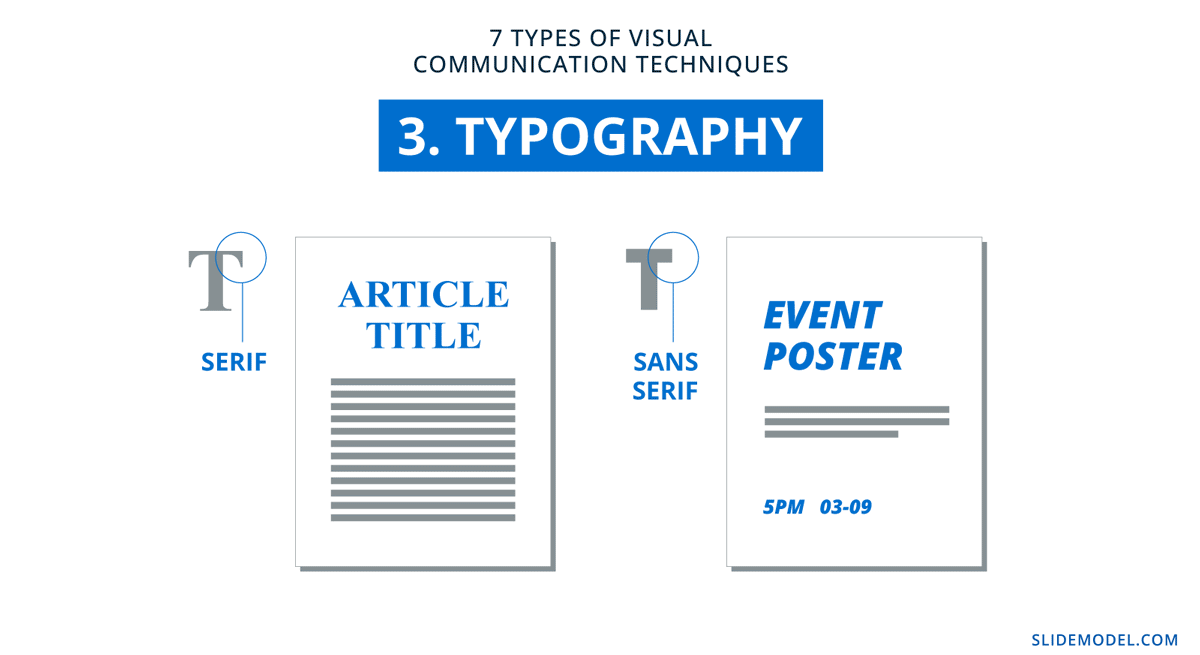
3. Typography
The way letters look brings a sense of meaning from content to the eyes—from text to visual. There are two main font types: serif and sans serif. Serifs are more serious, while sans serifs are friendlier and easygoing. On top of that, each type has a personality that emanates through the content. The visual style of the typography in your presentation must match energetically with the tone and message of both visual and textual content.
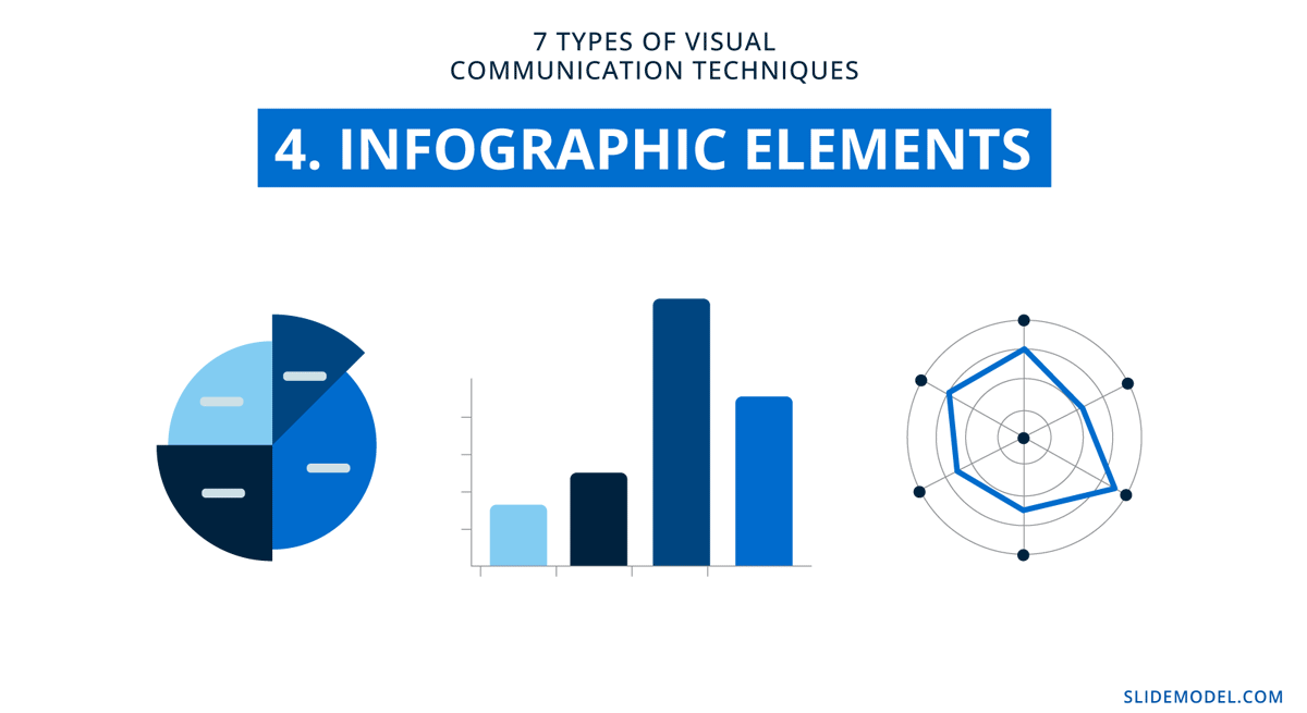
4. Infographic elements
Infographics are the poster boy for visual communication. Data visualization and information design are at the core of data stories and exciting business communication. Data viz graphics simplify complex ideas that can take up lots of text space in a presentation slide. Your regular charts and graphs can fall through the cracks if you don’t add a good dose of visual communication strategy and design.
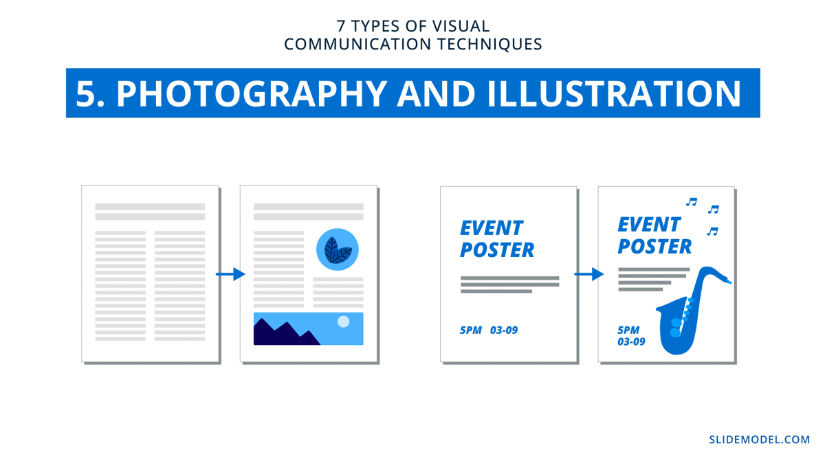
5. Photography and Illustration
Photography and illustration are classic tools for storytelling. Every slide can be easily turned into a pictorial presentation to tell your story, and you have the power to structure it how you want. Be wary of stock photography; overused images will negatively affect your presentation. Custom imagery adds integrity and uniqueness that only a visual communication strategy can achieve.
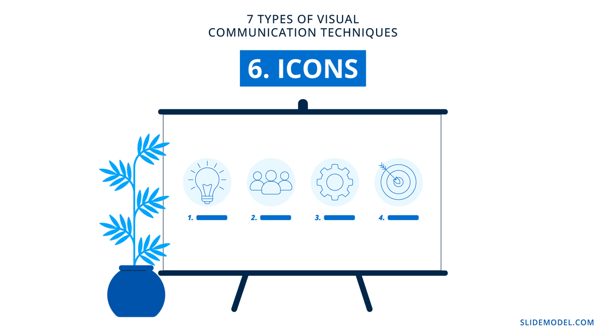
6. Icons
When using icons in your presentation templates, remember to keep a visual unity between them. Icons can also tell a story from slide to slide in your presentation. Stay consistent in terms of style, color, size, and positioning.
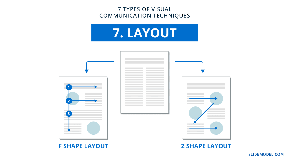
7. Layout & Visual Hierarchy
Viewers use their eyes to see, read, and understand your content. When the layout is designed in a way that helps them absorb the information subconsciously, engagement is seamless. It’s as simple as following visual hierarchy and placing elements in the viewer’s line of sight in a Z or F reading pattern.
How To Use Visual Communication At Work Beyond Presentations
Visual communication doesn’t stop at presentations. There are countless other ways to incorporate visual communication at work. Here’s a—not complete—list of the design practices that embody visual communication.
- Videos
- Infographics
- Visual guides
- Flowcharts and processes
- Employee training
- Internal communication
- Work attire
- Body autonomy
If someone can see it and understand it, it can be communicated visually. Take advantage of that and harness the power of perception, association, and emotional response.
Common Mistakes in Visual Presentations
Even the most well-intentioned visual presentations can fall short due to common yet avoidable mistakes. Visual clutter, perhaps the most pervasive issue, occurs when slides are overloaded with text, images, or data points. This not only overwhelms the audience but also dilutes the message, making it difficult to discern what’s important. For example, a slide crammed with bullet points and multiple charts forces viewers to split their attention, reducing comprehension and retention.
Another frequent error is the misuse of color, which can range from poor contrast to culturally insensitive choices. For instance, using red to denote growth might confuse audiences accustomed to associating red with deficits or warnings. Similarly, inconsistent styling—such as alternating fonts or erratic color schemes—creates a disjointed experience, distracting from the content’s substance. Check out our article on the best PowerPoint fonts to learn the best practices for preventing this.
Data visualization errors are equally detrimental. For example, misusing 3D effects in charts can distort proportions and obscure key insights, while cherry-picking data to fit a narrative breeds skepticism and undermines credibility.
Finally, another overlooked mistake is neglecting white space, a design element that provides visual breathing room and enhances readability. Cramped layouts, on the other hand, create cognitive strain, making it harder for the audience to process information. Our guide on presentation structure can help you master these aspects.
Final Words
In visual communication, it’s important to remember that first impressions matter. Your presentations and the message they deliver depend on the value of the visuals throughout the slides. Discover more techniques for improving your presentations in the SlideModel blog. Learn how to incorporate SlideModel templates into your PowerPoint slide decks and leave your audiences satisfied and informed.