Delivering a presentation goes beyond simply speaking through slides. And although most presenters acknowledge this, they lack a framework of techniques that help the audience absorb, recall, and interpret what they hear. They act on instinct, using an empirical method that reproduces what works and avoids what fails. In our experience, we should cultivate a disciplined approach that starts with the structure we aim to give the content and ends with the audience contact we expect.
This article focuses on the presenter’s side: how to speak, structure, orient, and respond in ways that reduce uncertainty and build credibility through deliberate technique rather than improvisation. Many of the methods described here remain unfamiliar even to experienced professionals. They sit between rhetoric, pedagogy, and cognitive psychology, and they often go unnoticed because they feel natural when performed well. Techniques such as strategic pausing, precise eye contact patterns, controlled variation in pacing, and micro-signposting operate beneath the surface. They apply to analysts defending a report, managers explaining results, educators structuring a lesson, and technical professionals communicating complex material.
Summary of the 14 Best Presentation Techniques to Use in 2026
- Audience-first framing: Open with the audience’s goal, constraint, or decision, so relevance is immediate.
- Outcome titles: Turn slide titles into takeaways (“Revenue fell due to churn”), not categories.
- Chunking and sequencing: Break complex ideas into small units and reveal them in a controlled order.
- Signposting transitions: Use short verbal cues to keep listeners oriented as topics change.
- Purposeful pausing: Insert brief pauses after key claims to help the insight land and stick.
- Data storytelling: Present charts as a narrative, context, pattern, or implication, rather than raw output.
- Cognitive load control: Reduce on-screen text and remove visual noise so slides support, not compete.
- Structured Q&A handling: Answer with a repeatable pattern: direct response, evidence, impact.
- Objection anticipation: Pre-load likely concerns and address them before they surface.
- Micro-interactions: Use quick polls, show-of-hands, or targeted questions to reset attention.
- Consistent visual grammar: Keep typography, spacing, and color logic stable across the deck.
- Rehearsal with timeboxing: Practice sections with strict timing to maintain pacing.
- Hybrid delivery discipline: Alternate attention between the room and camera so remote attendees stay included.
- AI-supported coaching: Use AI for pacing notes, transition rewrites, and rehearsal feedback without outsourcing judgment.
PowerPoint Rules of Presentations
Effective slide design is guided by established frameworks that help structure content, manage timing, and control cognitive load. Resources known as the Rules of PowerPoint Presentations consolidate practical standards for clarity, readability, and visual balance. These guidelines form the backbone of professional slide development and support consistent delivery across business, academic, and sales contexts.
Audience management is addressed by the 20/60/20 Rule, which segments listeners into supporters, neutral participants, and skeptics. This framework helps presenters adjust tone and messaging strategically rather than attempting to persuade everyone equally.
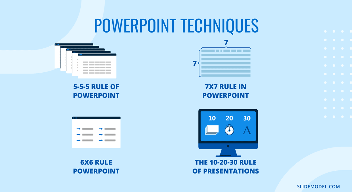
Time and slide discipline are central to the 10/20/30 Rule of PowerPoint, which recommends ten slides, twenty minutes, and a minimum thirty-point font size. While originally tailored for pitch environments, it remains relevant for executive briefings and investment proposals.
Text density guidelines such as the 6×6 Rule of PowerPoint, the 5-5-5 Rule of PowerPoint, and 7×7 Rule of PowerPoint regulate the number of words per line and lines per slide. These frameworks aim to prevent overcrowding and maintain visual hierarchy, especially when presenting complex information. You can overview their differences in the table below.
| Rule | Core Principle | Best Use Case | Primary Benefit | Limitation |
|---|---|---|---|---|
| 10/20/30 Rule | 10 slides, 20 minutes, 30-point font | Investor pitches, executive summaries | Encourages conciseness and readability | Not ideal for technical deep dives |
| 5-5-5 Rule | 5 words per line, 5 lines per slide, no more than 5 text-heavy slides in a row | Educational or training sessions | Prevents text overload | May oversimplify complex ideas |
| 6×6 Rule | 6 words per line, 6 lines per slide | Business presentations | Maintains visual clarity | Requires careful content editing |
| 7×7 Rule | 7 words per line, 7 lines per slide | Content-heavy briefings | Allows moderate detail | Higher risk of cognitive overload |
Remember, technical design alone is insufficient without delivery skills. Our presentation skills guide addresses structure, body language, pacing, and audience engagement. Together, these frameworks represent complementary types of presentation techniques that improve clarity, persuasion, and retention across different professional settings.
Foundational Presentation Techniques
Foundational presentation techniques determine how an audience processes information from the first minute. They shape the message’s structure and guide perception in ways that feel intuitive when executed well. These methods help the presenter control pacing, reduce ambiguity, and keep the audience oriented without overwhelming them. They form the base upon which more advanced techniques later build. This is where many teams fail to define types of presentation techniques clearly, mixing delivery behaviors with slide rules and calling it a “style.”
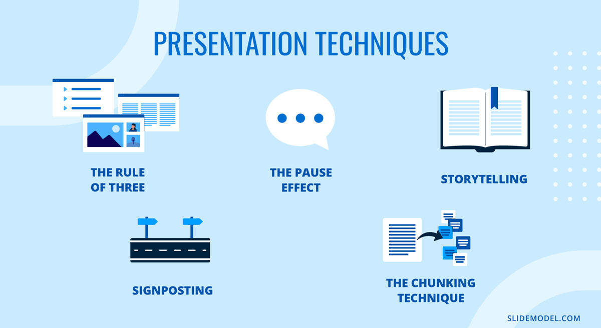
The Rule of Three
The Rule of Three allows audiences to retain grouped information more easily when it’s segmented into controlled clusters. It is not about oversimplifying or forcing content into arbitrary categories. It is a cognitive structure that reduces mental friction during listening.
By organizing information into three core ideas, themes, or movements, the presenter establishes clear boundaries that the audience can follow without effort. The key is not to announce the structure mechanically but to let it function as an internal blueprint. When used effectively, each “three-part” block has coherence: an opening idea that frames a topic, a development that clarifies its implications, and a resolution that points toward relevance. This rhythm creates stability. It also supports transitions, since each part naturally leads into the next without abrupt shifts.
In practical terms, the Rule of Three is most helpful when defining the scope of a talk, breaking down a complex concept, or managing a long explanation. It prevents the presentation from dispersing into unrelated threads. When the audience recognizes a pattern, they anticipate progression, which improves comprehension. Presenters benefit as well: a structured framework reduces cognitive load during delivery, making it easier to stay on message.
Signposting
Signposting is the practice of guiding the audience’s attention by indicating where the presentation is headed and why each segment matters. Most presentations fail not because the content is weak but because listeners cannot map new information onto what came before. Signposting solves this by creating orientation points throughout the session.
Effective signposting uses short verbal cues rather than long explanations. Phrases like “Now that we’ve established the context” or “This leads us to the next factor” serve as transitions that mentally prepare the audience. These cues reduce uncertainty; they signal continuity and prevent listeners from wondering whether the topic has shifted or expanded without warning.
The strength of signposting lies in its subtlety. When overused, it becomes repetitive. When used sparingly, it reinforces logical order. Signposting is particularly important in technical presentations, financial reviews, and educational settings where concepts build upon one another. It also supports oral presentation techniques in practice: clear speech is not only about pronunciation but also about keeping listeners oriented.
The Pause Effect
A deliberate pause is one of the most underestimated tools available to presenters. Silence is not the absence of content; it is the mechanism that allows content to land. Many speakers fear pauses because they associate silence with uncertainty, yet the opposite is true. A controlled pause signals composure. It tells the audience that the presenter owns the room’s rhythm.
The Power Pause serves three functions. First, they allow processing time. When the presenter introduces a crucial point, a short pause gives the audience time to absorb it before rushing into the next sentence. Second, pauses control emphasis. A well-placed pause before or after a key statement increases its perceived importance. Third, pauses reset attention. When the audience’s concentration drifts, a moment of silence reorients their focus more effectively than raising one’s voice or repeating information.
As a presentation technique, it’s especially valuable for complex material or for shifting between topics. It removes the sensation of overcrowded speech. It is also helpful during Q&A sessions. Taking a brief pause before answering a question prevents impulsive or unfocused replies and demonstrates thoughtful consideration. The effectiveness of pause lies in restraint: it works because it is purposeful, not because it is prolonged.
Storytelling Structures
Storytelling in presentations is not about embellishment. It is about imposing order on information that might otherwise feel abstract. A clear story structure gives the audience a way to follow reasoning without being experts in the topic. The most reliable structure mirrors classical narrative logic: an initial situation, a complication or challenge, and a resolution. This shape helps the audience understand why the content matters.
When used in business or technical settings, storytelling does not require dramatic language. It requires framing. The presenter establishes a premise: an issue, a gap, or a need. Then they walk the audience through the forces that shaped the outcome. The final step is the resolution, which explains what changed and why it is essential now. This structure works because it aligns with natural patterns of human inference.
Storytelling structure also helps with retention. Audiences forget isolated facts quickly. They remember sequences that show relationships. A metric, a diagram, or a conclusion gains meaning when tied to a progression.
Chunking Technique
The Chunking Technique divides information into manageable units that the audience can process without strain. This differs from simplification. Chunking does not reduce complexity; it organizes it. It acknowledges that attention is limited and that people understand better when information is distributed in layers rather than delivered all at once.
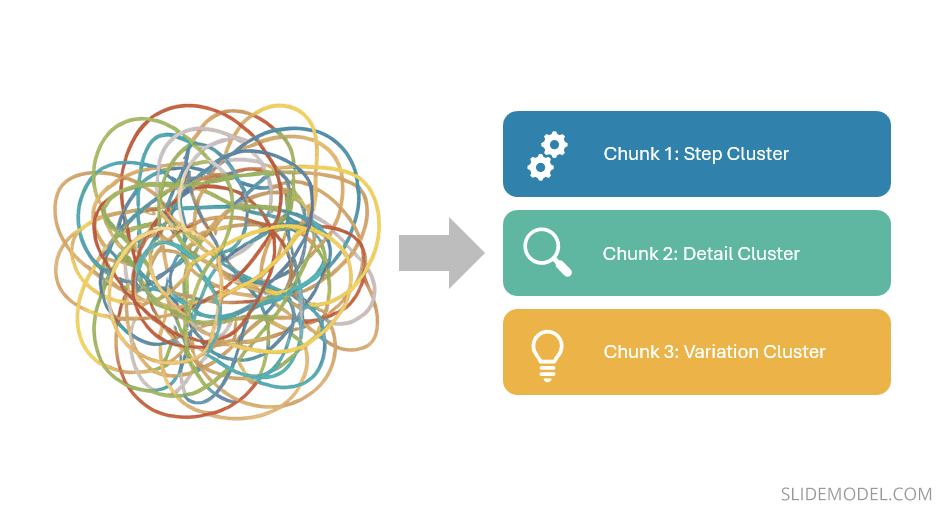
A chunk may contain related steps, supporting details, or variations of a single concept. When each chunk remains focused on one domain, the audience avoids the disorientation that comes from switching topics too quickly. Presenters often underestimate how disruptive topic-switching can be. Even small shifts, such as moving from a definition to a personal anecdote without a transition, force listeners to renegotiate context. Chunking prevents that by grouping information coherently.
Visual Presentation Techniques
Visuals shape how audiences interpret meaning long before a presenter begins speaking. Slides do not function as backgrounds; they operate as a parallel communication channel that either supports or disrupts comprehension. A strong presenter understands that visual clarity does not result from decoration but from deliberate design choices that reduce ambiguity. The techniques below focus on how presenters can control the viewer’s cognitive workload and reinforce structure through visuals rather than compete with their own verbal delivery.
Minimalist Slide Design
Minimalism in slide design is not the removal of content but the removal of interference. A minimalist slide strips away elements that do not add explanatory value. The presenter replaces decorative icons, excessive labels, heavy gradients, and redundant wording with a layout that directs attention through spacing, contrast, and hierarchy. This approach serves a practical purpose: audiences process visual information more quickly when each element has a clear reason for existing.
Minimalist slides work because they prevent visual fatigue. When a slide contains too many elements, the audience must decide where to look first. That decision introduces hesitation. In presentations that rely on rapid comprehension, financial reviews, technical demonstrations, and condensed status updates, every moment spent decoding layout is a moment lost for understanding content. Minimalism reduces this cognitive tax.
A minimalist slide also forces the presenter to prioritize meaning. One idea per slide becomes the default, not the exception. The presenter conveys nuance, while the slide provides structure. This separation of roles prevents the common mistake of overloading the screen with entire paragraphs.
Data Storytelling
Data storytelling transforms figures into interpretations by sequencing visuals that mirror reasoning. Instead of showing the entire dataset, the presenter reveals only the components necessary to support the message at each stage. This progressive visual logic prevents the audience from being overwhelmed by irrelevant information.
The strength of data storytelling lies in the choice of what not to display. Many presenters default to full tables or multi-series charts because they feel obligated to show all available data. This creates noise. A more effective approach is to isolate trends, contrasts, or anomalies that anchor the narrative. Each slide becomes a step in the explanation rather than a repository of raw material.
Data storytelling also benefits from controlled visual framing. Lines, bars, or figures should highlight relationships rather than appear as isolated artifacts. Visual cues such as consistent color coding, proportional scaling, and repeated chart structures let the audience track development across slides. This is where data presentation techniques become concrete: it’s the discipline of showing only what supports interpretation, not everything you measured.
Consistent Visual Themes
A coherent visual theme unifies the presentation into a sequence rather than a set of independent slides. This theme is built through color systems, typography choices, spacing patterns, and chart styles that remain constant from the first slide to the last. Consistency acts as a stabilizer. It reduces the mental adjustment required each time a new visual appears.
Recommended lecture: Visual Communication for Presentations
The presenter’s role is to establish a visual grammar. Once set, it should not shift without cause. For example, if blue represents outcomes and gray represents baselines, those assignments must remain unchanged. If the title text appears in one location on the first slide, it should maintain that placement throughout. Inconsistent layouts may seem trivial to the presenter but accumulate into noticeable strain for the audience, who must continually recalibrate.
Visual themes also serve credibility. A disciplined visual system signals preparation. It tells the audience that the presenter has applied a single logic to all materials, subtly communicating rigor. Even when the content is highly complex, the visual design’s stability gives the audience confidence that they are being guided, not left to interpret a fragmented sequence.
Contrast for Emphasis
Contrast is the primary mechanism through which the audience determines priority within a slide. Polished contrast highlights what matters without resorting to theatrical effects. Instead of dramatic color changes or oversized fonts, presenters use calculated variations in weight, spacing, and tone to draw attention to key elements.
Contrast should support hierarchy rather than replace it. For example, a bold figure centered on the slide establishes immediate importance. Muted background text suggests a supportive context. When contrast is executed with restraint, it instructs the viewer’s eye instinctively. They understand what they should focus on before the presenter speaks.

However, contrast loses power when applied indiscriminately. If everything is emphasized, nothing is emphasized. Presenters should select a single focal point per slide and apply contrast with discipline, ensuring that emphasis aligns with the verbal message.
Transitions & Animations
Transitions and animations influence pacing. They guide the audience through a sequence at a speed the presenter controls. When used correctly, animations reveal content in a structured order that matches the speaker’s explanation. For example, introducing a bullet list one item at a time prevents audiences from reading ahead and misaligning their understanding with the verbal flow.
The value of a PowerPoint animation lies in moderation. The purpose is not to entertain but to regulate cognitive pacing. Simple fades or stepwise reveals suffice. Complicated motion effects distract, especially in professional settings. They also risk technical issues in unfamiliar presentation environments. A slide should remain functional even without its animations, which means the animation must clarify the order of interpretation rather than define it.
PowerPoint transitions serve another purpose: resetting visual attention. When the audience shifts from one slide to the next, the movement cues them that a conceptual boundary has been crossed. This helps segment the talk into meaningful units. Without clear transitions, long presentations can visually blur, leaving the audience unsure where one idea ends and another begins.
Audience Engagement Techniques
We define audience engagement as the degree to which attendees remain cognitively connected to the material. Engagement emerges when the presenter maintains relevance, clarity, and responsiveness. The goal is not to energize the room artificially but to keep the audience aligned with the progression of ideas. Techniques in this section help the presenter sustain that alignment in real time.
Interactive Elements
Interactive elements work when they create purposeful participation, not when they interrupt the flow with unrelated activity. Their value lies in resetting attention and confirming understanding. Audience attention fluctuates naturally, especially in long sessions. A brief prompt, a short reflection exercise, or a targeted question stabilizes focus by requiring the listener to evaluate what they have just heard.
The presenter must be selective when delivering interactive presentations. Each element should relate directly to the content. When introducing a concept, asking listeners to consider a simple scenario or reflect on a recent experience builds relevance. This makes the following point easier to absorb because the audience has activated prior knowledge. In more technical settings, interaction can be limited to a moment of assessment: “Given this setup, which variable would influence the outcome most?” This does not require public speaking from the audience, but it demands cognitive involvement.
Interactive elements also give the presenter feedback. If a room hesitates or answers inconsistently, the presenter learns that clarity needs reinforcement before moving on. Engagement becomes diagnostic rather than decorative.
Call-and-Response Questions
Call-and-response questions help maintain momentum. They are not rhetorical. They are designed to prompt a brief response, whether verbal or internal. This keeps the audience participating actively rather than passively absorbing information. Such a technique is known as The Question Hook.
The most effective call-and-response questions do not test the audience. They guide interpretation. These questions often begin with a framing cue such as “Notice what happens when…” or “Consider what this implies…” They shape how the audience views the next slide or argument. The question is not an invitation for open debate but a signal to focus attention on a specific relationship or insight.
This technique works best when used sparingly. If overused, it becomes predictable and loses cognitive impact. When applied at key moments, before revealing a data trend, introducing a key decision factor, or transitioning to a contrasting concept, it strengthens the presentation’s narrative arc.
Body Language Awareness
Body language in presentations influences how audiences assess authority, confidence, and clarity. It operates independently of verbal content. A presenter may articulate a strong message, but an inconsistent posture or uncontrolled movement weakens its perceived reliability.
Effective body language involves a controlled stance (like the Power Position), intentional gestures (such as in the Palm Up Principle, and spatial awareness (as in the Lighthouse Method). A stable stance communicates composure. Excessive movement, especially lateral pacing, distracts by introducing unpredictable visual noise. Intentional gestures reinforce explanations when they mirror the verbal content. For example, referencing a specific element on a slide with a precise gesture grounds the explanation spatially, making it easier for audiences to follow.
Facial expression also contributes to engagement, though it should remain natural. A neutral, attentive expression conveys focus. Forced enthusiasm creates cognitive dissonance; the audience senses a mismatch between content and delivery. The goal is coherence. Body language must support the message, not compete with it.
Eye Contact Techniques
Eye contact is one of the most compelling ways to regulate connection. It signals presence. However, eye contact must be made deliberately. A presenter who scans the room inconsistently sends conflicting signals about direction and priority. A structured pattern ensures that all audience segments remain included.
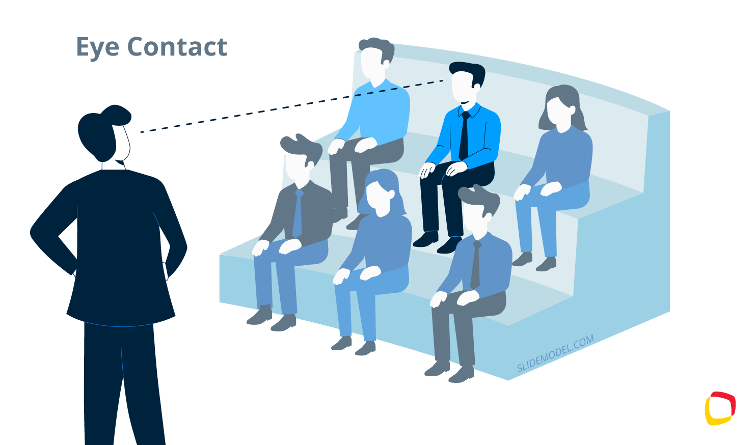
One approach is to mentally divide the room into zones and slowly rotate through them during key statements. This prevents over-focusing on a single area and creates balanced engagement. Eye contact should be sustained long enough to register attention, but not so long as to be uncomfortable. Short, targeted eye contact when delivering a key idea reinforces importance and signals confidence in the material. Another approach is to use the 5-5-5 Rule of Public Speaking
In virtual presentation settings, the principle shifts: the presenter must look into the camera when making key points. This simulates a direct connection and avoids the impression of reading or disengagement. Eye contact in hybrid environments requires even more discipline, as remote and in-room audiences must feel reliably acknowledged.
Adaptation in Real Time
Adaptation is the highest form of engagement control. It requires the presenter to evaluate the audience’s reactions and adjust accordingly. This does not mean changing the message but managing the delivery. Real-time adaptation might involve slowing down when the room shows signs of confusion, offering a brief recap when attention drops, or condensing a section when time constraints tighten.
Presenters who prepare rigid scripts often struggle with adaptation because they prioritize completion over comprehension. An effectual approach is to prepare frameworks that are flexible. When the presenter deeply understands the logic of each section, they can make adjustments without losing coherence.
High-Stakes Presentation Techniques
High-stakes presentations differ from routine meetings because the margin for ambiguity is smaller. These sessions often involve executives, investors, evaluators, or clients who make decisions quickly and expect clarity from the outset. The presenter must demonstrate control of the narrative, anticipate objections, and communicate value within a limited time.
Techniques in this section focus on precision, orientation, and strategic compressions of information, all of which help presenters manage pressure without relying on scripted theatrics. This is where sales presentation techniques often break down when the presenter relies on “confidence” rather than structure.
Elevator Storytelling
Elevator storytelling is the ability to condense the central message into a tight, coherent narrative that fits into a brief time span, such as in the Elevator Pitch. It is not a slogan or a sales pitch. It is a structural discipline that forces the presenter to isolate what genuinely defines the presentation’s purpose.
In high-stakes settings, audiences evaluate competence within the first minute. They look for direction: What problem are we addressing? What is the current state? What outcome are we aiming for? This technique stabilizes delivery under pressure. When the presenter carries a concise internal version of the message, they can recover quickly if interrupted, asked to skip ahead, or required to shorten the session. The technique ensures that the structure remains intact even when circumstances change abruptly.
Handling Objections Live
Handling objections in real time requires preparation, not improvisation. In high-stakes environments, objections are often attempts to test the presenter’s grasp of details, assumptions, or implications. The goal is not to win a debate but to demonstrate analytical coherence.
The presenter must distinguish between three types of objections: clarification questions, challenge questions, and strategic questions. Clarification questions signal that the audience is following the narrative but needs more detail. These should be answered directly and concisely, reinforcing understanding without unnecessarily expanding the scope.
Challenge questions probe the credibility of the data, assumptions, or methodology. Here, the presenter must stay factual. A brief explanation of the underlying rationale or constraints signals that control is in place. Avoid defensive tone; it shifts attention from reasoning to emotional posture. High-stakes audiences value composure as much as accuracy.
Strategic questions assess implications: how a recommendation affects cost, risk, or feasibility. These questions require the presenter to return to the anchor point. When the answer consistently aligns with the core narrative, the audience perceives cohesion. If an objection presents a scenario the presenter has not considered, acknowledging the limitation and outlining how it would be evaluated demonstrates maturity rather than weakness.
Executive Summaries
An executive summary in presentations serves a different function than in written reports. It is not a compressed restatement; it is a navigational tool designed to quickly orient decision-makers. High-level audiences often enter a session looking for confirmation that their time will be used efficiently. A strong executive summary establishes context, highlights the central insight, and clarifies what decisions or interpretations the presentation supports.
Effective presentation techniques on summaries consist of three components: the situation, the insight, and the implication. The situation frames the domain. The insight identifies what has changed or become clear. The implication describes what the audience should understand or consider. This approach prevents the common mistake of listing data without explaining why it matters.
Persuasive Closings
Closings in high-stakes presentations must resolve uncertainty. They provide the audience with a consolidated view of the message and reinforce the logical path that led there. This is not the space for emotional appeals or generic statements. A persuasive speech closing revisits the anchor point, reaffirms the insight, and articulates the final consequence in a controlled, factual manner.
The presenter should aim for precision. The closing should clarify what has been demonstrated, what the supporting evidence implies, and what action or interpretation logically follows. This prevents the impression of open-endedness, which weakens credibility. When a closing lacks structure, the audience may leave uncertain about whether the presenter’s argument held together.
Psychological Techniques
Psychological techniques do not manipulate the audience; they clarify how human cognition handles information. Presenters who understand these mechanisms design their delivery around the limits and strengths of memory, attention, and perception. These techniques create a stable audience experience, reducing the effort required to follow the message and increasing the likelihood that key ideas will be remembered accurately.
Primacy & Recency
Primacy and recency refer to the two points in a presentation where attention naturally peaks: the beginning and the end of a segment. Audiences are most receptive when a topic is introduced and when it concludes. This pattern is constant across contexts because it aligns with how memory organizes sequences. Presenters who structure content without considering these peaks risk placing their most important ideas in low-retention zones.
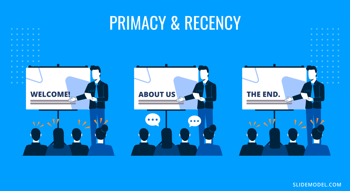
To apply primacy effectively, the presenter positions the core framing element at the moment the audience is orienting itself. This does not need to be a summary of the entire talk. Instead, it is the key reference point that the rest of the material will support. When the audience absorbs this reference early, they evaluate subsequent details against it, which improves comprehension.
Recency reinforces what should remain after the topic transitions. This final moment consolidates meaning, helping the audience retain the intended interpretation rather than form their own conclusions from fragmented impressions. A concise restatement of the insight, or a short clarification of its practical implications, is sufficient. Overloading the closing with new details weakens the effect by shifting attention away from consolidation.
Social Proof
Social proof shapes how audiences assess credibility. Listeners evaluate whether a claim or insight aligns with established norms, verified outcomes, or shared expectations. This does not mean appealing to authority. It means demonstrating that the reasoning presented is not isolated from the broader context.

The presenter uses social proof by referencing patterns, precedent, or validated processes. For example, when introducing a recommendation, showing how similar organizations approached comparable challenges reassures the audience that the proposal sits within known parameters. In technical or scientific settings, this may involve referencing widely accepted models or methodologies. The purpose is to position the insight within an ecosystem of established practices.
Social proof must be used with restraint. Excessive reliance on external validation signals a lack of confidence. The presenter’s explanation should remain the central source of credibility, while social proof functions as reinforcement. It helps the audience recognize that the reasoning is not speculative but grounded.
Cognitive Load Management
Cognitive load management ensures that the audience’s mental resources are directed toward understanding rather than decoding. It is one of the most critical psychological techniques because overload is the primary cause of disengagement. When the audience must process too much information at once: dense visuals, long sentences, or rapid transitions, they lose the thread of the argument.
Recommended lecture: How Different Cognitive Bias Impact Your Presentation

Effective cognitive load management starts with segmentation. The presenter divides content into manageable pieces and avoids abrupt domain switches. Verbal explanations should not compete with busy slides; one channel should support the other. If a slide contains a graphic requiring close examination, the presenter should pause verbal elaboration long enough for viewers to process the visual before continuing. Applied consistently, this turns presentation techniques for data into a repeatable practice rather than a one-off skill.
Anchoring Effect
Anchoring occurs when the audience forms an initial reference point that influences how they interpret subsequent information. Presenters can use this effect responsibly by setting accurate, context-driven anchors rather than exploiting arbitrary comparisons.
A well-chosen anchor helps the audience understand scale. For example, when describing growth from the baseline, the actual previous state ensures that improvements appear in the correct proportions. When discussing risk in presentations, anchoring the audience in the original constraint or limitation provides context for the proposed solution.
Digital & Hybrid Presentation Techniques
Digital and hybrid presentations introduce constraints absent from in-person environments. The presenter no longer relies on the natural feedback loop of eye contact, body language, and spatial presence. Instead, they must create connections through controlled framing, structured pacing, and deliberate management of visual channels. These techniques ensure that remote audiences remain aligned with the message, even when viewing conditions vary widely.
Camera Framing & Lighting
Camera framing serves as the audience’s window into the presenter’s presence. A stable, centered frame communicates intention and professionalism, while poor framing distracts and undermines credibility. The presenter’s eyes should be on the upper third of the screen, giving the impression of direct engagement. A camera positioned too low creates an unintended hierarchical effect, while a camera positioned too high diminishes immediacy.
Lighting influences both clarity and perception. Harsh backlighting obscures facial expression, making it harder for the audience to read cues. Soft, front-lit setups maintain natural visibility without introducing theatricality. This level of control matters because remote audiences depend on micro-expressions and subtle cues to judge confidence, pacing, and emphasis. If those cues disappear, the audience feels emotional distance, even when the content is strong.
Virtual Engagement Tools
Virtual tools help compensate for the reduced physical interaction in digital environments. Their value is not in novelty, but in the structure they provide. Polling, short written prompts, and controlled chat interactions allow the presenter to gauge comprehension and maintain the audience’s cognitive presence.
Polling works well when it has a direct analytical purpose. For example, asking the audience to estimate a trend or choose between options before revealing the data encourages active processing. The tool should support reasoning, not distract from it. Chat-based engagement should remain focused. Inviting comments at selected intervals helps the presenter assess clarity, but allowing continuous commentary during complex segments fragments attention.
Screen annotation tools can enhance explanation when used selectively. Highlighting a specific part of a chart or diagram focuses the audience without forcing them to interpret the visual themselves.
Hybrid Delivery Flow
Hybrid presentations divide attention across two audiences: those in the room and those attending remotely. The presenter must acknowledge both groups in ways that feel integrated rather than performative. Neglecting either group weakens engagement and disrupts cohesion.
The flow of a hybrid presentation begins with orientation. The presenter states how questions will be handled, how transitions will occur, and how remote participants will signal interactions. This reduces uncertainty and sets expectations for both audiences. Without this framework, hybrid sessions often devolve into logistical confusion.
During delivery, the presenter alternates attention between the room and the camera. This rotation must feel deliberate. Addressing the camera during key statements ensures remote participants remain included. Addressing the room during discussions anchors physical presence. The presenter must avoid long stretches where one group receives exclusive focus.
Niche Angles for Different Audiences
Presenters encounter a wide range of audiences whose expectations, cognitive preferences, and interpretive frameworks differ significantly. Techniques that work for executives may fail in academic environments. Methods that succeed with technical teams may overwhelm non-technical listeners. This section addresses how presenters adapt structure, pacing, and framing when the audience belongs to a specific demographic or operates under distinct professional norms.
Educators
Educators face a unique challenge: their audience is present not only to receive information but to integrate it into long-term understanding. This requires a presentation structure that is both rigorous and accessible. Presentations in educational settings must balance conceptual depth with clarity of sequence. Learners need stable anchors, especially when encountering unfamiliar material.
Effective educational presentations begin with explicit framing. Students must understand why the topic matters and how each section contributes to the broader subject. Without this context, even high-quality explanations fail to build durable comprehension. Educators should segment content into progressive tiers, moving from foundational concepts to applications, then to evaluation or synthesis. This mirrors the cognitive progression students undergo as they internalize material.
Examples and analogies play an essential role, but they must be carefully selected. The analogy should clarify a structure, not replace it. When introducing technical processes, the presenter guides learners through intermediate reasoning steps, avoiding the temptation to skip ahead. The pacing must allow students to form mental models rather than memorize details.
Recommended lecture: Metaphors in Presentations
Technical Topics
Technical audiences assess accuracy before narrative. They expect precision in terminology, methodology, assumptions, and data sources. A presentation aimed at engineers, researchers, or developers must demonstrate alignment with the norms of their discipline. Any deviation or ambiguity quickly erodes credibility.
Recommended lecture: Thesis Presentations
The structure for technical topics should reflect logical progression rather than rhetorical flow. Definitions appear early, followed by methods, constraints, and evidence. Diagrams must be accurate, appropriately scaled, and free of decorative embellishment. Slides should reveal reasoning rather than only results. When discussing findings, the presenter distinguishes between what is supported by data and what is inferred.
Technical audiences also value transparency regarding limitations. Acknowledging uncertainties, error margins, or incomplete data conveys intellectual honesty, which is essential for credibility. Overconfidence or vague assertions create resistance. The presenter should anticipate technical questions and have backup material available, even if it remains outside the main slide sequence. In these contexts, asking ourselves what are data presentation techniques become less about aesthetics and more about interpretability and traceability.
Cross-Cultural Presentations
Cross-cultural audiences interpret visual cues, rhetorical structures, and expressions of authority differently. A technique that signals confidence in one cultural context may appear too assertive or too passive in another. Presenters must recognize these variations to maintain clarity and respect.
Clarity begins with neutral language. Idiomatic expressions, culturally specific humor, and region-dependent metaphors can confuse international audiences. A straightforward, literal articulation of ideas is more reliable. Visual design must also avoid culturally charged color associations. Colors such as red, white, or yellow carry distinct symbolic meanings across cultures, so presenters should prioritize neutral palettes unless local conventions are well understood.
Decision-making patterns also differ. Some cultures emphasize direct recommendations, while others prefer to accumulate evidence before drawing conclusions. The presenter should structure the narrative to align with the audience’s decision-making culture. When uncertain, a balanced approach works: provide evidence early and state recommendations clearly, but allow space for discussion before final interpretations.
Introverts
Introverted audiences do not engage through overt participation. They prefer time to think, structured explanations, and stable pacing. Presenters often misinterpret quietness as a lack of interest when it is simply a different style of processing. Presentations for introverted audiences must reduce performance pressure and provide a predictable structure.
Interactive methods should be low-visibility. Silent reflection prompts, written responses, or private polls allow introverts to interact without public exposure. The presenter must avoid rapid-fire questioning or forced verbal participation, as these practices create cognitive shutdown rather than engagement.
Clarity is essential. Introverted audiences respond well to well-structured visuals (such as infographics), steady pacing, and explicit reasoning. They benefit from material that unfolds logically, with minimal deviation. Pauses are particularly effective because they provide processing time without drawing attention to any individual audience member.
Matching Techniques to SlideModel Templates
Presentation technique examples gain strength when matched with the appropriate visual structure. PowerPoint templates serve as scaffolding: they reinforce logic, clarify emphasis, and make complex sequences easier to follow. When a technique and a template align, the audience processes information with less effort and greater accuracy. The following matches outline how specific templates support the methods discussed in earlier sections.
The Rule of Three and Executive Summary techniques benefit from templates built around three-part segmentation. Three-step diagrams, three-column layouts, and executive one-pagers create visual stability. These structures guide the audience toward the central insight by presenting information in controlled clusters. For executive contexts, a one-pager with three dominant sections mirrors the flow of a high-level summary: situation, understanding, and implication. The design helps the presenter maintain focus while giving decision-makers a predictable pattern that supports rapid evaluation.
Signposting and Progress Tracking align naturally with agenda slides that visually display progression. Trackers, whether horizontal bars, vertical steps, or segmented timeline templates, signal where the audience is within the presentation. Section divider templates strengthen transitions by resetting attention and clarifying topic boundaries. When these templates appear consistently throughout the deck, the audience forms an internal map of the session, reducing the cognitive strain of reorientation.
Data Storytelling is most effective when paired with annotated chart templates. These templates provide structured placement for callouts, emphasis markers, and brief interpretations. A highlight circle, arrow, or contrasting color draws attention to the relevant data immediately, preventing the audience from scanning the chart aimlessly. The presenter gains control because the slide shows not only the data but also the reasoning behind it. This is especially useful in analytical presentations where interpretation matters more than volume.
Metaphor Mapping relies on templates that embody conceptual movement. Roadmaps, puzzle diagrams, funnels, and ladder PPT templates help audiences visualize relationships, progression, or transformation. These structures work because they convert abstract logic into a format the audience can navigate spatially. A roadmap expresses stages over time; a funnel shows narrowing focus; a ladder implies upward movement or incremental improvement. When the metaphor template matches the argument, comprehension accelerates because the audience anchors ideas in familiar conceptual patterns.
Interactive Moments require slides designed for participation rather than exposition. Poll slides, Q&A templates, and parking-lot templates provide a dedicated space for reflection, assessment, or deferred questions. These slides signal a temporary shift in pacing, encouraging the audience to re-engage actively. In digital environments, poll templates integrate clean layouts for quick responses, while parking-lot pages help maintain flow by capturing off-track questions without derailing the presentation.
How Can AI Improve Your Presentation Techniques
AI improves presentation techniques not by replacing the presenter, but by accelerating iteration and sharpening decision-making. One of the most practical applications is working with LLM models, such as ChatGPT, as AI presentation outline generator tools, which reorganize ideas into clearer logical sequences and expose gaps in reasoning before rehearsal even begins. When working from dense reports, converting long-form text to presentation slides with AI helps extract core claims and separate supporting evidence from background detail.
On the design side, automated slide layout optimization identifies overcrowded slides, inconsistent hierarchy, and spacing problems that dilute emphasis. This directly supports reducing cognitive load with AI-assisted design, ensuring visuals reinforce the spoken message rather than compete with it. For analytics-heavy talks, AI-driven data visualization techniques recommend appropriate chart types, remove redundant variables, and suggest clearer annotations that make insights visible at a glance.
AI also strengthens narrative quality. Using AI storytelling prompts for presentations, presenters can refine transitions, clarify stakes, and structure their arguments without drifting into vague language. When visuals need support, generative AI for presentation imagery can propose context-relevant concepts aligned with the topic rather than decorative filler. This is particularly useful if you work with models such as Google Nano Banana, Midjourney, or even OpenAI’s Sora for video presentations.
Beyond preparation, AI enhances delivery. Real-time AI speech coaching tools analyze pacing, filler words, and monotone risks, helping presenters practice with measurable feedback. During strategic preparation, AI-powered audience sentiment analysis can identify likely objections and areas of skepticism, enabling the presenter to prepare structured responses in advance.
If all this isn’t enough, we invite you to see what AI can do for the slide deck creation process by working with SlideModel.ai, our AI presentation maker tool that can create highly-visual, 100% editable decks out of PDF/Word documents, or by taking prompts.
AI Prompt Library for Presentation Techniques
AI can support presenters across preparation, design refinement, and performance practice. The goal is not to outsource judgment, but to accelerate iteration and surface blind spots that presenters miss when they are too close to the content. The following prompt library is designed for practical use: improving delivery technique, reviewing structure, strengthening narrative logic, and tightening slide design for clarity.
- “Run automated slide layout optimization on this slide list: identify overcrowded slides, missing hierarchy, and inconsistent spacing. Output precise fixes per slide.”
- “Suggest AI-driven data visualization techniques for this dataset, including chart selection and what to remove to improve interpretability.”
- “Propose generative AI for presentation imagery concepts that support the message without becoming decorative. Provide style guidance and where each image belongs.”
- “Act as an AI presentation outline generator. Reorder the outline for stronger reasoning flow, then flag missing assumptions and weak transitions.”
- “Audit this deck for reducing cognitive load with AI-assisted design. Identify places where the slide and the speech compete, and propose simplifications.”
- “Simulate Real-time AI speech coaching: analyze this script for pacing, filler words, monotone risk, and where pauses should be inserted.”
- “Provide presentation technique feedback on delivery: posture cues, eye contact patterns, and signposting opportunities based on this outline.”
- “Run AI-powered audience sentiment analysis on this talk track: predict skepticism points and propose alternative phrasing for higher trust.”
You can learn more in our guide on ChatGPT prompts for presentations.
Common Mistakes & How to Fix Them
Wall-of-Text Slides
Slides overloaded with paragraphs divert attention and force the audience to read rather than listen. Replace dense text with a clear headline, a single visual anchor, and only the minimum supporting bullets required for orientation. Detailed phrasing belongs in speaker notes, not on the slide. This is one of the simplest tips for presenting that directly improves comprehension.
Overcomplicated Visuals
Crowded diagrams, decorative icons, and multiple data layers create unnecessary cognitive strain. Remove elements that do not directly support comprehension, increase white space, and simplify shapes or labels. A clean layout allows the audience to grasp relationships quickly and without hesitation.
Charts Without a Point
Charts become noise when the audience must guess their meaning. Add a “so-what” title that states the insight directly, not the category. Highlight the relevant segment with a subtle color shift or annotation so viewers know immediately where to focus before the verbal explanation begins. This is central to presentation techniques for data and prevents the audience from doing interpretive work you should do for them.
Losing Audience Attention
Attention typically drops midway through a presentation. Continuing with the same pacing or visual pattern accelerates disengagement. Insert a change-of-pace slide, a brief example, a recap, or a structured question to reset focus and prepare the audience for the next segment of reasoning.
Reading Slides Verbatim
Reading text aloud weakens authority and breaks the connection with the audience. Keep slides concise so they function as cues, not scripts. Place complete sentences and extended explanations in the speaker notes. This separation allows the presenter to maintain eye contact, adapt the pacing, and deliver the message rather than recite it.
FAQs
What are oral presentation techniques?
Oral presentation techniques include voice modulation, pacing, eye contact, structured storytelling, and audience interaction. These elements influence clarity and persuasion beyond slide design.
What is the most important element of an effective presentation?
Clarity of structure. When the audience understands where the presentation is heading and how each section relates to the next, comprehension stays high even if the content is complex.
How long should a presenter speak before changing the visual on screen?
Only as long as the slide continues to support the argument. When the slide has served its purpose, advancing prevents stagnation and maintains attention.
What are data presentation techniques?
They involve selecting appropriate charts, simplifying metrics, highlighting trends, and providing context for interpretation.
How do presentation techniques for data differ from general techniques?
They prioritize clarity of metrics, visual accuracy, and avoiding misleading scales.
Should every slide include visuals?
Not necessarily. Some ideas require simplicity. A clean, text-focused slide with a single headline may provide better orientation than an unnecessary graphic.
What’s the best way to handle unexpected questions?
Pause briefly, isolate the core of the question, and address it at the appropriate level of depth. If the answer requires extended explanation, offer a concise version and expand later if time allows.
What are the most effective sales presentation techniques?
Customer-centered framing, problem-solution structure, social proof, and objection anticipation.
What are advanced presentation techniques?
Narrative structuring, contrast framing, data storytelling, and layered visual hierarchy.
How do I handle skeptical audiences?
Use structured evidence and acknowledge counterpoints directly.
How do I know if my slides are too dense?
If the slide cannot be understood at a glance, it contains more information than the audience can process during a presentation. Reduce text, simplify visuals, or split the material across multiple slides.
How can I create stronger openings?
Begin with orientation: define the central problem, the objective, or the reference point. Avoid anecdotes or unrelated details that delay clarity. You can learn more in our article on how to start a presentation.
How should I close a presentation?
Reinforce the final insight clearly and link it back to the central objective. A concise, well-structured closing helps solidify interpretation before discussion begins. You can learn more in our article on how to end a presentation.
What is presentation techniques training?
It involves structured practice of delivery, visual design, and persuasive framing.
When should I introduce data?
Only after framing why the data matters. Raw numbers introduced without context force the audience to infer meaning, which leads to inconsistent interpretations.
How can AI help me practice presentation technique delivery, not just build slides?
Use AI to rehearse delivery fundamentals: pacing, pausing, clarity, and emphasis. You can paste a script or outline and ask for a timed read-through plan (where to slow down, where to pause, where to stress keywords). The value is in creating repeatable rehearsal cycles rather than “one-off” feedback.
Can AI coach me on speaking style (tone, confidence, filler words) in a realistic way?
Yes, if you provide a transcript (or even rough notes), AI can flag filler patterns, long sentences that create breathlessness, and sections that sound defensive or uncertain. It can also rewrite spoken phrasing to match how people actually talk, which directly improves delivery and audience trust.
Can AI improve my storytelling presentation techniques and transitions without making my talk sound scripted?
Yes. Ask AI to audit your flow for missing transitions and unclear causal links, then propose natural spoken bridges between sections (one-sentence signposts and short recap lines). This strengthens audience orientation and prevents the “I jumped topics” feeling.
How do I manage time in a dense presentation?
Identify core segments that cannot be shortened and peripheral segments that can be compressed if needed. This allows real-time adjustment without breaking structure.
How do I keep hybrid audiences aligned?
Alternate attention between the room and the camera, articulate transitions verbally, and avoid fast slide transitions that remote participants may not see in sync.
How can AI help me adapt my presentation techniques to different audiences?
AI can generate alternative delivery plans based on audience type (executives, technical teams, customers, students). It can recommend changes in structure, depth, pacing, and interaction style, so you’re applying the right types of presentation techniques rather than repeating the same delivery in every context.
Final Words
At its core, how to make a presentation is about guiding attention. When the structure is clear, and visuals stay purposeful, the audience follows the message without effort. Strong presenters decide in advance what the audience must understand, then design every slide and transition to support that goal. They avoid clutter, pace information carefully, and use emphasis only where it clarifies meaning.
Effective delivery does not depend on charisma. It comes from control: knowing when to pause, shift tone, and simplify. This discipline allows the presenter to adapt to the room, whether in person, remote, or hybrid, without losing direction.
A presentation succeeds when the audience leaves with a stable, accurate understanding of the key idea. That outcome is built through intention, not volume or theatrics.