Creating a PowerPoint presentation can seem straightforward, but several essential rules must be followed when the goal is to deliver something truly compelling. These guidelines ensure that your presentation slides are visually appealing and serve their primary purpose: clearly communicating your message to evoke an emotion.
In this article, we will cover 14 rules that differentiate an amateurish presentation from a professional one. Each rule will include tips on how to implement it.
Table of Contents
- Keep It Simple
- Consistent Design Matters
- Use Visuals Wisely
- Focus on Readability
- Limit Text Per Slide
- Data Presentation Should Be Clear
- Use Animations Sparingly
- Use White Space Effectively
- Prepare a Strong Opening and Closing Slide
- Test for Cross-Platform Compatibility
- Always Include a Call to Action
- Stay Within Time Limits
- Plan the Flow of Information
- Balance Between Text and Visuals
Keep It Simple
This is a no-brainer. Complex or cluttered slides overwhelm your audience and detract from your message. Every element on the slide should have a clear purpose. Too much text, excessive animations, or irrelevant images will distract rather than enhance your presentation.
When preparing presentation slides, always focus on the key message of each slide. Ask yourself, “Does this support my point, or is it just noise?” Simplifying your content makes your presentation more engaging and easier for your audience to follow.
Tips:
- Use bullet points rather than paragraphs.
- Limit each slide to one key idea or point.
- Avoid unnecessary effects like transitions between every slide.
- For more information on creating a truly compact presentation, check out our article on the 10-20-30 rules for presentations.
Consistent Design Matters
A well-designed slide deck should have a uniform look throughout the presentation. A consistent color scheme, font selection, and layout make your slides aesthetically pleasing and help the audience stay focused on the content.
A mismatch of fonts, colors, and slide layouts gives the impression of a disorganized presentation or lack of skill. You don’t have to be a designer to accomplish this; just stick to a PowerPoint template and get the design decisions sorted out for you.
Tips:
- Stick to one or two fonts (e.g., a sans-serif font for headers and a serif font for body text). Check out our guide on the best PowerPoint fonts for more information.
- Use a limited color palette (three to four complementary colors).
- Ensure that each slide follows a similar layout for headings and content placement.
- Our color theory for presentations article can guide you about the psychological factors of certain colors and how to create color combinations.
Use Visuals Wisely
Visuals are critical to any good presentation slides PPT, but they should be used thoughtfully. Images, charts, and diagrams help illustrate points in a way that words alone cannot. However, overusing visuals or choosing inappropriate ones can be counterproductive in terms of visual communication.
The rule is to use visuals that support your content. For instance, opt for a simple, well-labeled chart rather than a wall of numbers when discussing data. Pictures should reinforce your message, not distract or confuse the audience.
Tips:
- Choose high-quality images that relate directly to your content.
- Make sure charts and graphs are easy to read with clear labeling.
- Avoid clipart and overly decorative elements. Instead, opt for high-quality vector images for PowerPoint.
Focus on Readability
Effective PPT presentation slides must be easily read, even from the back of the room or during a virtual presentation. Small or overly intricate fonts can make it difficult for your audience to follow along.
Ensure that text stands out against the background, with a strong contrast between the font color and slide background. A good rule is to avoid bright or overly complex backgrounds that can obscure text.
Tips:
- Use a minimum font size of 24 points for body text.
- Stick to simple fonts like Arial, Calibri, or Helvetica.
- Avoid placing text over busy backgrounds.
- Don’t use intense contrast between text and background. Websites like WebAIM color contrast checker are ideal to ensure you work with the appropriate hues.
Limit Text Per Slide
Your slides are not a presentation transcript; they should provide highlights and key points, not the entire content.
Slides packed with text are hard to read and tempt your audience to start reading rather than listening to what you’re saying. Stick to the idea of “less is more” when preparing good presentation slides.
Tips:
- Use short bullet points or brief phrases instead of full sentences.
- Aim for no more than 5-7 lines of text per slide.
- Highlight key points, not entire explanations.
- Apply the Feynman technique to simplify explanations.
Data Presentation Should Be Clear
If your PowerPoint presentation includes data, it must be presented in a way that’s easy to understand. Avoid dense tables of figures and opt for simple, clean charts and graphs that visually communicate the data.
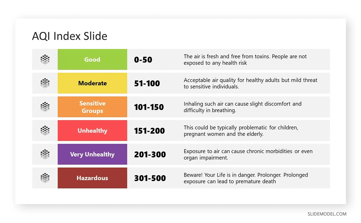
Good presentation slides ensure that every data point supports your narrative. Clarity is the number one winning factor when presenting sales growth, research findings, or market trends.
Tips:
- Use charts that match the data type: bar graphs for comparisons, pie charts for proportions, etc.
- Label axes and data points.
- Avoid 3D charts that can distort data visualization.
- Check our guides on data presentation and data storytelling to structure your data in the most appropriate format.
Use Animations Sparingly
While animations and transitions can add a dynamic element to your presentation, they should be used sparingly and with a clear purpose. Overuse of these effects can make a presentation look unprofessional and distracting.
The best practice is to use simple transitions, such as fades or wipes, to move between slides smoothly. Animations within slides should be used to emphasize important points or guide the audience’s attention, not as a constant feature of your effective PPT presentation slides.
Tips:
- Stick to one type of transition throughout the presentation.
- Use animations only to highlight important data or concepts.
- Avoid overly complex or distracting animations.
- These effects are not restricted to PowerPoint. Learn how to use Google Slides animations.
Use White Space Effectively
White space, or the empty space on a slide, is just as important as the text and visuals. It gives your content room to breathe and prevents the slide from feeling overcrowded.

Proper use of white space can make your good presentation slides more professional and easier to read. It allows the audience to focus on the key points rather than trying to decipher a crowded slide.
Tips:
- Leave margins around the text and visuals to balance them. If you plan to print your slide deck, consider safe areas, margins, and bleed.
- Avoid filling every inch of a slide with content.
- Use white space to separate different elements for clarity.
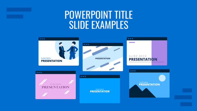
Prepare a Strong Opening and Closing Slide
The first and last impression is critical in any PPT presentation. Your opening slide sets the tone for the entire presentation, while your closing slide provides the final takeaway.
Keep the opening clean and straightforward, introducing the topic without overwhelming details. The closing slide should summarize the main points and leave a lasting impact, perhaps with a call to action or final thought.
Tips:
- Use a simple title slide to start your presentation.
- Include key takeaways or a strong conclusion in your closing slide.
- Avoid introducing new information in the final slide.
Test for Cross-Platform Compatibility
Sometimes, formatting, fonts, or multimedia may not translate well between systems, leading to errors during the presentation. For users who consistently work with Google Slides templates, this may not be an issue, but if PowerPoint or Keynote are your presentation software options, then it’s best to stick to the safe side.
Tips:
- Test your presentation on both Mac and PC platforms.
- Use standard fonts that are available across different operating systems. If not, opt for Google Fonts.
- Embed fonts or convert your presentation to PDF format to avoid compatibility issues.
Always Include a Call to Action
If your presentation has a purpose beyond delivering information—such as inspiring action or driving decisions—your final slide should include a clear call to action slide. This will direct your audience to what to do next, ensuring that your message has a lasting impact. It can be as simple as just adding a banner slide to seduce prospective clients about your upcoming offers.

Tips:
- Use action-oriented language like “Sign up,” “Start now,” or “Contact us.”
- Provide clear instructions or next steps for the audience to follow.
- Keep the call to action simple and easy to follow.
- Bold colors help to guide the audience toward the CTA button or phrase.
Stay Within Time Limits
When preparing your presentation slides, keep the time constraints in mind. While the content may be detailed and relevant, your presentation must fit within the allocated time to avoid rushing or cutting key information.
Tips:
- Time yourself when rehearsing to ensure you stay within limits.
- Trim unnecessary slides or points if your presentation exceeds the allowed time.
- Use visual cues, like a progress bar or section divider slides, to show time management.
Plan the Flow of Information
The presentation structure of your slide deck should guide the audience through your argument or story step by step. Start with an introduction, move into your key points, and conclude with a summary or call to action. Jumping between unrelated points can confuse the audience, so the order of your slides matters as much as the content.
Tips:
- Plan your slides in a way that builds on the previous information.
- Ensure smooth transitions between sections.
- Use summary slides to reinforce key points at the end of each section.
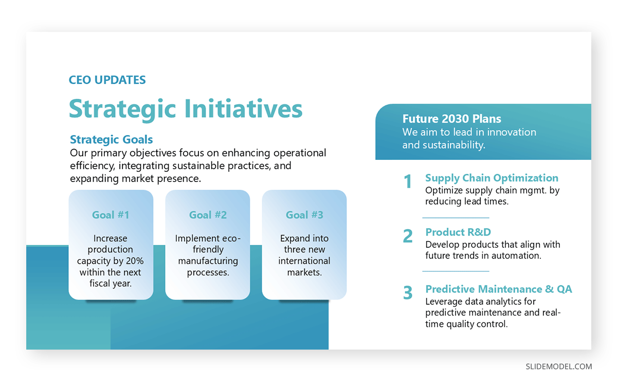
Balance Between Text and Visuals
As with everything in life, going overboard or coming up short has consequences. Too much of either of these elements can make your slides overwhelming or too simplistic.
When considering how to make effective presentation slides, always think about how the text and visuals can work together to reinforce the main message. If a visual alone can convey the point, limit the text to a title or supporting bullet point.
Tips:
- Pair concise text with a relevant visual.
- Avoid slides that are entirely visual or entirely text-based.
- Maintain a clear hierarchy by using larger fonts for headings and smaller ones for supporting text.