Imagine sitting through a seemingly never-ending presentation. The speaker rambled on, reading from text-heavy slides, using a tiny font that strained your eyes, and failing to connect with the audience. As the minutes ticked by, you found yourself daydreaming and eagerly awaiting the end of the ordeal.
If you have been in this situation, then you know what to do if you were in the presenter’s shoes – make your presentations concise. But how do you even start?
You can follow several techniques when preparing your deck and your presentation as a whole. One of them is the 10/20/30 rule of PowerPoint, a presentation rule championed by Guy Kawasaki – a former Apple employee and a marketing specialist.
Table of Contents
- What Is the 10/20/30 Rule of PowerPoint Presentations?
- The 10 Slides Rule
- The 20 Minutes Rule
- The 30-Point Font Rule
- The Benefits of Using the 10/20/30 Rule
- Tips for Applying the 10/20/30 Rule to Your Presentation
- Conclusion
What Is the 10/20/30 Rule of PowerPoint Presentations?
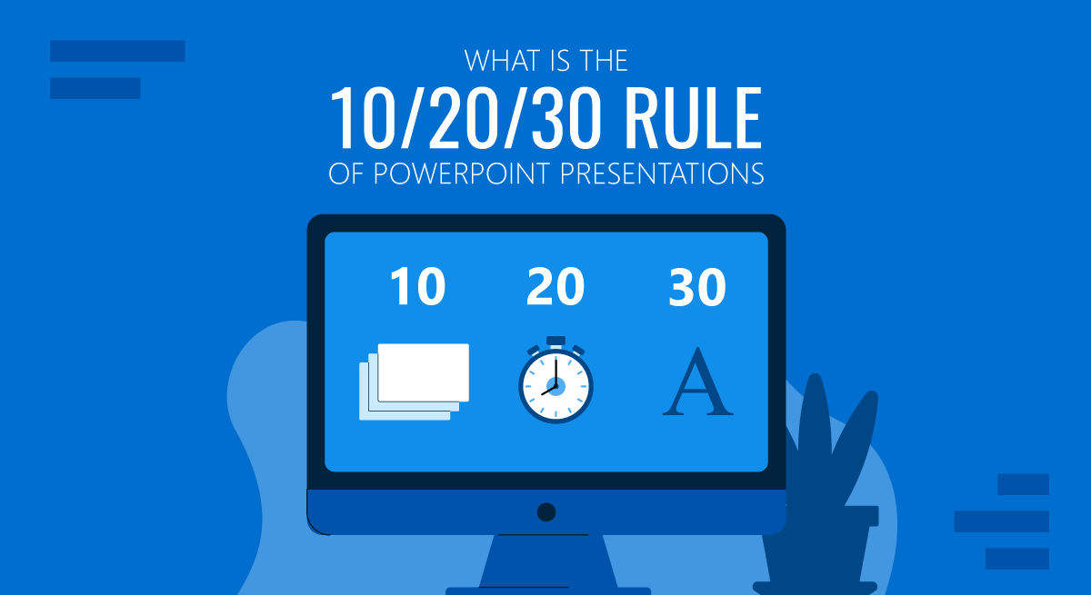
The idea of the 10/20/30 rule is easy to understand, which is summed up in three points.
- Your presentation should consist of no more than 10 slides.
- Your presentation should last no longer than 20 minutes.
- The text on each slide should be no lower than 30 points in size.
Guy Kawasaki’s 10-20-30 rule for slideshows emphasizes brevity, focus, and visual appeal to keep your audience engaged and deliver your message effectively.
Let’s examine each rule and explore how to apply it to your presentations.
The 10 Slides Rule
Kawasaki argues that a typical person can only take 10 concepts in one sitting. Therefore, according to him, a presentation should only consist of 10 slides, each serving a specific purpose and conveying a distinct concept.
This insight underscores the importance of concise, focused presentations that prioritize key messages and avoid overwhelming the audience with too much information.
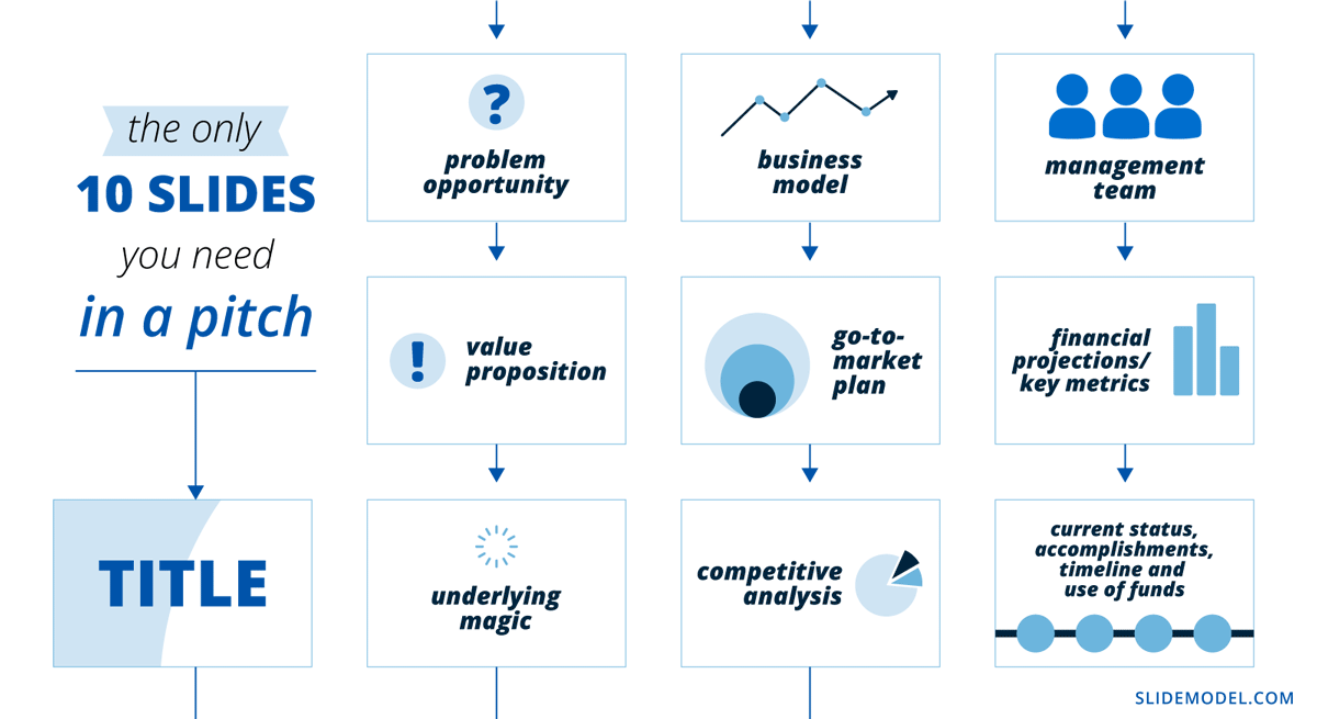
If you are a business presenter struggling to develop a pitch deck, Kawasaki suggests a 10-slide PowerPoint template that includes what venture capitalists like him care about.
- Title – Includes the business name, the presenter’s name, contacts, etc.
- Problem/Opportunity – Highlights pain points or unmet needs of customers you aim to solve.
- Value Proposition – Articulates the value or benefits of your product or service.
- Underlying Magic – Explains the key technology that goes into your product or service offers.
- Business Model – Describes how you plan to generate revenue.
- Go-to-Market Plan – Outlines your strategy for bringing your product or service to market, e.g., marketing and sales plan.
- Competitive Analysis – Explains how your business is positioned to compete and capture market share.
- Management Team – Highlights your management team’s skills, experience, and expertise that will drive the success of your business.
- Financial Projections and Key Metrics – Highlights your business’s financial viability and potential profitability.
- Current Status, Accomplishments to Date, Timeline, and Use of Funds – Provides an overview of your current business status, any accomplishments or milestones achieved to date, the timeline for future milestones, and how you plan to use the funds you seek.
Applying Guy Kawasaki’s 10 Slide Template In Any Presentation
The 10 rule slide was specifically designed for startup and business presentations, focusing on pitching a business idea or concept to potential investors. However, it can also be a useful framework for other types of presentations that don’t deal with selling a service or product.
For example, if you are a lecturer, you can emulate Kawasaki’s PowerPoint template layout and reduce your presentation to 10 slides. Some slides might not be relevant to the nature of your topic, so replace them with one that works for your presentation. Using PPT templates helps you focus on the graphical aspect so you can articulate the content to fit into exactly 10 slides (while preserving the same aesthetic).
Let’s say you are a mindfulness expert talking about the benefits of meditation. The first three slides of Kawazaki’s workflow may be applied as you’ll need to establish your audience’s pain points and your solution.
However, you may need to modify the remaining slides as you’re not seeking to make a sale or raise funding. You may use them instead to discuss the main content of your presentation – in this case, the benefits of meditation. The last two slides may contain your conclusions and call to action, respectively.
The 20 Minutes Rule

Now, off to the second part of the 10/20/30 presentation rule.
According to Kawasaki, you only have 20 minutes to present your 10 slides – the time needed before your audience’s attention starts declining. He believes it is long enough to convey a meaningful message but short enough to maintain the audience’s attention span.
This is exactly why most TED Talks or The Big Bang Theory episodes would only last for approximately 18 minutes.
While giving longer presentations is possible, longer presentations may be more difficult to maintain audience engagement and attention.
The 30-Point Font Rule
Kawasaki’s final rule pertains to the font size that presenters can use. This rule suggests that presenters should use a font size of at least 30 points for all text in their slides, including titles, headings, and body text.
When creating presentations, it is common to jam each slide with text and information. This poses two possible problems:
- First, it may take your audience’s attention from you as they may end up reading your whole presentation and stop listening to you.
- Second, including too much information can make your presentation overwhelming and difficult to follow.
Using a larger font size, you must include only the key points of your presentation slides. This prevents your audience from getting ahead of you and keeps them listening to you speak. By applying this rule, you are also ensuring your content is understandable for people with visual impairments. We highly recommend you check concepts from W3C.org on how to make events accessible, as some of these rules can benefit your audience.
The Benefits of Using the 10/20/30 Rule
Presenters often ask themselves whether is worth applying a new framework for their presentation design and delivery. The reality is that the 10/20/30 Rule of PowerPoint Presentations is one of the most effective methods to build your presentation skills. In the list below, we expose the main benefits of this framework for presenters.
Concise and Focused Presentation
With a limited number of slides and a strict time limit, the 10/20/30 encourages you to choose the most relevant content and eliminate unnecessary information carefully. This avoids overwhelming your audience with too much information and ensures your key message is clear and memorable.
Improved Audience Engagement
This rule encourages presenters to focus on delivering a clear message rather than overwhelming the audience with flashy visuals. With fewer slides and a shorter duration, you are likelier to hold your audience’s attention throughout the presentation. This also allows you to address questions from the audience, leading to better interaction and a productive meeting.
Increased Chance of Success
Whether pitching to investors or selling a product, a concise and focused presentation can significantly increase your chances of success. The 10/20/30 rule helps you effectively communicate your value proposition and address potential concerns. This makes your presentation more persuasive and memorable, increasing the likelihood of securing funding or closing a sale.
Time Management
The more senior the person you present to, the lesser time you got to make your case and convey your message. Following the 10/20/30 encourages you to be mindful of the time and deliver your presentation within the allocated timeframe. It also allows you to show respect for your audience’s time.
Tips for Applying the 10/20/30 Rule to Your Presentation
1. Present One Idea Per Slide

Following Kawasaki’s rule on creating your PowerPoint presentation, identify the key points you want to convey to your audience and allocate one slide for each.
Presenting one idea per slide can help your audience stay focused on the topic at hand. It makes it easier for them to understand and remember your message, as it reduces the amount of information they have to process at once. When there’s too much information on a slide, it can be overwhelming and distracting, making it difficult for your audience to stay engaged and attentive.
Presenting one idea per slide can also help you control the flow of information and ensure that you cover all of your main points.
2. Keep Your Slides Simple
As mentioned earlier, the 10/20/30 rule emphasizes simplicity. Keep your slides simple and avoid flashy design elements that may distract your audience.
Use a consistent color scheme, font style, and layout throughout your presentation. This will help your audience follow along and focus on your message.
3. Balance Text and Visuals
Visuals like images, charts, graphs, videos, and diagrams can help break up text-heavy slides and make your presentation more interesting and memorable. However, relying solely on images can also be ineffective and lead to confusion or disengagement.
When using visuals in your slides, it’s important to balance text and images. Text can provide important context and details, while images can help illustrate key points and make your presentation visually appealing.
Let’s say you want to inform your audience of your company’s marketing plan. Using a rising spiral template is an excellent choice since it can represent multiple plan stages with increasing intensity.

4. Break Down Your Presentation into Smaller Units and Make it Interactive
Kawasaki’s 10/20/30 rule only gives you 20 minutes to wrap up the whole presentation, but what if you need more than that?
It’s not uncommon to give presentations that last 45 minutes to an hour – for instance, if you are giving a lecture or facilitating a training workshop for employees. The longer your presentation, however, the harder it will be to hold your audience’s attention.
One great way to keep them engaged is to divide your presentation into smaller units and pause in between.
So, before the guy from the third row starts yawning, plan in-between activities to reenergize your audience and reacquire their attention. It can be a simple Q&A session, interactive exercises, or team-building activities.
Don’t forget to time your activities so they won’t disrupt the flow of your presentation.
5. Start Strong
The opening of your presentation is critical in capturing your audience’s attention and setting the tone for the rest of the presentation. Start with a compelling hook, such as a thought-provoking question, a powerful quote, or an engaging story, to grab your audience’s attention. Clearly state the purpose and objectives of your presentation to establish the context and provide a roadmap for what’s to come.
6. End Strong
Your outro is as important as your introduction. So, instead of ending your presentation with a flat Thank you slide, use the opportunity to nudge your audience to action.
Using a summary slide is one of the ways you can end your presentation if your goal is to reinforce your key points. It can be a useful reference for the audience, helping them remember the most important information.
You can also encourage your audience to take action based on what they’ve learned in your presentation. This can be a great way to motivate them to apply the concepts you’ve covered.
Conclusion
The 10/20/30 rule of PowerPoint is a useful framework to emulate in creating your presentation.
There are questions about the practicality of its application outside the business context. However, we can agree that it teaches us valuable insight – keeping presentations concise as possible. Limiting the number of slides, adhering to a strict time limit, and using a larger font size can create a concise presentation that effectively communicates your message.
There’s no one-size-fits-all approach to presenting; you don’t have to strictly follow Kawasaki’s rule. Depending on the audience and the topic, modify the template and adapt your presentation to suit the situation.
