PowerPoint presentations are notorious for being dull and boring. This issue is so bad that the term’ Death by PowerPoint’ is commonly used to describe this problem. You might consider keeping your slides simple when reading through any tips for editing your PowerPoint templates or using other platforms such as Google Slides templates. However, how to do that is another question. This is where the 7 by 7 rule can be helpful when designing presentations in Microsoft PowerPoint.
What is the 7 by 7 Rule in PowerPoint?
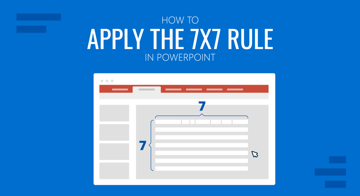
The 7×7 rule in PowerPoint implies that you should use a maximum of 7 lines per slide, with no more than 7 words in each line, and a total of 7 slides per presentation. This can be done in bullet points to simplify the slide. In such a case, the rule recommends using no more than seven bullet points with seven words each per slide. The 7×7 rule is meant to simplify how presentations are made to ensure that presenters don’t go overboard with text-heavy slides.
Why use the 7×7 Rule in PowerPoint?
There can be a number of benefits of using the 7×7 rule in PowerPoint. For example, the rule can help make your slides simple, easy to create and grasp. Below are reasons you might want to use the 7×7 rule for PowerPoint.
1. Easy to Create Slides
Slides created using the 7 by 7 rule in PowerPoint are easy to develop since they take less time and effort. Some people might find it tricky to reduce words initially, but once you get used to the concept, creating slides will seem much more manageable.
2. Easy to Present Slides
Slides with fewer words are more accessible to present than content-heavy slides. By focusing on a handful of pointers, you can focus on the key topic and avoid deviating from the core discussion points.
3. The 7 by 7 Rule can Help Improve Presentation Skills
You can quickly get right to the point by showcasing information in just seven lines. This can help improve your skills as a presenter, as you will rely more on the depth of your knowledge than what’s written in the slides.
4. Attention Grabbing Slides
It can be arguably said that slides with less text can be better at grabbing the audience’s attention than lengthy blocks of text that might lead to people losing interest in your slides.

5. The 7×7 Rule Saves Time by Avoiding Verbiage
The 7×7 rule can help save time and avoid jargon. Using this simple rule, you can save your time and that of the audience with a simple and to-the-point presentation.
6. Clarity Regarding the Discussion Topic
The 7×7 rule can help clarify the topic under discussion by ensuring that the presenter sticks to the point with concise information.
7. Focused Presentation
The 7×7 rule for PowerPoint can be a great way to create a focused presentation that can help dig deep into the most essential bits of the discussion points. This can also be helpful to avoid deviation from the core topic that can often occur due to lengthy presentations with unrelated information or Q&A sessions going off track due to a member of the audience discussing something unrelated to the core topic.
8. Improved Efficiency in Communicating Information
You can make communication efficient by making the topic concise regarding slides and explaining the concept yourself. This is one aspect that many presenters usually struggle to ensure when giving presentations, as one can easily get lost in translation when creating and presenting PowerPoint slides.
9. Adaptability for Different Presentation Topics
The 7×7 PowerPoint rule can be adapted for any presentation topic. The universal nature of the rule helps make any presentation topic concise and focused. The rule is not designed for a specific presentation topic or concept.
10. Professional Looking Presentation Slides
A simple, to-the-point presentation will likely look professional and polished, with the information as plainly as possible for the audience’s ease. While many consider content-heavy and flashy presentation slides a good option, any public speaking expert would tell you that ‘less is more.’ An example is the 10/20/30 rule by Guy Kawasaki.
How to Use the 7×7 Rule in Presentations
If you want more precise guidelines for PowerPoint slides using the 7×7 rule, consider following the tips below.
1. Fewer Topics Per Slide
Using multiple subtopics with the 7×7 rule might not always be a great idea; it is best to try accommodating a single or fewer topics per slide. While you can build upon previous slides to assist your topic across multiple slides, trying to connect too many references and data points can lead to confusing slides. The 10-20-30 rule of Presentations also puts emphasis on this point.
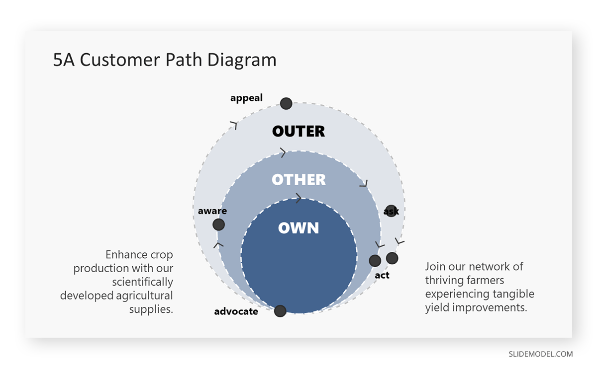
For example, if we take an agricultural retailer as an example, they can express their customer’s journey cyclical process by using a 5A Customer Path Circular Diagram, a framework derived from the traditional AIDA model. The concepts can be simplified in one slide, and the presenter can dialogue about the components of the diagram.
- Aware: “Farmers learn about our high-yield seeds and organic fertilizers through agricultural fairs and social media.”
- Appeal: “Testimonials from successful harvests and competitive pricing capture the interest of the agricultural community.”
- Ask: “In-field demonstrations and Q&A sessions help farmers understand the benefits for their specific crops and soil types.”
- Act: “Farmers purchase our products with guidance on best practices for use to ensure improved yields.”
- Advocate: “Satisfied farmers share their success stories, recommending our products to fellow growers.”
2. Improve Text Legibility
One of the advantages of having less text is that you can increase the font size to make your slides easier for the audience to read. Try to use a clean-looking font with a large font size to help everyone in the audience read the text conveniently, especially the people located at the end of the room or venue.
3. Use Impactful Words
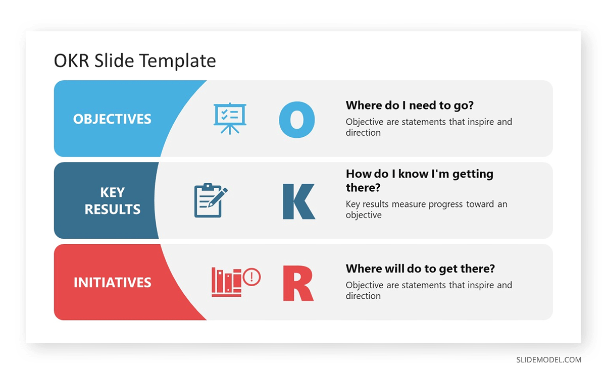
Since you will be using fewer words, you should try to use terms that might be more impactful instead of run-of-the-mill definitions and lengthy introductions. Be it terms associated with the topic, the line of work you are engaged in, or phrases derived from famous quotes, you should use words that hold meaning, captivate the audience, and help make information memorable.
4. Let Images Speak for You
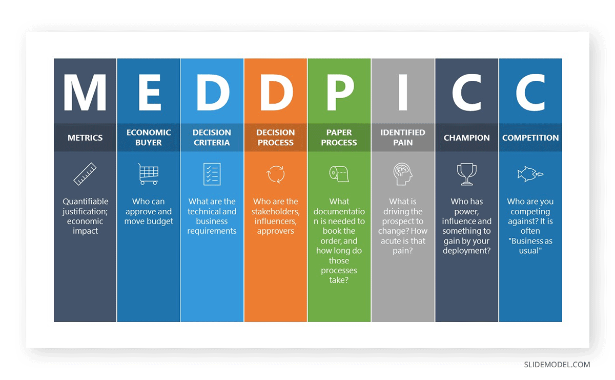
Reducing text allows you to accommodate a few images or illustrations to do the talking for you. Self-explanatory or complementary imagery can help give the audience a picture of the topic under discussion without using much text or a lengthy speech. This will be particularly useful since you must work with no more than seven slides.

5. Avoid Cluttered Slides
While fewer lines of text should reduce clutter, the opposite can be true if you include too many images, icons, tables, or text with an untidy-looking font. Ensure your slides look clean since fewer words would not guarantee that automatically.
6. Avoid Unnecessary Information
Sometimes, people add unnecessary information in slides even when the audience knows the added details. For example, you don’t need to add an introduction for a project every time you present it to your colleagues since they will be familiar with the project’s background.
7. Plan Your Slides
It will not be easy to create seven slides, with seven lines of text, with seven words per line every time. It is best to consider the sequence of your presentation and plan how to create it to accommodate relevant information best. You can also look for visual aids that might help shorten your slides to get the job done.

8. Consider Other Simplification Methods
Most design languages today emphasize using less content to make the primary information pop out. A few examples include the material design used in smartphone UIs and the modern design introduced by Microsoft since Windows 8 was introduced in 2012. You can also consider wisely using colors, as mentioned in our article about color theory, and using AI tools to design your slides, such as the Designer feature in PowerPoint.
9. Use Speaker Notes
While you can use a brief slide, this does not mean you can’t use speaker notes. In fact, using speaker notes might be necessary to ensure that you can remember critical information, such as figures and data that might not be included in the original slide. It is essential not to make your speaker notes lengthy, as that would defeat the purpose of simplifying the presentation with fewer words.
10. Try to Engage Your Audience
By making brief slides, you can spare more time for engaging activities such as polls and quizzes to engage your audience. This can help make your presentation effective by breaking the monotony, improving the attention span of your audience, and helping you get insight from them regarding crucial discussion points.
Final Words
The 7×7 PowerPoint rule is among the guidelines presenters use to simplify their presentation creation tasks for effectiveness. This is similar to other concepts, such as the 10/20/30 rule made famous for pitch decks by Guy Kawasaki. While the PowerPoint 7 by 7 rule can be pretty handy, one must not limit one’s creative approach to a single rule. If you think you need more than seven slides, there is no reason to limit yourself unnecessarily. However, rules like 7×7 can be good guidelines for creating effective presentations.


