Statistical Distribution PowerPoint Curves
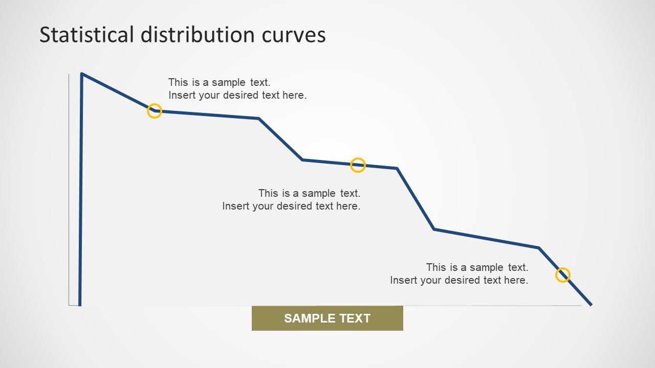
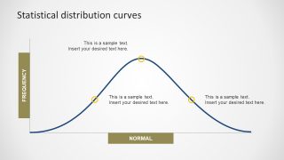
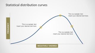
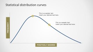
The Statistical Distribution PowerPoint Curves include popular curves and lines to show statistical models and trends. It gives a graphical representation of data collection and analysis based on statistical patters. These PowerPoint charts are commonly used to show results of surveys and data experiments. The statistical distribution charts are usable in presenting recession, crisis or show progress slope and curves. The statistical distribution is a vastly used tool to calculate data in natural and social sciences. Such data is mostly presented graphically by avoiding demonstration of large, time consuming data values.
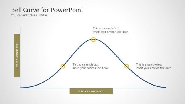
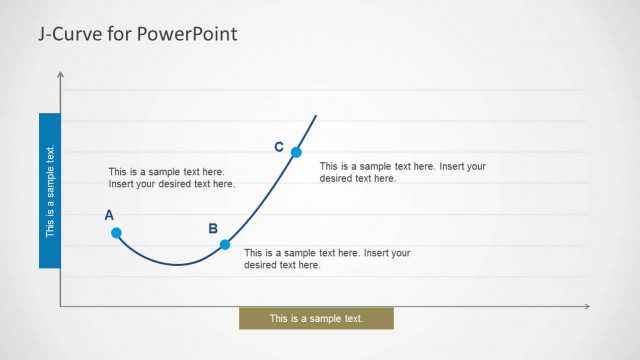
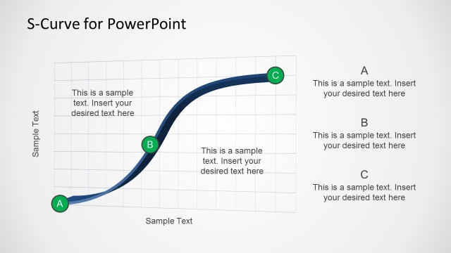
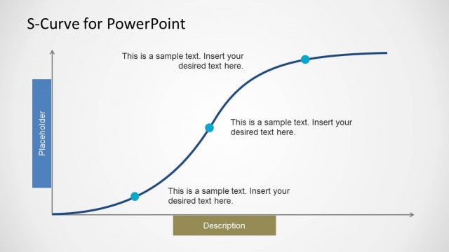
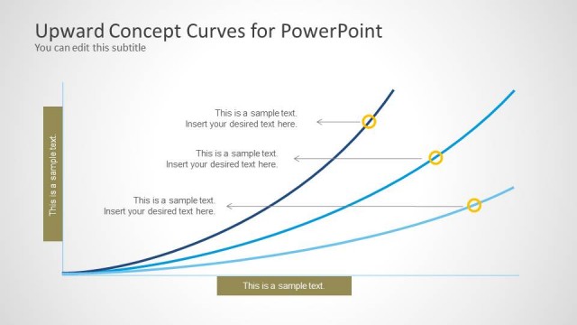
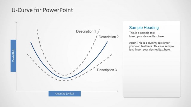
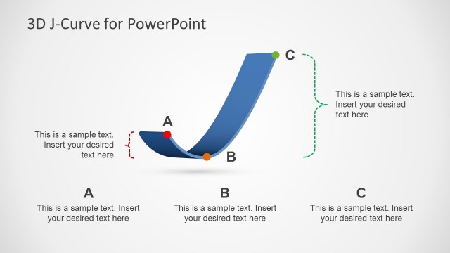
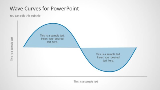
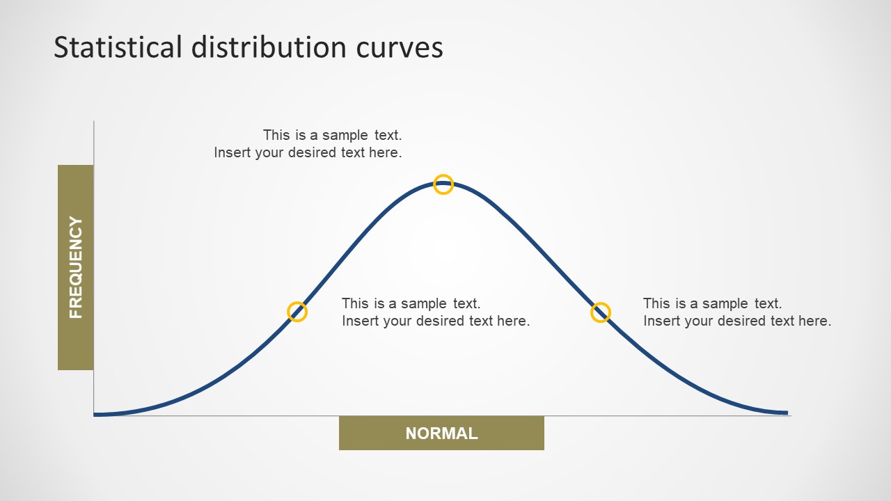
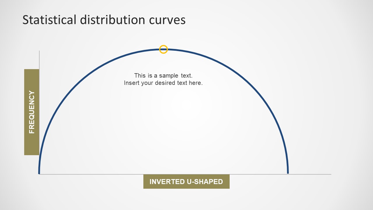
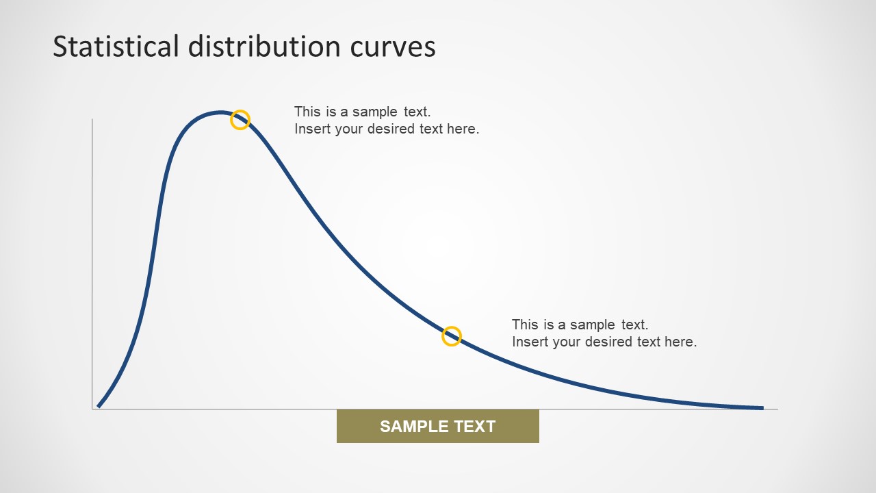
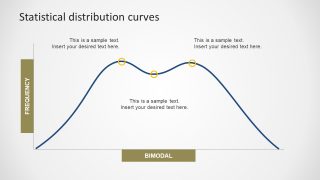
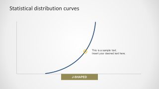
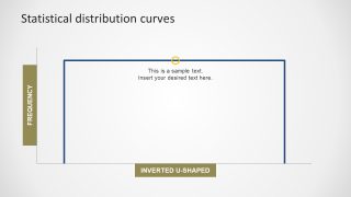
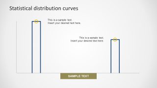
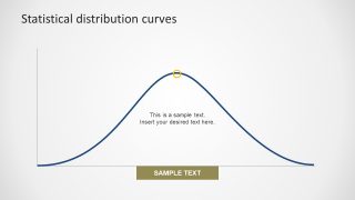
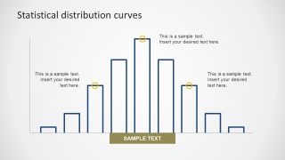
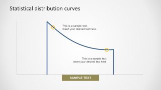
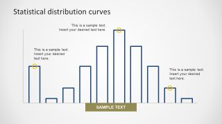
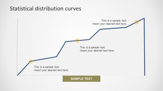
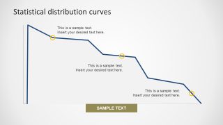
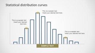
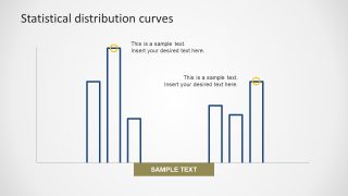
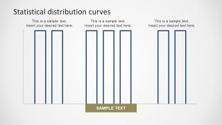
This PowerPoint Template gives many variations in the distribution diagrams such as normal, symmetric (skewness) and inverted-U, histogram, bar and run charts. With the use of editable curve charts created in PowerPoint shapes, users can add text, change shape properties to match any desired style and present. The Statistical Distribution PowerPoint Curves has a collection of 18 diagrams. Each slide contains text fields, title and other editable elements inside the diagram to customized accordingly. The bell-shape is the most popular graphical distribution used in statistics and this template gives three distinctive styles to present it. Inverted yield shows long term bond maturity and yield. Several slides of growth Charts in PowerPoint presents the development model as advancing trend of business. The J-Curve is used situations where trend initially falls but then rises to higher that the starting point. Two different versions of inverted U-Curve or Kuznets model represents relationship between pressure and performance whereas, Bimodal distribution shows two peak points.
A field of statistics deals with analysis, interpretation and presentation of data. There is no limit to areas where it is applicable. The experts and learners of numerous fields including business, research, science, socialism and more can make use of this PowerPoint template slides for their analysis reports and give an impressive impact of visual to the audience.


You must be logged in to download this file.
DOWNLOAD- Category
- Data & Charts
- Rating

 Loading...
- Size
- 16x94x3
- Item ID
- 7465-01
- Colors
Subscribe today and get immediate
access to download our PowerPoint templates.