Statistical Distribution Data Charts
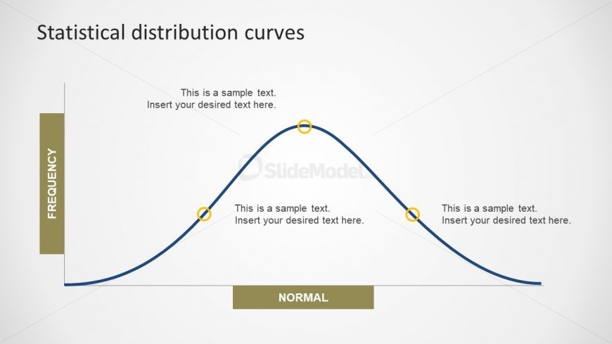
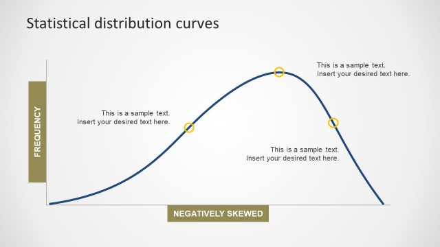
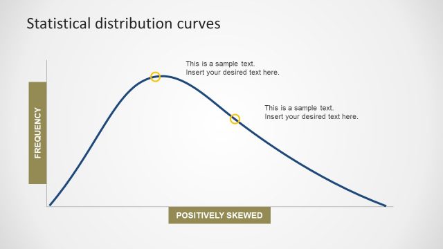
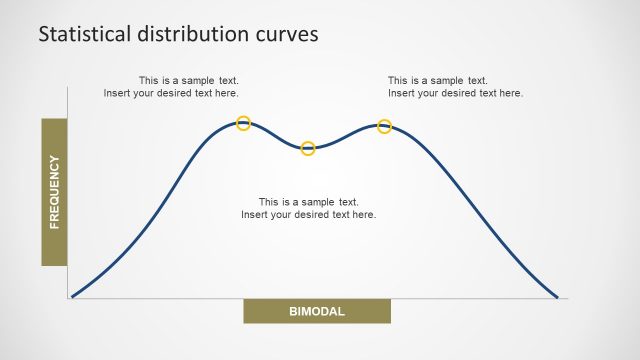
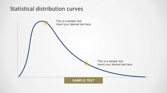
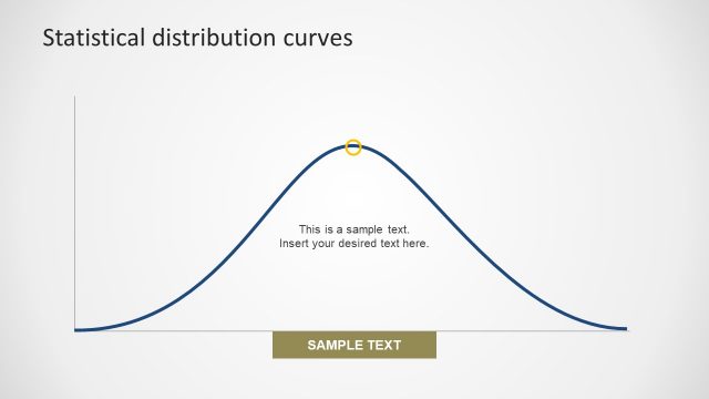
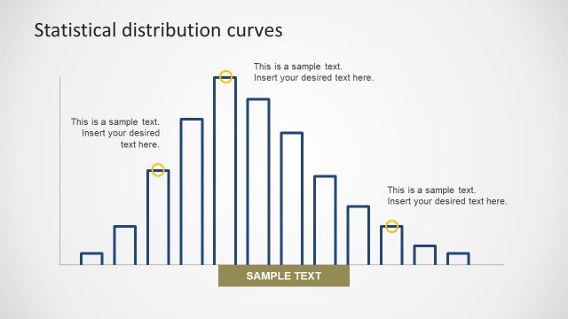
The Statistical Distribution Data Charts slide is the normal distribution template in statistical analysis PowerPoint. It shows the probability of events such as, the peak of bell displays the most probable event. This PowerPoint slide have editable elements such as the curved line and the axis. This template shows Normal horizontally (x-axis) and Frequency vertically (y-axis). The text placeholders let users add important notes and useful content. Also, these editable placeholders have the option to edit font and style of text. Similarly, the background and shapes like rectangular label bars and circular icons are customizable. For instance, change the color, rotate the shape or resize objects.
Return to Statistical Distribution PowerPoint Curves.