Illustration of Curves in PowerPoint
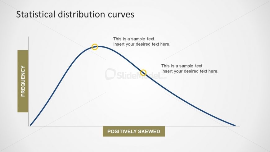
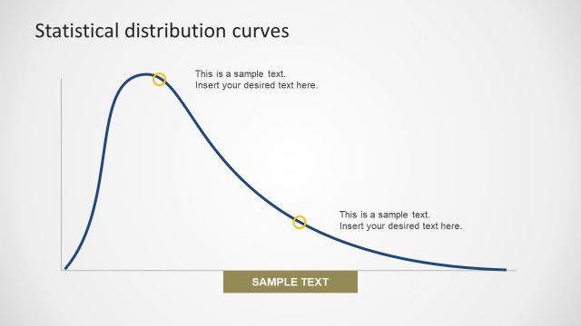
The Positive Skewed Bell Diagram is a slide to measure asymmetry of probability distribution in data driven charts. These charts contain the spreadsheet to present the mathematical calculations and their graphical illustrations. In the positive distribution, the mode is less than mean and median. This incredible slide of Statistical Distribution PowerPoint has the amazing editable chart. Here, users can select the curve line and modify the image according to their presentation requirements. Further, change the colors and sizes of the diagram in seconds. Lastly, alter the background of template in design menu.
Return to Statistical Distribution PowerPoint Curves.