Bell Curve Chart Variation PowerPoint
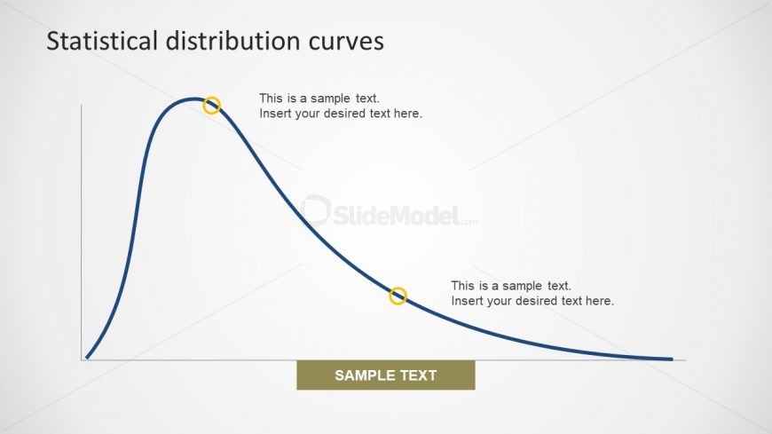
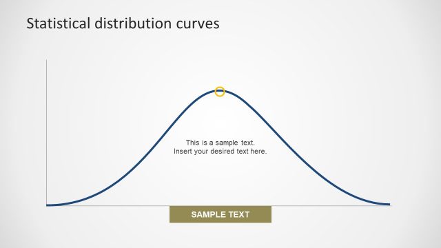
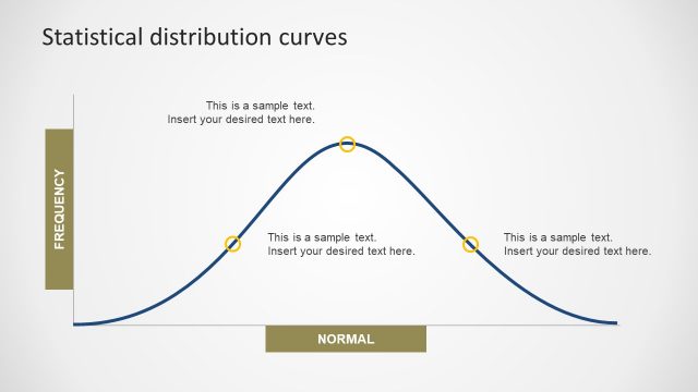
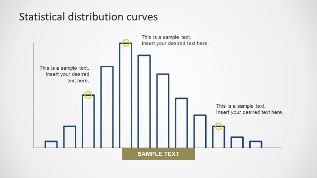
The Bell Curve Chart Variation PowerPoint is the most common data distribution of variable known as normal distribution. This bell curve depicts bell shaped distribution line in the graph. The diagram is useful in finance, social sciences, technology, also called Gaussian distribution. It represents the standard distribution for test scores and results. In this graph, the peak of bell explains the most likely event. Whereas, the rest of the data is evenly distributed in the curve. The editable template lets users modify the design of slide. For instance, change the background, color theme of template etc.
Return to Statistical Distribution PowerPoint Curves.