Bar Diagram Representing Curve
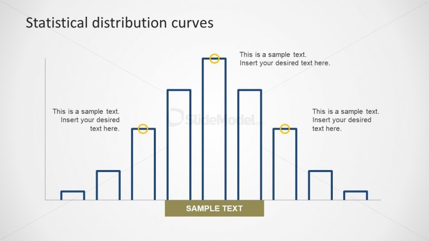
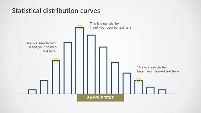
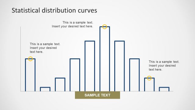
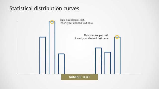
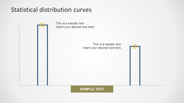
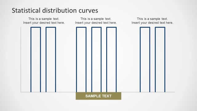
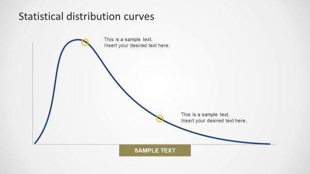
The Bar Diagram Representing Curve is the bar chart slide to illustrate the bell curve data distribution. This template is an amazing tool of statistical reports and probability PowerPoints. The finance professionals use this normal probability distribution for analyzing market sensitivity. It is the standard distribution chart of bar graph creating a curve. The statistical distribution PowerPoint template is an editable graph. Therefore, users can modify the bar chart by increasing or decreasing the size. Similarly, the circular icons can be copied and replaced in the diagram. Also, change the color of bars, icons and background to customize the slide.
Return to Statistical Distribution PowerPoint Curves.