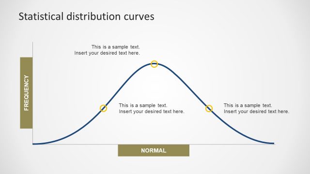
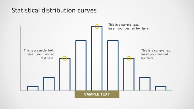
Normal Distribution Curve Chart
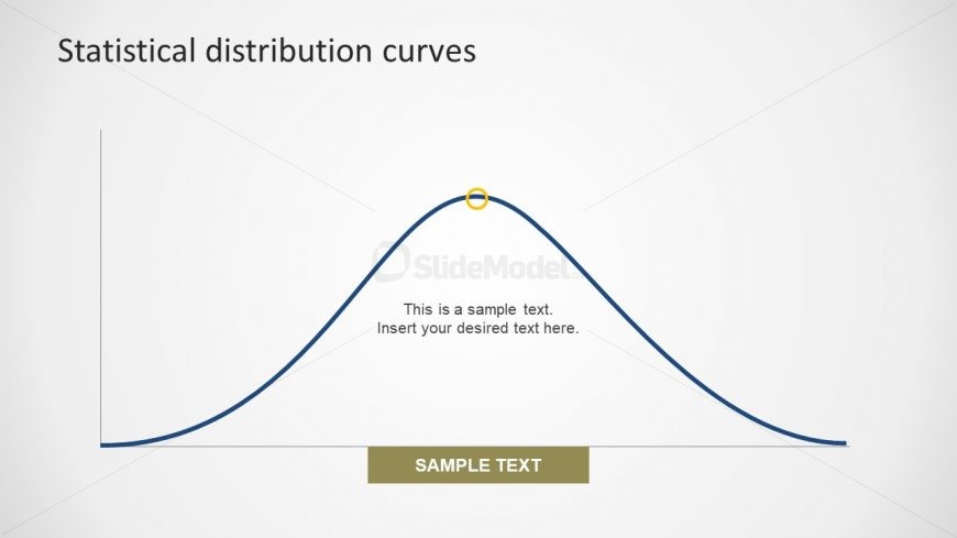
The Normal Distribution Curve Chart slide contains the bell-shaped diagram for statistical analysis and probability. The chart has one peak point and most commonly used normal distribution for variables. Here, the peak represents the most probable event in entire data. Whereas, the rest of occurrences are equally distributed to create a normal curve. This PowerPoint slide has the simple design of diagram with gray background. However, these designing properties are customizable in PowerPoint. Also, the curve line is adjustable by resizing and rotating the shape according to the presentation needs.
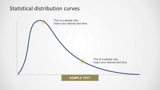
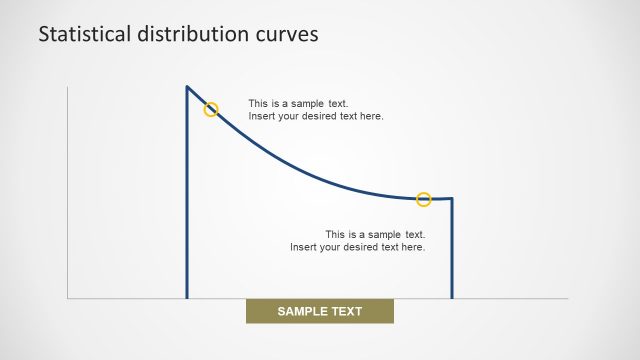
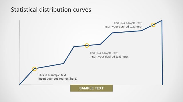
Return to Statistical Distribution PowerPoint Curves.