A presentation goes beyond the idea of crafting a catchy document to present in front of an audience. It is an art in which a person relies on communication skills to introduce a topic relevant to a group of people, regardless of its size. Different elements participate in this communication process, such as body language, presentation skills, visual tools, etc. and are key in delivering an effective presentation.
In this article, we shall present a detailed guide on how to make a presentation, intended both for newcomers in this subject but also for professional presenters who seek to improve the performance of their presentations. Let’s get started.
What is a presentation, and what is a PowerPoint presentation?
It is essential to highlight the difference between Presentation and PowerPoint Presentation, often interchangeable terms. One thing is a presentation, an audiovisual form of communication to present information. A PowerPoint presentation is a subset of a presentation. Since PowerPoint remains the leading tool in the market for creating presentations, the term was coined by both spectators and presenters. Let’s begin by checking the main differences between the two terms.
What is a presentation?
A presentation is any situation in which a person or group has to transmit a message in front of an audience. The format by which the audience attends can answer the following categories:
- Live crowd: A slideshow presentation in which the average number of spectators exceeds 100 people.
- Massive event: Similar to the format above, but we speak about thousands of spectators. This format has specific requirements regarding scenario setup and logistics, and the usual presenters are influencers in worldwide conferences or corporate events (like All-Hands meetings).
- Private event: A selected number of attendants can listen to the presenter. Coaching sessions are the leading kind of private event for presenters, but multiple other categories can fit into this format.
- Online event: Following the trends of remote working and what the pandemic has left us in terms of digital immersion, multiple events shifted their large attendance numbers in favor of online settings. This has the advantage of a narrowed setting, as the area in which the presenter has to stand is considerably reduced – with simpler A/V inputs. Attendees are given a link to the event and watch from their computers or mobile devices.
- Offline event: This medium is what we consume via YouTube videos. Behind each and every YouTube video is countless hours of content development, editing, rehearsing a slideshow presentation, and so forth. We call it offline because attendees can browse the content at any time, replaying as desired, unlike Online Events in which the attendees must be logged in to a specific platform. No interaction with the presenter.
- Hybrid event: This is a format coined by large tech companies, the automobile industry, and even fashion brands. The idea is to create an event where a selected number of attendees are allowed to participate (using the Private Event model). Still, at the same time, the event is streamed for users worldwide (Online Event) and/or available on the official social media networks of the brand (Offline Event).
Each one of these formats exposed above has specific requirements in terms of interaction with the audience. For example, in-company presentations will differ from common presentations that seek to capture the interest of new consumers. It is vital to establish the presentation’s intent from the very first moment and then narrow it down according to the topic to present, as well as the knowledge level of your target audience.
A presentation does not necessarily requires to create a slide deck. It is a tool presenters use to make the content more interesting for the audience and also memorable. However, it is well-known that influencer speakers such as Warren Buffett ignore PPT documents altogether, preferring to articulate their narrative on the go.
What is a PowerPoint presentation?
A PowerPoint presentation is a specific type of presentation, which involves the usage of a slide deck crafted with Microsoft PowerPoint. This kind of tool allows presenters to communicate a message through a vast range of mediums, such as images, graphs & charts, audio, and video for a better impact.
Creating a PowerPoint presentation is an easy process, and there are two routes for it: working from a blank slide or using PowerPoint templates.
Some of the advantages of building a PowerPoint presentation:
- Better information retention by the audience, thanks to visual cues.
- Improves the audience’s focus.
- Easy to create powerful graphics.
- Templates are editable, meaning you can repurpose the original designs to meet your standards.
- Saves time to create presentations thanks to its user-friendly UI.
- Encourages teaching and learning processes.
The Importance of a Good PowerPoint presentation
There are some elements that presenters must take into account when making a PowerPoint presentation. It’s not just drag-and-drop, then magic happens. Creating a PowerPoint presentation involves a process of generating the graphic content to display and the narrative around it. The purpose of PowerPoint is to serve as a tool to enhance communication, not to make it overly complex.
We emphasize the relevance of working the speech and graphic content together since the speech itself gives the timeframes for each slide, what elements it contains, or whether it is relevant to use a slide or not to speak about a topic.
Some points to highlight when preparing a presentation:
- Presenters often use the element of surprise. This means a presentation can start without a slide, use a video, or involve a discussion between two parties, then jump to the slide deck presentation. More on this topic later on.
- A good PowerPoint presentation can be your introduction card in multiple professional settings. The effort you put in terms of design and content shall pay back over time in contacts or business deals.
- Having a spare copy of your presentation, preferably in Google Slides presentation format, is a safe-proof technique in case the PPT file gets corrupted. The aesthetic remains the same and can be browsed by any computer with internet access.
How to Make a Presentation (5 Essential Points)
Presenters have access to a wide array of tools, including AI-powered solutions, to create and deliver presentations. While technology can assist in generating slides and content quickly, the essence of making a great presentation lies in following a structured process. Whether you’re building your deck manually or using AI to create a PowerPoint presentation, the fundamentals remain the same: thoughtful planning, audience awareness, content development, compelling design, and confident delivery.
1. Planning your presentation
The first step in making a presentation is to plan the content according to our personal/business goals and the audience’s interest. Let’s break down each part in more detail.
Choosing the topic of your presentation
There are two situations for this. The first one is that you are open to presenting any topic of your preference. This usually happens in business presentations, inspirational presentations, product releases, etc. The second scenario is restricted, by which you have to pick a topic among a selected number of references. That’s the typical situation in which presenters see themselves when taking part in significant events – as not all topics are suitable for the main content of the event, and this is where creativity comes to play.
How to choose a topic, you may ask. Brainstorming is a good technique as long as you remain within the boundaries of this formula:
What you know and feel confident about + What is relevant to the current moment + What can resonate with your audience = Quality Content.
Again, if you experience restrictions due to the nature of an event, but your objective is to share specific information about your business, here are some tactics that can come to play:
- Do keyword research about the topics your business is involved. See the common patterns in your activity compared with the keywords. Then research the 15 articles on the 5 biggest volume keywords. Narrowing the possibilities in your business is a different take.
- Research whether there’s room for sponsored advertisement. That’s an alternative when directly speaking about your business is a no-no in a presentation.
- Turn your presentation into an inspirational story. That works in most events and brings the audience’s interest.
Another vital point to consider is how passionate you can be about the topic of your choice. Nothing speaks more about professionalism than a presenter being deeply involved with the topic in discussion. It sparks curiosity and gives validation as a reliable authority on the content. On the other hand, when a presenter delivers a talk about a topic they don’t connect with, body language usually betrays the presenter. Spectators feel that the speaker wished to be elsewhere, hence dooming the presentation’s performance (and badly impacting the presenter’s reputation).
Consider the purpose of the content to present. Is it going to be informative? Educational? Inspirational? That shall set the tone of your speech later on.
Consider the audience & presentation goals
Like with any project, you can estimate the ROI of your presentation with two verifiable metrics: the behavior of the audience and how many contacts did you build after delivering an effective slideshow presentation.
Making a presentation has the implicit purpose of helping you construct your network of professional contacts. Even when the slideshow presentation has no explicit financial purpose – as in the case of non-profitable organizations, there is still the acknowledgment component. People want to feel validated for the work they do. People want to build long-lasting contacts that can later on turn to be part of a new project.
Considering the audience is imperative, and often one of the pitfalls many presenters fall prey to. You must be aware of the following:
- The knowledgeability of your audience about the topic to discuss. This filters the option of using technical jargon during a presentation.
- The age range and demographics of your audience. It is not the same to discuss a methodology to reduce financial risk to a group of corporate workers in their 40s than to a group of students in their early 20s. The language is different, the intention behind the message is different, and so is the information retention span.
On regards to presentation goals, they can be classified as professional goals (those who seek conversions or valuable business contacts), influential (to establish a brand in the market), educational (to inform a group of people about a topic you researched), etc. Depending on the presentation goals, you can then structure the content to list and the tone in which you speak to your audience.
2. Preparing content for your presentation
Gather data, references, and source
No presentation can be made without reference material. Even when you believe you are the most prominent authority about a topic – you have to prove it with valuable, referenceable material. For some niches, this is critical, such as scientific poster presentations, educational presentations, and other areas in which copyright might be an issue.
References for the material you used can be listed in different formats:
- If you are citing a book/article, you can do a bibliography slide, or screenshot the excerpt you want to cite, then include a proper source format below the image.
- You have to credit the author for images/videos that are subject to intellectual property rights. Depending on the context where the image is presented, you may even have to inquire the author about using the image. If the photo in question is yours, no citation is required. Learn more about how to cite pictures in PowerPoint.
- Graphs and charts should include a reference to what they mean, explaining in a short sentence their context. Cite the source if the graph is extracted from a book or article.

As a tip, prepare a document in which you jot down the references used to create the presentation. They can serve whenever a question is asked about your presentation and you must research extra material.
Define the presentation storyline
We interpret the storyline as what is the connecting thread of your slideshow presentation. What do you wish to discuss? What motivated you to present this topic in this particular setting and in front of an audience? What can your message deliver in terms of new information and quality to your spectators?
All those questions are worth asking since they shape the narrative you build around your slideshow presentation. The storyline is the step before building an actual outline of your presentation.
Define the presentation outline
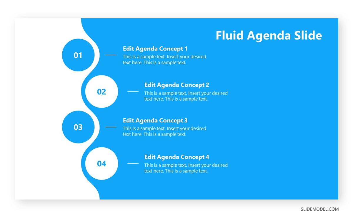
Now that you have a clear idea of your reference material and the story to tell behind your presentation, it is time to list down your presentation structure in a Table of Contents format. Keep in mind this is for internal reference, as the outline is a tool for writing the speech and creating the slides. You don’t have to list the outline in a presentation; if you desire, you can do a simplistic version with an agenda slide.
Be specific. Don’t let any topic be broad enough to lead to confusion. Sometimes, it is best to list many elements in a presentation outline, then trim them down in a second iteration.
As you define your outline, consider the flow of your presentation. A well-structured flow helps guide your audience through your key points in a logical sequence, creating a seamless and engaging experience. Think of each slide as a step that builds toward your main message, ensuring a clear transition between ideas.
Using one idea per slide
This is perhaps the biggest mistake presenters make in the professional context when creating a new presentation. Slides are free; you don’t have to jam everything in, wishing people get an instant idea about EVERYTHING you will discuss in one slide. Not only does it become overwhelming for the audience, but it is also a faux pas in terms of design: when you use too many elements, the hierarchy does not seem clear enough.
Opt for the “one-idea-per-slide” technique, which, as the term refers, implies using one slide per concept to introduce. Work with as many slides as required, but just one main idea by slide. Your presentation becomes clearer, easy to digest for a non-knowledgeable audience, and also serves as reference material on how to pace your presentation.
3. Designing your presentation
The following section contains guidelines about the different aspects that shape a presentation structure. If you are looking for an all-in-one solution that implements these teachings into presentation design, try SlideModel’s AI Presentation Maker. A time-saver AI-generation tool for presenters powered by Artificial Intelligence. This presentation creator can help you design slide decks from a prompt or document and turn your academic papers or business reports into a compelling presentation.
When designing your presentation, pay attention to the flow from slide to slide. Consistent transitions, visual cues, and balanced pacing help the audience follow along without losing interest. The flow should feel natural, carrying the audience smoothly through your points without abrupt or confusing shifts.
Choose the presentation format
Event organizers have a saying in the presentation format, which can be online or a live event. Depending on which, users have to structure the elements of their presentation to match the final output. An example of this: it’s not the same to create a PPT slide deck for an event in which you stand on a stage, in front of a live audience, than when you present via Zoom call, using your computer screen to cast the presentation.
The format is different because text usage and images are perceived differently. For starters, an online presentation is most likely to draw users to read the entire content of your slides than a live presentation. The audience may not get your body language in an online presentation, merely watching slide after slide with the presenter’s voiceover. In some conditions, it can be incredibly dull and hard to follow.
Do your research with the event organizers about which format shall be used. When it comes to in-company presentations or educational presentations, the format is usually live, as the audience is selected and part of the same organization (that being a company or a school/university). If a webinar is required for an in-company format, ask the organizers about the length of the presentation, if it is possible to interact with the audience, deliverable requirements, etc.
The aspect ratio for a presentation format usually follows the 16:9 format or 4:3 format. Presentations built in 16:9 aspect ratio are the standard, rectangular format PPT templates, which also serve to be printed without many distortions in regular A4 files. As we work with a rectangular format, there are two axes – horizontal and vertical, in which presenters can arrange the content according to its importance (building a hierarchy). Working with a 4:3 format is more challenging as it resembles a square. Remember, in a square there are no visible tensions, so all areas have the same importance.
As a recommendation, the 4:3 aspect ratio is a safe bet for all projectors & beamers. When working with a 16:9 slide and the projector is 4:3, the content gets squeezed to fit the required ratio, and for that very reason, it is advised to increase the font size if you use a 16:9 slide on a 4:3 projector. Be mindful about logos or photographs getting distorted when this conversion happens.
The 16:9 ratio looks more visually appealing these days as we get used to TVs and mobile devices for browsing content. New projectors are usually intended for 16:9 format, so you won’t experience any inconvenience in this regard.
Colors & styles
No, not every color works harmonically with other colors. Colors have a psychology behind their usage and impact, and to not make this guide extensive, we highly recommend you visit our article on color theory for presentations. You can find suggestions about which colors you should use for different kinds of messages to deliver and what each color represents in terms of color psychology.
The color you use in your presentations must be in accordance with your branding. For example: you should definitely not build a presentation with a bright, bold magenta neon tone when your logo contains green neon-like hues. If you work with a PPT presentation template that doesn’t match the color of your branding, we recommend you check our guide on how to change color themes in PowerPoint.
Regarding typefaces, do never use more than 3 different typefaces per design. It is best to stick to 1 or 2 typefaces, using the variations each font offers in terms of weight.
An example of this:
You create the heading title (H1 size) with Open Sans bold. Subtitles should be done in H2 size using Open Sans regular. Body text in paragraph size, using either Open Sans Regular or Light. Words to emphasize shall be bolded for important terms and italics for foreign terms to be explained.
Use a cohesive color scheme that fits the background, graphics (such as charts and bar graphs), text, and even images. It helps the audience to understand concepts more naturally and gives a pleasant experience to the sight.
Determine the use of metaphors and visual slides
Just as badly a slide deck filled with text is felt by the audience, the exact impact can be attributed to a slide deck that only contains images. The audience may feel disconnected, not understanding the purpose of the presentation. A second side-effect is when the spectators wish to browse the slides to study, as in the context of an educational presentation. If the presenter does not include any text guidance, the slide deck is a mere collection of images without any reference that helps remember the presentation.
Work in balance, like a 3:1 ratio between graphic elements and text. For every 3 graphic elements, a text box must be included.
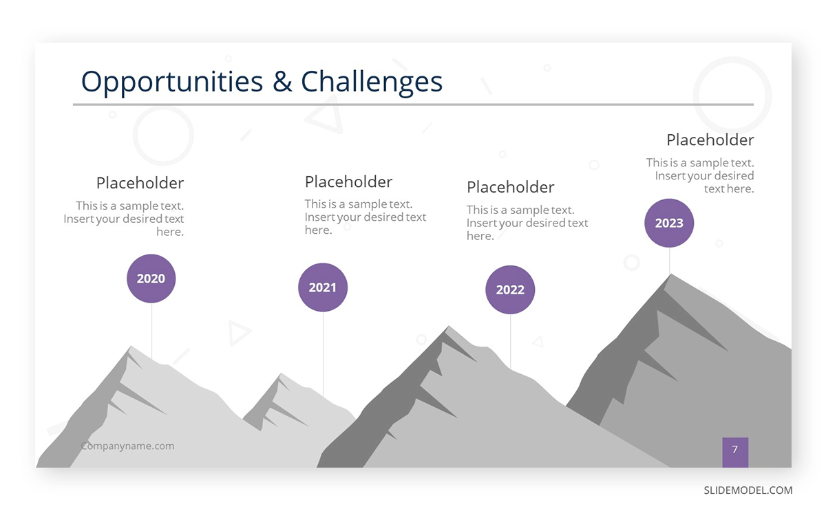
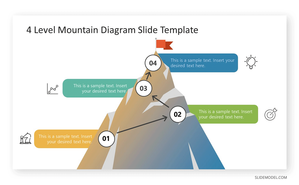
Using metaphors in presentations is a great idea to introduce complex topics or to tell a story. Say, you want to make the audience aware of your company’s challenges to reach its current standing in the industry. Using a roadmap template that depicts a mountain is an excellent idea as it reinforces the ideas of “challenge” and “teamwork.”
4. Final touches and polishing your presentation
Proofreading and polishing process
Before giving any presentation, you should dedicate at least one day to this polishing process. Let’s break down the process for easier understanding.
- Do a first iteration of your slides. The objective here is to grasp how everything looks in terms of design. Check the alignment of images and text, any color inconsistencies, typos, etc.
- Rehearse your presentation one time, tracking how much time it takes to perform the slideshow presentation.
- If any information is missing that’s worth adding to the slides, proceed to add it. If there are elements that can be reduced, trim them.
- For time-restricted presentations, get a clear idea about how much time it takes to complete your presentation, plus 5 extra minutes for a Q&A session.
- The second iteration should check the tone of your writing, and double-proof any spelling, punctuation and grammar errors.
After two complete iterations, your presentation is ready to go to the next stage.
Prepare your speech
Even though we believe the speech is partially built as you prepare your presentation slides, you should dedicate an extra section of time to prepare your speech correctly. This process involves the following steps:
- Identifying the purpose of your presentation. The core element of why you are speaking to this audience.
- Get to know your audience, their interests, their challenges, and what can they possibly wish to overcome.
- Adding value. This is vital – your presentation has to leave a lasting message to your audience on what they are interested.
- A strong start and a strong finish. Don’t neglect any of these elements.
Writing down your speech in notes is a must. It is the tool you can use to rehearse your presentation, and -in case you feel anxious- you can include some speaker notes in your presentation (which won’t be visible to your audience) to help you structure the speech.
Rehearse, rehearse and rehearse
Practice makes perfect. Rehearsing does not imply memorizing the entire presentation, as that would make your speech robotic, and prone to errors. How? Imagine a person asking you a question in the middle of your presentation, a question you didn’t expect. A prepared presenter can easily manage the situation because of the background built around the topic. A presenter that memorized a speech and robotically repeated its content can feel unease, losing focus for the remainder of the presentation.
Some valuable tips on the rehearsing process:
- Record your rehearsing sessions. You can use tools like Presenter View in PowerPoint to track your time.
- Make it a memorable event. Creating an engaging presentation requires creativity, so consider brainstorming for new takes on adding exciting elements to your presentation for attention retention.
- An exercise recommended by Tim Ferris is to mimic the conditions as closely as possible. This helps to reduce presentation anxiety, and also to get used to cameras and spotlights or evaluate your body language.
- If possible, ask a friend for feedback on your presentation performance. This is particularly helpful for new presenters to get used to interacting with the audience.
5. Presenting (your presentation)
Now it’s time to talk about the presentation and your performance when delivering it in front of an audience. Giving a presentation has many aspects to discuss, from start to end, the techniques to keep your audience interested in the topic, and also recommendations to make a memorable event. Let’s get started.
How to give a Memorable Presentation – Delivering an Impactful Presentation
There are multiple methods to approach a presentation and deliver an impactful presentation. Let’s be honest, not everyone feels comfortable when standing in front of an audience. For that reason, we want to lay out some fresh ideas to help you bring your best to your spectators.
The first element you ought to be aware of is body language. It has to feel natural, not overly acted but also not stiff. Think of a presentation as a similar scenario in which you have a deep conversation with a group of people about a topic you are passionate about. That mindset helps to ease anxiety out of the equation. Avoid crossing arms or constantly pacing across the stage – that only shows impatience and lack of interest.
Keep the concepts simple. Don’t overload your presentation with unnecessary jargon; if you feel something cannot be easily explained, go break down concept by concept until the whole idea is understandable. Graphics are a fantastic asset to help you in this process and boost your performance as a presenter.
Be mindful of not doing any of these common pitfalls:
- Including large chunks of text on a single slide.
- Using intense background colors that make it difficult to understand the contents of the slide.
- Don’t read every single element in your slides – this is perceived as boring by your audience.
One particularly interesting approach is by Guy Kawasaki, author of the book “The Art of the Start.” He considers the best presentations to be handled using 10 slides, lasting no longer than 20 minutes, and using a 30pt font size. That’s known as the 10-20-30 rule in presentations. It helps you to condense the content for the sake of information clarity.
In case you don’t use a PowerPoint presentation, there are multiple ways to make a presentation memorable:
- Tell a story, but connect with your audience in terms of body language. Play with the elements on the stage (much like TED presenters do), and let the audience feel the experience of your story by being as detailed as possible within the time frame.
- Using a video is an incredibly engaging tool, as it lets you introduce a topic you will discuss in more detail later.
- Use a visual impact in the form of an image with a dramatic element (i.e., climate change consequences, technological advancements, children engaging with technology or studying, etc.). This allows to hook the audience into what’s due to come next.
Start strong
Knowing how to start a presentation is a critical skill all presenters ought to master. There are several approaches for this behalf, but for the sake of this guide, let’s stick to the following ones.
Using the Link-Back formula
This consists of throwing a story in front of your audience that explains who you are, what your background is, and why your speech should make a difference in the life of the spectators.
The Link-Back formula is beneficial for creating an emotional connection with the audience.
Using a Hook
Asking a rhetorical question, using a powerful fact, or other well-known hook techniques is a plus when starting a presentation. We shall talk about hook techniques for presenters in the next section.
Using a captivating visual
Much like the power of storytelling, visuals impact the audience’s psyche, especially if the presentation is about a trendy topic. Create a quality graphic with any of our designs at SlideModel, a graphic designer’s help, an AI Image Generator, or work with a video.
Hook your audience
A hook is a tactic used by presenters as an opening statement but can be used in different areas of the presentation if it has an ample length. Much like the metaphor suggests, they serve to attract the audience to what you are communicating.
Research on attention span during lectures suggests a gradual decline in the audience’s interest in the presentation. That’s exponentially increased if you miss the chance to give a powerful first impression. Check this list of hook techniques to enhance the performance of your presentation skills:
- Asking rhetorical questions – better if a series of them on the topic to discuss.
- Using catchy phrases.
- Using a contrarian position, explain why such thinking harms the topic you wish to introduce.
- Historical event referencing.
- Making a powerful statement, best if data related. (i.e., “Every year, 8 million tons of plastic gets into the ocean, which equals to a truckload being dumped every minute”)
- Using the word “imagine”. It’s one of the powerful words in you can use in presentations.
- Add the comedy element – NB: be careful not to overdo it.
- Apply a “what if” scenario – this hook is similar to the “imagine” but with more data added.
- Tell a story.
- Spark curiosity.
- Smartly use quotations. Do not stick to text-book quotations but give your insight on why the quote is relevant for your speech.
Photo 9: Slide using a hook
Close your presentation
Most people assume that ending a presentation equals doing a recap. It is a bad idea since your audience feels as if you haven’t planned a conclusion for your presentation.
Another bad practice is to end with a Q&A format. Although questions and answers are often a required part of any presentation, they shouldn’t be the end of your presentation. You can include questions during your presentation or opt for a proper closure of the presentation past the Q&A session.
There are some powerful strategies to give a memorable ending to a presentation:
- Include a CTA on the lines like “Join our journey!” or similar that make the audience part of a bigger story.
- Close using a relevant quote. The idea is to deliver something that can linger, so the audience remembers your content.
- Use a story to close your presentation, as long as you avoid using a case study. The idea is to close with a meaningful thought, not with boredom.
We recommend you check our article on how to end a presentation for more ideas before reaching this stage of your presentation.
How to Make a PowerPoint Presentation (Quick Steps)
In this section, we will see how to use PowerPoint to make a presentation. Starting from creating a blank presentation or choosing a pre-defined PowerPoint template to preparing the presentation structure by adding PowerPoint slides and then working on the design of the presentation, we will explain how to make a visually-appealing and eye-catching PowerPoint presentation and how to create a slideshow in PowerPoint.
1. Selecting a PowerPoint template
When making a PowerPoint presentation, Professional PowerPoint Templates bring the advantage of not needing to think about complex graphic design decisions. However, there are certain aspects worth considering prior to picking the perfect PowerPoint template.
- Color aesthetic: If your presentation has to be done quickly, stick to PowerPoint templates that resemble your company’s branding palette. Although color can be changed, it is best not to lose time with extra adjustments.
- Opt for minimalistic designs: It is one of the most suitable ways to remain elegant in the professional world. You won’t be signaled for using a template that speaks seriousness on its design – and take for granted everyone shall badly remember the presentation that overdid color or graphics (or even worse, typeface effects).
- Avoid using heavy transition effects: Not all computers are as powerful as the ones you own. The simpler you make your presentation, the best it shall play on any PC.
As in life, there are advantages and disadvantages of using Premium or Free PowerPoint Templates vs. starting from a blank slate.
Advantages of PowerPoint templates when making a presentation
- Speed up the presentation design process.
- Reusable designs, ready for any situation.
- Helps to present data in an understandable format.
- Complex design decisions are made for users.
- Color pairing and font pairing are done for users.
- Helps to reduce the usage of text in slides.
Disadvantages of PowerPoint templates
- We are not learning to use advanced PowerPoint tools, as designs come pre-made for users.
- It can hinder creativity.
- Not every presentation template for PowerPoint is suitable for any topic.
- A professional team of PowerPoint template designers must be behind those templates to ensure quality.
2. Add or delete slides in PowerPoint
When we create PowerPoint Design ideas, not every slide makes the cut for the final presentation. Users then feel overwhelmed about those slides: will they be visible in the final presentation? Should you make a new PPT file without those extra templates? How to clone the “good” slides into a new file?
Instead of worrying about that process, we have here a guide on how to add, delete and rearrange slides in PowerPoint that explains, step by step, how to get rid of the unwanted slides or add more content to your presentation.
3. Adding images to slide templates
Some presentation templates and slide decks include entirely editable placeholder areas, and those boxes do not imply text only – they can include images, graphs, videos, etc. Say you want to add more images to your slides – it is as easy as replicating one of those placeholder areas with CTRL+C / CTRL+V (CMD for Mac users) or going to Insert on the Ribbon’s menu, then Picture.
If you plan to move elements in your slide design, we recommend you get familiarized with how to lock an image in PowerPoint, so the images that shouldn’t be altered remain in position. This technique is ideal when your images are surrounded by plenty of editable graphics.
4. Adding notes to your slides
Presenters often struggle to remember key pieces of information due to performance anxiety or because they were moved from focus by an unexpected question. Using speaker notes in PowerPoint is the answer to prevent becoming stuck, since those notes won’t be available to the viewers – they remain visible only on the computer where the presentation is being streamed.
Keep in mind this technique works when the presenter is sitting next to the computer. If you have to stand in front of a crowd, opt to use different memory-recalling techniques when you feel out of focus.
5. Adding animations to your slides
Another technique presenters use adding animated objects or effects. This is as easy as following these steps:
- Select the object/text you desire to animate.
- Go to Animations in the Ribbon and select Add Animation.
- You can stack animations on a simple object to make unique effects.
Using animated presentation templates is an alternative when you don’t feel confident about adding animations.
6. Adding transitions to your slides
Transitions are animated effects that happen when you change between slides during a presentation. Some people love them, while others prefer to stay away from them.
If you want to add transitions to your slides, follow these steps:
- Select the slide you want to add the transition effect.
- Go to Transitions in the Ribbon, and choose a transition.
- If the transition allows the Effect Options menu, you can alter that transition’s direction and behavior.
- Click on Preview to visualize the effect.
- To remove a transition, select Transitions > None.
7. Adding audio narration to your slides
Sometimes, presenters opt to add audio narrations to the slides. The advantage of using this medium is to increase accessibility for visually impaired users. We created a guide on how to add audio narrations in PowerPoint that explains the procedure in detail.
Considerations for your PowerPoint presentation
Ideal typeface and font size
There are multiple opinions on which typeface is ideal for presentations. Experience tells us the ideal typeface to work with is one that is system-available, meaning you don’t have to install a new font in the computer used to present. Why? You may ask. Simple: If the font used is not available on a computer, PowerPoint will automatically render a different font (sometimes even a different typeface) to replace and display the text appropriately. That action, which is replicated by other software such as Google Slides, Adobe Photoshop, Adobe Illustrator, Apple Keynote, etc., can drastically change your design.
Font size for titles should be between 36-44 pt. Paragraph font size between 24-28 pt. Use bold to emphasize concepts, and italics to insert foreign terms or quotations. Alternatively, you can make quotations to be displayed on a single slide, using 36 pt size, in italics.
Remember, these recommendations about size are intended for presentations in a live format. If the presentation is streamed through Zoom, using screen sharing, reduce the font size by 10-15% to avoid incredibly large texts. Test your presentation beforehand to be on the safe side.
Color scheme
The color scheme used is a primary part of your presentation design. When defining the presentation color palette, we recommend working within the colors that make part of your branding scheme.
If we speak about a personal presentation or a presentation with no logo, then opt for pastel tones that don’t create harsh contrast between text and background.
Above all things, avoid these conflictive color combinations:
- Yellow and green
- Brown and orange
- Red and green
- Neon colors combined
- Purple and yellow
- Red and purple
- Black and navy
- Navy and red (unless you use a muted red tone or control the amount of red used)
Printing your PowerPoint presentation
Sometimes, printables are a requirement by event organizers, which represents a challenge to many presenters. We want to give a helping hand on this behalf, offering tips that can improve your printing experience:
- Always work within margins when adding content. It helps not to downsize the presentation, which often renders the text illegible.
- If you have to print a presentation that uses intense background colors, opt for laser printing instead of inkjet. Laser printing won’t make the paper look odd when it is full-color print. The extra price is worth it when presenting a quality product.
- On the same lines about color-heavy presentations, ask for thicker printer paper than the average. This option is often advised when opting for laser printing.
- Run a print proof before ordering a large printing order. Colors can significantly change due to the RGB to CMYK conversion.
PowerPoint Presentations Tips
In this section, we want to list valuable tips to power up your slideshow presentations for their best performance. Some of these tips are tailored to presentation skills, others to design ideas, but ultimately, you can take in mind these tips the next time you need to make a powerful presentation in PowerPoint.
Tip #1. Using Video Presentations
An alternative to conventional presentations is to work with video presentations. These are particularly useful in academic and educational environments since they can convey large chunks of information in a memorable, easy-to-digest format.
If we consider that social media platforms like YouTube and TikTok are transitioning into professional content for creatives, you should consider using video presentations when the situation arises. As a plus, you can repurpose that presentation on your website or other official social media channels for your company.
Tip #2. Drop Shadows and Text Shadows
When we intend to create interesting contrasts between elements, color isn’t the only option to try. Learn how to work with drop shadows in PowerPoint to make images and objects stand out from the presentation. It is an effect that boosts a tri-dimensional feeling in the presentation.
Using text shadows in PowerPoint – with extreme caution – is an excellent method to highlight titles instead of using fancy colors or other 3D effects. Do not overdo the text shadow, as it makes the text illegible.
Tip #3. Working on your Presentation Skills
Giving presentations in front of an audience is, as we have seen, a process that involves many factors. One of those is the human element and the speaker’s ability to resonate with the audience. Therefore, we advise presenters to work on their presentation skills early, especially for mastering different kinds of presentation approaches, such as persuasive presentations (used in sales).
Tip #4. Editing Background Graphics in PowerPoint
Sometimes, PPT presentation templates include quality backgrounds that make the design pop from the screen. Yet, some of those backgrounds may not be suitable for all brands in terms of color, textures, etc.
Learn today how to edit background graphics in PowerPoint and create outstanding presentations in just minutes.
Tip #5. Google Slides compatibility
Finally, we want to remind users that almost every PowerPoint template has compatibility with Google Slides – if you intend to upload the presentation into the Cloud. Google Slides is an online tool for creating slideshow presentations, and one of its features is that we can convert PowerPoint presentations into Google Slides format. The converted slides are entirely editable, allowing presenters to count with a backup plan in case the PPT file doesn’t work or the computer to use doesn’t count with PowerPoint.
This is not an exhaustive list of presentation tips, but they offer a starting point for those who want to create attractive and effective PowerPoint presentations. You can also create presentations in other ways, and leveraging AI, for example. Check out the article how to create a PowerPoint presentation with ChatGPT to learn how to use Large Language Models to prepare presentations.
Closing thoughts
As we have seen, making a presentation is a complex process involving different skills, from knowing how to deliver a speech to having essential graphic design criteria.
While it is true that PowerPoint presentation templates make the process far more manageable, we shouldn’t entirely rely on them. A PowerPoint presentation isn’t a presentation on its own. It is a medium by which presenters showcase their ideas and structure the speech, but one cannot live without the other.
We hope this guide can give you a better understanding of how to create a successful presentation. See you next time!