Working with graphic assets can bring a degree of expectancy when delivering a presentation, such as in the case of PowerPoint animations. They can help add emphasis to slide content and reveal parts of the slide gradually to help presenters discuss topics sequentially.
As a presenting software, PowerPoint provides all kinds of animations for emphasis, entrance, exit, and to create a set motion. Join us today to learn all about animations in PowerPoint and unleash your creative potential.
Table of Contents
- How PowerPoint Animations Can Benefit Presentation Design
- Understanding PowerPoint Animation Basics
- Types of Animations in PowerPoint
- How to Animate Text on PowerPoint
- Animating Objects for Visual Impact
- Crafting Seamless Slide Transitions in PowerPoint
- Mastering Advanced Animation Techniques in PowerPoint
- Dos and Don’ts of PowerPoint Animations
- Real-World Use Cases of Animated Presentation Slides
- Recommended Animated PowerPoint Templates
- Conclusion
How PowerPoint Animations Can Benefit Presentation Design
Enhanced Engagement and Understanding through Animations
Dynamic presentations can have many benefits. The importance of such animations is often only realized by people familiar with PowerPoint. As we’ve seen in our guide on visual communication, graphical elements can make concepts more understandable. In the case of animations, we can use the transitions between slides or elements to split concepts and make them clearer.

Audience engagement is another factor, as eye-catching slides often include surprise elements hidden behind animations. These elements attract the audience’s interest and increase retention rate. In this case, animations serve as powerful presentation aids for the speaker.
Capturing Audience Attention
PowerPoint animations are more likely to capture the audience’s attention than static slides. The moving objects on-screen are the type of visuals people are likely to find attention-grabbing instead of trying to read through static slides or looking at static images. On this behalf, storytelling techniques boost their efficacy in connecting with the audience by implementing animations and transitions rather than sticking to static slides.
Emphasizing Relationships Between Elements
Whenever we work with contrasting values, like pros and cons slides, animations help the presenter highlight areas of interest or disclose the opposite values section by section. This, in turn, structures the speech for real-time interaction with the graphical assets rather than having the audience read the slide and lose focus on the speech.
Interactive Presentations
As mentioned before, presenters can craft compelling stories through the careful use of animations in PPT. What is often overlooked is the link between interactive presentations and animations. For instance, a speaker can deliver different outcomes of the presentation by selecting one path whose outcome is revealed through an animation. This “wow” factor induces surprise and creatively presents case scenarios.
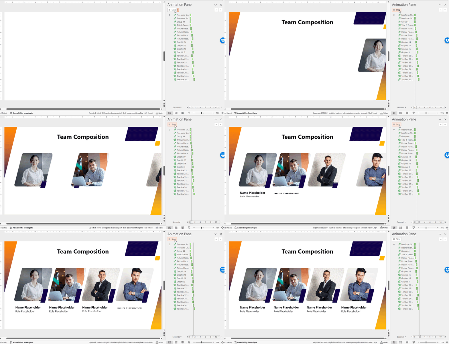
Another option is when introducing your team in presentations. Rather than using static slides, incorporating animations gives more rhythm to the presentation and invites the public to interact with the speaker.
Understanding PowerPoint Animation Basics
Getting Started with Animation in PowerPoint
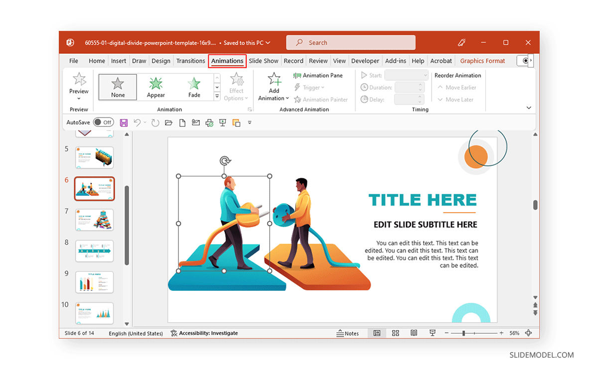
To start with animations in PowerPoint, select an object you wish to animate and go to the Animations tab to choose an animation to add to the slide element. When adding animations to multiple objects in a slide, you should consider the sequence you wish to use to animate objects.
Accessing Animation Features
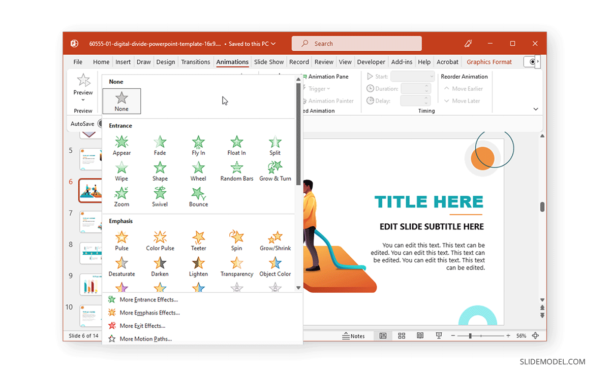
When accessing animation features, you will come across various animation types. By expanding the Animations menu, you can select animations for entrance, exit, emphasis, and motion paths to create a path for your animated sequence. You can also click to instantly preview an animation for the selected object or switch to slideshow mode to see how the animation will appear.
Adding Animations to Text and Objects
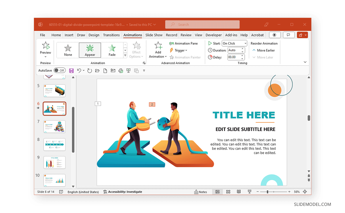
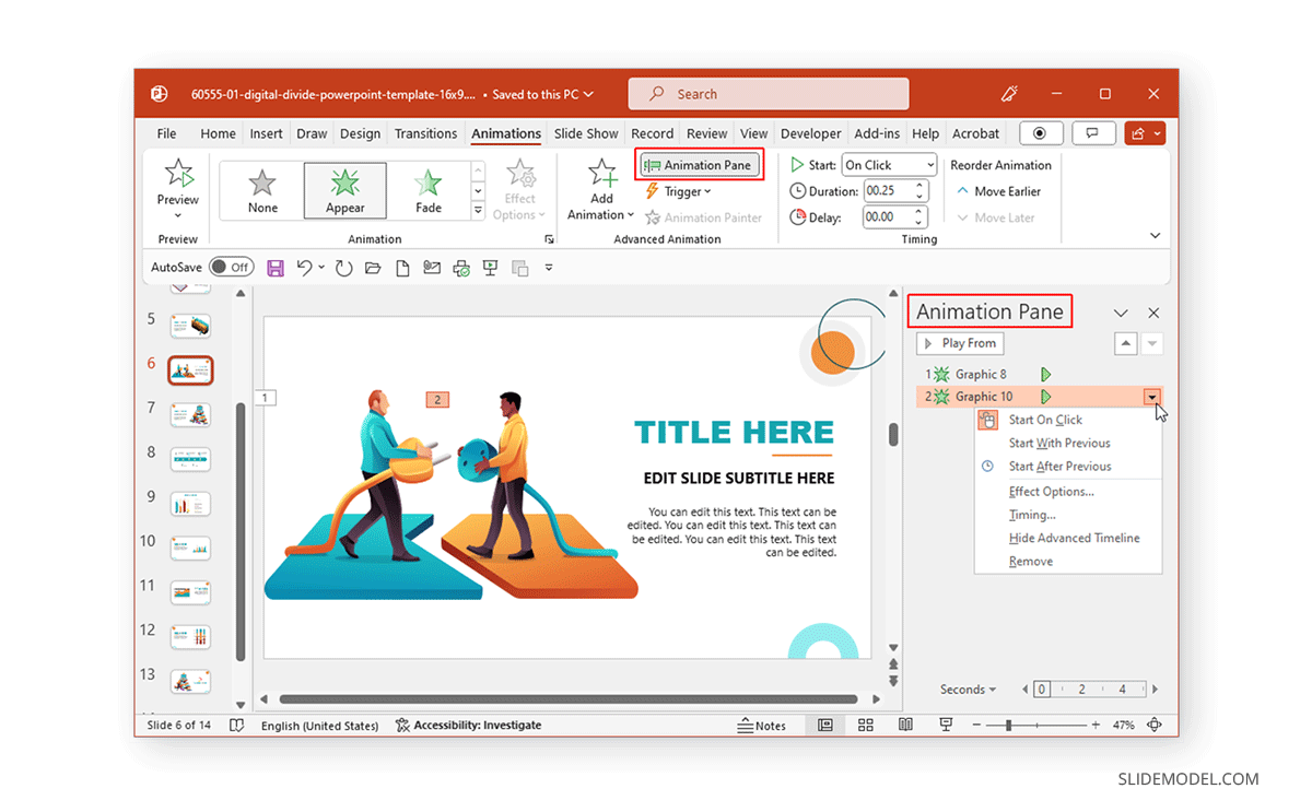
Once an animation is added to a text or object, a number is assigned. This number shows the sequence in which the object will be presented. For example, the object will be the first to be animated on screen, followed by two, three, and so on.
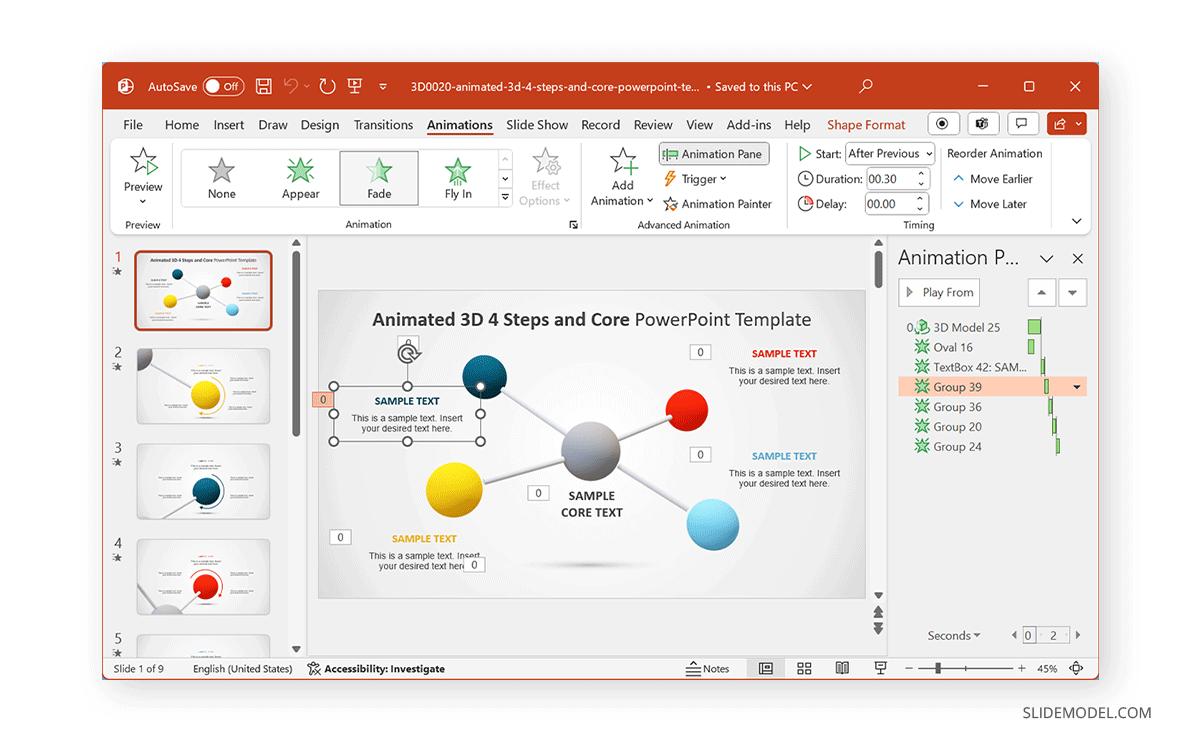
You can adjust the sequence of animations, triggers, and other settings from the Animation Pane in PowerPoint.
Timing and Sequence in Animations
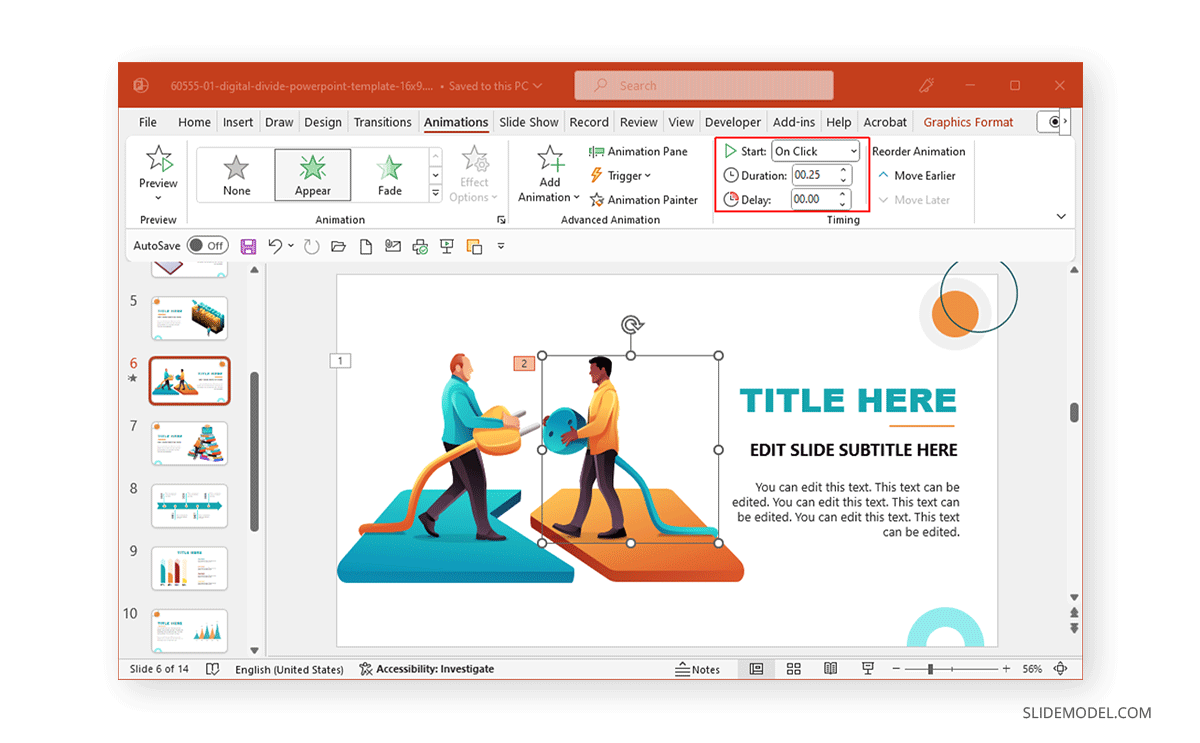
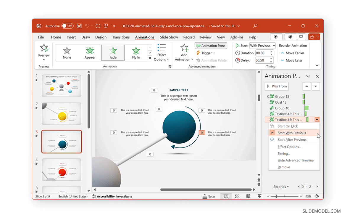
The Timing menu in the Animations pane provides options to set the duration of the animation, the time to delay the animation on the screen (if necessary), and to assess if the animation starts on click, with the previous or after the last animation. How you select these animations will help you adjust the time and sequence of the animations. For example, you can use ‘with previous’ option to show two animated objects simultaneously.
Types of Animations in PowerPoint
Entrance, Exit, and Emphasis Animations
Some of the most commonly used animation types fall under three categories: entrance, exit, and emphasis animations.
Entrance Animations
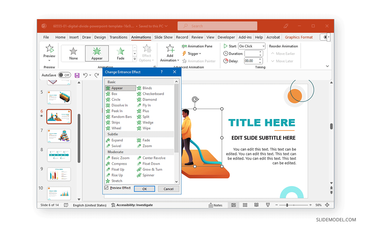
The Entrance Animations are meant to start or introduce objects. You can explore all entrance-related animations by going to Animations -> Animation (menu) -> More Entrance Effects. This will reveal all entrance animations you can click to preview for a selected object. These often consist of basic animations with effects like appear, fly-in, float-in, strips, wheel, circle, box, dissolve-in, split, wedge, wipe, plus, diamond, checkerboard, blinds, etc. The animations can be divided into three categories: basic, subtle, and moderate. These categories help identify the type of effects in each category according to how prominent they might be on screen.
Exit Animations
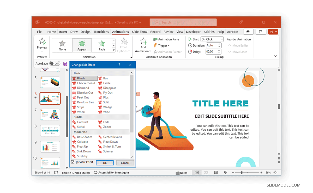
The Exit Animations are meant to help exit a slide or animated sequence to close a topic or subtopic, or to conclude the on-screen animations for a slide. These animations are similar to the Entrance Animations with the same effects. You can use these animation types for an exit sequence using effects like blinds, circles, checkerboard, box, plus, split, wedge, wipe, diamond, dissolve out, contract, swivel, fade, zoom, basic zoom, collapse, float up, etc.
Like the Entrance Animations, you can go to Animations -> Animation (menu) -> More Exit Effects to preview the animations and to see the three categories for basic, subtle, or moderate animations.
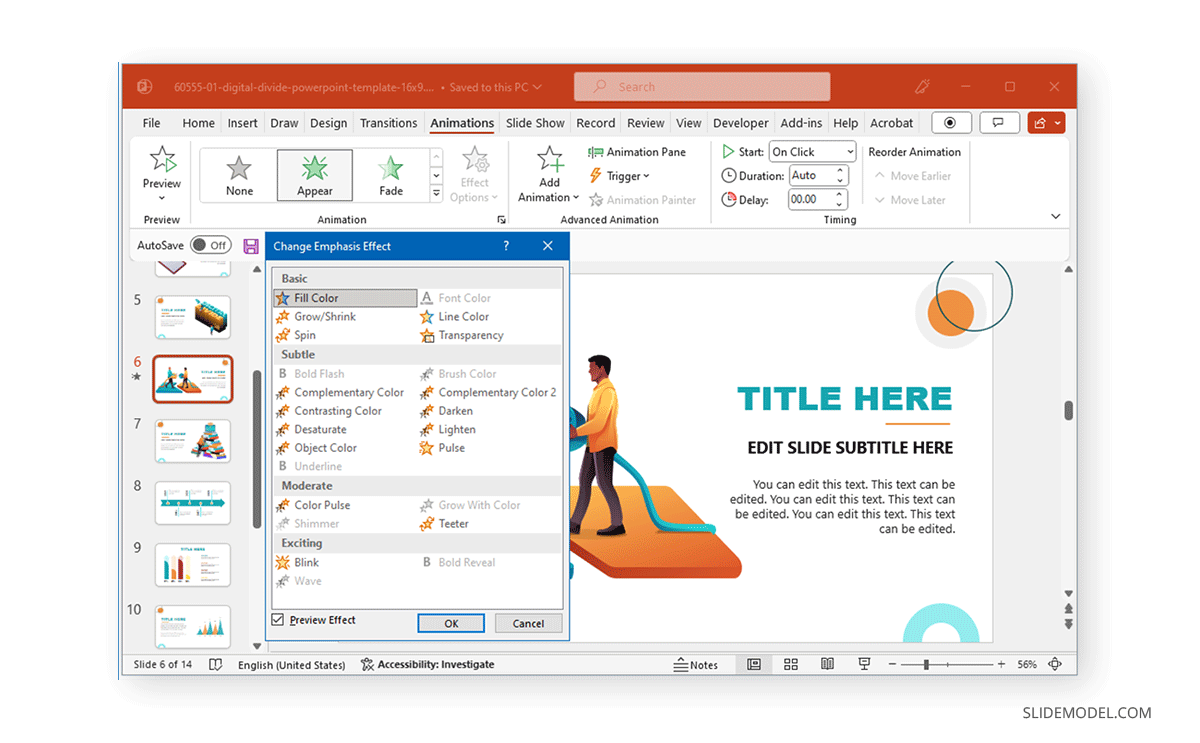
Emphasis Animations
Other than basic, subtle, and moderate, the Emphasis Animations come with an additional category, ‘exciting.’ Emphasis animations in PowerPoint provide visual aids for emphasizing content within slides. The effects for these animation types in PowerPoint are also quite different from the entrance and exit-themed effects. Effects like fill color, grow/shrink, transparency, line color, teeter, color pulse, object color, desaturate, darken, lighten, blink, wave, and others can help emphasize an object within a slide to make it pop out before the audience.
Exploring Motion Path Animations
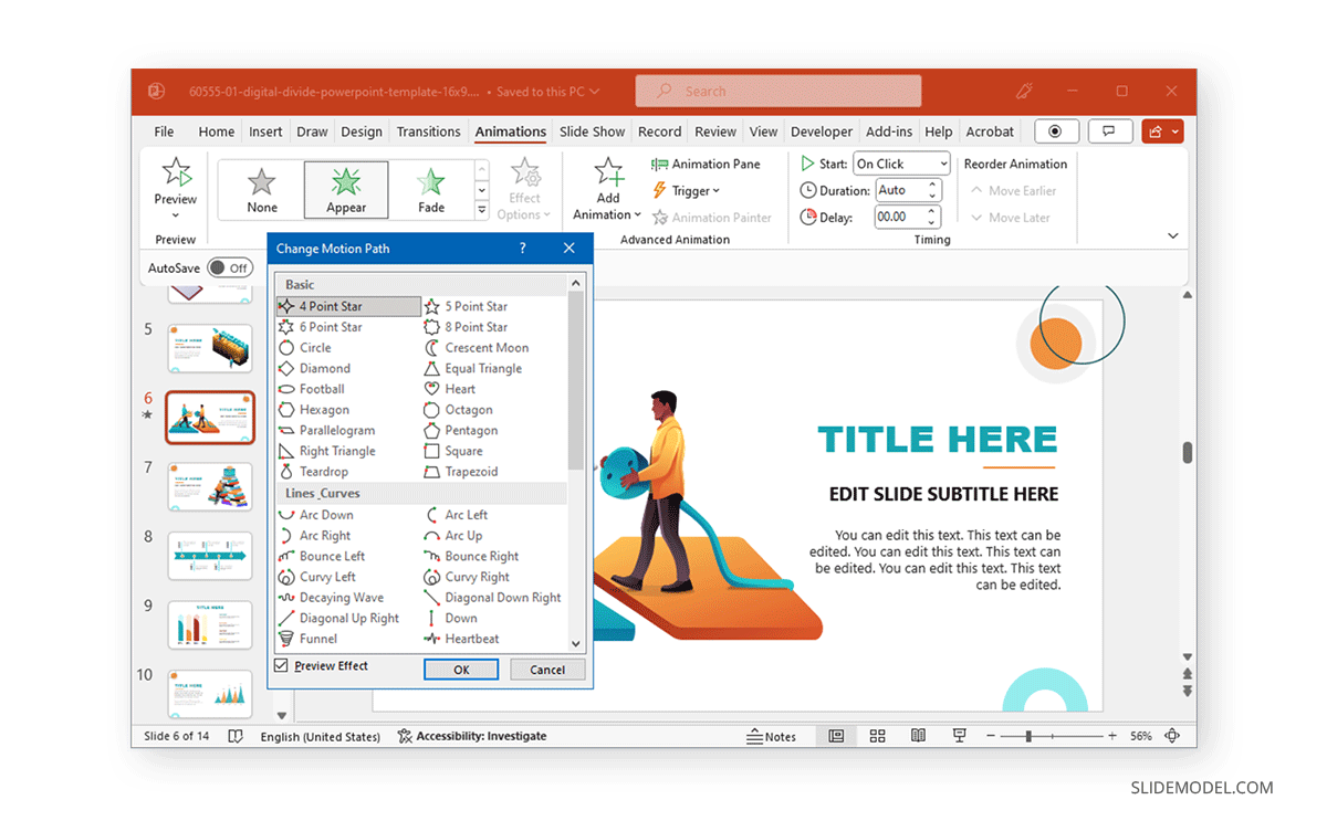
If primary effects aren’t what you want, it’s time to switch to Motion Paths. These are animated effects in PowerPoint that showcase objects across a specific path. In other words, these are elaborate animations that drag objects on the screen based on a particular shape or path, such as a 4,5, 6, or 8-point star, crescent moon, circle, diamond, football, heart, octagon, pentagon, square, trapezoid, teardrop, right triangle, arc (down, right, left, up), curvy right, bounce right, etc.
Motion Paths are divided into four categories. The basic effects consist of shapes, whereas, Line Curves provide lines and curves to animated objects. Similarly, the special category contains more elaborate effects such as inverted square, loop de loop, peanut, bean, curved square, etc.
Choosing Appropriate Animation Styles
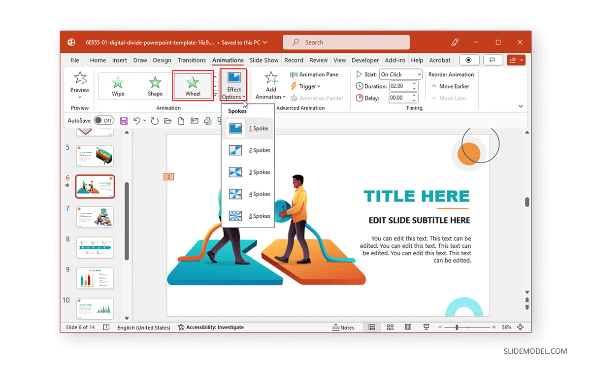
When choosing animation styles, picking a style that best resonates with your presentation slides is important. The animations’ names and categories can help you identify what might work for you. Furthermore, after adding an animation, you can go to Effect Options to view the various directions and options used to refine the animation to build your sequence further. Depending on the animation type, you can pick variations of the animation, directions, colors, transparency, points to edit or lock, or other options for selected effects. The image below shows the variations for the Wheel animation in PowerPoint via Effect Options.
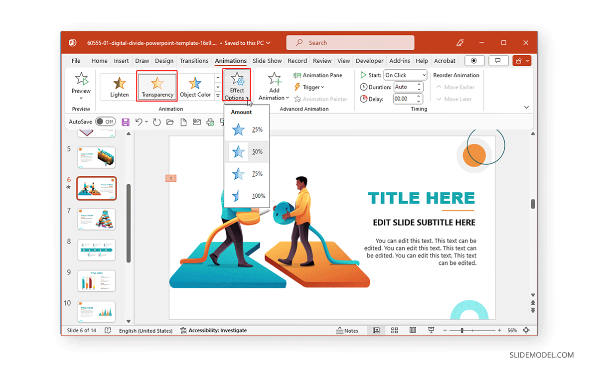
Similarly, if you select Transparency from Emphasis Effects, you can choose how transparent the object will appear on the screen. Likewise, many color-themed effects enable picking a custom color to animate an object.
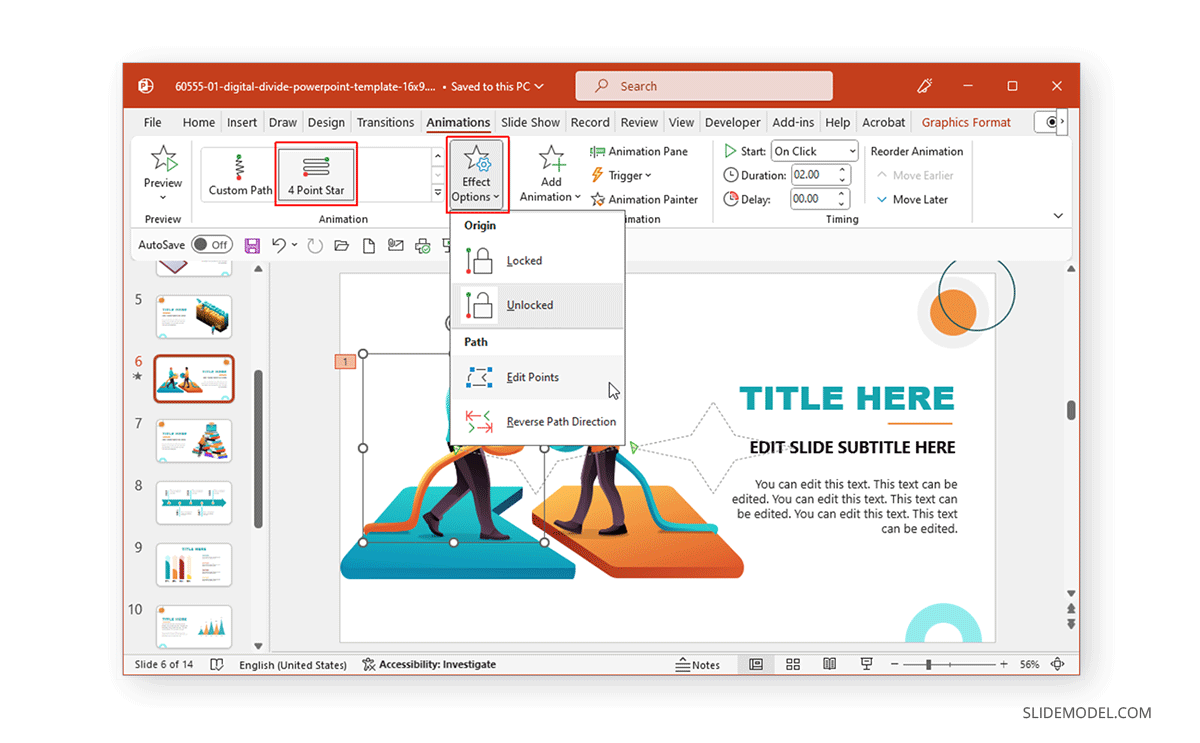
Since Motion Paths are unique, you will get options to edit points, lock paths, reverse the direction of the default animated sequence, etc.
How to Animate Text in PowerPoint
Now that you know how to animate shapes and objects in PowerPoint, it’s time to explore making written content more interesting using animations.
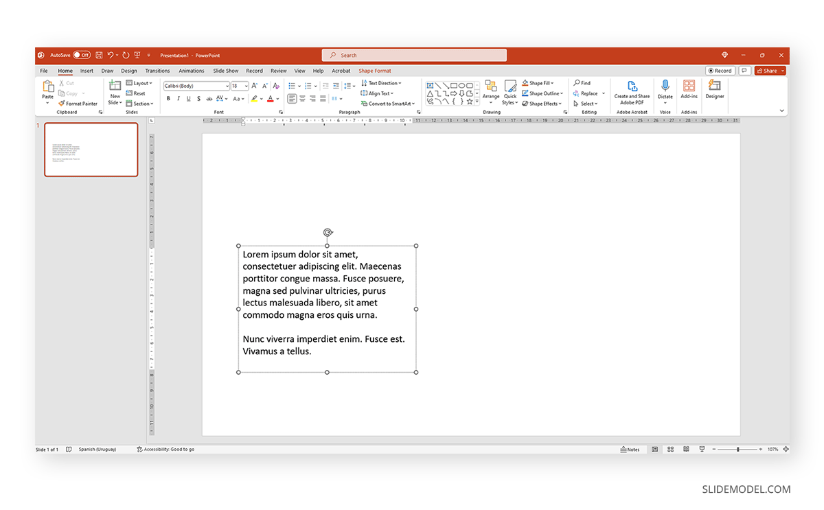
To animate text in PowerPoint, start by opening a blank PPT file and adding a placeholder text. The idea is to learn how text interacts with animation effects without working with complex graphic layouts. You can animate or make words appear one line at a time.
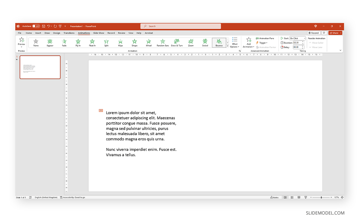
Select the text and switch to the Animations tab. In there, pick an animation effect of your preference. You will get a preview of the effect applied – which will show the number of the animation order once completed.
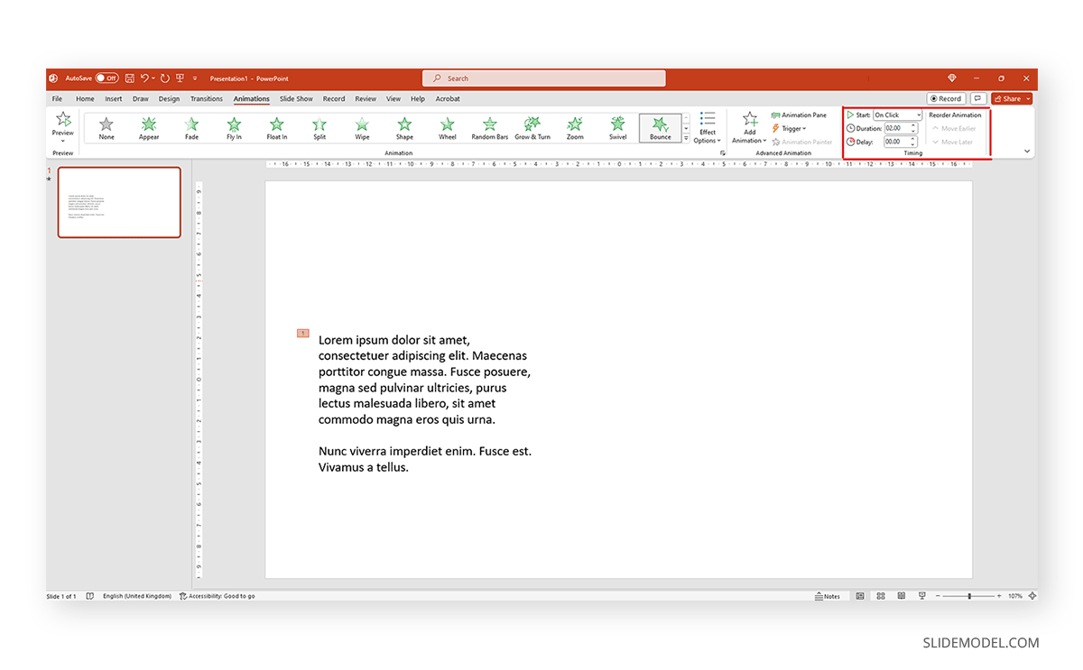
Animations for text, like any other animation, can be controlled in terms of behavior by accessing the panel at the right-most section of the Ribbon.
Additionally, we can expand the animations panel to select from the different effects offered by PowerPoint.
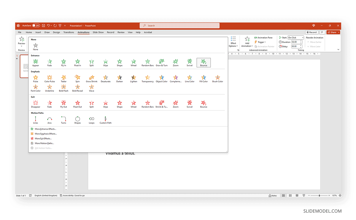
Animating Text Elements on PPT Templates
Animating text elements to highlight key aspects of your slides can be a great way to create engaging presentations. The Animated 3D 4 Steps & Core PowerPoint Template shown below are among the Animated PowerPoint templates at SlideModel that animate objects and text elements for emphasis while retaining a clear layout.
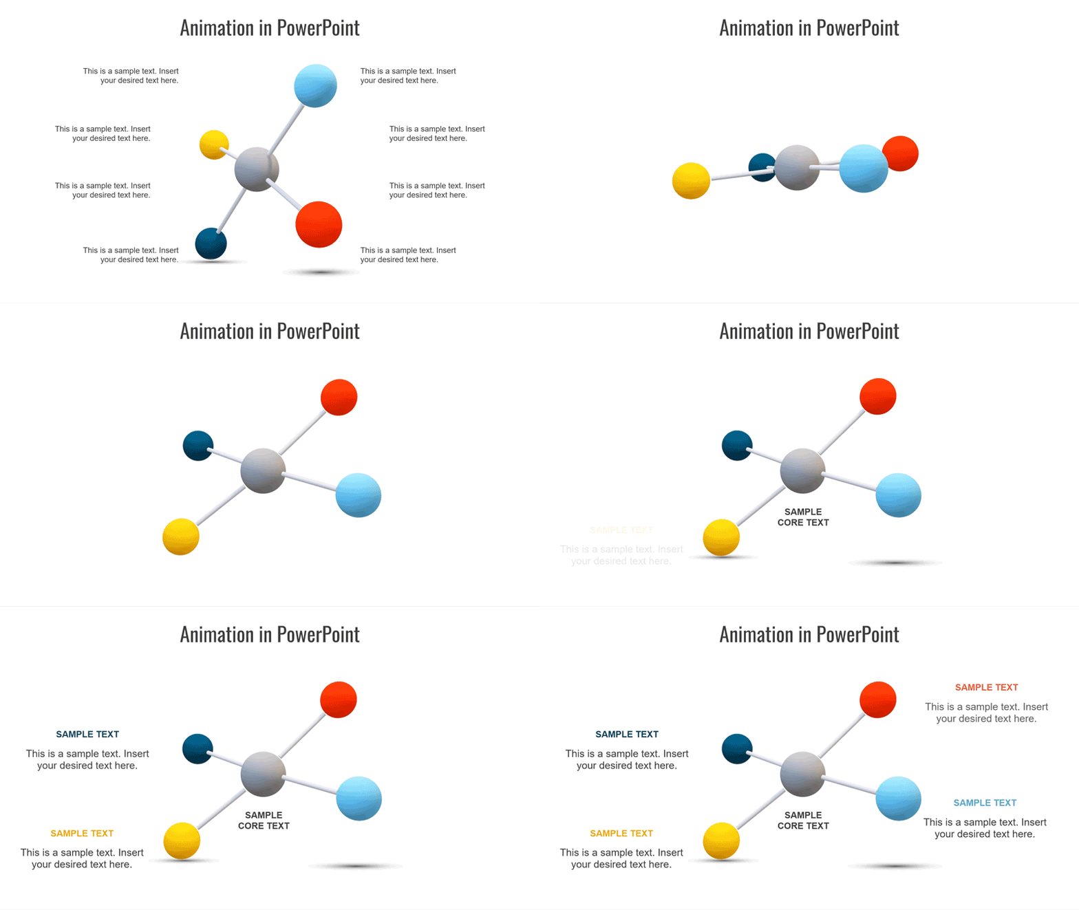
As visible from the animated sequence from the Animation Pane in the image below, the slide deck uses animated text boxes with a mix of other slide elements to create a sequence where a four-step diagram is highlighted with supported text to help elaborate each part of the diagram in an animated sequence. We can add, remove, or modify the included effects via the Animation Pane.
Balancing Text Animations for Impact
By balancing text animations, you can have maximum impact when highlighting content for your slides. The animations can be triggered to start simultaneously to reveal all the text after a sequence of objects, before objects appear, or one by one to reveal the diagram contents gradually.
Animating Objects for Visual Impact
Animating Images, Shapes, and Charts
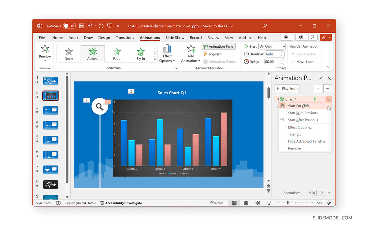
When animating shapes and images, you can use a variety of animation types for entrance, exit, and emphasis, and to make the content pop out. However, charts require subtle animations, and it’s best to use basic effects to reveal charts, such as Appear and Disappear.
The Animated Network Diagram PowerPoint Template is an example of how to animate shapes.
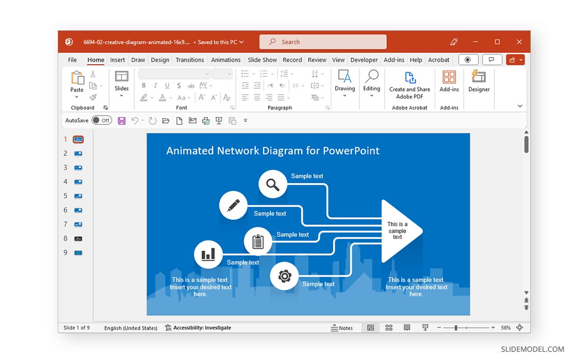
The template’s title slide reveals shapes and icons in the form of a diagram in an animated sequence.

You can also include images in such a template to customize the given diagram and animate it to reveal the image simultaneously or after a set of objects has already been revealed.
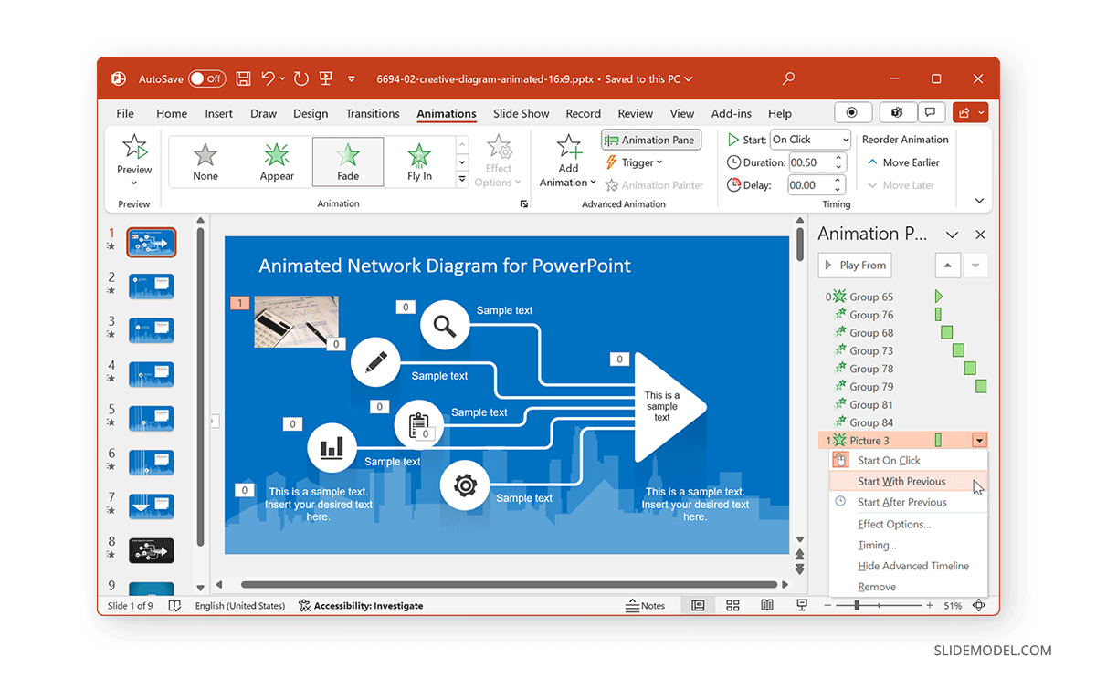
If you are including a chart in your slide that is to be animated, make sure the animation corresponds to other elements that might also be animated. For example, you can trigger the chart to be revealed after the slide title with a simple Appear effect. In such a case, the chart can be displayed altogether or gradually, in animated form.
Applying Object Animations Strategically
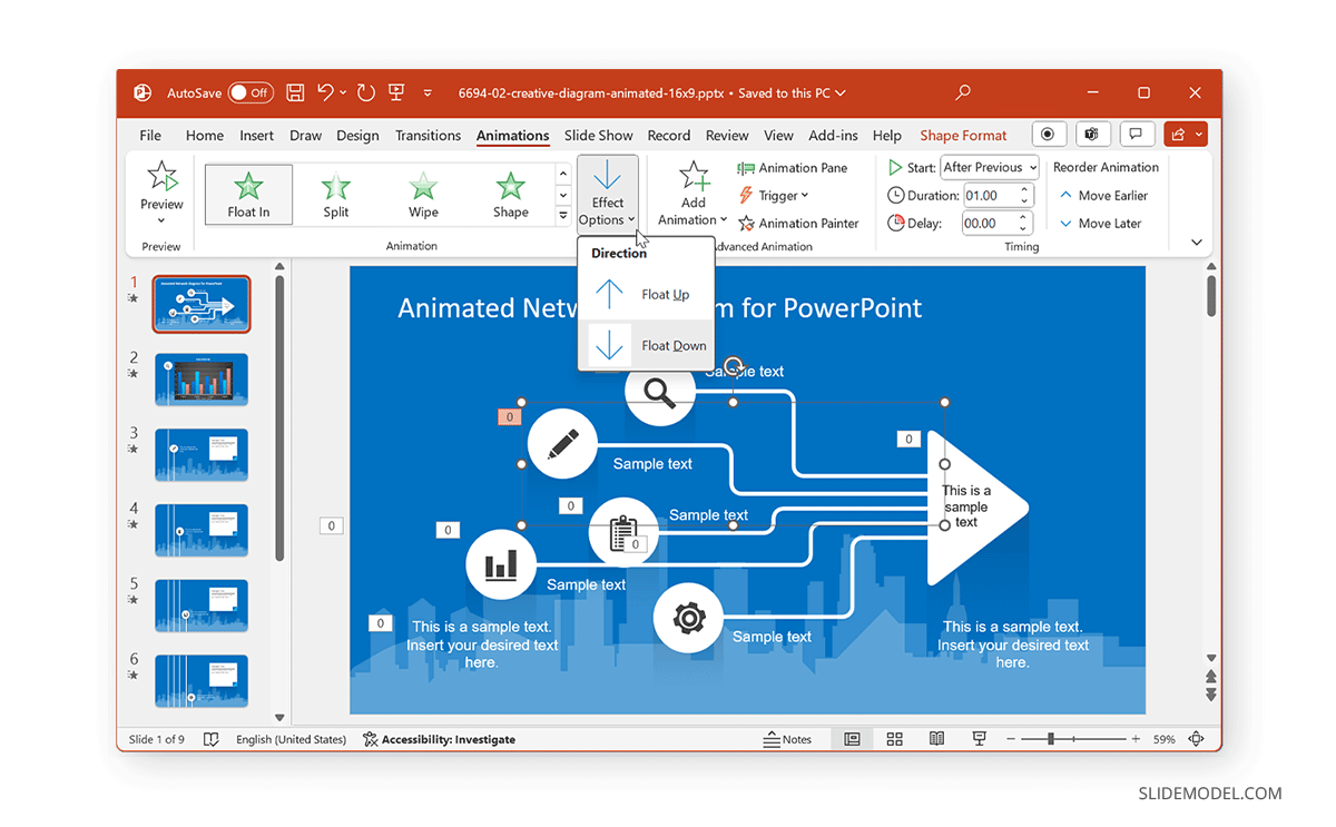
When placing slide objects, you must apply the animations strategically to avoid revealing information out of sequence. Furthermore, it is also worth considering how your effects appear. For example, in the image of the diagram below, would you prefer the diagram to appear floating upward or downward? Such considerations and other vital elements, such as your branding needs, are important to ponder when setting your animated sequence.
Crafting Seamless Slide Transitions in PowerPoint
Enhancing Presentation Flow with Transitions
While Animations for PowerPoint are one way of making your slides engaging, PowerPoint Transitions is another. You can access them via the Transitions tab in PowerPoint and apply transitions between slides.
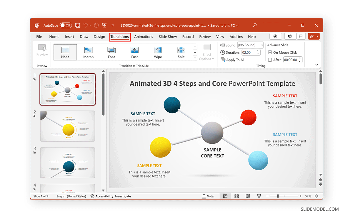
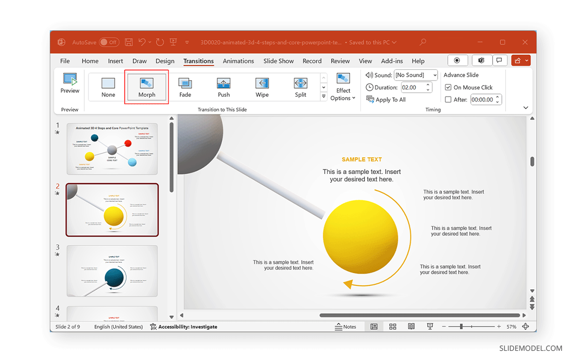
While many legacy transitions provide basic effects when switching between slides, some of the more recent additions to this menu, such as Morph Transition, enable the creation of elaborate animations by using Transitions to animate your slides. The below example shows a slide with the Morph transition, giving an animated effect to the diagram.
Maintaining Coherence Between Slides
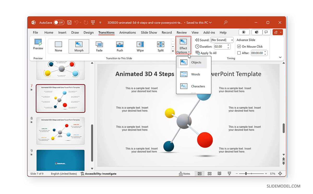
When applying Transitions, it is essential to maintain coherence between slides by ensuring they don’t overlap with any added Animations. To do this, you should preview your slide deck to see how it might appear once all the animated effects have been included in your slides. Like PowerPoint Animations, you can also use Effect Options for Transitions to set a sequence or direction that best suits your needs.
Mastering Advanced Animation Techniques in PowerPoint
Layering for Complex Animation Effects
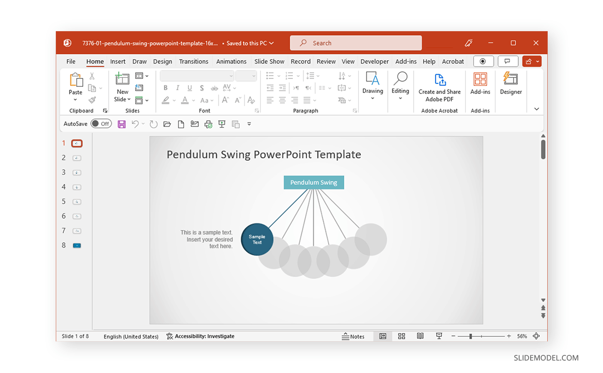
Using layers of multiple objects and slides can easily create advanced animation effects. This can be done using not only PowerPoint animations but also transitions. The Animated Pendulum Swing PowerPoint Templates from the SlideModel archive of animated templates use Transitions like Morph to create animated sequences. The below example shows a swinging pendulum created using Morph.
Combining and Triggering Animations
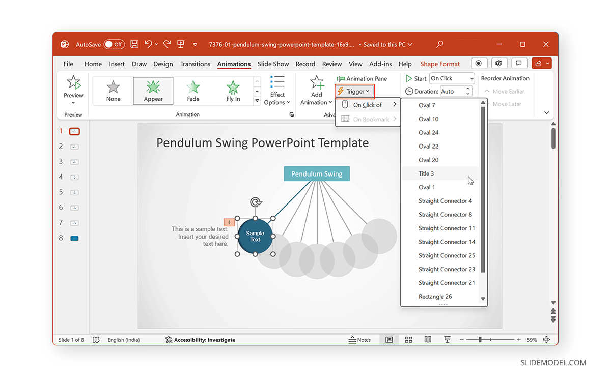
Depending on the number of elements within a slide and the animations used, you can use triggers to customize and set sequences for slide elements to animate. The example below shows the selected pendulum’s various linking options for the on-click trigger. By placing your slide objects to be connected and triggered with different parts of your slide, you can create and customize animated sequences that can be pretty attention-grabbing.
PowerPoint Animation Painter
If you thought you had to start from scratch to animate each slide of your presentation, you are sorely mistaken. Much like the Format Painter option in PowerPoint, we can find Animation Painter, which is accessible via the Ribbon under the Advanced Animation control options.
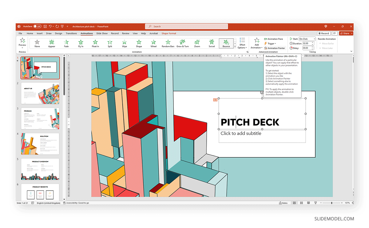
This tool helps us duplicate animations between elements of the same slide or copy animation effects from one slide to another. As a format copying tool, it requires at least one animation effect to be placed otherwise the option is grayed out.
Creative Experimentation
Experimenting with Animations in PowerPoint can be pretty helpful to avoid making monotonous presentations. Experimentation does not necessarily require making slides from scratch, but you can also use ready-made templates such as the 3D animation PowerPoint Templates at SlideModel. Alternatively, some slide deck templates offer a considerable range of animation effects intended for maximum audience engagement, which users can quickly customize by editing placeholder areas for text, images, and logos.

Dos and Don’ts of PowerPoint Animations
Below is a list of do’s and don’ts of PowerPoint Animations for making presentations that best use animated effects.
Maintain Animation Moderation
It is essential to maintain moderation when using animations, as the use of too many animations on a single slide or presentation can make the content confusing.
Use of Appropriate Animations
Try to use appropriate animations for slide objects. The animation should suitably show if the object is to enter, exit, be emphasized, or be highlighted using a motion path.
Avoid Animation Overload
Avoid flashy animated sequences unless your presentation is meant for an audience that might find engaging, such as children in a classroom session.
Subtle can be Just as Engaging
Sometimes, subtle animations can be just as engaging as an animation with an elaborate effect. This can, in fact, be a better option than using animations that might be visually overpowering or difficult to follow due to elaborate effects.
Ensure Visual Consistency
As discussed earlier, it is vital to maintain consistency in using animated effects. Be it Animations or Transitions, using flashy effects or too many diverse effects can hurt how the audience perceives your content, as it might become confusing, visually overpowering, or unprofessional. In such a case, the audience might quickly lose interest in the presentation, leading to Death by PowerPoint.
Less is More
The design language of visual designs over the past decade or more has been intended to use fewer effects and graphical elements with ample space to make the interface look clean. Be it Modern UI or Material design apps, this design language has been evident across desktop and mobile UIs. Using the same concept, you can design your slides with fewer animations and graphical elements to make your content more visually appealing.
Real-World Use Cases of Animated Presentation Slides
Turning PowerPoints into Millions
Courtney Allen, a professional PowerPoint designer who came out of a BFA in graphic design from Boise State University, had all but PowerPoint as a part of her portfolio. She started her freelancing career via Upwork, making over a thousand PowerPoints for clients, bringing in as many as $4 million. She suggests using simple designs and animations to make the most out of PowerPoint presentations.
Guy Kawasaki Pitch Deck
Guy Kawasaki, a former Apple employee, whose famous 10-slide pitch deck has inspired a variety of PowerPoint templates. This rule was designed for startups and business presentations, focusing on pitching a concept to investors. While this isn’t directly related to using animations in presentations, it is an example of making the best use of minimalist content in a few slides. You can learn more about the Guy Kawasaki pitch deck from our article about the 10/20/30 rule for PowerPoint presentations.
How not to use an Animated PowerPoint Presentation in Court!
Presentations with animations aren’t always a great idea. In 2014, a court in the United States criticized a PowerPoint presentation by the prosecutor, which led to the court throwing the case out. The presentation was made with sound effects and animations, with flashy elements like the bullseye. Some of the significant mistakes made by the prosecutor included ‘visual advocacy,’ where the defendant was marked with the word ‘guilt’ in the slide deck. Not to mention, the animated presentation seemed to be aimed at influencing the court using visual aids. Something that did not sit well with the court.
Use of PowerPoint by the US Military
The US Military has often been accused of Death by PowerPoint for preparing what some call the worst PowerPoint slides ever created. The issue became so profound that in 2011, it was revealed that an executive communications manager at Microsoft, Dave Karle, was tasked with ensuring that the US military could finally start using the software properly. After discussions with top military officials, an updated military presentation method was created, consisting of a number of presentation templates, tips, and graphics and more than 6,000 map symbols.
Recommended Animated PowerPoint Templates
In this section, you can check some ready-made templates that can be easily customized for your presentation’s purposes. All these templates feature professionally made animation effects with native PowerPoint tools.
Conclusion
Using animations to make visually appealing and engaging presentations requires ensuring that your content corresponds with your added animated effects. In this article, we explored how to use animations in PowerPoint. It is always best to use animations in moderation and to keep your slides minimalist while unleashing your creativity as a presenter. Using ready-made animated PowerPoint templates can also help give you a good starting point to begin experimenting with animations and effects. This can also be useful for people new to PowerPoint Animations to explore what is doable with an animated slide deck, using animated sequences tailored for customization.
Whether you’re using an animated template or making one from scratch, a preview in slideshow mode can save you a lot of trouble with potential issues tied to animated effects. Last but not least, using animations in PowerPoint isn’t always necessary, and you can even go for a simple slide deck with a handful of slides. What matters is that you should be aware of the information being presented, and the visual aids should be just to aid your slides and not meant to be the whole package on their own.

