As one of the Big Four consulting firms, Deloitte is renowned for its professional and polished presentation. Its meticulously crafted slides aim to align with the high standards expected in corporate and consulting environments. Deloitte presentations are not just a communication medium; they convey the firm’s branding, expertise, and work ethics. But how exactly does the firm reflect its identity into its slide decks?
Deloitte’s presentation approach is grounded in structure and audience-centric design. Each component of a Deloitte PowerPoint template—from the title slide to the appendix—is thoughtfully designed to provide clarity, ensure precision, and facilitate decision-making. This article explores the key elements that define the Deloitte presentation framework, how to make a presentation and its specific presentation structure, and provides detailed insights into how consultants can replicate Deloitte’s style and effectiveness in their presentations.
Table of Contents
- What is the Deloitte Presentation Style?
- How Long a Deloitte Presentation Should Be?
- Benefits of Deloitte Presentation Slides for Consultants
- How are Deloitte Slides Different from McKinsey, BCG, and Other Consultancy Styles?
- The TIM Framework
- Understanding the Structural Components of a Deloitte Presentation
- Title Slide
- Agenda Slide
- Executive Summary
- Background or Context Slides
- Approach or Methodology Slides
- Analysis Slides
- Next Steps Slides
- Conclusion Slide
- Common Deloitte Presentation Mistakes
- FAQs
- Final Words
What is the Deloitte Presentation Style?
The Deloitte presentation style is characterized by clarity, precision, and professionalism. It strongly emphasizes delivering a focused message, with every slide designed to achieve specific communication objectives. All in all, it’s a balance between content and design that ensures that complex ideas are simplified and key messages amplified without overloading the slides with unnecessary information.
A Deloitte PPT template is visually clean and consistently uses the firm’s branding (logo, color scheme, and typography). Slides are formatted with generous whitespace areas to avoid clutter and strategically incorporate visual assets like charts, graphs, and infographics to support data-driven insights. The content on each slide is structured according to the audience-first approach. It is tailored to the stakeholders’ concerns, ensuring the presentation addresses their challenges and objectives, while progressing logically from context to recommendations and actionable outcomes.
In terms of tone, the Deloitte presentation framework maintain a professional, yet accessible language. Bullet points are commonly used, and dense text areas are avoided. Overall, the design philosophy is grounded in functionality, with every design element serving a purpose to enhance comprehension.
How Long a Deloitte Presentation Should Be?
A typical Deloitte presentation ranges from 30 to 90 minutes, depending on the content’s purpose, audience, and complexity. In general, we can consider these common scenarios:
Executive Presentations:
- Duration: 30-45 minutes.
- Focused on high-level insights, strategic recommendations, and key takeaways. Designed for senior leadership with limited time.
Client Workshops or Detailed Deliverables:
- Duration: 60-90 minutes.
- In-depth discussions that include detailed analyses, methodologies, and implementation plans. Suitable for operational teams or collaborative sessions.
Internal or Interim Presentations:
- Duration: 20-60 minutes.
- It may include project updates or preliminary findings tailored to internal stakeholders.
Benefits of Deloitte Presentation Slides for Consultants
For consulting presentations, the use of Deloitte presentation slides offers a range of benefits that go beyond aesthetics. Let’s break this point by point.
Structured Information Presentation
Deloitte presentations help organize complex information into manageable, logical segments. This structured approach makes it easier for stakeholders to follow the narrative and focus on critical insights. Consultants can use a Deloitte PowerPoint template to ensure consistency and professionalism across all slides.
Enhanced Storytelling
The Deloitte presentation structure emphasizes a logical flow that begins with the problem, progresses through analysis, and concludes with actionable recommendations. This approach ensures an engaging presentation experience for the audience, and they can follow the storyline without confusion. Visual aids like charts and graphs enhance storytelling by making data-driven insights more relatable and easier to understand.
Time Efficiency
Building an entire deck using Deloitte PPT templates is a method to speed up the design process, as the pre-designed framework provides clear content placement and formatting guidelines. Consultants can focus on crafting impactful messages and jaw-dropping graphics with tools like Midjourney.
You can find multiple presentation templates that meet the standards of Deloitte slides in our selection of consulting PowerPoint templates.
Flexibility Acrosss Industries
The Deloitte presentation framework is versatile, making it applicable across various industries and scenarios. Whether it’s a strategic proposal, financial presentation, or operational review, the framework’s adaptability ensures it can be used effectively in diverse contexts.
How are Deloitte Slides Different from McKinsey, BCG, and Other Consultancy Styles?
While Deloitte, McKinsey, and BCG are all renowned for their exceptional presentations, their styles reflect unique approaches to communication and design. Understanding these differences can help professionals appreciate the distinctive qualities of a Deloitte presentation framework.
Visual Design
Deloitte slides strike a balance between aesthetics and functionality. They feature clean layouts, branded colors, and strategic use of visuals to support the narrative. The McKinsey presentation structure, in contrast, is often minimalist, with an emphasis on whitespace and text. BCG slides, on the other hand, are known for their storytelling focus and often feature more elaborate visuals and diagrams.
Focus on Implementation
Deloitte presentations often include detailed implementation plans, emphasizing actionable steps and practical recommendations. This action-oriented approach sets Deloitte apart from McKinsey, which may lean more heavily on strategic frameworks, and BCG, which often highlights case-specific insights.
Data Visualization
While all three firms prioritize data-driven insights, Deloitte’s use of infographics, charts, and graphs focuses on enhancing audience comprehension. McKinsey’s data presentations tend to be highly structured and often text-heavy, whereas BCG employs a more creative approach to visual storytelling.
Use of Frameworks
McKinsey presentations often rely on the MECE (Mutually Exclusive, Collectively Exhaustive) framework to organize content systematically. Deloitte presentations, while structured, focus more on themes and audience-centric insights, allowing for greater flexibility in addressing specific challenges.
Brand Integration
Deloitte’s slides prominently feature its branding, reinforcing the firm’s identity. This consistent use of the Deloitte PPT template ensures a cohesive look and feel across all presentations. McKinsey and BCG presentations, while professional, may place less emphasis on brand-specific design elements.
The TIM Framework
The TIM Framework—Topic, Intention, and Message—is a foundational element of the Deloitte presentation structure. This approach ensures that every slide contributes to the overall narrative and delivers maximum impact. Below is a detailed breakdown of the TIM Framework.
Topic
The topic sets the focus of the presentation. It defines the overarching subject matter and ensures that all slides are unified under this central idea. For instance, a presentation on improving operational efficiency would center around strategies, processes, and metrics relevant to achieving this goal. The topic is the presentation’s anchor, keeping the content consistent and aligned.
Intention
The intention highlights the purpose behind the presentation. It answers the “why” of the discussion, such as whether the goal is to inform, persuade, or propose solutions. For example, a presentation aimed at securing stakeholder buy-in will have an intention focused on persuasion and alignment, dictating the slides’ tone, design, and level of detail.
Message
The message distills the topic and intention into actionable recommendations. It answers the “so what” question, ensuring that stakeholders understand the implications of the findings. Each slide in a Deloitte presentation is designed to convey a specific message, with supporting visuals and text that reinforce the key point.
Understanding the Structural Components of a Deloitte Presentation
Deloitte presentations are meticulously designed to ensure clarity, professionalism, and effective communication. At the heart of this structure lies a logical sequence of slides, each serving a distinct purpose in the narrative. These structural components are integral to the Deloitte presentation framework, helping consultants deliver impactful messages tailored to their audience.
- Title Slide: The opening slide introduces the presentation, typically including the presentation title, client name, project name, date, and Deloitte’s logo. This slide sets the tone for professionalism and provides a visual identity aligned with Deloitte’s branding.
- Agenda Slide: The agenda slide acts as a roadmap and outlines the flow of the presentation. It helps manage audience expectations by listing the primary sections or topics to be covered.
- Executive Summary: This section is critical for senior stakeholders who may not have time to review the entire presentation. It offers a concise overview of the problem, findings, and key recommendations in an easy-to-digest format.
- Background or Context Slides: These slides provide the foundational understanding of the problem or situation being addressed. They highlight the objectives, challenges, and relevant context, supported by visual aids like charts and graphs.
- Approach or Methodology Slides: Transparency is a hallmark of Deloitte presentations, and these slides detail the process or framework used to derive findings. They often include flowcharts, timelines, or step-by-step visuals to build credibility.
- Analysis Slide: This is the core of the presentation, showcasing data-driven insights. Charts, tables, and infographics make complex data accessible and highlight the most critical findings.
- Next Steps Slide: The recommendations come to life through detailed action plans, timelines, and resource requirements. These slides bridge the gap between strategy and execution, ensuring stakeholders can see a clear path forward.
- Conclusion Slides: Summarizing key takeaways, the conclusion slide reinforces the main message and typically includes the next steps or a call to action.
- Appendix Slides: These slides provide supplementary information, such as backup data or additional analyses, which support the main presentation but are not included in the core narrative.
In the upcoming sections, we’re explaining item by item what these slides should contain, and which is the winning formula to wow your audience from the very instant they set their eyes on your content.
Title Slide
The title slide in a Deloitte presentation is much more than a simple introductory slide—it serves as the first point of engagement with the audience. This slide is designed to make a strong impression, ensuring it captures attention while conveying essential details about the presentation.
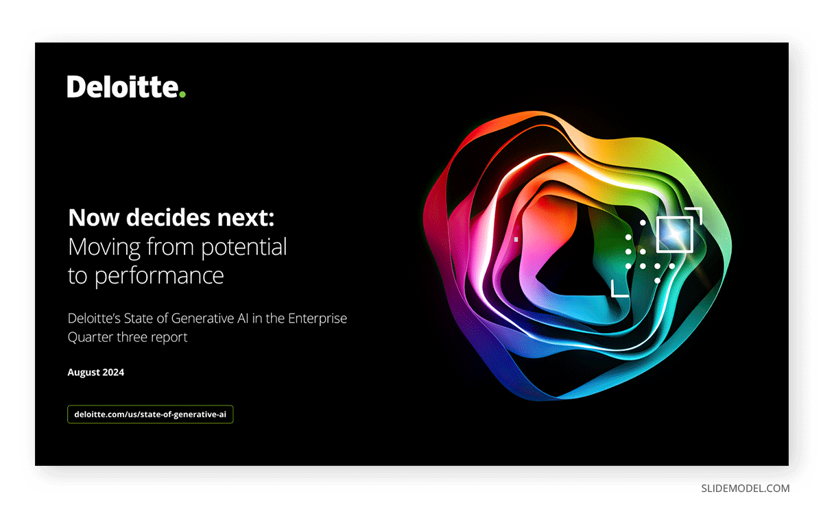
Key Components of a Deloitte Title Slide
- Presentation Title: The title must clearly indicate the topic or purpose of the presentation. It should be concise yet informative, providing enough context to set expectations for the audience.
- Client or Stakeholder Name: Including the name of the client or stakeholders personalizes the presentation and reinforces its relevance to their needs.
- Project Name or Scope: A brief descriptor of the project’s scope or focus adds specificity, helping the audience understand the context of the discussion.
- Date: The date of the presentation ensures that the content is contextualized within a specific timeline, which is particularly important for ongoing or iterative projects.
- Deloitte Logo and Branding: Including Deloitte’s branding reinforces the firm’s identity and commitment to professionalism. The logo is usually placed strategically in alignment with the firm’s design standards.
- Visual Design Elements: The use of color, typography, and whitespace ensures the slide is visually appealing and aligned with Deloitte PowerPoint templates. Visual elements such as subtle backgrounds or thematic icons may be included to enhance design.
The title slide sets the tone for the entire presentation. As the first slide the audience sees, it carries the weight of creating a positive first impression at the moment of how to start a presentation.
Agenda Slide
The agenda slide is more than just a list of topics; it’s a tool for managing audience expectations and maintaining engagement. Providing a clear structure helps the audience stay focused and anticipate what’s coming next. This is especially important in complex presentations where the audience might struggle to keep track of multiple data points and recommendations.

The sections are presented logically, reflecting the narrative flow of the presentation. For example, a Deloitte presentation might start with context-setting slides before progressing to data analysis and actionable recommendations.
Executive Summary
Think of the executive summary slide as a time-saving item for stakeholders. They reduce the need to delve into the entire slide deck to get an idea of what the presentation is due to be about, giving a high-level overview of the key aspects of the talk. This enables decision-makers to quickly understand the scope, findings, and – sometimes – recommended actions.
Key Components of a Deloitte Executive Summary Slide
- Objective or Problem Statement: This section concisely outlines the purpose of the presentation. Whether it’s to address a business challenge, present strategic insights, or recommend solutions, the objective sets the stage for the rest of the summary.
- Key Findings: These are the most important insights derived from the analysis. This component often includes brief data points or trends presented as bullet points for quick readability.
- Recommendations: The executive summary highlights the proposed solutions or actions, ensuring they are concise yet impactful.
- Value Proposition: The value proposition is a statement of how the recommendations will benefit the stakeholders, such as improving efficiency, reducing costs, or capturing market opportunities.
- Next Steps: The final component briefly overviews the implementation plan or actions required to achieve the proposed outcomes.
Visual aids can support the text and reduce the need for extensive written explanations. They enhance comprehension and break up monotony from the slides. As in any other case, the executive summary needs to be tailored to the target audience’s priorities; for instance, a CFO might prefer focusing on financial outcomes, whereas an operations leader may prioritize efficiency metrics.
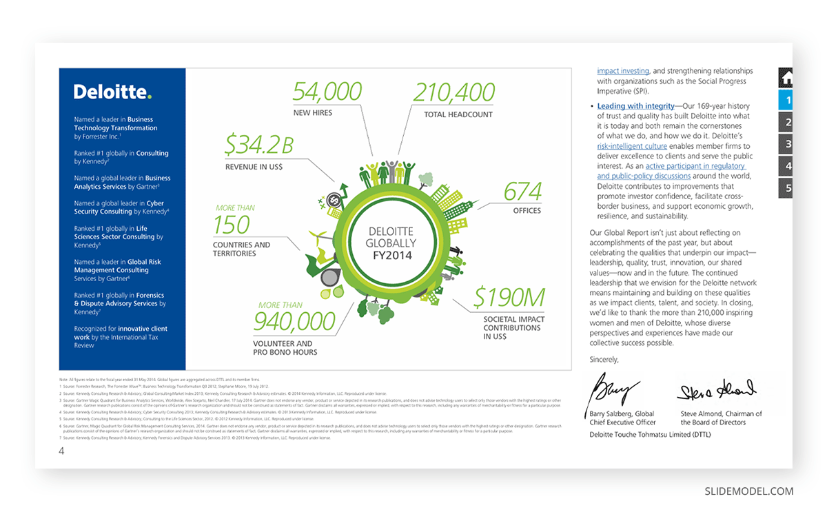
Legal frameworks, as are the abbreviations, are typically added in this section as ground-leveling elements for people unfamiliar with some aspects of the document.
For senior executives, the summary serves as a decision-making tool. Distilling the most relevant insights and recommendations into a single slide enables them to assess the presentation’s value and decide whether to explore the details further.
Background or Context Slides
These slides provide the necessary groundwork for the presentation, ensuring all stakeholders understand the problem and its context. Without this shared foundation, subsequent presentation sections may lack clarity or relevance. They act as a bridge to the gap between the executive summary and the proposed solutions.
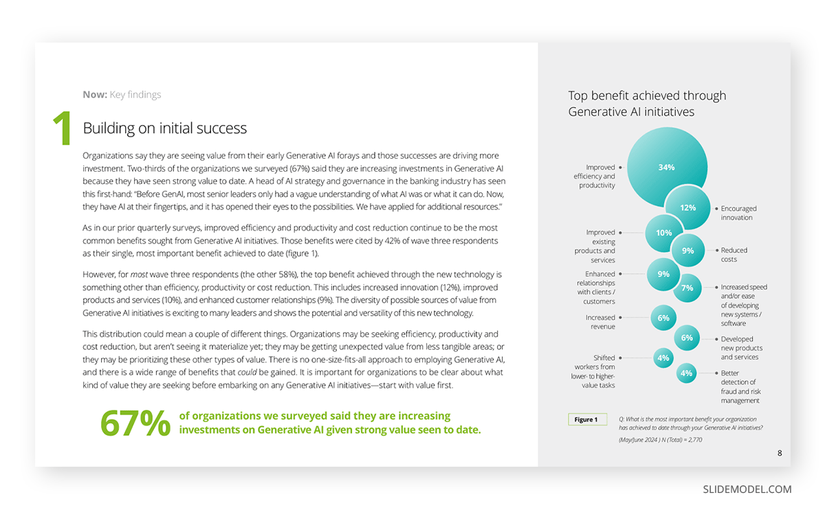
Key Components of Deloitte Background or Context Slides
- Problem Statement: A concise description of the issue or challenge being addressed. This section outlines the key pain points or gaps that require resolution, ensuring the audience understands the topic’s significance.
- Objectives: Clear articulation of what the presentation aims to achieve. Objectives provide direction and help align stakeholder expectations with the intended outcomes.
- Contextual Information: This includes relevant historical data, industry benchmarks, or situational factors that provide deeper insights into the problem. For example, a slide might include trends in market share, operational inefficiencies, or competitive pressures.
- Stakeholder Impact: Highlighting how the problem affects various stakeholders, such as customers, employees, or shareholders, adds a human dimension to the discussion.
- Visual Data: Charts, graphs, or infographics are often used to make contextual information more digestible. For instance, a timeline might depict the progression of a problem, or a bar chart might illustrate declining performance metrics.
Background slides also demonstrate thoroughness and preparation. By addressing the underlying causes of a problem and its broader implications, they establish the presenter’s credibility and create a compelling case for action.
Approach or Methodology Slides
Presenters cannot prove transparency when exposing their ideas to an audience without exposing the methodology used to analyze data, develop strategies, or solve problems. They demonstrate that the recommendations are not arbitrary but result from a structured and evidence-based process. This transparency is crucial in fostering trust for audiences such as senior executives or external stakeholders.
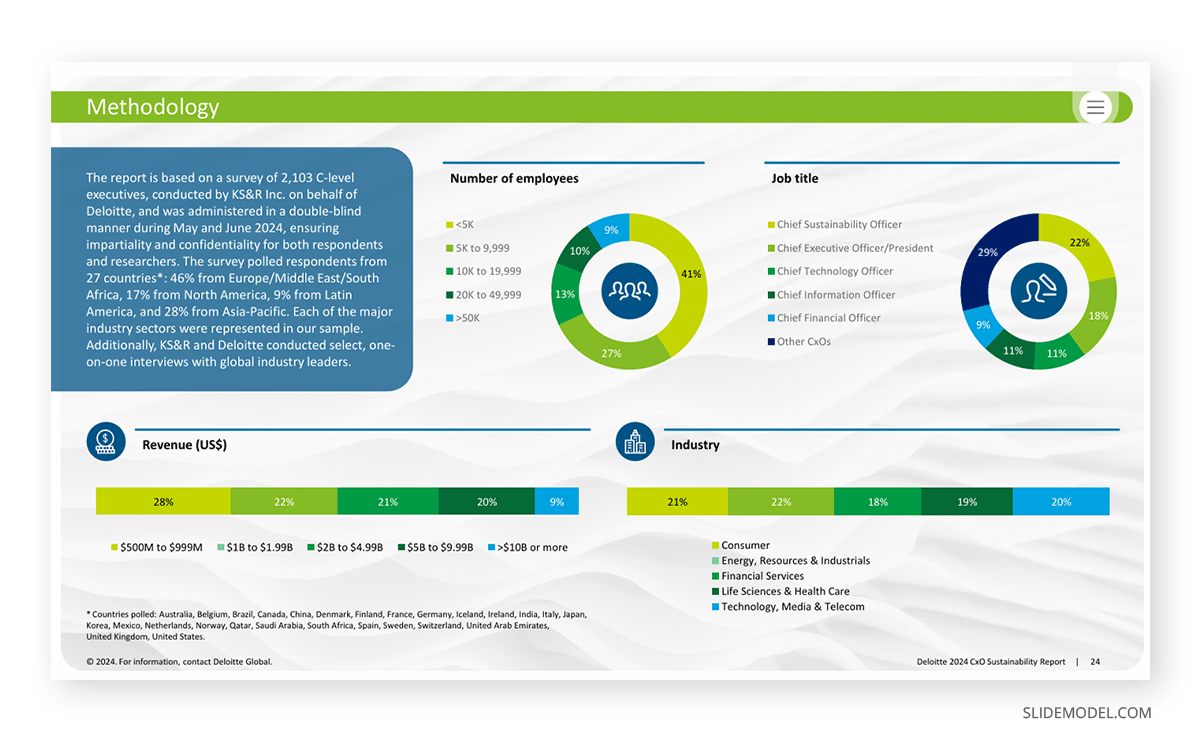
Key Components of Deloitte Approach or Methodology Slides
- Detailed Steps: Break down the methodology into clearly defined steps. Use concise descriptions for each step to explain what was done and why it was necessary. For instance, steps might include “Identifying Key Performance Indicators (KPIs),” “Applying the Pyramid Principle,” or “Developing a SWOT Analysis.”
- Visual Elements: Incorporate visuals such as flowcharts, timelines, or diagrams to illustrate the process. For example, a circular diagram could represent an iterative approach, while a timeline might demonstrate the sequence of tasks over time.
- Tools and Frameworks Used: Highlight any specific tools, technologies, or frameworks employed during the process. Examples might include “Data analysis conducted using Power BI” or “Insights generated using the 5 Forces Framework.” This demonstrates the use of industry-leading methods.
Approach or methodology slides are not just about explaining what was done; they are about showcasing the rigor and thoughtfulness behind the work. In some cases, the methodology is summarized in the appendix slides, and sections relevant to the audience are mixed into the analysis slides to make the presentation more concise.
Analysis Slides
Every consulting report presentation requires clear analysis slides. Data-driven insights and findings are presented in a structured and impactful format, transforming complex data into actionable insights that guide decision-making. They demonstrate how the issue was examined, what trends or anomalies were identified, and how these findings will inform the next steps.
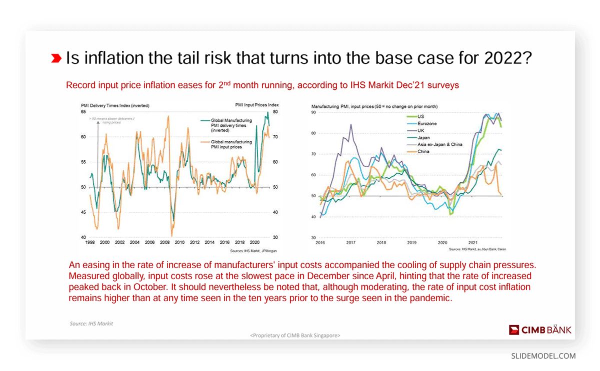
Key Components of a Deloitte Analysis Slide
- Title and Key Insight: The slide begins with a concise and informative title that captures the essence of the analysis. A supporting headline or subtext can provide additional context or highlight a critical takeaway, such as “67% of organizations we surveyed said they are increasing investments on Generative AI given strong value seen to date.”
- Visual Data Representation: Charts, graphs, and tables are integral to analysis slides. Common visuals include:
- Bar Charts to show comparisons between categories.
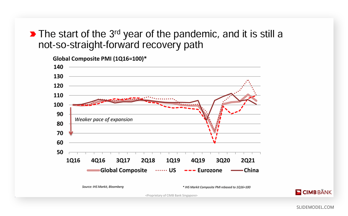
- Line Charts to illustrate trends over time.
- Pie Charts to depict proportions or percentages.
- Heat Maps for identifying geographical or categorical hotspots. Deloitte ensures that visuals are clean, simple, and aligned with its branding, using professional colors and design elements.
- Key Metrics and Data Points: Highlight specific data points that support the overall narrative. For example, a slide analyzing customer satisfaction might include metrics like Net Promoter Score (NPS), survey response rates, and year-over-year changes in satisfaction levels.
- Contextual Explanations: Provide brief textual explanations to clarify the significance of the data. For instance, below is a line graph depicting a declining sales trend, including annotations such as “Sales declined by 20% following the introduction of a competitor’s new product.”
- Callouts or Highlights: Use callouts to draw attention to critical findings within the data visualization. For example, a red circle might emphasize a significant dip in performance, while a green arrow could highlight a positive trend.
Next Steps Slides
We can consider these slides as the action plan of any Deloitte presentation. They outline how Deloitte’s proposed solutions will be implemented to achieve the desired outcomes, and are characterized by clarity, structured timelines, and detailed activities that align with the client’s goals. Below is an in-depth look at the key elements commonly found in these slides and their role in driving the presentation’s objectives.
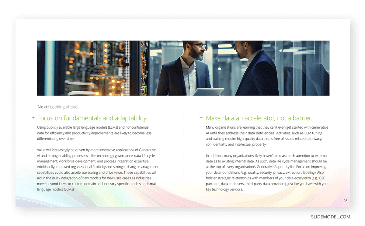
Structure of the Deloitte Implementation Plan Slides
- Overview and Objectives: The first slide in the Implementation Plan section often summarizes the objectives of the implementation. This slide outlines the primary goals of the execution process, ensuring alignment with the project’s overarching strategy. Key components might include:
- Problem statement recap
- Goals and deliverables
- Success metrics or KPIs
- Implementation Timeline: The timeline slide is a critical visual tool, typically represented through a Gantt chart or phased roadmap. This slide lays out the sequential stages of the plan, which often include:
- Planning and Preparation
- Execution
- Monitoring and Feedback
- Handover and Post-Implementation Review
- Timeframes, milestones, and dependencies are detailed to ensure all stakeholders understand the progression.
- Workstreams and Activities: A common feature is a breakdown of workstreams, each linked to specific activities, owners, and deliverables. This slide ensures a division of responsibilities, highlighting the importance of collaboration between the Deloitte team and client staff. Typical workstreams might include:
- Change management
- Technology implementation
- Policy or process redesign
- Communication and training plans
- Resource Allocation: The implementation plan must address the resources—both human and financial—necessary for execution. This slide might list:
- Team structures (e.g., Deloitte consultants, client leads)
- Skill sets required for each phase
- Budget estimates for technology, training, and operational shifts
- Risk Management Plan: Successful implementation hinges on proactive risk management. Deloitte often includes a slide that identifies potential risks to the project, such as resistance to change, technological setbacks, or resource constraints. It outlines mitigation strategies and assigns ownership for addressing these risks.
- Monitoring and Evaluation: To ensure success, Deloitte emphasizes ongoing tracking and reporting. Slides may describe:
- Reporting structures
- Tools or dashboards used for monitoring
- Mechanisms for adapting the plan based on real-time feedback
The risk & mitigation slides listed inside the implementation plan phase categorize risk for clarity, commonly identifying the following categories:
- Strategic Risks: Misalignment of project objectives with organizational goals.
- Operational Risks: Inefficiencies or gaps in processes or resource availability.
- Technological Risks: Issues related to system integration, data migration, or IT infrastructure.
- Financial Risks: Budget overruns, unexpected costs, or funding limitations.
- Change Management Risks: Resistance from stakeholders or lack of engagement.
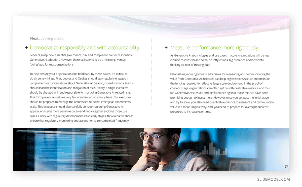
Once that stage is completed, a risk assessment analysis is presented to discuss the likelihood of occurrence, and potential impact of these risk factors. Each risk is paired with a corresponding mitigation strategy, so all bases are covered to ensure maximum efficiency. You can learn more about how to present risk in a presentation by checking the following articles:
Conclusion Slide
Consultants must end a presentation with a lasting impact that inspires action. This is the final moment to reinforce key messages and align stakeholders on the path forward. Do not consider it a mere repetition of earlier content but a strategic reframing to remind stakeholders of the “why” behind the presentation and why it matters for their organization.
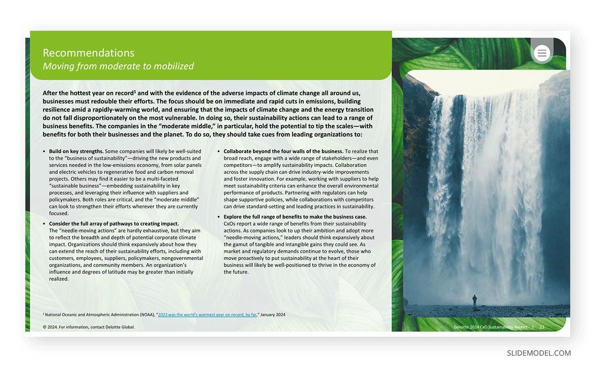
Structure of a Deloitte Conclusion Slide
- Recap of Key Insights: The slide often begins with a concise recap of the top 2-3 findings that set the foundation for the recommended actions. These insights are presented in bullet points or a short summary, ensuring clarity and relevance to the client’s objectives.
- For example: “Analysis revealed a 20% inefficiency in operational workflows, indicating a significant opportunity for cost reduction.”
- Summary of Recommendations: Next, the slide reiterates the core recommendations, highlighting their alignment with the client’s strategic goals. These might include process improvements, technology implementations, organizational changes, or financial adjustments.
- The focus remains on outcomes, ensuring stakeholders see the tangible benefits of adopting the proposed solutions.
- Next Steps: The most critical component of the Conclusion slide is a reminder of the action plan. It provides a clear outline of what happens next, ensuring momentum is maintained post-presentation. This section typically includes:
- Immediate actions for the client (e.g., scheduling workshops, reviewing resource allocation).
- Deloitte’s role in subsequent phases (e.g., implementation support, training, ongoing monitoring).
- Suggested timelines or milestones for the next steps.
- Closing Statement: The slide concludes with a strong, forward-looking statement that underscores Deloitte’s commitment to delivering results.
Acknowledgments are typically included in this section, which can be presented as a simple slide containing the key members behind the project, their photos, roles, and email for contact. Alternatively, an org chart slide can be used as well.

Appendix slides follow up next, including the endnotes for the presentation, disclaimers, and, in some cases, the methodology used to conduct the study. Typically, they don’t take more than 1-2 slides except for large documents.
Common Deloitte Presentation Mistakes
Although the Deloitte presentation framework has evolved over the past decades, we can still prevent some identifiable mistakes to connect with the audience in a much clearer format.
Overloading Slides with Information
Slide decks from the past decade commonly included dense text walls, abusing bullets, and condensing reports into PPT format. Although some may find it useful, with the reduced attention span reported by scientists these days, it can be a detractor to retain the audience’s interest.
Rather than populating your slides with content, opt for presentation handouts that can expand the concepts you’re introducing to the attendees. It is an efficient method to deliver important data and avoiding death by PowerPoint.
Overemphasis on Data Without Insights
Presenting data without clear explanations or actionable insights can confuse stakeholders. The audience needs to understand how the data supports the overall narrative or recommendations.
Ambiguous Recommendations
Providing vague or high-level suggestions without clear, actionable next steps undermines the value of the presentation. Clients expect specificity and feasibility in recommendations.
Poor Slide Design and Readability
Using cluttered visuals, inconsistent formatting, or illegible text sizes detracts from the professionalism of the presentation. Deloitte presentations should adhere to a clean and cohesive design. Abusive text use can also affect readability, even if you use bullets to present the information.
Lack of Consistency in Design
Inconsistent fonts, colors, or formatting across slides can give the impression of a hastily prepared presentation, affecting the audience’s trust in its quality.
FAQs
What are the key design principles for a Deloitte presentation?
The design should be clean, professional, and consistent. Slides should use Deloitte’s branded templates, a limited color palette, legible fonts, and avoid clutter by balancing text and visuals.
How does Deloitte make presentations visually engaging?
Data is effectively represented using visuals such as charts, graphs, and infographics. Slides are kept simple, with one main idea per slide, supported by concise text and high-quality graphics.
How much text should be on each slide?
Slides should avoid heavy text blocks. Bullet points, concise language, and whitespace ensure readability and allow key points to stand out.
What tools does Deloitte use to create presentations?
PowerPoint is the primary tool for presentation design, often supplemented with Excel for data analysis and Tableau for advanced data visualizations.
How does Deloitte ensure consistency in presentations?
Adhering to Deloitte’s branded templates, using uniform fonts, colors, and formatting across all slides, and strictly following design guidelines maintain consistency and professionalism.
What types of visuals are commonly used in Deloitte presentations?
Common visuals include bar and pie charts, Gantt charts for timelines, heat maps for risk analysis, and process flow diagrams. These visuals are designed to simplify complex information.
How does Deloitte handle slide transitions and animations?
Animations are used sparingly and only to enhance clarity, such as revealing points sequentially. Overuse of transitions is avoided to maintain a professional tone.
What makes a strong conclusion slide in a Deloitte presentation?
A strong conclusion slide summarizes key findings, reinforces recommendations, and provides clear next steps. It often includes a call to action and emphasizes Deloitte’s commitment to client success.
How does Deloitte tailor presentations for different audiences?
Presentations are adapted based on the audience’s priorities. For executives, slides focus on high-level insights and strategic implications, while technical details are included for operational teams or as appendices.
What techniques are used in Deloitte presentations to maintain audience engagement?
Deloitte presenters engage the audience through storytelling, clear visuals, and interactive Q&A sessions. They emphasize key takeaways and avoid overly technical jargon unless appropriate.
How are data-heavy slides handled effectively in Deloitte slide decks?
Data is simplified using charts, graphs, and summary points. Key insights are highlighted to ensure the audience understands the relevance without being overwhelmed by raw numbers.
How does Deloitte address audience questions during a presentation?
Presenters are well-prepared for anticipated questions and often reference supporting materials in the appendix. They ensure answers align with the client’s goals and concerns.
What is Deloitte’s approach to designing slide titles?
Slide titles are descriptive and often summarize the key takeaway of the slide. This ensures the audience can quickly grasp the main point at a glance.
How does Deloitte ensure clarity in complex presentations?
Complex topics are broken down into smaller, digestible sections. Supporting visuals, clear headings, and concise language ensure that even technical content is easily understood.
What role does storytelling play in Deloitte presentations?
Storytelling is used to create a compelling narrative, linking findings, recommendations, and outcomes. This approach ensures the audience remains engaged and sees the logical progression of ideas.
How does Deloitte handle time constraints during a presentation?
Key slides are prioritized, and less critical details are moved to the appendix. Presenters focus on delivering the most impactful insights within the available time.
Final Words
Mastering the art of Deloitte-style presentations is crucial for any consultant striving for excellence in client engagements. These presentations are not just about conveying information—they are a reflection of the consultant’s ability to synthesize complex data, deliver actionable insights, and align recommendations with the client’s strategic goals.
However, the evolving nature of business and technology demands that consultants stay up to date with emerging trends in presentation formatting. The growing emphasis on data visualization, the integration of advanced tools like Tableau or Power BI, and the need for presentations to resonate with digitally savvy audiences require continuous refinement of this skill set. Additionally, as client expectations shift toward faster, more concise communication, adapting the delivery style without compromising depth is vital.
