
Presentations are an important communication tool in professional and academic environments. Effective slide design is not merely about aesthetics; it’s about enhancing comprehension, engagement, and retention of information. Each type of slide serves a specific purpose and requires thoughtful consideration in its creation and application. This guide explores twelve common types of slides, explaining their purposes, typical usage scenarios, essential components, and strategies for maximum effectiveness.
Table of Contents
- Title Slide
- Picture Slide
- Text Slide
- Agenda Slide
- Introduction Slide
- Summary Slide
- Thank You Slide
- Quote Slide
- Chart & Diagram Slide
- Table Slide
- Animation & Video Slide
- Call-to-Action Slide
- Final Words
Title Slide
The title slide sets the tone and context for the presentation. It’s our main opportunity to make a strong first impression and establish the speaker’s credibility regarding aesthetics and professionalism.

As the core point in how to start a presentation, the title slide gives a clear indication of the topic, the presenter’s identity, and relevant contextual data. A good presentation title serves two purposes: to be practical and creative. Let’s see which are the components of the title slide.
- Main Title: This is the focal point of the slide. It should be concise yet descriptive enough to clearly explain the presentation’s focus. The font size should be large enough to be readable from the back of the room.
- Subtitle: If necessary, provide additional clarification or a more detailed descriptor of the presentation’s scope.
- Presenter’s Name and Details: Includes full name, job title, and affiliation. Positioned for easy visibility but without overshadowing the main title.
- Date and Venue: These are important for context, especially if the presentation might be referenced later or is part of a larger conference or seminar.
- Design Elements: The layout should reflect corporate or personal branding, using logos, specific color schemes, and fonts. It should also be clean and not cluttered, maintaining a professional appearance.
The title slide should be crafted around a concept that is valid for different types of slides: less is more. Maintain a high contrast between the text and the background, but don’t overdo it; otherwise, you will affect the readability of your slides. If you’re using a background image, ensure it does not distract the audience’s attention from your speech. Alternatively, we can add a fade-in or morph effect for the text to create neat transitions and grab the audience’s attention without being distracting.
For more information, read our tutorial on how to add title slides in PowerPoint.
Picture Slide
We call a picture slide to those who use strong visual imagery to aid in storytelling presentations, making concepts tangible, providing an emotional impact, or those who serve to illustrate case studies.
Picture slides are mainly used to illustrate complex concepts, but they are also an element that can add dynamism to a presentation, making the overall presentation less “boring” than just sticking to data and tables. The components of picture slides are:
- High-Quality Image: The image should dominate the slide and be directly relevant to the accompanying content. It should be sharp and have appropriate rights for use – meaning we cannot claim an image from a professional photographer as it is. Either work with royalty-free pictures or with your own images (or work your way around Midjourney to create AI-images).
- Minimal Text: If text is necessary, it should not compete with the image. Placement should be thoughtful, ensuring that the image remains the focus. In some particular scenarios, text can be the image, as we see in portraits made out of words.
- Caption: Optional, but can help provide context or cite the source of the image. Also, captions help people with auditory impairments to comprehend the reason why the image is being shown.
Aim to choose images that evoke the emotion you want to convey in your presentation. For an appropriate layout, you can use the rule of thirds for a balanced composition or half-and-half if you are presenting the image alongside relevant written data. Avoid oversaturated images or heavily dramatic black-and-white effects.

Text Slide
We’re all used to text slides. That being said, good design practices regarding text slides don’t consider having huge walls of text with the sole excuse of “delivering information.” Layouts matter. Presenters should stick to a column layout where the information is summarized and arranged using presentation aids to break up the written format monotony and ensure audience engagement.
Text slides can contain the following elements:
- Headline: Clearly states the topic or point of the slide. It should be written in a distinctive type format than the rest of the body text.
- Body Text: Should be organized in short, concise paragraphs. Limit the text to essential information to avoid overwhelming the audience. Take special care when selecting the font for the presentation to ensure legibility.
- Visual References: PowerPoint Icons or tiny graphics can help illustrate points and break up text, enhancing readability and retention.
Always pay attention to legibility. Although bullet points can be helpful in organizing information, some viewers may find them reiterative, like everything is important—hence the reason why we shouldn’t abuse them. You can emphasize words or important phrases with bold, italics, or color changes. Ensure that the text-to-whitespace balance is accurate to prevent crowded slides.
Agenda Slide
After delivering the title slide, a good practice is to disclose the structure of the topics to be presented. This is where agenda slides are incredibly handy. They help the audience manage their expectations from the presentation and also structure the presentation’s logical flow. As a tool, they are useful in lengthy business presentations or academic presentations in which presenters review the concepts in the format of presentation handouts (or directly by checking the slide deck if it’s facilitated by the event’s organizers).
Agenda slides are usually built out of these components:
- List of Topics: Clearly enumerated or bulleted, each representing a key section of the presentation. They can list or not the slide number in which they are shown.
- Timings: Optional, but it can be helpful to indicate how long each section is expected to last.
- Progress Indicator: Visual elements like checkmarks or arrows can show what has been covered and what remains to be done.
Using distinctive headings can keep the slide clean. If we use hyperlinks in PowerPoint for our agenda slide, we can mention them during the speech so there are no abrupt jumps between slides.
Introduction Slide
The introduction slide is designed to provide a background or context for the topic presented, delivering the key concepts, theories, or frameworks required to understand the rest of the presentation.

The introduction slide is placed right after the agenda slide. After the concepts of the introduction slide are delivered, a smooth transition can direct the presentation’s flow toward the core concepts of the presentation. In terms of the introduction slide’s components, we can count:
- Key Concepts: Briefly introduce and define critical concepts or terms that will be recurrent throughout the presentation.
- Context Setting: Provide any necessary historical, social, or academic context that frames the topic appropriately.
- Objectives: Clearly outline what the presentation aims to achieve, helping to set the audience’s expectations about the takeaways.
- Engaging Visuals: Relevant images, presentation icons, PPT visuals or brief animations can help highlight important elements and make the slide more engaging.
In general lines, the introduction slide should have visual elements but not be overwhelming for the audience. The visuals must not distract, and we cannot use bold color combinations that take the focus away from the message. Using diagrams can also help to present key concepts effectively.
Summary Slide
At the final stages of a presentation, we can use the summary slide to review all the key points discussed throughout the presentation. It’s typically placed before the closing remarks, “thank you” slide, or Q&A session. Summary slides help recap the information presented, making it easier to process the key takeaways.
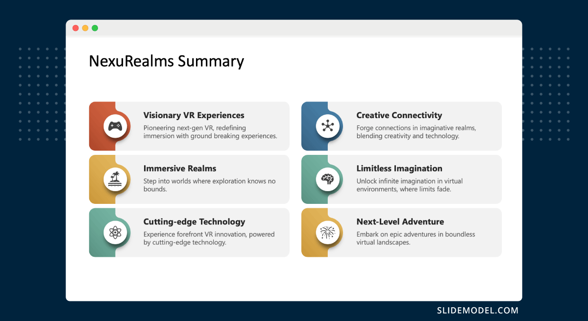
We can count these elements in a summary slide:
- Key Points: Summarize the main points covered in a clear, easy-to-read format.
- Visual Recap: Use simple graphics, charts, or callouts to represent significant data or conclusions visually.
- Concluding Remark: A sentence or two that encapsulates the overarching message or conclusion of the presentation.
Use consistent styling with the earlier slides for a cohesive aesthetic. You can apply levels of hierarchy to the concepts summarized through color or size variations in text.
Thank You Slide
When preparing for how to end a presentation, the thank you slide is a formal conclusion format. It is always the last slide available in the presentation, and it offers a moment to express gratitude to the audience for their attention, time, and participation. Let’s review which elements make a successful thank you slide:
- Thank You Note: A simple, clear expression of gratitude. It doesn’t require fancy graphics.
- Presenter’s Contact Information: Include an email address, phone number, or social media handles for further communication.
- Invitation for Questions: A prompt that encourages the audience to engage in discussion or ask questions about the presentation.

The transition between the thank you slide and the questions and answers session has to be smooth. Therefore, it’s vital to put an invitation to questions rather than just signaling the slide as the conclusion. A subtle background that follows the slide deck’s aesthetic is always a plus.
Quote Slide
Quote slides integrate wisdom, authority, or inspiration from well-known or respected sources into your presentation. They can provide powerful support for your arguments or serve as a motivational element within your talk.

This type of PowerPoint slide is ideal for emphasizing a point, sparking reflection, or inspiring the audience. Use them to underscore the relevance of an idea or introduce a shift in the presentation’s focus.
The components of the quote slide are:
- The Quote: Clearly presented and attributed to the speaker or writer. The text should be legible with enough emphasis to stand out.
- Author’s Name and Credentials: Provide context for the quote by including the author’s name and, if relevant, their credentials or why they are an authority on the topic.
- Related Imagery or Background: An image or abstract design that complements the theme of the quote can enhance its impact.
Work with a quote PowerPoint template that effectively highlights the quote through a professional layout. For visibility, a strong contrast must be maintained between the text and the background; therefore, text boxes with backgrounds are commonly used. If using an image, select one that enhances rather than competes with the text.
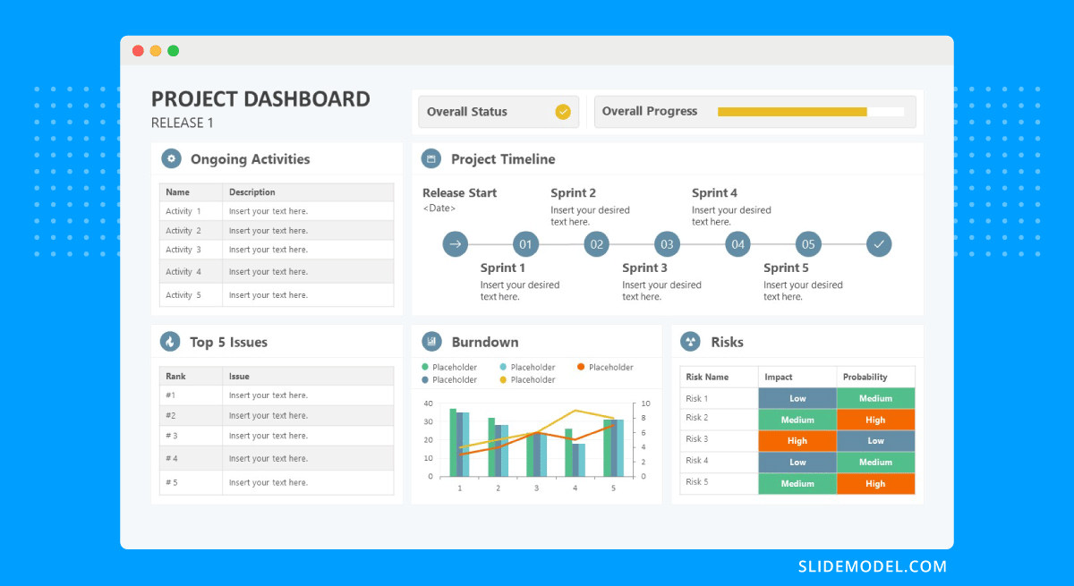
Chart & Diagram Slide
Chart and diagram slides are essential for visually representing data, showing relationships, illustrating processes, and explaining complex systems. They transform numbers and abstract concepts into more digestible graphic formats that enhance audience understanding. We can choose between charts and graphs depending on the kind of data to represent, but diagrams often help to contextualize the raw data for simpler explanations.

Use these slides when discussing data trends, comparisons, workflow processes, or hierarchical structures. They are particularly helpful in business presentations, scientific discussions, and any scenario where visual simplification of complex data is beneficial.
The main components for any chart or diagram slide are:
- Chart or Diagram: Select the appropriate type (e.g., bar chart, pie chart, flowchart, organizational chart) based on the data or process you are illustrating.
- Labels and Legends: Essential for clarity, they help the audience understand what each part of the chart or diagram represents.
- Titles and Subtitles: They clearly indicate what the graphic explains or highlights.
- Annotations or Callouts: Use these to emphasize key points or data within the chart or diagram.
Keep all text in graphs readable and clear. Animated effects can show a progression or illustrate relationships more dynamically. In terms of colors, use contrasting colors for data sets to aid in differentiation.
For more information, check our collection of chart PowerPoint templates.
Table Slide
The other format for representing data in presentation slides is tables. Tables can structure data sets systematically and allow for the presentation of detailed data in a comparative and accessible format. For this reason, they are ideal for showing exact figures and relationships between items.

These slides are especially useful in financial, research, or technical presentations where precise data needs to be compared or detailed specifications have to be presented side by side. We can identify the following elements in table slides:
- Table: Clearly segmented into rows and columns. Headers should be distinct to guide the viewer through the data.
- Row and Column Labels: These should describe the data they contain succinctly and clearly.
- Highlighting: Use shading, bolding, or color-coding to emphasize important data points or trends within the table.
- Footnotes or Source Citations: If the data comes from external sources or requires additional explanation, include this information in a discreet but readable manner.
In design terms, tables should be kept as neat as possible. All text must be legible, with sufficient spacing and an appropriate font size (no less than 11 pt). Colors can be used to differentiate between data sets, but avoid using too many colors, as they can lead to confusion.
For more information, check our collection of PowerPoint table templates.
Animation & Video Slide
Sometimes, images aren’t enough. Video presentations and vector image animations are powerful tools, as they can be planned to enhance storytelling. The average duration depends on the total presentation length, but they shouldn’t take more than 30% of the total allotted time (as otherwise, the attendees are just streaming video rather than viewing a presentation).

When it comes to the components of this type of slide, we can find:
- Embedded Video or Animation: This should be high quality (720p minimum) and directly relevant to the presented content.
- Playback Controls: Clearly visible to allow easy control during the presentation.
- Brief Descriptions or Introductions: Provide context or prepare the audience for what they will see.
As a presenter, your job is to ensure the video or animation is seamlessly integrated into the presentation, both technically and from a design perspective. This means testing the playback functionality multiple times prior to the presentation.
Also, check our collection of animated PowerPoint templates.
Call-to-Action Slide
We conclude this list with a slide to persuade the audience to take specific action following the presentation. Call-to-action slides, or CTA slides, encourage the viewers to take action, such as further conversation, purchasing an item or service, or participating in a project.

It is typically placed at the end of the presentation, following the summary and thank you slide, to motivate immediate action. Its components are:
- Clear Directive: The CTA itself should be straightforward and compelling, such as “Register Now,” “Join Us,” or “Visit Our Website.”
- Reasons to Act: Briefly reiterate the benefits or importance of taking the action, enhancing the persuasive appeal.
- Contact Information or Links: Provide all necessary links or contact details to make it easy for the audience to know how to act.
The CTA slide should feature a design that grabs attention. Use strong, action-oriented language and a large, readable text.
Final Words
As we’ve seen, harnessing the usage of these different types of slides helps us become better presenters, with our message being tailored to specific needs. Create your own slide decks by implementing the guidance listed in this article and customize the slides each time for a unique experience.