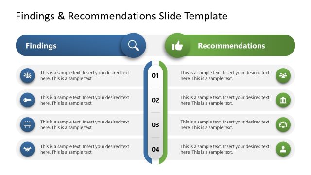
Customize our editable Survey Presentation Template to showcase your market research findings in the stakeholder presentations. Surveys involve identifying people’s conditions or preferences related to a particular thing or process. Companies conduct surveys to find out the interests of their target audience. This helps them tailor their products or services to their target audience and increase their chances of success even before launch. Various government professionals use our survey PPT template to showcase people’s political biases and party affiliations. They can also use the survey template to illustrate public feedback on the ruling party and its activities across the country. Marketing directors use this survey template to communicate the behavior of their target persona and adjust strategies accordingly in their team presentations.
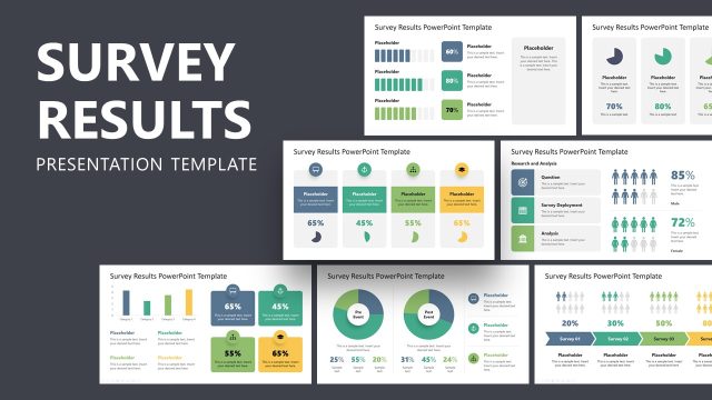
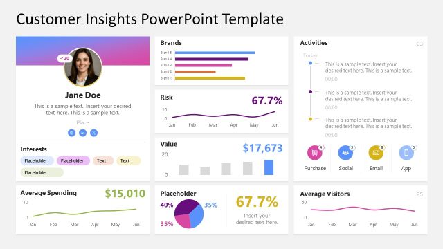
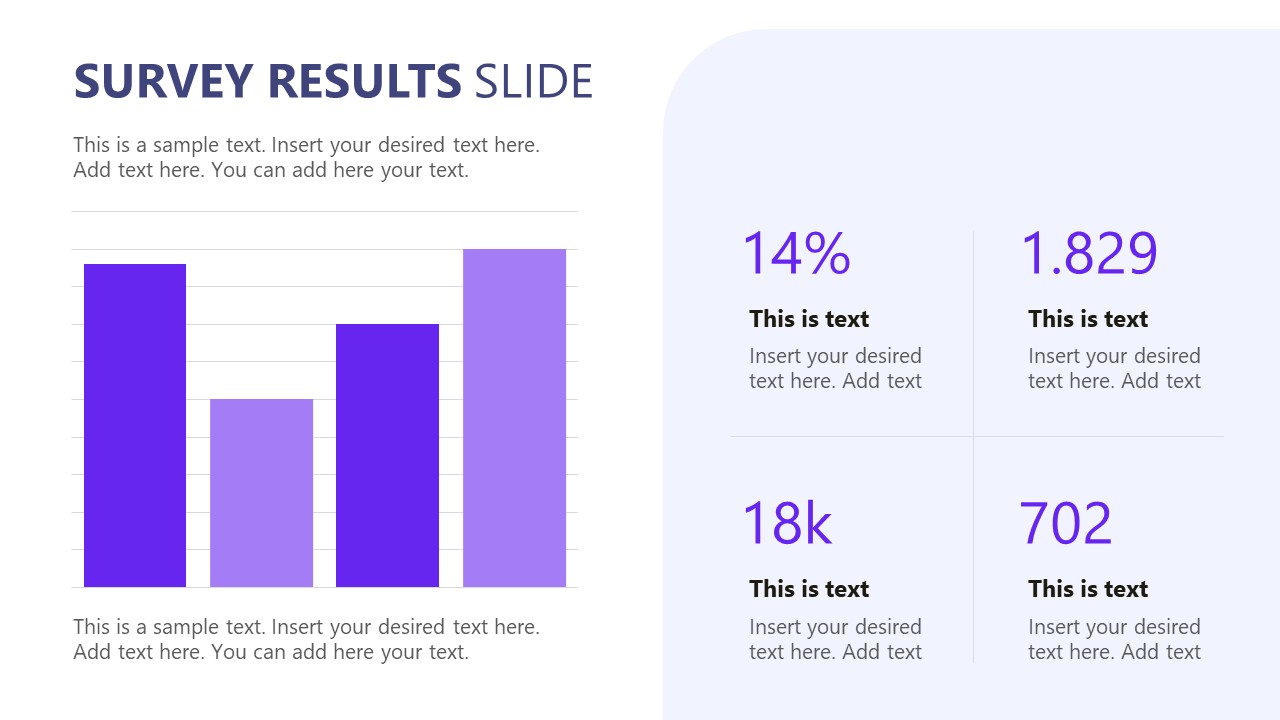
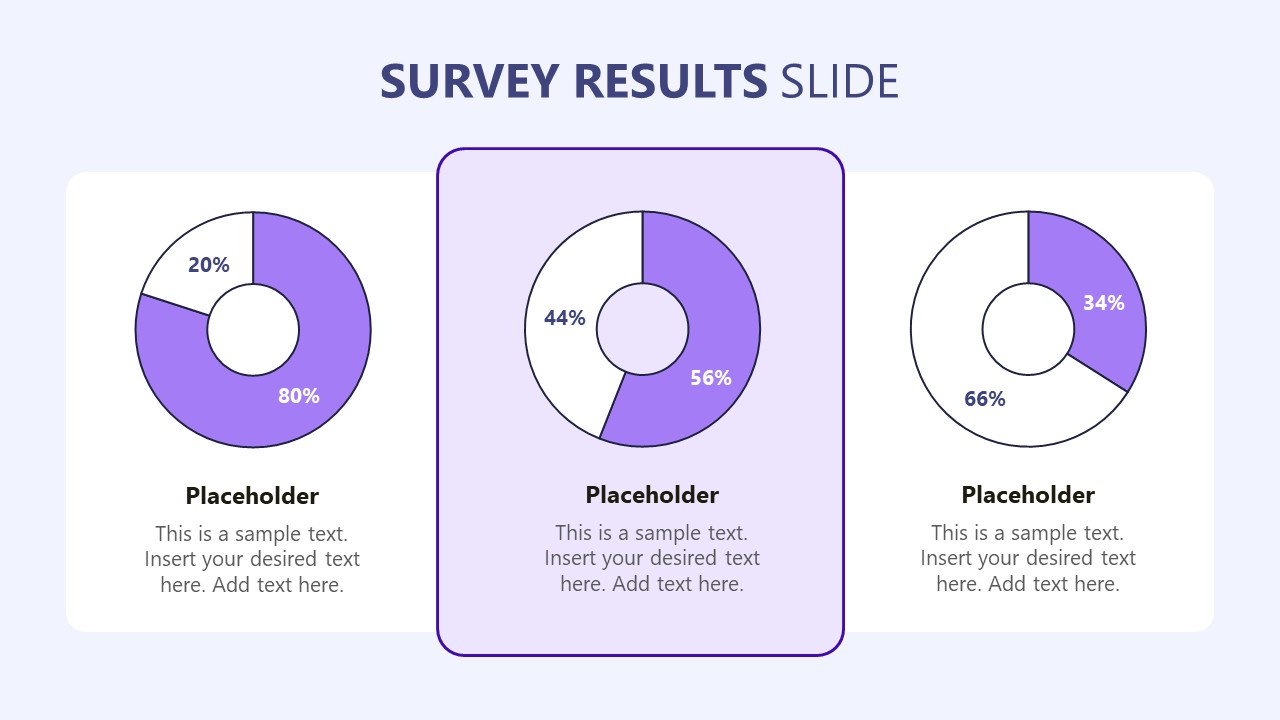
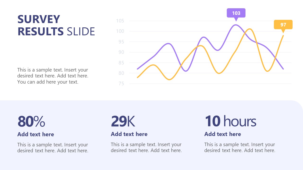
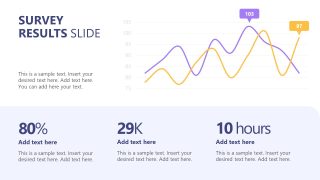
The Survey Presentation Template features multiple slides with simple, modern data visualizations. Data charts, such as pie, bar, and column charts, are useful for summarizing large datasets in a few lines or columns. In strategy presentations, decision-makers can identify patterns and trends in data and improve their action plans. Some slides have line charts, while others use multiple pie charts on a single slide. This is perfect to showcase comparisons between various metrics with clarity. Furthermore, business analysts can modify the types of charts and data points to suit their needs.
In addition, you can try our survey results PPT template or check our collection of editable survey slide templates to present your analysis effectively. Download the survey presentation PPT template for your executive presentations to showcase buyer characteristics to board members.
What’s inside this template
Example presentation scenarios
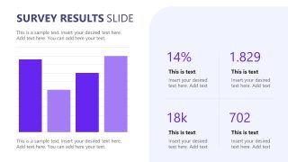
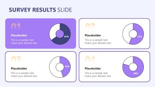
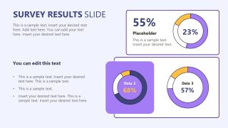
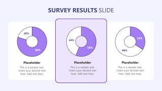
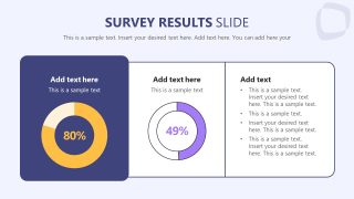
- A market researcher can present customer preference findings to executives using the donut chart grid, pie chart breakdown, and KPI cards to compare response groups.
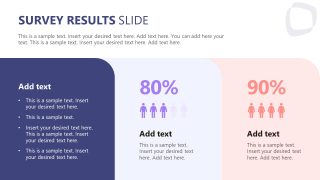
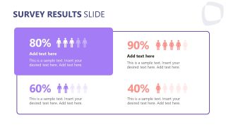
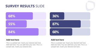
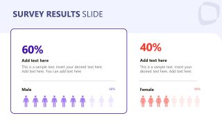
- A marketing director can brief a campaign team on audience behavior using the demographic percentage slides, people icons, and horizontal progress bars to show segment differences.
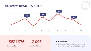
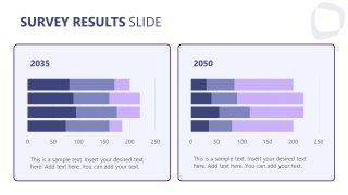
- A public-sector analyst can report polling or citizen feedback to leadership using the line chart trend slides and side-by-side stacked bar charts to show changes over time.
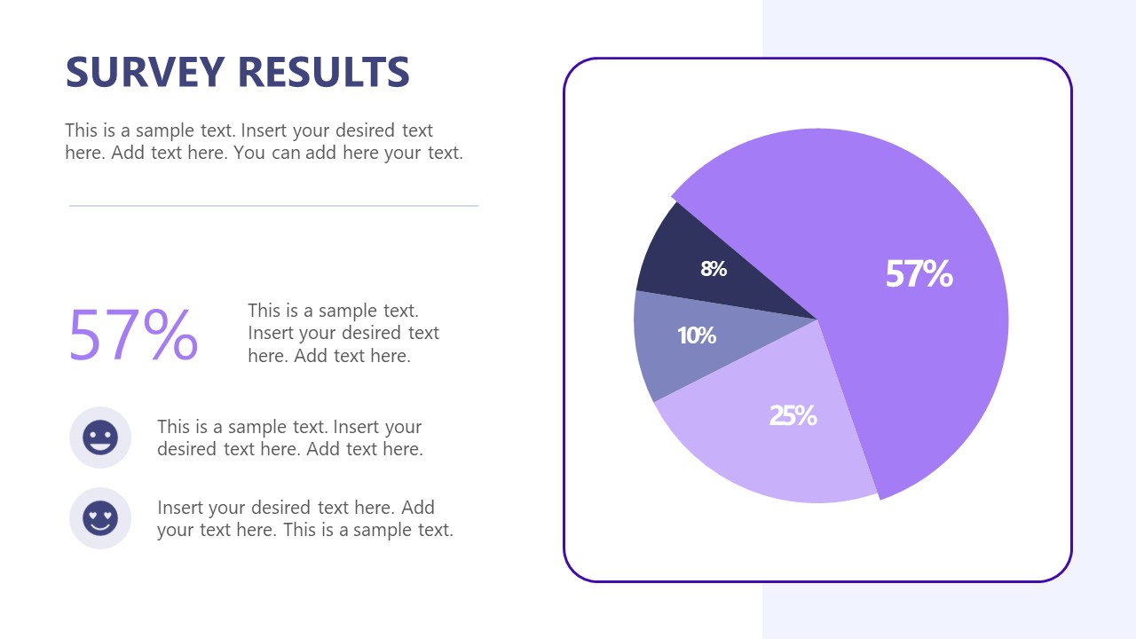
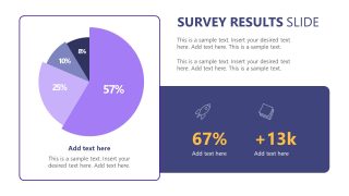
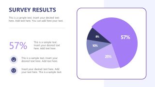
- A product manager can summarize pre-launch survey feedback for decision makers using the large pie chart slide, metric callouts, and bullet interpretation panel.
Features
- 100% editable presentation template
- Compatible with Microsoft PowerPoint
- 16:9 aspect ratio slides
- Scalable vector shapes, icons and illustrations
- AI-Ready for Microsoft Copilot and Claude
- Instant access and download
Frequently asked questions
Q: How should a presenter turn these survey slides into a clear findings story?
A: Start with the cover and a one-sentence research question, then use the bar chart or KPI slide to establish the headline result. Follow with donut or pie slides for category breakdowns, and reserve the line chart or stacked bar comparison for change over time. End each chart slide with one written implication, not only the numeric result.
Q: Who is this survey template best suited for?
A: This template is best for analysts, marketers, consultants, and public-sector presenters who need to summarize survey results for stakeholders who will not read a full research report. The percentage panels, demographic icon slides, and KPI cards work well when the audience needs quick comparisons, segment differences, and decision-oriented takeaways.
Q: Why does the template mix pie charts, donut charts, bars, and people icons?
A: The mix gives each survey question a more suitable visual form. Donut and pie charts show share of responses, horizontal bars make rankings easy to scan, line charts show movement, and people icons make demographic splits more tangible. This prevents every result from looking equal and helps the audience recognize the type of comparison being made.









Survey Presentation Template
15-slide 16:9 presentation template for survey results, pie charts, and demographic data
This is a 15-slide, 16:9 Survey Presentation Template for Microsoft PowerPoint that reports survey findings with a cover slide, bar chart summary, donut chart grids, pie chart breakdowns, line chart trend slides, and demographic percentage panels. It is built for researchers, analysts, marketers, and public-sector presenters; chart data can be edited as an Excel spreadsheet in PowerPoint.
- Category
- Business PowerPoint Templates
- Rating

 Loading...
- Aspect ratio
- 16:9
- Item ID
- 94212-01
- Colors
 Microsoft PowerPoint
  Microsoft Copilot
  Claude for PowerPoint
 Other formats supported
Subscribe today and get immediate
access to download our PowerPoint templates.