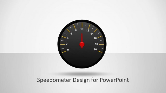
Circular Blue Dashboard PowerPoint Speedometer
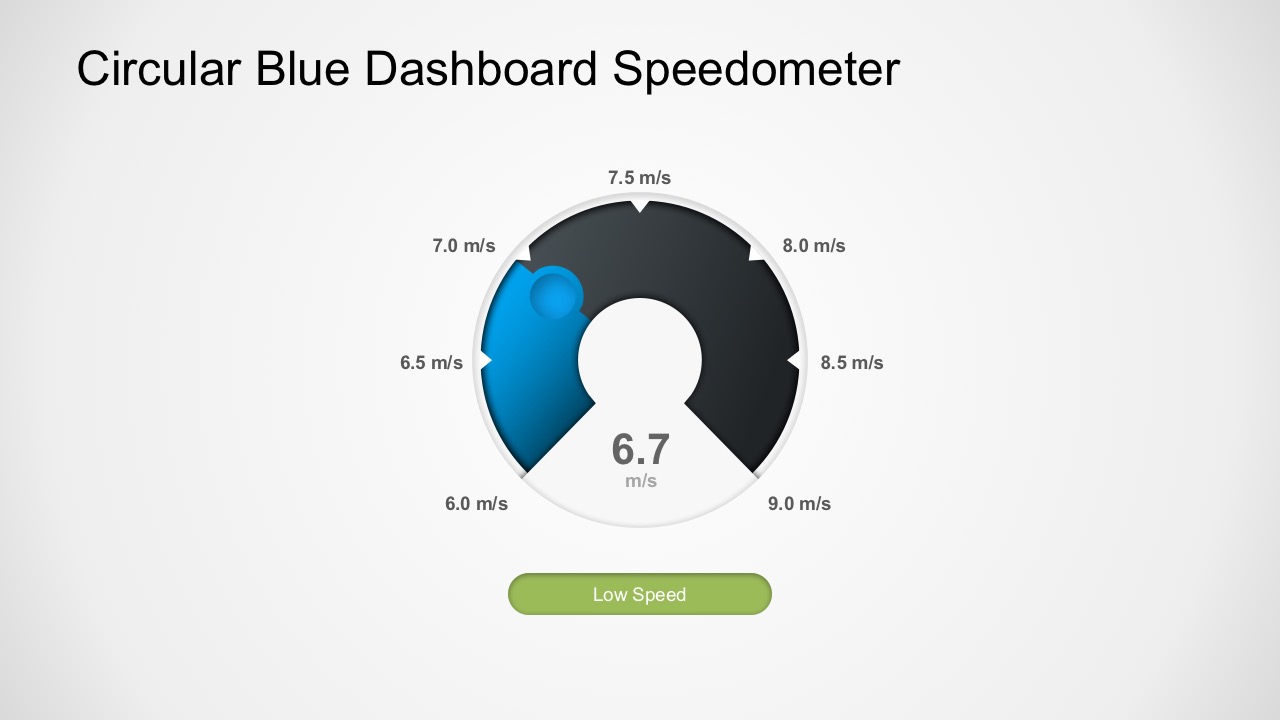
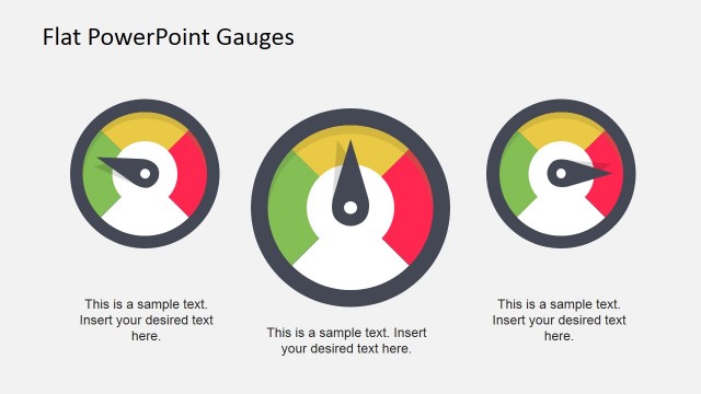
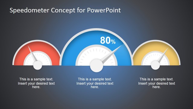
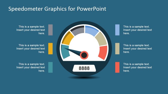
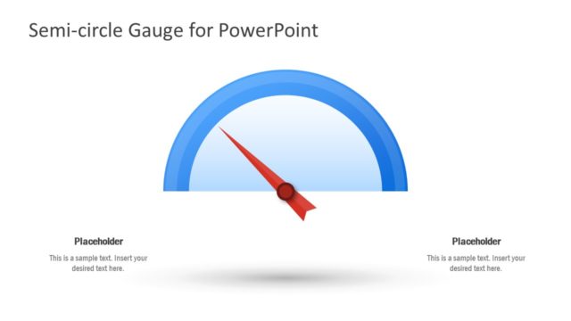
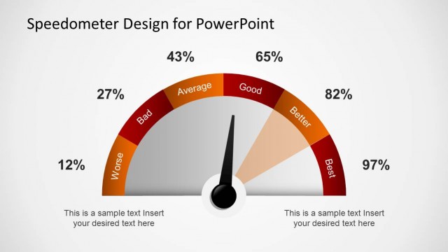
The Circular Blue Dashboard uses speedometer graphics. The PowerPoint template can be very practical and flexible in many ways. For example, the speedometer metaphor can serve as key performance indicators: low, average critical.
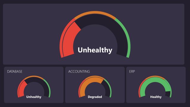
Other than Key Performance Indicators (KPI), the user can use the template to present scenario analysis applying the fact that speedometer gives a graphical measurement of speed in numbers. The user can create similar digital dashboards to visualize sales or production figures. They can easily edit the data inside the dashboard as it uses standard PowerPoint options.
Meanwhile, Project Managers can use the chart to indicate percentage completion. Simply change the figures to percentages. For example, the gauge points at 25% or 100%, depending on the progress accordingly. This even allows quantifiable deadlines. If not, project managers can use the dashboard as Balanced Score Card. Indicating the performance percentage and adding text boxes for possible evaluation. Overall, the simplicity of the speedometer gives a quick overview of the performance ratings.
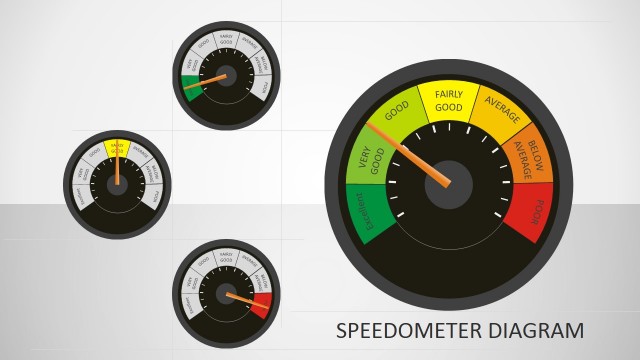
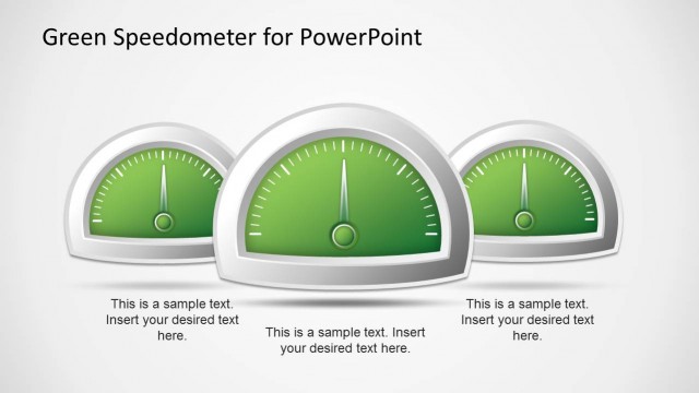
The many uses of Circular Blue Dashboard PowerPoint Speedometer make it a user-go-to template. Additionally, the user may access other slides with gauges and charts dashboard. For example, this Editable Speedometer Gauge PowerPoint Shapes designed in a typical vehicle gauge highlights KPI and more.
