KPI PowerPoint Templates & KPI Slides for Presentations
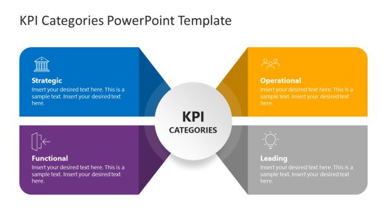
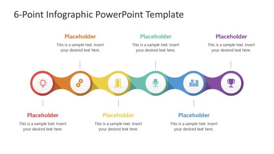
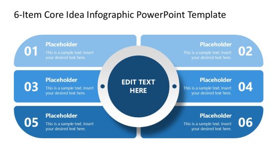
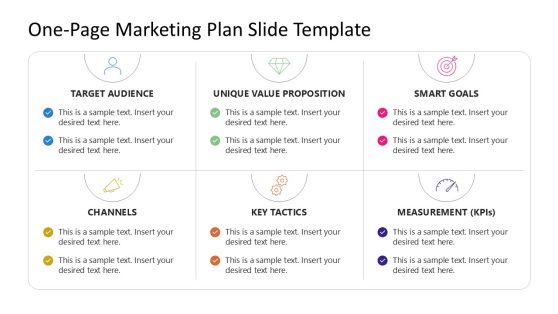
Download PowerPoint presentations to present your KPI or Business Key Performance Indicators in Business Performance PowerPoint presentations. KPI & Metrics slide designs can help you to make focused presentations on metrics that really matter.
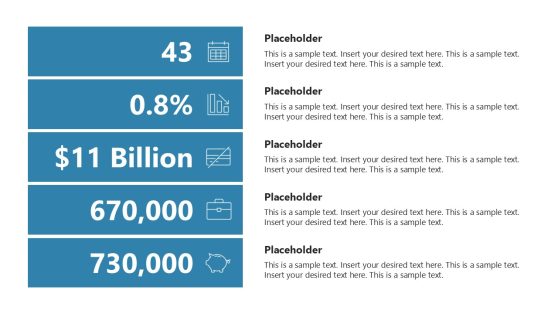
Vertical By The Numbers PowerPoint Template
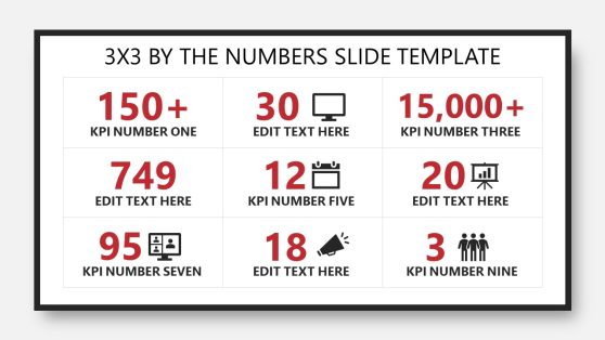
3×3 By The Numbers PowerPoint Template
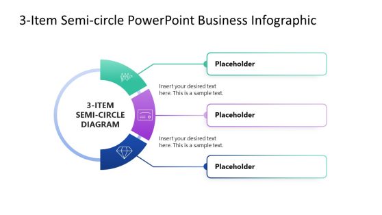
3-Item Semi-circle PowerPoint Template Infographic

Performance Appraisal PowerPoint Template

Modern Business Insights PowerPoint Template
Tracking your KPIs and making adjustments along the way is key to staying efficient when running a business.
Make your life easy by downloading our KPI templates and using them to create a visual representation of your business goals and objectives.
Our KPI templates make it easy to showcase milestones you are looking to achieve within a particular period of time. These milestones could be the volume of sales you want to make, the number of followers you want to get on your social media handles, or the number of leads you want your marketing team to generate.
The cool part is that our KPI PowerPoint templates and slides are highly editable. You can even use them together with our 4-Metric Canvas PowerPoint templates to create a powerful marketing tool to boost your marketing performance.
What does KPI mean?
KPI is an acronym for Key Performance Index. It is an index that measures a set of objectives an individual or a business entity is looking to achieve.
What are examples of KPI?
KPIs can either be long or short-term. A business’s long-term KPIs can be growing sales, reducing product returns, reducing customer complaints, boosting brand awareness, etc.
On the other hand, a short-term KPI can be publishing 5 blog posts a week, replying to customer comments, etc.
What is the main KPI for a business?
The major goal of every business is to make sales and increase profit. If that is not the main KPI, we don’t know what else is.
What should I include in a KPI slide?
In general, stick to just 5 lines of text per slide. The text is important, but the critical item of each slide is the graph data. Quality images guarantee your presentation’s success, as any interested party can easily understand the KPI in discussion with carefully crafted graphs.
Common mistakes in KPI Presentations
These issues refer to common errors in graphic design composition rules. Since we talk about visual presentations for your KPIs, hierarchy matters. Don’t make objects too similar in size, font, and color, as otherwise, the relevant points won’t stand out. Avoid placing elements too close to each other, or you end up with a crowded instead of a neat presentation.
Be sure to add context to the metrics you are sharing, else it’s just data being thrown into a slide.
