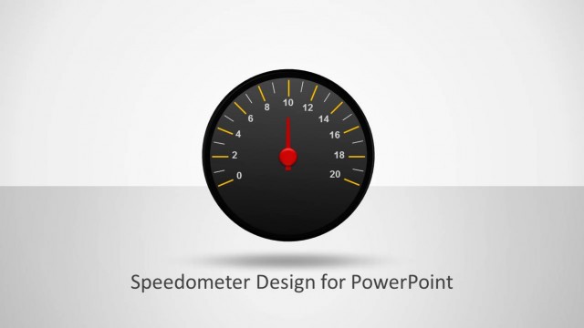
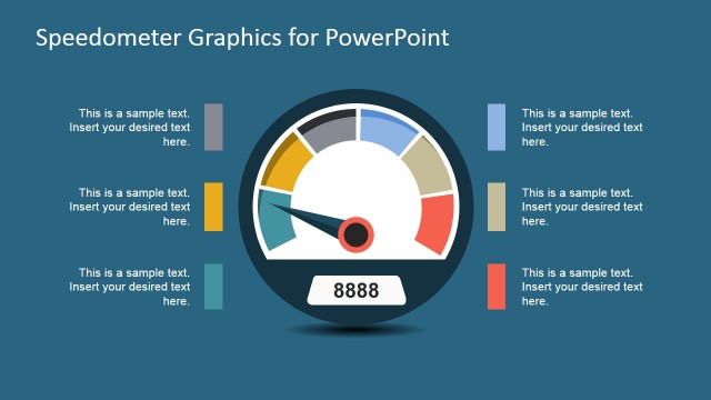
Speedometer Concept for PowerPoint is a fully-editable speedometer design that can be used to make presentation dashboards in PowerPoint.
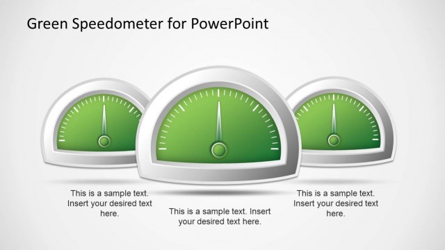
This presentation template contains a nice speedometer illustration with adjustable needle and very creative design. The needle can be adjusting by rotating the needle shape in PowerPoint and colors can be changed via Shape properties menu.
Gauges & Speedometers are useful to make business & performance presentations in PowerPoint and can be added to a presentation dashboard to present KPIs.
What’s inside this template
Example presentation scenarios
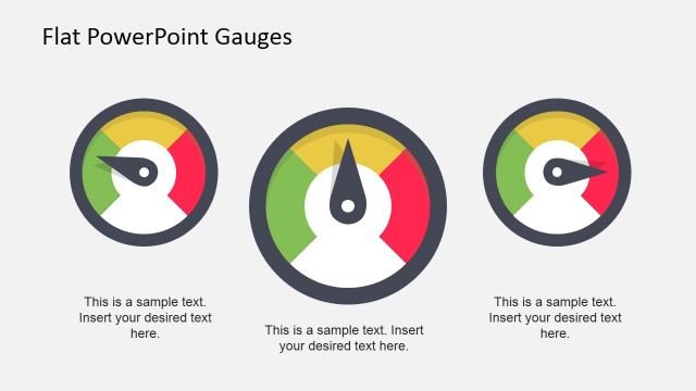
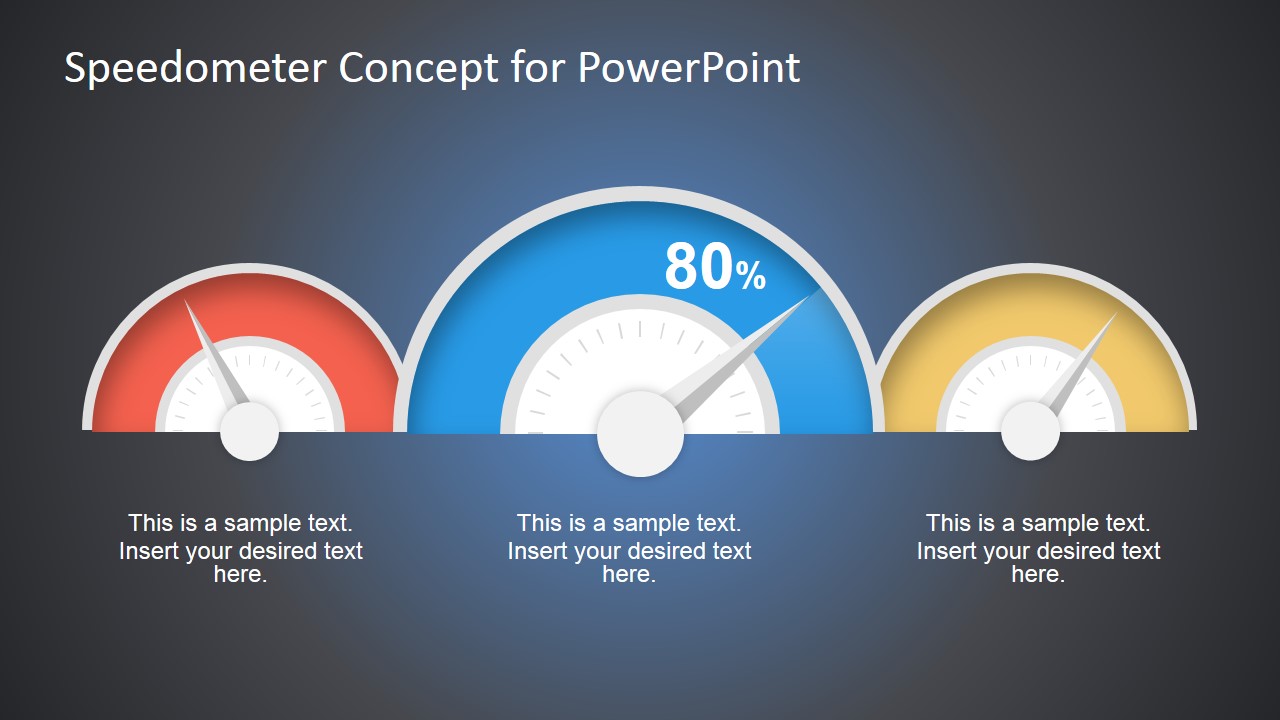
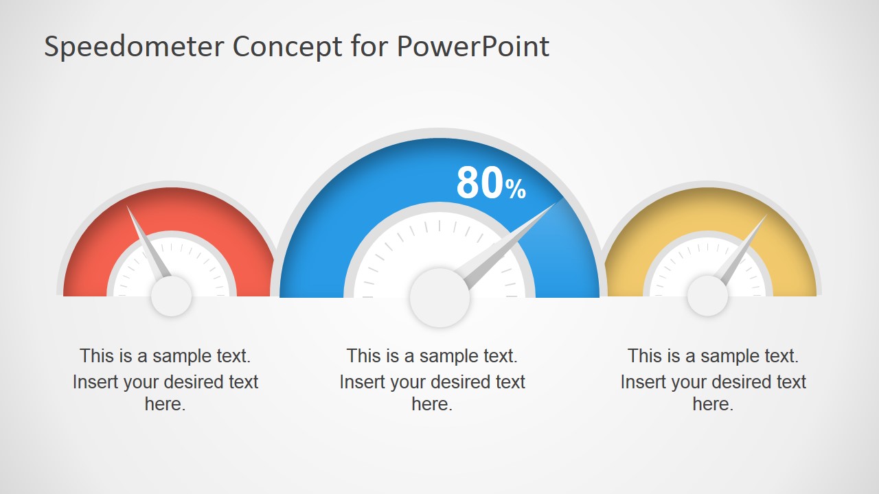
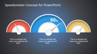
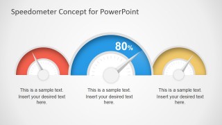
- An operations manager can present service performance to executives by using the three-gauge dashboard to compare red, blue, and yellow KPI categories at a glance.
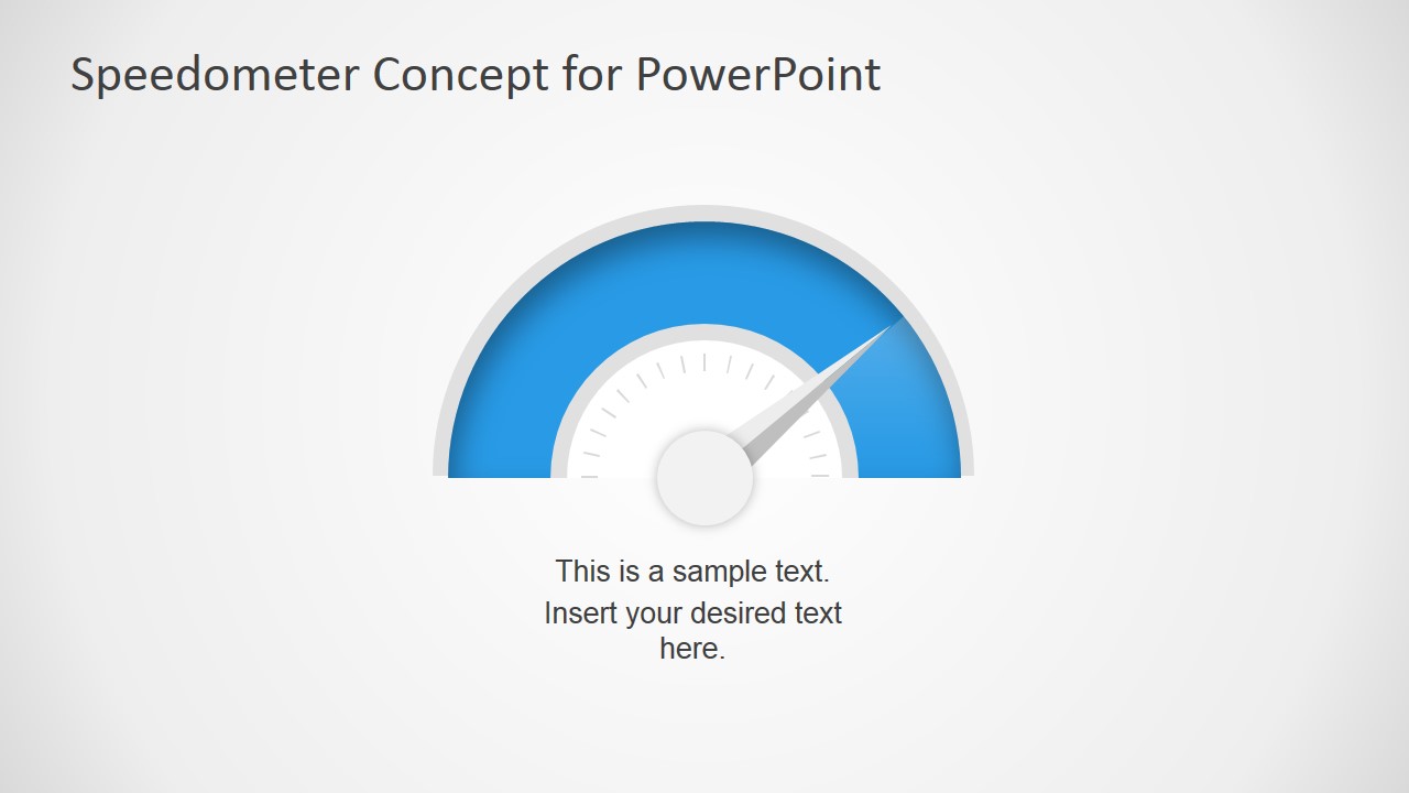
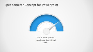
- A sales leader can report progress toward quarterly targets by placing the main revenue metric on the single blue speedometer slide with a short status caption.
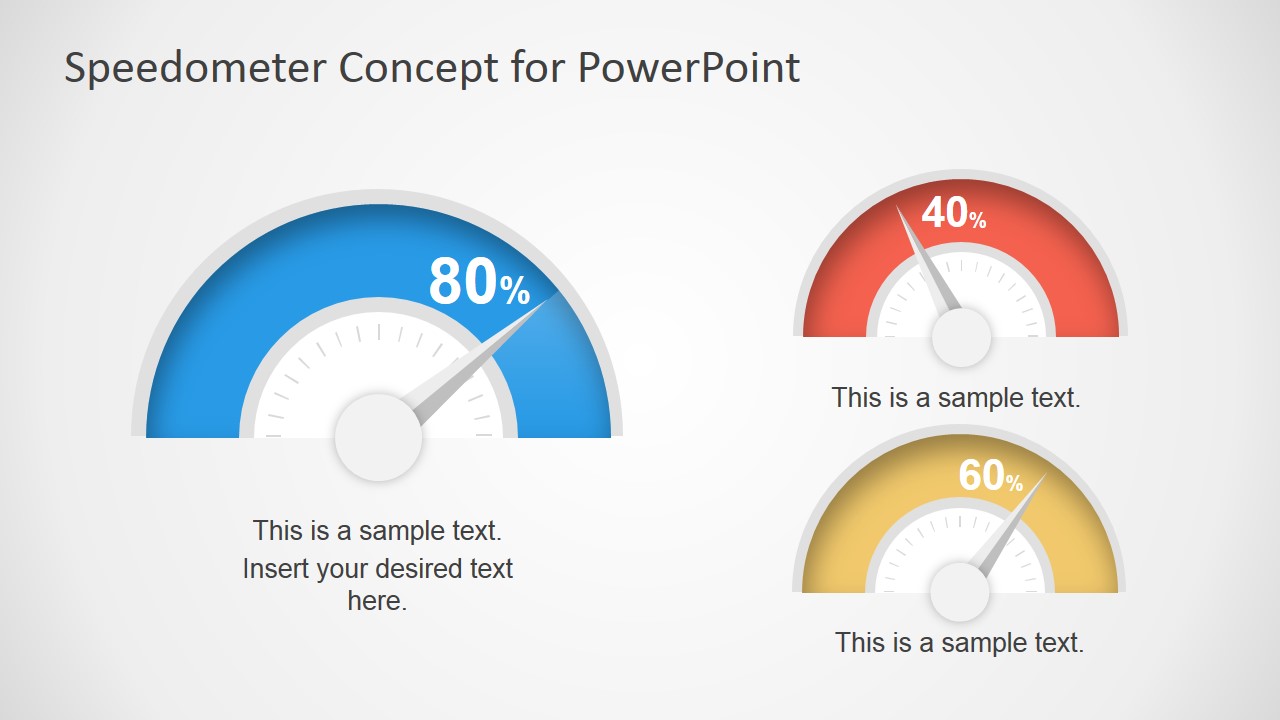
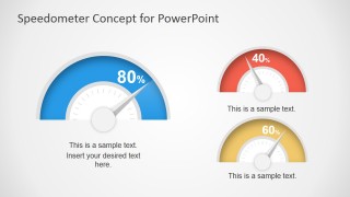
- A project manager can brief sponsors on schedule, cost, and quality health by using the comparative gauge layout with one large priority metric and two supporting gauges.
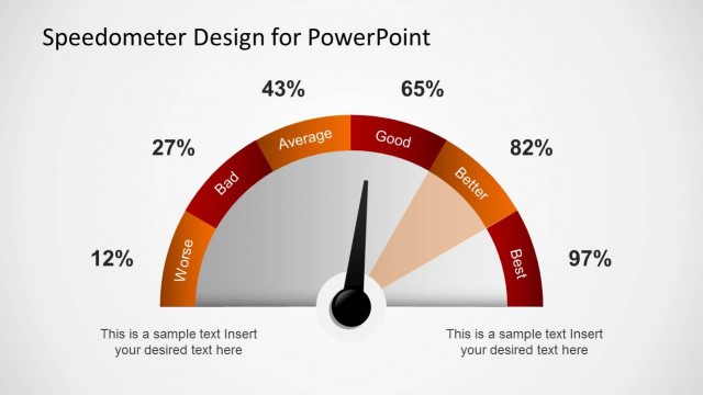
- A business analyst can summarize a dashboard page in a management report by adapting the gauge percentages, needles, and captions to match current performance levels.
Features
- 100% editable presentation template
- Compatible with Microsoft PowerPoint and Google Slides
- 16:9 aspect ratio slides
- Scalable vector shapes, icons and illustrations
- AI-Ready for Microsoft Copilot and Claude
- Instant access and download
Frequently asked questions
Q: How should a presenter use the speedometer gauges without oversimplifying performance?
A: Use each gauge as a status signal, then add a short caption that explains what the reading means and what action follows. Put the most important KPI on the largest blue speedometer and keep supporting metrics in smaller gauges. Avoid crowding the slide with extra numbers unless they clarify the decision.
Q: Who is this speedometer dashboard best suited for?
A: This template fits managers, analysts, and team leads who need to communicate KPI status quickly to a business audience. It is strongest for executive updates, project health reviews, sales performance summaries, and operational dashboards where the main message is whether a metric is below, near, or above target.
Q: Why use a speedometer metaphor for KPI communication?
A: A speedometer gives the audience an immediate visual cue for movement, pressure, and status against a target. The red, blue, and yellow gauges separate performance states faster than a paragraph or dense table. The metaphor works best when the presenter explains the threshold behind each dial position.
Speedometer Concept for PowerPoint Dashboard
4-slide dashboard slide template with editable speedometer gauges for KPI and performance reporting
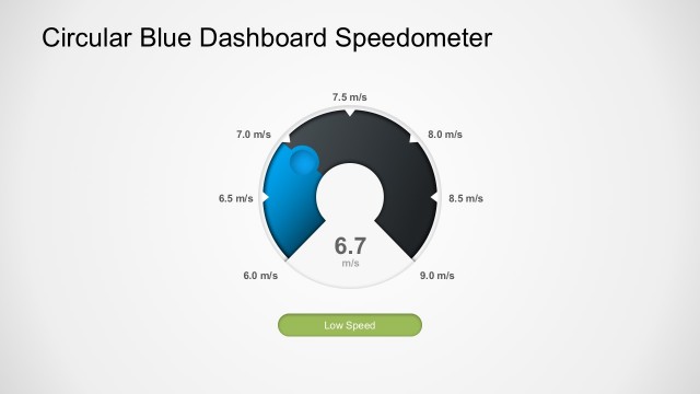
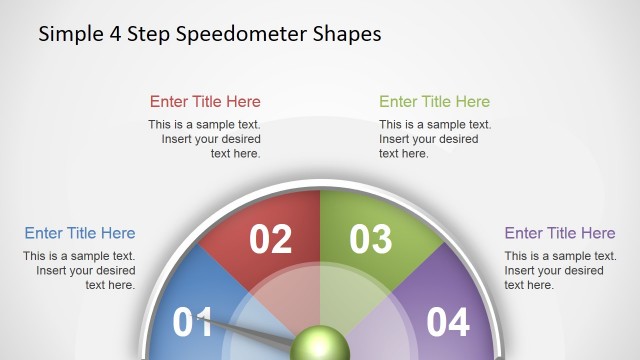
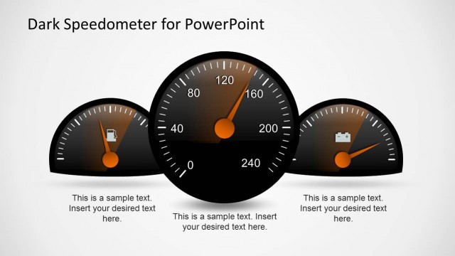
Speedometer Concept for PowerPoint Dashboard is a 4-slide shape template for presenting KPI status with gauge visuals. It includes a three-gauge dashboard on dark and light backgrounds, a single blue speedometer slide, and a comparative KPI gauge layout. Designed for business performance reporting in Microsoft PowerPoint and Google Slides.
- Category
- Shapes
- Rating


 Loading...
- Aspect ratio
- 16:9
- Item ID
- 7040-01
- Colors
 Microsoft PowerPoint
  Microsoft Copilot
  Claude for PowerPoint
 Other formats supported
Subscribe today and get immediate
access to download our PowerPoint templates.