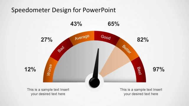
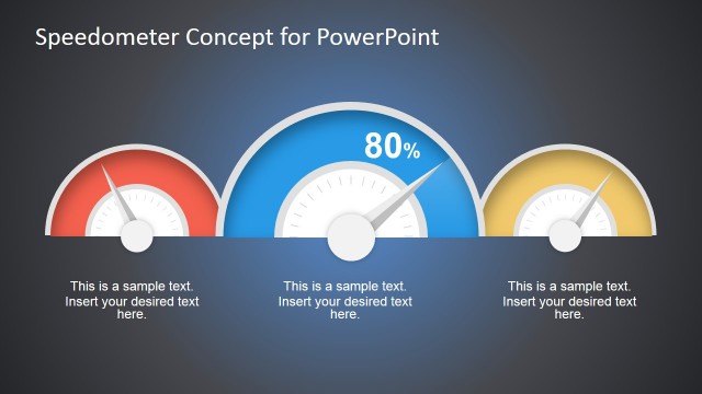
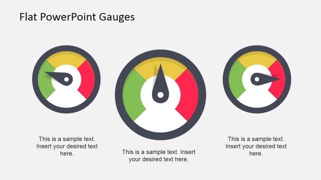
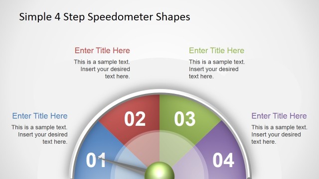
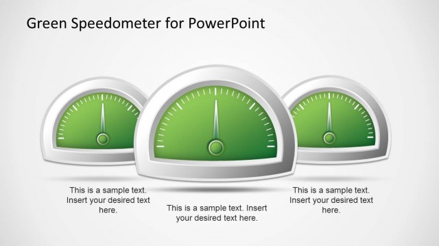
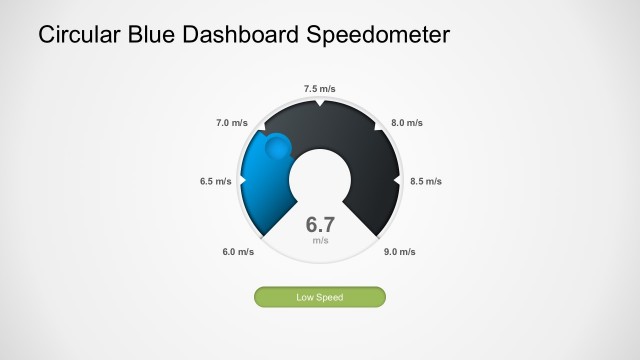
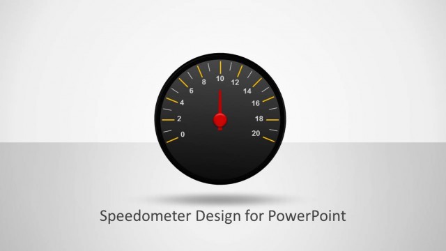
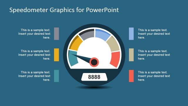
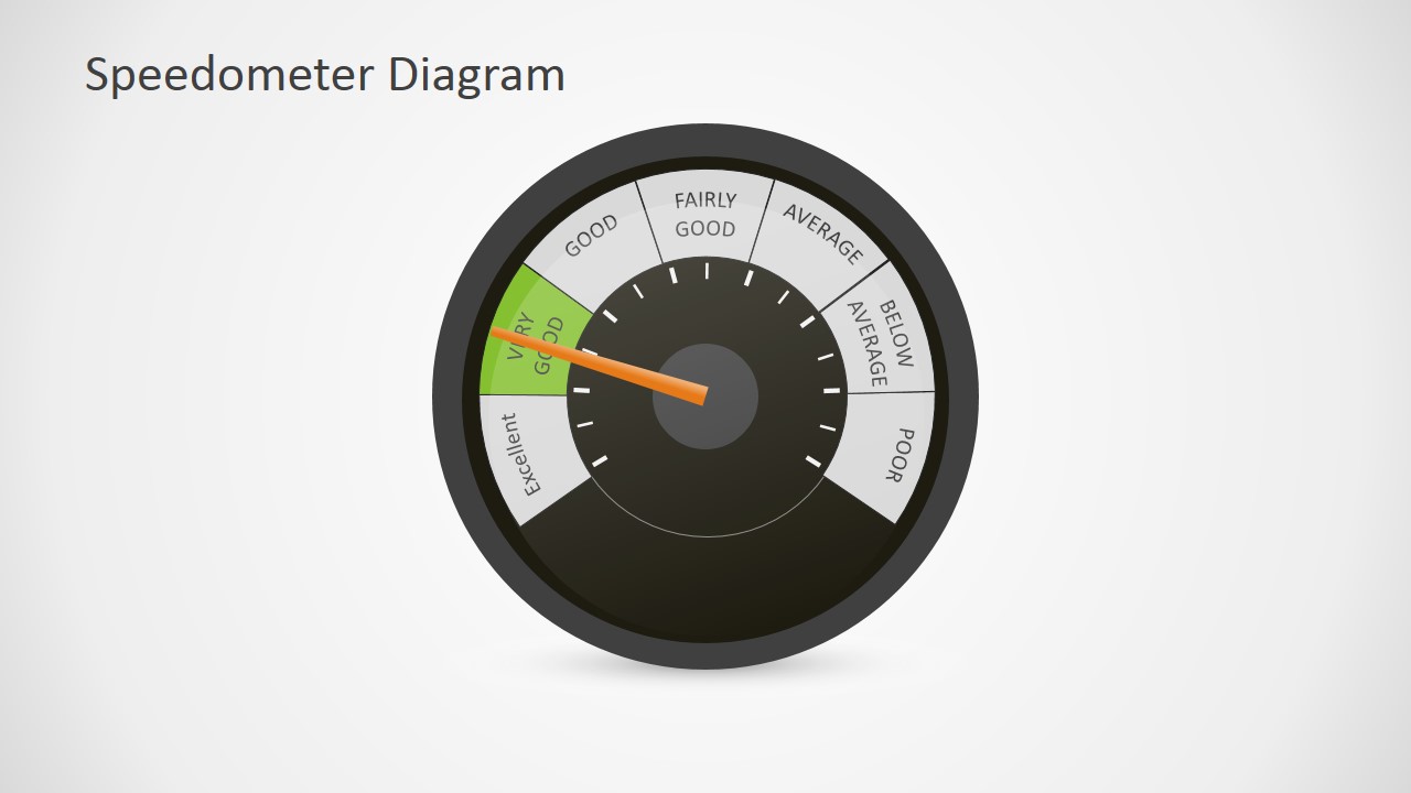
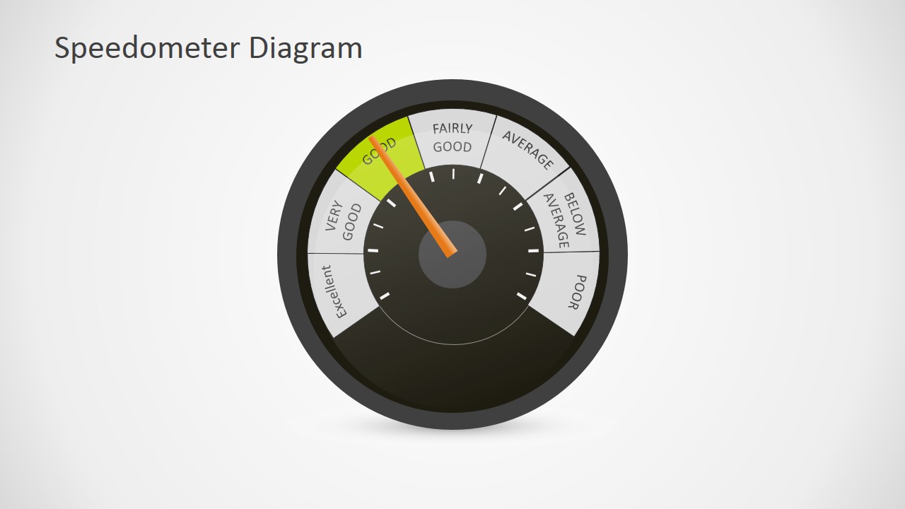
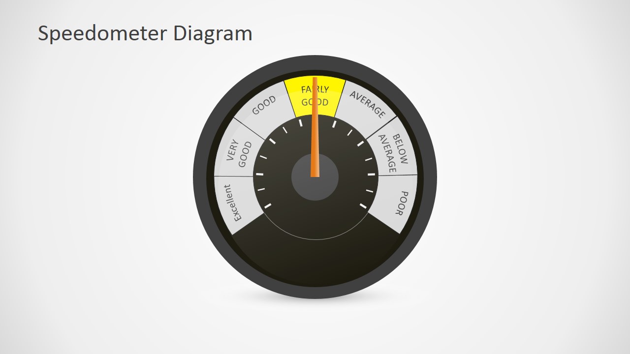
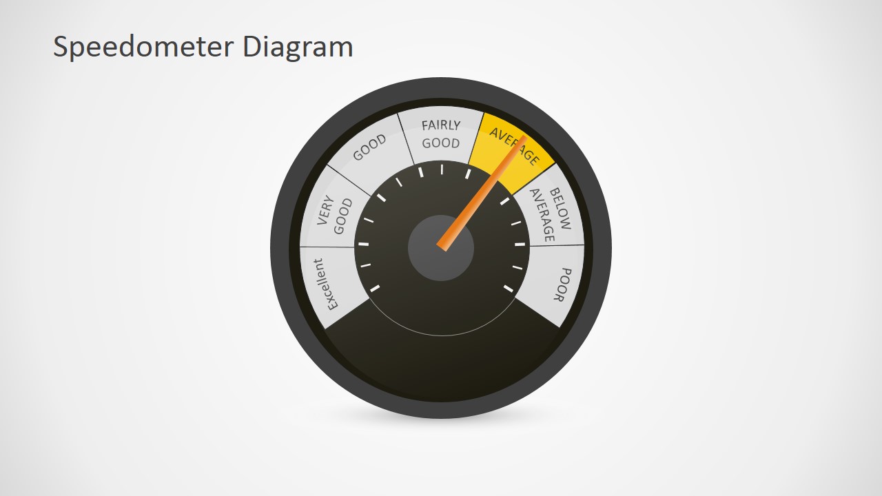
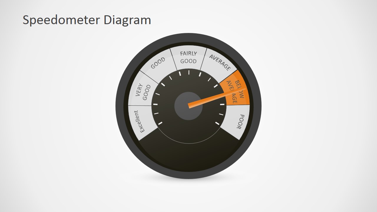
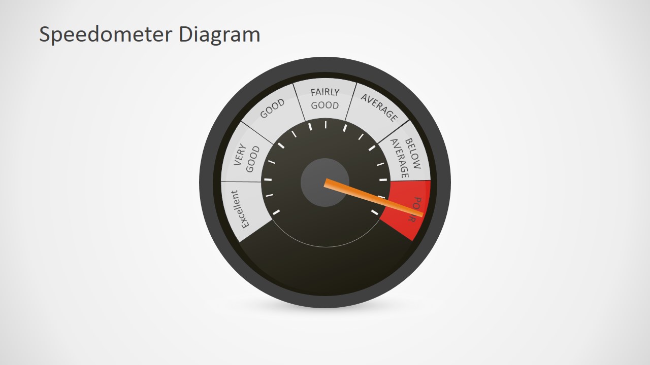
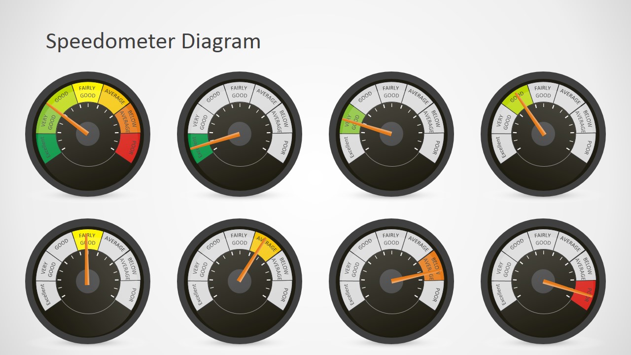
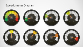
Create professional dashboard or KPI’s reviews presentations with the Editable Speedometer Gauge PowerPoint Shapes. The template provides a seven steps editable speedometer. With the ability to gauge 7 values, the user can rotate the arrow around the surface to point the desired indicator. Each indicator is created as an individual PowerPoint Object, allowing the user to customize its appearance, texts and effects. Created with modern flat design techniques, the PowerPoint template is compatible with all major versions of Microsoft PowerPoint and other popular presentation editors as Google Slides and Apple Keynote.
What’s inside this template
Example presentation scenarios
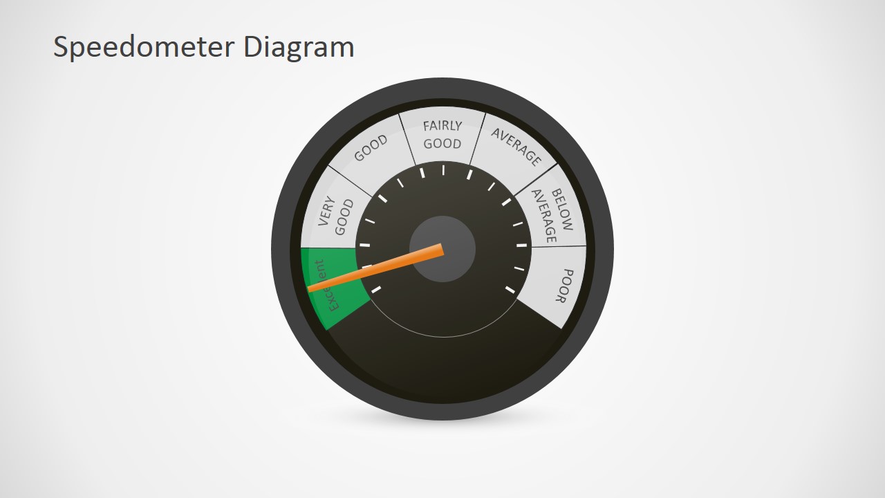
- An operations manager can present weekly KPI health to executives by assigning each metric to a speedometer rating zone and using the single-gauge slides for the most important measures.
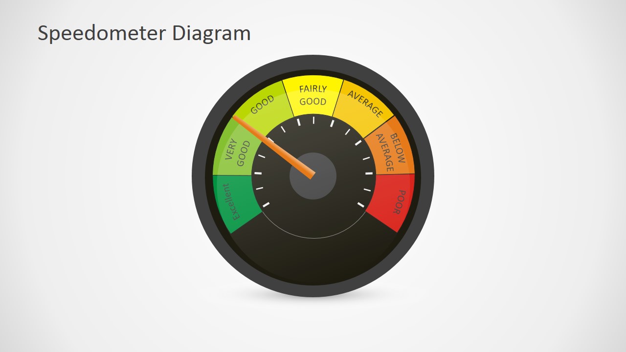
- A project manager can summarize delivery risk for sponsors by pointing the gauge to green, yellow, orange, or red status areas and explaining the cause behind each rating.
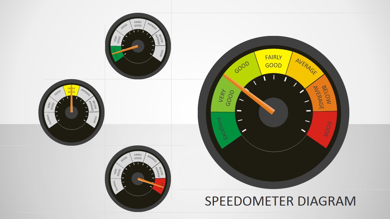
- A consultant can compare business unit maturity scores with the multi-gauge grid, using one gauge per department to show relative performance at a glance.
- A sales or customer success leader can report account health by using the red, orange, yellow, and green gauge bands to separate urgent accounts from stable ones.
Features
- 100% editable presentation template
- Compatible with Microsoft PowerPoint and Google Slides
- 16:9 aspect ratio slides
- Scalable vector shapes, icons and illustrations
- AI-Ready for Microsoft Copilot and Claude
- Instant access and download
Frequently asked questions
Q: How should a presenter explain KPI status with the speedometer gauge without oversimplifying the message?
A: Use the gauge as the headline indicator, then add the reasoning verbally or in adjacent notes. The colored zones make status easy to read, but the presenter should define what each rating means before comparing results. For executive reviews, focus each single-gauge slide on one metric and explain the next action tied to the pointer position.
Q: Who is this gauge template best suited for in a business presentation?
A: This template fits managers, analysts, and consultants who need to translate performance, risk, or maturity into an easy status signal. It works best for review meetings where the audience must quickly decide whether a KPI is healthy, needs attention, or is at risk. The multi-gauge slide is useful for comparing several teams or metrics.
Q: Why use a speedometer metaphor instead of a table or standard bar chart?
A: A speedometer is a familiar progress and condition metaphor, so audiences can interpret direction and severity fast. The pointer creates a single focal point, while the green-to-red arc separates acceptable and problem states. This design is useful when the communication goal is quick judgment rather than precise numerical analysis.
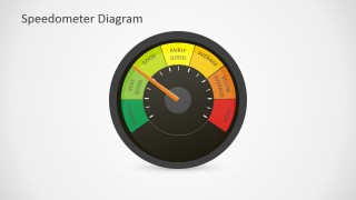
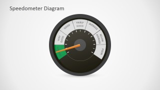
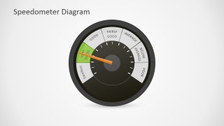
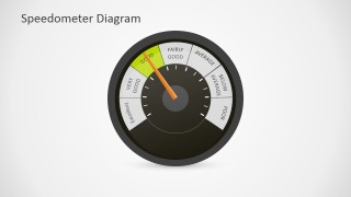
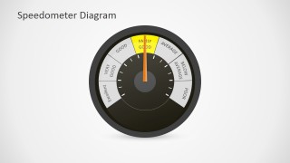
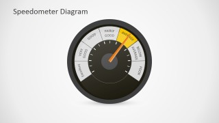
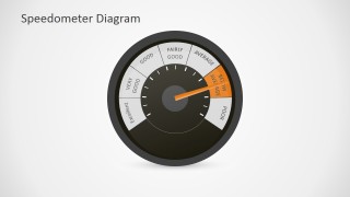
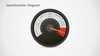
Editable Speedometer Gauge PowerPoint Shapes
10-slide presentation template with editable speedometer gauges for dashboard status, KPI review, and performance rating visuals
Editable Speedometer Gauge PowerPoint Shapes is a 10-slide presentation template for showing performance status with speedometer-style gauges. It includes a cover overview, single-gauge rating slides, colored status bands, and a multi-gauge comparison layout. The template is designed for dashboard, KPI, risk, and progress updates in Microsoft PowerPoint and Google Slides.
- Category
- Shapes
- Rating


 Loading...
- Aspect ratio
- 16:9, 4:3
- Item ID
- 0005-01
- Colors
 Microsoft PowerPoint
  Microsoft Copilot
  Claude for PowerPoint
 Other formats supported
Subscribe today and get immediate
access to download our PowerPoint templates.