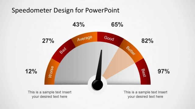
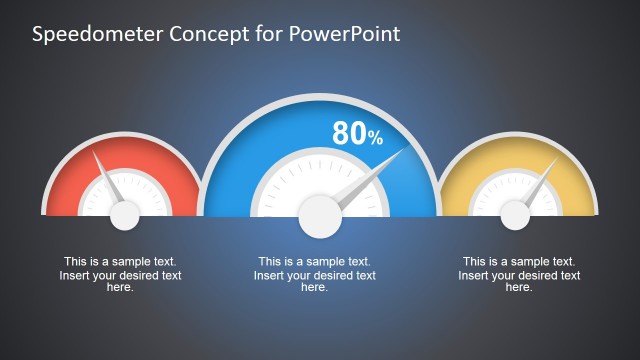
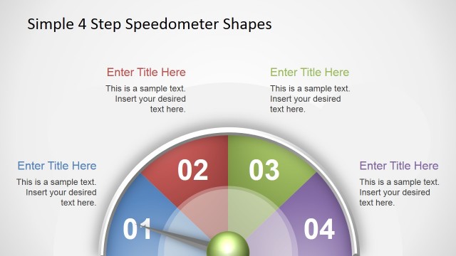
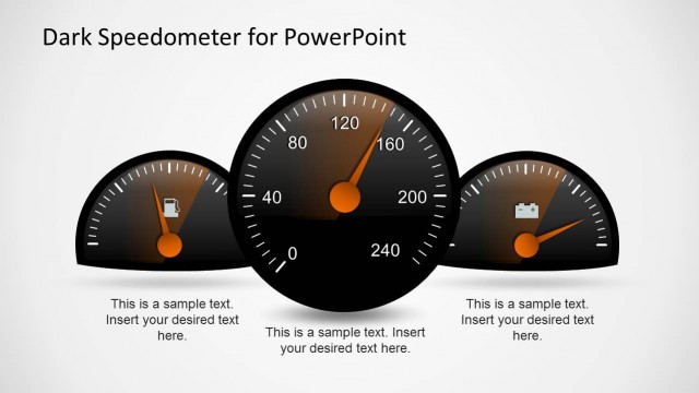
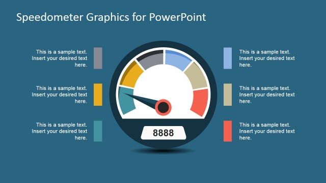
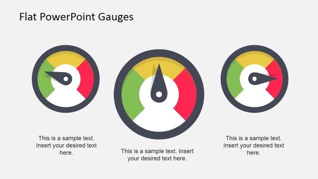
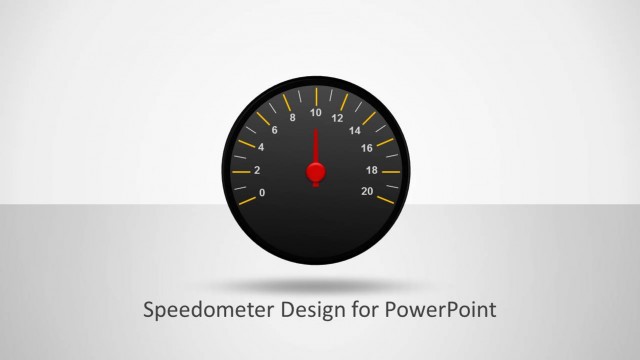
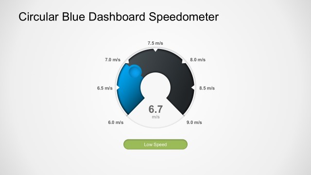
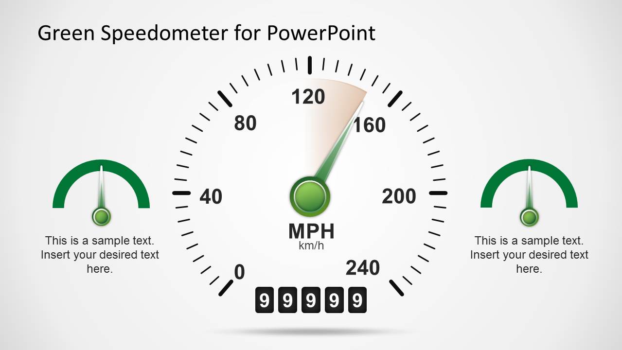
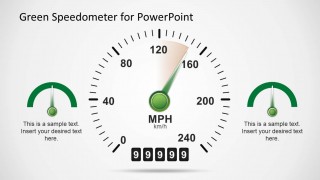
Green Speedometer Shapes for PowerPoint is a nice presentation template with odometer or speedometer shapes in the slide design that you can use in PowerPoint dashboards as a KPI or to show any desired level. You can easily rotate the needle to match any desired value.
What’s inside this template
Example presentation scenarios
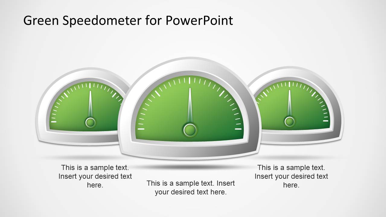
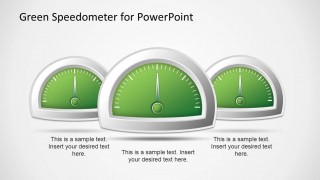
- An operations manager can present weekly production status by assigning each metric to the triple gauge comparison and adding short captions beneath the indicators.
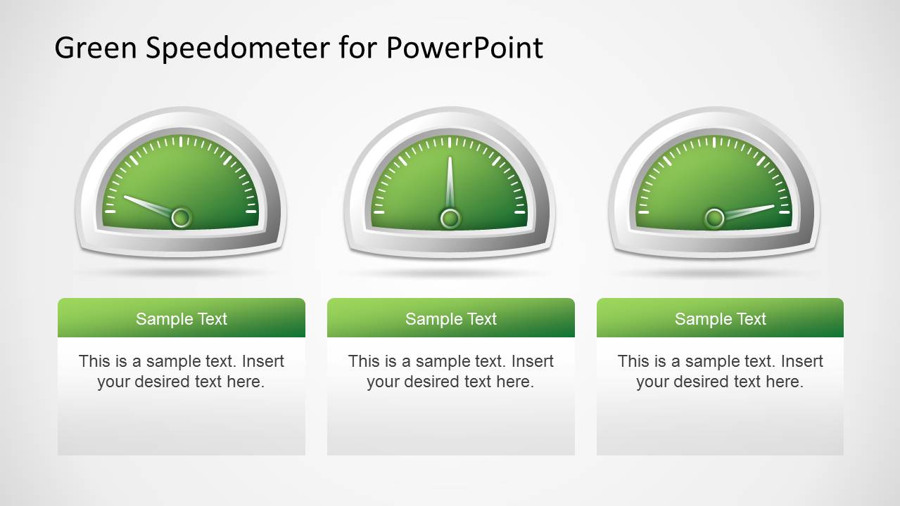
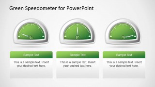
- A sales leader can explain pipeline health by using the three KPI card slide to compare territory performance, quota progress, and forecast confidence.
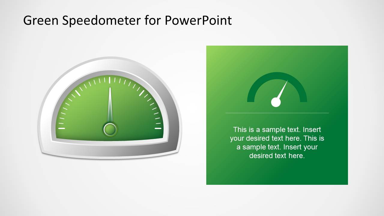
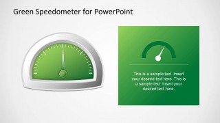
- A customer experience team can report Net Promoter Score movement with the single gauge and green text panel, pairing the score with a short interpretation.
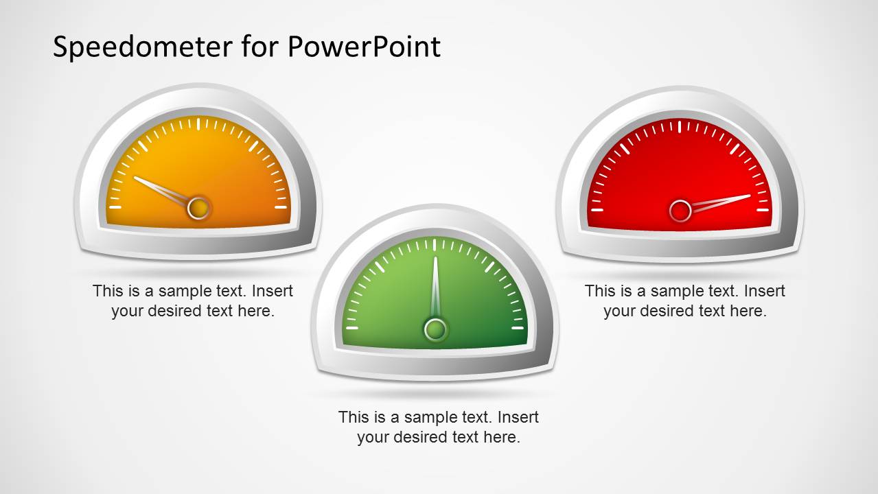
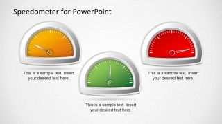
- A project manager can show risk status by mapping low, on-track, and critical conditions to the orange, green, and red speedometer slide.
Features
- 100% editable presentation template
- Compatible with Microsoft PowerPoint and Google Slides
- 16:9 aspect ratio slides
- Scalable vector shapes, icons and illustrations
- AI-Ready for Microsoft Copilot and Claude
- Instant access and download
Frequently asked questions
Q: How should a presenter explain performance levels with these speedometer slides?
A: Start by naming the metric, then define what the needle position means before discussing the result. The triple gauge slide works well for comparing three KPIs, while the single gauge with text panel is better for one headline metric. Keep each caption focused on the implication, not just the numeric value.
Q: Who is this template best suited for in a business presentation?
A: This template fits managers, analysts, and executives who need to turn status data into quick visual signals. It is strongest for KPI reviews, NPS updates, project health reports, and target progress briefings where the audience needs to understand direction, urgency, or relative performance without reading dense tables.
Q: Why use a speedometer metaphor instead of a standard chart?
A: A speedometer immediately suggests movement, thresholds, and current operating level. That metaphor helps audiences read status faster than a generic shape or text box. The green gauges communicate normal or positive performance, while the orange and red gauges on slide 4 make exception states easier to separate visually.
Green Speedometer Template for PowerPoint
5-slide presentation template with green speedometer gauges for KPI dashboards and indicator slides
Green Speedometer Template for PowerPoint is a 5-slide gauge shape set for KPI and status reporting. It includes a triple gauge comparison, a single gauge with text panel, three KPI cards, traffic-light speedometers, and an MPH odometer dial for dashboard presenters using Microsoft PowerPoint or Google Slides.
- Category
- Shapes
- Rating


 Loading...
- Aspect ratio
- 16:9
- Item ID
- 6331-02
- Colors
 Microsoft PowerPoint
  Microsoft Copilot
  Claude for PowerPoint
 Other formats supported
Subscribe today and get immediate
access to download our PowerPoint templates.