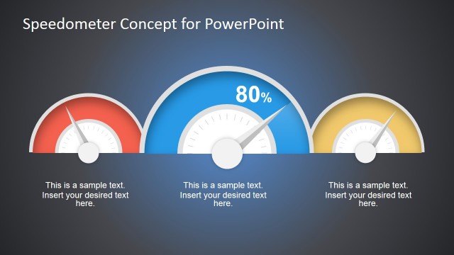
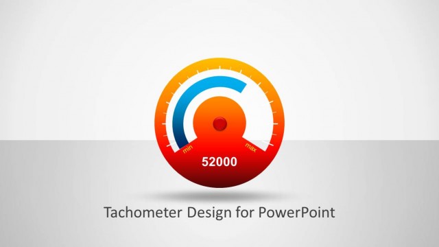
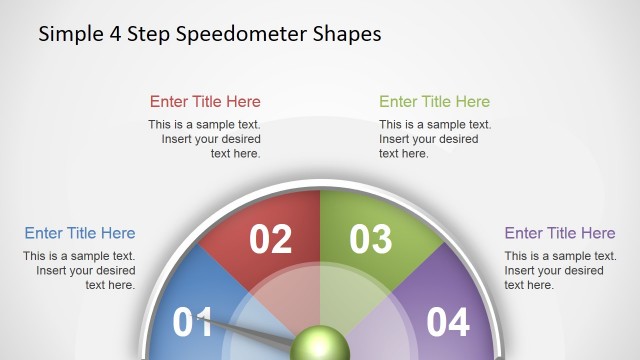
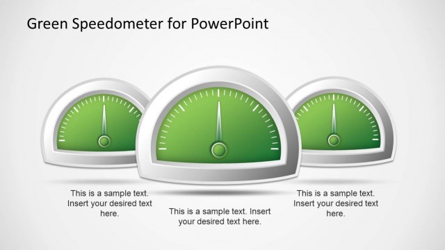
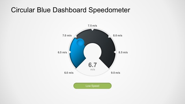
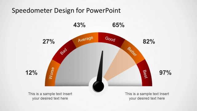
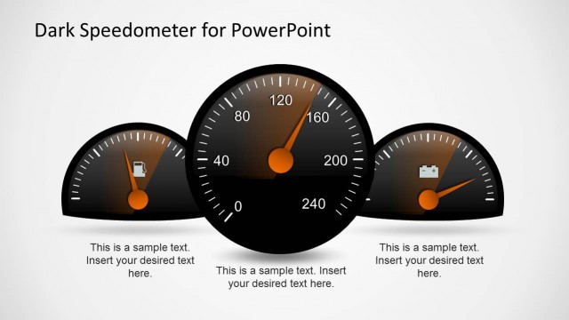
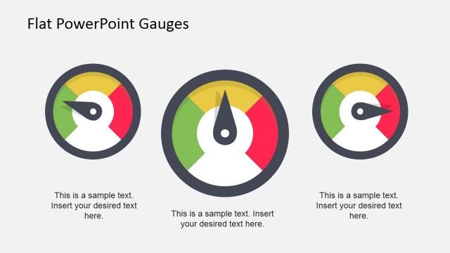
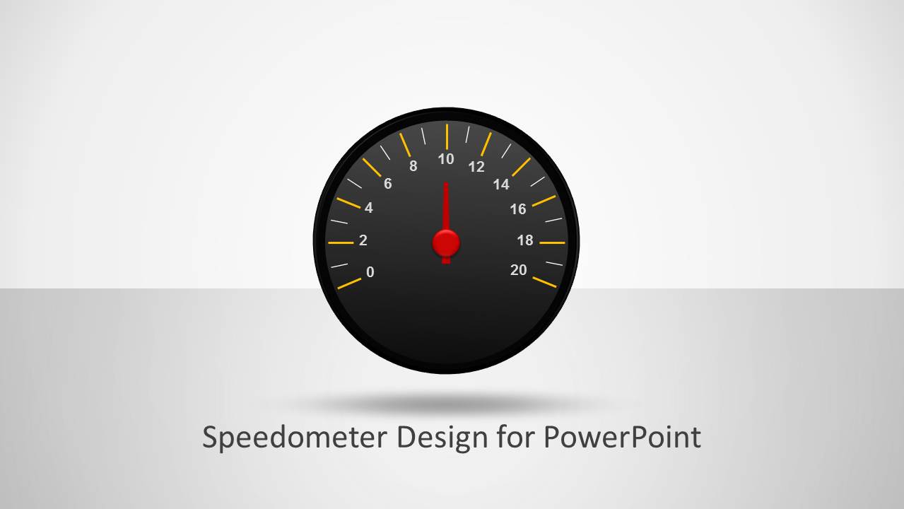
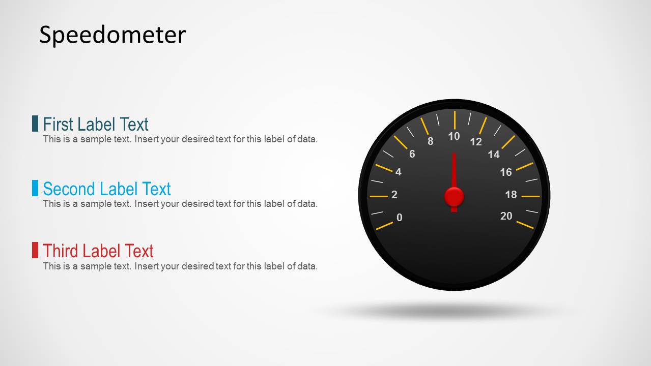
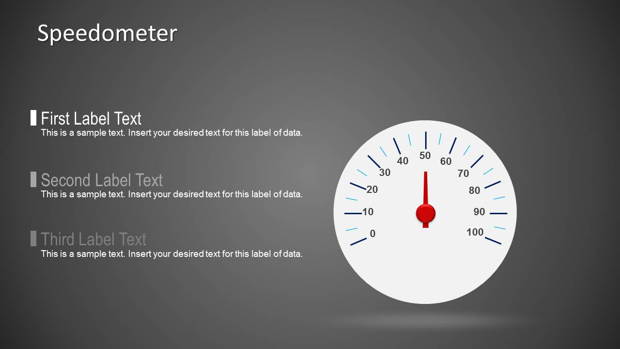
Speedometer Shape for PowerPoint Dashboards. The speedometer shape for PowerPoint comes with a ready-made needle illustration that you can adjust to match the desired value. This is very useful if you want to customize the slide graphics and create a dashboard in PowerPoint.
To change the speedometer needle value you can ungroup the shape and then rotate the needle the desired degrees. Learn how to use the grouping features in PowerPoint.
What’s inside this template
Example presentation scenarios
- A project manager can use the three-label KPI layout to report schedule, budget, and risk status while the speedometer shows overall project health.
- A sales manager can present target progress by placing revenue, pipeline, and conversion notes beside the gauge on the light dashboard slide.
- An operations analyst can use the dark dashboard slide to summarize service level, capacity, or efficiency metrics for an executive performance review.
- A product lead can use the title cover and gauge visual to introduce a short status section inside a larger roadmap or business update.
Features
- 100% editable presentation template
- Compatible with Microsoft PowerPoint and Google Slides
- 16:9 aspect ratio slides
- Scalable vector shapes, icons and illustrations
- AI-Ready for Microsoft Copilot and Claude
- Instant access and download
Frequently asked questions
Q: How should I present a metric with the speedometer so the audience understands the status quickly?
A: State what the gauge measures before showing the reading. Use the three KPI labels to define the metric, explain the target, and name the action required. Keep the dial for one headline status only; if the slide carries too many numbers, the speedometer becomes decoration instead of a decision cue.
Q: Who is this template best suited for in a business presentation?
A: This template fits managers, analysts, and team leads who need to report one key status in a short update. It works well for project health, sales target progress, service performance, or operational readiness, especially when the audience needs a fast read before discussing details on later slides.
Q: Why use a speedometer metaphor instead of a standard bar or pie chart?
A: A speedometer suggests movement, thresholds, and current status at a glance. That metaphor is useful when the message is about performance intensity or progress toward a target. The surrounding label blocks add explanation, so the gauge creates attention while the text clarifies what the reading means.
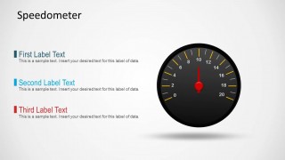
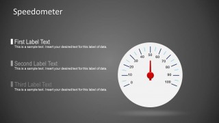
Speedmeter Shape for PowerPoint Dashboards
3-slide presentation template with speedometer gauge shapes for KPI dashboards and indicator panels
Speedmeter Shape for PowerPoint Dashboards is a 3-slide presentation template for KPI and performance reporting. It includes a cover with a central speedometer, a light dashboard layout with three KPI labels, and a dark dashboard layout with a white gauge. It is for Microsoft PowerPoint and Google Slides.
- Category
- Shapes
- Rating

 Loading...
- Aspect ratio
- 16:9, 4:3
- Item ID
- 9501
- Colors
 Microsoft PowerPoint
  Microsoft Copilot
  Claude for PowerPoint
 Other formats supported
Subscribe today and get immediate
access to download our PowerPoint templates.