In the business world, a presentation is so much more than just a bunch of slides or points—it’s a golden opportunity. It can sway decisions, propel change, or bring people together. How you structure your presentation is absolutely critical in getting your ideas across clearly and compellingly.
When you’ve got a structured presentation just right, it’s like you’re taking your audience by the hand and guiding them through your thoughts, making sure they pick up all the important bits along the way. Moreover, it speaks of your degree of professionalism and how much knowledge you bear on the topic in question.
Therefore, nailing your presentation structure isn’t just helpful; it’s downright necessary to get the results you’re after. Whether you’re pitching a new concept to the investors, sharing the latest findings with your team, or taking the stage at a conference, how you lay out your content becomes the language you use to interact with your audience. Get to know all that’s required to create a powerful presentation structure that will guarantee success in business meetings, academic dissertations, or motivational talks.
Table of Contents
- What is a Presentation Structure
- Key Elements of a Presentation Structure
- Techniques to Structure Your Presentation
- Common Mistakes to Avoid When Designing a Presentation Structure
- Final Words
What is a Presentation Structure
Let’s compare a presentation structure to a business plan. Just as a business plan is essential for guiding a company’s strategy and ensuring all aspects of the business are aligned toward common goals, a presentation structure is crucial for organizing the content and delivery of your talk.
The presentation structure lays out a clear and logical sequence of information, akin to the sections of a business plan that outline the company’s mission, market analysis, and financial projections. It defines the flow of your presentation, and this clear sequence of information ensures that your audience can easily follow and understand your message, maximizing the impact your speech can deliver and influencing your target audience.
Key Elements of a Presentation Structure
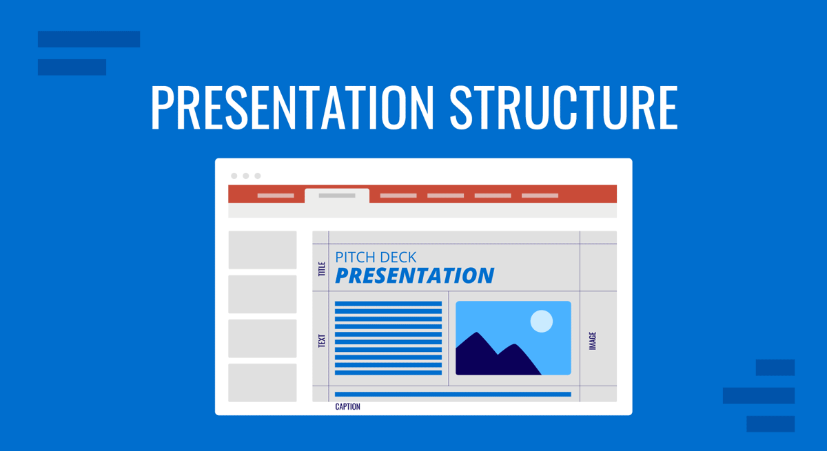
The easiest way to study a presentation structure is to subdivide it into sections. Basically, every presentation has a structure that follows this formula: Introduction > Body > Conclusion.
Introduction
The introduction is the first section of the presentation and sets the tone for the rest of the presentation. It provides a presentation overview, and it should be attention-grabbing and make the audience want to listen to the rest of the presentation.
When defining how to start a presentation, these are the best tips we recommend you implement.
Start with a Hook
Kick off your introduction with a strong hook that grabs your audience’s attention. This could be an intriguing fact, a thought-provoking question, or a compelling story related to your topic. A captivating opening will make your audience want to listen and engage with your presentation.
Clearly State Your Topic
Be clear and concise when stating your topic. Your audience should immediately understand what your presentation is about and what they can expect to learn. A clear statement of your topic sets the stage and provides a roadmap for the rest of your presentation.
Establish Credibility
Take a moment to establish your credibility by briefly sharing your qualifications or experience related to the topic. This helps to build trust and rapport with your audience, and it shows that you are knowledgeable and well-prepared.
Engage Your Audience
Make your audience part of the presentation by engaging them from the start. Ask a question, encourage participation, or invite them to think about how the topic relates to their own experiences. Engagement helps to create a connection between you and your audience. Using a surprise factor is an alternative if you feel the topic you’re about to present may not fully resonate with the target audience.
Preview Main Points
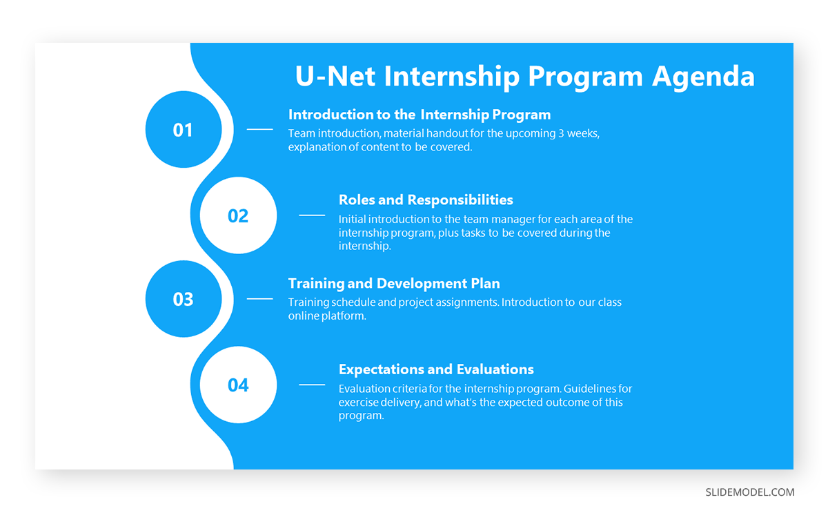
End your introduction by briefly previewing the main points you will cover in your presentation. This provides a clear structure for your audience to follow and helps them understand what to expect in the body of your presentation. An agenda slide is the perfect tool for this purpose.
Body
The body is the main part of the presentation and provides the content and information that the audience came to hear. It should feature the main points and details supporting your presentation’s objective. Depending on your topic, this could include data, arguments, case studies, examples, or demonstrations. Each main point should be clear and distinct, with evidence or examples substantiating it. The content should be tailored to your audience’s level of knowledge and interest.
As you organize the body of your presentation, pay attention to the flow from one main point to the next. A smooth flow keeps your audience engaged and helps them follow your message effortlessly. Transitioning logically from one idea to the next ensures that your presentation is cohesive and reinforces the main points effectively.
Different presentations call for various structures. For example, a Product Presentation’s structure should start by dividing the content into clear sections or headings. For instance, if presenting a new software tool, sections could include its features, benefits, and user feedback.

On the other hand, a Persuasive Presentation begins with stating the current situation or problem, followed by proposed solutions, evidence supporting those solutions, and the benefits of adopting your proposition.

Workshop or Training Presentations begin with an overview of what will be taught, followed by step-by-step instructions, examples, demonstrations, and summaries or quizzes after each major section.
One essential aspect is to plan the multimedia elements to include in your presentation, including audio, images, and video, depending on the presentation style you aim to deliver. Through our expertise, we want to share some tips on how to plan this kind of content:
- Using relevant content: Each image should be related to its accompanying content. Avoid using images just for decoration. If using videos, dedicate an entire slide to them rather than sticking them to a corner of your slide. Plan a powerful hook to connect your thoughts with these visual aids.
- Quality: Ensure all images are of high resolution and can be clearly viewed, even from a distance. Avoid pixelated or distorted images.
- Simplicity: Infographics and diagrams should be easy to understand. If presenting data, use simple charts or graphs instead of complex tables. Limit the amount of text on each slide to ensure clarity. This rule of simplicity also applies to written content and the structure of your speech. Use the Feynman Technique as a time-saver approach to simplify content to reach any knowledgeable audience.
- Consistency: A common cause of presentation failures is to distract the audience with an unprofessional look. Maintain a consistent style and color scheme for all images to give your presentation a polished and professional feel.
Along the path of creating these media elements, you can rethink your strategy for disclosing content. In general lines, you should present your points in a logical order, often from the most to least important or in a chronological sequence. This helps the audience follow along and build understanding step by step. Well-known practices like the storytelling technique follow this approach to maximize audience engagement.
Transition smoothly between points. Phrases like “moving on,” “in addition,” or “on the other hand” can guide your audience through your narrative. Break up long sections of spoken content with anecdotes, questions, or short videos. Such an approach adds variety and keeps the audience engaged.
If you need a quick method to create a presentation, check out our AI presentation maker. A tool in which you add the topic, curate the outline, select a design, and let AI do the work for you.
Conclusion
A well-structured conclusion is the linchpin that holds your presentation together, reinforcing your main points and leaving a lasting impression on your audience. It is your final opportunity to communicate your message and encourage audience engagement. So, before you consider how to end a presentation, here are some powerful tips to ensure you conclude your presentation with impact.
End with a Strong Statement or Quote
This technique is commonly used in motivational presentations, where the speaker leaves the audience with a slide containing a quote related to the topic of the presentation, something that evokes inner reflection about the topic discussed.

Conclude your presentation with a strong, memorable statement or a powerful quote that ties back to your main message. This adds weight to your argument and leaves a lasting impression on your audience. If you aim to surprise your audience, silence can also be a strong statement if your presentation has to raise awareness about a problem.
Incorporate a Call-to-Action
Clearly communicate to your audience what you want them to do next. Whether it’s to adopt a new perspective, take specific action, or continue the conversation outside of the presentation, a clear call to action drives engagement and encourages your audience to act upon your message.
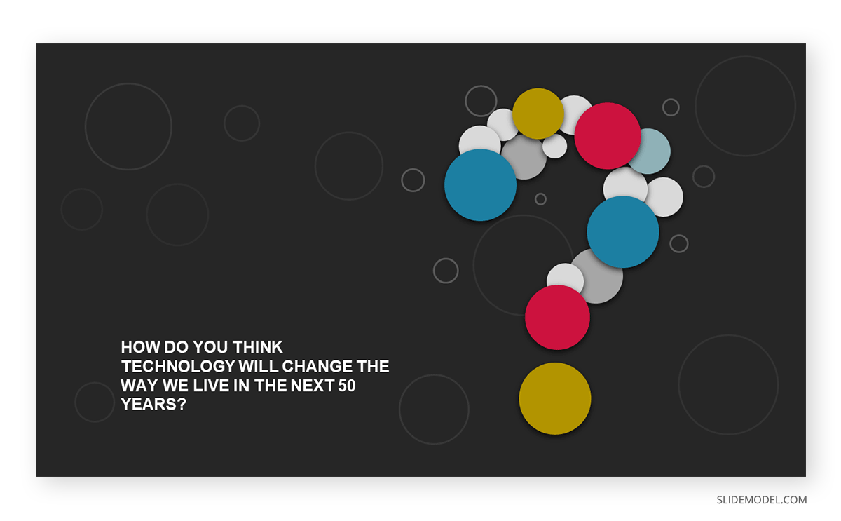
Ask Thought-Provoking Questions
Pose thought-provoking questions that stimulate reflection and discussion. This opens the door for audience participation and engagement and allows you to interact with the audience in a Q&A session, or reach after your presentation concluded to network.
Additional Resources and Contact Info
Offer resources such as articles, websites, or books for those interested in exploring your topic further. This not only adds value to your presentation but also encourages the audience to engage with the content beyond the presentation itself.
Consider the way you leave a communication channel open with your audience. This can be in the format of a deliverable, writing down your contact data in the “Thank You” slide, or simply via speech to inform where they can know more about you and your work.
Techniques to Structure Your Presentation
We already discussed the basic Introduction-Body-Conclusion framework for a presentation, but there are alternative approaches that can help you structure your talk.
Problem-Solution Framework
The Problem-Solution Framework is a compelling method to structure presentations, particularly when aiming to persuade or inform an audience about addressing specific challenges. The framework operates on a simple yet impactful premise: initially, highlight a problem or challenge that needs addressing and subsequently propose a viable solution or set of solutions.
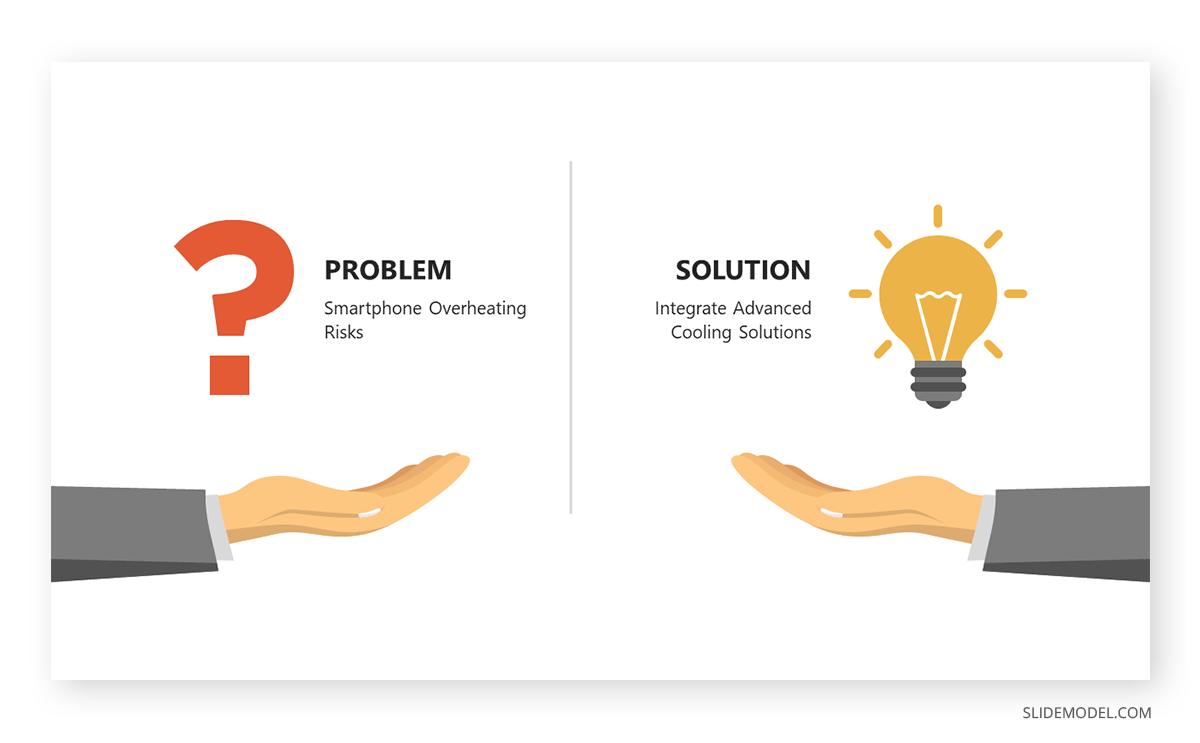
Starting with the problem establishes a context, engages the audience by highlighting pain points or challenges they may recognize, and creates a desire for resolution. It sets the stage for the solution to be perceived as necessary and valuable.
The solution phase offers that much-needed resolution. By presenting a clear, actionable solution or set of recommendations, the presenter provides a pathway to overcome the identified challenge. This structure is not only logical but also highly persuasive, as it appeals to the audience’s desire for resolution and improvement. In essence, the Problem-Solution Framework is both a guide for content organization and a psychological tool for persuasion.
Chronological Structure
The Chronological Structure is an intuitive and organized approach to presenting information based on a sequence of events or a progression in time. Whether recounting historical events, outlining the stages of a project, or narrating a personal story, this structure follows a clear beginning, middle, and end sequence. By presenting details in the order they occurred, the audience can easily follow the narrative, making connections between events and understanding causality.
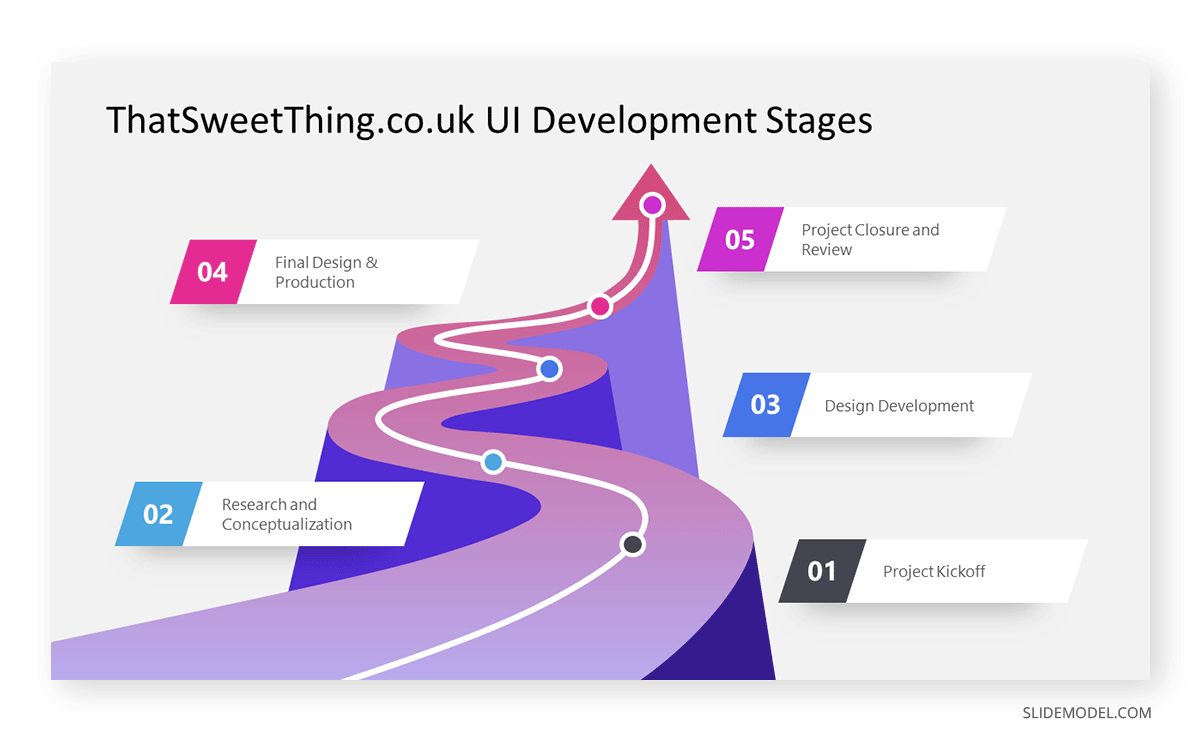
This structure is especially effective when the timeline of events is crucial to the narrative or when showcasing developments, evolutions, or growth over time. It provides clarity and eliminates confusion that might arise from a non-linear presentation. Moreover, by anchoring information on a timeline, the Chronological Structure aids memory retention, as the audience can mentally “map out” the journey of events. In sum, this method offers clarity and a compelling narrative arc, ensuring audience engagement from start to finish.
Comparative Structure
The Comparative Structure is a strategic approach to presentations that hinges on juxtaposing two or more elements, ideas, or solutions side by side. By examining similarities and differences, this method illuminates unique qualities, advantages, or drawbacks inherent in each element. Often employed in business scenarios like product comparisons, market analysis, or debates, the comparative structure helps audiences critically analyze options and make informed decisions.
Presenters utilizing this structure typically start by introducing the elements for comparison. They then delve into detailed analysis, often using criteria or metrics to maintain objective evaluations. Visual aids like Venn diagrams or comparison charts can enhance clarity and visual appeal.
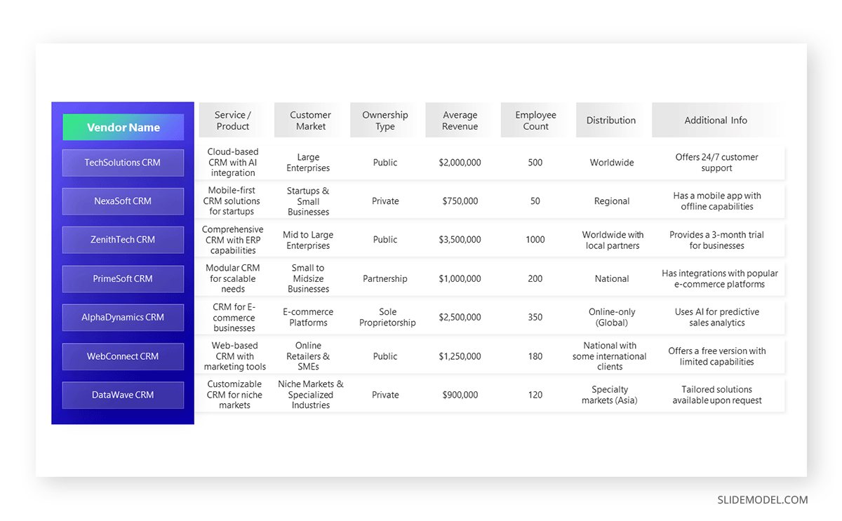
The strength of the Comparative Structure lies in its ability to foster critical thinking. By directly contrasting items, audiences are engaged, encouraged to weigh pros and cons, and ultimately arrive at a deeper understanding or more nuanced perspective on the subject matter.
Matrix Structure
The Matrix Structure offers an approach to organizing presentations by segmenting information into distinct categories or sections, akin to a grid or matrix. Instead of a linear flow, topics are grouped by themes, criteria, or any relevant classification, allowing for simultaneous exploration of multiple facets of a subject. Think of it as viewing a topic through various lenses concurrently.
For instance, in a business setting, a product might be examined in terms of design, functionality, market positioning, and customer feedback. Each of these constitutes a segment in the matrix.
Visually, the matrix can be represented using tables, grids, or quadrant charts, making the content easily digestible and engaging. A key advantage of this structure is its flexibility; presenters can delve deep into one segment or provide a broader overview of all areas, depending on the audience’s needs. Ultimately, the Matrix Structure ensures a comprehensive and multifaceted examination of a topic, providing depth and breadth in analysis.
Modular Structure
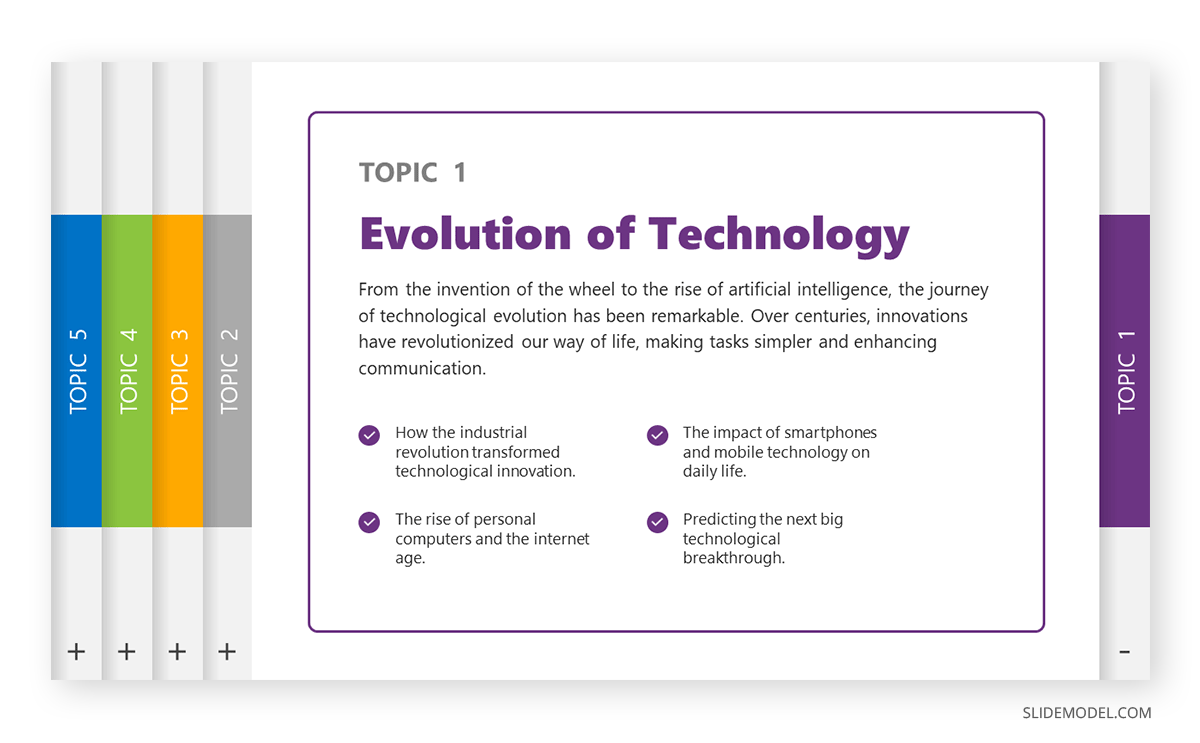
The final model we will study is the Modular Structure. It takes content and packs it into modules, which can be arranged at any other the presenter requires them to be. Each module addresses a specific topic or idea and is designed to be self-contained, ensuring clarity even if presented independently or in a different order. This adaptability makes the modular approach especially valuable in dynamic settings, such as workshops or conferences, where audience feedback or time constraints might necessitate adjustments on the fly.
For example, in a corporate training session, different modules could cover distinct skills or topics. Based on the attendees’ prior knowledge or the session’s time limit, the presenter can prioritize, omit, or rearrange modules without compromising the integrity of each segment.
By adopting the Modular Structure, presenters gain flexibility without sacrificing depth. This approach fosters a responsive presentation style, allowing speakers to tailor content in real-time, ensuring maximum relevance and engagement for their audience.
Common Mistakes to Avoid When Designing a Presentation Structure
Even well-seasoned presenters can fall prey to these common mistakes in terms of presentation structure. Let’s learn how to prevent them.
Overloading with Information
It’s tempting to include every bit of knowledge you have on a topic. Still, information overload can quickly disengage an audience. Prioritize key points and leave out extraneous details. As famous architect, Mies van der Rohe famously coined, “Less is More.”
Overlooking Flow Between Slides
Overlooking the flow between slides can disrupt your audience’s engagement. Jumping abruptly from one topic to another can create confusion. By ensuring that each section leads naturally into the next, you maintain a narrative flow that guides the audience seamlessly through your points.
Weak Transitions
Jumping abruptly from one point to another can disrupt the flow and confuse listeners. Ensure smooth transitions between sections, signaling shifts in topics or ideas to keep the narrative cohesive.
Dull Design
While content is king, visual appeal matters. Relying solely on walls of text or bland slides can lose your audience’s interest. Incorporate engaging visuals, charts, and multimedia elements to enhance your message and retain attention.
Ignoring the Call to Action
Concluding your presentation without guiding the audience on the next steps or what’s expected of them can be a missed opportunity. Whether it’s seeking feedback, prompting a discussion, or encouraging an action, always have a clear call to action.
Final Words
Good communication is all about making your point clear, especially in presentations. We’ve talked about how the right structure can keep your audience hooked. But there’s more to it. Think about your presentation. Is it telling your story the way you want? Is it reaching your audience? Take a step back and really look at how you’re laying it out. Don’t just go with the flow – choose your format wisely. Remember, every presentation tells a story, and how you set it up matters a lot.
