Meeting presentations are an entirely different context regarding preparation and assets to create a slide deck. Whether you’re providing updates, presenting a proposal, or collaborating on a problem, a meeting presentation is more than just a formality—it’s a powerful tool to influence decisions and drive action. Done correctly, it ensures clarity, fosters engagement, and maximizes the efficiency of team collaboration.
In this guide, we’ll delve deep into every aspect of a meeting presentation: what it entails, how to structure it, when it is required, and common mistakes to avoid. As an extra, you can find a selection of meeting PPT templates to help you speed up the meeting and presentation design process.
Table of Contents
- What is a Meeting Presentation?
- How is a Meeting Presentation Different from Other Presentation Formats?
- What Information to Include in a Meeting Presentation
- How to Create a Slide Deck for a Meeting Presentation
- Body Language and Meeting Presentations
- When to Use a PowerPoint During a Meeting Presentation and When Not
- Typical Mistakes in Meeting Presentations
- Recommended Meeting PPT Templates
- FAQs
- Final Words
What is a Meeting Presentation?
A meeting presentation is a structured delivery of information, ideas, or proposals tailored to a specific audience in a corporate or organizational setting. Its purpose is often action-oriented, whether providing updates on key projects, making strategic decisions, or brainstorming solutions. Unlike other presentations—such as public speaking engagements or marketing pitches—a meeting presentation is inherently collaborative and aims to achieve concrete outcomes.
In this context, visual aids such as meeting slides support the presenter’s key points. A well-prepared meeting ppt helps streamline information, making it digestible for the audience. These slides, often created using meeting PowerPoint templates, are concise and visually appealing, complementing rather than overshadowing the speaker’s delivery.
Meeting presentations vary depending on their purpose. Some are primarily informational, designed to communicate updates or insights, while others are persuasive, aiming to gain approval or build consensus. Regardless of the type, a successful presentation aligns with the meeting’s objectives and effectively engages its audience.
How is a Meeting Presentation Different from Other Presentation Formats?
While all presentations share some common features, meeting presentations are distinct in several critical ways:
Purpose and Context
Meeting presentations are inherently goal-driven. They serve as tools for collaboration, decision-making, or knowledge sharing among a focused group of stakeholders. This contrasts with other presentation formats, like keynote addresses, which are often broader in scope and audience.
For instance, when presenting in a team meeting, the emphasis is on providing actionable insights and fostering discussion, whereas a conference keynote may focus on storytelling or thought leadership.
Audience Expectations
The audience for a meeting presentation typically comprises colleagues, managers, or clients who already have a foundational understanding of the topic. This means you can skip introductory or overly generalized information and focus on specifics that matter most to the audience to create an engaging presentation. For example, presenting in a meeting with executives will demand data-driven insights and recommendations, whereas a conference audience might expect broader industry trends.
Time Sensitivity
Time is often a constraint during meetings. Presenters must deliver their message concisely without sacrificing clarity. The presentation structure for the meeting format is designed to ensure every minute is used effectively, and the key points are often reinforced with terse meeting slides.
Collaboration and Interaction
Unlike standalone presentations, meeting presentations encourage real-time interaction. Whether you’re presenting updates (as in sprint planning) or pitching an idea, expect questions, feedback, or even debates. This interactive presentation element distinguishes presenting in a meeting from formats like webinars or recorded presentations.
Use of Tools
While tools like PowerPoint are common across most presentation formats, their role in a meeting PPT is often more utilitarian. Slides serve as guides to facilitate discussions rather than the centerpiece of the presentation. In contrast, a public presentation may rely heavily on the data storytelling aspects of a slide deck.
What Information to Include in a Meeting Presentation
As we mentioned before, the content of a meeting presentation depends on its purpose, but it must always be tailored to the audience and aligned with the meeting’s objectives. Unlike other forms of communication, where the narrative can take center stage, meeting presentations prioritize clarity, actionability, and relevance.
Here’s a detailed breakdown of what to include in your presentation.
Title and Objective
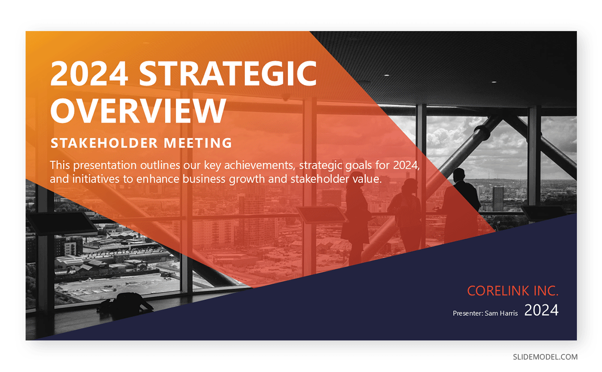
Define how to start a presentation for a meeting by selecting a professional title slide that includes the topic, presenter’s name, and date. This works as a visual asset to set the tone and context for the presentation. Unlike other formal formats, the objective explanation can be super concise or simply skipped, as your audience is already aware of the meeting. Consider it an extra element that helps focus on the meeting’s content, but not a vital one.
Agenda
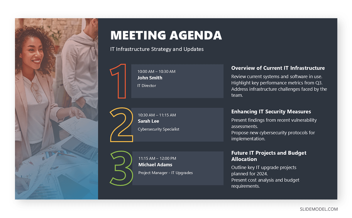
Provide a slide outlining the structure of the presentation. An agenda gives attendees a roadmap of what to expect and helps them follow along. For instance:
- Introduction and background
- Current status or problem statement
- Analysis and insights
- Recommendations or decisions
- Actionable next steps
Background and Context
Even if the audience is familiar with the topic, offering a concise recap of relevant background information can help with the level-set and provide context. For example, a quarterly review meeting might include a brief overview of the company’s financial targets and previous performance.
Key Data and Insights
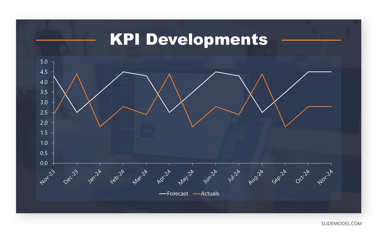
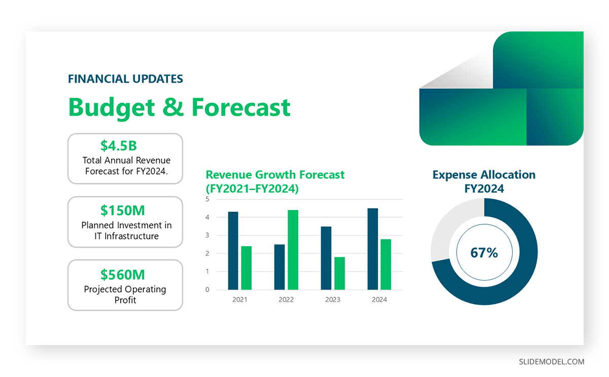
Data is the backbone of a strong meeting presentation. Whether presenting sales numbers, customer feedback, or operational metrics, use visuals like graphs, charts, and tables to convey insights. Be selective about the data you include—focus on what directly supports your message or decisions. You can check our article on business plan presentations to learn more about how to condense large datasets for business presentations.
Discussion Points or Recommendations
Every meeting presentation should aim to engage the audience in meaningful discussion. Clearly outline the key issues or decisions that need to be addressed. For example:
“What steps should we take to improve customer retention in Q2?”
“Should we allocate additional resources to this project?”
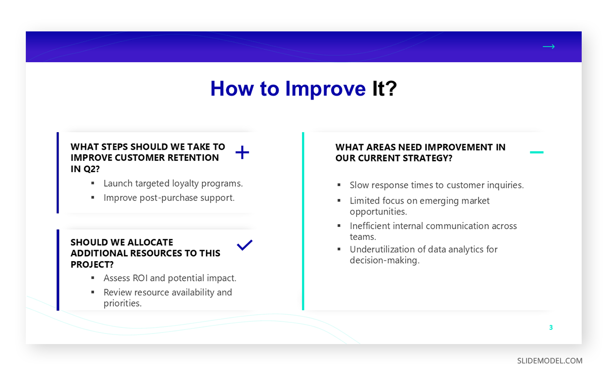
Provide recommendations backed by evidence, and be prepared to justify your proposals during the discussion.
Action Items
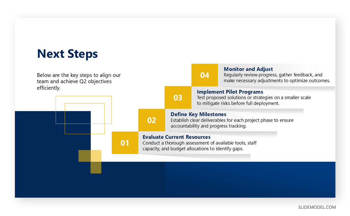
End a presentation for a meeting with a slide summarizing the key takeaways and next steps. Specify who is responsible for each action and provide clear deadlines. This ensures accountability and keeps momentum after the meeting. An AI note taker can also help here by automatically logging action items and decisions from the meeting, so nothing gets missed when assigning tasks later.
How to Create a Slide Deck for a Meeting Presentation
Now that we’ve established some baselines for which slides should be present in the meeting presentation, it’s time to define core concepts to create a selection of powerful meeting slides.
Select a Professional Template
When presenting to the meeting audience, professional-quality graphics are a must. This is a no-brainer. You need to establish your organization’s branding and create a cohesive message with the graphical assets you use; otherwise, all that hard work is wasted, as the audience won’t connect to your speech due to messy slides.
Prioritize Visual Hierarchy
Ensure that slides are easy to read and navigate. Use headings to highlight main points and bullet points for supporting details. For instance, a slide discussing sales trends might include:
- A large, bold heading: “Q3 Sales Performance”
- Key insights in bullet form: “Revenue increased by 12%,” “Customer acquisition costs decreased by 8%.”
- A graph or chart visualizing the data.
Minimize Text
What’s the point of having slides with huge walls of text when you are the person required to deliver the speech? It’s either one or the other thing, not both, so trim down the text lines and focus on conveying one idea or point per slide. Detailed explanations should be delivered verbally, with small cues to remember what was discussed.
Design for Your Audience
Visuals enhance understanding and retention. It’s much easier for the audience to react to an image, a chart, or an infographic than to a text reference. This means you have to understand your audience’s intellectual requirements before the meeting so you can create the proper graphical pieces for your slide deck.
Always test your slides for readability, especially if the meeting venue is a larger room. Avoid small fonts, overcrowded layouts, complex effects that can distract the viewer’s attention, and poor color contrast. Our article about presentation failure reasons explains the damaging effects of bad slides.
Grammar, spelling, or formatting errors can distract from your message and affect your credibility. Review your slides thoroughly and rehearse your presentation to ensure a smooth delivery.
Body Language and Meeting Presentations
Among the critical presentation skills to master for meeting presentations, body language stands out as it significantly impacts how your presentation is received. Follow the upcoming recommendations for the best non-verbal communication skills for meeting presentations.
Posture and Presence
Stand tall with a relaxed yet confident posture. Avoid slouching, leaning on furniture, or crossing your arms; these behaviors can signal disinterest or nervousness. Position yourself where all attendees can see you.
Eye Contact
Establishing eye contact builds trust and engagement. Shift your gaze naturally across the room to connect with all participants, avoiding the temptation to stare at your slides or notes.
Gestures
Use open and deliberate gestures to emphasize points. For example, when explaining a statistic, motion toward the relevant section of a graph or chart. Avoid repetitive or nervous movements, such as fidgeting or tapping.
Facial Expressions
Your expressions should match the tone of your presentation. A smile can foster warmth and approachability, while a serious expression underscores critical points.
Voice Modulation
Speak clearly and vary your tone, pitch, and pace to maintain interest. Use pauses strategically to let important points sink in.
When to Use a PowerPoint During a Meeting Presentation and When Not
Let’s be real: not all meetings require a presentation deck. Knowing when and how to use a meeting PPT slide deck ensures your presentation performance remains effective, but mostly, it depends on the context.
When a PowerPoint Enhances Your Presentation
PowerPoint is ideal when your presentation involves complex data, structured workflows, or visual comparisons. For example:
- Presenting quarterly financial performance
- Outlining a project timeline
- Comparing market trends using charts
Slides are also helpful for large meetings, where visuals can ensure everyone follows along.
When a PowerPoint Is Unnecessary
In smaller, informal settings, slides may feel redundant. For example, brainstorming sessions or team discussions often benefit from direct verbal exchanges or whiteboard illustrations. Additionally, avoid using PowerPoint if the content is simple enough to convey verbally or through presentation handouts.
Typical Mistakes in Meeting Presentations
Ignoring the Meeting’s Purpose and Context
Failing to align your presentation with the purpose of the meeting is a critical mistake. For example, presenting overly detailed research in a strategy meeting or delivering high-level overviews at an academic conference undermines relevance and wastes time. Always tailor the depth and scope of your presentation to the specific meeting goals.
Overestimating Audience Knowledge or Interest
Assuming the audience deeply understands your topic—or that they find it as fascinating as you—is a frequent misstep. For instance, presenting niche findings without connecting them to broader implications in academic environments can leave the audience disengaged. Similarly, technical jargon or excessive complexity without context can alienate non-specialist attendees in corporate settings.
Relying on Outdated or Irrelevant Data
Using old or irrelevant information can instantly undermine your credibility. For example, presenting last year’s market trends in a proposal for next year’s strategy reflects poor preparation. In academic contexts, citing outdated research without acknowledging recent developments can weaken your argument.
Ignoring Audience Signals
In a meeting setting, failing to read nonverbal cues—such as confusion, disinterest, or impatience—is a missed opportunity to adjust. Academic audiences, for instance, may disengage when slides are too fast-paced or overly technical. Corporate audiences may lose interest if key points are delayed or diluted.
Avoiding Constructive Discussion
Presenters sometimes treat questions or challenges as interruptions rather than opportunities for clarification or collaboration. Dismissing or deflecting questions in a business meeting can create friction and reduce trust. Failing to address critiques in academic environments undermines credibility.
Focusing Solely on Data Without Context
Data-heavy presentations that lack interpretation or actionable insights are ineffective. Simply presenting figures or graphs without explaining their relevance to the audience’s needs diminishes the impact of your content.
Recommended Meeting PPT Templates
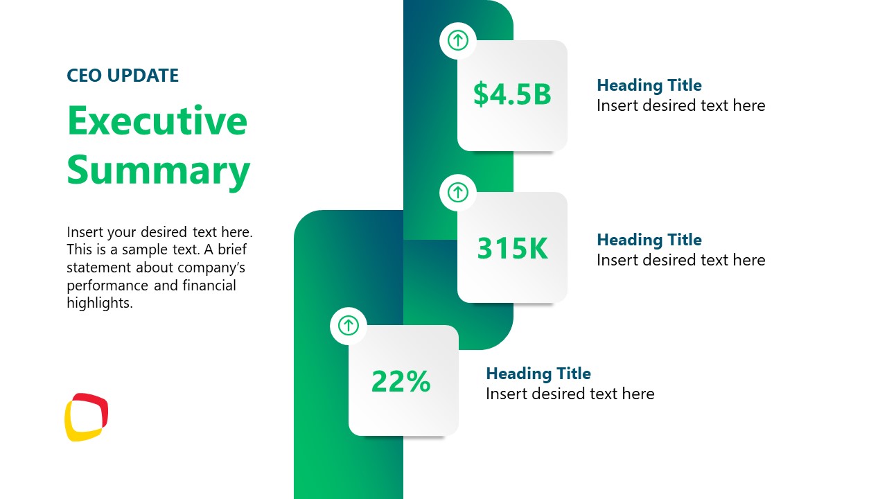
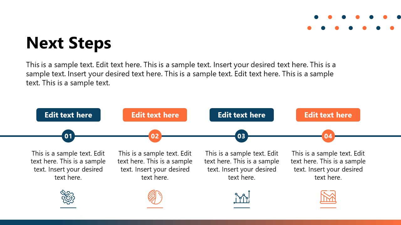
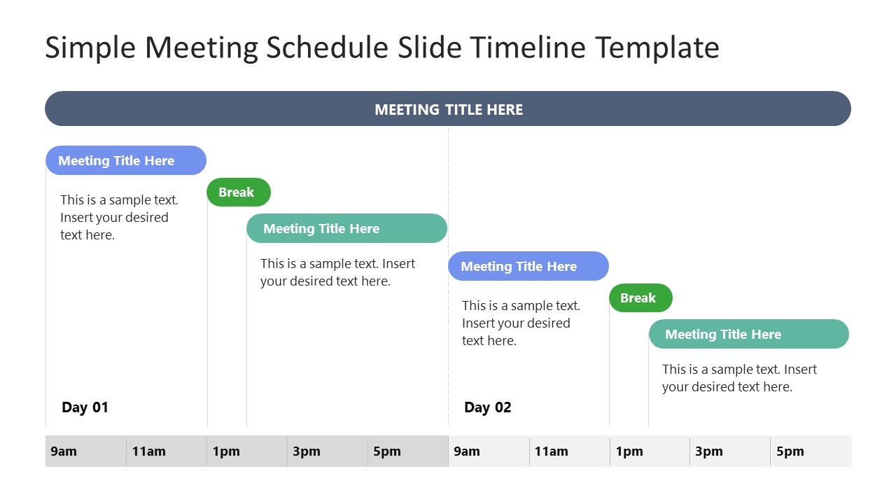
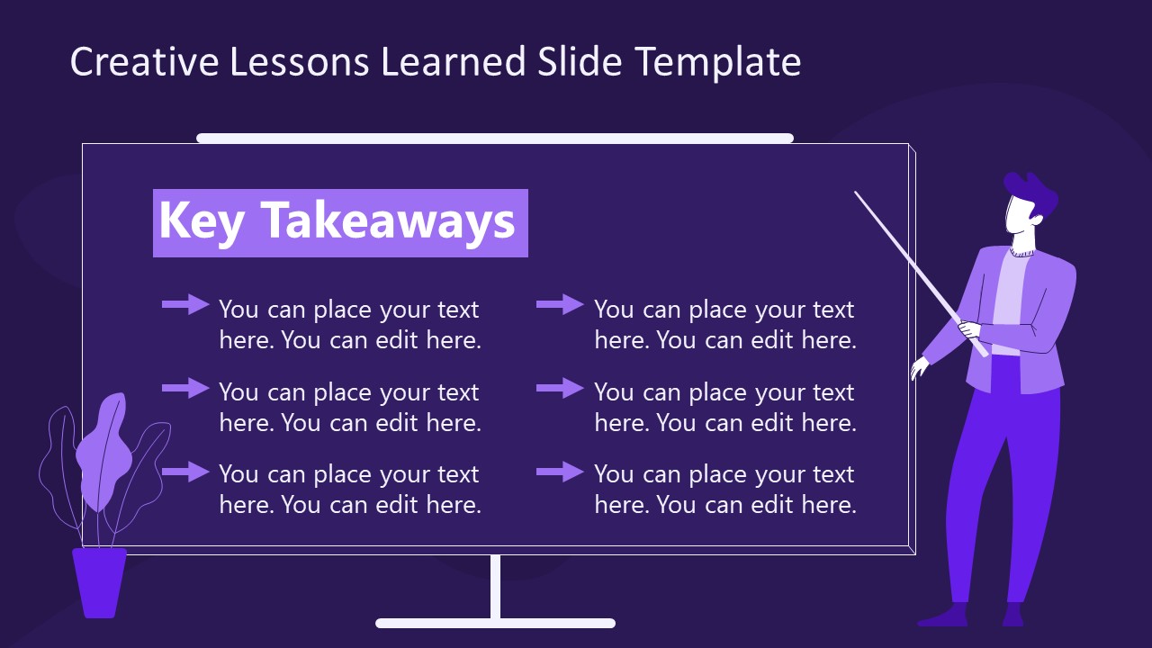
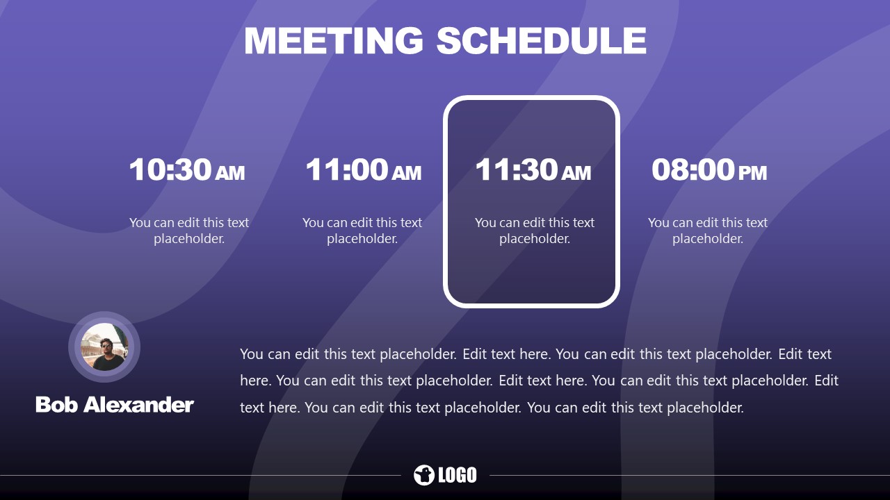
Check this selection of PowerPoint templates tailored for meeting presentations. Remember, these PPTX files are entirely editable, from text placeholders to images, shapes, colors, and more. Also, they work as Google Slides templates for Google Slides users.
FAQs
Can a meeting presentation include multimedia elements?
Yes, incorporating multimedia like videos or animations can enhance a meeting presentation. However, ensure these elements are relevant, concise, and used sparingly to avoid distractions.
How should I handle questions during a meeting presentation?
Allocate specific time for questions or indicate when questions can be asked during the presentation. Be open to feedback, and if necessary, note complex questions for follow-up discussions after the meeting.
Is it essential to use visuals in meeting slides?
While not always essential, visuals like charts, graphs, and images enhance the clarity and impact of meeting slides. Use visuals selectively to highlight critical points and maintain a professional aesthetic.
What’s the ideal length for a meeting presentation?
A meeting presentation should fit within the allocated time, typically 15–30 minutes, allowing additional discussion time. Each slide should focus on a single idea to keep the flow concise and impactful.
How can I ensure inclusivity when presenting in a meeting?
Use accessible language and visuals in your meeting slides. Avoid overly complex charts and provide descriptions for visuals, ensuring all participants, including those with disabilities, can follow along.
What’s the difference between meeting slides and handouts?
Meeting slides are designed for live presentations, focusing on key points and visuals. Handouts provide detailed information for later reference and should complement, not duplicate, the content of your slides.
Final Words
A well-executed meeting presentation requires careful planning, concise content, and confident delivery. By tailoring your presentation to your audience’s needs, creating effective meeting slides, and avoiding common mistakes, you can transform your presentations into tools for collaboration and decision-making.
Whether you use a conference presentation template or design a custom meeting ppt, focus on clarity, relevance, and professionalism. Mastering these elements ensures that your message resonates, your goals are achieved, and your audience clearly understands the next steps.
