An EBITDA slide is one of the few pages in a corporate deck that a room full of skeptical stakeholders will actually stop and read closely. Board members, private equity partners, and lenders use it as a shortcut to judge operating performance without the noise of financing structure, tax jurisdiction, or depreciation accounting choices. Yet many finance teams hand this number to whoever is building the rest of the deck, and it ends up buried in a dense table or a chart that looks lifted straight from an Excel export.
That gap between how much the audience relies on this figure and how little design attention it receives is where decks lose credibility. This article covers what an EBITDA slide needs to communicate, which chart formats fit different reporting contexts, how to build a clean bridge from net income to EBITDA, and the layout choices that keep a financial slide readable under pressure in a live meeting.
What an EBITDA Slide Communicates to a Business Audience
EBITDA stands for earnings before interest, taxes, depreciation, and amortization, and on a slide its job is to isolate operating performance from decisions made elsewhere in the business, such as how the company is financed or which depreciation schedule the accounting team chose. Executives read this number as a proxy for cash-generating ability, which is why it shows up constantly in board packs, credit committee memos, and acquisition models. A slide built around EBITDA needs to make two things obvious at a glance: the current period figure and the direction it is moving relative to a prior period, a budget, or a forecast.
This differs from a slide reporting net income because of the audience’s mental model. A CFO presenting net income has to walk through tax effects and interest expense, line items an operating manager rarely controls. An EBITDA slide strips that away, so the reader expects the story to be about the business itself: pricing, volume, cost discipline, or operating leverage. If a slide mixes EBITDA with unrelated financing commentary, it muddies the exact clarity the metric is supposed to provide. The design should reinforce that separation, keeping the EBITDA figure and its drivers front and center, and pushing financing or tax context to a supporting slide or appendix.
When an EBITDA Slide Belongs in the Deck
EBITDA slides earn their place in a handful of recurring deck types rather than every deck a company produces. Board meetings are the most common home, where a single EBITDA bridge often anchors the financial section and sets up the rest of the discussion. The same slide format works well inside a well-run quarterly business review, where leadership needs to show department heads how operating results compare to the plan they signed off on at the start of the period.
Recurring internal reporting cycles are a second natural home. Finance teams building department-level updates for internal leadership often need an EBITDA slide that ties company-wide performance back to unit-level contribution, which means the same underlying number gets sliced differently depending on who is in the room.
Investor-facing contexts are the third major category, and here the bar for polish rises considerably because the audience often has no prior context on the business. Pitch decks, lender presentations, and acquisition materials all rely on EBITDA as a comparability anchor, since it lets an outside party benchmark the company against public comparables or industry multiples without adjusting for capital structure. In each of these settings, the slide must work as a standalone artifact, because it will be screenshotted, forwarded, and read again without the presenter in the room to add context.
Preparing the Underlying Numbers Before You Design
Good slide design cannot fix numbers that were never reconciled correctly, so the groundwork happens before anyone opens a presentation tool. Start from the income statement and confirm the starting point, usually net income or operating income, along with every add-back the finance team plans to include: interest expense, income tax provision, depreciation, and amortization. Many companies then layer in further adjustments to reach an adjusted EBITDA figure, covering items like one-time restructuring costs, stock-based compensation, or transaction fees tied to an acquisition. Each adjustment needs a defensible rationale, because an experienced board member or investor will ask about any add-back that looks like it is smoothing over a recurring cost.
Pulling these figures directly from the source documents, rather than a summary built weeks earlier, matters more than it sounds. Teams that build slides from financial statements formatted for that specific presentation cycle avoid the version-control problems that come from copying numbers across multiple spreadsheets. It also helps to have supporting detail ready, such as a statement of retained earnings, in case a board member asks how EBITDA performance is flowing through to accumulated equity. None of this detail needs to appear on the main slide, but having it one click away in an appendix keeps the presenter from fumbling during questions.
Choosing the Right Chart Type for EBITDA
The right chart format depends on the question the slide answers. A single period figure calls for a different treatment than a multi-year trend, and a bridge from one number to another needs a format built specifically for that purpose. Two formats cover most EBITDA reporting needs, each suited to a distinct kind of comparison.
The Waterfall Bridge for Reconciliation
When the goal is to explain how EBITDA moved from one period to the next, a waterfall chart is the closest format to telling the story correctly. Starting and ending EBITDA appear as full-height bars, and everything in between- price, volume, cost inflation, one-time items- shows up as a floating bar that steps the reader from the starting figure to the ending one. This format works because it answers the question a board actually asks: not what EBITDA was, but what changed and why.
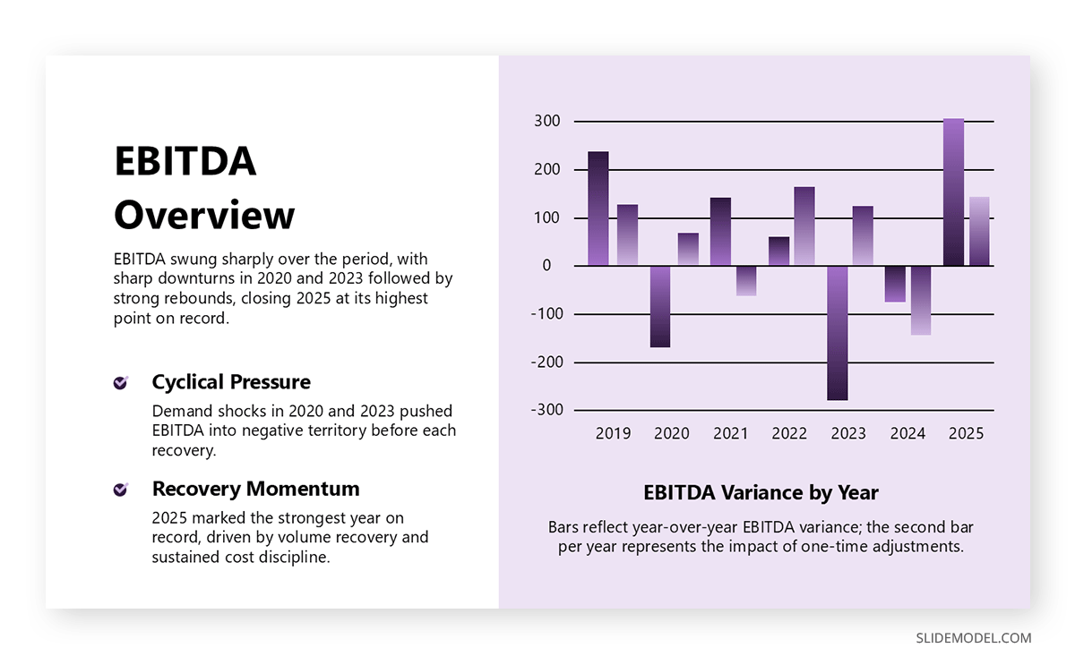
Keep the number of floating bars manageable. Five to seven drivers is usually the ceiling before the bridge becomes harder to read than the table it replaced. Group smaller items into an “other” category rather than showing every minor adjustment, and reserve individual callouts for drivers large enough to warrant a conversation. Label each bar with both the dollar impact and a short description of the driver, since a bar labeled only with a dollar figure forces the audience to guess at the cause.
Trend Lines, Columns, and Tables for Comparison
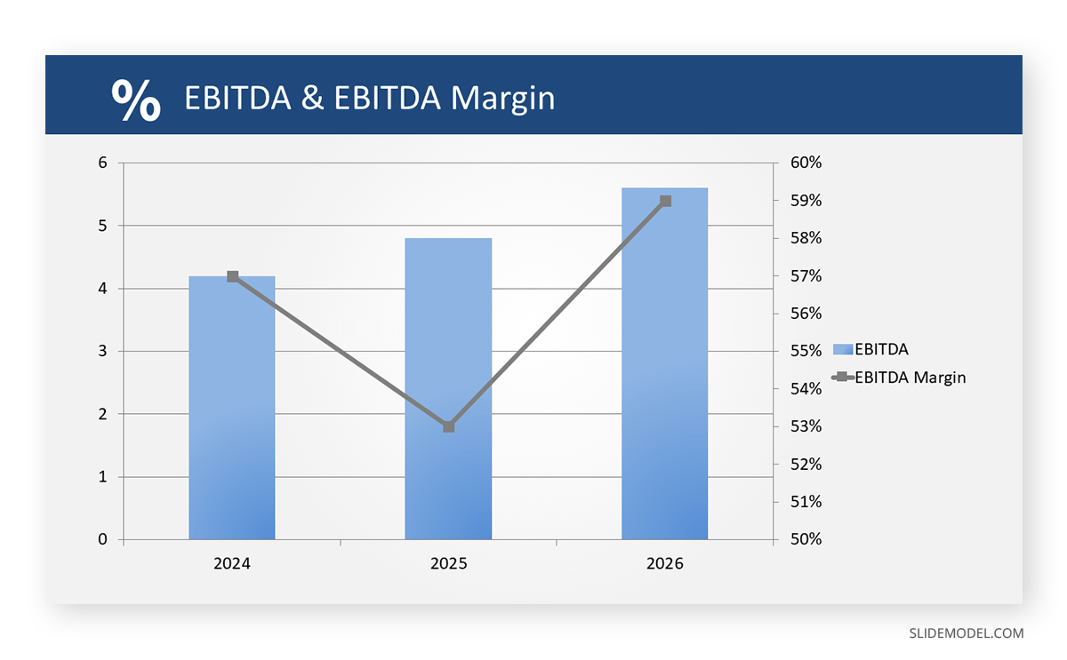
A multi-year or multi-quarter view of EBITDA usually reads better as a column chart with a trend line overlay than as a waterfall, since the audience is tracking a trajectory rather than reconciling a single period’s movement. Columns show the absolute dollar figures, while a secondary line tracking EBITDA margin lets the audience see whether growth comes with improving profitability or simply more revenue at the same margin. This combination answers two questions in one visual instead of forcing a second slide.
When the audience needs to compare EBITDA across business units, regions, or scenarios side by side, a well-formatted table slide often communicates more precisely than any chart. Tables are the right call when the exact figures matter more than the visual impression of the trend, such as in a board pack appendix where a director might need to trace a specific number back to a source document. The mistake to avoid is defaulting to a table because it is faster to build; a table should be a deliberate choice for precision, not the fallback when nobody has time to design a chart.
Building the EBITDA Slide Step by Step
Start by confirming the starting and ending values on the bridge match the numbers already presented elsewhere in the deck; a bridge that doesn’t reconcile to the headline figure a few slides earlier is one of the fastest ways to lose a room’s trust. From there, list every driver in the order it occurred or in descending order of magnitude, whichever makes the narrative easier to follow out loud. Assign each driver a consistent color based on whether it increased or decreased EBITDA, and keep that color pairing consistent across every bridge slide the company produces, since a board that sees one color convention in one meeting and a different one in the next will spend energy decoding colors instead of listening to the story.
Size the chart so the floating bars are tall enough to read their labels without a legend pointing back and forth across the slide. Place the dollar value directly above or below each bar rather than relying on a data table underneath, which forces the eye to travel away from the visual it is trying to interpret. Finally, add a single sentence of takeaway text above or below the chart, stating in plain language what drove the change, so a reader skimming the deck later gets the conclusion without having to reconstruct it from the bars alone.
Design Principles That Keep Financial Slides Credible
Financial slides live or die on restraint. The first principle is visual hierarchy: the EBITDA figure itself should be the largest and highest-contrast element on the page, with supporting commentary, footnotes, and axis labels receding into smaller type and lighter color. Several of the laws of UX for presentation design apply directly here, particularly the idea that the eye follows the strongest contrast first, so a slide meant to register the EBITDA number before anything else needs to make sure nothing else on the page competes with it in size or saturation.
Color coding for positive and negative variances should stay consistent and avoid relying on red and green alone, since some audience members have a form of color vision deficiency. Pairing color with a directional icon, such as an up or down arrow, or with a plus or minus sign on the label itself, keeps the message accessible without diluting the visual language finance teams already expect.
Typography deserves the same discipline. Use a tabular figure font so digits align vertically in any accompanying table, and keep rounding conventions consistent across the deck, whether that means reporting to the nearest thousand or the nearest million. A slide that rounds one figure to the nearest ten thousand and another to the nearest million invites the audience to question the rigor behind every other number in the deck.
Common Mistakes on EBITDA Slides
Mixing adjusted and reported EBITDA without a label
When both figures appear near each other with no visible distinction, the audience cannot tell which number to trust, and the ambiguity itself becomes the story instead of the results.
Overloading the bridge with too many drivers
A waterfall with a dozen floating bars is harder to parse than the spreadsheet it was meant to replace. Group minor items and save the individual callouts for what actually matters.
Skipping the margin story
A dollar figure alone cannot show whether growth came with better profitability or just more revenue at a flat margin, and an audience that has to ask usually assumes the worst.
Rounding inconsistently across slides
Switching between the nearest thousand and the nearest million within the same deck reads as carelessness, even when the underlying numbers are perfectly accurate.
Burying the adjustment methodology in tiny footnotes
Non-GAAP reconciliations need to be easy to find, not technically present but visually hidden, or they read as an attempt to obscure rather than disclose.
Changing the color convention between reporting periods
A board that has to relearn which color means an increase every quarter is spending attention on the legend instead of the results.
Tailoring the Slide to Board, Investor, and M&A Audiences
The same underlying EBITDA figure often needs a different presentation depending on who is reading it and what they already know about the business.
Board and Internal Presentations
Board members and internal leadership see the company’s numbers regularly, so the EBITDA slide can assume a baseline of familiarity that would be inappropriate for an outside audience. The presenter can move faster through the bridge and spend more time on the two or three drivers that matter most this cycle, rather than re-explaining the mechanics of EBITDA itself. This is also where consistency across meetings pays off: a board that sees the same bridge format quarter after quarter can spot an unusual driver immediately, because everything else on the slide looks exactly as expected.
For department-level internal presentations, the EBITDA slide often needs to translate a company-wide figure into a business unit’s specific contribution. This version usually benefits from an additional layer of detail, such as a contribution margin breakdown beneath the headline number, since operating managers respond better to figures they can trace back to decisions within their control.
Investor and Pitch Deck Contexts
Outside investors rarely bring the historical context a board does to every meeting, so an EBITDA slide in an investor pitch deck needs to work harder to earn trust. Historical EBITDA should appear alongside enough narrative to explain any unusual swings, and adjusted figures need a visible reconciliation rather than a footnote in small type, since sophisticated investors will discount any number they cannot immediately verify.
Where the deck moves from historical results into a financial projections slide, the EBITDA story shifts from explanation to persuasion. The projected bridge should use the same driver categories as the historical slides, so investors can judge whether the assumptions behind future growth match what drove past performance.
M&A and Due Diligence Materials
Acquisition processes put more scrutiny on EBITDA than almost any other reporting context, since the metric often anchors the valuation multiple both sides are negotiating against. Materials prepared for this stage need every adjustment traceable to a line in the underlying financials. Building the supporting detail against a structured due diligence checklist helps confirm that every adjustment on the EBITDA slide has documentation ready to back it up, rather than discovering a gap mid-negotiation.
The slide itself should stay conservative in this context. Aggressive add-backs that would be unremarkable in an internal board deck can become negotiation leverage for a buyer trying to argue the adjusted figure overstates true operating performance. A slightly more conservative adjusted EBITDA with airtight documentation tends to hold up better under scrutiny than a higher number built on adjustments a buyer’s advisors can pick apart early in diligence.
Complementary Slides That Reinforce the EBITDA Story
An EBITDA slide rarely stands alone in a well-built deck. An executive summary slide placed earlier in the presentation gives the audience the headline figure and its direction before they see the full bridge, so the detailed slide confirms a story the audience already has in mind rather than introducing it cold.
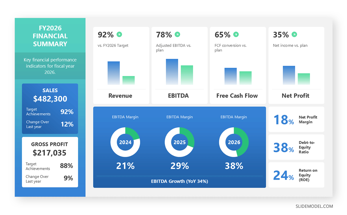
For companies reporting on a recurring basis, a broader financial dashboard slide can sit alongside the EBITDA bridge, giving the audience revenue, margin, and cash metrics in one view before drilling into operating profitability specifically. Some finance teams also tie EBITDA performance to a balanced scorecard that connects financial results to the operational and strategic metrics driving them, helping the board see EBITDA as an outcome of specific initiatives rather than an isolated number.
Looking forward, a financial planning slide that lays out the assumptions behind next period’s EBITDA target closes the loop, showing the audience not just where the business has been but the specific plan for the number they should expect to see next time.
FAQs
How does an EBITDA slide differ from a net income slide in a board deck?
Net income reflects financing and tax decisions the operating team may not control, while EBITDA isolates operating performance. An EBITDA slide should stay focused on operating drivers like pricing, volume, and cost, leaving financing commentary for a separate section.
What is the best chart type for showing multi-year EBITDA growth?
A column chart with margin shown as an overlaid trend line usually works better than a waterfall for multi-year trends, since it shows both the absolute dollar growth and whether profitability is improving alongside revenue.
How many drivers should appear on an EBITDA bridge before it looks cluttered?
Five to seven floating bars is a practical ceiling. Beyond that, group smaller adjustments into a single “other” category rather than showing every line item individually, or the bridge becomes as hard to parse as a spreadsheet.
Should EBITDA margin appear alongside the dollar figure on the slide?
Yes, in most cases. Margin tells the audience whether growth is coming with improved profitability or simply more revenue at a flat margin, a distinction the dollar figure alone cannot show.
How should a negative EBITDA figure be handled on a waterfall chart?
Keep the color convention consistent with positive figures reversed, typically the decrease color, and anchor the bar clearly below the zero line so the negative result is visually unambiguous.
What is the right way to footnote non-GAAP adjustments on an EBITDA slide?
A brief footnote identifying which figure is non-GAAP and pointing to a reconciliation table in the appendix is standard practice. Burying the disclosure in tiny type invites scrutiny from investors and auditors alike.
How many periods of historical data should an EBITDA trend slide include?
Three to five years is typical for board and investor decks, enough to show a trend without overwhelming the slide. Shorter internal reporting cycles often work better with four to eight recent quarters instead.
Should EBITDA be shown in absolute dollars or as a percentage?
Both, ideally. The dollar figure anchors the scale of the business, while the percentage margin lets the audience compare performance across periods or against industry benchmarks without recalculating in their head.
How does an EBITDA slide change between a board meeting and an investor pitch?
Board audiences already have context, so the slide can move quickly to the drivers that matter this cycle. Investor audiences need more narrative and a visible reconciliation, since they cannot verify the adjustments from memory.
What color conventions work best for EBITDA variances?
Consistent color pairing for increases and decreases, reinforced with a directional icon or a plus and minus sign rather than color alone, keeps the slide readable for audience members with color vision deficiency.
How can an EBITDA slide avoid looking like a spreadsheet dump?
Limit the visible data to what supports the narrative, move exhaustive detail to an appendix, and let one chart format, whether a bridge, a column trend, or a table, carry the entire story instead of combining several on one page.
Is it appropriate to show projected EBITDA on the same slide as historical results?
Yes, as long as the projection uses the same driver categories as the historical bridge. Consistency between the two builds confidence that the forecast is grounded in the same operating logic that produced past results.
How should the source of EBITDA figures be cited on a slide?
A small source line beneath the chart, referencing the specific financial statement or reporting period the figures were pulled from, gives the slide credibility without cluttering the main visual.
What is a common mistake when comparing EBITDA across business units?
A common mistake is comparing units without normalizing for scale or applying reporting adjustments consistently. Each unit’s figure needs the same adjustment methodology applied before any side-by-side comparison is meaningful.
Should adjusted and reported EBITDA both appear on the same slide?
Only if clearly labeled and reconciled. Showing both without a visible bridge leaves the audience unsure which figure to trust, undermining the credibility the slide is trying to build.
Final Words
An EBITDA slide earns the scrutiny it gets because the number itself carries real weight in how a business gets valued, financed, and judged by people who were not in the room when the results were produced. The slide’s job is to survive that scrutiny on its own, whether it’s read live in a board meeting or forwarded weeks later without narration. That means the chart format has to match the question being asked, the underlying numbers have to reconcile cleanly back to the source financials, and the design choices, from color coding to typography, need to support the story rather than distract from it.
Treat the EBITDA slide as recurring infrastructure rather than a one-off design task, and each reporting cycle becomes a matter of updating numbers inside a format the audience already trusts.