At SlideModel.com we receive several help requests from our users regarding Financial Analysis PowerPoint Presentations, mainly the presentation of Financial Statements data. We have previously wrote about this topic in our post Financial Statement Templates For PowerPoint Presentations with the objective to help users summarize relevant data and communicate the important conclusion extracted from the statements. The feedback was positive, but we are still requested to provide some guidelines on detailed statements. For this reason we will walk through our Financial Statements PowerPoint Template which provides comprehensive tables that provide higher level of detail. In order to have a higher visual impact and allow the message to engage the audience, the template also provides charts and ratios dashboards that will appeal to executive audiences.
- Financial data is complex
- Concepts are not intuitive
- The understanding and frame of references varies depending the audience.
This facts will drive your consolidated financial statements presentation plan.
The following sections will walk through financial statement presentation examples and will provide insights on how to tackle them.
Balance Sheet
The balance sheet by definition is a financial statement that summarizes an organization assets, liabilities and equity at a specific point of time (a snapshot). This three concepts provide information on what the organization owns, owes and how much was invested (capital). Applying the facts we described before, Balance Sheet data is complex, so you will try to summarize the data in each section as much as possible, presenting the relevant accounting lines (generally, those associated with Liquidity , Debt and Net Worth). The Concepts (Assets, Liabilities and Equity) are not simple, and when you dive into “liquidity of them”, it starts getting harder. The audience will drive your level of detail, so present a table where the major concepts are clearly highlighted (background colors), with totalizers (use bold for this lines and make sure you point them strongly). Move quickly to the Ratios section if understood, otherwise navigate to a second level of detail, if the audience requests to drill down.
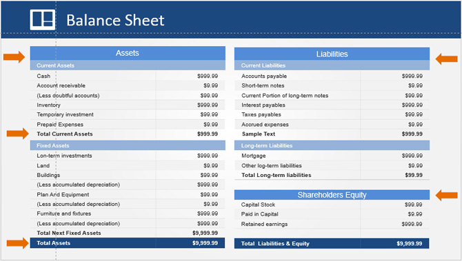
As shown by the orange arrows in the image, the important concepts are highlighted. Again, what will remain in the audience mind is that “you can explain detail if requested”, “you can show the consolidated numbers” and that “you can move to the important topics derived in the relationships of Financial Statements”, the Ratios.
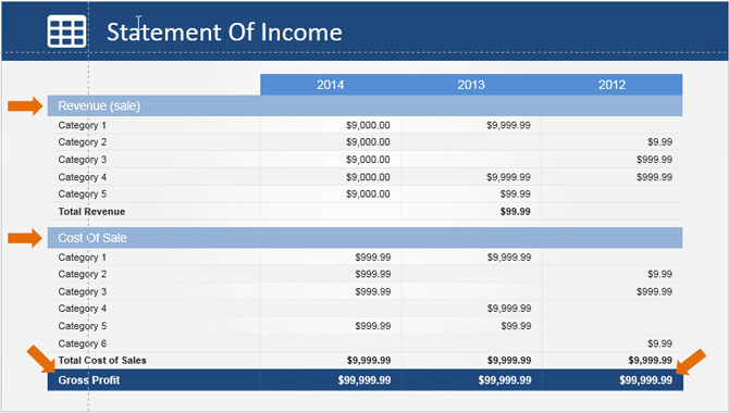
Income Statement
The Income Statement, also known as “Statement of Incomes” , “Profit & Loss” or just “P&L”, is a financial statement that presents financial performance of an organization over a time period. How does it measures performance ?, summarizing how revenues occur and how expenses were incurred for all the organization activities (operational and non-operational). Also , shows the Net Profit (positive or negative) over the period.
This statement if divided into two sections, operational and non-operational. Operational items are directly related with the organizations core activities in Sales and Cost of Sale. Non Operational Items are expenses the company incurs for administrative , managerial or assets exchange activities.
Differently from the Balance Sheet, the Income Statement represents a period of time and not a snapshot.
When creating an Income Statement Presentation, take into account that what the audience is looking for is How the organization is performing?. Generally, to show performance, you will need to compare against other period or a benchmark, for that reason each column is a “challenger” for the actual period column. Even though the absolute numbers are important you will need to communicate the Trend concluded against the original and challengers statements. Highlight the Revenues and the Cost of Sales. Present them in an individual Slide as the “Operational” Section of the statement.
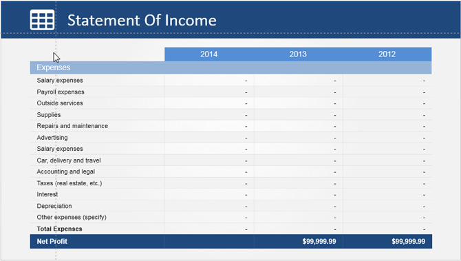
The second section of the Income Statement, is the Non-Operational Items, generally called “expenses”. This section shows how the organization management is using money for non operational activities. This section is important when the analysis is centered in improving efficiency. The amount of non-operational items can be huge, so its important you can consolidate into categories. Take your time to exercise this suggestion, otherwise the list will be too long, and will dis-encourage the audience. As a suggestion, keep in mind that this line items are industry dependent. Analyze some examples in your industry to come up with meaningful consolidated categories.
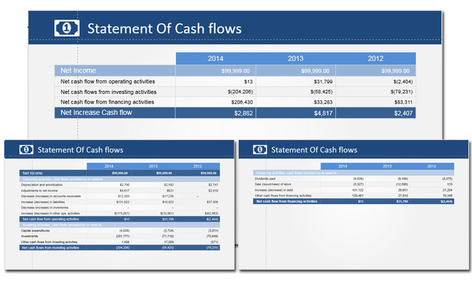
Statement Of Cash Flows
The Statement Of Cash Flows, by definition, is the financial statement that presents all the cash inflows and outflows derived of the operating, financing and investing activities of the organization in a period of time. This financial statement is created by 2 widely used methods, the direct and indirect methods. The main difference is that the direct method uses cashflow records to create the operational items while the indirect method uses accrual accounting information to present the cash flows from the operations section, deriving them from the net income.Considering that the indirect method is the most popular, we included its table in the template.
This statement must communicate the cash flows through the organization activities and their accounting recognitions. The analysis generally will focus on the sustainability of the operational section, and how much investment and financing is required at the period to keep the business going. If contracts are being recognized as revenue in a period but money is not really reaching the organization, the statement of cashflows will spot this problem and will help managers to take actions over it. With the same reasoning, if net income allows higher cash flow bandwidth in operations, the organization could use fund for repaying debt and diminish the cost of financing.
The Statement of Cash Flows is divided in the three sections mentioned, Operational, Financing and Investing activities. In this template we created one slide for Operations and Finance, a second slide for Investing and a third slide with the subtotals of each activity, showing the total cash flows.
Presenting Trends
As we mentioned before, the important message that need to be presented with the financial statement is the organizations performance. The best tools for communicating trends, are the charts. In this case the Financial Statements PowerPoint Template Provides three editable examples. We will show how the presenter can edit the charts and present meaningful information derived from the statements.
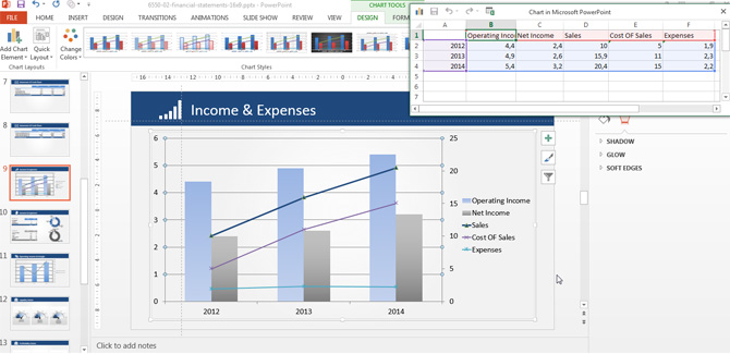
Income and Expenses Barchart
When reviewing the Income Statement, we explained the importance of the Operational Data versus Non-Operational. The Income and Expenses Chart visually communicate the relationship between this activities and allows the audience to review the trend or evolution, period versus period. This is ideal for spoting efficiency opportunities. The chart has two veritcal axis. The left (or main) axis represents the Operational Income and Net Income. The right axis (or secondary Axis) represents the Sales, Cost of Sales and Expenses. Remember the simple algebra that relates this value:
- Operational Income = Sales – Cost of Sales
- Net Income = Sales – Cost of Sales – Expenses
This example shows that the Net Income increases with time at a higher rate than the operational income. This can be interpreted as that sales improved, and expenses were kept almost similar. This kind of information is the message the presenter need to communicate, and the use of chart will boost the audience retention of the idea.
The chart is created as a PowerPoint chart, so the user will be able to edit it though the “Edit Data” Option of the “Chart Tools > Design” menu.
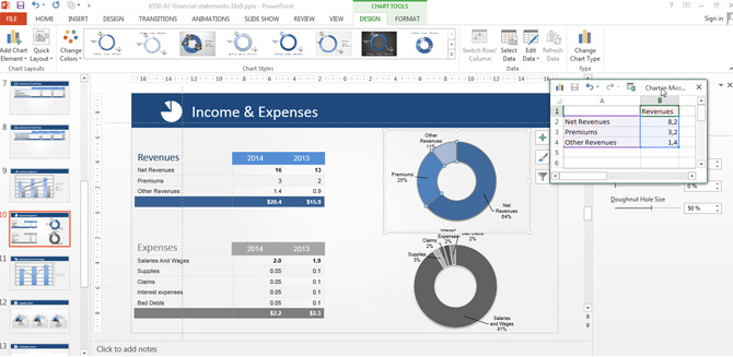
Income and Expenses Pie Chart
The other Chart Tool included in the Financial Statement PowerPoint Template is the Discrimination in Revenues and Expenses. This Charts help to transmit the message of revenues streams and expenses items. Ideal to communicate which are the business lines that bring higher revenues to the organization and which are the items were most of the money is being spent. Again, this chart will allow to spot efficiency problems, prioritize business units or cut costs.
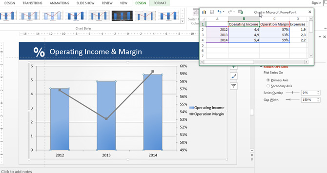
Operating Income & Margin
One of the most extensively used key performance indicators in financial statement is the Operating Margin. This indicator derived from the operating revenues and operating costs allows to compare efficiency on the performance of the value proposition delivery. The trends over the operating margin can show problems in costs or problems on value proposition delivery that derive in a lower return. Again, in the sake of providing comparable features, the chart presented uses two vertical axis (primary and secondary). The primary axis (left) represents the Operating Income. The secondary axis (right) represents the Operating Margin. The chart is Data Driven, and editable through Excel.
Financial Statement Ratios
In this section we will show the most popular ratios used in conjunction with the Financial Statements. Following the initial note idea, the aim of the financial statements presentation should not be to repeat numbers and lists, but to communicate conclusions of the information hidden behind them. With this objective in mind is that executives decided to move into ratio analysis instead of financial statements analysis, basically because a summarized indicator (KPI) that relates specific data, provides enough information for decision making process, without the need of extensive analysis.
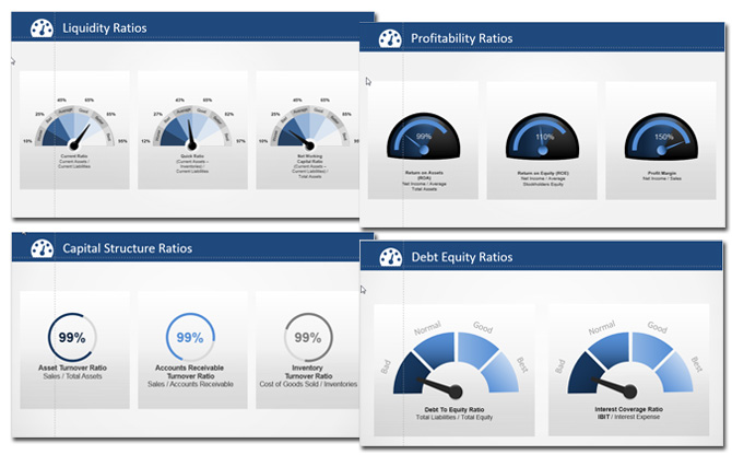
Liquidity Ratios
The liquidity ratios,by definition, are key performance indicators of the organization to determine it’s ability to pay off its short-terms debts obligations. They are created with information derived from the Balance Sheet (so they represent a snapshot). In the Financial Statement PowerPoint Template we created gauges indicators with categories from Best to Worse. The presentar can edit and manipulate this shapes as the are 100% fully editable. The indicators selected are:
- Current Ratio: also known as Working Capital Position.
- Quick Ratio: also known as Acid Test Ratio
- Net Working Capital Ratio
Profitability Ratios
Organizations Financial Performance can be interpreted from different angles, some times, growth is more importante than being “more” profitable, but almost all the times executives need to compare profitability between periods, to understand the impact of strategic decisions over the amount of money left for the organization and stakeholders.
For this ratios we prepared an alternative Gauge design, modern and without classification over the values.
The ratios presented are:
- Return on Assets (ROA)
- Return on Equity (ROE)
- Profit Margin
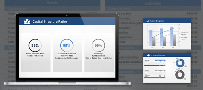
Capital Structure Ratios
The Capital Structure is how an organization finances its overall operations and growth by using different sources of funds. The Ratios on this sections allows the presenter to communicate this relationships. In this case instead of gauge like indicators, we used Editable Donut Charts.
- Assets Turnover Ratio
- Accounts Receivable Turnover Ratio
- Inventories Turnover Ratio
Debt Equity Ratios
The debt equity ratios show how the organization uses debt and equity to finace assets and operations.
- Debt to Equity Ratio
- Interest Coverage Ratio
Conclusion
Creating Consolidated Financial Statements PowerPoint Presentations can be a tough job. The presenter needs to evaluate the complexity of the data, the depth to be shown and the audience that will assist the presentation. Tools like charts and dashboard will help the presenter to summarize relevant information and communicate quicker, the important facts. The use of Financial Ratios is fundamental for a successful message.