A win/loss analysis creates value only when someone in the room decides to change something because of it. Collecting the interviews, tagging the loss reasons, and building the spreadsheet is the easy half. The harder half is turning that raw material into a presentation that a sales leader, a product owner, and a CFO can all sit through and walk away with a shared understanding of what happened and what to do next.
This guide covers what a win/loss analysis presentation needs to include, how to structure it so the argument builds logically instead of dumping data on the audience, and how to design the slides so the charts, tables, and comparisons carry the message rather than bury it.
What Is a Win/Loss Analysis Presentation
A win/loss analysis presentation is the slide deck version of a research process: it takes interview transcripts, CRM notes, and deal outcome data and compresses them into a narrative that explains why deals were won, why deals were lost, and what pattern connects them. It differs from the underlying research report in one important respect. The report documents everything the team learned. The presentation exists to drive a decision, whether that is a change to pricing, a shift in messaging, or a new competitive battlecard for the sales team.
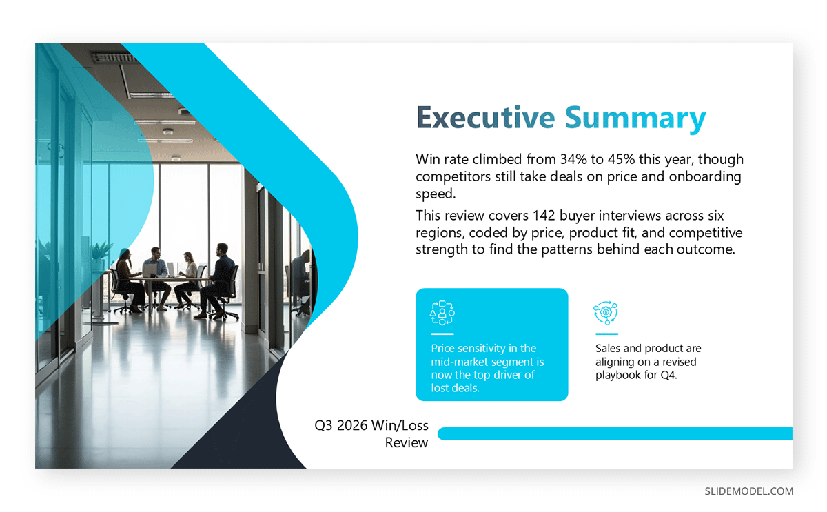
That distinction shapes almost every choice that follows. A report can include every quote and data table because a reader can skim past what doesn’t apply to them. A presentation cannot, because an audience in a live meeting has one pass at the material and can’t skip ahead. The presentation deck needs an executive summary slide near the front that states the headline finding before the supporting detail arrives, and every later slide needs to reinforce that headline rather than introduce competing threads.
The format also changes how much interpretation the presenter has to do out loud. A written report can leave a finding slightly open-ended and let the reader draw their own conclusion. A live presentation puts the presenter in the room to answer follow-up questions on the spot, which means the slides can carry less defensive detail than a report would need, as long as the presenter is prepared to back up each claim verbally when someone in the meeting pushes on it.
Why a Win/Loss Deck Needs Its Own Presentation, Not a Slide in Something Else
Win/loss findings often get folded into a broader sales presentation or quarterly business review, appearing as one or two slides near the end. That placement tends to bury the findings under everything that came before, and it forces the presenter to compress months of interview work into a summary that has no room for the reasoning behind the recommendation.
A standalone win/loss review earns a dedicated slot on the calendar because the output is meant to change behavior across several teams at once, not just inform one meeting’s agenda. Sales needs the objection patterns to update talk tracks. Product needs the feature gaps to prioritize the roadmap. Marketing needs the messaging feedback to adjust positioning. Giving the analysis its own presentation, even a short one, signals that the findings carry enough weight to warrant a decision rather than a passing mention, and it gives the presenter room to walk through the evidence before asking the room to act.
A dedicated slot also protects the meeting’s agenda from getting cut short. When win/loss findings sit at the end of a longer quarterly business review, they are the first section to lose time if earlier topics run long, which means the recommendation slide, the part that actually matters most, often gets rushed through or pushed to a follow-up email that few people read closely.
Gathering and Structuring the Data Before Building a Single Slide
The presentation is only as strong as the data behind it, so it is worth organizing that data before opening a slide editor. Interview notes and CRM fields often arrive in inconsistent formats: some reps write detailed loss reasons, while others log a single word. Before the slide deck takes shape, the underlying reasons need to be coded into a consistent set of categories, whether that is price, product fit, timing, competitor strength, or internal champion turnover, so the same category means the same thing across every deal in the dataset.
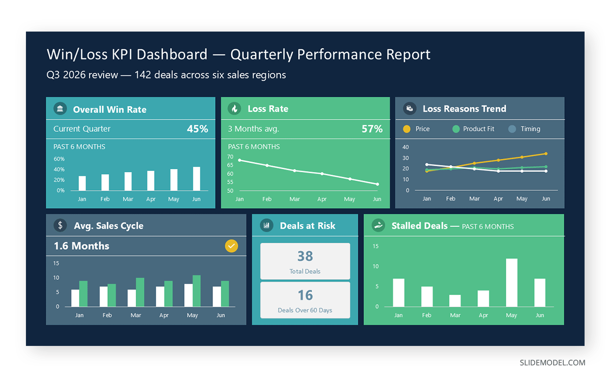
Once the categories are settled, pair the qualitative themes with the quantitative counts behind them. A comparison chart works well here because it lets the audience see how frequently each loss reason appears relative to the others, rather than reading a list of anecdotes with no sense of scale. If the team already tracks these figures on an internal dashboard slide, pulling the same numbers into the presentation keeps the story consistent with what stakeholders see day to day, rather than introducing a second set of figures that don’t quite match.
It also helps to decide early which deals get excluded from the dataset, such as internal test accounts or deals that stalled for reasons unrelated to the buying decision, so the final counts hold up when someone in the audience asks how a specific number was calculated. A short data appendix at the end of the presentation, listing the deal count, the date range, and the categorization rules, gives a skeptical stakeholder somewhere to look without cluttering the main slides.
Structuring the Presentation From Cover to Recommendation
A win/loss presentation reads best when it follows a sequence the audience already expects: context, methodology, headline numbers, the reasons behind wins, the reasons behind losses, competitive comparison, and a recommendation. Opening with a brief methodology slide, how many deals were reviewed, over what period, and how the interviews were conducted, gives the findings credibility before the audience sees a single chart, and it heads off the natural question of whether the sample is representative.
Many teams borrow a recognizable presentation structure for this kind of review rather than inventing one from scratch. A McKinsey-style structure that opens with the answer and builds supporting logic behind it suits executives who want the conclusion first. A Deloitte-style structure that walks through situation, complication, and resolution can work better when the recommendation depends on convincing a skeptical audience that a real problem exists before proposing the fix. Either approach beats a chronological retelling of every interview, which tends to lose the room by the third slide.
The section order matters as much as the structure it borrows from. Placing the win drivers before the loss drivers, rather than leading with everything that went wrong, sets a more balanced tone for the rest of the meeting and gives the sales team a foundation of what to keep doing before the deck turns to what needs to change.
Choosing Charts That Make Win/Loss Data Readable
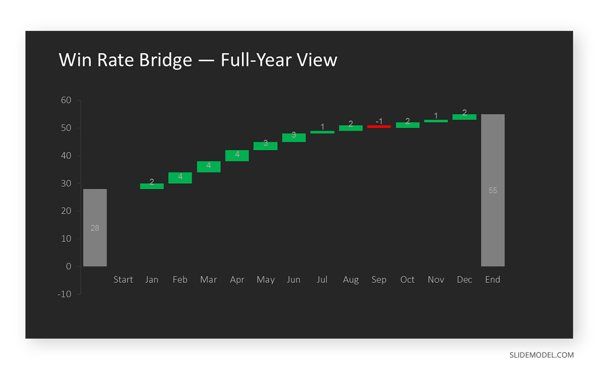
Win/loss data is dense, and the chart choice does more to help or hurt comprehension than any amount of narration on the slide. Categorical breakdowns, such as loss reasons by frequency, read clearly as a horizontal bar chart ordered from most to least common, since the ranking itself is part of the message. A waterfall chart suits win rate changes over time particularly well, because it shows not just the starting and ending number but which factors added or subtracted along the way.
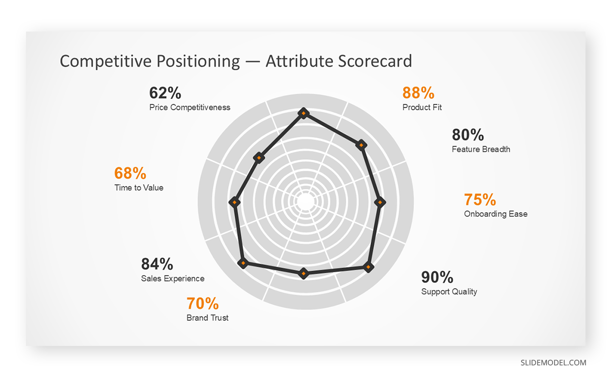
When the analysis compares multiple competitors across several attributes at once, such as price, product breadth, and support quality, a radar chart can condense that comparison into a single shape rather than a page of numbers, though it only works cleanly with four to six attributes before it becomes hard to read. For raw figures that stakeholders will want to reference later, such as win rate by segment or by deal size, a well-formatted table slide still beats a chart, since some numbers are meant to be looked up rather than compared visually.
Color choice on these charts deserves its own attention rather than defaulting to whatever the software suggests. Reserving one consistent color for the organization’s own figures and a separate, neutral color for competitor or lost-deal figures across every chart in the deck lets the audience read the pattern at a glance, even on a slide they have not seen before, instead of relearning the color key each time a new chart appears.
Designing Slides That Show Competitive Positioning Clearly
The competitive section is usually where a win/loss deck earns its keep, since it tells the sales team exactly where they are strong and exactly where a specific competitor tends to pull deals away. A side-by-side layout, with the organization’s strengths and gaps on one side and the named competitor’s on the other, communicates this faster than paragraphs of text, and it mirrors the logic of a SWOT analysis that many stakeholders already recognize from other planning exercises.
Slide design choices matter more here than almost anywhere else in the deck, because a cluttered competitive slide undermines the credibility of the finding it is trying to convey. Keeping a consistent color code for “us” versus “them,” limiting each slide to one competitor at a time rather than several, and leaving enough white space for the eye to separate one column from the other all trace back to basic UX principles for slide design that apply well beyond this one section. A dense grid comparing five competitors across ten attributes might be accurate, but it asks the audience to do the analysis themselves instead of doing it for them.
When more than one competitor genuinely needs to appear on the same slide, split the layout into clearly separated panels, each with its own heading and consistent internal spacing, to keep the comparison readable without collapsing into a wall of small text. Pulling direct language from the loss interviews onto the slide, rather than paraphrasing it into generic bullet points, also helps the finding land, since a quote about a specific missing feature carries more weight with a skeptical product team than a summary sentence describing the same gap in abstract terms.
Tailoring the Deck to Sales, Product, Marketing, and Executive Audiences
The same underlying findings need to be framed differently depending on who is sitting in the room, and this is where a single deck often falls short of what four different audiences actually need. Sales leadership wants objection patterns and win drivers translated into specific talk-track changes. Product wants feature gaps and requests organized by how often they surfaced and how many deals they affected. Marketing wants messaging feedback tied to specific campaigns or collateral, and executives want the trend line and the dollar impact more than the individual deal detail.
Rather than building four separate decks, many teams keep one core set of slides and add audience-specific appendix sections at the end, so an internal presentation to the sales team can run longer on tactical detail while the same core deck, trimmed down, works for a board update. This approach keeps the underlying numbers consistent across audiences while still respecting that a sales rep and a CFO listen for different things.
Naming the intended audience directly on the cover slide, along with what decision the meeting is meant to produce, also helps a presenter stay disciplined about which appendix slides to show and which to skip, rather than working through the full deck regardless of who is in the room that day.
Turning Findings Into a Recommendation Slide Leadership Can Act On
A win/loss analysis that ends on a data summary without a stated recommendation leaves the room to draw its own conclusions, and different stakeholders in the same meeting will often draw different ones. The presentation needs a slide, usually near the end, that states plainly what the data suggests the organization should do: adjust pricing for a specific segment, invest in a missing feature, retrain a region on a particular objection, or walk away from a segment where the win rate never recovers regardless of effort.
Framing that recommendation as a narrative rather than a list of disconnected bullet points tends to land better with a mixed audience, since a well-told story carries the logic from evidence to conclusion in a way a reader can follow without the presenter in the room. Good presentation storytelling does not mean dramatizing the numbers; it means sequencing the evidence so the recommendation feels like the obvious next step rather than an opinion tacked onto the end of a data dump.
Assigning an owner and a rough timeline to each recommendation, directly on the same slide rather than in a follow-up email, also increases the odds the meeting produces a real outcome. A recommendation without a name attached tends to get general agreement in the room and no real movement in the weeks that follow.
Making Win/Loss Reviews a Recurring Cadence Instead of a One-Off Deck
A win/loss presentation delivered once and never revisited tends to lose its value within a quarter, since the competitive landscape and the reasons deals are won or lost both shift as products, pricing, and competitors change. Setting a review cadence, whether monthly for fast-moving segments or quarterly for longer sales cycles, keeps the findings current and gives stakeholders a reason to track whether their earlier recommendations actually moved the win rate.
Some teams borrow a lightweight retrospective format for the recurring version of the deck, running through what changed since the last review, what the team should keep doing, and what needs to stop. A start, stop, continue structure works well for this because it forces the presentation to close on action items rather than ending after the last chart, and it gives the next review an obvious starting point instead of rebuilding the deck from scratch each time.
Carrying a short “since last review” slide into each new version also makes the cadence visible to the audience, showing which prior recommendations were implemented and whether the win rate moved as a result. Without that continuity, a recurring win/loss review can start to feel like the same presentation repeating itself, even when the underlying numbers have genuinely shifted.
Common Mistakes That Undermine a Win/Loss Presentation
The most frequent mistake is treating every loss reason as equally important and giving each one its own slide, which flattens the presentation and buries the two or three factors that actually explain most of the lost revenue. A close second is presenting only losses while skipping the win analysis entirely, which leaves the audience without a baseline for what the organization is already doing well and turns the meeting into a purely defensive exercise.
Overloading a single slide with every available metric is another common problem, since an audience forced to parse a dense table during a live meeting tends to disengage before the presenter reaches the recommendation. Anonymizing every deal so thoroughly that the findings feel abstract can also work against the presentation’s purpose, since sales leaders often need at least some named context to trust that the pattern is real rather than a statistical artifact.
Finally, decks that never state a clear owner for each recommended action tend to produce agreement in the room and no follow-through afterward, which is often the gap between a well-received presentation and one that actually changes outcomes. A last, quieter mistake is reusing last quarter’s slide layout without checking whether the categories still fit the current data, which can leave a shrinking loss reason taking up the same visual weight as one that has grown into the dominant factor.
FAQs
What is the difference between a win/loss analysis and a win/loss report?
The report is the underlying research document containing every interview note, quote, and data table the team collected. The presentation is a condensed version built to drive a specific decision, using only the findings that support the recommendation.
How many slides should a win/loss analysis presentation have?
Most run between twelve and eighteen slides for a standard quarterly review, though the number depends on how many segments or competitors are covered. The goal is enough detail to support the recommendation without requiring the audience to sit through every deal individually.
Who should attend a win/loss analysis review meeting?
Attendance usually includes sales leadership, a product representative, and someone from marketing, since the findings typically affect all three functions. Executive attendance depends on whether the recommendation requires budget or a strategic decision beyond what the presenting team can approve.
How often should a win/loss analysis be presented to leadership?
Quarterly is common for most B2B sales cycles, though fast-moving markets with shorter deal cycles sometimes review monthly. The right cadence depends on how quickly the competitive landscape and messaging need to adjust based on new findings.
Should the presentation rely more on CRM notes or structured interviews?
Structured interviews conducted soon after a deal closes tend to surface more reliable detail than CRM fields, which reps often fill in quickly and inconsistently. CRM data still has value for tracking volume and trends, but the qualitative detail usually comes from direct conversations.
Should wins and losses receive equal space in the presentation?
Yes, since a presentation that only covers losses reads as one-sided and gives the audience no sense of what is already working. Balancing both sides also helps distinguish truly competitive weaknesses from factors that simply vary deal to deal.
What is a common structure for the competitive positioning slide?
A side-by-side layout comparing the organization’s strengths and gaps against a single named competitor, using consistent colors and enough white space to keep the two columns visually distinct, usually communicates faster than a dense multi-competitor grid.
How do you present losses to executives without the meeting turning defensive?
Pairing every loss reason with a specific, costed recommendation keeps the conversation focused on next steps rather than blame. Executives generally respond better to a clear plan than to raw problem statements without a proposed fix attached.
What chart works best for showing loss reasons by category?
A horizontal bar chart ordered from most to least frequent communicates the ranking clearly, since the relative size of each category is usually the point the presenter is trying to make.
Should sales rep names be included in the presentation?
Most teams avoid naming individual reps in a broadly shared deck, since the goal is to identify systemic patterns rather than evaluate individual performance. Rep-level detail can still be useful in a private coaching conversation, just not in the main review.
How do you handle a win/loss analysis when the sample size is small?
Acknowledging the sample size directly on the methodology slide, rather than letting the audience assume more data than actually exists, preserves credibility. Framing findings as directional rather than conclusive is also appropriate when only a handful of interviews are available.
How is win/loss analysis different from a customer satisfaction survey?
A satisfaction survey measures how existing customers feel about a product they already use. A win/loss analysis focuses specifically on the buying decision itself, covering both customers who chose the product and prospects who chose a competitor instead.
How long should a win/loss analysis presentation run in a meeting?
Thirty to forty-five minutes is typical for a standard review, leaving time for questions after the recommendation slide. Longer sessions tend to lose the audience’s attention well before the findings translate into agreed action.
What tools are commonly used to build a win/loss analysis deck?
Spreadsheets remain common for coding and aggregating the underlying data, while teams usually build the presentation in PowerPoint or Google Slides so they can share and edit it.
How do you keep a win/loss presentation from going stale between reviews?
Setting a fixed review cadence and updating the same core deck each cycle, rather than rebuilding it from scratch, keeps the findings current and makes it easier to track whether earlier recommendations actually changed the win rate.
Final Words
A win/loss analysis earns its place on the calendar by doing two things at once: building an honest, well-organized account of why deals are won and lost, and presenting that account in a way that a mixed audience can absorb in one sitting. The data work and the design work depend on each other. Clean categorization without a clear slide structure still leaves the audience guessing at the recommendation, and polished slides built on inconsistent data will not hold up under the first hard question from the room.
Treating the presentation as a deliverable in its own right, with the same attention to structure, chart choice, and audience framing that goes into any other high-stakes business deck, is usually what separates a win/loss review that changes behavior from one that gets nodded through and forgotten by the next quarter. Teams that revisit the format each cycle, refining which charts got questions and which slides were skipped, tend to close that gap a little more with every review.