Subscription businesses and B2B service providers live and die by a number most executives can recite from memory, but few can explain with precision: the churn rate. Behind that single figure sits a web of cohorts, contract renewals, support tickets, and product usage patterns that together determine whether revenue grows or quietly erodes. A churn and retention analysis presentation makes that web legible. It takes scattered data points from a CRM, a billing system, a support platform, and a product usage log and arranges them into a narrative that a finance team or a board of directors can act on in a single meeting.
Building that narrative is harder than pulling a report from an analytics dashboard. Raw numbers describe what happened; a presentation has to explain why it happened and what the organization should do next. This article walks through what belongs in a churn and retention analysis presentation, which metrics carry the most weight, how to structure the slide flow, which visuals communicate retention patterns clearly, and the mistakes that most often weaken this kind of presentation before it reaches the people who need to act.
What Is a Churn and Retention Analysis Presentation?
A churn and retention analysis presentation is a structured summary of how many customers a company keeps and loses, along with the revenue consequences of both. It differs from a live data presentation dashboard in one important way: a dashboard is built for exploration, while a presentation is built for a decision. Dashboards let an analyst filter, sort, and drill into segments at will. A presentation, by contrast, has already made those choices for the audience, selecting the handful of charts and figures that matter most for the meeting at hand.
This distinction matters because churn and retention data can be read in dozens of ways depending on the time window, customer segment, or revenue tier under review. A presentation format forces a point of view. It asks the presenter to decide which cohort mattered most this quarter and which product line is losing customers fastest. It also forces a call on which retention initiative is worth funding next. That editorial judgment is what separates a useful dashboard presentation from a raw export of numbers that leaves the audience to draw its own, possibly incorrect, conclusions.
The best versions of this presentation format also acknowledge their limits. Churn is rarely caused by a single factor, and a presentation that oversimplifies the story, blaming a price increase or a competitor launch without supporting evidence, tends to trigger decisions that address symptoms rather than causes. A well-built presentation states what the data shows and flags what remains uncertain, taking care to separate correlation from confirmed cause.
Why Churn and Retention Data Deserves Its Own Presentation
Many organizations fold churn and retention figures into a broader operational review, mentioning them alongside sales pipeline updates or product roadmap changes. That approach tends to shortchange the topic. Retention economics compound over time in ways that a single slide buried inside a quarterly business review cannot adequately convey. A five-point improvement in retention can be worth more to a subscription business than a comparable increase in new customer acquisition, yet that kind of insight rarely survives a crowded, multi-topic meeting.
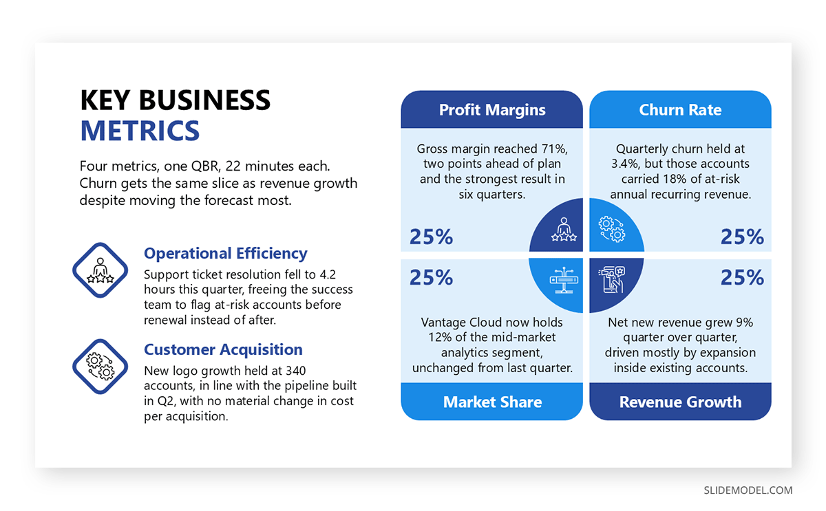
A dedicated presentation also changes who shows up and how they engage. When churn and retention analysis is the sole subject of a meeting, finance and product teams arrive prepared to discuss root causes instead of skimming past the topic on their way to the next agenda item, and customer success typically joins with the same expectation. This is particularly relevant for companies where retention is the primary growth lever, since acquisition costs have made new customer growth alone an unreliable path to profitability for many software and services businesses.
There is also a reporting benefit. A standalone presentation creates a consistent artifact that can be compared month over month or quarter over quarter. Pairing it with a concise executive summary at the front of the deck gives leadership a fast read on the headline numbers before they decide whether they need the full detail behind them. Over time, this consistency turns the presentation into a reference document that new team members can use to understand how the business has trended, not just where it stands today.
Core Metrics Worth Including
The temptation with churn and retention data is to include everything the analytics platform can export. A stronger approach, similar to the discipline behind presenting key metrics in any executive report, is to select a small set of figures that together tell a complete story, then support each one with enough context for the audience to understand what changed and why.
Churn rate is the starting point for almost every version of this presentation. It measures the percentage of customers, or revenue, lost over a given period. Presenting both the customer-based and revenue-based versions side by side often reveals a gap worth discussing: a company can lose many small accounts while revenue churn stays low, or the reverse, where a handful of large accounts leaving erases retention gains made everywhere else.
Retention rate is the inverse framing of churn and tends to land better with audiences outside of finance, since it describes what the business kept rather than what it lost. Retention rate is also where net revenue retention becomes useful, since it accounts for expansion revenue from existing customers, not just whether they stayed. A business can post net revenue retention above 100 percent even while losing some customers, as long as the accounts that remain spend more.
Customer lifetime value connects retention trends to long-term financial planning. When retention improves, lifetime value rises, which changes how much a company can reasonably spend to acquire a new customer. Including this metric turns a churn and retention analysis presentation from a look backward into an input for forward-looking budget decisions, a connection worth spelling out explicitly for audiences who are used to seeing lifetime value calculated separately from retention figures. This kind of layered metric reporting mirrors the discipline found in a well-built balanced scorecard, where financial and operational indicators are read together rather than in isolation.
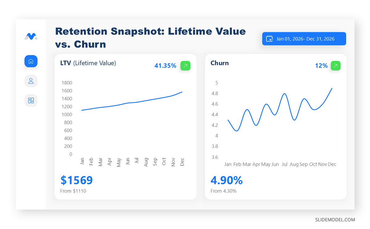
Cohort retention curves round out the core set by showing how a group of customers who joined in the same period behaves over time. This view often reveals whether retention problems concentrate in the first few months after signup or emerge later, a distinction that changes which team owns the fix. For subscription and SaaS presentation audiences in particular, cohort curves tend to generate more discussion than any other single chart in the deck, since they expose whether onboarding or long-term product value is the weaker link.
Structuring the Presentation from Open to Close
A churn and retention analysis presentation benefits from a predictable shape, since audiences who see this report regularly will look for the same sections in roughly the same order. Starting with a brief statement of the headline numbers, current churn rate and current retention rate, along with the direction of both compared to the prior period, orients the room before any supporting detail appears.
From there, the presentation should move into the data behind those headline figures: the time period covered and the customer segments included. It should also flag any changes to how the metrics were calculated since the last report. Skipping this step is a common source of confusion in recurring presentations, since a change in methodology can make a metric appear to move even when underlying customer behavior has not. A clear presentation outline at the start of the deck, or at minimum a consistent section order, helps returning audiences track where they are in the narrative.
The middle section is where cohort analysis and segment breakdowns belong, along with the root-cause detail that explains what is driving each one. This is the part of the presentation most likely to include the cohort curves and segment comparisons discussed earlier, along with any qualitative context gathered from exit surveys or customer success notes. Because this section carries the analytical weight of the presentation, it benefits from the same narrative discipline described in guides to presentation storytelling: each slide should answer a question the previous slide raised, rather than presenting disconnected charts in sequence.
The closing section shifts from analysis to recommendation. This is where the presenter proposes specific actions and connects them to expected impact on retention or revenue, naming who owns each initiative afterward. A presentation that ends on data without a recommendation leaves the audience to interpret next steps on their own, which often means nothing happens before the next reporting cycle.
Choosing Visuals That Make Retention Patterns Legible
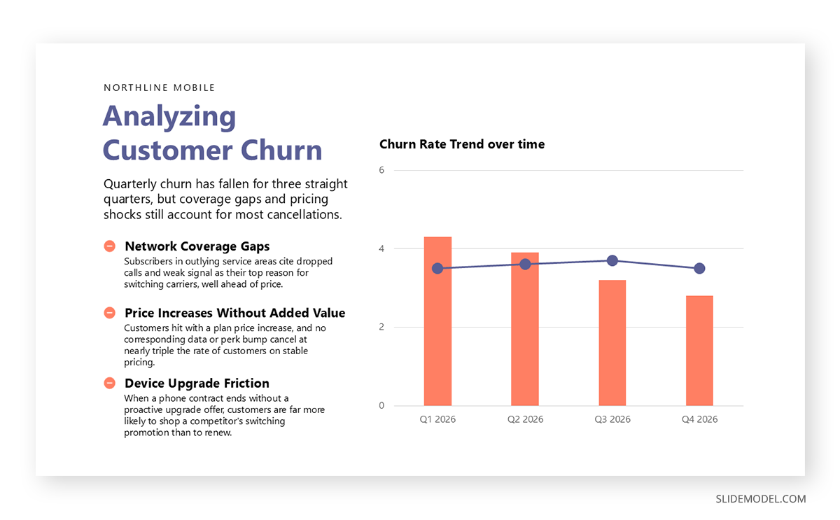
Churn and retention data is fundamentally about change over time, which makes chart selection more consequential here than in many other business presentations. A line chart remains the clearest way to show churn or retention rate trending across months or quarters, particularly when comparing multiple customer segments on the same axis. Layering too many segment lines onto a single chart, however, works against clarity; beyond three or four lines, most audiences struggle to track which segment is which.
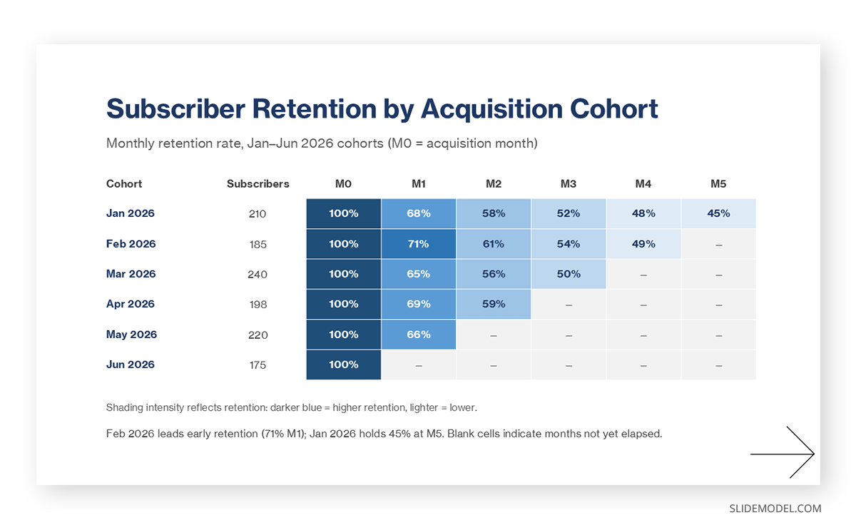
Cohort retention is typically better served by a triangular grid or heat map format, where each row represents a signup cohort and each column represents time since signup. This layout makes it possible to spot patterns at a glance, such as a consistent drop-off at the three-month mark across every cohort, that a line chart would bury in overlapping trend lines.
For the underlying numbers behind each chart, a well-formatted table slide still has a place in a churn and retention analysis presentation, particularly in an appendix section for audiences who want to verify specific figures without re-deriving them from a chart. Tables are also useful when comparing metrics across many small segments where a chart would become cluttered, such as a breakdown of churn rate by every product tier or geographic region a company serves.
Common Mistakes That Undercut a Churn and Retention Presentation
Treating churn as a single, uniform metric
Voluntary churn, where a customer actively cancels, and involuntary churn, caused by a failed payment or an expired card, have different causes and different fixes. Combining them into one number obscures which problem the organization is actually facing.
Presenting trailing metrics without any forward-looking view
A presentation that only reports what already happened leaves little for the audience to act on. Pairing historical churn and retention figures with a churn prediction model, even a simple one based on usage decline or support ticket volume, gives stakeholders something to intervene on before the customer actually leaves.
Skipping the denominator
A churn rate reported without context on the size of the customer base or the revenue at stake can mislead an audience into overreacting to a small absolute change or underreacting to a large one. Stating both the percentage and the underlying customer or revenue count keeps the scale of the problem in view.
Ignoring renewal timing
For contract-based businesses, a spike in churn during a particular month often correlates with when a large batch of contracts came up for renewal, not with a sudden decline in product satisfaction. Reviewing the renewal calendar alongside the churn rate prevents this kind of misread.
Reporting retention metrics that do not match how the business actually sells
A company with annual contracts gains little from a monthly retention view, since normal renewal cycles will make the number swing in ways unrelated to customer sentiment. Matching the reporting period to the actual sales and renewal cadence keeps the metric meaningful.
Leaving out the cost side of retention
Retention initiatives, whether a customer success hire, a loyalty discount, or a product investment, carry a cost. A presentation that recommends retention spending without weighing it against the customer lifetime value it protects makes the case harder for finance to approve.
Turning the Analysis into an Action Plan
Data on its own rarely changes behavior inside an organization. A churn and retention analysis presentation earns its place on the calendar when it closes with a clear plan, not just a diagnosis. That plan usually spans more than one function. Product teams fix the features or gaps driving cancellations. Customer success teams focus on accounts already showing early warning signs. Pricing and packaging adjustments come into play when what customers pay no longer lines up with the value they receive.
Customer success initiatives deserve particular attention in this section, since they are often the fastest lever an organization can pull. Outlining how to set up a customer success program or expand an existing one gives the recommendation section concrete substance rather than a vague call to “improve retention.” Supporting that recommendation with evidence from accounts the company has already saved, drawn from customer success studies, gives stakeholders a reason to believe the approach will work again.
Mapping churn against the customer journey also helps target where intervention will do the most good. A cohort losing customers in the first thirty days needs a different fix than one losing customers after a year of steady use. The first points to onboarding; the second points to product fatigue, pricing misalignment, or a change in the customer’s own business needs. Connecting the retention data back to the journey stage where the drop-off occurs keeps the action plan specific enough for a team to actually execute.
Adjusting the Churn and Retention Analysis Presentation for Different Audiences
The same underlying churn and retention data supports different presentations depending on who is in the room. A board of directors typically wants the headline trend and the revenue impact, along with enough confidence that management understands the cause, all delivered in a handful of slides. A product team wants the cohort and feature-level detail that points to specific fixes. A sales team, meanwhile, often cares less about historical churn than about how retention trends affect their ability to sell expansion revenue into the existing base, a framing that overlaps with how a team might present market share shifts to explain competitive pressure on renewals.
Adjusting the level of detail for each audience does not mean changing the underlying numbers. It means choosing which slides from a fuller deck to show, and how much supporting context each audience needs before the headline figures make sense. A customer success team reviewing the same data monthly needs less framing than a board seeing the annual figures for the first time. Building the presentation in modular sections, rather than one fixed sequence, makes it easier to reassemble the right subset for each audience without rebuilding the analysis from scratch each time.
FAQs
What is the difference between churn rate and retention rate?
Churn rate measures the share of customers or revenue lost over a period, while retention rate measures the share kept. The two are mathematical inverses, but presenting both separately still matters, since audiences tend to react differently to a loss framing than to a framing built around what the business successfully kept.
How often should a churn and retention presentation be updated?
Most subscription businesses update this presentation monthly or quarterly, matching the cadence of their billing cycle and board reporting schedule. Companies with longer contract terms sometimes review it quarterly with a lighter monthly check-in on early warning signs rather than a full presentation each month.
What counts as a good churn rate for a subscription business?
It depends heavily on the customer segment and contract length. Enterprise software companies with annual contracts often aim for annual churn in the low single digits, while consumer subscription products can tolerate higher monthly churn given lower acquisition costs. Comparing a company’s churn rate against its own history is usually more useful than comparing it against a general industry benchmark.
Should churn and retention data be presented separately from other business metrics?
For companies where retention drives a meaningful share of revenue, a standalone presentation tends to produce better discussion than folding the topic into a broader operational review. It gives the topic enough time for root-cause discussion rather than a brief mention before the meeting moves on.
What is cohort analysis and why does it matter here?
Cohort analysis groups customers by when they joined and tracks how each group’s retention changes over time. It matters because it separates recent product or pricing changes from long-term trends, showing whether a retention problem is new or has existed across multiple signup periods.
How is net revenue retention calculated?
Net revenue retention takes the revenue from a cohort of existing customers at the start of a period, adds any expansion revenue from upgrades or additional purchases, subtracts revenue lost to downgrades and cancellations, and divides the result by the starting revenue. A figure above 100 percent means expansion revenue outpaced losses from that same customer base.
What visuals work best for showing churn trends over time?
Line charts handle overall trend lines well, particularly when comparing a small number of segments. Cohort retention is usually clearer in a grid or heat map format, since it shows how multiple signup groups behave across the same time intervals in a way a single line chart cannot capture.
How long should a churn and retention analysis presentation run?
A focused version built around headline metrics and a short action plan typically runs 15 to 20 minutes, with time for discussion. A deeper quarterly review that includes cohort detail and segment breakdowns can run closer to thirty minutes, especially when multiple departments present their own contributing data.
Who should be included when churn and retention data is presented?
Finance and customer success leadership are the most common attendees, and product leadership usually joins as well when cohort-level detail is on the agenda, since each group owns a different lever affecting retention. Include sales leadership when expansion revenue or renewal timing is part of the discussion, since renewal patterns directly affect their pipeline.
How should a presenter handle a quarter where churn rose sharply?
The most credible approach is to name the change plainly and show the data behind it, then separate confirmed causes from open questions rather than offering a single explanation before the analysis supports one. Audiences generally respond better to a presenter who says what remains uncertain than to one who overstates confidence in an incomplete diagnosis.
What is the difference between voluntary and involuntary churn?
Voluntary churn happens when a customer actively decides to cancel, often tied to dissatisfaction, cost, or a switch to a competitor. Involuntary churn happens when a subscription lapses due to a failed payment, an expired card, or a billing error, which usually requires a different fix, such as improved payment retry logic, rather than a product or pricing change.
How does customer lifetime value connect to retention analysis?
Lifetime value rises as retention improves, since customers who stay longer generate more revenue over their relationship with the company. Tracking the two together turns a retention presentation into a financial planning input, since lifetime value directly informs how much a company can afford to spend acquiring new customers.
Final Words
A churn and retention analysis presentation succeeds when it does more than restate numbers the audience could have pulled from a dashboard themselves. It succeeds by choosing the right metrics and explaining what changed and why, then closing with a plan specific enough for someone in the room to own. That requires discipline in what to leave out as much as what to include, since a presentation trying to cover every available metric usually ends up clarifying nothing.
Retention economics reward organizations that treat this reporting as a recurring discipline rather than a one-time exercise. Each version of the presentation should build on the last, tracking whether previous recommendations moved the numbers and adjusting the plan when they did not. Over enough quarters, that consistency turns a single presentation into a record of how the business learned to keep the customers it already earned.