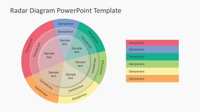
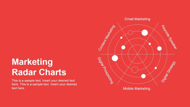
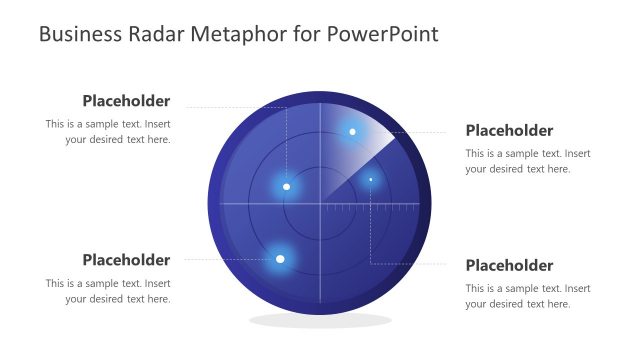
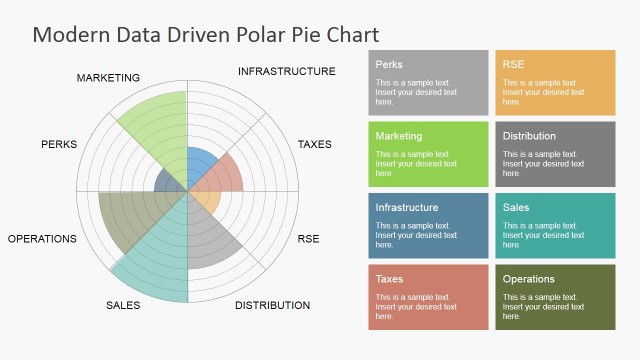
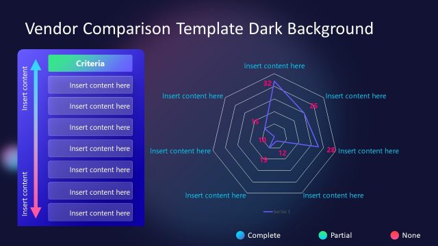
Radar Chart Template for PowerPoint– Radar charts display information in 2D graphics. The chart can have three or more quantitative variables. Some popular names of Radar charts are web, spider, start and polygon charts. Appeal to professional audiences using Radar Chart Template for PowerPoint.
The diagram is perfect for quality development and product comparison demonstrations. It is ideal for performance metrics and concepts of sales. The chart is suited in analyzing commonality of variables. It can be used in sports where the user can outline the strengths and weaknesses of the players.
Each star or set of values in the chart is considered as one single observation. Usually, these graphing styles are used when there are multiple stars or observations in one presentation. The stars lie on the graph, sometimes overlapping each other in rare cases. They give a rectangular image in the chart. Divisions of the web refer to clusters of data. Each feature on the chart is meaningful such as the distance between every division. The presenter can easily find patterns in this PowerPoint design.
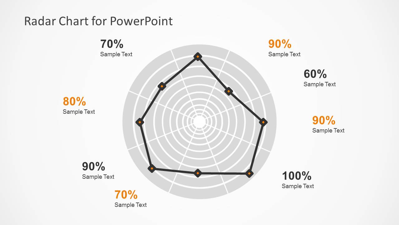
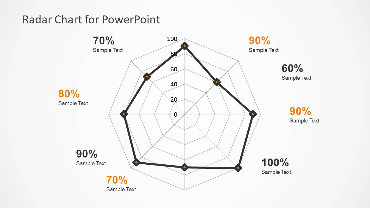
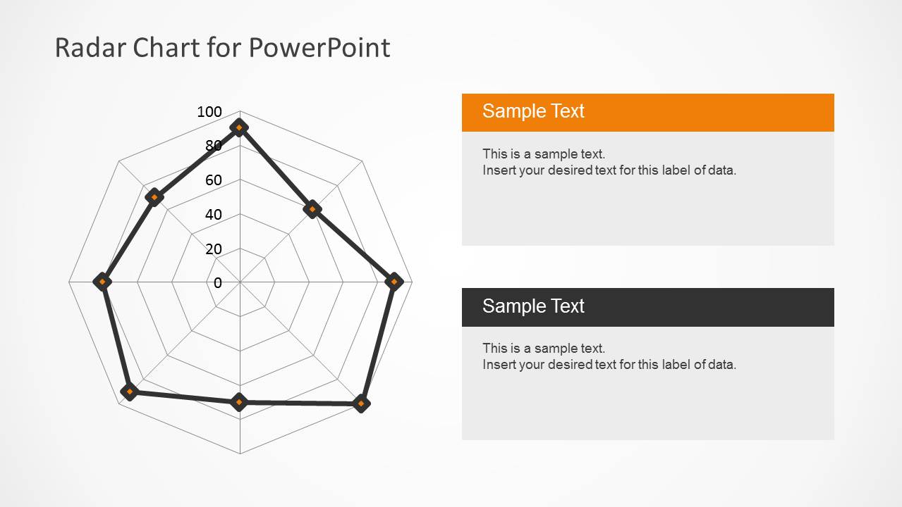
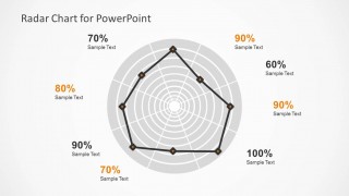
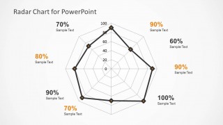
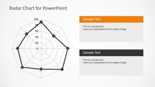
The presenter can find a radar chart in the center of the first slide. It has a circular grid. The slide design incorporates percentages around the PowerPoint diagram for additional function. The chart is illustrated on gray background with the star segments in black lines. The second slide showcases a more web-like grid. It contains percentage values like the first slide but has an additional vertical grid labels. Lastly, the third slide shows a web with vertical grid labels. The user can utilize the text placeholders on the right to elaborate on the variables and details of the subject.
Awe global audiences with beautiful infographics using Radar Chart Template for PowerPoint. The PowerPoint shapes are 100% customizable to suit the needs of the presenter. Data Driven Polar Charts for PowerPoint is a relative design with radar charts downloadable at the SlideModel gallery.
What’s inside this template
Example presentation scenarios
- A product manager can use the polygon spider chart to compare feature strength, usability, cost, and readiness across a product concept before prioritization.
- A sales leader can use the circular radar chart with percentage callouts to explain capability gaps across territories, accounts, or sales behaviors.
- A quality manager can use the spider chart and right-side text panels to present assessment scores and explain the most important corrective actions.
- A consultant can use the radar layouts to compare client options across several weighted criteria and guide discussion around trade-offs.
Features
- 100% editable presentation template
- Compatible with Microsoft PowerPoint and Google Slides
- Scalable vector shapes, icons and illustrations
- Data-driven charts, editable in Microsoft Excel
- AI-Ready for Microsoft Copilot and Claude
- Instant access and download
Frequently asked questions
Q: How should I present a radar chart so the audience understands the comparison quickly?
A: Start by naming the variables before showing the plotted shape, then explain what a larger radius means in the context of your data. Use the outside percentage labels on slides 1 or 2 for the headline readings, and reserve slide 3 for short interpretation notes rather than repeating every value.
Q: Who is this radar chart template best suited for?
A: This template fits analysts, product managers, sales leaders, and consultants who need to compare one subject across several dimensions. It is strongest when the presenter wants to show a performance profile, such as feature coverage, quality maturity, player skills, or market segment behavior, instead of a single ranked list.
Q: Why use a spider chart instead of a standard column chart for this message?
A: The radar and spider chart metaphor turns several scores into a visible profile, making balance, gaps, and outliers easier to discuss. The circular and polygon grids help the audience compare relative strength across dimensions, while the right-side text boxes on slide 3 give space for the meaning behind the shape.
Radar Chart Template for PowerPoint
3-slide radar chart presentation template for spider chart comparison and performance metrics
Radar Chart Template for PowerPoint is a 3-slide data and chart template for comparing multivariable performance. It includes a circular radar chart, a polygon spider chart with percentage callouts, and a radar chart with explanatory text panels. It is intended for product, sales, quality, demographic, or feature comparison presentations in PowerPoint and Google Slides.


 Loading...
 Microsoft PowerPoint
  Microsoft Copilot
  Claude for PowerPoint
 Other formats supported
Subscribe today and get immediate
access to download our PowerPoint templates.