Choosing the right chart is often more important than knowing how to create one. Pie charts are among the most common chart types in PowerPoint, but also among the most misused. In this guide, we will explain how to make a pie chart in PowerPoint. We will also discuss when to use different types of pie charts, how to create a PowerPoint pie chart from Excel data, and how to avoid common design mistakes that make charts difficult to interpret.
When Should You Use a Pie Chart
A pie chart can quickly show how individual categories contribute to a whole, but it becomes hard to read when too many values compete for attention or when another chart type communicates the information more clearly. A pie chart works best when you want to show how individual values contribute to a single total. Each slice represents a percentage of the whole, making it easy for audiences to understand proportions at a glance. Common business examples include market share by competitor, annual budget allocation, survey responses, department spending, and product sales by category. Pie charts work best when there are relatively few categories and one or two slices clearly stand out.
When Should You Choose Another Chart
Not every dataset belongs in a pie chart. While pie charts are excellent for showing how individual categories contribute to a whole, other chart types often suit different kinds of data better. Choosing the right chart can make your presentation easier to understand and help your audience spot key insights faster. If you’re comparing many categories, tracking changes over time, or highlighting precise differences between values, a column, bar, or line chart will usually present the information more clearly.
Use a Column or Bar Chart for Comparisons
Column and bar charts are ideal when comparing multiple categories or identifying the largest and smallest values. They let audiences compare lengths more accurately than pie slices, especially when values are similar. For example, if you’re presenting sales by region, revenue by product, employee headcount by department, or customer satisfaction scores across different teams, a column or bar chart makes it much easier to compare differences. These chart types also accommodate more categories without becoming cluttered.
Use a Line Chart for Trends Over Time
Line charts show how values change over time, making them the preferred choice for trends and patterns. Examples include monthly sales, quarterly revenue, website traffic, stock prices, or project progress over several weeks. Unlike a pie chart, which represents a single snapshot, a line chart highlights increases, decreases, seasonal patterns, and long-term trends. If your audience needs to understand how performance has changed rather than how a total is divided, a line chart is usually the better option.
Use a Stacked Bar or Stacked Column Chart for Changing Proportions
Sometimes you need to show both the total value and how individual categories contribute to that total across multiple periods. In these situations, a stacked bar or stacked column chart is often more informative than creating several separate pie charts. For example, you might compare how different product categories contributed to annual sales over the last five years or show how departmental budgets changed from one quarter to the next. Stacked charts make it easier to identify both overall growth and shifts in category proportions.
Use a Scatter Chart to Show Relationships
When your goal is to identify relationships between two variables rather than parts of a whole, a scatter chart is the better choice. Scatter charts reveal patterns, clusters, and correlations that would be impossible to communicate with a pie chart. Business examples include comparing advertising spend with sales revenue, product price with customer demand, or training hours with employee performance.
Use a Table When Precise Values Matter
Sometimes the audience needs exact numbers rather than visual comparisons. Financial reports, budgets, pricing lists, and detailed performance metrics are often easier to understand in a well-formatted table than in any chart. If precise values matter more than proportions or trends, a table may be the clearest option.
How to Create a Pie Chart in PowerPoint
Once you’ve determined that a pie chart is the appropriate visualization, creating one in PowerPoint takes only a few steps. The chart uses an embedded Excel worksheet, so you can edit values directly without leaving PowerPoint. In the following example, we will use the Corporate AI Training PowerPoint Template to add a pie chart for marketing data.
Step 1: Insert a Pie Chart
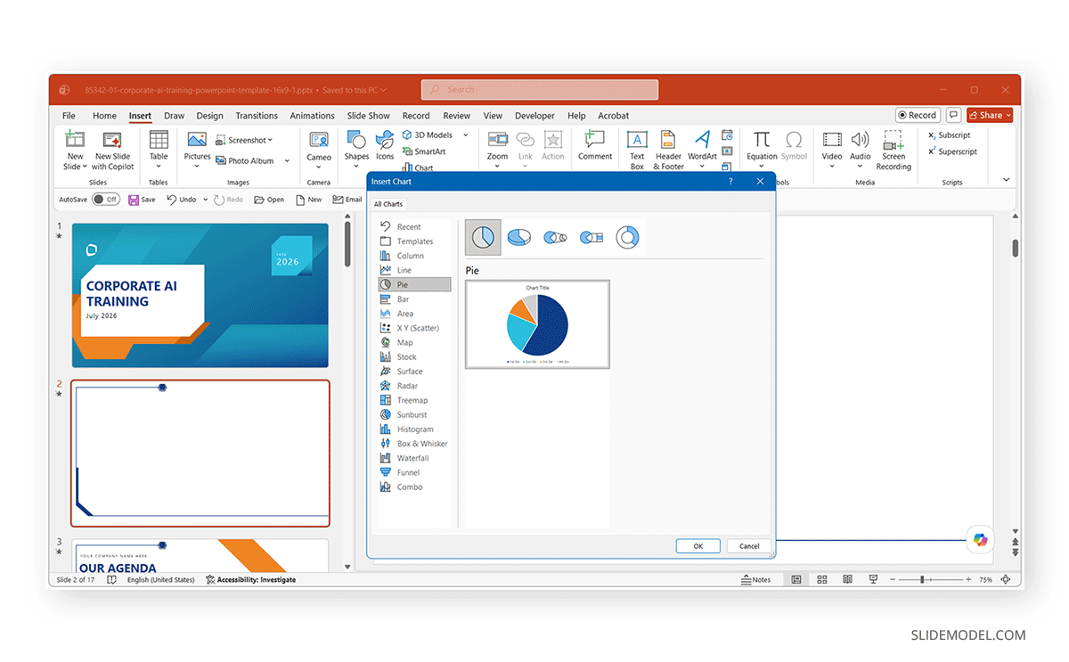
Open your presentation and go to the slide where you want to add the chart. Select Insert -> Chart. The Insert Chart dialog displays several chart categories. Choose Pie from the left-hand menu. PowerPoint offers several pie chart variations, including Pie or 2-D Pie, 3-D Pie, Pie of Pie, Bar of Pie, and Doughnut.
Step 2: Choose the Right Pie Chart Type
Selecting the correct subtype is just as important as entering accurate data. A standard 2-D Pie chart suits most business presentations because it shows proportions clearly without visual distortion. Other chart types, such as Doughnut or Pie of Pie, suit specific situations and should be chosen intentionally rather than for appearance alone. We’ll examine each subtype later in this guide.
Step 3: Enter or Replace the Sample Data
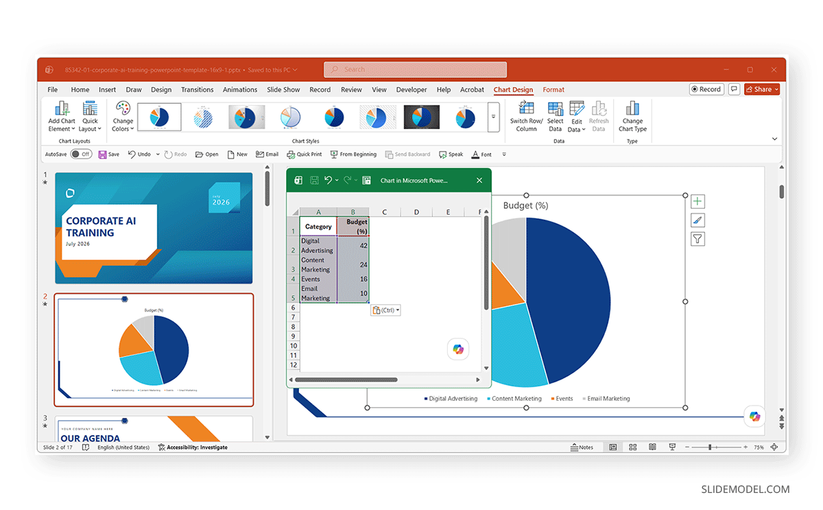
After inserting the chart, an Excel worksheet opens automatically with sample data. Replace the sample values with your own data. The first column normally contains category names, while the second column contains the corresponding values.
Step 4: Add a Title That Explains the Data
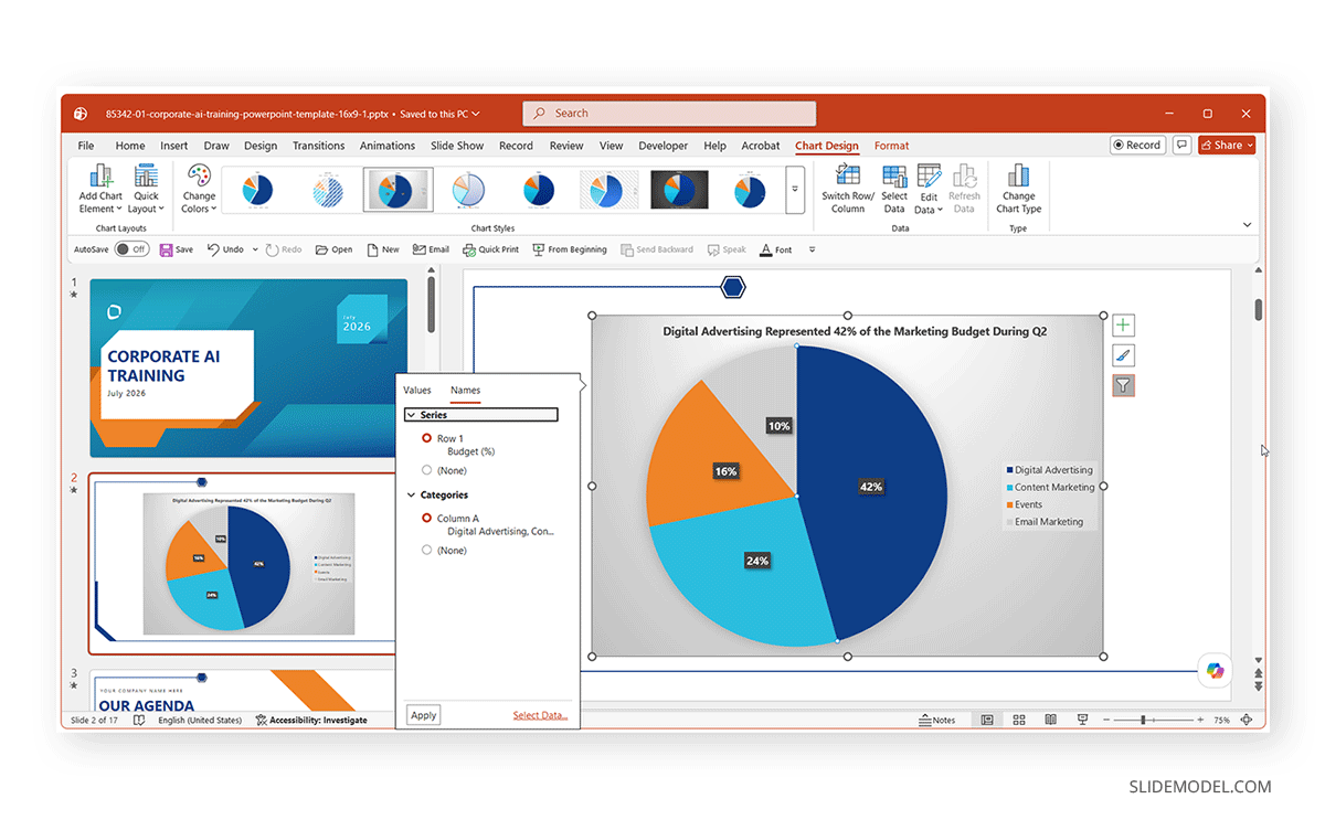
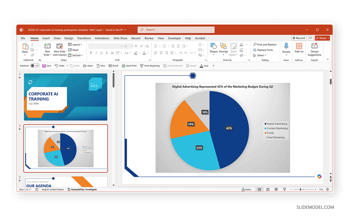
Many presenters use generic titles such as sales, revenue, or budget. These labels describe the subject but not the message. Instead, write titles that communicate the key takeaway. For example, you may use a title like “Digital Advertising Represented 42% of the Marketing Budget During Q2” to make the title more descriptive.
Step 5: Add Data Labels
Data labels help audiences interpret a pie chart without constantly referring to the legend. Select the chart, then choose Chart Elements (plus icon) and enable Data Labels. For business presentations, percentages are often the clearest option because pie charts are designed to communicate proportions. PowerPoint also lets you display category names, values, percentages, and leader lines. Positioning labels Outside End usually improves readability, particularly when slices are small or closely grouped.
Step 6: Arrange Slices to Improve the Story
PowerPoint creates slices based on the order of the source data, but that order isn’t always best for communication. If appropriate, reorder your data so the largest categories appear first or place the most important category where it naturally draws attention.
Step 7: Apply a Clean Chart Style
The final step is refining the chart’s appearance. When formatting your chart, use a limited color palette, highlight only the most important slice, avoid excessive shadows and visual effects, remove unnecessary chart borders, and keep fonts consistent with the rest of the presentation. The goal is to emphasize the data, not decorative formatting.
Choosing the Right Pie Chart Type
PowerPoint includes several pie chart variations, each designed for a different purpose. While they all show parts of a whole, some suit analytical presentations better than others. Understanding each type’s strengths and trade-offs helps you choose the most effective visualization for your data.
2-D Pie Chart
The standard 2-D Pie is the default option and the best choice for most business presentations. Because the slices are displayed on a flat surface, audiences can compare proportions without perspective distortion. You can use a 2-D pie chart to show budget allocation, present market share, compare survey responses, and display category percentages. For most analytical presentations, this should be your first choice.
3-D Pie Chart
A 3D Pie Chart PowerPoint adds depth and perspective, making the chart more attention-grabbing. However, the added dimension can distort the apparent size of slices, especially those positioned toward the front of the chart. While 3-D charts may work in decorative presentations or marketing graphics, they are generally discouraged for data analysis because they make accurate comparisons more difficult. If your goal is to help an audience interpret data quickly, a standard 2-D chart is usually the better option.
Doughnut Chart
A Doughnut Chart PowerPoint resembles a pie chart with a hole in the center. The format works well when you want a cleaner appearance or need to display multiple data series using concentric rings. It can also provide space in the center for a key metric, icon, or percentage. However, multiple rings can become hard to interpret if you display too many categories. For a single data series, a standard pie chart is often easier to read.
Pie of Pie Chart
A Pie of Pie Chart improves readability when one or more slices are too small to distinguish clearly. PowerPoint automatically separates smaller categories into a secondary pie chart, allowing viewers to examine minor values without overcrowding the main chart.
This chart works well when several categories represent only a small percentage of the whole, small slices overlap or become difficult to label, or when you want to emphasize the primary categories while still showing detailed breakdowns. Since the chart divides information across two pies, some viewers may need a moment to understand the relationship between them.
Bar of Pie Chart
The Bar of Pie chart serves a similar purpose but displays the smaller categories as stacked bars rather than as a second pie chart. This format often makes small values easier to compare because audiences generally find bars easier to judge than narrow pie slices. It is particularly useful when numerous minor categories must remain visible, small differences between values matter, or labels become crowded in a traditional pie chart.
How to Create a Pie Chart in PowerPoint from Excel
Many organizations already maintain their data in Microsoft Excel before preparing a presentation. Instead of re-entering the values, PowerPoint lets you create charts directly from existing Excel worksheets. Two common approaches depend on how you’ll use the presentation.
How to Embed Excel Data in PowerPoint
Embedding stores the workbook inside the PowerPoint presentation. This option is best when the data is final, the presentation will be shared independently, or you don’t expect the source workbook to change. To embed Excel data, copy the data from Excel, insert a pie chart in Excel, and replace the sample worksheet with the copied values. The chart becomes part of the presentation and no longer depends on the original Excel file.
How to Link the Excel Workbook
If you update your Excel workbook regularly, linking may be the better choice. A linked chart maintains a connection to the original workbook, so PowerPoint reflects changes made in Excel. This workflow is useful for data such as monthly business reports, financial dashboards, sales presentations, and operational reports. Keep in mind that linked charts require access to the original Excel workbook. If you move, rename, or lose access to the file, PowerPoint may not be able to update the chart.
To create a linked chart, copy the chart or data from Excel and use Paste Special in PowerPoint to paste it as a linked Microsoft Excel Chart Object. When the source workbook updates, PowerPoint can refresh the chart to show the latest data. This workflow is particularly useful for recurring reports, financial dashboards, sales presentations, and operational updates where figures change frequently. Keep in mind that linked charts depend on the original Excel workbook. If you move, rename, or make the file unavailable, PowerPoint may not be able to update the linked chart.
How to Use Microsoft Copilot to Create a Pie Chart
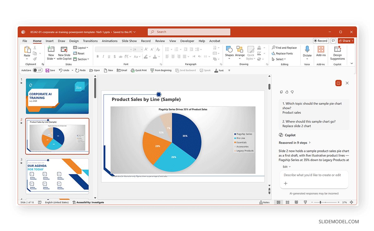
Microsoft Copilot can help you generate charts faster by analyzing your data or responding to natural-language prompts. For example, you can ask Copilot to create a pie chart showing product sales or departmental spending, and it will generate a first draft based on the available information. If you try to generate a chart with detailed information, Copilot may take longer to respond.
To generate a chart using Copilot, select New Slide with Copilot from the Home tab and enter a prompt to create your chart. While this method can save time, view Copilot as a starting point rather than a finished design. Review the chart carefully to ensure the chart type is appropriate, labels are clear, colors match your presentation, and the title communicates the key takeaway. When making a chart with Copilot, a few manual refinements can significantly improve the result and ensure accurate data representation.
Avoiding Common Pie Chart Mistakes
Even a correctly created pie chart can become ineffective if you overlook basic design principles.
Including Too Many Categories
Pie charts become increasingly difficult to read as the number of slices grows. If your dataset contains seven, eight, or more categories, individual slices become increasingly difficult to distinguish. In these situations, consider grouping smaller categories into others or switching to a bar chart.
Using 3-D Effects for Analytical Data
Three-dimensional charts may look attractive, but perspective can exaggerate or reduce the apparent size of slices. For reports and business presentations, a flat 2-D chart usually communicates the data more accurately.
Using Generic Titles
Titles such as Sales or Revenue tell audiences what the chart contains but not what they should learn from it. Instead, write titles that summarize the key finding.
Omitting Data Labels
Forcing audiences to repeatedly match slices to a legend slows interpretation. Therefore, showing percentages or category names directly on the chart can make the information easier to understand.
Using a Pie Chart for the Wrong Data
Pie charts show parts of a whole. They are not suitable for displaying trends over time, comparing many categories, or showing negative values. When another chart type communicates the data more clearly, use that instead.
Final Words
Choosing the right chart type, organizing the data effectively, and presenting the information clearly can greatly affect how your audience understands the message. The most effective charts are often the simplest ones. For most presentations, a standard 2-D pie chart with clear labels, a descriptive title, and a simple color palette provides the best balance between readability and visual appeal. Features such as Pie of Pie, Bar of Pie, and Doughnut charts can be valuable in specific situations. At the same time, Microsoft Copilot offers a convenient way to generate an initial chart that you can refine with a few manual edits.