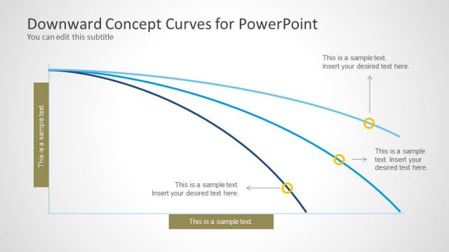
J-Curve for PowerPoint is a template for making professional J-Curve diagrams with accuracy.
Using this template you can present a J-Curve by adjusting the sample diagram according to need. The template offers multiple J-Curve sample slides, all of which come with editable objects, including the curve itself, which is highly customizable.
You can adjust the curve using drag and drop and customize it using options from the PowerPoint Ribbon Menu.
What’s inside this template
Example presentation scenarios
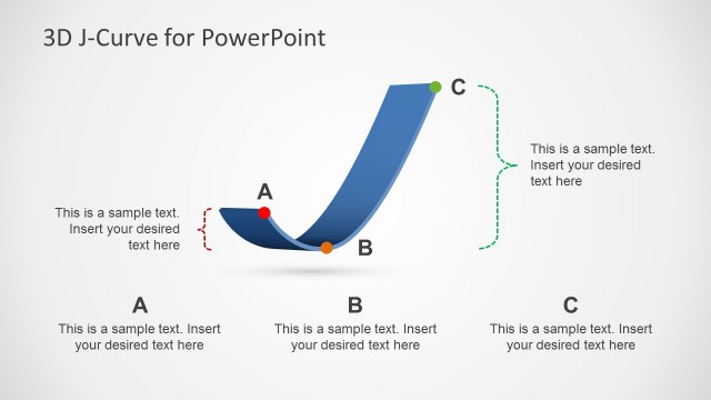
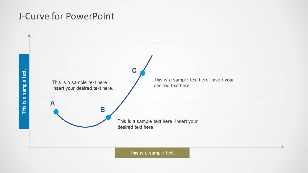
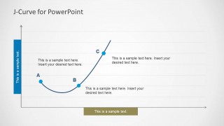
- An economist can use the point-marker J-curve to explain how a variable drops, reaches a low point, and later recovers toward a higher outcome.
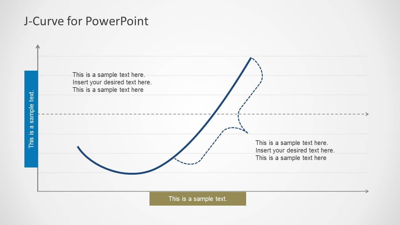
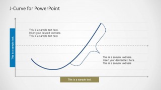
- A strategy consultant can use the solid-versus-dashed curve slide to compare a current trajectory with an alternative scenario or forecast.
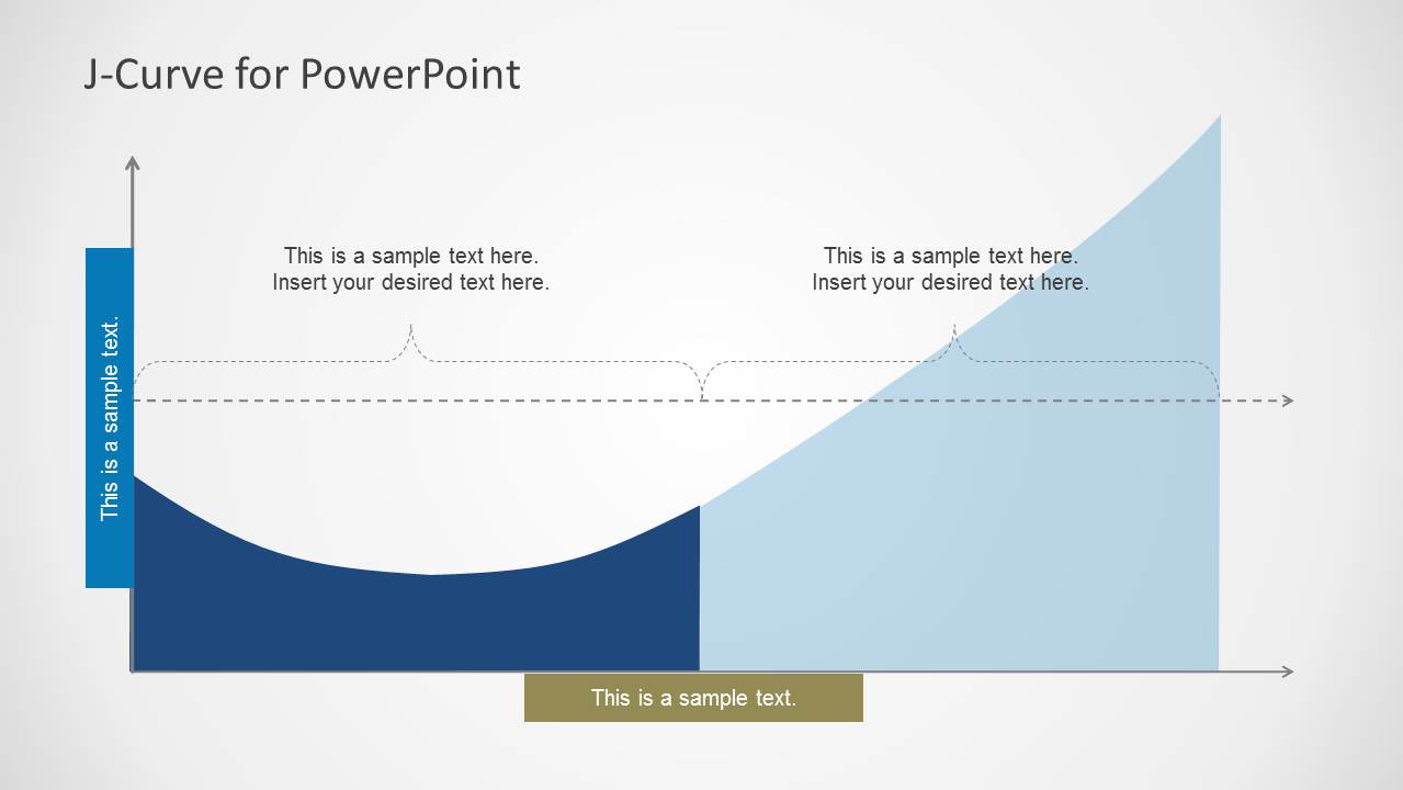
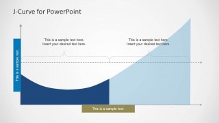
- A researcher can use the filled area J-curve to show the relative size of negative and positive phases in a social science or policy outcome.
- A finance presenter can use the annotated curve layouts to discuss short-term loss, recovery timing, and longer-term growth in an investment narrative.
Features
- 100% editable presentation template
- Compatible with Microsoft PowerPoint and Google Slides
- Scalable vector shapes, icons and illustrations
- AI-Ready for Microsoft Copilot and Claude
- Instant access and download
Frequently asked questions
Q: How should a presenter explain the J-curve without overloading the audience?
A: Start with the labeled point-marker slide and define what A, B, and C mean in plain language, such as initial decline, trough, and recovery. Keep each callout tied to one decision or observation. Then move to the comparison or filled area version only if the audience needs scenarios or magnitude.
Q: Who is this template best suited for?
A: This template fits analysts, economists, consultants, researchers, and educators who need to explain a non-linear change pattern. It works best when the message is about short-term pain followed by recovery or growth, such as trade balance effects, policy impact, adoption behavior, investment performance, or organizational change.
Q: Why does the J-curve shape work as a communication device?
A: The J shape gives the audience a visual metaphor for a temporary downturn before improvement. The first slide labels the stages, the second compares possible paths, and the third uses filled areas to make the negative and positive phases easier to compare. This reduces abstraction in an otherwise conceptual argument.
J-Curve for PowerPoint
3-slide PowerPoint presentation template for J-curve diagrams, curve annotations, and area growth visuals
J-Curve for PowerPoint is a 3-slide editable diagram template for presenting J-curve behavior in economics, social science, strategy, or performance analysis. It includes a labeled point-marker J-curve, a solid-versus-dashed curve comparison, and a filled area J-curve for showing downturn, recovery, and growth.


 Loading...
 Microsoft PowerPoint
  Microsoft Copilot
  Claude for PowerPoint
 Other formats supported
Subscribe today and get immediate
access to download our PowerPoint templates.